Search the Community
Showing results for tags 'monteverde'.
-
-
- jacques herbin
- rohrer & kingner
- (and 8 more)
-
Can anybody tell me what this is worth (approximately) It's a Monteverde pen set with: (1) pen body with three replaceable front ends with Fine, Medium and Omniflex nibs (4) 1 oz 30 ml bottles of ink- black, 2 shades of purple and red (3) Converters (2) Ink cartridges (1) bottle of pen flush (1 oz 30 ml) All in a nice presentation box. I know what I paid for it, but I can't find any comparable sets. I also don't know if Monteverde pens are affordable or not. If they're worthwhile, I'll be listing some on here. Thanks in advance.
- 2 replies
-
- pens
- monteverde
-
(and 1 more)
Tagged with:
-
Here's my scans of Monteverde Brown both bottle and cartridge. I was excited when I got the carts as the packaging had "copyright 2010" on it, possibly the original formula but in testing it sure seems to be the same as the bottled ink. With the bottle ink, I had bad problem with hard starts and really bad skipping on block letters with first 2 pens I tried, a Kaweco Sport M and a Hemisphere M (wasn't as bad with cursive's long, continuous strokes). Had same problem with Jinhao Safari M so tried a Luxor Vector and it worked perfectly there. But I left the Jinhao sit overnight and when I tried it the next day, the hard stops and skipping were gone, so probably didn't let ink feed completely on 1st 2 pens. Tried a Baoer 801 F after the Vector and was surprised when a big drop of ink fell on paper during a pause while writing! I saw that if I just held the pen, nib down, a drop of ink would form fairly quickly (maybe 1 1/2 mins?) on the end of the feed and then drop onto the paper unless I started writing before it fell. The ink can really be described as "gushing" on that Baoer, laying down a then but very wet line. That 's the 1st time I've encountered ink dripping from a pen like that. Carts arrived and I flushed the Jinhao and put one in it; for the bottle ink, I kept the Vector and added a Pelikano M, a pretty wet writer with a broad line. The Jinhao is also fairly wet, though not like the Baoer was. On cheap memo book paper, all 3 pens performed well, not too wet as the paper absorbed quickly. Color was like the 3 bears - Vector F a nice medium shade, Jinhao a little darker and Pelikano definitely darker. That matched the line width - Vector thin, Jinhao a smidge thicker, Pelikano thick. Feathering on the memo was really minimal, only the Jinhao showed an ever-so-slighty fuzziness. I've added a new test book for trying out inks, a Strathmore Sketch pad; it has thick, very white paper with a "fine tooth surface" and is actually intended for dry media. I like it because it is so white and doesn't absorb the ink so readily; I've come to realize how much the absorbency of cheap paper, especially the little memo books I was using, can affect the color I'm seeing and that the hard white surface of the Strathmore pad gives me a better idea of what the ink should look like. The difference between the three pens was even more pronounced on the Strathmore. The Vector's line seems a little thinner while the Jinhao's seems a little heavier. Ink glistens as it's laying down, indicating the wetness. Most surprising is the color, though; now the Jinhao line is darker than the Pelikano. Results on the scan are closer to the memo paper than to the sketch pad in that regard. Some shading is also noticeable on the Strathmore, most obviously on the Pelikano but some on the Vector, as well. Overall, I like this particular color of brown. I would call it medium-dark brown that's not too light or too dark, it's not reddish or orange-ish, it's not really yellow-ish, either, it's just a nice brown. It's very wet - watery, I guess you'd call it, so you might have to try it in a few pens before you find one it works well in. By the same token, there's lots of good browns in this range from other manufacturers so there's no particular reason to chose this one over others unless you like this particular shade, like I did when I saw Sandy1's review. Price on ebay runs $14-15 (incl ship) for a generous 90ml bottle. I stumbled on a bargain (spurring me to buy), $5 +$4 ship. The cartridges, I paid $4.45 for 3 6-packs w/ free shipping; that works out to 19 cents each - can't beat that. So, without further ado, onto the scans. Scans seem reasonably accurate. My thanks to Sandy1 for both the original review and the encouragement to post one myself.
- 16 replies
-
- monteverde
- brown
-
(and 2 more)
Tagged with:
-
Monteverde is part of Yafa company. Some time ago the company offered wide array of new inks with Ink ITF™ - new Ink Treatment Formula that's supposed to drastically improve ink-flow quality, extend cap-off time and improve ink drying time on paper. After trying two inks I can agree it's not just marketing - the inks behave very well. Bottle The inks can be bought in 30 (and 90) ml bottle. The bottle is made of lass, has simple design and id pretty functional - stable and with wide neck allowing to fill quite comfortably (as long as there's more than 60 % of the ink content in it) even monster fountain pens straight from the bottle. Ink The ink is well saturated and displays pleasant range of warm hues. The shading is visible. The flow is smooth and the ink feels well lubricated even in dry pens. Some feathering and bleed-through will be experienced only on crappiest papers (hello Moleskine). Drying time is reasonable. Also, it's impressive that the ink doesn't dry out when you leave the pen uncapped. Even after three minutes the pen starts without any skipping when you put the nib to the paper. Basically, it's ok. Drops of ink on kitchen towel Color ID Color range Copy paper, Kaweco Classic Sport, M Munken Rough, Platinum 3776, B Fabriano, Kaweco Classic Sport, stub 1.1 Rhodia, Wing Sung 696, F Water Resistance
-
Monteverde is part of Yafa company. Some time ago the company offered wide array of new inks with Ink ITF™ - new Ink Treatment Formula that's supposed to drastically improve ink-flow quality, extend cap-off time and improve ink drying time on paper. After trying two inks I can agree it's not just marketing - the inks behave very well. New colors are divided into two series. The newest one is called GEMSTONES. I admit I have a problem with this name as Pelikan started their Gemstone collection (Edelstein inks) years ago and was succesfull. I do realise that this name can't be copyrighted but I feel something's off. Sure, it's easy to base marketing on proven and succesfull ideas but I feel just a little bit of disapproval. I believe they could have created something new, especially that the colors are rather interesting and eye-catching. Anyway the line has inks Amethyst Charoite Erinite Fireopal Garnet Moonstone Olivine Ruby Sapphire Topaz I appreciate the fact that Monteverde posted on their website data about these inks' pH values: I've ordered two inks from Gemstone line. After a week of testing ( using at least two converters of each) I'm ready to share some thoughts. I'll start with Olivine. Bottle The inks can be bought in 30 (and 90) ml bottle. The bottle is made of lass, has simple design and id pretty functional - stable and with wide neck allowing to fill quite comfortably (as long as there's more than 60 % of the ink content in it) evem monster fountain pens straight from the bottle. Ink The ink is well saturated and displays interesting green hue. It shades form a light olive color to a dark green. The shading isn't very strong in finer nibs, yet it remains visible. The flow is smooth and the ink feels well lubricated even in dry pens. Some feathering and bleedthrough will be experienced only on crappiest papers (hello Moleskine). Drying time is reasonable. Also, it's impressive that the ink doesn't dry out when you leave the pen uncapped. Even after three minutes the pen starts without any skipping when you put the nib to the paper. Drops of ink on kitchen towel Color ID Color range Rhodia, Lamy Al-Star, medium nib Leuchtturm1917, Lamy Al-Star, medium nib Oxford, Hero 5028, stub 1.9 Tsubame, Lamy Al-Star, medium nib Moleskine, Lamy Al-Star, medium nib Mini-comparison Water resistance
-
Thicker than a Faber Guilloche, thinner than a Monteverde Ritma?
joshi posted a topic in Fountain & Dip Pens - First Stop
In the market for a pen that’s cylindrical, not cigar shaped. have both the Faber Castell Guilloche and the Monteverde Ritma and wouldn’t you know it, would rather have something between those widths. All suggestions gratefully received. A wet writing nib is a bonus. thanks in advance. -
(Another quickie review, being largely a by-product of my checking how the EF nib on a Delike Alpha performs.) Colour: I suppose the closest colour of ink I have to it is Diamine Evergreen but, at least in daylight, Monteverde Olivine is slightly more yellow (and Diamine Evergreen has an obvious red sheen). Feathering: None observed on the Rhodia paper I used. Ghosting and bleed-through: Not from normal writing, but several passes with a soaked cotton swab or a wet nib can cause some ghosting and even bleed-through. Drying time: Quick enough. No smearing after 15 seconds. Water resistance: None whatsoever. Washed clean off the page under a running tap in under 15 seconds. Shading: Some, but slightly subtle. No distinct step going from faint to dark. That's a good thing. Sheen: Not any to speak of. There is the slightest hint of a dark red outline or 'halo', if you look really hard, but that's about it.
- 19 replies
-
- monteverde
- gemstone
-
(and 3 more)
Tagged with:
-
Monteverde is part of Yafa company. Some time ago the company offered wide array of new inks with Ink ITF™ - new Ink Treatment Formula that's supposed to drastically improve ink-flow quality, extend cap-off time and improve ink drying time on paper. After trying two inks I can agree it's not just marketing - the inks behave very well. New colors are divided into two series. The newest one is called GEMSTONES. I admit I have a problem with this name as Pelikan started their Gemstone collection (Edelstein inks) years ago and was succesfull. I do realise that this name can't be copyrighted but I feel something's off. Sure, it's easy to base marketing on proven and succesfull ideas but I feel just a little bit of disapproval. I believe they could have created something new, especially that the colors are rather interesting and eye-catching. Anyway the line has inks Amethyst Charoite Erinite Fireopal Garnet Moonstone Olivine Ruby Sapphire Topaz I appreciate the fact that Monteverde posted on their website data about these inks ph: Bottle The inks can be bought in 30 (and 90) ml bottle. The bottle is made of lass, has simple design and id pretty functional - stable and with wide neck allowing to fill quite comfortably (as long as there's more than 60 % of the ink content in it) evem monster fountain pens straight from the bottle. Ink The ink is well saturated and displays an interesting purple hue. It shades nicely, with the slight sheening. The flow is smooth and the ink feels well lubricated even in dry pens. Some feathering and bleedthrough will be experienced only on crappiest papers (hello Moleskine). Drying time is reasonable. Also, it's impressive that the ink doesn't dry out when you leave the pen uncapped. Even after three minutes the pen starts without any skipping when you put the nib to the paper. Thank you Nikaa for allowing me to fill Pilot CH92 with this ink Drops of ink on kitchen towel Color ID Color range Rhodia, Pilot CH 92, medium nib, stubbed Midori, Pilot CH 92, medium nib, stubbed Tomoe River, Pilot CH 92, medium nib, stubbed Water resistance
-
As a pen (and ink) afficinado that lives in Austria, it amazes me, that so many inks are made locally here, even though there is basically no high quality fountain pen and ink production by Austrian brands. There are cheap (and somewhat ugly in my opinion) "Jolly" branded school pens, and the quite nifty Jolly branded ink cartridges (they fit international standard on one end, Lamy on the other), but really nothing worth mentioning on this forum. And then there ist the "mysterious Austrian OEM producer" that does at least ink for: Montblanc Kaweco Monteverde (i am almost sure, I have thrown away the packaging though) Online and probably others. I suspect that this manufacturer ist basically the one company that in the last 30 years has consolidated all Austrian stationery producers(with brands JOLLY, SAX, Cretacolor and BIBA). Again the ink/fountain pen production was never worth mentioning, but the predecessors to that corporation had a centuries long tradition in producing pencils, and their pencils are still very good today (Jolly is a brand aimed at the school market, but their coloured pencils are very good, as are the "Cretacolor" branded artist pencils). I have no evidence to confirm that this is the producer of above OEM inks, would love to hear from anybody who knows more In my much too large collection of inks there are several of these Austrian inks mentioned above, today I swabbed three reds, because I've just bought Kaweco Ruby Red (mainly because of the nice new bottle). Another, probably less known German brand is "Online", their red is called Ruby too, and I was wondering if it is the same, as I suspected could be the case with "Monteverde Valentine Red". As you can see, Kaweco and Online/Monteverde are actually quite a bit different. Monteverde *might* be just a bit watered down Online ink or batch variation, or just an ever so slight variation. I am actually surprised by Online Ruby being such a strong true red, without any hint of blueish or yellowish cast. Is Montblanc red still "Made in Austria", has anybody made comparisons to one of the inks mentioned above? None of these inks is very cheap (don't know about Monteverde, it was expensive to me mainly because of shipping), most of them are quite saturated (as is e.g. Montblanc royal blue). Somehow I am phantasizing about sneaking into the Sachs&Brevillier factory building, discovering lots of ink secrets Does anybody here have more information about that mysterious producer? Should I buy Montblanc Modena red to compare I think the new Kaweco bottle (it is basically a jam or marmalade bottle with its twist off cap) is great BTW, it brings ink price somewhat down too. It is 50ml now, instead of 30ml before at the same price. a nice weekend to all ink-afficionados, Ralph
-
Looking for info about these estate sale pens
LizzieF posted a topic in Fountain & Dip Pens - First Stop
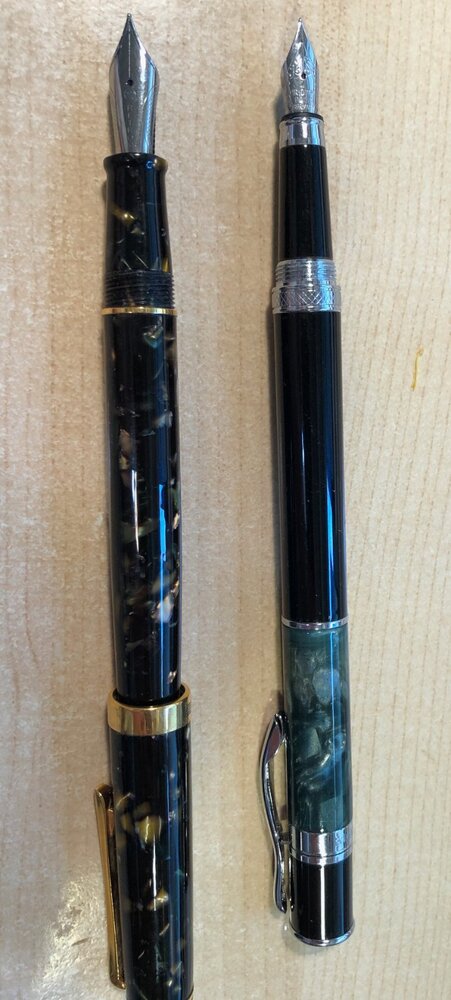
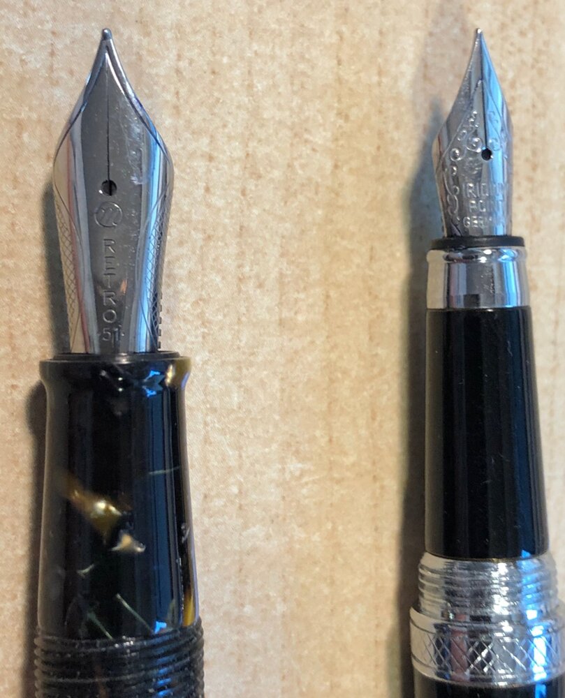
A Monteverde and an Acme pen from an estate sale with steel nibs. Just curious how old they might be. Thanks. Lizzie -
Since succumbing to the Hobonichi Cousin last year, I have been enjoying matching my fountain pen ink colour to that of the daily pages. The Japanese versions of this planner has lovely, slightly dusty, faded vintage colours which change for each month. The whole page is printed in that colour - grid, Japanese quote, date and day markets etc. So I thought it would be fun to write using a matching ink - a great excuse for exploring some of the glorious colours now available and a built in excuse for changing inks regularly. This idea was inspired by a blog I saw (sorry, can't remember who) where the writer had done a similar project but using gel pens. I know everyone's experiences of ink colour is different, depending on pen, nib, paper, how heavy-handed your are, phase of the moon (who knows? Maybe) but I thought someone out there may be doing something similar and we could share our thoughts. Anyway, here are my selections so far: January: burnt orange - Monteverde Fire Opal February: bronze brown - my own mix using Platinum mixable inks March: pinky purple - Herbin Larmes de Cassis April: red pink - Colorverse Sea Europa May: bright olive - KWZ green Gold Ii or Monami Olive June: grey green - another custom mix - see above July: grey turquoise - Birmingham Pen Co Fountain Turquoise August: blue grey - another custom mix - see above September: warm brown - Krishna Vaikhari October: grey purple - another custom mix - see above November: pine green - Birmingham Pen Co Fern Hollow Creek December: faded red - another custom mix - see above. As you can see, I've ended up mixing some colours myself - lots of fun, and I'm less happy with some of the other choices so will need to explore further. For example, I find the Herbin colours a bit watery but haven't yet found a similar colour to Larmes de Cassis; the Krishna Vaikhari is a nice colour but not quite yellow enough... I generally stick to relatively easily available inks and would like to expand the brands but I like this selection as a first pass. I should add that I'm using a Pilot Metro with a Plumix EF or F calligraphy nib. If anyone else is doing this, I'd love to see your choices or generally, any thoughts.
- 30 replies
-
- hobonichi
- monteverde
-
(and 7 more)
Tagged with:
-
Monteverde's revamped line of inks recently got my attention for their comprehensive lineup of clear, distinct hues, as well as good value. A 90ml bottle can be had for about $13-$15 USD from the better known online retailers in the United States, making it a very good deal. Monteverde touts their "ITF Technology". From Monteverde's promotional material, here's how it claims to benefit us writers: At my recent visit to the 2017 LA Pen Show, Monteverde gave a free bottle of Malibu Blue ink to all show attendees. A company representative had all their inks available for sampling with swabs, as well as show discounts. I brought home four bottles of Monteverde ink, and post-show I've purchased a few more online:Malibu BlueCapri BlueHorizon BlueSapphire BlueMonteverde also offers two blues I am missing: Caribbean Blue (turquoise), and a Blue-Black. I am posting individual reviews for each of the four Monteverde inks I have. I filled a variety of pens with these four inks, with nibs ranging from fine to double-broad stubs. Here's a snapshot from my Bullet Journal Ink Log, showing the pen/ink assignments and a writing sample from each. Monteverde Horizon Blue This is Monteverde's Parker Penman Sapphire workalike. It is similar to Diamine Blue Velvet and Visconti Blue. Here is how it appears on Clairefontaine paper. Color/Saturation Horizon Blue is a deeply saturated, "pure" blue. It doesn't lean to purple or green. Shading/Sheening Horizon Blue has a light amount of shading on Tomoe River. A little bit of red sheening can be seen in the Tomoe River sample. Flow Horizon Blue is a well-behaved ink. I had no skips or hard starts on the initial flow. Horizon Blue came in second place for flow amongst the four inks tested. In my Sheaffer Prelude with M nib (a wet pen), it comes out wet but not too wet. Lubrication Like the other Monteverde inks, Horizon Blue has good lubrication, but has some stiction at the start/stop of a pen stroke. In my Clairefontaine bullet journal, my Sheaffer Prelude squeaks as I write! Dry Time Dry time is moderate, between 25 and 30 seconds on Clairefontaine paper from the Prelude. Feathering Horizon Blue performs well in the feathering test on cheap office paper. Bleedthrough There is a medium amount of bleedthrough on the other side of the page on the cheap office paper. Water Resistance Horizon Blue probably performed best of the four Monteverde inks, but still it is not a water-resistant ink in the 10 second immersion test. Before After Comparison with Other Inks Here is a tile comparing Horizon Blue with other medium blue inks. NB: The Parker Penman Sapphire is from a diluted sample and so isn't quite true in terms of saturation.
- 56 replies
-
Monteverde is part of Yafa company. Some time ago the company offered wide array of new inks with Ink ITF™ - new Ink Treatment Formula that's supposed to drastically improve ink-flow quality, extend cap-off time and improve ink drying time on paper. After trying two inks I can agree it's not just marketing - the inks behave very well. Bottle The inks can be bought in 30 (and 90) ml bottle. The bottle is made of lass, has simple design and id pretty functional - stable and with wide neck allowing to fill quite comfortably (as long as there's more than 60 % of the ink content in it) even monster fountain pens straight from the bottle. Ink The ink is well saturated and displays pleasant range of warm hues. The shading is visible. The flow is smooth and the ink feels well lubricated even in dry pens. Some feathering and bleed-through will be experienced only on crappiest papers (hello Moleskine). Drying time is reasonable. Also, it's impressive that the ink doesn't dry out when you leave the pen uncapped. Even after three minutes the pen starts without any skipping when you put the nib to the paper. I enjoy this ink. Drops of ink on kitchen towel Color ID Color range Field Notes, Platinum 3776, B Munken Rough, Platinum 3776, B Fabriano, Kaweco Classic Sport, stub 1.1 Rhodia, Wing Sung 696, F Water Resistance
-
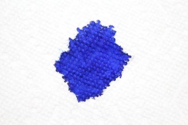
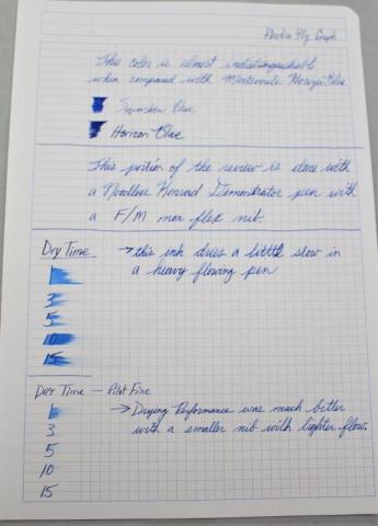
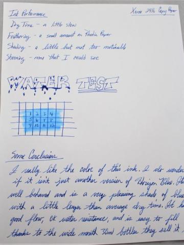
I ordered the Teal for this year, and I figured why not get last year too. Here is my review of last year's DC Supershow Blue from Monteverde. My initial impression is that it is simply another iteration of Horizon Blue. You can see from the comparison that they are very close in color. This color was just as well behaved as the Horizon blue and had just as good of flow. It didn't feather on any paper I have used so far. I really like the color but I do feel like I doubled up on colors since I already have Horizon Blue. On the bright side this may also be another one of those colors that is close to Parker Penman Sapphire. I hope you enjoy the review. I would love to hear what everyone thinks. Thanks for looking.
-
Monteverde is part of Yafa company. Some time ago the company offered wide array of new inks with Ink ITF™ - new Ink Treatment Formula that's supposed to drastically improve ink-flow quality, extend cap-off time and improve ink drying time on paper. After trying two inks I can agree it's not just marketing - the inks behave very well. The company entered ink market in strong way. After succesfull launch of Gemstone series, Noir, Core and Emotions series followed. Bottle The inks can be bought in 30 (and 90) ml bottle. The bottle is made of lass, has simple design and id pretty functional - stable and with wide neck allowing to fill quite comfortably (as long as there's more than 60 % of the ink content in it) even monster fountain pens straight from the bottle. Ink The ink is strongly saturated and simply nice. I don't really use blue inks but I'll keep this one. Drops of ink on kitchen towel Color ID Color range Field Notes, Faggionato Petrarque, M Rhodia, Faggionato Petrarque, M Tomoe River, Faggionato Petrarque, M Water Resistance
-
Anyone have got their hands on the new Monteverde Sweet Life inks? Really interested in seeing the impressions on the Blue Velvet, Iced Cookie and Chocolate Pudding if possible. Thanks!
- 4 replies
-
- monteverde
- sweet life
-
(and 3 more)
Tagged with:
-
I recently purchased the full set of the Monteverde Noir inks and am slowly trying them out. I am happy with the colours I have tried so far, although I found Rose Noir to be drier than the others. I am surprised, but so far Copper Noir is my favourite. While I like darker orange inks such as PR Orange Crush, I tend to prefer muddy greens, blues and purples. However, I am blown away by this ink and just had to share it. (The paper is Rhodia Dots)
- 70 replies
-
- orange inks
- monteverde
-
(and 1 more)
Tagged with:
-
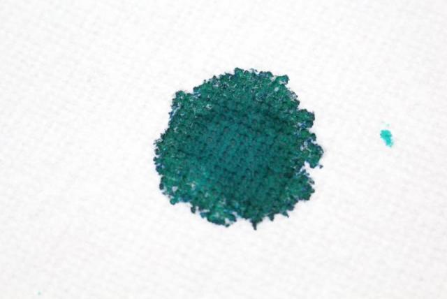
I just got this ink. I didn't get to go to DC, but really liked the look of the color when I first saw it. I kinda like Teals and kinda don't. I'm better when they are on the bluer side. This one is about right in the middle. You can see this from my ink sample paper. I think I still like the color of Ku-Jaku more, but this is starting grow on me. One thing I noticed with this ink was that, depending on the pen I used, it did shade quite a bit and looked really cool. It seemed to me like the finer point better flowing pen allowed for more shading than just a wider nib would. I tested this on a couple different types of paper and it was reasonably well behaved with a faster than normal dry time. After about 5 to 7 seconds it was dry unless I laid down a lot of ink. On really wet strokes it dried still by 10 seconds. Its interesting that the paper towel blotch looks very green while there were several spots on the paper where it looked very blue. I hope you enjoy the review. I would love to hear what everyone thinks.
-
I have a bunch of Monteverde inks purchased and as of yet untested, so on a whim I inked up my Pilot Kakuno with it. To my surprise, I actually got my Con-70 to fill up properly (this is only the second time I've ever used it)! I got so excited I wrote another 5 page review. I kept the scans messy because I didn't colour correct anything and I find leaving in the edges and bookmarks and stuff helps a little bit with the automatic colour correction. There's no pictures at this time because I have no light! We will see what tomorrow brings to the potato camera. Which is not much because they said it's going to be 37 degrees Celcius. Yeah, maybe we can test if ink can melt under direct sunlight, or if notebooks can spontaneously combust. Or not. Anyway here it is, let me know if you have any questions or just want me to stop posting these, for the love of god, enkida, stop posting already nobody thinks it's funny except you
- 10 replies
-
- monteverde
- garnet
-
(and 1 more)
Tagged with:
-
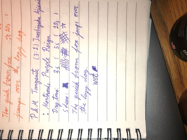
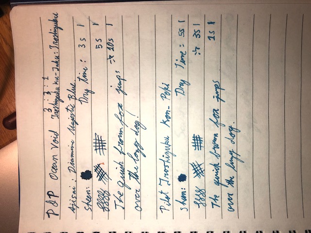
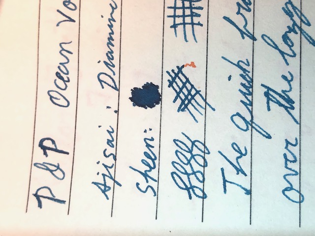
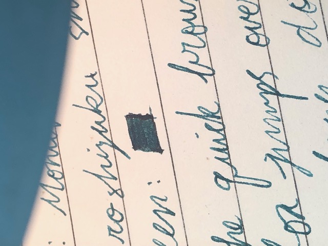
These have been sitting in my pens and bottles for months by thus point without any issues. No solid chunks, no odors or bubbling, no color loss. I especially like the golden brown and purple. I call these colors: -Golden Sands -Tanzanite -Ocean Void -Oasis (Instead of Deep Teal) Anyone like any one of them in particular?
-
- pilot iroshizuku
- monteverde
-
(and 2 more)
Tagged with:
-
Fountain Pen Review: Monteverde Invincia - Stealth Black (M Nib)
nmcnick posted a topic in Fountain Pen Reviews
Monteverde Invincia - Stealth Black (M Nib) Review To start this review off, keep in mind it is my first review; and as all reviews, is at least somewhat subjective. Also, for perspective, I have used this and 4 other fountain pens, which are: Pilot Varsity Lamy Al-Star Lamy Safari Conklin Duragraph and I have been using this pen for around 1 month. Overall Appearance: Measurements: 5.35" / 136mm long capped 5.30" / 134.7mm long uncapped 6.10" / 154mm long posted 1.10" / 28mm long nib 0.55" / 14mm body diameter 0.35" / 8.9mm grip diameter 1.40 oz/ 39g weight overall Monteverde makes some amazing looking pens and this is no exception. This pen is downright edgy. From it's shiny, reflective all black metal surface to the rounded style which makes it look sharp and artsy; this is a beautiful pen. Well.. chances are that it wouldn't be taken as a compliment it by saying it's "beautiful", so.. let's instead just say this.. it's a good looking pen. I love the little details on this pen such as the Monteverde mountain etched into the nib, the rounded body which is dynamic and changes in girth frequently throughout the pen. Also, the logo on the top of the cap is a nice touch. Pen Parts, Build & General Details The pen cap screws on securely and takes about 2 rotations to pop off. In posting the pen, the cap just slides on securely and really feels sturdy and macho even in the way it does this. There are many things about this pen that just feel so edgy and make me feel as if I am the coolest person on the planet. The grip of the pen is probably the biggest turn off for me. I have very large hands, but with the grip being skinny and having a pretty quick cut off to the body, combined with it being metal makes it a tough pen to hold for a long time at least for me. I prefer to hold my pens further back then most anyway, so maybe this is what causes the issue. Adding to this, the clip is EXTREMELY tight, its hard to even slide onto a pocket. This isn't a huge deal for me since I never clip my pens, but it may be for you. It has a standard international converter and cartridge filling mechanism. It comes with your standard run of the mill piston converter (standard international) and as such isn't remarkable but works as it should. I haven't encountered any problems with filling the Invincia. You are going to be getting 1.07ml of ink out of cartridges and 1.12 out of your converter. It should be noted that I used monteverde black ink which, once again, was a fairly standard black ink; very similar to noodler's black. The nib is a #5 steel nib, which writes well. It surprised me to find this out as most outlets say it has a #6 nib. Whether it's a change in production or something else I'm not aware of, the important thing is it fits! I'll be getting more on the writing later, however. I chose the medium nib model and it fit fantastically for me. I cannot say how it compares to other mediums very well as this is my first medium nib, however, it seems to be a broad medium with some stub properties (some, very small but more on that later) which was a surprise to me. Not a lot more to say about it's structure! I think the black look was absolutely essential and having an all black pen just looks really sleek. Writing As mentioned above, the pen feels a little strenuous on my hands and eventually causes them to cramp up. However, aside from that, this pen is an excellent writer. It's incredibly balanced unposted, and when posted is ever-so-slightly back heavy. This is the first pen I can use either posted or unposted simply because I have such large hands and most pens aren't very large until you post them. This pen isn't huge, but the length mostly subsides in the body as opposed to the cap. It's got some weight to it and feels durable. I love the metal finish in looks.. but sometimes it can be a tad slippery in writing. Putting the pen to the pad, this thing writes extremely smoothly. Its a really interesting writer and feels unlike anything else I've written with. It's smooth, with very very little feedback, but not at all glidy. It feels as if you are effortlessly carving into paper, like a butterknife into soft butter. That being said, It has a bit of a sweet spot. When you use it any way else other than right down the middle, it makes a very thin line and can feel a little scratchy. Using horizontal or diagonal lines result in a skinnier line because of this and therefore can produce really interesting results, resembling a tiny bit of a stub look, or so I've seen. Very interesting and fun nib to write with. Overall, this is a pretty great pen. It has some issues, but I like the overall look and feel of this pen. The all metal body with a black nib and nice writing comes to a pretty good conclusion for me. Final Verdict: (7.8/10)- 12 replies
-
- monteverde
- invincia
-
(and 7 more)
Tagged with:
-
The day before yesterday, I received a shipment of four Monteverde inks, in the 80 ml bottles, from a reliable vendor. I have gotten accustomed to opening new bottles of ink to check for problems. To my surprise, the bottle of Motivation Orange contained a large amount of goopy contamination. There was no unusual odor, unlike the problem with Montblanc yellow ink several years ago. The vendor has already dispatched a replacement bottle, but if you have this ink, you should check it. As with the Montblanc ink, it may not be an isolated problem.
- 15 replies
-
- ink
- contamination
-
(and 3 more)
Tagged with:
-
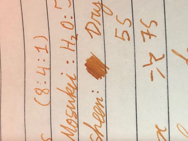
Recently, I got myself a bottle of Monteverde Fire Opal - because I liked the colour, but also because I hoped that it might finally prove to be that rare ink in this particular colour range to be free of nib crud issues. Alas, I have now found that it suffers from the same sort of nib crud that users of similar-coloured inks like Diamine Ancient Copper will be familiar with. When used in pens with a less-than-perfect cap seal, the usual frothy crud builds up. The same happens during long writing sessions - crud gradually builds up along the length of the nib slit and the nib-section and nib-feed interfaces, and needs to be wiped off every now and then. After having owned and used three inks from different manufacturers in this colour range - Diamine Ancient Copper, Private Reserve Orange Crush, and now Monteverde Fire Opal - and having experienced nib crud issues with all of them, I have now resigned myself to the understanding that, so long as I am using a rusty/coppery-coloured ink of this particular type, there shall be no escaping nib crud. It's just a cosmetic and convenience issue, but still rather annoying.
- 11 replies
-
- monteverde
- fire opal
-
(and 3 more)
Tagged with:
-
Monteverde is part of Yafa company. Some time ago the company offered wide array of new inks with Ink ITF™ - new Ink Treatment Formula that's supposed to drastically improve ink-flow quality, extend cap-off time and improve ink drying time on paper. After trying two inks I can agree it's not just marketing - the inks behave very well. The company entered ink market in strong way. After succesfull launch of Gemstone series, Noir, Core and Emotions series followed. Bottle The inks can be bought in 30 (and 90) ml bottle. The bottle is made of lass, has simple design and id pretty functional - stable and with wide neck allowing to fill quite comfortably (as long as there's more than 60 % of the ink content in it) even monster fountain pens straight from the bottle. Ink The ink is well saturated and displays pleasant range of grey hues. The shading is visible. The flow is smooth and the ink feels well lubricated even in dry pens. Some feathering and bleed-through will be experienced only on crappiest papers (hello Moleskine). Drying time is reasonable. Also, it's impressive that the ink doesn't dry out when you leave the pen uncapped. Even after three minutes the pen starts without any skipping when you put the nib to the paper. I enjoy this ink. It's one of best grey inks I've used. Also it's quite water resistant. Drops of ink on kitchen towel Color ID Color range Field Notes, Pilot CH 92, medium nib, stubbed Rhodia, Pilot CH 92, medium nib, stubbed Tomoe River, Pilot CH 92, medium nib, stubbed Water Resistance
-
Monteverde is part of Yafa company. Some time ago the company offered wide array of new inks with Ink ITF™ - new Ink Treatment Formula that's supposed to drastically improve ink-flow quality, extend cap-off time and improve ink drying time on paper. After trying two inks I can agree it's not just marketing - the inks behave very well. New colors are divided into two series. The newest one is called GEMSTONES. I admit I have a problem with this name as Pelikan started their Gemstone collection (Edelstein inks) years ago and was succesfull. I do realise that this name can't be copyrighted but I feel something's off. Sure, it's easy to base marketing on proven and succesfull ideas but I feel just a little bit of disapproval. I believe they could have created something new, especially that the colors are rather interesting and eye-catching. Anyway the line has inks Amethyst Charoite Erinite Fireopal Garnet Moonstone Olivine Ruby Sapphire Topaz I appreciate the fact that Monteverde posted on their website data about these inks' pH values: Bottle The inks can be bought in 30 (and 90) ml bottle. The bottle is made of lass, has simple design and id pretty functional - stable and with wide neck allowing to fill quite comfortably (as long as there's more than 60 % of the ink content in it) even monster fountain pens straight from the bottle. Ink The ink is well saturated and displays nice hue. It shades form a a bit. The shading isn't very strong in finer nibs, yet it remains visible. The flow is smooth and the ink feels well lubricated even in dry pens. Some feathering and bleed-through will be experienced only on crappiest papers (hello Moleskine). Drying time is reasonable. Also, it's impressive that the ink doesn't dry out when you leave the pen uncapped. Even after three minutes the pen starts without any skipping when you put the nib to the paper. I enjoy this ink. Drops of ink on kitchen towel Color ID Color range Discovery 70 mgsm copy paper, Aurora Ipsilon, stub 1.2 Leuchtturm1917, Aurora Ipsilon, stub 1.2 Midori, Aurora Ipsilon, stub 1.2 Rhodia, Aurora Ipsilon, stub 1.2 Water resistance