Search the Community
Showing results for tags 'montblanc rose burgundy'.
-
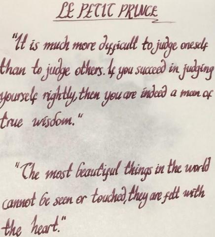
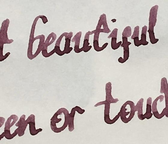
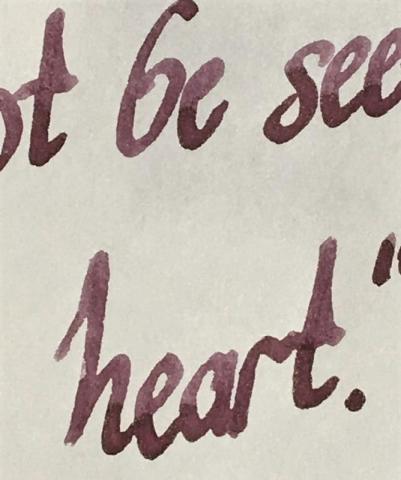
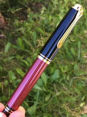
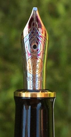
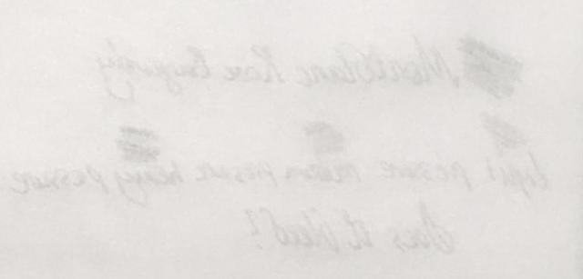
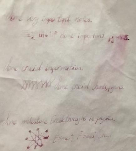
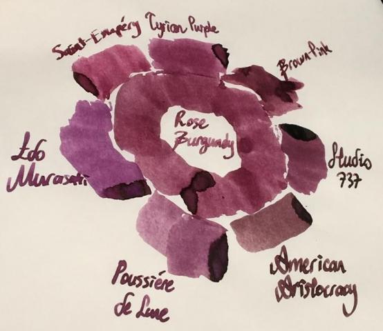
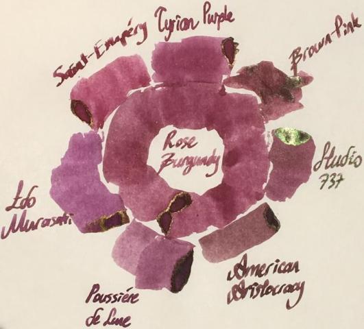
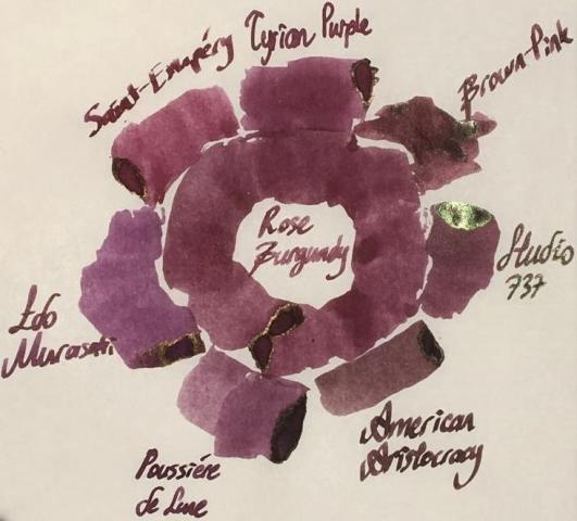
Hello dear FPNers, We have a common enemy. An enemy who is obsessive to take out what we have in our bank accounts or even what we got in our purses. A decisive, a talented, a perfectionist, a world wide known enemy who keeps releasing some magnificent items which we really don't need to but have to buy. Please welcome, Montblanc Le Petit Prince The Planet - Rose Burgundy: It is part of Le Petit Prince The Planet collection. It has the standard 50 ml cube-shaped bottle of Montblanc. It is freshly released. As far as I see, it is not claimed to be "limited edition", but it seems like. Don't know. The colour is a dusty burgundy red with hints of brown: I specifically did not filter this photo. Note that the photo is taken in a very bright time of day. The ink seems to be more vivid and more red than it really is. Actually, above version is what most people would expect to see when reading the name of the ink, I think. However, the colour seems to be more realistic in this tuned photo below: Yes, it is a bit brownish, maybe a litte bit greyish than what a burgundy red name recalls. This ink does not have an exact match of colour in ink literature as far as I know, but KWZ Brown-Pink is the closest one I suppose, which is a bit brighter, more vivid ink. Here are some writings with two lovely quotes from the book: Some close-up shots: Lovely shading, isn't it.. Note that, before moving on to ink properties, the pen I chose for this review is a Pelikan M605 in red: This pen normally comes with a 14k nib, but I found an 18k BB nib on Ebay and upgraded (!) it. Really, upgrade? It is a debate issue. Some likes 14k more since they are likely to be more springy. Of course it is also related to nib shape and the other contributors of alloy. Whatever, this nib is not a nail like my Aurora 88's 18k nib, but not amazingy soft either. It just has a small cushioning, that's all. I tuned its wetness and worked on the tip so that it is a wet stub now: Lovely. Saturation: Rose Burgundy has medium saturation. It is partially a washed out colour, but it cannot be said that it has low saturation I think. Sheen: Very little. Shows a distinct bronze sheen when you pour over huge amounts on Tomoe, but during normal writing, you will probably not see any sheen. Shading: Has a lovely shading. I loved it. Not the most shading ink, though.. But still above average. Shimmer: None. Wetness: Rose Burgundy is a dry ink, just like most Montblanc inks. I had specifically chosen a wet BB nib to compansate the potential dryness of this ink before I got the ink. But still, with very light pressure, this pen made some skippings on smooth Clairefontaine paper. Ink makes you really feel it is dry; not as dry as a Pelikan 4001, but still a dry ink. Feathering: Not detected, not likely to feather. In this term, quite a well behaved ink. The back page of Tomoe: Bleeding: Not detected, not likely to bleed. In this term, quite a well behaved ink. Showthrough: Some distinct showthrough on Tomoe but every ink has a showthrough on Tomoe, so it shouldn't be a criteria I think. So I tried it on 80 gr white Rhodia paper: And the back page is: An acceptable level of showthrough. If you zoom in at a sunny day outside, every ink will showthrough a little bit. So I can say this ink has a low amount of showthrough, like many other Montblanc inks. Water Resistance: I made a water test on Tomoe only: Let's see: Veeery little water resistance, nearly none. If you were about to find the equation of travelling in speed of light and if a cup of coffee spills over your papers, humanity would probably lost a few decades until some other person finds it. For me, it is nice. I love inks with low water resistance because they are cleaned easily. Similar Colours: As stated above, I think the closest ink in terms of colour is KWZ Brown-Pink. But there are some other powerful candidates: Diamine Tyrian PurpleMontblanc Antoine de Saint-Exupery, Encre du DesertJ. Herbin Poussiere de LuneSailor Studio 737I know it is not a very matching colour, but I wanted to compare it with Iroshizuku Edo-Murasaki also. Because Edo-Murasaki has the similar slightly washed out pastel characteristic of Rose Burgundy, except the former is a purple, not a burgundy brown. Another weak candidate is Noodler's American Aristocracy. It is not a very similar colour to Rose Burgundy, but I wanted to show the answer of question "What would happen if this ink was a bit browner?", so I added this one. Here are the swabs on Tomoe: And on Rhodia: I thought a rose of colour on Tomoe would help in exact comparison of Rose Burgundy with others. Again, I thought providing both the unfiltered and filtered versions would give some insight about the true colour. Unfiltered shot, slightly taken from side: Too bright, too warm, colours are more vivid than they used to be. Rose Burgundy is not this red normally. So here is filtered version: which suits better to reality I think. Another shot from a more perpendicular angle, which shows some sheen, again unfiltered first: And filtered version: Well, this last picture summarizes the results in terms of colour pretty well. Compared to Rose Burgundy: American Aristocracy is too brown, they seem like irrelevant. But with naked eye, American Aristocracy has some purple or burgundy red tones. If both inks are written with wet vintages, I think they will be likely to seem similar.Studio 737's base colour is much more pinkish, but it has high amount of green dye in it, making it a more complex, a darker colour with brilliant green sheen. Note that 737 is my favourite purple.Poussiere de Lune is closest in terms of being dustiness, but it is much more purpler and a bit greyish compared to Rose Burgundy. Besides, Poussiere de Lune gives green sheen whereas Rose Burgundy gives bronze sheen, which is of course valid when poured over Tomoe paper at high amounts for both inks.Edo-Murasaki is the most magenta ink out of all mentioned candidates. It does not have a vivid pinkish structure as much as 737 does, less greyish than Poussiere de Lune and it has definitely a more magenta undertone than Poussiere de Lune. It is pinker than what a medium purple should be. It has similar dusty characteristic evoking the Rose Burgundy.Saint-Exupery is the most red ink in this comparison. It is much redder than dusty Rose Burgundy, and definitely a more vivid colour.Tyrian Purple is a close colour to Rose Burgundy, but a bit pinker than it. It is a bit more "burgundy red" than Rose Burgundy, actually. Also, Tyrian Purple is more vivid, though being not a very saturated colour, it shows its colour better than Rose Burgundy.This part is a bit tricky. I said KWZ Brown-Pink is the closest colour I have in my inventory. Note that I am responsible of my own samples and pictures I provided you. I made a literature research on Brown-Pink's colour, and saw veeery different tones. Compared to those photos of KWZ on internet, Brown-Pink's colour provided by me is not that purplish, but rather a dusty pink with some chestnut hints. Actually, I think, base colour of Brown-Pink is lighter than Rose Burgundy, but Brown-Pink includes a considerable amount of green dye, making it a darker, a more vivid colour. CONCLUDING REMARKSThis is a dusty brownish burgundy red. A "unique colour" description would not be very wrong. This is a pale pastel colour with high shading.If you want saturated, vivid lines of colour, this ink doesn't seem to satisfy you.If you are on the train of sheen-craziness like me, this ink is not for you.There is no shimmer. It has a medium saturation I can tell. Doesn't deserve to be called "lowly saturated".It has nearly no water resistance. Didn't try yet but seems like it will be cleaned from pen very easily.It's kind of a dry ink. Try using it in wet nibs, even gushers or vintage pens, to get the maximum of it.Price is about 35 Euros, same as Montblanc Petrol Blue. It is definitely not a cheap ink, but not the most expensive one either. I am not sure if it deserves this price. I would buy it anyway since I am an ink nerd. There are cheaper alternatives in terms of colour, but not the exact same. Right now, I am suspicious that I will buy another bottle, because the colour seems to be a bit pale for my taste. But it is a unique colour, and it has the potential to be the ink of serious writings in moody days with a wet, unproblematic, reliable pen. If I start to enjoy the colour much more by putting it in my vintage Pelikan M400 with OBB nib, I may continue to buy this ink. Hope you enjoyed. Thank you..
- 16 replies
-
- montblanc
- montblanc rose burgundy
- (and 8 more)


