Search the Community
Showing results for tags 'montblanc oblique italic'.
-
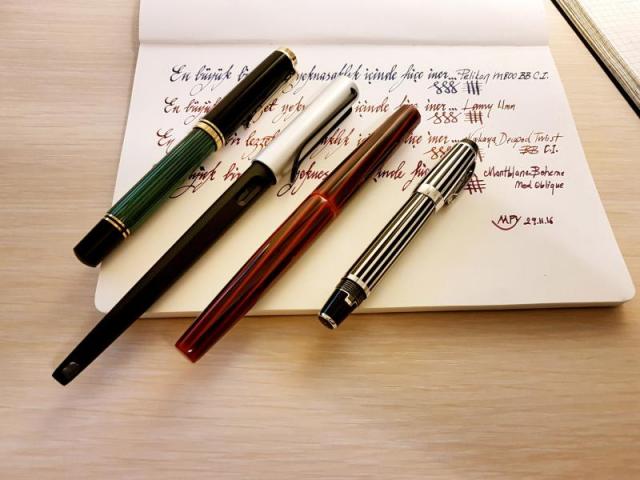
Hi, I learnt a lot from this forum and here is my payback...I want to share my comparison of couple of my Italic pens/nibs. Enjoy... The pens/nibs are: 1-Pelikan M800 BB Cursive Italic by John Mottishaw. Line variation ~x4 (1.0mm/0.25mm) 2-Lamy 1.1mm (standard calligraphy pen). Line variation ~x1.8 (0.9mm/0.5mm) 3-Nakaya Decapod Twist Aka Tamenuri BB Cursive Italic by John Mottishaw. Line variation ~x3.6 (0.9mm/0.25mm) 4-Montblanc Boheme Oblique Medium (original Montblanc nib; no customization). Line variation ~x2.0 (0.8mm/0.4mm) The meaning of the sentence in the pics is "The biggest pleasures become mundane if they are repeated excessively" Observations: John Mottishaw's Cursive Italic nibs are similar to Osmoroid/Manuscript calligraphy pens in terms of nib sharpness but feels not as cheap. They are definitely sharper than Lamy Italic nibs but not so much as to bother for daily writing. Nib is sharp but not too sharp to catch paper. Given that stubs are too blunt for me Cursive Italic is definitely perfect for my taste. These pens can perfectly be used for daily writing. I asked John to make Pelikan 1.0mm and Nakaya 0.9mm. Based on my measurements they are exactly as I wanted... Finally, for daily note taking, 1.0mm seems little bit too bit. My miniscules are getting too big for my taste. On the other hand 0,8mm is too small to some enough line variation. Therefore, for me 0.9mm is the optimum nib size for daily note taking. Let me know what you think... Thanks
- 7 replies
-
- john mottishaw
- cursive italic
- (and 3 more)


