Search the Community
Showing results for tags 'montblanc'.
-
Hello FP Network -- Does anyone have knowledge about this folding roller pocket from, I'm guessing, the 1930s?
-
Hello, Everybody, To me it is a bit of sad and sentimental story, yet life goes on. Perhaps it’s worth sharing, please pardon me if not so… My one and only “friction fit mechanism” 149, with 18C architect grind nib started failing after 45+ years of continuos use. It started developing hairline cracks in the section. I have treated the pen neither badly, nor like a piece of jewelry. Being a valuable part of my every day reality it has traveled with me all around the world for 40+ years. Material fatigue, perhaps… As I know nothing about “precious resin” solvent welding (any shared experience would be more than appreciated), my only option was getting a replacement 1963 type barrel. Those who had it tried to charge for it almost as much as for a new pen, without mint condition warranty, so it was not a secure and afforfable option. Luckily, a friend had an entire 1967 type (screw-in “threaded” mechanism) spare body, which cost me just a fraction of what I’d have paid for a 1963 barrel only. I knew my 149 would become a sturdier, heavier pen, with less ink storage capacity than the one I got used to. It made me feel a little reluctant, but I eventually decided to go for it. So, I just “transplanted” the nib unit and cap to the newer body. It is still a great pen, almost as much a marvel of engineering as the old one, just feeling somewhat more robust, with weight distribution slightly reminding of the 50s celluloid ones. Yet, my trusty “friction-fit” is gone for good, or at least until I arrange a barrel I can afford, or hopefully learn solvent-welding MB “precious resin”. 🙂
- 35 replies
-
- montblanc
- 149; mb 149
-
(and 2 more)
Tagged with:
-
-
James Purdey & Sons Single Malt scented ink was released in 2018 by Montblanc as part of a series in collaboration with James A. Purdey, a gunmaker and hunting lifestyle brand. The ink surprised me! Single malt scented ink sounded at first like a (overpriced) gimmick and to some extend it is of course. But the color is a deep, beautiful orange-brown with amazing shading. Definitely a fall color which can be used in both a business environment (note taking) as well as for personal writing and correspondence. Be careful though, when opening the bottle or the pen cap the whisky scent is quite strong. It might be frowned upon at 830am when the meeting starts... The scent fades quickly though, within minutes. After 20-30 minutes the smell of the paper itself always wins. The ink behaves like most Montblanc inks I own. Perfect behavior in a broad, wide nib. A bit dry and with a strong dislike for TWSBI pens. The shading is wonderful, no feathering, and no show-through. Drying time is well below average at roughly 22 seconds. As can be seen, the ink doesn't really appreciate water. This ink is the most bright, orange-brown ink I have. SBRE brown (P.W. Akkerman) is not far off, Comte de l'Or (produced by Diamine) is much more gold (of course), Herbin's café des Îles and Caroube de Chypre have far less orange in them and are a more true brown. The ink will definitely gain some attention in the office, but I will use it for a while. I really like it. N.B. Review written on Original Crown Mill Vellum paper
-
Is this now normal for Montblanc? I was awarded a 164 in the late 80s, and it came in a very nice clamshell presentation box. The box and pen were lost in a burglary. After a decade, I broke down and bought a new one to replace it. I knew it was authentic. It arrived in a cardboard box. It is a nice box as boxes go, but it's still a box (and a protective soft cloth pouch). I was expecting a clamshell case. There aren't any on their website. Does anyone on the forum know when this change was made? Sorry for the rant. It just irks me.
- 10 replies
-
- montblanc
- fountain pens
-
(and 2 more)
Tagged with:
-
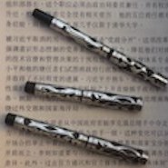
Preface: This article is to discuss the Montblanc 12/14/22/24/32/34 series, giving the reader detailed information on this series history background and structure. Also will discuss the pen's variations. I always enjoy this serie because these pens are very well made and the nibs are divine. There is not too much information for them available, I would like to make my contributions. And also if you are interested, I always have a couple of them available. Enjoy! Historical Background: First, I would like to quote from http://montblanc.parkerpens.org/montblanc.html. In 1959, the Montblanc line was redisigned, 142, 144 and 146 are retired, instead Montblanc was offering: Meisterstück: 12 (plastic, looked a bit like the Parker 45 and had a triangular capband) 14 (plastic, see above) 72 (with rolled gold cap) 74 (with rolled gold cap) 82 (with rolled gold cap and barrel) 84 (with rolled gold cap and barrel) 92 (in 14 carat solid gold cap and barrel) 94 (in 14 carat solid gold cap and barrel) Medium range: 22 (with 14 ct gold nib and two cap rings) 24 (with 14 ct gold nib and two cap rings) Economy: 32 (with 14 ct gold nib and one cap ring) 34 (with 14 ct gold nib and one cap ring) 31 (with steel nib) 32S (with steel nib, silver clip and cap ring) 34S (with steel nib, silver clip and cap ring) 31D (with "manifold" nib) 32P (cartridge filling system) 34P (cartridge filling system) As you can see, the 12/14/72/74/82/84 is Meisterstück range already, they are very well made, the plastic is very robust for Meisterstück range. The medium range (22/24) and economy range (31/32/34) is very well made, too. However, I did receive some reports saying that the 32's plastic developed cracks. I do have more than 10 economy range pens (32/34), they are all in NOS or near mint condition, no crack at all. I guess this really depends on the condition of the pen. The size: First I would like to show a picture of Montblanc 14/12/24/22/34/32 (from left to the right in Figure 1). The pens follow a 2 digit coding system, the second digit is most likely to be 2 or 4 --> 2 stands for regular size, 4 stands for large size. And for economy range, there are pens coded as 31, they are still regular size, the 1 just stands for regular size with steel nib (most of the economy range are equipped with 14k gold nibs). Figure 1. Montblanc 14/12/24/22/34/32 The 12/14 Series: It is very well summarized by "soapytwist" in a previous post (https://www.fountainpennetwork.com/forum/topic/132995-montblanc-12-22-and-32/), but there are some mistakes, I will just quote and make the correction. Please give the credit to him. The 12/14 series are equipped with: 1. 18k "butterfly" nib 2. Push on cap 3. Bishop's mitre cap band 4. Amber/brown, faceted ink window 5. Gold accent band on piston knob end Please check: Figure 2 to see the Montblanc 14/12 with cap off. Figure 3&4 to see the 18k "butterfly" nib on a Montblanc 14/74/84/94 Figure 5&6 to see the feed and feed housing on a Montblanc 14/74/84/94 Figure 7&8 to see the assembled feed and feed housing on a Montblanc 14/74/84/94 Figure 9 to see the assembled section of a Montblanc 14/74/84/94 Figure 10 to see the Gold accent band on piston knob end of a Montblanc 12/14/72/74 Figure 11 to see the cap top of a Montblanc 12/14 Figure 12 to see the Bishop's mitre cap band of a Montblanc 12/14 Figure 13&14 see the cap of a Montblanc 72/74 Figure 2. Montblanc 14/12 with cap off Figure 3. 18k "butterfly" nib on a Montblanc 17/74/84/94 Figure 4. 18k "butterfly" nib on a Montblanc 17/74/84/94 Figure 5. Feed and feed housing on a Montblanc 14/74/84/94 Figure 6. Feed and feed housing on a Montblanc 14/74/84/94 Figure 7. Assembled feed and feed housing on a Montblanc 14/74/84/94 Figure 8. Assembled feed and feed housing on a Montblanc 14/74/84/94 Figure 9. Assembled section of a Montblanc 14/74/84/94 Figure 10. Gold accent band on piston knob end of a Montblanc 12/14/72/74 Figure 11. Cap top of a Montblanc 12/14 Figure 12. Bishop's mitre cap band of a Montblanc 12/14 Figure 13. Cap of a Montblanc 72/74 Figure 14. Cap of a Montblanc 72/74
- 105 replies
-
- montblanc
- montblanc 12
- (and 5 more)
-
Eternal Obsession For Burgundy (Life Of Montblanc 144 And More)
jhsd1124013561 posted a topic in Montblanc
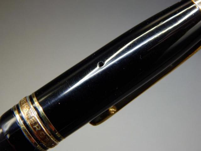
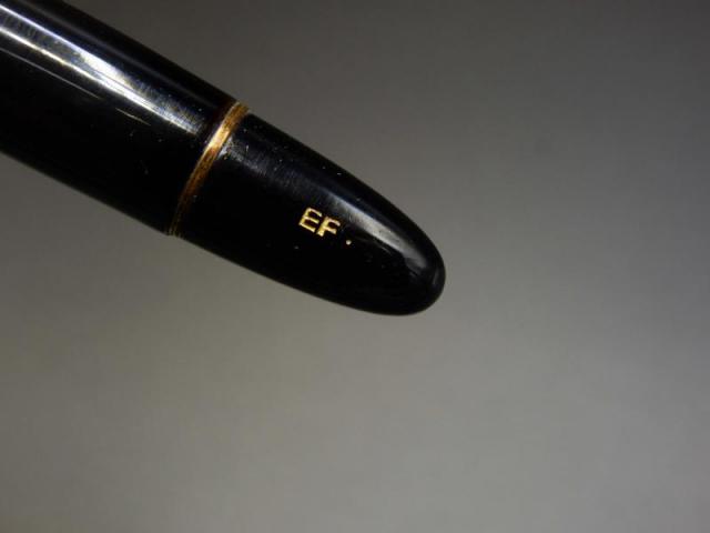
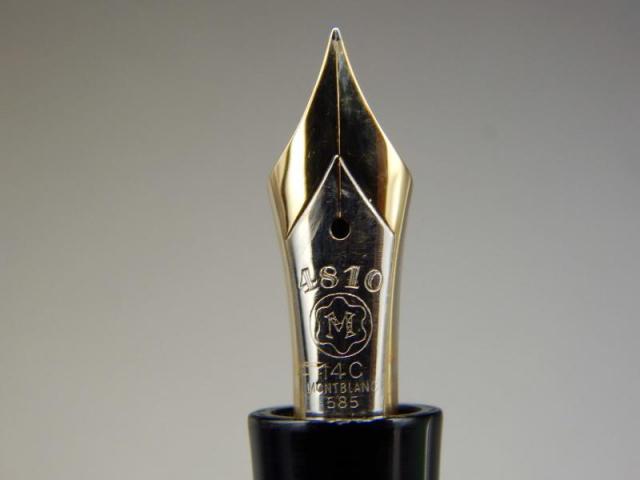
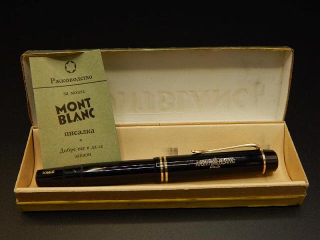
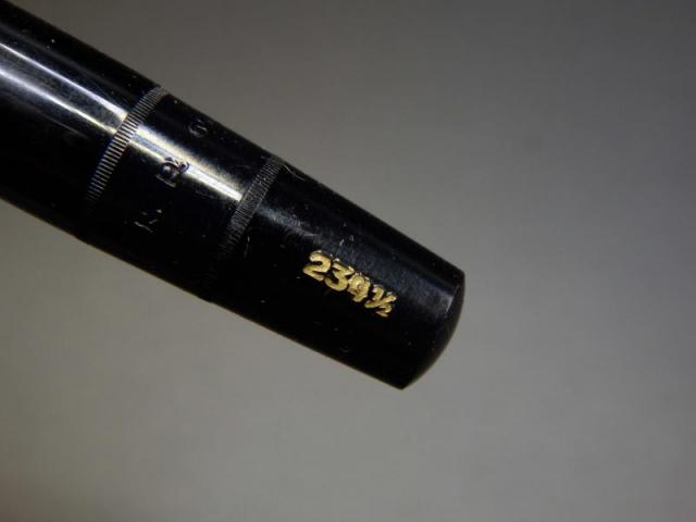
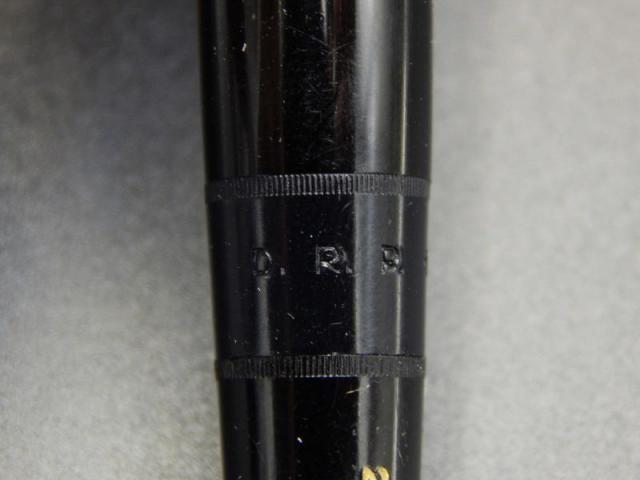
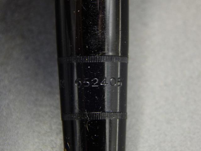
Abstract:This article discusses the following issue:1. The Montblanc Meisterstück Classique 14X series products in burgundy color since 1980's2. The Montblanc Meisterstück 144 generations3. The origin and successor of Montblanc Meisterstück 144 The Montblanc Meisterstück 14X Burgundy Family:Allow me to start with 2 pictures shown below, from the left:1. Montblanc 144 Classique generation 1 in burgundy2. Montblanc 144 Classique generation 2 in burgundy3. Montblanc 144 Classique generation 3 in burgundy4. Montblanc 144 Classique generation 4 in black5. Montblanc 145 Chopin in burgundy6. Montblanc 146 old style in black (just as a comparison)7. Montblanc 146 in burgundy (146R Bordeaux) Figure 1. The Montblanc Meisterstück 14X Burgundy FamilyFigure 2. The Montblanc Meisterstück 14X Burgundy Family Now, I will discuss the Montblanc Classique 144 generation:Montblanc 144 Classique generation 1 characters:1. Monotone color 14k gold nib (figure 6) Please notice that the distance between the imprint and the shoulder of the nib is further compared to the 2nd (figure 14) and 3rd (figure 22) generation2. Ebonite feed (figure 7)3. Plastic section thresd equipped with old style Montblanc converter (figure 8)4. Cap clip reads 'GERMANY' (figure 5)5. Black section for both Black and Burgundy Montblanc Classique 144 Figure 3. Montblanc 144 Classique generation 1 in burgundy (Cap on)Figure 4. Montblanc 144 Classique generation 1 in burgundy (Cap off)Figure 5. Montblanc 144 Classique generation 1 in burgundy (Cap)Figure 6. Montblanc 144 Classique generation 1 in burgundy (Nib Detail)Figure 7. Montblanc 144 Classique generation 1 in burgundy (Feed Detail)Figure 8. Montblanc 144 Classique generation 1 in burgundy (Section Thread&Converter)Figure 9. Montblanc 144 Classique generation 1 in burgundy (Cap off)Figure 10. Montblanc 144 Classique generation 1 in burgundy (Cap off) Montblanc 144 Classique generation 2 characters:1. Monotone color 14k gold nib (figure 14) Please notice that the distance between the imprint and the shoulder of the nib is shorter compared to the 1st generation (figure 6)2. Old Style Plastic feed (figure 15) -> 2nd and 3rd generation use the same old style plastic feed3. Plastic section thresd equipped with old style Montblanc converter (figure 16)4. Cap clip reads 'GERMANY' (figure 13)5. Black section for both Black and Burgundy Montblanc Classique 144 Figure 11. Montblanc 144 Classique generation 2 in burgundy (Cap on)Figure 12. Montblanc 144 Classique generation 2 in burgundy (Cap off)Figure 13. Montblanc 144 Classique generation 2 in burgundy (Cap)Figure 14. Montblanc 144 Classique generation 2 in burgundy (Nib Detail)Figure 15. Montblanc 144 Classique generation 2 in burgundy (Feed Detail)Figure 16. Montblanc 144 Classique generation 2 in burgundy (Section Thread&Converter)Figure 17. Montblanc 144 Classique generation 2 in burgundy (Cap off)Figure 18. Montblanc 144 Classique generation 2 in burgundy (Cap off) Montblanc 144 Classique generation 3 characters:1. Monotone color 14k gold nib (figure 22) Please notice that the distance between the imprint and the shoulder of the nib is shorter compared to the 1st generation (figure 6)2. Old Style Plastic feed (figure 23) -> 2nd and 3rd generation use the same old style plastic feed3. Brass section thresd equipped with old style Montblanc converter (figure 24)4. Cap clip reads 'W-GERMANY' (figure 21)5. Black section for Black Montblanc Classique 144 and Bugundy section for Bugundy Montblanc Classique 144 Figure 19. Montblanc 144 Classique generation 3 in burgundy (Cap on)Figure 20. Montblanc 144 Classique generation 3 in burgundy (Cap off)Figure 21. Montblanc 144 Classique generation 3 in burgundy (Cap)Figure 22. Montblanc 144 Classique generation 3 in burgundy (Nib Detail)Figure 23. Montblanc 144 Classique generation 3 in burgundy (Feed Detail)Figure 24. Montblanc 144 Classique generation 3 in burgundy (Section Thread&Converter)Figure 25. Montblanc 144 Classique generation 3 in burgundy (Cap off)Figure 26. Montblanc 144 Classique generation 3 in burgundy (Cap off) Montblanc 144 Classique generation 4 characters (discontiuned around 2004):1. Bicolor 14k gold nib (figure 31)2. New Style Plastic feed (figure 32) -> Same with Montblanc 1453. Brass section thresd equipped with new style Montblanc converter (figure 33)4. Cap clip engraved with serial number (figure 30)5. Black section for Black Montblanc Classique 144 and Bugundy section for Bugundy Montblanc Classique 144 Figure 27. Montblanc 144 Classique generation 4 in burgundy (Cap on)Figure 28. Montblanc 144 Classique generation 4 in burgundy (Cap off)Figure 29. Montblanc 144 Classique generation 4 in burgundy (Cap)Figure 30. Montblanc 144 Classique generation 4 in burgundy (Cap)Figure 31. Montblanc 144 Classique generation 4 in burgundy (Nib Detail)Figure 32. Montblanc 144 Classique generation 4 in burgundy (Feed Detail)Figure 33. Montblanc 144 Classique generation 4 in burgundy (Section Thread&Converter)Figure 34. Montblanc 144 Classique generation 4 in burgundy (Cap off)Figure 35. Montblanc 144 Classique generation 4 in burgundy (Cap off) Montblanc 145 Chopin characters (started around 2004):1. Bicolor 14k gold nib (figure 40), nib size is significantly smaller than Montblanc 144 Classique Series2. New Style Plastic feed (figure 41) -> Same with Montblanc 144 4th generation3. Brass section thresd equipped with new style Montblanc converter (figure 42)4. Cap clip engraved with serial number and 'GERMANY' (figure 38&39)5. Black section for Black Montblanc Classique 144 and Bugundy section for Bugundy Montblanc Classique 144 Figure 36. Montblanc 145 Chopin in burgundy (Cap on)Figure 37. Montblanc 145 Chopin in burgundy (Cap off)Figure 38. Montblanc 145 Chopin in burgundy (Cap)Figure 39. Montblanc 145 Chopin in burgundy (Cap)Figure 40. Montblanc 145 Chopin in burgundy (Nib Detail)Figure 41. Montblanc 145 Chopin in burgundy (Feed Detail)Figure 42. Montblanc 145 Chopin in burgundy (Section Thread&Converter)Figure 43. Montblanc 145 Chopin in burgundy (Cap off)Figure 44. Montblanc 145 Chopin in burgundy (Cap off) Montblanc 146R Bordeaux characters:The 146R Bordeaux model is bascially the modern Montblanc 146 in Burgundy color.1. Bicolor 14k gold nib (figure 50)2. Plastic feed (figure 51)3. Cap clip engraved with serial number and 'GERMANY' (figure 47&48) Figure 45. Montblanc 146R Bordeaux (Cap on)Figure 46. Montblanc 146R Bordeaux (Cap)Figure 47. Montblanc 146R Bordeaux (Cap)Figure 48. Montblanc 146R Bordeaux (Cap)Figure 49. Montblanc 146R Bordeaux (Cap)Figure 50. Montblanc 146R Bordeaux (Nib Detail)Figure 51. Montblanc 146R Bordeaux (Feed Detail)Figure 52. Montblanc 146R Bordeaux (Nib Detail)Figure 53. Montblanc 146R Bordeaux (Section Detail)Figure 54. Montblanc 146R Bordeaux (Cap off) Montblanc 144G From the 50'sSince the beginning the of Montblanc's 3 digits fountain pen system, XX4 stands for the standard size (nib size). For example, size wise, 149>146>144>142, here 144 is the standard size.In 1948, 144 model was first introduced to the Meisterstück family, the predecessor is the 134 model. The 144 model has the following character:1. The pen is made from celluloid2. Breath Hole on Cap (figure 59)3. Blind Cap Imprint Indicates Pen Model and Nib Size (figure 60&61)4. Bi-color 14C nib (figure62) The imprint distance from the should is closer to the Montblanc Classique 1st Generation's desgin5. Ebonite feed (figure 63)6. Telescopic piston filler Figure 55. Montblanc 144G From 50's (Box)Figure 56. Montblanc 144G From 50's (Box Open)Figure 57. Montblanc 144G From 50's (Cap)Figure 58. Montblanc 144G From 50's (Cap)Figure 59. Montblanc 144G From 50's (Cap Breath Hole)Figure 60. Montblanc 144G From 50's (Blind Cap 'EF')Figure 61. Montblanc 144G From 50's (Blind Cap '144G')Figure 62. Montblanc 144G From 50's (Nib Detail)Figure 63. Montblanc 144G From 50's (Feed Detail)Figure 64. Montblanc 144G From 50's (Section Detail) Montblanc 234 1/2 From the 40'sIn 1934, the company changed its name to Montblanc-Simplo GmbH, the famous Montblanc 3 digits was adopted. For the first digit, 1 stands for Meisterstücks (Masterpiece), 2 stands for Middle Range and 3 stands for economy range.For the second digit, 0 stands for safety filler, 2 stands for button filler and 3 stands for piston filler.For the third digit, it stands for the nib size.Here, 234 1/2 stands for Middle Range, piston filler and 4 1/2 nib size pen. Since it was during wartime, gold was not allow for pen production and alloy was used for nib material.This 234 1/2 model has the following character:1. The pen is made from celluloid2. Breath Hole on Cap (figure 69)3. Cap Imprint 'MONTBLANC' (figure 68)4. Blind Cap Imprint Indicates Pen Model and Nib Size (figure 70&71)5. Alloy nib (figure 74) 6. Ebonite feed (figure 75)7. Telescopic piston filler (figure 72&73)8. Blind Cap can be taken off (figure 77) Figure 65. Montblaanc 234 1/2 (Box)Figure 66. Montblaanc 234 1/2 (Box Open)Figure 67. Montblaanc 234 1/2 (Cap)Figure 68. Montblaanc 234 1/2 (Cap Engraving)Figure 69. Montblaanc 234 1/2 (Cap Clip)Figure 70. Montblaanc 234 1/2 (Blind Cap 'EF')Figure 71. Montblaanc 234 1/2 (Blind Cap '234 1/2')Figure 72. Montblaanc 234 1/2 (Telescopic Piston Filler 'D.R.R')Figure 73. Montblaanc 234 1/2 (Telescopic Piston Filler '652405')Figure 74. Montblaanc 234 1/2 (Nib Detail)Figure 75. Montblaanc 234 1/2 (Feed Detail)Figure 76. Montblaanc 234 1/2 (Section Detail)Figure 77. Montblaanc 234 1/2 (Blind Cap Off)Figure 78. Montblaanc 234 1/2 (Blind Cap)Figure 79. Montblaanc 234 1/2 (Cap On)Figure 80. Montblaanc 234 1/2 (Cap Off) In the end, please enjoy the Montblanc Classique 144 Line with 145 Chopin:- 92 replies
-
- montblanc144
- montblanc 144
- (and 5 more)
-
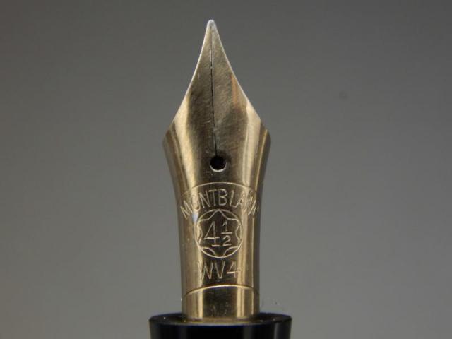
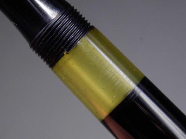
I have what I think is a 2 piece barrel. It has been leaking around the nib and possibly at the section between the ink window as well. I'm I correct that this is infact a two piece section. I've attached a photo of the nib removed and the barrel. I would gently heat the area again and remove the other part for resealing as well. As long as I'm correct here. After I clean up the threads should I use rosin to seal it back up replacing what this pink rubbish stuff is or should I be looking for a specific sealant.
-
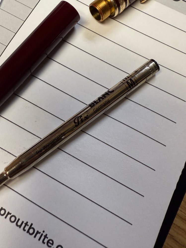
Time for everyone’s favorite game 😅😂 Can you give me your thoughts regarding authenticity? Thank you kindly.
- 9 replies
-
- montblanc
- montblancballpoint
-
(and 2 more)
Tagged with:
-
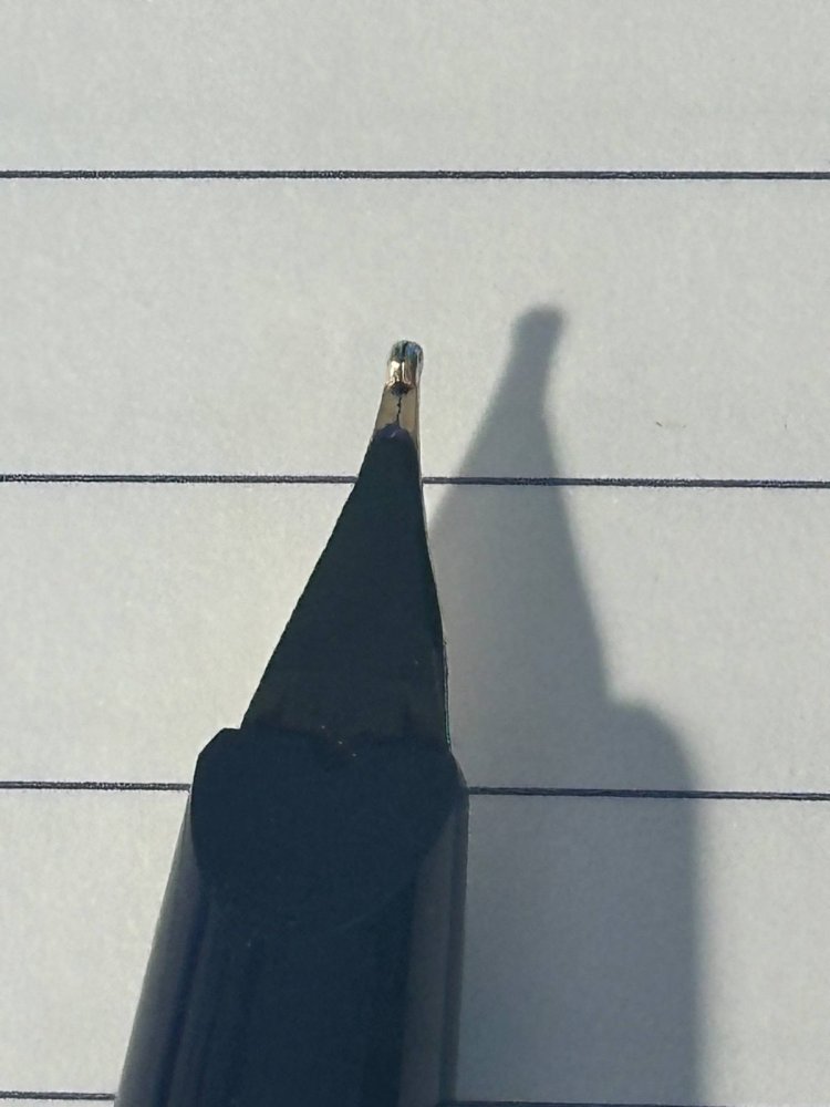
Hi everyone, I recently purchased a Montblanc Generation with a medium nib on Ebay for a decent price. The pen looks to be in great condition overall and so does the nib. However, when I write with it, I frequently bump into starting issues with the pen not writing immediately after touching the paper. As long as the nib keeps touching the paper it'll continue to write and ink flow is good. I've disassembled the pen completely and fully cleaned the feed and nib so they can't be the issue. Writing angle also does not seem to affect the issue in any way. Attached is a small writing sample and some pictures of the nib itself. What is likely the issue here and what can I do about it? Thanks in advance!
-
Hi everyone, I recently picked up a vintage Montblanc 149 from the 1980s, and while doing some routine maintenance and greasing, I noticed some rust around the edges of the brass part of the piston housing (not entirely sure of the correct term for it). Should I be concerned about this? Is there a safe way to remove or stop the rust—perhaps polishing it gently with metal polish? I’d love to hear your thoughts or advice from anyone who’s dealt with something similar. update: I have cleaned the brass piece with multi metal solution and it looks brand new. I will clean all the parts with distilled water, will post some photos. Thanks in advance!
-
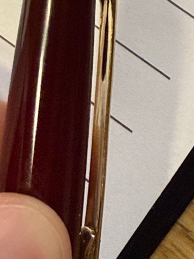
I have a Montblanc 146 from the 80's It has developed a leak around the nib. I have attached a picture as to where. It is a slow one but persistent and leaves ink on my fingers. I have it filled with water currently as I was attempting to see where it was coming from by letting it drip on to a paper towel but it isn't leaking enough to cause a drip. The water though is enough to push ink out of the seam I have indicated in the photo. The red arrow points to a definite leak and the yellow to a possible however the red is showing much more ink creeping out. I'm wondering if I should apply Capt. Tolly's creeping crack glue to this seam after a good clean removing the ink that is still in that seam and a long dry time in some silica gel. I have viewed it under a microscope and there is no obvious cracks that are visible. Thanks for your thoughts and advice
-
Hello everyone, Years ago I had the opportunity to buy a faulty Montblanc Agatha Christie FP at a bargain price. I feel time has come to fix it. Before sending the pen to MB for a service quote, I'd like to know if I can fix It by myself. Any Way to put the c-ring in Place by myself? Thanks to everyone Who can help!
- 4 replies
-
- montblanc
- agatha chistie
-
(and 2 more)
Tagged with:
-
Hi everyone, I hope you’re all doing well! I recently received a Montblanc M Red Resin Fountain Pen, designed by Marc Newson, as a gift from my dad. It’s a beautiful pen, and I know Montblanc is known for its high-quality writing instruments, but I’m not too familiar with their pens, especially the limited or special edition models. The pen comes in the original box with the certificate of authenticity, and it looks to be in great condition. I believe it’s a special edition, but I’m unsure of its current value or what it could be worth in today’s market. I would love to get your thoughts—if anyone here has experience with this model or has an idea of what it might be worth, I’d really appreciate your input. Thanks in advance for your help!
- 4 replies
-
- montblanc
- special edition
-
(and 1 more)
Tagged with:
-
I have an issue with my MontBlanc 146 LeGrand Solitarie, piston gets stuck at the bottom of the barrel.
Humberto posted a topic in Montblanc
I bought this MontBlanc fountain pen a few weeks ago and it was all full of dried ink. I cleaned it and I think I forced the piston mechanism, as I could unscrew it and I took it apart. Now when I try to suck ink from the reservoir, the piston gets stuck at the bottom of the barrel. Any tips on how to fix this issue? Thank you very much. -
It took me some time to finish this comparison but here it is. Not flawless, not pefect, but it has plenty of colors to see. To be honest I've never been violet fan. I always liked dark purples but disliked most of violets. It's hanged with time. At the moment I'm quite keen on these hues. I've included 60-63 inks here (the number differs on different papers, I didn't have enough samples of some inks, I've forgotten about one or two inks and haven't included them everywhere). There are some odd-looking inks here that aren't violet/purple like KWZI Blue L51 (I just had a small sample so I included it here). Kung Te-Cheng, Potassium, Purpillusion are more blue than purple. Alt-Bordeaux and Deepwater Obsession can be regarded as burgundy but as I'm not planning (yet) to compare burgunds / bordeaux I've included them here as well. I need to thank Cyber6 here for A LOT of samples. You trully are Ink Smuggler Extraordinaire Ink Splashes http://imagizer.imageshack.us/v2/1024x768q90/674/D57Iib.jpg http://imageshack.com/a/img911/9309/XMowa7.jpg http://imageshack.com/a/img905/9462/Dzf3fY.jpg http://imageshack.com/a/img537/121/srURhs.jpg http://imageshack.com/a/img901/3985/xcEDod.jpg http://imageshack.com/a/img537/4492/NtfODA.jpg http://imageshack.com/a/img538/2685/q8cIq7.jpg http://imageshack.com/a/img673/1967/EnAfQy.jpg http://imageshack.com/a/img674/4319/WdEf3j.jpg http://imageshack.com/a/img631/7922/1S4blW.jpg http://imageshack.com/a/img673/9114/raVPLz.jpg http://imageshack.com/a/img674/3466/vK8xaM.jpg http://imageshack.com/a/img538/7629/ivb3lB.jpg http://imageshack.com/a/img538/2456/dhwe19.jpg http://imageshack.com/a/img745/7901/pw9g05.jpg http://imageshack.com/a/img674/6609/m4k036.jpg GEMS (they were cut from photos taken on a sunny day, you may find the colors bizarre but I like to show them this way even though most of the times we're not writing in a direct sunlight) http://imageshack.com/a/img910/3417/UZX0cP.jpg http://imageshack.com/a/img674/7610/4sDPbR.jpg http://imageshack.com/a/img538/8730/osVcHA.jpg http://imageshack.com/a/img912/9997/NAgsqc.jpg
- 54 replies
-
- akkermandiamine
- montblanc
- (and 7 more)
-
I like red inks and I use them on every day basis. I'd like to present you short comparison of ten colors. Of course it would be great to compare more reds but then my samples of Oxblood and Monaco Red are empty. Next time. So the inks I've compared are (in alphabetical order): BRILLIANT RED - Diamine http://imageshack.com/a/img834/7010/tg6s.jpg BRILLIANT RED - Pelikan http://imageshack.com/a/img842/8815/x797.jpg BURGUNDY RED - Montblanc http://imageshack.com/a/img843/6245/qxoy.jpg CIEMNY CZERWONY (Dark Red) - Nicpoń* *Nicpoń is chemistry PhD Student that's active on Polish fountain pen network. He'c created limited line of nice, saturated inks in many colors. http://imageshack.com/a/img834/7862/c9n5.jpg GARNET RED - Graf von Faber-Castell http://imageshack.com/a/img834/7862/c9n5.jpg MATADOR - Diamine http://imageshack.com/a/img834/6818/pmh4.jpg MORINDA - Rohrer & Klingner http://imageshack.com/a/img835/3799/pvp4.jpg RED - Hero http://imageshack.com/a/img842/9356/rew0.jpg RED DRAGON - Diamine http://imageshack.com/a/img842/1002/kwg3.jpg RUBY - Diamine http://imageshack.com/a/img836/6886/yi84.jpg There was an accident. I was ready to make "splash painting" with Ruby. The sample was standing near the sink, I don't know why, but I've abruptly turned and my hand pushed the sample. The rest of the ink flow down the sink to some foreign lands. Ruby is a great color, so it's a pity I couldn't compare it this way. SWABS ON SCAN (Canon MP 250) http://imagizer.imageshack.us/v2/1024x768q90/843/9jsta.jpg SWABS ON PHOTO http://imagizer.imageshack.us/v2/1024x768q90/842/jpna.jpg FEW DROPS OF INK ON KITCHEN TOWEL http://imagizer.imageshack.us/v2/1280x1024q90/835/bqr6.jpgTEXT WRITTEN WITH PILOT 78G, B NIB in Oxford notebook http://imageshack.com/a/img838/576/fra5.jpg TEXT WRITTEN WITH PILOT 78G, B NIB in notebook http://imageshack.com/a/img841/5115/eifu.jpg TEXT WRITTEN WITH PILOT 78G (B NIB) IN CALENDAR http://imageshack.com/a/img842/3936/qgzj.jpg TEXT WRITTEN ON CHEAP PAPER (inks are listed as above) http://imageshack.com/a/img845/3366/v4ws.jpg http://imageshack.com/a/img835/7620/sqyd.jpg TEXT WRITTEN ON CHEAP COPY PAPER PRINTED WITH DOTS http://imageshack.com/a/img834/2382/c4e57.jpg http://imageshack.com/a/img834/7564/p4hw.jpg http://imageshack.com/a/img843/7411/bud7.jpg SUMMARY RED DRAGON stomps. It's amazing deep color. I love it. Second and third place are taken by CIEMNY CZERWONY and MORINDA / MATADOR ex-aequo. There are also colors I dislike, namely: Pelikan's BRILLIANT RED (it sucks: I can't find anything interesting about this ink), GARNET RED (moderate flow, dull), BURGUNDY RED (dull, not interesting). What's your opinion? You can choose few inks from the poll.
- 24 replies
-
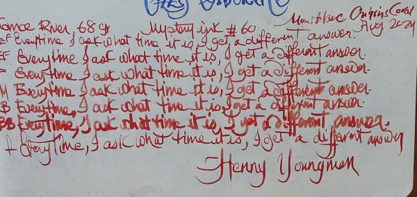
Montblanc Meisterstuck - Origins Coral - (Limited Edition) This ink review was part of a blind test on the Fpgeeks website. Many thanks @JungleJim for the sample. It is a limited edition of Montblanc, celebrating their 100th anniversary and my first Montblanc ink. According to their website, the ink is inspired by both the 1920s Montblanc writing instruments and the coral reefs. It writes sort of a reddish pink colour drying to a rusty orange. It’s subtly different depending which paper you use. Paradoxically, I enjoyed it most on copy paper, and Tomoe River 68 gsm. On copy paper, depending the wetness of pen/ nib width, pressure, you may or may not have woolly lines, ghosting, bleed through all together or not at all. There is some subtle shading, especially on Japanese paper. Chroma: Writing Samples: I think this would be quite fun to use on thick absorbent paper (like Peter Pauper) and on white Japanese Paper. Despite the massacre it looks on Hammermill 20 gr copy paper, it behaved more or less ok between European Ef up to B nibs. Photo: The blue line is Rohrer and Klingner Königsblau (Royal blue) Comparison: Water test: Left side 10 seconds under running water. Artwork: Fox and the grapes: a rebuttal to Aesop's fox and the grapes fable. - Paper is Talens mixed media Paper. Montlblanc Origins Coral Noodler's Lexington Gray/ Black Swan in English Roses Diamine x Niche Pens Alexandrite (non-shimmering) · Pens used: Kaweco (EF/F/M/B, BB), Pilot F3A (Ef, semi-flex) · What I liked: The colour. · What I did not like: The colour with wide nibs, lack of water resistance · What some might not like: Woolly lines on copy paper Price 😛 · Shading: Subtle · Ghosting: Depending nib/ pen/ pressure on cheap paper. · Bleed through: Same as above. · Flow Rate: Restrained. · Lubrication: Lower than average. · Nib Dry-out: Did not notice. · Start-up: Ok · Saturation: Pastel · Shading Potential: Depending paper, wetness of pen, nib size. · Sheen: Did not see. · Spread / Feathering / Woolly Line: Yes on copy paper, ironically with EF nibs (Japanese and Euro) · Nib Creep / “Crud”: Did not notice. · Staining (pen): No. · Clogging: Did not notice. · Cleaning: Easy · Water resistance: Non-existent. · Availability: 50 ml bottles. Please don't hesitate to share your experience, writing samples or any other comments. The more the merrier
-
-
Dear Forum, I hope this finds you well. I have bought a Montblanc 320P With a original Steel-Goldplated nib , wich I want to replace….but there is a problem… I can’t finde replacement nibs ? Or almost none ? So this makes me question, where can I buy replacement nibs ? (I live in Germany, so most us sellers don’t sell to me ) I have wondered , if I could use nibs from other pens , like the Montblanc Carrera or from another brand …but here I need your help. i know somebody here for sure knows something about this problem or can help me… ( I sorry , but sadly I am not a native speaker, if there are any questions, pls ask and I am going to answer them , I really need help )
-
It seems that in 2010 Montblanc changed the manufacturer of their ink as well as the design of the bottle. The company's issued a new, larger (60 ml vs 50 ml) bottle. To be honest I find Montblanc bottle not only nice but also practical, much better than Iroshizuku or Sailor. The new colours launched in 2010 include: Burgundy Red Irish Green Lavender Purple Mystery Black Midnight Blue Oyster Grey Royal Blue Toffee Brown Toffee Brown flows well, has no detectable odor, and no negative qualities that I discovered so far. The ink is not waterproof. At all. If you like brown inks but need them to be permanent take a look at Platinum Sepia. Toffee Brown dry times depend on the width of the nib you use and the paper you write on (as with all other inks), but it's rather wet ink that offers nice kind of shading. In older flex pens it can look very dark while in most regulat pens reddish components are quite visible. Personally I'm not crazy about the color but the facty is Toffee brown is very good ink. Drops of ink on kitchen towel Software ID Tomoe River, kaweco Classic Sport, B Leuchtturm 1917, Kaweco Classic Sport, B Oxford, Gama Airborne, F Oxford, Hero 5028, stub 1,9 Lyreco Budget 60 mgsm, vintage no - name flex Clairefontaine, Kaweco Classic Sport, B Clairefontaine, Gama Airborne, F Comparison
-
Somehow I did it again and managed to buy too many Royal Blue inks. It's far from my favourite blue hue but nevertheless useful in broad nibs. In any case, it gave me the opportunity to compare them. The first picture is of what I wrote on a scrap of Lalo 100g paper. It's not a great picture but you can probably see that there's not much difference between Montblanc, Pelikan 4001 and Faber-Castell Königsblau. Pilot Blue, which was added for comparison, is similar but yet slightly more blue (apologies for the tautology but I can't put it otherwise). Also note that the unlabelled cotton swab at the bottom is Pilot Blue. Then I folded the paper, so that only the right part remained visible and left it exposed to the spring sun for a month. The second photograph shows the deterioration of all inks but especially of Montblanc Royal Blue and, surprisingly, Pilot Blue. Pelikan and its presumed sibling Faber-Castell fared slightly better. Finally, I put a wet finger across the paper and then blotted it with a tissue. All inks but Pilot Blue were affected. Bottom line: everything as expected, although I thought that Pilot Blue was more UV resistant.
- 21 replies
-
- montblanc
- pelikan 4001
-
(and 2 more)
Tagged with:
-
Were any of the 220 pens made with gold plated nibs? I have what I think is a 220 and it appears the nib is plated as it looks like its flaking off a bit.
-
I believe Montblanc company doesn't need introduction here. Each year Montblanc offers few LE inks. Their evil-minded marketing team creates interesting colors that soon become unavailable. Not all of them are great but almost all of LE ink become sought after after they're gone and are sold for outrageous prices. Personally I have mixed feelings about idea of LE inks but I enjoy some of them a lot. Montblanc LE red inks were great (Winter Glow can easily concur with Maruzen Nihombashi Akane; it's not the same and but still amazing). 2016 LE inks were rather disappointing. I was interested in trying last one - Lucky Orange. After a week I would like to share few initial thoughts about it. The hue is nice, I rather enjoy it, especially for occasional writing. I use oranges on daily basis however my taste leans more toward more subdued one (like Iroshizuku Yu-yake). Lucky Orange is saturated but not as strongly as, for example, Diamine Orange or Pumpkin. So far I've tried it only in medium and broad nibs and I would say the flow is nice. The ink isn't overly wet but it definitely doesn't feel dry. In both Kaweco Classic and Faber-Castell Ambition broad nibs the lubrication was satisfying. I'm going to try it in dryish Platinum Plaisir 0.2 nib to see how it behaves in a "nail". Drawbacks? Well, it tends to dry out on the nib if you take a pause and leave the pen uncapped for 30-40 seconds. I've left some ink in Jinhao and put it in a drawer, after three days there's no nib creep or crud but I want to see what will happen after a week. Anyway I think it's nice addition to MB LE line. Personally I like this ink. It wouldn't make to my Top 5 of orange inks but it's a keeper. Bottle Ink splash Drops of ink on kitchen towel Software ID Color range Tomoe River, Kaweco Classic Sport, broad nib Leuchtturm 1917, Kaweco Classic Sport, broad nib Maruman, Kaweco Classic Sport, broad nib
-
It seems that in 2010 Montblanc changed the manufacturer of their ink as well as the design of the bottle. The company's issued a new, larger (60 ml vs 50 ml) bottle. To be honest I find Montblanc bottle not only nice but also practical, much better than Iroshizuku or Sailor. The new colours launched in 2010 include: Burgundy Red Irish Green Lavender Purple Mystery Black Midnight Blue Oyster Grey Royal Blue Toffee Brown Mont Blanc's Oyster Grey is a good ink, however it does’t stand out from the crowd. It' nice, well-behaved, quite nice. Drops of ink on kitchen towel Software ID Tomoe River, kaweco Classic Sport, B Tomoe River, Omas Emotica, M Leuchtturm 1917, Kaweco Classic Sport, B Comparison

