Search the Community
Showing results for tags 'modern pen'.
-
As I wrote in my review of the Opus 88 "Flow" in May last year, I almost bought the resin-and-ebonite Koloro before the Flow was introduced, but backed off at the last minute because I felt that the smaller #5 nib of the Koloro did not match the size of the pen. Well, the Flow is really such an excellent pen that ere long my thoughts turned fondly toward Opus 88 once more, and I was tempted again by the unique resin-and-ebonite combination of two of their models, the larger Koloro and the smaller Fantasia. Once more, the Koloro lost out, and for the same reason as before. I bought the smaller Fantasia that has the same #5 nib as the Koloro, but this smaller nib is a perfect match for the smaller size of the Fantasia. Actually getting a Fantasia in hand in the US proved to be a challenge -- it looks like Opus 88 may have stopped distributing them here, as the only online store actually having them in stock was Vanness pens, and even they did not have all the colors available. On the other hand, several European retailers seemed to have them in stock. At any rate, the Fantasia offered the interesting option of a steel 1.4mm stub nib, which I chose for the sake of variety, since all my other stub nibs are 1.1mm (except for one Visconti tubular steel nib that is 1.3mm). For those who may not be aware of Opus 88, it is a Taiwanese manufacturer of eyedropper filler pens with injection-molded plastic instead of hand-machined ebonite as in the high-end Japanese manufacturers' models, and with steel JoWo or Bock nibs instead of gold nibs. This drops the price of these pens from the stratosphere ($500+) down to earth (about $100). Every Opus 88 pen still has the characteristic shutoff valve that Japanese eyedropper-filler pens are famous for: when the shutoff valve is fully screwed in, the tip of the rod inside the barrel closes off the mouth of the barrel so that the ink in the barrel cannot get to the feed and the nib will run dry after the ink already in the feed is exhausted. In other words, to write for more than a paragraph or two, you need to open the shutoff valve (as shown in the photograph below). Fantasia with "Brick Red" ebonite cap (with multicolored rings) and Amber barrel. The section is the same amber resin as the barrel, and the eyedropper shutoff valve (shown open in this photograph) is also made of the same ebonite material as the cap. The build quality of the Fantasia is above reproach. Opening and closing the screw cap, the shutoff valve, and the section is always perfectly damped, with no wobbliness, and indicating tight tolerances. There is absolutely no play or wobble anywhere. I do not know how the multi-colored rings are fastened onto the cap, but they are absolutely flush with the cap itself and look as if they are painted (but they are not). The pen feels jewel-like, a similar feel to a very different small pen in an altogether different price class, the Montblanc Boheme (the small model with the retractable nib). The Fantasia comes in a small flat box with a glass eyedropper to fill it with. The pen itself is quite small: just 4.5in (11.5cm) capped. The bottom of the barrel has threads for you to post the cap. I have small hands, but even then using the pen without posting is uncomfortable, so posting the cap is a must for usability. After posting, the pen is very well-balanced and becomes a comfortable 5.75in (14.5cm) in length. But the Fantasia hides another trick up its sleeve -- the cap can be used to open the (rather thin) shutoff valve for writing! See the nice sunken (for a reason -- see below) medallion on the cap, with "Opus 88" and "Fantasia" inscribed on it, separated by a raised ridge? That raised ridge is not ornamental but functional. (Note, by the way, that the ridge is exactly perpendicular to the clip -- a testament to the attention to detail in the construction of this little jewel of a pen.) Now, the use of that raised ridge in the cap top is to engage like a screwdriver with one of the slots cut into the shutoff valve at the bottom of the barrel: That's also why the medallion with the raised ridge is sunken into the cap and not flush with the top. This little bit of gadgetry is an unexpected pleasure on this little pen. However, it is not really necessary, as the shutoff valve, narrow though it is, still affords enough purchase for one to open it by hand. Nevertheless, I enjoy going through the additional motions of unscrewing the valve using the cap, then flipping the cap over and posting it into the threads at the bottom of the barrel. When posted, the cap not only does not touch the shutoff valve but also aligns the clip perfectly with the nib. Well, at least that perfect alignment of clip with nib appears to have been the intention of the designer. However, my pen arrived with the clip out of alignment with the nib, which bothered me rather more than it should. At the suggestion of another fellow-Opus 88 fan and fellow-buyer of both the Flow and the Fantasia, I unscrewed the nib unit and screwed it back in starting from exact alignment, and to my delight, when fully screwed in, the nib was again in perfect alignment with the clip. The barrel is a translucent amber on my pen, and there are a few other choices of color amongst the Fantasia models. And this brings me to the first of two issues I have with the Fantasia, namely the relatively short grip section (seen in the photograph above). Unfortunately for me, after a couple of weeks of use, I cannot train myself to hold the pen by either the grip section or further up by the barrel -- instead, my fingers naturally gravitate to the joint where the section meets the barrel and where, alas, lie the cap threads. In other words, when I hold the pen, my fingers always find themselves exactly on top of the cap threads. The cap threads are not sharp, but after a while, they do feel uncomfortable. The second issue is one that manifested itself after I had written extensively with the excellent and smooth steel 1.4mm stub nib, a very wet writer. I found, to my surprise, that the nib suddenly ran dry even though I could see a good deal of ink at the bottom of the barrel and even at the top of the barrel, just below the section threads. You can see a dark ring of ink at the top of the barrel in the above photograph as well. It turns out that on that one occasion (and only that one occasion) something about the viscosity of the ink (Montblanc Irish Green) combined with the barrel caused the ink to adhere to the inside of the barrel in a ring instead of going into the feed, and the nib ran dry. I had to unscrew the section and shake the ink back to the bottom of the barrel, then screw back the section in order to get the ink to flow into the nib again. This is my first load of ink in this barrel, so I do not know if this is likely to happen with other inks. Moreover, it only happened once with this ink too, but I will be on the lookout for it. Here's a sample of writing with the steel #5 JoWo 1.4mm stub nib. Although I did not do any careful comparisons, it does not appear to be significantly wider than my 1.1mm stub nibs, and appears a little less wide than my Visconti 1.3mm steel stub nib. At any rate, this 1.4mm stub nib is very smooth, very wet, and an excellent writer. A writing sample with the #5 JoWo 1.4mm steel stub nib and Montblanc Irish Green ink, on a little "Minerva" Italian writing pad that Vanness sent with the pen. To sum up: the pen is superbly made. It will be hard to find a better-made pen for the price (list price is $125), and the thoughtful details about alignment of the cap medallion with the clip, and the alignment of the clip with the nib, coupled with the cute little conceit of having the ridge on the sunken cap medallion fit right into the groove on the shutoff valve in order to open it, add greatly to the enjoyment one gets from the pen. The nib performs excellently, as is expected from a JoWo. I did experience a strange phenomenon of ink sticking to the inside of the barrel instead of going down the section into the feed, but that only happened once and may be specific to the ink I used. The main issue I faced when using the pen extensively the past two weeks was the discomfort of having the cap threads always under my fingers when writing. I wanted to train myself to hold the pen by the barrel but could not. If you can do so, your enjoyment of this pen will be greatly enhanced. As it is, I like the pen but for writing comfort, it loses out to its bigger brother, the Flow.
- 11 replies
-
- eyedropper filler
- shutoff-valve
-
(and 1 more)
Tagged with:
-
Is it worth it? Parker offered me a 50% discount on a Sonnet Cisele
Darthagnon posted a topic in Parker
I contacted Parker about getting a replacement lid for my Vector and Rubbermaid-Newell support basically said "Send us a photo. Oops, no can do, no spare parts. I can, however, offer you a special 50% discount on any of our subsidiary products." (This includes Parker, Rotring, Waterman, Papermate, etc. etc.) So I looked around, and their current top of the range, the Parker Sonnet Cisele fountain (gold/silver) is covered by the 50% discount offer, so could get one for 186.50 GBP. I believe the term is "grail pen". The discount is valid for a couple months. Is it worth it? Are modern Sonnets, especially the Cisele ones, good pens? Do they tend to hold value, e.g. is it resellable for no loss? Or should I just forget it? I've seen fake Cisele Sonnets from China on eBay for 10 GBP, and also have no idea if modern Rubbermaid Parker is still up to scratch... (I've been able to compare older and modern Vectors, where the older ones look just a little nicer/tougher). -
Conway Stewart Dandy Opinions
collectorofmanythings posted a topic in Fountain & Dip Pens - First Stop
Hello! I’ve been looking into possibly getting a modern Conway Stewart. I personally prefer gold nibs, and like the look of their Dandy model. I was wondering if any of you have any opinions on modern Conway Stewarts and/or this model. I haven’t seen really any review for it anywhere. Thanks, W. Major- 5 replies
-
- conway stewart
- gold
-
(and 5 more)
Tagged with:
-
Do You Agree With This Statement: People Always Love Their First Gold Nib Better Than Other Pens That Work Better
collectorofmanythings posted a topic in Fountain & Dip Pens - First Stop
Like Brian Goulet loves his Custom 74 and Kerry from Pens and Tea loves her Platinum 3776 Century and I personally love my Sailor Pro Gear Slim Mini. Do you personally like your first gold nib more than other pens that write, look, feel, etc. better? Thank you for your responses! W. H. Major -
Could I put a FPR 14k or Edison 18k nib in a Conklin Duragraph?
collectorofmanythings posted a topic in Of Nibs & Tines
Hello! I love the look of many Conklin pens, especially the Duragraph, and the steel JoWo nibs are just fine, but I would love to put a gold nib in it. I saw that both Edison and FPR make gold nibs (I especially like FPR because it is $20 cheaper) in the #6 size and was wondering if anyone thinks this is a good idea or if anyone has ever tried it. Thank you for your help! W. H. Major- 5 replies
-
- conklin
- modern pen
-
(and 3 more)
Tagged with:
-
Could I put a 18k Edison nib or 14k FPR nib in a Conklin Duragraph? Is there any other gold nib I could get that would fit it for cheaper?
collectorofmanythings posted a topic in Of Nibs & Tines
Hello! I love the look of many Conklin pens, especially the Duragraph, and the steel JoWo nibs are just fine, but I would love to put a gold nib in it. I saw that both Edison and FPR make gold nibs (I especially like FPR because it is $20 cheaper) in the #6 size and was wondering if anyone thinks this is a good idea or if anyone has ever tried it. Thank you for your help! W. H. Major I posted this in the wrong section before. Oops! Reposting to the right place, which I think is this one. -
Conklin All American Courage Red Review
collectorofmanythings posted a topic in Fountain Pen Reviews
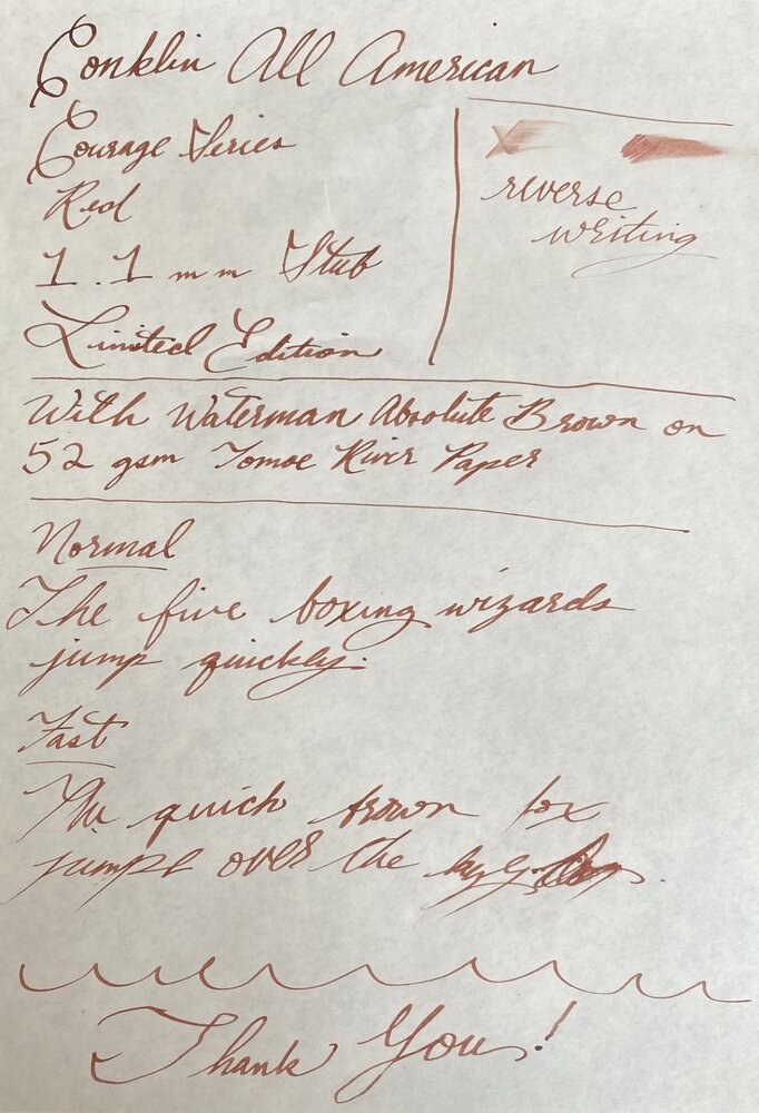
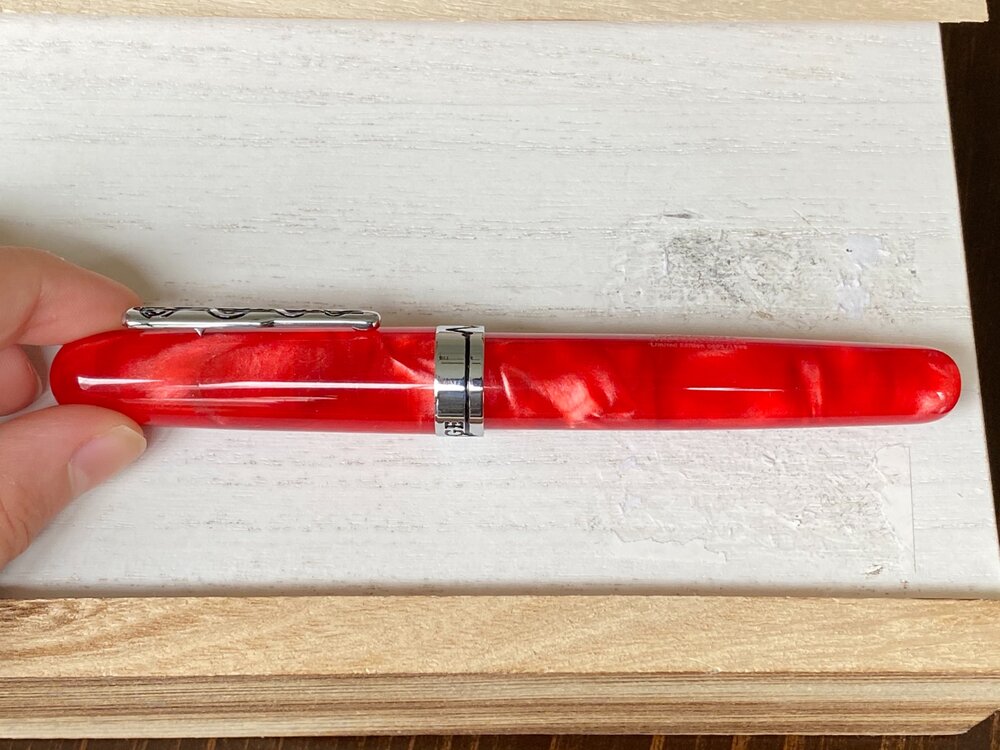
Today, I am reviewing the Conklin All American Limited Edition Courage Red pen. First of all, in my opinion Conklin get a lot of unnecessary bad press. While brands like Edison get wonderful reviews for their pens which often are around 170 bucks that come with a steel nib, and Conklin which also offers cast resins for sometimes over 100 cheaper, and they get horrible reviews. Now I am not saying that Edison pens aren’t great, because they are, I’m just saying that they are pricey for what they are, and, in my humble opinion, Conklin pens are a steal. If you don’t like the nibs, then you can get a Goulet nib or an Edison nib, and if you want a good nib, you can get an Edison gold nib or a JoWo gold nib from fpnibs.com (who offers the JoWo 14k gold nib at just $115!) in the #6 size. Sorry about that, now let me get back on track. This pen is a limited edition of 1898 pieces (Conklin was founded in 1898) and I personally have #0693. So be sure to get it while you can! Design and Build Quality (8.5/10) This pen is huge. It’s about the size of my hand. Granted, I have relatively small hands, but nevertheless it is huge. I can’t imagine anyone ever posting this pen. I personally don’t like reds and pinks a lot, but this pen really spoke to me because it reminds me of a betta fish I used to have when I was younger. Without that though, I don’t think I would have gotten it. It is medical themed, and it is called the Courage series because of the incredible amount of courage shoes by first responders during the pandemic. The clip has the medical snake around a pole, and then the cap band has a heartbeat in the front with another heartbeat on the back which is used to spell “COURAGE”. The body tapers down to the end. The swirls in this pen are magnificent. The material has such a depth to it, and it has pearlescent whites and thin streaks of black all throughout the semi-translucent red resin. It is just gorgeous and a sight to behold. When you unscrew the cap (which takes about 1.75 turns), it reveals a JoWo steel nib, in my case a 1.1 mm stub. It doesn’t have a lot of decoration, just the Conklin logo and Toledo, U.S.A. . The reason that it is a 8.5 out of 10 is because it’s just so huge. Nib and Writing Experience (7.5/10) The writing experience is pretty good. You can’t write incredibly quickly, or else you’ll get skipping. Otherwise, it works great. Relatively dry, but that can be fixed. Reverse writing is not recommended. Has pretty good line variation. Adds a nice bit of character to your writing. I have nothing wrong with this nib, it’s just like a lot of stubs where you have to be more thoughtful how you are writing. In fact, I like it quite a bit. Thank you for reading this review! As this is only my second review, please leave some constructive criticism! I would appreciate very much. Or, just tell me what you thought if the review! Just please leave a comment so I know what to keep doing and what to improve upon. Here are the pictures: -
I love my Parker vacumatic. Its nib is the best I’ve ever written with. It seems to be an extra fine/fine and though it doesnt have line variation like a stub or italic/ the line width isn't totally uniform and has some nice character. There is a wonderful almost pencil-like feedback. What modern pens would you recommend that have a similar feel? I’m guessing gold nibs? I’m tired of the likes of Kaweco nibs that feel like a nail and not as tactile.
-
I have 2 of the 2nd from left, 6 of the 3rd from left, and 3 of the far right. All I know is that they are engraved "Sheaffer", but nothing else. The 3rd from left were sold as "School Pens". If I Google "Sheaffer School Pens", the 3 on the left will appear. The one on the right appears labeled as a Viewpoint. If you know what they are, please let me know.
- 14 replies
-
- sheaffer
- inexpensive pen
-
(and 1 more)
Tagged with:
-
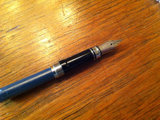
The fountain pen I have was handmade by one of my brother's teachers and now I want a calligraphy nib and I need some replacement inks. The problem is, I can't remember what website she uses to get the nibs and inks. Here's a photo of the nib and you can see the threads where the pen part attaches? This is my first fountain pen and I just want to be able to do calligraphy with it. Thanks, April