Search the Community
Showing results for tags 'medium nib'.
-
Does Pilot Custom 823 has feedback?
penmaster6969 posted a topic in Fountain & Dip Pens - First Stop
I have a Pilot Custom 823 Medium nib currently inked with Iroshizuku Asa Gao, does it have a little feedback? Or it is totally frictionless with no feedback at all? The pen is very buttery in terms of smoothness, the feedback is like a very soft pencil lead, akin to Uni's soft lead.- 1 reply
-
- medium nib
- pilot custom 823
-
(and 1 more)
Tagged with:
-
BEFORE you start throwing things at me for asking a question which has likely been asked many times, I'm new to TWSBI (and fountain pens in general). I'm looking to buy a TWSBI Diamond 580 in "Iris' because it looks great. But it's not cheap so I kinda want this one to be the one I'd use for my day to day writing. Now, I have an older but basic Parker fountain pen, uses a converter, steel nib noted as 'medium'. That's all I know about it. (Aside from it gives a little too much feedback for my liking) Writing on normal 7mm ruled notepaper (nothing fancy) using Parker Quink ink (all I currently have, that'll change). The line width, for what I'd call 'normal' handwriting size sometimes gives me closed loops on the e's. For that reason I thought PERHAPS a fine nib might be a better option? On the other hand, it wouldn't show off a nicer ink as well as a medium nib would. For what it's worth I intend to use Diamine Inks, primarily. And while I'll practice on cheaper notebooks and copy paper I do have a couple of pads of Rhodia and Clarefontaine paper 'for best'. Maybe those with experience of 580s and both M and F nibs using Diamine ink could comment as to whether the TWSBI M writes toward the Fine or Broad side of things (if that makes sense). If anyone is able to give me any guidance as to what else I might do / check / think about to help me decide between a medium or fine nib, I would very much appreciate it.
- 12 replies
-
From the album: OldTravelingShoe's Random Pics of Japanese Fountain Pens
© (c) 2022 by OldTravelingShoe. All rights reserved.
- 0 B
- x
-
From the album: OldTravelingShoe's Random Pics of Japanese Fountain Pens
© (c) 2022 by OldTravelingShoe. All rights reserved.
- 0 B
- x
-
From the album: OldTravelingShoe's Random Pics of Fountain Pens
© (c) 2022 by OldTravelingShoe. All rights reserved.
- 0 B
- x
-
- conway stewart
- cs 58
-
(and 5 more)
Tagged with:
-
From the album: OldTravelingShoe's Random Pics of Fountain Pens
© (c) 2022 by OldTravelingShoe. All rights reserved.
- 0 B
- x
-
- conway stewart
- cs 58
-
(and 5 more)
Tagged with:
-
From the album: OldTravelingShoe's Random Pics of Fountain Pens
© (c) 2022 by OldTravelingShoe. All rights reserved.
- 0 B
- x
-
- green
- conway stewart
-
(and 7 more)
Tagged with:
-
I recently purchased a brand new Pelikan M600 (Blue) with a fine nib, which I love, but I’m also interested in trying the medium nib in this pen. What reliable, affordable retailer would you recommend to sell me that medium nib? I’d be open to buying a used one in great condition, as well. Thanks! Gary
-
desaturated.thumb.gif.5cb70ef1e977aa313d11eea3616aba7d.gif)
How-to: Set, or change, personal info that others can see about me
A Smug Dill posted a blog entry in Sus Minervam docet
It helps to explore this yourself, revisiting once in a while if need be, and keep in mind where each of those personal info fields are entered. Don't leave it until the urge to change something specific to come upon you, and only then bother to ask the question! Invest the time surveying upfront, instead of waste it later waiting for an answer from nobody in particular. Most of the fields shown above are self-evident as to what they are. I think the only ones that could do with explanation are: Security and Privacy: There is only one setting under there, and that is a toggle for whether your online status (including ‘last active’ date or time) is visible to others Content View Behavior: That has nothing to do with what others can see about you, but only where you would like to start reading when accessing content Enable status updates: This toggle enables/disables the public feed on your profile page; if you disable it, then nobody (including you) can post publicly visible ‘status updates’ or any other message against your profile, but if you enable it, then anyone — friend, foe, or complete stranger — can post something there whenever, without waiting for you to initiate and then only reply to what you wrote Notification Settings have nothing to do with what others can see about you, and so is out of scope for this article, and I'm not going to delve into those right now. (You can look here, here, and here to wrap your head around how notifications work with respect to followed content.) N.B. There is a possibility that some of the above settings and data fields may not be available to Bronze members and/or Silver members, but I have no way of testing that or scoping it out. — • — Another way of getting to the Edit Profile dialog, and the way to change your profile photo (or ‘avatar’), is here: — • — Freeform, custom member titles that one enters for oneself are long gone, and have not been a thing since FPN came back from a long hiatus and platform upgrade late in 2020.-
- fight club
- salix
-
(and 101 more)
Tagged with:
- fight club
- salix
- parker 51
- jacques herbin
- bleu austral
- bleu de minuit
- graf von faber-castell
- moss green
- olive green
- deep sea green
- gulf blue
- cobalt blue
- midnight blue
- parker urban
- night sky blue
- diamine chocolate
- platinum
- vicoh
- kanazawa
- gold leaf
- maki-e
- kanazawa-haku
- modern maki-e
- slender
- feminine
- snap cap
- penbbs
- chinese ink
- lamy 2000
- aurora
- ottantotto
- aurolide
- rose gold
- 888
- limited edition
- solar system
- planets
- jupiter
- giove
- conway stewart
- cs 58
- duro nib
- 14k
- medium nib
- green
- hatched
- sheaffer
- balance
- statesman
- 14k
- fine nib
- 1930s
- sheaffer
- balance
- statesman
- 14k
- fine nib
- 1930s
- webster gold crown
- webster gold crown
- webster gold crown
- jinhao x159
- feed diameter
- size 8 nib
- my foot!
- pilot
- plumix
- ef nib
- bb nib
- stub nib
- steel nib
- pilot
- plumix
- ef nib
- bb nib
- stub nib
- steel nib
- pilot
- plumix
- ef nib
- bb nib
- stub nib
- steel nib
- space
- stationary
- planets
- rubber
- pencil
- ruler
- vjreviews
- vjreviews
- nibsmith
- dan smith
- italic
- nibsmith
- dan smith
- italic
- lamy z52
- lamy studio lx all black
- aurora ipsilon
- faber-castell essentio
- noodlers aircorp blue black
- aircorp blue black
-
This is a medium Sonnet I just received, from a reputable shop, which was sold as "new old stock." The nib looks bent to me, but it writes pretty nicely. Perhaps a little scratchy in one direction, but wildly better than the custom ground nib I unexpectedly got from another shop. So this has me wondering, should the nib on this pen be straight? Or are there benefits to nibs shaped like this? Or is it a flaw that needs to be returned and corrected? (None of the photos on the site showed it from the side, so it wasn't clear that it would look like this when I ordered.)
-
What's the width of a line put down by a diplomat magnum Medium nib in millimetres
-
I'm Hidden I'm hidden where nobody knows Cause all you can see are my nose and my toes. Abbey Road died about a week before her first birthday from feline leukemia. She was an amazing kitty and loved putting on her vest and going for walks around the neighborhood and hiding in boxes. A month or two after she died my vet called. One of their clients cats had kittens and they needed homes.They sent pictures of them taken when the kittens came in for their very first check up and they were tiny little fuzzy things. So my sister and I drove over to the vet's office to find six kittens in a pile, all climbing over each other, eyes open and amazed by the big world. Suddenly two fuzzballs broke out of the pile and headed our way, one straight to me and then up my shirt to my shoulder, the second not far behind. The other four kittens simply went on with their game attacking those strange things that grew out of the end of the other kittens and was perfect to pounce on. All the kittens were perfect, lovable, wonderful, cute, fascinating but two chose me. http://www.fototime.com/5176D7A38426937/medium800.jpg So far this comparison has been like that. All of the pens are perfect, lovable, wonderful, beautiful and fascinating but two ended up choosing me. The comparison begins with six Japanese fountain pens with medium nibs. To keep things simple, each is filled using a cartridge from the manufacturer. Three are from Pilot, two from Sailor and one from Platinum. I don't remember where I bought them but all except two came with a converter; the two exceptions were the Pilot Custom 74 and the Sailor 1911L. Fortunately I am not converter poor so that was not an issue for me. All of the pens have a monotone gold nib in 14K except the Sailor 1911L which has a 21K nib. The largest nibs are on the Pilot Custom 743 and the Platinum #3776 Century. The smallest nibs are the Pilot Custom 74 and the Sailor 1911S. And so ... the Boring Details: http://www.fototime.com/7A5AE11F6841ADA/large.jpg and the pens: http://www.fototime.com/67F4897AB99DEDF/medium800.jpg All of the pens were like the kittens, all near perfect and it would be hard to go wrong with any one of them. All had unique strengths and all had certain weaknesses. It really will come down to which chooses you; which most closely fits your needs. All cap or uncap in under two turns. They all felt better in hand when posted... http://www.fototime.com/EC9C668913A5669/medium800.jpg ... but they were all also long enough to use un-posted if that is your preference... http://www.fototime.com/65EA8DCB4397FB8/medium800.jpg ... and each of the pens had nibs that were tastefully done without being gaudy. http://www.fototime.com/B4024867B695CC0/medium800.jpg The six pens have far more in common than they have differences. All follow the basic Sheaffer Balance profile and all have the wide raised cap band popularized by Montblanc but of course with only two bands not three. All are moderately to very wet writers with the three Pilot pens the wettest, then the two Sailors and the Platinum while wet, not as gushing as the others. Here are writing samples of all six pens on Clairefontaine notebook paper. http://www.fototime.com/29857646D6BD2CC/large.jpg As expected, the actual lines are also pretty similar. In addition, all were very smooth writers. So what were the differences? As mentioned by me in the past, I find Pilot pens as shipped almost too wet. If you read my review of the Custom 845 I found it so wet I had to switch to a drier ink (Pelikan 4001) to make it even usable. These pens are not as wet as the BB nib on the 845 but were still the wettest of the Japanese pens in this comparison. All three, even the little #5 nib on the Custom 74 were wetter than the Sailors or the Platinum. They were not so wet I would feel the need to switch to something like Pelikan 4001 but they were wet enough that I never really felt I was in full control of the pens. The Pilot Custom 743 was the largest pen in the comparison (actually the Pilot trio were all the longest in every measurement) and it also has he fanciest furniture with a raised section on the cap and body end bands and the writing on the wide cap band filled in to make it stand out. The place the Pilot pens did all fall down is in the pocket clips. The Pilot pens have the most pocket unfriendly clips of the six pens. The Sailor pens tested were both plain black and gold, the most tapered in looks and simply traditional. They were not quite as wet writers as the three from Pilot but still slightly more than moderately wet. The 1911L had the only non-14K nib of the group with a nice large 21K beauty. The 1911S had the smallest nib of the group, just a hair smaller than the #5 nib on the Pilot Custom 74. In use I always felt in total control with either of the Sailors. Where Sailor really stood out is in their pocket clips. The two Sailor pens had by far the most pocket friendly easy to use pocket clips. The Platinum #3776 Century had the biggest nib of the group with wider shoulders than even the big #15 Pilot Custom 743 nib. It also was available in the widest selection of colors but also had the smallest selection of possible nib widths and styles. Like the others it is moderately wet, smooth but with the most feedback of any of the six nibs. Platinum is also the only one of the three makers that offers an adapter that allows using Standard International cartridges in their pens. Since I have lots of them that is something I like. http://www.fototime.com/1B3C251F4CFB161/medium.jpgWhere the Platinum #3776 Century really stands out is in the nib. It really offers the best feedback of all of the pens in this comparison. It, like all the Platinum and Nakaya nibs I've tried simply feels like it was created just for me; not a separate object but rather an extension of my thoughts. I said that Sunshine and Princess picked me. So which of these pens also seemed to choose me? Surprisingly to me, the two smallest. The Sailor 1911S and the Platinum #3776 Century just feel the best of all six in my hand.
-
Hi all, I'm considering to sell my once inked Pilot 100th anniversary pen, but I'm not sure of it's resale price. It is in as-new condition, with a fabulous Medium nib. Also I have the box for it. Would anyone have an indication on that? Reason to sell is that the pen feels like a work of art to me and I've not been able to use it like I would use any other pen. Appreciate your inputs!
- 3 replies
-
- pilot
- 100th anniversary
-
(and 2 more)
Tagged with:
-
Fountain Pen Review: Monteverde Invincia - Stealth Black (M Nib)
nmcnick posted a topic in Fountain Pen Reviews
Monteverde Invincia - Stealth Black (M Nib) Review To start this review off, keep in mind it is my first review; and as all reviews, is at least somewhat subjective. Also, for perspective, I have used this and 4 other fountain pens, which are: Pilot Varsity Lamy Al-Star Lamy Safari Conklin Duragraph and I have been using this pen for around 1 month. Overall Appearance: Measurements: 5.35" / 136mm long capped 5.30" / 134.7mm long uncapped 6.10" / 154mm long posted 1.10" / 28mm long nib 0.55" / 14mm body diameter 0.35" / 8.9mm grip diameter 1.40 oz/ 39g weight overall Monteverde makes some amazing looking pens and this is no exception. This pen is downright edgy. From it's shiny, reflective all black metal surface to the rounded style which makes it look sharp and artsy; this is a beautiful pen. Well.. chances are that it wouldn't be taken as a compliment it by saying it's "beautiful", so.. let's instead just say this.. it's a good looking pen. I love the little details on this pen such as the Monteverde mountain etched into the nib, the rounded body which is dynamic and changes in girth frequently throughout the pen. Also, the logo on the top of the cap is a nice touch. Pen Parts, Build & General Details The pen cap screws on securely and takes about 2 rotations to pop off. In posting the pen, the cap just slides on securely and really feels sturdy and macho even in the way it does this. There are many things about this pen that just feel so edgy and make me feel as if I am the coolest person on the planet. The grip of the pen is probably the biggest turn off for me. I have very large hands, but with the grip being skinny and having a pretty quick cut off to the body, combined with it being metal makes it a tough pen to hold for a long time at least for me. I prefer to hold my pens further back then most anyway, so maybe this is what causes the issue. Adding to this, the clip is EXTREMELY tight, its hard to even slide onto a pocket. This isn't a huge deal for me since I never clip my pens, but it may be for you. It has a standard international converter and cartridge filling mechanism. It comes with your standard run of the mill piston converter (standard international) and as such isn't remarkable but works as it should. I haven't encountered any problems with filling the Invincia. You are going to be getting 1.07ml of ink out of cartridges and 1.12 out of your converter. It should be noted that I used monteverde black ink which, once again, was a fairly standard black ink; very similar to noodler's black. The nib is a #5 steel nib, which writes well. It surprised me to find this out as most outlets say it has a #6 nib. Whether it's a change in production or something else I'm not aware of, the important thing is it fits! I'll be getting more on the writing later, however. I chose the medium nib model and it fit fantastically for me. I cannot say how it compares to other mediums very well as this is my first medium nib, however, it seems to be a broad medium with some stub properties (some, very small but more on that later) which was a surprise to me. Not a lot more to say about it's structure! I think the black look was absolutely essential and having an all black pen just looks really sleek. Writing As mentioned above, the pen feels a little strenuous on my hands and eventually causes them to cramp up. However, aside from that, this pen is an excellent writer. It's incredibly balanced unposted, and when posted is ever-so-slightly back heavy. This is the first pen I can use either posted or unposted simply because I have such large hands and most pens aren't very large until you post them. This pen isn't huge, but the length mostly subsides in the body as opposed to the cap. It's got some weight to it and feels durable. I love the metal finish in looks.. but sometimes it can be a tad slippery in writing. Putting the pen to the pad, this thing writes extremely smoothly. Its a really interesting writer and feels unlike anything else I've written with. It's smooth, with very very little feedback, but not at all glidy. It feels as if you are effortlessly carving into paper, like a butterknife into soft butter. That being said, It has a bit of a sweet spot. When you use it any way else other than right down the middle, it makes a very thin line and can feel a little scratchy. Using horizontal or diagonal lines result in a skinnier line because of this and therefore can produce really interesting results, resembling a tiny bit of a stub look, or so I've seen. Very interesting and fun nib to write with. Overall, this is a pretty great pen. It has some issues, but I like the overall look and feel of this pen. The all metal body with a black nib and nice writing comes to a pretty good conclusion for me. Final Verdict: (7.8/10)- 12 replies
-
- monteverde
- invincia
-
(and 7 more)
Tagged with:
-
Dear All, I think this is an age old debate. I just want to start it again. I am from Chennai. I am using FPs with Western Medium Nibs coupled with dry ink. Which are the fountain pen friendly papers / notebooks (minimum size: B5) made in india which can be bought online or may be in stores directly. Please share your views. Thanks in advance.
- 16 replies
-
Hi. I'm planning on buying myself a Twsbi Eco just after Christmas, and I'm torn between which nib to get - A stub or a medium. Typically I write quite quickly, and reasonably small with a medium nib, but I really love the look of writing with a stub. There is a photograph of my handwriting written with a Waterman Gentleman with an 18k gold Medium nib, inked with Waterman Black ink. What do you think? Thanks!
-
Just got a Lamy 2K Iconic Stainless Steel, 14k m nib, for few days. Quite a lot of info can be found everywhere I guess yet here are some my little review. ProsExcellent finishingStylistic (my major push-buy-button reason)Smooth wet nibNo hard start, no skipping, won't dry out over-nightLine variation (it surprises me)Good clipPiston fillerGood price with 10% off form cult (compare the price in HK)Write right out from the box ConsReally heavy, surely not for long writing, also not good for shirt pocket.Comparatively small sweet area for the nibCan't see the ink levelStill some ink remains on the section area (using Iroshizuku-murasaki-shikibu)Whole pen, a little bit slippery. (Maybe I don't have a wet hand...) About the weight: it is 55g capped (uncapped 36g).My capped Pilot CH92 PLUS Custom 74 = 44g. Conclusion: It's iconic and really stylistic.The nib performs nicely.Love it. Sorry the lamp is a bit yellow, actually the ink is a very pretty purple indeed... Thanks for stopping by.
- 13 replies
-
- lamy 2000
- stainless steel
-
(and 1 more)
Tagged with:
-
Hello, I accidentally posted this in the "Of nibs and tines" section, so click here to go to the original post. See you there! -Cyan
-
- sheaffer 100
- sheaffer
-
(and 4 more)
Tagged with:
-
I have never seen a review of the Caran d’Ache blue lacquer Varius. I think this pen is a great addition to people who wants to know more about the lacquer version of this Caran d'Ache model. This is my first fountain pen review and I hope to write more reviews for the fountain pen community. Please feel free to comment on this post. I hope to contribute more to the fountain pen community. I will like to thank Sbre Brown, FP geeks, and the Pen Habit for getting me started on fountain pen reviews. First impression This pen is something special. The first thing that catches the eye is the blue lacquer. From what I can tell, it is a navy or dark blue. I will argue this is the prettiest of the lacquered Varius because the color really contrasts well with the silver plating. The color reminds me of the staedtler product with the pencils and erasers, which I used throughout school. I just love lacquer and always wanted to own a pen made with the material. When people think of lacquer, they think of Nakaya, Sailor, or Namiki. I am pretty sure they never thought of this Swiss brand. score 5 out of 5 Appearance This is a very thin pen which is a characteristics of many Caran d'Ache pens. They are usually very thin and a gripping section that is even thinner than the pen body. I usually have very big pens. My everyday carry is a Lamy Al-star and my biggest pen is a Homo Sapien Bronze. But the blue and silver body will make anyone fall in love with this pen. The pen body is hexagonal with the beautiful Caran d'ache labeled cap perfectly aligned to the 6 sided blue and silver body. The hexagonal cap has smooth edges capped a cylinder top with the words Caran d'ache and the logo CdA. I got to admit that Swiss engineering make this pen aesthetically pleasing and very precise. Well done Caran d'Ache. The clip is a very functioning that can easily clip to any shirt and even jean pockets. Tension of this clip is just enough to secure the pen while having enough give to operate it with relative easy. The metal cap is a fingerprint magnet. I personally have no problem with it, but some people certainly do. If you hate fingerprints on your pen, I would not recommend this pen score 5 out of 5 Size/ weight The pen capped at 5¼ inches and uncapped at 5 inches. Capped, this pen stands at 6½ inches. The diameter of this pen at its largest section at ½ inch and the smallest section at ¼ inch. I will say this is a very decent size pen, but the section is a little small for my hands. I will hold it a little further back. I can still write with this pen for long sessions. This is a heavy pen. It is a smaller pen, but the metal certainly make this a very substantial pen on the hands. I like heavy pens so I definitely like the weight of this pen. I will advise this pen to be uncapped because it is a little back heavy when its capped. Without the cap, this pen is extremely well balanced. score 4 out of 5 Filling mechanism This is a standard/ international cartridge converter pen which will have some people groan. I personally have a power filler visconti and while I enjoyed it, its not too upsetting for some pens to have with cartridge converter. For the retail price, I definitely expect this pen to have a piston filler. I understand that the company might not want to put in a piston filling mechanism because this pen is pretty small with a small piston knob will certainly make this pen difficult to operate. score 3.5 out of 5 Nib The pen is nothing without the nib. This is a 18K Medium nib with a plastic feed. Decorated with the beautiful scroll work, this is a very small nib. It writes smoothly when you write on its sweet spot. It has a preference on how you hold it. If you angle the pen towards you to admire the nib design, the nib will become scratchy. I have to adapt to its sweet spot, but it was not hard to figure it out. This pen has a lot of tooth so you definitely feel like writing with a fountain pen. This pen writes like a true European medium. I have compared the Pilot Vanishing point and the Visconti Homo Sapien. The VP writes just a tad bit thicker Varius with the gushing Homo Sapien writing the broadest. It is very consistent with flow when I filled this pen with Waterman Serenity blue. It only skips once or twice after I had this pen, but once I started writing it is just magical. This pen does not flex well, while it can give some line variation, it is a pretty small difference between flex and unflex. I will not use this pen for any spencerian script. Score: 4 out of 5 Price At retail price of over $1115.95 at gold Spot, this pen is MORE THAN the Montblanc 149 and that is a piston filler. I saw this pen at the back room of Fountain Pen Hospital for $495 used. I am screaming inside because this pen is certainly NOT worth $1000+ dollars. The writing experience plus the blue lacquer is just not worth $1000. Luckily, I bought this pen off an auction on Ebay used for about $300. I will say this pen is a steal for me. The owner really took care of this pen and I will treasure it like its previous owner. Retail: 0 out of 5 Me: 5 out of 5 Conclusion It is not everyday that someone can find this pen for the price I got it. The color just POPs. I am really impressed by the design. It is a beautiful Swiss design and I am proud to say I found my accidental grail pen. Here in the U.S., not a lot of people appreciate Caran d’Ache due to price and its not a Montblanc, Visconti, nor a Pelikan. I think I will looke into Caran d’ache more often in the future assuming the price is right. Score 4.417 out of 5 Total
- 6 replies
-
- caran dache
- varius
-
(and 3 more)
Tagged with:
-
I've recently got a virtually new 149 medium nib off ebay, but the nib frequently skips. I can write with it fine, but as I say it skips and I get a lot of feedback, and if I wanted that I could have made do with a Jinhao 159. I wouldn't mind swapping the nob for a broad, but does anyone have any tips about how to make it write smoother as it is? Thanks
-
The pen in question is a white Waterman Hemisphere, with a medium nib. The section is black so I'm not too worried about staining while I'm filling. But what do you suggest I fill with? Until now, I've always had a same-ish colour ink and pen (eg Red Lamy Safari has Skrip Red, Blue Sheaffer 330 has Diamine Denim, etc) but white ink would be... well, silly, for a student. I considered perhaps pink?
- 27 replies
-
Spoiled brat alert: my new M1000, medium nib provides all these delightments...thick, nicely balanced solid heft for my big, thick-fingered hand...a soft yet responsive slightly springy nib...that lays down a precise, silken, wet line. Bliss. BUT, 5% of the time, it skips for just a stroke or two, both up and down. This happens mostly on the slickest paper surfaces (Clarefontaine, Rhodia Premium, Maruman Mnemosyne) but also on Black 'n Red, Exacompta FAF, and even TWSBI notebooks. Pelikan Blue-Black ink is most prone to cause this skippage, then Noodler's BP Black, then Diamine Green-Black. I've flushed, I've flossed, and I've fussed over every nook and Souverän cranny...any insights from the wise heads on FPN...? It's like meeting a new lover who is SO close to your ideal that you spend all your time and energy obsessing about how to 'get there'... (That's the spoiled brat part...)
- 4 replies
-
- m1000
- medium nib
-
(and 1 more)
Tagged with:
-
This is my first MB fontain pen. I bought it as second hand item from Ebay. It is quite new but I have a nib creep problem. While writing a droplet of ink comes up the surface of the nib and immadiately whicked back into the feed living a stain behind. I tried it twice with both MB Black and with Aurora Black ink. It happens more with MB ink when compared with Aurora Black. I flushed and cleaned the pen before inking. I called MB Service in Turkey about the problem before seeing the pen we can't say anything exactly they said. Except these what can I do what can the reason for it? Kind regards. Cengiz
- 11 replies
-
First Impressions Of The Yiren 829 (Plum Blossoms)
notebookerie posted a topic in Fountain Pen Reviews
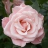
http://i8.photobucket.com/albums/a28/grapefruiit_/IMGP8270_zps5e2c0d08.jpg The Yiren 829 is yet another unbelievably affordable Chinese-made fountain pen that can be purchased on eBay. It set me back $7.20 AUD including postage! My first impressions of this pen? It’s well-built, aesthetically pleasing, a great everyday writing tool – if used mostly at home. The barrel and cap are made of a chromatic-finish charcoal grey metal, with an engraving of gold plum blossoms across the barrel. It’s smaller and more slender than I expected. It feels solid in the hand, yet not overwhelmingly heavy. In fact, it’s fairly light for a fountain pen, much lighter than some Parker ballpoints I own. Truth be told, I purchased this pen purely as a gamble, because I love plum blossoms. To the Chinese and Koreans, plum blossoms (KR: 매화, CH: 梅花) are a symbol of strength, endurance and beauty in the midst of hardship: http://i8.photobucket.com/albums/a28/grapefruiit_/03plum_BaoChun-red_2002_zps633e5cb8.jpg It comes with a very clean, minimalistic medium hooded nib, which I rather like. See below for a closer look - http://i8.photobucket.com/albums/a28/grapefruiit_/IMGP8267_zpscc1db78f.jpg I think of it as an ‘everyday pen’ because together with the ink I used* to test it out, it is compatible with such a wide range of papers. It writes wonderfully on A4 cartridge paper without any feathering or bleeding onto the back of the page. I was pleasantly surprised, but dubious about how well it would perform on thinner paper. So I gave it a spin on a regular Spirax composition book. Though Spirax normally produces quality notebooks, this particular style – from its latest fashion stationery range – had very flimsy paper. Amazingly, while some faint traces were visible through the back of the page, the Yiren 829 performed very well on even this cheap-grade exercise-book style paper. (* from Hero, another Chinese brand – I don’t need expensive ink when I get through a stack of paper each day for my thesis!) http://i8.photobucket.com/albums/a28/grapefruiit_/IMGP8278_zpsf1655464.jpg I would recommend this pen for students, or anyone else who wants an inexpensive writing tool of decent quality. It doesn't quite match the ease/comfort/smoothness of the Lamy Safari, but it's nice for those days when you want to treat yourself to a little luxury while writing.

.thumb.jpg.3af3eb57a0bc069ef20476220b4d1b2e.jpg)
