Search the Community
Showing results for tags 'matching'.
-

Does Anyone Else Try To Match Specific Inks To Specific Papers?
Arielle Finberg posted a topic in Inky Thoughts
Some of you like to match specific inks to specific pens. And I do that myself, sometimes. But do any of you try to match specific inks to specific papers? I really love Kaweco Paradise Blue but recently discovered that the strokes of ink form a weird greasy-looking halo, plus bleed-through, apparently only on cream-colored Rhodia paper after several months. I checked back in my Leuchtturm 1917 notebook where I had used the ink about a year or two ago with no such problems showing up (just a tiny bit of bleed-through). And some inks look dulled on off-white paper, while others look richer. Right now I am trying to find a good A5 notebook match for J. Herbin Cacao Du Brésil, my all time favorite ink. I was using it in my Bullet Journals but the color visually made the dot grid on my journal pages look extremely prominent, causing each page to look like a crazy Svengali hypnotic pattern (i.e. hard to read)! I’ve been trying lighter dot-grids than what is in the Rhodia “goalbook,” but I may have to move to a lined or blank journal if I want to use my favorite ink. What inks and papers do you like to use together? -
I'm curious about why you're inspired to try/use new colors. Right now, as the leaves start to change (a bit prematurely) to their autumn colors, I'm looking for inks that match the colors around me in nature. I'm currently craving a particular shade of blue that would match a sweater I'm making. It is somewhere between Diamine Cornflower, Lapis, Tudor, or J. Herbin Blue Ocean (if I feel like going shimmery). I want to track down samples of each of those. It isn't necessary, as I have plenty of blues and plenty of inks in general. I don't always go for matchy matchy. There's no need to match a sweater and my pen's ink, but I'm inspired by the color of this beautiful yarn. Other times, I crave a contrasting, but complementary, color. A deep burgundy ink to go with some deep teal items a close friend gave me, for example. I've used a particular shade of pink (Diamine Carnation) because it reminded me of my grandmother. A particular red (Diamine Monaco Red) because my mom would like it in the pen of hers that I have. Quick Blue-Black reminds me of my dad and of my intro to fountain pens. I rotate varying purples in a pen that was a gift from someone who loves purple (though in general I'm neither someone who must match inks to barrel color nor someone who avoids it entirely). From other posts, matching seasonal colors is something that many people here seem to do. Others look for colors that match logos or team colors. I always enjoy reading these threads, but I haven't found a broader discussion of this topic. Why are you motivated to look for a particular shade of ink? If you're looking to match something else, what is that item? If you have a signature color or usually use only a particular color family, when/why do you branch out? Thanks for sharing your thoughts.
-
Mont Blanc Meisterstuck 149 Diplomat
roberthansjorg posted a topic in Fountain & Dip Pens - First Stop
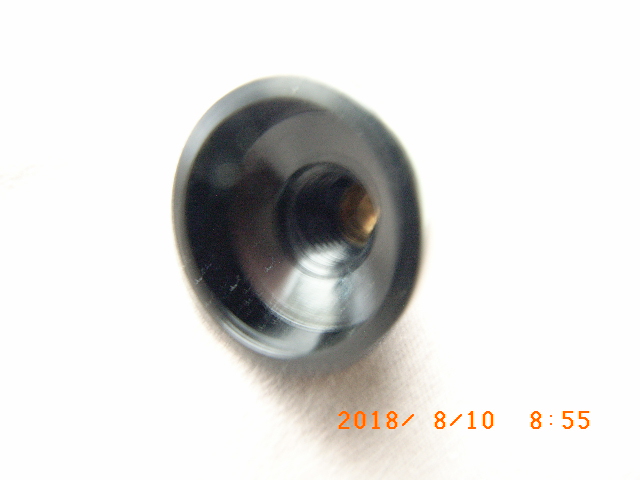
Hi, I have a 149 barrel which I believe is from the 70/80's and I want a matching bare cap. I think I may have found one which has the threaded post on the end to take a screw on snow flake top which I happen to have. The present owner of the cap says it's from a Diplomat 149 Meisterstuck. I wouldn't know if my barrel would be designated a Diplomat barrel so what are the chances my barrel and this mans cap would match? Only way to find out is to try it I know. Trouble is it's a long way just for this "fitting". I looked up the Mont Blanc website and there does not appear to be any reference to "Diplomat" there. Is this label just for the American market and not used in the UK? I've included a photo of the s/f top I've got which would screw down onto the threaded post on the cap and hold the clip in place as well.

