Search the Community
Showing results for tags 'matador'.
-

Some larger mid-twentieth-century German piston and button fillers
alexander_k posted a topic in Fountain Pen Reviews
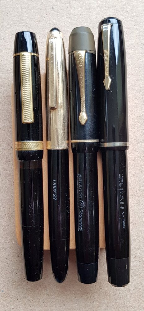
Fountain pens from around the middle of the twentieth century, on either side of World War II, especially German ones, hold considerable appeal to me. They were meant for intensive writing and so quite a few still work admirably well. Their nibs are often magnificent and the overall construction quality good to excellent. My only gripe is their size: most adhere to a 'standard' size that is a bit too small for my hands. Thankfully, there are a few that are bigger, without necessarily falling under the 'oversize' category. These tend to be high-end models, meant for important people who needed to impress with the size of their possessions. Accordingly, they generally also have higher production standards and therefore are in an even better state than other models. Today, when we think of large, high-end German pens, it’s mostly Montblanc and Pelikan that come to mind. Back then, however, there were more brands vying for a share of that prestigious part of the market. Over the years I’ve managed to collect a few and recently I inked and compared some of them over a period of a few weeks of rather intensive use. For comparison purposes, I used the same ink for all: Pelikan 4001 Brilliant Black (a bottle from the 1980s), with a one exception that will be explained later. The pens come from lesser or extinct brands, so don’t expect to see any Soenneckens (these will be compared in the future), Osmias or Gehas (of these two brands I have currently nothing that qualifies as large) or Pelikans (I’m all out of them). Left to right: Elite-Meisterklasse, Mercedes 100, Artus 57, Böhler-Normal Left to right: UHU-Nobel, Lamy 27m, Matador Standard 92, Rally (not compared, just another large pen from the same period) Elite-Meisteklasse The first is a pen reportedly purposely made by (or for) the Berlin Weltpen company (Schmieglitz & Co) as a competitor to the big Montbalncs. It’s a piston filler of good size and capacity, with a smooth black body and cap, orange ink window and ebonite blind cap and cap finial. The most impressive feature is the huge 14K medium nib, of the semiflex category. Flow is good, allowing the nib to flex without any railroading. The Elite-Meisterklasse one of the pens I used most in the comparison period because it was quite comfortable to hold for hours, either posted or not. It’s a pen that compares favourably with any of the larger daily writers in my collection. Mercedes 100 The next piston filler comes from another obscure company, Mercedes, which was apparently founded by a former Matador employee. Some consider Mercedes pens to be second-tier but the ones I’ve had always gave me a much better impression in all respects. Judging from its construction, the 100 model was clearly meant as a higher-end pen, although it sports a steel medium nib (possibly an indication of the period it was made: gold had been rather scarce in Germany for some years during and after the war). The body and cap are chased and it has a green ink window. In terms of size, it’s slightly longer and thinner than the Elite. Its flow is more generous and the responsive nib comes close to the semiflex of the Elite - yet another proof that back then they could work with steel as well as with gold. I’ve had this pen for many years now and I regret not having used it more often. It sits very comfortably in my hand (quite comparably to my benchmark, the Parker 51) and works very reliably. Artus 57 In contrast to the previous two brand, we know enough about Artus and its relation to Lamy but I’ve been unable to find anything about this particular model, the 57. It’s a piston filler made of chased plastic and has a green ink window. In terms of size, it’s between the girthier Elite and the longer Mercedes. Ink flow is generous and serves well the soft, semiflex 14K medium nib. The pen is as comfortable as the Mercedes, suitable for long writing sessions, and its flex nib adds a playful element I appreciate, even when writing in haste. Böhler-Normal Böhler’s origins and relation to Osmia are also well known. This button filler is made of chased plastic to a size very similar to the Artus 57, expect for the length, which is roughly one centimetre shorter. This calls for posting the rather long cap at most times. The main difference, however, is also the main attraction of the Böhler: the marvellously flexible 14K medium nib. The pen works very reliably and posted has the right size for my hand but I prefer to use it for less hurried and shorter writing jobs, so that its flexing remains a joy. Flow is excellent but, as I’ve noticed also with other flexible nibs, when the ink level in the pen falls below a threshold that I’ve been unable to fathom (no ink window), the nib becomes drier and starts to exhibit a bit of resistance than can be tiring. UHU-Nobel The UHU-Nobel is on of my latest acquisitions and the most expensive of this lot. It is a piston filler made of smooth black plastic to a size almost identical to the Elite, so presumably also intended as a competitor to the big Montblancs. The orange snakeskin ink window seems to confirm that. The nib, however, is a steel medium - nevertheless a responsive one, just like the one in the Mercedes. The pen is rather dry, so initially it didn’t take well to Pelikan 4001. It took some work before flow became acceptable and may require some more. In terms of size, the UHU is near perfect: the most comfortable of the bunch, either posted or not. The only problem is the flow, which could be more generous. This is a fine-tuning and ink-matching challenge I actually appreciate. What’s the use of having so many inks, otherwise? Lamy 27m Probably the youngest of the lot is the Lamy 27m (the fat model in the 27 line). It’s a piston filler of smooth plastic, with an orange ink window and a gold-filled cap. The nib is a semi hooded 14K oblique bold. Its size is similar to the UHU but the hood adds holdable length, so posting is never necessary. Unfortunately, the pen is rather dry (unlike other 27s I’ve had), so it’s inked with Rohrer & Klingner Blau Permanent. Otherwise I’m quite fond of the stiff OB nib and the overall appearance and size of the pen (but I’ve already declared the Parker 51 to be my benchmark, so that’s no surprise). Matador Standard 92 Finally, my favourite of this bunch -partly because of the time and effort I put into it, partly because of the way it writes: the Madator Standard 92 arrived several months ago with half a tine missing, so I had to replace the original nib with a broad 14K Montbalnc I had from some other abused pen. Thankfully, the marriage worked. The pen is a smooth black button filler with an ebonite cap finial, very similar in size to the UHU, only slightly longer. Flow is generous and the nib has a lot of flex - my favourite kind: broad, smooth and flexible. I can use this pen, posted or not, for hours without tiring. On the contrary, I feel inspired and invigorated by the effortless and effective way it lays ink on paper. I’ve had various Matadors before and all were great pens, only too small for me. So, this larger Matador is one I intend to keep. Still, I’d like it to have a Matador nib, so if anyone has a spare medium or broad one, or knows how to grow tines, please contact me. Conclusions As you can read, I do have preferences but at the same time I appreciate all these pens. I used them all regularly with pleasure but not with the same intensity (which also relates to the kind of stuff I had to write). Most of these vintage pens haven’t cost me much, so I don’t mind letting them rest some of the time. I didn’t have to do much to get them going, either: some cleaning, o-rings for the pistons and sacs for the button fillers and a bit of silicone grease was all they required. Most importantly, all nibs but the one on the Matador were in perfect condition. As for the comparison to Montblanc, at least half of them feel as substantial and well-made as my 149s (although closer to the 146 in size) or the Pelikan M800 that used to be my main pen for two decades. So, the advice remains: go vintage; it’s an adventure you won’t regret in the long run.- 14 replies
-
- elite-meisterklasse
- mercedes
- (and 5 more)
-
I have a Matador Click "020" in good condition, except for its nib. This steel nib seems to have had its tines partially clipped off and smoothed, turning it into an awful stub nib. However, I have some hope for this pen. It has a screw-out nib unit, that seems to be similar to Pelikan nib units. Are those compatible? In another question, I have seen this pen with many clips, from a Waterman-style stepped clip, an arrow clip, a normal rectangular clip, all as military clips. Does anyone have any information on how the numbering of the pen relates to these clips, as well as if they have a steel or gold nib?
-
My latest ink is Diamine Matador. This is a bright red. It's brighter than Red Dragon and is what I would call a perfectly balanced red in the middle of the red range. Not too much blue or orange/yellow. Because I like to compare the inks I am reviewing against other inks that I have, I decided to use Red Dragon, Monaco Red and Crimson as my comparison inks this time. However, no matter what I tried in Photoshop CS6, I couldn't get an exact colour replication for both Matador and Red Dragon on the same document for some reason. So I matched the document as closely as I could to Matador. Red Dragon has slightly more of a pinkish tinge than Monaco Red and Matador, but is less pink than Crimson. I decided to use a parker 45 as I had one clean on my desk. It's been a while since I used one but I found this ink behaved very well with it. I believe it's a M nib. It was a pleasure to use with Matador ink. I don't particularly like the idea of comparing blood red colours, as in D. Matador, Mb. Alfred Hitchcock or D. Oxblood. But if you wanted to do that, Matador is a bright red more like arterial blood than venous blood.The water test on the review form shows this isn't a waterproof ink but it shows a little water resistance.Bearing in mind the paper I use is thick with a shiny surface, and I used a M nib, this ink took 16-18 secs to dryIt flows through the pen well and lubricates the nib well. I saw no skips or hard starts while I did swabs and dry time tests.It is currently available in 80ml glass bottles, 30ml plastic refill bottles or cartridges.Diamine sell it directly to end-users on their web-site.It's a reasonable price


