Jump to content

Search the Community

Showing results for tags 'masuyama'.

  • Search By Tags

    Type tags separated by commas.
  • Search By Author

Content Type


Forums

  • FPN Community
    • FPN News
    • Introductions
    • Clubs, Meetings and Events
    • Pay It Forward, Loaner Programs & Group Buys
  • The Market Place
    • The Mall
    • Market Watch
    • Historical Sales Forums
  • Writing Instruments
    • Fountain & Dip Pens - First Stop
    • Fountain Pen Reviews
    • Of Nibs & Tines
    • It Writes, But It Is Not A Fountain Pen ....
    • Pen History
    • Repair Q&A
  • Brand Focus
    • Cross
    • Esterbrook
    • Lamy
    • Mabie Todd Research/Special Interest Forum/Group
    • Montblanc
    • Parker
    • Pelikan
    • Sheaffer
    • TWSBI
    • Wahl-Eversharp
    • Waterman
  • Regional Focus
    • China, Korea and Others (Far East, Asia)
    • Great Britain & Ireland - Europe
    • India & Subcontinent (Asia)
    • Italy - Europe
    • Japan - Asia
    • USA - North America
    • Other Brands - Europe
  • Inks, Inc.
    • Inky Thoughts
    • Ink Reviews
    • Ink Comparisons
    • Co-Razy-Views
    • Th-INKing Outside the Bottle
    • Inky Recipes
  • Paper, and Pen Accessories
    • Paper and Pen Paraphernalia
    • Paper & Pen Paraphernalia Reviews and Articles
  • Creative Expressions
    • Pen Turning and Making
    • Pictures & Pen Photography
    • The Write Stuff
    • Handwriting & Handwriting Improvement
    • Calligraphy Discussions
    • Pointed Pen Calligraphy
    • Broad (or Edged) Pen Calligraphy

Blogs

  • FPN Board Talk
  • Incoherent Ramblings from Murphy Towers
  • The Blogg of Me
  • FPN Admin Column
  • Rules, Guidelines, FAQs, Guides
  • Musings on matters pen
  • Marketing & Sales
  • Iguana Sell Pens Blog
  • Newton Pens' Blog
  • Peyton Street Pens Blog
  • holygrail's Blog
  • A Gift For Words
  • I Don't Have a Name; So This Will Do
  • Karas Kustoms' Blog
  • Debbie Ohi's Inky Journal
  • Sus Minervam docet
  • Crud!
  • Clut and Clutter
  • Federalist Pens

Product Groups

  • FPN Pens
  • FPN Inks
  • FPN Donations
  • Premium/Trading/Retailer Accounts

Categories

  • Fonts
  • Tools & Software
  • Rules for Notepads & Paper

Find results in...

Find results that contain...


Date Created

  • Start

    End


Last Updated

  • Start

    End


Filter by number of...

Found 9 results

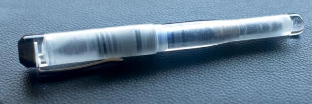
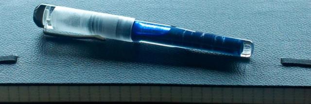
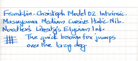
  1. This is my first first review, although by now I've owned and used quite a few fountain pens. Franklin Christoph is one brand I've found myself going back to - perhaps it's their exceptional customer service, perhaps it's the quality of their pens, or perhaps it's because they ship worldwide for free. I had seen a "Smoke & Ice" version of their Model 40, and had been thinking of getting one for a while. So when I saw they're releasing a similar smoke & ice version of their flagship Model 02 (Intrinsic), I just had to get one! Appearance, Material & Design I'll let the photos do the talking! The pen really looks & feels like a quality product. One thing you notice when you hold the hefty-looking pen for the first time is how light it actually is. You see demonstrators all the time, but the whole concept of "Ice" (glossy transparent acrylic on the outside, textured inside) on this model is simply stunning! So much so that you cannot help but convert this to an eyedropper. The "smoke" parts (section, finial) are also nice, they have a subtle glow when held to light. The design is quite interesting. The placement of the threads at the end of the section makes the pen comfortable to hold (without the threads getting in the way when you hold the section). Moving the threads in the cap to the very inside means the cap can be posted quite deep - making the posted length not much longer than capped length. Writing with the Model 02 feels about the same posted or not. You get a slight feeling of insecurity when you post the pen - I'm a little hesitant in pushing the cap down really firmly, the transparent barrel makes it look fragile (although I'm sure it isn't). I also wouldn't want scratches on the end of that beautiful barrel Nib To me, the nib is the most important part of a pen. However well a pen is constructed, if it doesn't write well, it's just an expensive paperweight. This is where the Model 02 moved from "eye candy" to a fantastic writer. Franklin-Christoph offers Mike Masuyama nibs for a small fee, and they're amazing! I've used standard round nibs in all my pens until recently. Then I tried the Masuyama Medium Cursive Italic when I purchased a Model 27 earlier. Let's just say I cannot see myself going back to round nibs any more! I ordered a gold M-CI nib with the Model 02. It writes very well, but a little too wet for my liking, so I ordered an additional steel nib that writes somewhat dry - it's super smooth, and now this pen is just right for my writing style! Filling system Standard cartridge/converter, but the material pretty much forces you to convert it to an eyedropper. The increased ink capacity doesn't hurt - another incentive to use this as a daily writer. I know it's a big risk, but a bit of silicone grease and a leap of faith, it's done. Let's see how it holds up over time. The ink I'm using (my absolute favourite, Noodler's Liberty's Elysium) would possibly make it a nightmare to clean later, but that's a bridge I'll cross when I get to it Value At $180 for a unique pen with a Masuyama nib ($90 additional for the gold nib), one that can be used as a daily writer (one that you'd want to keep using), I'd say it's pretty good value. Conclusion This is my favourite pen, one that I look forward to using the next time. It's wonderful to hold in your hand, and just as great to write with. Add Franklin Christoph's lifetime warranty and exceptional customer service, this ticks all the right boxes for me.
  2. Hello Everyone, I recently received my F-C 02 Intrinsic in smoke and ice with a medium SIG grind, and I'm in love -- the nib, the design, and the finish have all made this easily my favorite pen to date. However, I've encountered an issue that I haven't seen discussed before: When filling the converter, ink is drawn up between the nib assembly and the section acrylic. This, in itself, is probably to be expected, and the finish definitely makes it more conspicuous than it otherwise would be. However, I did notice, after only my third fill, a slight bit of staining in this area. The culprit was Iroshizuku Shin Kai. This happened despite cleaning between fills. Now, no matter what I do, I can't seem to get rid of the light purple-blue hue of my virtually brand new section. I've definitely heard some warn against ED'ing these pens with Iroshizuku inks, but just filling the converter? Is the antique glass considerably easier to maintain and clean? I know I could try an ultrasonic cleaner or F-C's recommended ammonia/water solution, but it just seems too soon. Are the ultrasonic cleaners best for this finish? Any smoke and ice owners out there have any input or suggestions on how I might avoid this in the future? Are there certain inks which should be avoided even in converters? Thanks much in advance, all. I look forward to posting here more often!
  3. Hello, I would like to pick a Pen from F-C and I have doubts between Medium Italic vs Stub in steel from Meister Masuyama. I would like to know your feedback if you have tried both. I would pick up an italic because it is supposed to have more line variation. But I am afraid it to be very scratchy, I don't mind if it has a bit of feedback, like a sailor or so, but not too much that it is bothering. Would an italic from Masuyama be smooth or scratchy? Or something in between? I am used to write in cursive, since in Spain print script it is not taught in school. Also it would be great to see writing samples. I have seen the white on black samples from the F-C site but they are not very clear to me. Thank you FPN people.
  4. Hey Everyone, I've just sent back my Franklin-Christoph medium S.I.G grind in order to exchange for a broad Masuyama italic. Don't get me wrong: the SIG nib was great to write with and I liked it very much; but, since you can't buy Masuyama grinds separately like you can a sig, I've opted for the CI. I'm also interested in learning an italic handwriting script some time, so this makes sense long-term. Now, however, I'm hearing that Masuyama italic grinds are dry writers. One post I've come across was particularly bothersome in that the OP said their f-c Masuyama italic required loads of pressure to write with until they eventually sent it back for a flow adjustment. Moreover, the nib wasn't said to be defective by the F-C team, they just tuned it to what they'd call "wet". I'd imagine that an italic tuned on the drier side would maximize line variation and the integrity of the cross-stroke-- are there any other practical reasons for a CI to write dry? I'm particularly interested in hearing from those who regularly write with any form of italic or own steel F-C Masuyama italics. Have yours been dry compared to others? Do they write under their own weight? Having said all that, I'm really not too fond of nibs that are very dry, especially if they're broad. On the other hand, perhaps I should leave this to the expert Mr. Masuyama -- it is, after all, my first hand-ground cursive italic. Sorry for the long post and thanks in advance.
  5. Why Nothing Writes Like a Fountain Pen https://www.youtube.com/watch?v=qwsx1FG_2Ns
  6. Hello everyone, I've recently discovered Franklin Christoph pens and I've fallen in love with them. I'm seriously thinking about getting a P66 or a 02, as everyone talks so good about them, but I just have some trouble deciding which nib would fit me better. I hope you can help me. I usually use European M such as Delta, Lamy or MB. I wouldn't like to have a broader nib than those I've mentioned, as I would use the pen for everyday writing, note taking, etc. I've seen everyone recommends getting a Masuyama nib from them, but they only have Fine Italics and then Medium Stub and Italics. I've never used Italics and I'm afraid it wouldn't be suitable for me. Do you think the Medium Stub would be comparable to an European M as those mentioned above? From the information on the website, the Medium Stub is 0,7mm and the usual European M seems to be a bit smaller. What's your experience? Thank you very much!!
  7. I don't know if this is appropriate place to post this announcement. If this is not, I apologize. Mike It Work/Michael Masuyama will temporary stop taking new nib work orders until farther notice. Please stop sending-in orders until farther notice unless you have already started discussing about it with me over email. I have to take care family matters/business in Japan as my mother passed and that forces me to spend more time other than nib work. It also requires rather frequent trips to Japan for 2016 and it will be significant strain to my already too long backlog. I will work on the pens that I have already in my queue as quickly as possible and also keep my plan to attend few pen shows that I have posted in my email auto-reply. I plan to return to my normal routine sometime later this year. I very much appreciate your support and understanding and I will try to get back to my routine as soon as I can. If any of you can re-post this to other fountain pen internet community that I do not know, that would be helpful. Thank you, Michael & Emiko Masuyama
  8. This is a review of a Pelikan M800 F Cursive Italic and an M205 0.3mm, with customizations done by Michael Masuyama (a.k.a. "Mike-It-Work"). Pelikan M800 and M205 Demonstrators Pelikan’s demonstrators are among my favorite pen designs of all time, with a Bauhaus-like emphasis on function in form. While Lamy remains the standard-bearer in functional design, the Pelikan demos bring together a similar simplicity and elegance in an intentional, practical way. Best of all, the opportunity to watch Pelikan’s much-admired piston filling system in action is always a lot of fun. No one can deny that the mechanics of the Pelikan piston filler are amazing. And the quality of the pens, overall, is likewise amazing. The resin feels solid and is surprisingly tactile, with a nice polished finish. The only thing that fell short of my expectation was the QC details of the M800. First of all, there’s an acrylic thread left over from the molding process inside the barrel behind the piston. Though it does not interfere with the piston mechanism, it seems like an obvious oversight that this was not removed prior to assembly. Also, though I really like the cut-away in the brass spindle housing, there are two brass shavings stuck in the barrel. Again, while not affecting function in any way, the shavings should have been cleaned out in the assembly process. These small but (in a clear demonstrator) obvious defects are disappointing, especially given the high expectations for an M800 “Special Edition.” Overall, though, the construction is solid and the quality of the materials is readily apparent. Pelikan Piston Filling Mechanisms Writing with the nibs, on the other hand, was somewhat disappointing. I’ve never been totally thrilled by a Pelikan factory nib out of the box: the tipping, while abundant, is very round. What’s more, the line put down even by a factory EF is so broad that I struggle to write legibly with it. The nibs are ok, but I am not sure why Pelikan does not produce a wider range of factory-ground nibs; it seems that for their market, Pelikan could produce a wider variety of grinds. Fortunately, there is a ton of tipping on modern Pelikan nibs and they can be readily customized by a nibmeister. (Unfortunately, that route adds expense in both of time and dollars to every Pelikan purchase -- but read on!) Pelikan Demonstrator Nibs When I finally decided to go ahead with customized nibs for these pens, Richard Binder (who had tuned my Matador 811 and reground my Pelikan Pharo) had closed up his mail-in nib service. I had previously swapped my M800 EF nib for an already-ground F italic via the FPN Classifieds, but the italic – while producing extraordinary line variation for its relatively narrow width – turned out to be quite crisp and way too sharp for everyday writing. I sent the nib to Masuyama of “Mike-It-Work” renown to be reshaped as an even narrower cursive italic. The result was an italic grind of truly miniscule proportions (finer even than the 0.4mm stub grind on my Pharo) with a relatively dry-ish flow that perfectly suited my small handwriting. Most amazingly is that despite the small scale, the line is still clearly an italic. The dryness of the flow helps preserve the sharpness of the line and allows for small, tight lettering. I appreciate having a pen so well adapted for my writing style. The only drawback is that due to the dryness of the line (sometimes maybe a little too dry), the color saturation changes dramatically when the surface finsih of the paper is uneven. I think a slightly wetter nib would produce a more consistent line, but I was concerned about losing definition (especially in the cases of "a" and "e"). Pelikan Demonstrator Writing Comparison I was less disappointed initially with the factory steel M205 nib, which was closer to what I was expecting in an EF – but even that nib was too broad in the long run. And, again, the out-of-the-box writing experience left me rather disappointed. This time, a Masuyama 0.3 nib, listed as a “Japanese F” (equivalent to a Western XXF), came up in the Classifieds and I was lucky enough to get it before someone did. I had used one of Richard Binder’s XXF “Waverly” nibs on an M205 in the past, but could not get used to the curved tip (even though the Waverly nib wrote perfectly). I appreciated that the Masuyama 0.3 grind maintained the straight profile of the nib. This super-fine steel nib writes a very consistent, wettish line and is one of the best nibs I have used. Close-Up Writing Samples Pelikans are mechanical marvels and the demonstrators superbly showcase the awesome filling system. However, I find the factory nibs, while reliable, somewhat lacking in the character that makes fountain pens so enjoyable for me to write with. Because Pels are well suited (perhaps even intentionally built) for customization, additional investment results in pens that are awesome for serious writing. Pairing the functional and awesomely minimalist demonstrator design with a customized nib epitomizes the modern fountain pen experience. In the future, perhaps I will even add an M1005 Demo to the lineup…with a customized nib, of course.
  9. Yes, the twins are here and I love them (Pardon the low quality pictures)! Here they are, - Fosfor Sandalwood with a Franklin Christoph HPS #6 Masuyama Needlepoint Nib - Fosfor Islander in Red Burl with the Franklin Christoph #6 Music Nib The F-C nibs were a gift from a friend and I was given the freedom of choosing the nibs. My limited experience with EF or F nibs (limited to lower end Indian and Japanese nibs) left me wanting more and I was on the lookout for something that I could use for sketching and quick notes (among a few other things). The music nib was to continue to practice some scripts for calligraphy. I've been wanting wooden pens for a while now and there was no better marriage than the F-C Nibs and the Fosfor body that I could think of in India. I must admit that the F-C website was very tempting and I will probably pick something from their offering pretty soon. I haven't uploaded more than a single picture as I am not able to do justice to the pens with my shoddy camera skills. Both Fosfor Pens and Franklin Chirstoph have great sample pictures on their own websites for anyone interested. I'm not good with reviews, but here are my impressions about both the pens and the nibs after a few weeks of usage. Experience with the seller(s) Franklin Christoph: I bought the nib units online and their customer support and sales was great, they have a well oiled process. The nibs units were shipped from their store the day after (or I think the same day given the time zone difference) and they knew the details about shipping, exports, etc. The sales folk at F-C were really helpful about the plethora of questions that I as this was the first time I was getting pen parts shipped into my country. They were always prompt and the whole process of buying the nibs from them was really easy and I did like the little containers that the nib units arrived in. Mike Masuyama's chop on the little card was nice for a first time buyer. Fosfor Pens: I've been commenting and reading Manoj's work (Fosfor Pens) here on FPN and wanted to order one for myself and when these nibs arrived, I shipped them off to him for these two beauties. These are my second set of wood pens, I think I'd rank wood higher than ebonite in terms of personal preference, with acrylic a distant third (so far nothing has made me budge on acrylics), and other plastics/resins being a distinct no. Bring on more of those wood pens I say! Manoj was patient with my finicky emails and decision process and helped me narrow down on these two choices for the pen. He updated me through the process and sent me these two lovely pens a few weeks ago. As I've posted in other threads, I'm a sucker for good packaging, and the boxes and the choice for the box material material made it all the more interesting. The small little pouch with the sandalwood shavings that I got was nice touch!Design, material, build and quality from Fosfor Fosfor Sandalwood: It is the understated look of this design that nailed it for me, the shape and the use of the threads on the cap were a great touch to make the pen look lovely. I opted for the unpolished finish for the sandalwood as I wanted to feel the wood when the pen is used. Yes, there are great risks of staining an unpolished wooden pen (I have stained a ball point sandalwood pen with my clumsiness earlier), but we do live dangerously anyway. The use of the red/brown ebonite is lovely (at some later point I might ask Manoj for an ebonite from this lovely colour itself). The natural wood grains on the pen (the swirl and I think one little burn mark from teh turning process or otherwise) add character to the pen. I did opt for this design as will not be posting the cap while writing. My only grouse with the pen being that when the cap is screwed onto the pen, the brown ebonite casing is visible (it does not protrude or create a gap). I'm only guessing that is either a easthatic choice or a utility choice (to insure against wear and tear of the unpolished sharper edges or probably any ink pooling/leaks). It might have been a good bonus if the swirls on the cap and body aligned when the cap was screwed on. Fosfor Islander: Most of the pens I own are understated or are discreet in nature, so I thought I'll mix it up a little with the silver trimmings on the Islander. Given the need for the natural look of the wood to be retained, I decided to go with the Red Burl offered by Manoj instead of my personal favourite of the Sheesham (with no trimmings) for the Islander. As you can see, the swirls are lovely, the polished finish is great and the black ebonite section provides a nice contrast for the nib and the clip on the cap. The tapering end could probably be used for posting, but I don't like posting my pens and I'm guessing it could lead to the natural wear and tear. Apart from the slight offset for the trimming at the top of the clip the pen is marvellous. The balance of the pen is great and I do love the fact that even after the polish that my brain tells me I'm using a wooden pen. As stated earlier, the aligning swirls on the body and cap would have been a lovely bonus. Performance of the nibs from Franklin Christoph HPS #6 Masuyama Needlepoint Nib: The technical details and pictures are available on F-C's website. I'm surprised by the performance of such a thinly ground nib. I must admit that I was apprehensive about it's performance but after clariyfing details from their sales team and using it for the last few weeks, I have become a big fan. Being and EF nib that is ground by Mike Masuyama to approx .25mm according to their website. As expected of such a finely ground tip, it has a smaller sweet spot. The performance is great and it is a wonderful writer both forwards and backwards! As a testing ground, I've used the Needlepoint on papers varying from 70gsm to 100gsm (and copier type, handmade, more threaded, etc.) and I am surprised at how well it handled all the paper. Though I guess this type of a nib would be best used on copier type of paper to ensure a longer life and better care. It almost feels like a mechanical pencil when using the nib and very unlike the EF nibs that I am used to. Here are few quick drawing samples, Franklin Christoph #6 Music Nib: This nib was offered in both a shadow steel and a polished steel finish. It was greatly tempting to buy the shadow steel finish. The eventual aim for me was to be able to use the nib units in different pens as needed when travelling, etc. Both of the pens I wanted from Fosfor are definitely not the travel with them in your pocket kind which meant that the options for a matching body for the shadow steel nib pen reduces drastically. The horizontal and vertical strokes on this pen are great and it glides over paper. I've tried the nib with a few different inks (locally available Bril, Camlin and Sheaffer Scrip inks) and so far it lays down a consistently wet line. I've had a couple of railroad-like situations (what would you call that for a broad nib?) in about 30 pages of writing/doodling/scribbling which I am attributing to the position/writing angle. The flow keeps up with the nib and my writing speed. Here is a quick 'F' in Old English Engrosser's script, The twins have given me great pleasure over the last few weeks and I'm a little unsure of where this new hobby of mine is leading me.


×
×
  • Create New...