Search the Community
Showing results for tags 'marc newson'.
-
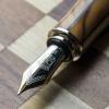
PRELUDE In the search of suitable replacements for a Meisterstuck Doue FP 145 My meticulously planned fountain pen hiatuses are occasionally disrupted by the well-meaning members of my family. Instead of appreciating my carefully timed fountain pen acquisitions, they enthusiastically offer advice on investments, the time value of money, and everything in between. To add a twist to the tale, they threw me a curveball last year by gifting a Meisterstück Doue FP 145 LE, even though I had only bought a total of three fountain pens in the last three years. If we exclude the Opus 88, then it's just two. The Doue 145 is undeniably a beautiful pen, but I found myself wondering if I could ever use it with its slim metal section and rather shortish nib. Determined to find a more suitable replacement, I revisited the local MB Boutique. While Montblanc's customer service remains top-notch for pens within the two-year warranty period, they seem to derive more delight from pens outside the warranty period than their customers do. Faced with the task of choosing two pens to match the value of the pricier Doue, I was drawn to a Naruto LeGrand 146. Then, the salesperson revealed his secret NOS drawer, housing various pens, including a Great Characters Walt Disney FP. Opting for the Montblanc M, not only because its 2018 price, combined with the Naruto, matched the total credit value for the Doue, but also because it simply looked nicer. And here goes the review.... If you like a pictorial blogger view, here is the link: A Review of the Montblanc M in Red PRESENTATION (6/6) Usual MB The usual MB single pen box. The standard Montblanc single pen box with no customisation, with the only variation being the red cardboard sleeve that encases the box. The RED collection boasts a charitable initiative, contributing less than 1% (€5) towards fighting HIV/AIDS programs. It's almost as if Montblanc is tackling HIV/AIDS single-handedly, making minuscule donations of €5 at a time, all while charging the end customer a whopping €540+. As Master Yoda famously said, “Do or do not. There is no try”. The pen securely nestles within a cushioned and somewhat snug slot inside the box, accompanied by a complimentary cartridge filled with black ink. However, it seems that most of the ink inside the cartridge had evaporated during its 5 years of shelf-living. DESIGN (6/6) From the likes of the Apple Watch The Montblanc M, available today in three finishes—Ultra Black, RED, and RED Signature—has been designed by Marc Newson, renowned for his work on the Apple Watch. Newson has successfully blended functionality with elegance, anchoring the design firmly outside the tradition for Montblanc. The shape of the pen is particularly appealing in modern pen terms. It boasts a perfect cylindrical shape with zero taper and rounded ends, except for the flat section, commonly referred to as the “plateau” at the end of the barrel. The platinized clip is a personal favourite; it avoids the cheap look of the Safari, perhaps because it's not oversized and doesn't unlawfully occupy a third of the cap's surface area. The glossy and bright red finish mirrors background lights and hues effectively. Upon uncapping, one notable feature is the novel use of magnets to secure the cap. The snap cap rotates itself to align its magnetic poles perfectly, ensuring the clip and plateau on the barrel are perfectly aligned on a plane. A soft snap securely seals the cap, earning full marks here. According to Red Dot Project award records, the snowflake emblem made of white resin is ultrasonically welded onto the plateau and then milled with a diamond tool to maintain flatness. The design reflects a harmonious flow and is truly eye-catching. The cap, adorned with the snowflake emblem on top like regular Montblanc pens, exhibits impeccable overall quality of work. In certain lighting conditions, the magnetic insert is faintly visible inside the cap. The knurled platinized metal section adds enough weight to balance an otherwise light barrel. Due to the flat plateau on the barrel, the cap cannot be posted. The section, embossed with the MONTBLANC brand name five times on the visible rear ring where the cap snaps on, is somewhat short and not ideal for longer writing sessions. More on that later. FILLING & CLEANING SYSTEMS (4/6) Cartridge & No Converter This is where, like many other fountain pen users, I express my concerns. It's worth noting that this pen only supports standard international short cartridges, and none of the available converters are compatible due to the featured plateau on the barrel. On the positive side, the pen accepts short international cartridges or proprietary MB cartridges, limiting its cartridge capacity to 0.5 ml. The form of the pen, while aesthetically pleasing, somewhat restricts its functionality as part of the design. Perhaps because the pen was conceived in this digital age, the designer didn't anticipate it being used extensively. Additionally, cleaning the section with running tap water is an easy process. NIB - ALL THAT MATTERS (6/6) The two toned rhodium ruthenium stunner The 14k nib is claimed to be handcrafted by Montblanc in a series of 30 steps. Rhodium-coated with a dark grey ruthenium-coated inlay, this nib is a stunner. I particularly love the shape of the nib, which comes in two widths - Fine and Medium, as far as I know. A dazzling cylindrical flow of silvery rhodium bounds the dark grey ruthenium inlay with well-defined contours. Just below the circular breather hole, the 'M' logo rests within an encircled star. The tail end specifies the composition 'Au585' of the gold-alloy, and the brand name 'MONTBLANC' rests just above the tail. Between those, a hallmark of 'StOD' inside a crossed ellipse adds a touch of elegance. As always, the nib itself doesn't mention the width explicitly, but a sticker at the piston end of the barrel provides all the necessary details. Once you turn the nib, you'll behold a somewhat unconventionally shaped black glossy feed that seamlessly matches the curvature of the pen. Apart from an air hole, there is nothing else in the feed, although the nib runs almost medium wet. PHYSICS OF IT (5/6) – RELATIVELY SPEAKING The Newtonian Laws The overall capped length is around 14 cm. As perhaps mandated by Mr. Newson, I have to use the pen un-posted. Although the section has a somewhat comfortable girth, the shortest length of the section of around 2 cm with a step from the barrel does make it less than ideal to use it as a workhorse. The metallic section balances the weight of 19g pretty well. Below are the pictures along with a Conid Minimalistica for a comparative reference. The Minimalistica is super comfortable for me, here are the dimensions for the Montblanc M. Uncapped Length ~ 12.5 cm Total Length ~ 14 cm Exposed Nib Leverage ~ 1.6 cm (A #6 nib has typically 2.4 cm) The weight of the pen is comforting even without the cap. Overall Max Weight ~ 27 g (with a cartridge, without cap ~18.75 g) ECONOMIC VALUE (0/0) FOC for me No comments. No rating, as I paid nothing WRITING & FINAL COMMENTS (5.4/6) Writes well The writing experience is quite pleasant, albeit with a relatively stiff nib. It does possess a hint of tooth and precisely the kind of control you'd expect from a well-tuned nib. There is a certain degree of softness in the nib, though minimal line variation occurs with pressure. Lines dry in 30 seconds with MB Toffee brown ink on Endless Regalia 80 GSM paper, and the line width is sufficient to display some shading. The nib skipped on the black cartridges (the salesman included a couple of cartridge packs), but it performs flawlessly on the brown ones, offering a steady ink flow with no drying issues. However, the length of the section, along with the step, leaves something to be desired in an otherwise excellently designed fountain pen. The nib leverage is minimal, so you inevitably touch the step from the barrel. With sweat, the knurling on the grip loses efficiency, unlike a Conid Kingsize with a titanium section. The weight, balance, and aesthetics of the Montblanc M surpass present standards. I believe Montblanc has successfully created a modern pen. Thank you for going through the review. You can find other pen and paraphernalia reviews here. REFERENCES Mark Newson - M Red Red Dot Project PS. I am posting a fountain pen review after 4 long years and my 2 year old keeps me totally occupied.
- 21 replies
-
- montblanc
- marc newson
-
(and 3 more)
Tagged with:
-
Foreword: For some inexplicable reason, Montblanc's "traditional" piston-filler pens do not interest me in the least: for the brief time I owned a 146, I found it unutterably boring, and the 149 is just too stodgy (and stogie) and pompous for me -- I own its Made-In-Germany knockoff the Senator President (suggested names for LEs: "JFK" and "Obama"), which is less showy but has seen almost no use from me either. On the other hand, something about Montblanc's cartridge-fillers appeals to me: I have all three Bohemes (all without that gaudy bauble on the clip -- take that, bling aficionados!), a Starwalker, and now both versions of the M. In fact, with the exception of the midsized Boheme, all of these pens are supposed to use cartridges exclusively -- this lack of flexibility ought to count as an annoyance, yet I cheerfully overlook it for these pens, and only for these pens, in my collection. I say all this in advance of my review, because my criticism of the two M models may sound harsh, but the fact is that I own them both and like them, warts and all. With that out of the way, let's get to the review. The Montblanc M and the M Ultra Black, which I shall refer to in this review as the Newson Twins after their parent (designer), Marc Newson, have evoked very polarized responses from the moment the M was introduced in 2015. Here's an amalgamation of the criticism that has been leveled at it, with the hyperbole turned up to 11, as befits modern internet style: What does the "M" stand for? Montblanc? Marc (Newson)? Millennial? Mediocrity? Monstrosity? Money-grab? From the cribbed-from-Lamy-Safari ($35) clip, to the flattened barrel that doesn't accommodate a converter, to the cap that won't post even in the revised-edition Ultra Black (though the cap on the rollerball version of the Ultra Black does post), this ugly-duckling design just proves that Newson has (a) never used a fountain pen and (b ) delegated this project to the junior most intern in his studio. And the price! Sure, it's built to the very tightest of tolerances and the highest of standards, but at $575, Montblanc has gilded a you-know-what and is selling it as a gold brick! My response to the above rant(s) would be to ask the ranter, "Have you ever written with one?" Yes, there is an annoying step in the section. Yes, you cannot post the cap. Yes, the nib looks ugly too, at least the early ones that had Newson's initials on them -- the later nibs with an "M" inside Montblanc's snowflake design look better. But ultimately it's the way the nib writes that matters, and the nib delivers. It looks like a modified version of the nib on the Starwalker, but it writes differently and feels different, in a way that I cannot quite describe [then what am I doing writing this "review"?]. I expect that the M line was designed primarily to sell rollerballs and ballpoints to millennials (or maybe Gen Y-ers -- millennials probably aren't earning enough yet to throw $450+ at a pen), and the fountain pen version of the M was an afterthought. Yet credit is due to Montblanc for putting in the resources and effort required to design a new nib for this line, and for executing it so well. A word on the difference between the two models: the original M came in a shiny finish, while the later M Ultra Black came in a matte finish with a distinctive thin red band visible when the pen is uncapped. It is a striking and eye-catching flourish and gives the pen a bit of flair that I think is missing from the original. However, the very shininess of the cap and barrel on the original M gives it a certain spartan appeal as well. I, for one, am delighted to have both. By the way, I would never buy them for list price or anywhere close to list price. However, they are not easy to find on the used market either -- maybe they sell in small numbers to begin with, or those who do buy them know what they are getting and tend to hold on to them. Fortunately, I managed to buy them both used in mint condition a month or two apart, both at a substantial savings off list. In short, the Montblanc M: dumb name, hit-or-miss design, but the nib hits it out of the park. Sure, if you want a modern pen made by a designer better known for furniture, the $75 Lamy Aion by Jasper Morrison is far better value (it even has a different nib from the rest of the Lamy models!), but I am nevertheless happy that Montblanc used its profits to fund this project!
- 6 replies
-
- montblanc
- montblanc m
-
(and 2 more)
Tagged with:
-
Hi guys, Please find my latest post in Penficionado.com We take a closer look at the collaboration between Montblanc - Marc Newson and the new strategic direction. http://www.penficionado.com/index.php/2015/06/montblanc-m-pen-collection-announced/ Let us know your opinion! Warm regards, Iunal
-
Penficionado Article: Montblanc M Pen Collection Announced
penficionado posted a topic in Fountain & Dip Pens - First Stop
Hi Guys, Please find my latest article in Penficioado.com. We take a look at the collaboration between Montblanc and Marc Newson and the new strategic direction. http://www.penficionado.com/index.php/2015/06/montblanc-m-pen-collection-announced/ Let us know your opinion! Warm regards, iunal- 2 replies
-
- montblanc m
- montblanc
-
(and 2 more)
Tagged with: