Search the Community
Showing results for tags 'maki-e'.
-
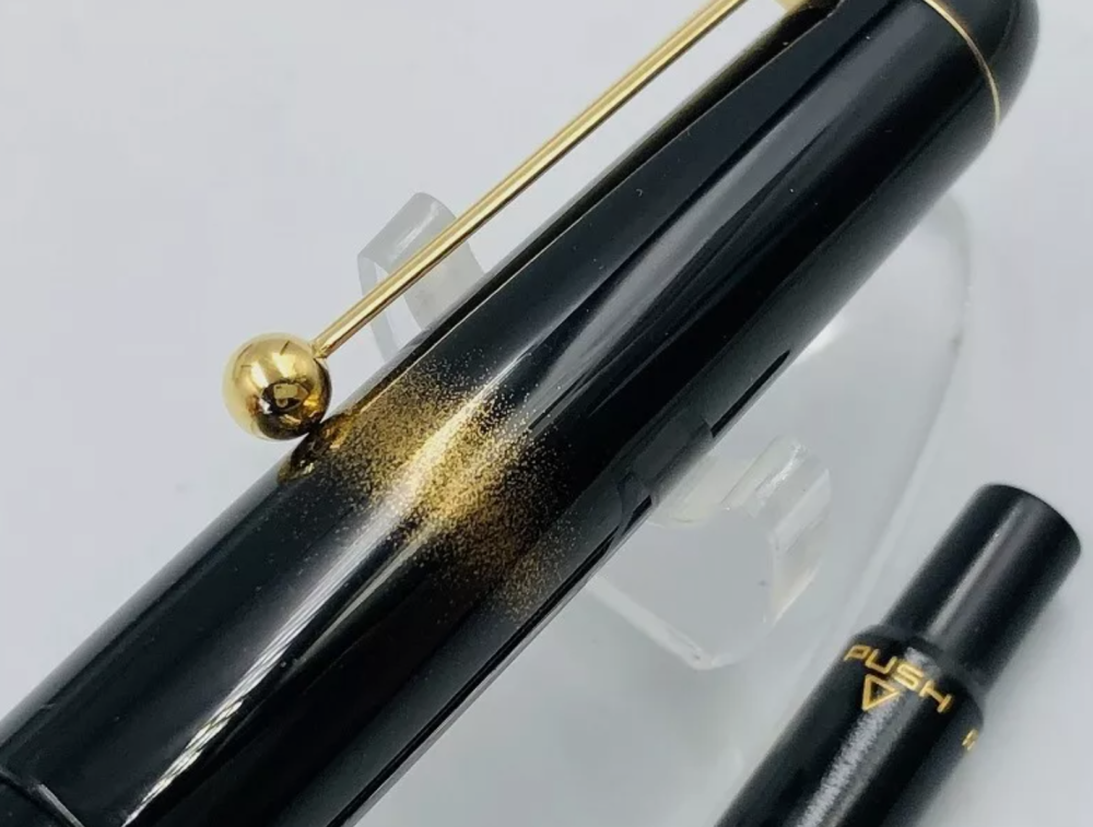
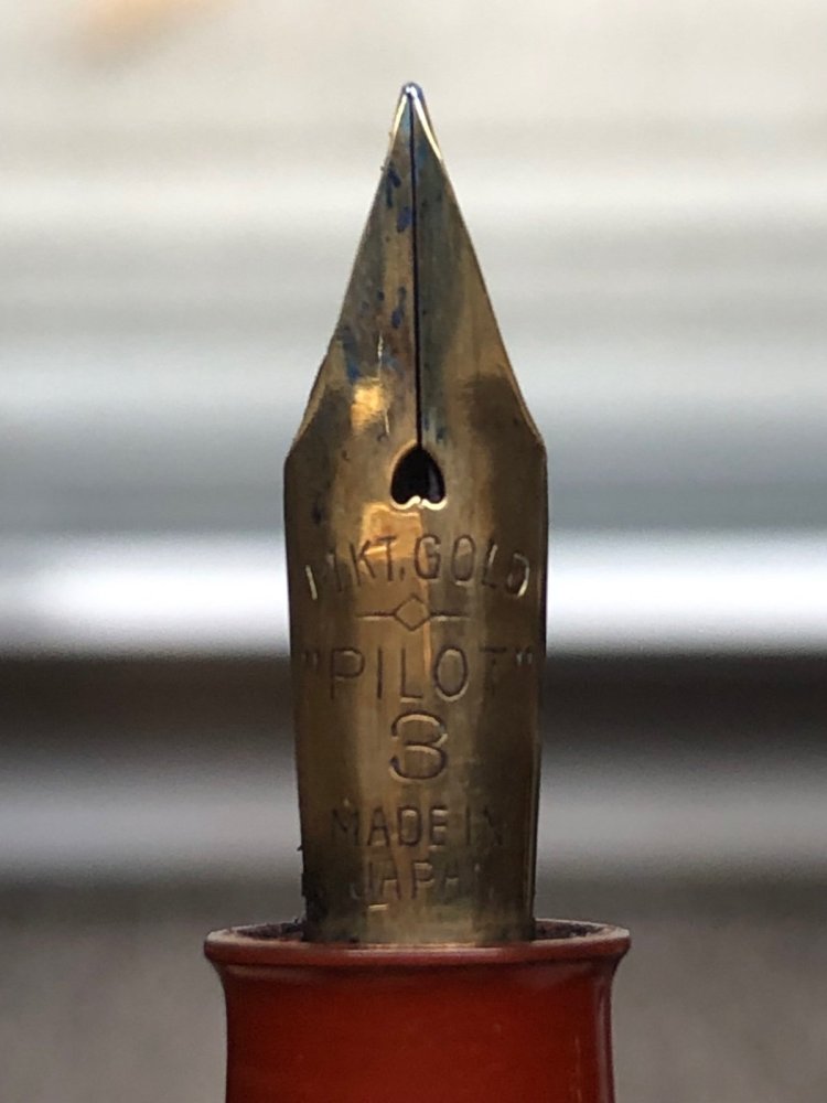
Hello Everyone! I recently purchased this pen, and am eager to learn as much about it as possible. What are the best resources for any information on this pen? I would love to learn as much about its entire history as I am able to. From the artist, to any of the old marketing information or catalog information, or pictures of the original box and papers, etc. etc. I have no idea what I bought or if I got a good deal, I just know I love the look of it and can't wait for it to arrive. As far as I can tell its from the 70's? Thanks!
- 3 replies
-
- pilot
- identification
-
(and 2 more)
Tagged with:
-
Like a few others here, I’ve bought a couple of J800s and admired the quality of this ‘homage’ pen. When I saw several versions of this pen at my favorite AliExpress seller, I hesitated (double the regular price & would it be as nice as it looks?) and then grabbed one as I saw the tiny inventory disappearing—all gone in 48 hours. It arrived today and it’s very well done, as far as I can feel and see. The ‘gold dust’ sprinkling is uniform and the denser areas form a spiral of sorts around cap and barrel, while the little orbs of mother-of-pearl are well distributed across both. I think it’s reasonable to question the technique used to create this effect and others who know lacquer and maki-e techniques may want to weigh in. But it is quite lovely and if I put it among my several other maki-e or raden pens, it wouldn’t stand out as inferior or obviously different—I’ll try taking a photo to demonstrate after I finish this post and feed the dogs 😃 Ive included some photos of the pen and a video of it in my hand, still grubby from the garden when it arrived. It is sold out at the manufacturer and on AliExpress, but you might be able to find it if you’re in China. They are scheduling another maki-e J800 for autumn. On a side note, AliExpress sellers have recently dropped their price for the regular J800, from around $52 USD to as low as $47, a bit higher than comparable self-fillers from Hongdian or Asvine, and I hope others will voice an opinion about whether that premium is worth it. https://share.icloud.com/photos/0b1HBRyTZwraQNGspx7R6cKRw
-
Hi folks I am super new to this hobby. Since I recently completed my first project I would like to post it here and get your eyes on it. Like many of you, I too found the Japanese maki-e fountain pens amazingly beautiful yet very out of my reach price-wise. I had some experience assembling car model kits, so I thought since I already have the spray paint and sandpaper and all that stuff, why not treat a fountain pen just another car model and do some experiments on it? And here's the outcome! Quite honestly, I am pretty happy with the result, although the wood finish I was using doesn't seem super scratch-resistant. Another major issue is that there doesn't seem to be a lot of cheap clip-less fountain pens out there for me to work off. If you folks have any suggestions, please let me know! I bought this one off eBay: Cheers!
-
This is an old pen from the 1990's that is new to me. Condition is outstanding. The workmanship is really beyond. This is a Sailor Long Profit model, likely from the Koshyu Shitsugei series. It is called the 清照 - "Kiyoteru" or "Seiteru". The totally amazing maki-e work was evidently done by Otomaru Koda, the inventor of the choshitsu engraved lacquer technique used on the pen, and a National Treasure. The urushi is composed of many thick layers that is carved down to reveal concentric multi-colored layers. The carving is deep, it can be seen and felt. It is beautiful to say the least. The pen next to the Sailor is a Wancher Dream Pen in midori urushi. IMG_5022 by Ja Ja, on Flickr IMG_5023 by Ja Ja, on Flickr IMG_5026 by Ja Ja, on Flickr Also pictured is my Danitrio with kamakura-bori carving. Compared to the Sailor the carving on the Danitrio is simple. IMG_5025 by Ja Ja, on Flickr IMG_5024 by Ja Ja, on Flickr The nib was made by Nagahara Sr. It is his invention, the naginata-togi with emperor overfeed. The nib is perfect, sublime. Perfect writing with typical feedback. IMG_5036 by Ja Ja, on Flickr Packaging is a Paulowina wood box typical of Japanese craft items. IMG_5031 by Ja Ja, on Flickr
-
Anyone know what this is? There is no branding aside from the nib and the clip is broken off… can’t seem to find any records of a Namiki that looks like this or similar.
-
It's been a while (years in fact) since I've dipped into the fountain pen world but I'm here today with a brief review of a recent purchase from Goulet Pens--the Namiki Yukari Herb Decoration pen with M nib. More details ahead~ First Impressions – The Namiki Yukari Herb Decoration came in a very prettily packaged paper box that cleverly left an "open side" so you don't have to struggle to free the wooden box within: p1 by Jadie, on Flickr p2 by Jadie, on Flickr Inside you have the usual user care guide along with a lifetime warranty card and a Namiki booklet. The foam padding rests perfectly above the cap of the bottled ink. p3 by Jadie, on Flickr Everything is packaged very nicely and wrapped in plastic atop a red velvet base. I appreciate how they plastic-wrapped the ink bottle too in case of unforeseen leaks. p4 by Jadie, on Flickr Here's the pen disassembled. In addition to a free ink cartridge, the Namiki Yukari Herb Decoration comes with a push-button filler, which worked like a charm. More on that below. p6 by Jadie, on Flickr Appearance & Design (9) – If you want the good photos, check out Brian's pics at Gouletpens. Under normal office lighting the pen simply looks "black" with maki-e designs. The raden bits behind the flower/herb bunches glitter very nicely and the designs have a "raised" texture to them, which some might find distracting but which I find wonderful as a tactile sensation. Everything fits very well--there's a velvet lining in the cap so you can post your pen, and the ball-shaped clip holds on firmly to paper when needed. One thing that bothers me is that the maki-e on the body is covered by the pen cap when you close the pen. D: This is a pen that looks great uncapped but that tiny detail bothers me the slightest bit. I keep worrying I'll rub off the design if time goes on... p10 by Jadie, on Flickr Comparisons of the pen capped (above) and uncapped (below). I adjusted brightness on these two photos so you can see where the overlap occurs. p11 by Jadie, on Flickr I'm not sure if this was an intentional design choice, or if the base design of the Yukari made it impossible to harmonize the pen design and the cap, but because of that I give it less than a perfect 10. Construction & Quality (10) – A solid, seamless work. What you see is what you get. The barrel threads are crisp and exceptionally clean (inside barrel threads too!) and the lacquer work is immaculate. It does tend to attract fingerprints; but then again, what urushi doesn't. = u = I love how the clip fits into a slot on the side of the cap so well that it might as well have floated out of urushi. I also appreciate how there's no loose bits of plastic, ebonite, or what have you that I need to brush off, which has been the case in some other pens I've bought. This one looks like it walked right off the presses without a single hair out of place. Weight & Dimensions (8) – The Namiki Yukari, when capped, weighs 33g or the same weight as a capped Visconti Rembrandt, my first fountain pen. I had to return my Visconti because it was too heavy to write with, so I had reservations about the Namiki. Fortunately, it is much more manageable (and shall we say balanced?), and the nib writes effortlessly against the paper with no weight. The brass elements are all hidden beneath the pretty lacquerwork so you only see and feel nice smooth urushi when you write. You can still feel the weight against the web of your hand when you write tho, and that does get noticeable after a while for someone with small hands who loves light pens (18g or less, while the Namiki is 19g uncapped and unfilled). For the sake of something so beautiful, I'm willing to shoulder the burden of longer writing sessions just because it's comfortable to write with. Posting the cap makes it noticeably back heavy, so I think smaller hand writers like me should just write with it unposted. Pretty sure most people will have no issues with this pen's weight, I'm just weak in my fingers. = u = Nib & Performance (9.5) – I bought this pen with one of Namiki's standard medium nib and tested it using Kobe #19 Minatogawa Lime ink. In terms of line thickness I'd say it's a hair thinner than a Western medium you'd find on the likes of Montblanc or other European brands. The nib itself is fairly firm, with the faintest hint of give when pressed on--so I'd classify it as "slightly springy." I'm a light writer, so it takes effort for me to achieve flex on stiff nibs. This one to me feels just right--I don't like nibs that are completely stiff. p9 by Jadie, on Flickr It's also different from other nibs I've tried before (Danitrio, Edison, various Pilots, Aurora). All of them the brands mentioned there are smooth writers, but to different degrees. I've had glass-smooth, stiff Pilots, buttery wet Auroras, and ice-skating Danitrios, but you'll see that I mention the Namiki nib writes like a very fine knife cutting through a very smooth piece of daikon. There's a bit of "noise" as the nib glides over paper, but no scratchiness; it's a weirdly smooth sensation that I've never experienced before and like quite well. This is a nib I'm happy with right out of the box and I think I'll keep it this way, since it has a tactile writing feel I've never felt before. Writing wise it leans towards the slightly wet side--again, not too much and not too little. I have a feeling I'm in Goldilocks and the Three Bears and Namiki keeps being the bed, porridge, and chair that fits just right, haha. It's a thin line to walk, so I'm impressed they've hit all the right corners! The only reason I've given it 9.5 instead of 10 is because I prefer softer nibs, and this one is soundly in the category of "just springy." Don't expect much line variation, but it definitely hasn't skipped! Filling System & Maintenance (10) - The Namiki Yukari came with both a catridge convertor and a Pilot push-button filler, which I've never tried before. Instructions included in the pen package said all it took was ~5 pushes of the nib dipped in ink up to the breather hole to completely fill the pen. I took around 6~7 pumps, probably because my ink bottle was running a little low. But yes, it works like a charm and fills it up quite well! I expect cleaning it will be equally hassle free if it sucks up liquid so well. p7 by Jadie, on Flickr p8 by Jadie, on Flickr All that black stuff in the tube is ink, yes. I made quite some bubbles in the bottle filling it up, but it was a hassle free and enjoyable experience. Cost & Value (10) – I was first enamored by this pen courtesy of Brian's amazing high-res photos back on Goulet and the actual article doesn't disappoint. I ended up buying it for the listed price on their site as well. There are a lot of details (better expressed in Goulet's photos) that my phone camera can't do justice to here in office lighting. Knowing that someone had the patience to hand paint layer after layers of the threads and flower petals on the pen, then stick in pieces of raden individually, really makes me appreciate the craftsmanship and value. p5 by Jadie, on Flickr I will say that I've paid slightly less for a similar, custom-ordered maki-e pen with similar levels of complexity and consider this a fair value for the cost. Of course, I wouldn't mind getting it cheaper, but it's definitely beautiful for what it is. The entire silhouette of the pen speaks of seamless grace. If I had a bigger budget, I would've gone for their Apricot Tree and Warbler too... Conclusion (Final score, 56.5/60) - I like to buy pens I use, so this is going to be part of my daily writers collection as I ease back into using FPs again. I think I'll keep it with the Minatogawa Lime ink because I like the green and it matches the flowers. I really, really like the feel of the nib--that indescribably smoothness that feels crisp without being scratchy, and though I'd prefer it to be lighter I can deal with a bit of weight. Now I'm just repeating myself... Namiki is worth its reputation, and its pens have their own unspeakable charm. It's not anything obvious, but the sum of various subtle, tiny details that add up to make the difference.
- 7 replies
-
- namiki
- namiki yukari
-
(and 1 more)
Tagged with:
-
This is my first Namiki Nippon Art series pen. I like my Pilot Seirei-nuri pen so much I went for the Namiki branded sibling in the Nippon Art Golden Pheasant. This pen is billed as being hira maki-e and is produced, and is signed by the Pilot/Namiki workshop. For the price somehow I doubt this is 100% hand done, but it does not really matter. It is an urushi craft, I like the big beautiful design, and it writes very nicely indeed. The writing experience is very similar to the preternaturally perfect Seirei-nuri but the Namiki comes with a CON-70 converter and a Namiki branded nib. Otherwise, at heart it is essentially identical to the Pilot. FWIW I purchased the pen from Pilot's Amazon listing for a good price and Prime shipping. IMG_1910 by Ja Ja, on Flickr IMG_1907 by Ja Ja, on Flickr IMG_1911 by Ja Ja, on Flickr IMG_1912 by Ja Ja, on Flickr Medium nib writes and unvarying line the first time every time with just slightly more ink flow than is absolutely necessary. Luxury is about getting more than you need and in this case lux is a pen that just writes a beautiful line. IMG_1909 by Ja Ja, on Flickr Felt in the cap for safe posting (?). I don't post urushi pens. IMG_1913 by Ja Ja, on Flickr IMG_1914 by Ja Ja, on Flickr Will see about getting more pens from the series.
-
Urushi Studio India Goldfish pen impressions and comparisons
jandrese posted a topic in India & Subcontinent (Asia)
I collect urushi and maki-e pens some of which are from India. Here is my Urushi Studio India Goldfish pen impressions and comparisons. First, I show below photos of the pen by itself then photos alongside Japanese pens with the same theme. 398CB59A-8CF7-4757-86E2-23AC7032FC21 by Ja Ja, on Flickr DDD9A3DA-A5A4-482E-87B8-EB2F9251CDF4 by Ja Ja, on Flickr 0AB601B8-1C2D-4B71-8201-AAB972792F21 by Ja Ja, on Flickr 2BE10825-8A09-4EE9-AE61-0F210CF727A9 by Ja Ja, on Flickr D0113742-49BC-4DC8-B125-F1D9C168B868 by Ja Ja, on Flickr Overall, the Urushi Studio India pen is an attractive and unique take on the traditional kingyo (goldfish) theme. The blue base color is remarkable for both the seeming obviousness of using blue when the Japanese use black, and for the difficulty of producing blue urushi. The rocks and goldfish are pleasantly raised urushi especially so the goldfish—the technique is subtle reminding one of the shishiai-togidashi maki-e oft used by Japanese artists when painting kingyo. Comparing the work to three examples of kingyo theme pens from Japanese manufacturers provides some informative contrasts. The three Japanese works are a Danitrio Hyotan by Yusai, a Stylo Art pen featuring Wajima-nuri, and a Namiki Emperor by Seiki. In ascending order of retail price the pens are Urushi Studio India, Stylo Art, Danitrio, and Namiki. The Stylo Art pen is priced only about 15% more than the Urushi Studio India pen whereas the Danitrio is ~2-fold the price and the Namiki tops the scales at nearly 10-fold. 1ED931C6-FA40-4F1A-B873-B8AC7EBE52B5 by Ja Ja, on Flickr The base color of all three Japanese pens is black, that is, polished black oil-free urushi (kuro roiro). The polished black base is highly traditional, glossy, and has a preternatural sense of depth. The Danitrio pen makes this finish a feature, which works well with the curvy shape of the pen, showcasing the perfection of the finish. The other two Japanese pens make use of the black surface more as backdrop for subsequent maki-e work. The black contrasts with the colorful maki-e work but being black does so equally for all colors. Black and gold can also combine to look brown-ish or form a stunningly rich contrast. The polished blue of the Indian pen immediately signals a non-traditional approach while the glossiness of the finish advances its quality. It is said that obtaining consistent blue urushi finishes are difficult so those in the know may appreciate some added difficulty in the preparing the base finish. There are, however, spots of inconsistency in color/gloss speed throughout the blue base coat that are apparent on close inspection. The blue color suggests a realistic depiction of an underwater scene although a more naturalistic color scheme would make use muted earth tones. Being opposite on the color wheel from orange the blue base forms a strong color contrast with the colors used on the goldfish. This is simultaneously attractive and sharply obvious. 21646BA8-3343-4208-9435-A29197FC664D by Ja Ja, on Flickr A bed of rocks are key elements on both the Urushi Studio India pen and the Namiki Emperor. On the Namiki the results are splendid with a multilayered, multicolored believably realistic depiction of a rocky bottom interspersed with foliage. Many maki-e techniques are on display including raised and polished work, multiple metal powder gradients, colored urushi, nashiji, and kirigane (inlaid gold foils). The Urushi Studio India pen also uses multi layered maki-e to depict the rocks yet has a comparative lack of details. The rocks are thickly layered rendered in black with a simple gradient of silver metal particles the texture of which can still be felt. The Namiki better integrates foliage amongst the rock and extends the subsurface to the very end of the pen with nashiji whereas the Urushi Studio India pen leaves a tip of blue at the end of the pen. 2A355D6C-A762-4827-8F2D-92AFAD973A7B by Ja Ja, on Flickr All four pens employ depictions of aquatic plants with the Namiki and Danitrio elevating the work to the highest levels. This is especially so on the Namiki but the clever placement of the plants on the Danitrio along with the the thickness of the lines as well as their subtle color shifts indicate high quality workmanship. The plants are more two dimensional on the Stylo Art pen but the shapes and colors are in keeping with the Namiki and Danitrio pens. The Urushi Studio India pen takes some liberties with its depiction of aquatic plants. The centerpiece looks more like a coral than a freshwater species and the overall color scheme is not as cohesive. The plant colors include silver, red, green, pink, and yellow that lack a sense of being clearly freshwater species that live in the same environment. Two of the pens use bubbles to enhance the underwater scene whereas the other two use gold particles. The bubbles on the Danitrio are rendered with raden, which adds to the visual and textural complexity. On the Urushi Studio India pen the bubbles are silver circles. Rendering the bubbles on the Danitrio is both a higher skill and a more time consuming process. On the Stylo Art and Namiki pens gold particles are used to indicate sand, texture, particles suspended in the water column, and light (the Namiki adds silver particles to enhance the sense of light). The maki-e work on these two pens adds a great deal of dimensionality and dynamism to the scene that is lacking on the less complex pens. 5A787263-2B46-4780-836B-A4F92E5238E5 by Ja Ja, on Flickr Now for the main attraction, the goldfish or kingyo. These pens depict Wakin kingyo, which is the most common kind of Japanese goldfish and the one that forms the basis for all the other types. Kingyo traditionally symbolize wealth, prosperity, and abundance. The red and shimmering gold colors of the goldfish are Summer colors as is green and blue. All four pens offer different depictions of the goldfish. Namiki’s is the most complex visually and artistically. The color scheme of the Danitrio goldfish matches that of the Namiki, and the artwork is similarly delicately raised but the overall approach on the Danitrio is less involved. The fish on the Stylo Art and Urushi Studio India pen are similar to each other although the Stylo Art proves the richer and more complex execution. FF8D6A9A-7FBF-4C15-8031-14E482642850 by Ja Ja, on Flickr Focusing just on the Urushi Studio India pen the goldfish are not shiny as they are on the other three pens. At the risk of anthropomorphizing the goldfish the expression is a frown on the Urushi Studio India pen whereas the others have a neutral expression. The scale lines and the lines on the fins are not regular, which affects the flow of the design causing the eye to wander. The Japanese work is typified by precise, regular, and delicate line work. The micro surface of the Urushi Studio India fish is uneven, which contrasts with the smoothly polished surface of the fish on the other pens. Diffuse and gradient gold particles are used on the Japanese pens to give texture and increase the color depth of the fish. The Urushi Studio India pen does not make use of gold particles except on the lines. The delicate flow of the goldfishes fins are rendered splendidly on the Namiki pen followed closely in effect by the Danitrio then the Stylo Art. The Urushi Studio India pen gives a large surface area to the fins, which is in keeping with the Namiki design but lacks the textural complexity and wispy sense of motion imparted by the Namiki and Danitrio depictions. Uniquely, the Stylo Art pen uses raden for the goldfish eyes, which is an inspired choice that elevates the artwork that otherwise lacks some of the complexity shown by the Danitrio and Namiki fish. In summary, Danitrio goes for simplicity and executes to perfection. Namiki uses complexity and executes to perfection. Neither are easy to accomplish. The Stylo Art and Urushi Studio India pens are in between those extremes although in design terms the Stylo Art is most akin to the Namiki whereas the Dantirio and the Urushi Studio India take a similar similar approach. That the Urushi Studio India pen can comfortably sit beside the Japanese works is impressive. Taken on its own, and seen with the eye not an unrelenting macro lens, the Urushi Studio India pen is a vibrant joy to behold. It has all the visual and textural appeal of good raised maki-e. Given time and increased experience no doubt the relative unevenness in design and execution will improve. It is exciting to see the development of new urushi and maki-e artists outside Japan that are creating new works in their own styles using these traditional techniques.- 11 replies
-
- urushi studio india
- urushi
-
(and 5 more)
Tagged with:
-
desaturated.thumb.gif.5cb70ef1e977aa313d11eea3616aba7d.gif)
How-to: Set, or change, personal info that others can see about me
A Smug Dill posted a blog entry in Sus Minervam docet
It helps to explore this yourself, revisiting once in a while if need be, and keep in mind where each of those personal info fields are entered. Don't leave it until the urge to change something specific to come upon you, and only then bother to ask the question! Invest the time surveying upfront, instead of waste it later waiting for an answer from nobody in particular. Most of the fields shown above are self-evident as to what they are. I think the only ones that could do with explanation are: Security and Privacy: There is only one setting under there, and that is a toggle for whether your online status (including ‘last active’ date or time) is visible to others Content View Behavior: That has nothing to do with what others can see about you, but only where you would like to start reading when accessing content Enable status updates: This toggle enables/disables the public feed on your profile page; if you disable it, then nobody (including you) can post publicly visible ‘status updates’ or any other message against your profile, but if you enable it, then anyone — friend, foe, or complete stranger — can post something there whenever, without waiting for you to initiate and then only reply to what you wrote Notification Settings have nothing to do with what others can see about you, and so is out of scope for this article, and I'm not going to delve into those right now. (You can look here, here, and here to wrap your head around how notifications work with respect to followed content.) N.B. There is a possibility that some of the above settings and data fields may not be available to Bronze members and/or Silver members, but I have no way of testing that or scoping it out. — • — Another way of getting to the Edit Profile dialog, and the way to change your profile photo (or ‘avatar’), is here: — • — Freeform, custom member titles that one enters for oneself are long gone, and have not been a thing since FPN came back from a long hiatus and platform upgrade late in 2020.-
- fight club
- salix
-
(and 101 more)
Tagged with:
- fight club
- salix
- parker 51
- jacques herbin
- bleu austral
- bleu de minuit
- graf von faber-castell
- moss green
- olive green
- deep sea green
- gulf blue
- cobalt blue
- midnight blue
- parker urban
- night sky blue
- diamine chocolate
- platinum
- vicoh
- kanazawa
- gold leaf
- maki-e
- kanazawa-haku
- modern maki-e
- slender
- feminine
- snap cap
- penbbs
- chinese ink
- lamy 2000
- aurora
- ottantotto
- aurolide
- rose gold
- 888
- limited edition
- solar system
- planets
- jupiter
- giove
- conway stewart
- cs 58
- duro nib
- 14k
- medium nib
- green
- hatched
- sheaffer
- balance
- statesman
- 14k
- fine nib
- 1930s
- sheaffer
- balance
- statesman
- 14k
- fine nib
- 1930s
- webster gold crown
- webster gold crown
- webster gold crown
- jinhao x159
- feed diameter
- size 8 nib
- my foot!
- pilot
- plumix
- ef nib
- bb nib
- stub nib
- steel nib
- pilot
- plumix
- ef nib
- bb nib
- stub nib
- steel nib
- pilot
- plumix
- ef nib
- bb nib
- stub nib
- steel nib
- space
- stationary
- planets
- rubber
- pencil
- ruler
- vjreviews
- vjreviews
- nibsmith
- dan smith
- italic
- nibsmith
- dan smith
- italic
- lamy z52
- lamy studio lx all black
- aurora ipsilon
- faber-castell essentio
- noodlers aircorp blue black
- aircorp blue black
-
Here is a focus stacked macro of the Platinum Izumo Kurikara-Ken in sumiko taka maki-e. This pen is subtly amazing. The mix of texture and contrasting finishes all in black is super cool. Best seen and felt to understand its intricacies. f2point8 stacked logo by Ja Ja, on Flickr
-
Here in full focus stacked macro glory is the limited edition Taccia Miyabi Imperial Koi. The background is, I think, byakudan-nuri whereas the fish are in rankaku with mother of pearl raden eyes. Usually, koi are not usually represented this large but Taccia made the specific choice to render them this way to good effect. Sailor nib so it writes well. focus stacked logo by Ja Ja, on Flickr focus stacked koi closeup logo by Ja Ja, on Flickr cap logo by Ja Ja, on Flickr
-

Sailor King of Pen Battle of Itsukushima LE pen and box details
jandrese posted a topic in Japan - Asia
This is the incredible Sailor King of Pen Battle of Itsukushima LE in full focus stacked macro glory. The artist is Ikki Moroiki and the total number of pens is 33. The presentation box is also incredible in black lacquer and maki-e. Details of the maki-e on the box are shown below. 8E7EBA7F-D2BE-4748-B5AF-EFB645A9EBC9 by Ja Ja, on Flickr 4FDBB95A-F8C8-4497-8026-D63CF7B90898 by Ja Ja, on Flickr 358CEAD5-FDD5-4C92-9B49-AE9CCEC83717 by Ja Ja, on Flickr- 5 replies
-
- sailor
- king of pen
-
(and 2 more)
Tagged with:
-

Some Japanese pens (and a Montegrappa) with custom maki-e by Morgan Wisser
jandrese posted a topic in Japan - Asia
I shot focus stacked macros of all these pens for Dromgooles. As far as I know they are all still currently available. Good, high relief maki-e by the French craftsman, Morgan Wisser. I have several pens customized by him and have been happy with the work. Let me know what you think or if you have any questions. focus stacked yes logo by Ja Ja, on Flickr focus stacked yes logo by Ja Ja, on Flickr focus stacked yes logo by Ja Ja, on Flickr focus stacked yes logo by Ja Ja, on Flickr turtle side focus stack yes logo by Ja Ja, on Flickr shark side focus stack yes logo by Ja Ja, on Flickr -
Here is my Pilot Maki-e Seirei-nuri pen that I purchased at Itoya in Ginza, Tokyo in full focus-stacked macro glory. I love writing with pen, which is the same form factor as a Namiki Yukari. From my 2019 post on this pen "The nib was expertly adjusted by the resident meister at Itoya and it is freaking perfect. Like, perfect. Just a light touch is needed for generous but far from gushing ink flow. The nib has the faintest hint of feedback without being intrusive. The lady working there is a savant!". Good stuff. pilot seirei nuri focus stacked yes logo by Ja Ja, on Flickr
-
Yesterday, I stopped at my local Danitrio fountain pen dealer and stumbled upon a parade of stratospheric pens. I just had to snap some pictures. Unbelievably, these pens represent but a fraction of the hyper pens available in the same trays. First up is the Genkai style 100 Kids design--it is truly extraordinary. I have several from the same artist but none like this! Next a Kaijin style Ebisu (A god of seven) design by Kogaku Then a Yokuzuna aka kyokuchi style emperor dragon design--indescribable beauty and technical prowess The self described #50 gigantic nib, which looks like custom work.
-
This is the Namiki Yukari Royale Frog in full focus stacked macro glory. Namiki calls this motif Frog. There is more than one frog but more importantly the dynamism and joy of the piece jumps off the pen. Note the different colors of urushi and raden to depict the water. I'd call this pen Happy Frogs. Focus stacked curves up color shift yes logo by Ja Ja, on Flickr frogs focus stacked with logo by Ja Ja, on Flickr
- 4 replies
-
- namiki
- yukari royale
-
(and 3 more)
Tagged with:
-

Danitrio Mikado eyedropper pen leaked-a comparison with a Namiki Emperor
jandrese posted a topic in Japan - Asia
One of my Danitrio Mikado (eyedropper filling model) pens leaked on me at work. That is Noodler’s Navy you see on the section in the first image. I collect Danitrio and this sort of thing happens more often than I care to admit on their eyedropper filling pens. I still collect Danitrio but stopped buying eyedropper models a couple of years ago. At this point I know all the potential ways in which a Danitrio can leak. This one leaked at the junction between the section and the barrel. Naturally, with a leak like this you don’t know it’s happening until you look at your inky hand so that’s nice. There is no obvious reason for the leak, which led me to investigate further. To do so I thought a comparison to a Japanese eyedropping pen that has never leaked on me was in order. Thus, I cleaned out the Namiki Emperor I had with me at work and set about comparing the two pens. What have I learned? 1) That even compared to a Namiki Emperor the Danitrio Mikado is a big pen and looks great. Feels good to hold and to write with and that stub nib is extra nice. Seems to be on par with the Namiki on looks and feel but… 2) The section engineering and machining execution is different between the two pens. The concept is the same—eyedropper with shutoff valve—but the Namiki has some advantages. a. The Namiki threads are finer pitched and better machined inside the barrel and on the section. This can be felt when screwing in the section; there is a smoother feel and less play. b. The threaded portion of the section has a bigger diameter on the Namiki. The overall diameter is 10% greater and but the ratio between the diameter of the grip portion and the threading is also 10% greater on the Namiki. c. The o-ring on the Namiki is more precisely seated, that is, it has no room to move about. d. Both o-rings fit into a slot in the barrel that is flat and smooth before the threads start up. The slot on the Namiki is not as deep. I have a gang of Danitrio pens that fill by eyedropper. One or two have never leaked on me at the section. This pen used to be one of them. The problem is at the level of the o-ring. There is too much potential for the o-ring to move about, get twisted, or otherwise compressed in an uneven fashion. It only takes an infinitesimal gap for ink to leak. Water always finds the path of least resistance. A little side pressure from your grip and the heat from your hand is all it takes to set the leak in action. Part of loving Danitrio seems to be leak mitigation. Changing o-rings has helped in the past on other pens but o-rings that fit are not easy to come by. Danitrio themselves does not seem to have consistently sized, readily available replacement o-rings. That bit about consistently sized o-rings may make more sense knowing that there is more variability between Danitrio pens of the same model than Namiki pens of the same model. I reckon Namiki buys only one size of o-ring that always fits like it is supposed to. I admit that it all is a bit frustrating, but I press on. IMG_8517 by Ja Ja, on Flickr IMG_8529 by Ja Ja, on Flickr IMG_8535 by Ja Ja, on Flickr IMG_8539 by Ja Ja, on Flickr IMG_8541 by Ja Ja, on Flickr IMG_8543 by Ja Ja, on Flickr -
This is the new LE from Sailor, the Bespoke Maki-e King of of Pen Shika to Gekkou or Deer in Moonlight. The artwork is amazing and emotive. Feast your eyes on this focus stacked macro capture of a wonder. Untitled-1 watermarked by Ja Ja, on Flickr
- 22 replies
-
This is my Danitrio Hyotan Special edition Maki-e F-49 Blue Dragon LE. There are only 30 of these pens produced by the artist Yuji. This dragon does, however, appear on another pen, a Mikado model with more involved maki-e that retailed for far more than this pen. Untitled-1 yes logo by Ja Ja, on Flickr closeup yes logo by Ja Ja, on Flickr
-

Danitrio Maki-e Ancient Dragon with Flowers by Kogaku on Hyotan
jandrese posted a topic in Japan - Asia
I've had this pen for awhile. Since it's attractive I thought I'd capture a good picture of it. Danitrio really does tamenuri well and the curvy shape of this pen lets the light play off of the tamenuri. working image full yes logo by Ja Ja, on Flickr -
The Taccia Hyakko-Hisho II collection Sango. The Hyakko-Hisho is a collection of 100 urushi styles, a type of reference work that artists have drawn on since the Edo period. Sango means coral and this pen in kawari-nuri captures the essence of coral. A unique addition to the collection. Fitted with a Sailor Zoom nib. AC7FC6BB-687B-4FAA-A81B-A3EAC71B0CB4 by Ja Ja, on Flickr 233884EA-F18B-4476-B23D-236FA60821C8 by Ja Ja, on Flickr
-
Sailor is pleased to announce a new series of limited edition maki-e fountain pens entitled 'Dobutsu to Gekkou' or 'Animals in the Moonlight.' The first one to crown the series is the Antler Stag. Proud and without fear, he stands in the moonlight. 'Sailor Shika to Gekkou' The round moon is one big spot of mother of pearl dusted with silver powder. The background of the pen is matt and has a slight ishime structure. At first sight, it looks black, but with changing light, it turns dark green. This piece of art is executed in Togidashi Taka Makie by master Ikki Moroiki. Fifty copies for the world. We have a few pens in stock, first come first served. https://www.sakurafountainpengallery.com/en/boutique/detail/sailor-shika-to-gekkou-deer-in-moonlight-sailor-maki-e
-
- sailor
- shikatogekkou
-
(and 3 more)
Tagged with:
-

Dantrio Hakkaku with dragon Maki-e and a 18k #6 size stub nib full macro glory
jandrese posted a topic in Japan - Asia
Here I present the Dantrio Hakkaku with dragon Maki-e and a 18k #6 size stub nib. I don't know anything about this pen other than I bought it in 2017. I've never seen the design on another Danitrio pen. Danitrio does not offer any story or explanation of the artwork. I posted about this pen in the fountain pen review pages back in 2017 but since then I've gained the ability to take good photos so I'm sharing again. Let me know what you think. I could be tricking myself but the tamenuri seems to be changing in a most enjoyable way. The artwork on this pen is rather nice and involved and also makes good use of the space on the pen. _SON4588 by Ja Ja, on Flickr _SON4593 by Ja Ja, on Flickr _SON4597 by Ja Ja, on Flickr _SON4598 by Ja Ja, on Flickr _SON4599 by Ja Ja, on Flickr -

Namiki Limited Edition 2021 Coral Emperor in full macro glory
jandrese posted a topic in Japan - Asia
This is the Namiki Limited Edition 2021 Coral Emperor in full macro glory. Drink it in. This pen is above and beyond in every way possible. _SON4578 by Ja Ja, on Flickr _SON4577 by Ja Ja, on Flickr _SON4580 by Ja Ja, on Flickr _SON4582 by Ja Ja, on Flickr _SON4584 by Ja Ja, on Flickr _SON4583 by Ja Ja, on Flickr _SON4585 by Ja Ja, on Flickr _SON4586 by Ja Ja, on Flickr- 3 replies
-
- namiki
- naimki limited edition 2021
-
(and 3 more)
Tagged with:
-

Namiki Limited Edition 2021 Coral Emperor first look and writing sample
jandrese posted a topic in Japan - Asia
Here is the mighty No. 50 size Namiki Emperor in the 2021 Limited Edition Coral maki-e. Words cannot express the amazingly superlative incredibleness of this pen. I have some pretty awesome macros I can share in a followup post if anybody is interested. IMG_8256 by Ja Ja, on Flickr- 16 replies
-
- namiki
- namiki limited edition
-
(and 4 more)
Tagged with:


