Search the Community
Showing results for tags 'logo'.
-
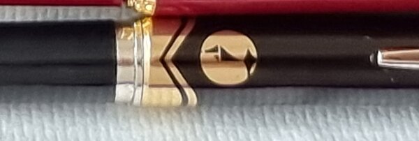
Unkown Logo and Signature that is present on all bodies of this pen
ThePenLover posted a topic in Fountain & Dip Pens - First Stop
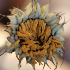
Hey i have a couple of examples of an unknown brand , the logo of which you will see below in all of the examples , also there is a signature of some kind in all the pens of this marking . Any help or ideas would be greatly appreciated ! Thanks ! -
From the album: OldTravelingShoe's Random Pics of Japanese Fountain Pens
© (c) 2022 by OldTravelingShoe. All rights reserved.
- 0 B
- x
-
From the album: OldTravelingShoe's Random Pics of Japanese Fountain Pens
© (c) 2022 by OldTravelingShoe. All rights reserved.
- 0 B
- x
-
From the album: OldTravelingShoe's Random Pics of Japanese Fountain Pens
© (c) 2022 by OldTravelingShoe. All rights reserved.
- 0 B
- x
-
From the album: Stuff by Astronymus
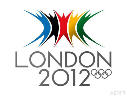
Alternative logo I made for the London 2012 Olympics because everyone hated the original. Was part of a graphics battle in a designer forum.© © astronymus.net
- 0 B
- x
-
Purchased a Lamy 2000 Fountain Pen. As expected there is a Germany 2 stamp on the back of the pocket clip. However, on the side of the pocket clip the Lamy logo was not laser engraved. Instead the letters are raised. Is this an older variant of the logo? A newer one?
- 4 replies
-
- pocket clip
- logo
-
(and 2 more)
Tagged with:
-
Among Montblanc collectors there are different opinions on the origin of the white star logo which was introduced by Montblanc in 1913. Holten/Lund introduce a new theory in their book Montblanc in Denmark 1914-1992 - The Untold Story: "The origin of the star logo has been discussed among pen collectors for many years. Though no solid proof the authors of the book believe it is no coincidence that the Montblanc headquarters from 1908 was situated in the Hamburg borough "STERNSCHANZE". The word "STERN" is "STAR" in English - STERNSCHANZE means STARFORTIFICATION (a fortification with the shape of a STAR)." The old fortification "Sternschanze" was situated only a few hundred meters from the Montblanc headquarters in Bartelstrasse/Schanzenstrasse. Shops and restaurangs used (and still uses) a white star as symbol of the district of Schanzenstern. The old Sternschanze fortification is long gone - today there is a beautifull hotel situated on the place - an old watertower rebuild to Hotel Mövenpick am Wasserthurm. When visiting Hamburg (Traditional Hamburg Penshow Oct. 3rd) I always order a room with a viev to the old Montblanc factory.
- 24 replies
-
- montblanc
- white star
-
(and 3 more)
Tagged with:
-
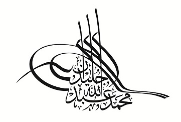
I was born in Dec 1972 in Cairo , Egypt , I have graduated from the faculty of specific Education , communication Branch , Ain Shams University since 1995. I began my discovery of calligraphy, when I heard about ACI ( Arabic Calligraphy Institute ) in Cairo, I decided to join it, I have studied all kind of Arabic Calligraphy art for 6 years. I have awarded a Diploma in Arabic Calligraphy and gilding since 2005, and I gained a Certificate to teach Arabic Calligraphy in Elementary schools. ACI made me really understand the letters,how they are built up and relate to each other I did my best to learn it . I have been fascinated with Arabic calligraphy styles , specially Thuluth style, because it is the most attractive and captivating Style in Arabic Calligraphy , it has a complexed and intertwined lettering , but has a charming view , at the same time. I have learned Styles of Arabic Calligraphy which include Naskh , Reqaa, Kufi,Dewani, Farisi and Thuluth, Each Style has its own characteristics. My love and infatuation with Arabic calligraphy led me to take more steps towards learning the logo design to serve the business sector who may need the Arabic calligraphy art interweaved with logo design. I have designed many Logos for Companies and corporations all over the world. I have a website on Arabic Calligraphy
- 39 replies
-
- arabic calligraphy
- logo design
-
(and 3 more)
Tagged with:
-
Hello there, Recently, I do a lot of pen maintenance mostly on vintage Montblancs. With this I realize the different colorations of some of the Montblanc stars on these pens which range from snow white over somewhat yellow to banana yellow. Here is a picture of a 344, a 252 and a 342 - all in different shades of yellow... These pens are otherwise in excellent condition; however, the discolorations are a bummer. A micro mesh treatment and an intensive polish have not shown any results. Does anyone of you have a suggestion on how to "revive" the original white of the stars? Best Greetings! 4810
-
Dear friends, I bought a fountain pen Visconti HomoSapiens bronze age (oversized) on ebay from a seller who declared the pen as new. When I received it, I noticed that the letter "I" of the logo had a defect (according to the photo). Do you think it's possible that the whole logo will peel? Is it common for these pens to happen?
-
Please Identify German Corporate Logo On Vintage Super Norma Cap
halfhyde posted a topic in Other Brands - Europe
I have a vintage Super Norma 4 color mechanical pencil. On the top of the cap is a German logo. It has some symbols and AG on it. Can anyone help identify this company?- 2 replies
-
- super norma
- fend
-
(and 2 more)
Tagged with:
-
Hello, I am currently assisting in an estate sale of a small collection of fountain pens. I have been able to find information on most of them, but this one eludes me. If anyone knows who this was made by or any other information about it, I would greatly appreciate it. Thank You
-
Hi! I have recently gotten back to using fountain pens after having used them in middle school, where it was mandatory. I find some old lens lying around the house and though i could identify most of them, I have no clue about this one. Please help! Im new to FPN and this is my first post, so if there is some other thread where I should be posting this, please direct me to that. Thanks in advance.
-
I was given a Goldring fountain pen along a couple of years ago with a bunch of other FPs and didn't think too much about it. It looked like a cheap tacky pen that I usually toss to the bottom of a drawer. Anyway, I decided to go through the drawer and clean the pen - it had ink in the cap and all over the section etc. There are no markings on the pen itself. The cap is marked "Goldring" and "W. Germany". The nib is marked "Iridium Point". The pen appears to be a cartridge/converter style pen. It is quite weighty, feeling metal not plastic barrel and cap, but the section is plastic. The finial is a pointed style like a Parker. I noticed a line around the end of the barrel like a piston filler and twisted it with no luck. However, something made me pull on it and voila the end of the pen shot out and inside is what can only be termed a "secret compartment". You will see from the photo there are two raised pieces and an embossed style logo that looks like a fishtail. I can't quite see if it is a fish, whale or a mermaid So my questions are: Why does the pen open? What is the compartment for? Anyone know anything about the Goldring brand? (besides being German) https://c1.staticflickr.com/4/3779/33021607536_7e63581137_o.jpg
-
Hello everyone, I have a 2004 M600 that is otherwise in very good condition, but has unfortunately lost the little black emblem at the end of the cap. In this particular model it is supposed to be the black resin emblem with a golden bird feeding its chick. Of course, there's the option of purchasing a whole replacement cap, but those go for over 100€, and I don't feel like paying 100€ for a tiny bit of plastic. So I ask you, the community. Is it possible to replace the M600's cap emblem with the cap emblem of a smaller model? M200, M400? Do you have spare cap emblems lying around? Do you know of someone that does? Very much appreciated! All the best. - Splotch
-
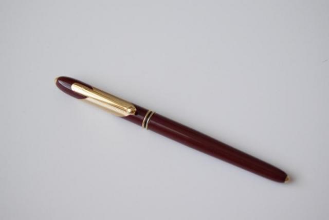
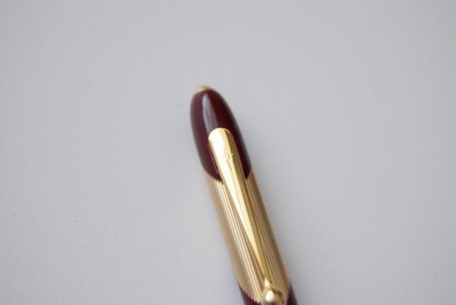
hi everyone, if anyone know which pen is this? It has an engraved symbol on the clip but it is hard to say what the symbol is about. I am appreciated any information you may know or have.Thanks a lot,
- 4 replies
-
- fountain pen
- merlot red
-
(and 8 more)
Tagged with:
-
Help Identifying This Pen Logo, Please.
AleciaButchko posted a topic in It Writes, But It Is Not A Fountain Pen ....
The pen I need help identifying is not a fountain pen. It is a chrome pen with lines running down and is a roller ball. Attached is a picture of the logo that's displayed on the pen, I see nothing else to help me identify it. Has anyone have an idea what logo this is? Thank you in advance! -
This year Lamy is celebrating "50 Years of Lamy Design". They have created several limited edition items and one is the Lamy Notebook and Logo M+ ballpoint gift set. These are already sold out and we have them in stock and available now. Lamy Special Edition Gift Set - Notebook & Logo Ballpoint PensRetail: $25.00
-
Greetings everyone! This is a review I've done of the Lamy Logo in Nut Brown finish. This is my second public pen review, and the first one to be posted here on FPN. I used the FPN review guideline to craft this review and I hope this is up to standard, but by no means is this perfect. Any inputs/corrections will be very much appreciated! The original post can be viewed here (with captioned images): ryanjonathanb.wordpress.com/2015/08/12/pen-review-lamy-logo-nut-brown/ When I entered my local bookstore today, I did not have any planned purchase in my mind. To me, a bookstore is a place you browse, a place to observe and discover; not like a fast food chain where you decide what to buy before you even enter the queue. So yeah, it’s this kind of thinking that made me walk out that bookstore with a brand new fountain pen in hand. It’s unhealthy for the wallet, I know, I know… The Lamy Logo sits above the much more popular Lamy Safari, and was priced accordingly. I got it for Rp.756.000 (that’s Indonesian Rupiah for those of you that may not be familiar) which is about $55 with the current exchange rate. That, as I understand it, is quite some more than it retails elsewhere. Many higher-tier, ‘non-essential’ items (like fountain pens, sadly) are priced higher here in Indonesia, so it’s not a good country for a pen enthusiast to live in, I suppose. For comparison purposes, the cheapest Safari is priced at around $32 here, and the Dialog3 at almost $500(!). I think this might have something to do with the general lack of appreciation for such items; companies may feel the need to rise the price a bit to compensate for the low demand (and pray that such a move would not lower demand even further). Okay, on to the review. Unboxing and first impression My Lamy Logo comes in a matte black angular box. It has a sleek, no-nonsense air about it, as is typical of Lamy. The surface is finished with some kind of rubberized coating, it feels cool and nice to the touch. One good thing about such a finish is that this box cannot pick up fingerprints, unlike other shiny or clear plastic boxes that smudges after a while. It is also quite scratch-resistant. Grease marks still shows though. Open it up and there’s the pen, prettily laying in wait for its new owner. I got the less common ‘Nut Brown’ finish, and I think it looks fantastic. This shade of brown is professional enough to be taken to any serious occassions yet sophisticated enough not to feel bland. There’s also this dark grey finish which is not bad by any means, but I personally prefer the brown. It invokes, if ever so slightly, a warm, fuzzy feel that more industrial colors (think grey and black) just can’t reproduce. The Logo comes with one standard Lamy blue cartridge and the usual booklet thing. It doesn’t come with the converter though, which must be purchased separately. Appearance and design Let’s begin from the end. The tail end of the pen is chrome-finished plastic. At first glance it looks like real metal but upon further inspection (and a few hours scouring pen sites) I believe that that’s not the case. The ridges of the chrome are not flawlessly cut; there are imperfections to it. I can also see a very, very slight mark where the chrome platings, if it were, are supposedly joined. I must apologize for not showing any pictures as proof because my phone camera just cannot capture it, but just by this statement you might hopefully get a picture (no pun intended, really) of how small these flaws are. For me, it doesn’t retract from the overall aesthetics at all. On the cap you can see the Lamy Logo’s Lamy logo of ‘LAMY’… erm, I think I might’ve botched that sentence. Let’s try again. Near the end of the cap we can see the LAMY branding. Now, much (or at least something) has been said of the naming Lamy chooses for this pen. The word ‘Logo’ implies that this pen is representative of the Lamy brand, or something like it. It may be; the Logo is the least expensive that exhibits in full glory Lamy’s Bauhaus design philosophy (see here for an excellent discussion on Lamy design). No fancy colors, no taperings of any kind, no triangular grip section, just a straight, sober cylindrical design through and through. This is the entry level to the world of ‘proper’ Lamy experience. Or it may be that some guy in the Lamy branding department just got lazy and went to randomly flip a dictionary. Whatever is the case, it makes for quite an interesting name. Below is an uncluttered, unadulterated view of the pen. It looks stylish. It feels stylish; at least that’s the impression I got when I first saw and held this pen. Scrutinized bit by bit, there’s nothing particularly eye-catching. But perhaps that’s the point; an understated and unassuming design, confident without being audacious. The clip is fastened securely to the cap, and is spring loaded. This makes for an easy real life usage. One thing about the cap. To my surprise, the top chrome part of the cap wiggles slightly; it’s like the connection between it and the body of the cap is not so solid. Not such that it causes any unconvenience, but enough to make it loses its ‘impeccably built’ air. Might have something to do with the spring loaded mechanism of the clip, or it could be that I happened to chance upon this particular quirky unit (‘flawed’ seems like too condemning a word to describe this). Feel, weight and dimensions The Lamy Logo (center) with a Sheaffer Ferrari 100 (top) and a Faber-Castell BASIC (bottom) The Logo is not a long pen per se, but it is a slim pen. It’s this slimness that contributes to the elongated feel of the pen, especially when posted. The pen weighs 21 grams with the cap, 15 grams without the cap. Lengthwise, it’s 13.5cm with the cap on, 12cm wihout the cap, and 16cm properly posted. So how does this relates to everyday use? For starters, it is light but does not feel cheap. The slender body of the pen compensates for this lack of heft. Yes, it’s small, but it feels sturdy enough not to be mistaken as fragile. No complaints here. Performance & handling The nib. It’s an EF black nib and it’s not the one that comes with the pen. Mine actually came with a regular steel F nib (the usual white one) and it writes smoothly enough. I had it changed to an EF black because of two reasons: One, I intend to use this pen as a fine writer of sorts; to edit texts and write small numbers/equations. An extra fine serves this purpose admirably. Two, I just think it looks cool. The default F nib is good, a bit on the wet side, and runs a little broad. The EF nib (the one you see here) lays down a significantly thinner lines than the F nib. It writes well, if a little scratchy at times. Nothing jaw-dropping. And speaking of the nib… I love the interchangability of the nib. It makes for a good reason to stockpile Lamy nibs of various grade and color. On the other hand, though, this very interchangability kills the fun and anticipation of trying a new Lamy pen (save for perhaps the 2000 and those with gold nibs). If you have ever used a Safari, you have used the Logo. If you have ever used the Al Star, you have used the Logo. It’s not a bad thing, but worth keeping in mind. Some writing with the EF nib. Sheaffer Skrip Turquoise. Moleskine notebook. The Logo is a pen that can be used either posted or unposted without much discernable effect on the overall balance. Posted, it’s not top heavy and gives the user a longer pen to work with. It’s light and quite comfortable for a longer writing session. Unposted, it’s even lighter and allows for faster scratches and nimbler movements, useful for scenarios like back-of-the-envelope calculations. It’s perfectly usable either way but not particularly outstanding. The grip section is ribbed and is in no way slippery. I find it cool to the touch (as it the whole pen) and comfortable to hold. Filling system and maintenance The Lamy Logo takes in a Z26 converter, and is not compatible with the Z24. So bear that in mind when taking converters from Safari, Vista, Al-Star, or Joy; they may or may not fit the Logo. About the converters: since the Z26 fits any Lamy that takes converters, I don’t see why Lamy didn’t just make the Z26 the one and only converter and call it a day. An obscure, but perhaps neccessary, choice by the company, it would seem. In practice, the filling system is nothing to write home about. Unscrew the body, dip the pen, and twist the converter. It’s simple, it’s reliable, and while some may say it’s a bit dull (compared to say, Sheaffer Intrigue), it gets the job done admirably. I have owned these converters for a while (both the Z24 and Z26) and they have never leaked, broke, nor otherwise failed me in any regards. One thing to note though, that the Logo (at least mine) did not come with the converter. I had to buy it separately, and account that as part of the pen’s cost. This lessens the overall value somewhat. Overall value and final thoughts I like my Lamy Logo. For an ‘accidental’ purchase (if there’s ever such a thing), I am happily satisfied. That being said, I did have a specific role assigned to this pen (that is, as more of a quick-jotter kind of pen) and have viewed the pen from this perspective. I do not see it becoming my daily writer, and will not recommend this as such except to those who really favour slim pens. But the fact that I won’t be using it everyday does not mean that this pen is inherently flawed, it’s just a matter of preference. Is this pen worth the asking price? Let’s see. This is not a flagship model that exudes a ‘Look, I own one’ vibe (not unsimilar to a piece of jewelry). Those flagships might be worth it even if it’s never used to write with. The Lamy Logo, on the other hand, is not something that you would brag for owning, and therefore has to make its case on its merits as a writing utensil, and as a writing utensil alone. At about $55, I feel it’s quite pushing it. Some reasons why you might not want the pen: If you are looking for a comfortable long writing session, this is not it, except if you really prefer slim pens. A pen with more girth is usually better in this regard.If you are looking for a portable pen, this is not it. The Logo may be small, but it’s still a full sized pen. Consider pocket pens or those with a capless system.If you are looking for an excellent nib, this is not (or may not be) it. Treat a Lamy pen and a Lamy nib as two distinct products, I’d say.If you are looking for a pen to convert to an eyedropper, this is not it. There are metal parts inside, and considering its thin profile, kind of defeats the purpose in the first place.That being said, however, below are some arguments why one should consider this pen: The spring-loaded clip, which I think is a great selling point. Not every pen, especially those around this price range, has it.The overall design. It’s no-nonsense, it’s understated, it’s a pen a professional would not be ashamed to carry.The finish. I find the brown finish marvelous. I just like it.The fact that this is a medium-level-ish pen. This will not burn a hole in your wallet but is nice enough to outclass entry-level pens.The interchangable nib, though this point is for Lamy pens in general and not specifically for the Logo.But as I said earlier, I like this pen. This is one pen I will enjoy owning in my collection, and that’s all I have to say about this pen. So there you have it. The Lamy Logo fountain pen review, done to the best of my current knowledge and ability. I hope that this is useful. Ryan
-
Need Help In How Can I Find And Install A Small Part For A Montblanc Slimline.
jairosoft posted a topic in Repair Q&A
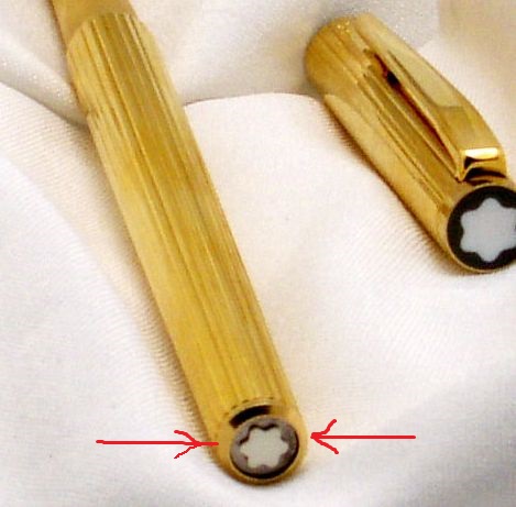
Dear Pen aficionados, I have a pen that is missing a cover [disk shaped, about 1/4" diameter] to the very top of the barrel, what looks like a black and white logo, not unlike the one on the other end but the missing one is somewhat smaller. I am attaching three photos, one a close up where it would go [it took me many attempts to take using an 11x mag lens in front of a smartphone lens], another [which I took from this website from the page showing a similar pen but a rollerball pen with link at https://www.fountainpennetwork.com/forum/topic/69972-montblanc-slimline-noblesse-vintage-rollerball-pen/ ] is a picture of showing how the two ends should look, and I point to the end that has the missing black and white logo disk, and another is a picture of the complete pen showing the two ends with the one barrel end missing the logo. I know the pen a MontBlanc fountain pen, but I don't know the exact model name or model number, but from searching around, the closest match was one being shown and sold at Ulugtekin.com and here is the link at http://www.ulugtekin.com/pen/Ulugtekin%20Montblanc/Vintage/Montblanc-Slimline-Fountain-Pen/Montblanc-Slimline-Fountain-Pen.htm So the piece missing is a plastic disk that fits inside the barrel end, but I am not sure if it comes with a screw or if it is shoved in place. I wasn't able to unscrew the beveled end, and it didn't try disassembly of the barrel to see if the end could be unscrewed. So any clues, suggestions, links, steps to replace the part would be greatly appreciated. Jairo- 2 replies
-
- montblanc
- mont blanc
-
(and 3 more)
Tagged with:
-

Platinum Preppy Logo Complete Removal.....? Has To Be Possible!
stoof2010 posted a topic in Japan - Asia
Ok... So ive seen one other thread on this but no answers really... I have preppys on order for testi.g new inks as well as for my baystate colors and other staining inks. My question is is it possible, without scratching the body, to FULLY remove the logo and all paint from the barrel of the pen? Ice seen people take off the wording but leave the white backround... i did see one video where it shows the last couple rubs and it was perfect and he said he used automotive headlight cleaner... Is that the product they sell to remove the fogginess feom headlight covers?!? I dont see vuying a qhole bottle of that just for a couple cheapo pens... So does ANYONE know another way to do it without acratching the pen? Thanks everyone!!! -
I'm interested in buying many ASA pens, but am hesitant because I've seen photos where the logo and inscriptions on the barrel for some pens take a large amount of visible real estate. It's not a small engraving, like on my vintage Sheaffer. Sometimes the logo takes up a whole side of the pen, like on the Spear, for example. From my perspective, it cheapens the look of a pen. If you look at other famous pen brands, none put such a large logo onto the barrel. Yes, perhaps a logo on the clip. Yes, perhaps an etching on the clutch or cap ring. None as big as on the ASA barrels. I don't want my fountain pens to have the aesthetic of a pharmacy-bought Bic ballpoint, with branding marks all over. On some level, ASA must be aware of this, as the pen photos on the site often hide the etched logo and inscription on the barrel. For ASA owners, do the large logo engravings bother you? Can you request that it not be as prominent? I'm curious, as I otherwise like the look and feel of many of the pens. I've ordered one. Hope that when I get it the logo will not be too visible every time I pick it up.
-
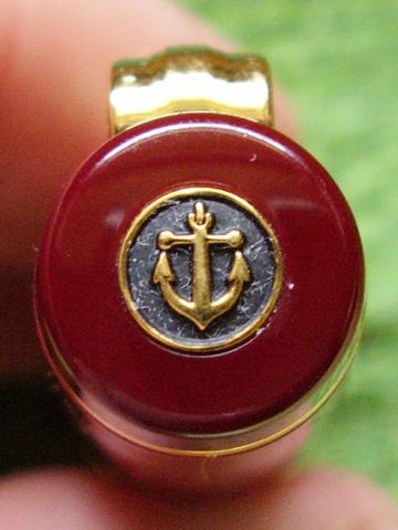
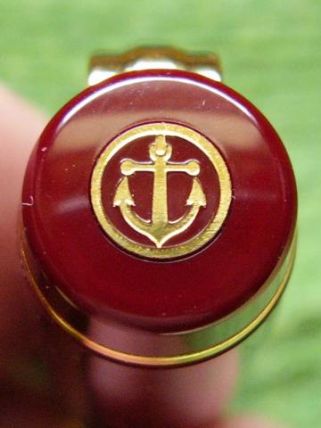
I received a new burgundy Sailor Realo (Professional Gear shape) from a Japanese ebay seller today. All seems as it should be, but for a difference to the anchor logo on top of the cap. The first of the two pictures below is of the anchor logo on the cap of a Sailor Professional Gear Kanreki purchased earlier this year. It is the same style and material (gold-plated brass, per nibs.com) that I've seen on all my other Sailors with cap logos and in pictures. The second picture is of the cap logo of the new Realo. It does seem to be on a little disc cut into the cap top, but otherwise is obviously different than the other logo. It doesn't have the black background that the other logos are set against; more importantly, it is entirely flat. The traditional logo is like an actual little anchor; it has texture and you can see it from the side. The one on the Realo might be painted on. However it is put on, it strikes me as obviously inferior in make and style. I might go as far as to call it kind of cheesy looking. Can anyone confirm this is the new style for the Realos (and Pro Gears)? If it isn't, how suspicious should I be? Again, everything else about the pen (and box/papers) appears to be right. Thanks.
- 8 replies
-
- sailor
- professional gear
-
(and 3 more)
Tagged with:


