Search the Community
Showing results for tags 'lie de the'.
-
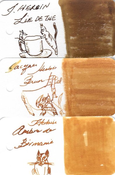
J Herbin Lie de thé Lie in French is the residue, lees or dregs deposited in teapots. I'm hoping our tea drinking members can give us the correct term This ink brings me fond memories. Many years ago, I scrubbed the tea stains of my mother's teapot, thinking it would please her. She wasn't. I'd removed the secret to her great tea, she informed. Lesson learned Ink is a lovely brown shading ink with the most amazing chroma. Dry times are longer than usual but can be mitigated with finer nibs. I enjoyed using this ink for sketching. The ink looks amazing on Iroful paper, it shades from dark gold/ sepia to dark brown. Ink has decent water resistance and lower than average lubrication. Chroma: Writing Samples: d Photo: Comparison: Water test: Left side 10 seconds under running water. I did two by mistake. I thought I post them both, note the difference Art Work: Mousey is trying to read the Cat's fortune in a cup of tea J Herbin Lie de Thé R&K Königsblau Noodler's Lexington Gray Paper is Talens mixed media sketchbook. · Pens used: Pilot F3A (EF/semiflex), Lamy (EF/F/M/B/ Stub 1.1), · What I liked: Colour. Sketching. And wiping the nib in a tissue. · What I did not like: Nothing much. · What some might not like: Long dry times. · Shading: Yes. · Ghosting: Depends on nib/ pen/ nib size. · Bleed through: Same as above. · Flow Rate: Average. · Lubrication: Slightly below average. · Nib Dry-out: Did not notice. · Start-up: Ok · Saturation: Medium. · Shading Potential: Very good. · Sheen: No. · Spread / Feathering / Woolly Line: A bit with wet pens on cheap copy paper. · Nib Creep / “Crud”: Did not notice. · Staining (pen): No. · Clogging: Did not notice. · Cleaning: Easy · Water resistance: Quite good. · Availability: 10/30/ 100 ml bottles, cartridges. Please don't hesitate to share your experience, writing samples or any other comments. The more the merrier
- 40 replies
-
- j herbin
- lie de the
-
(and 1 more)
Tagged with:
-
-
-
- j herbin
- lie de thé
-
(and 1 more)
Tagged with:
-
-
- j herbin
- lie de thé
-
(and 1 more)
Tagged with:
-
-
- j herbin
- lie de thé
-
(and 1 more)
Tagged with:
-
-
- j herbin
- lie de thé
-
(and 1 more)
Tagged with:
-
-
- j herbin
- lie de thé
-
(and 1 more)
Tagged with:
-
-
- j herbin
- lie de thé
-
(and 1 more)
Tagged with:
-
-
- j herbin
- lie de thé
-
(and 1 more)
Tagged with:
-
-
- j herbin
- lie de thé
-
(and 1 more)
Tagged with:
-
-
- jacques herbin
- j herbin
- (and 6 more)
-
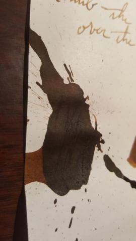
When I started out on my quest for inks that look nice AND have very good water resistance properties, honestly the last ink series I thought I'd be getting were J. Herbin's standard fountain pen inks. I had a very misguided opinion of the line as being too faded looking, low saturation, dull, certainly not water resistant. That's until I accidentally found some reviews that showed water tests of J. Herbin's Lie de Thé. I also realized how interesting of an ink it is. It led me down the path of reanalyzing the whole line of inks, and I almost got a large size of Poussiere de Lune and some other colors. But back to Lie de Thé! I take back what I thought and welcome this ink with open arms to the top of my favorite inks list. The color: It's a very complex sepia color! It keeps shifting between looking more green? or is it more orange? or yellow? As a paper towel drip test below shows (green-gray-brown base, orange and yellow elements over that), this ink has all of those colors, and due to the excellent shading property, all those colors are visible to some extent. But this ink definitely keeps you guessing if you stare at it for a while, influenced also by lighting conditions. Shading: Amazing shading! Not only that, but there's some color variation between different intensity parts of writing. This ink's ability to shade comes through well in all of my pens: from dry writers with wide italic nibs to wet writers with round nibs. Sheen: none, I really tried to make it appear, but it's not there Ink flow: Pretty high flow ink in all of my pens, lubrication is medium, not as high as, say, Organics Studio Walden Pond Blue, which is highly lubricating. Bleed-through: none observed on Fabriano's Bioprima or Clairefontaine paper. A small amount with a wet nib pen on standard [low quality] printer paper Feathering: none on high quality paper, a little bit on cheap paper. Water resistance: another stand-out property of this ink! Some pale color wash off, but what remains is a highly legible and neat gray-green-brown base color. Photographs were made in diffuse natural daylight indoors on a somewhat sunny day. I don't like using my scanner to show inks, as it's not terribly accurate. I can get accurate photographs much more easily with my set-up (paper shown below is Fabriano Bioprima 85g/m2, pale cream color)
-
J. Herbin - Lie de Thé La Société Herbin, Maître Cirier à Paris, was established in 1670. This makes J. Herbin probably the oldest name among European ink makers. Today, Herbin produces a range of beautiful fountain pen and calligraphy inks, writing instruments, gift sets and accessories. Herbin inks are made in France, and the finishing touches on the bottles are still done by hand in Paris. J. Herbin is probably best known for their inks in the "La Perle des Encres" series. In this review, the spotlight shines on one of the stars in this line-up: the gorgeous golden-brown Lie de Thé. This ink immediately grabs the attention with its wonderful colour - a golden brown with yellow-orange undertones. This is a soft brown with tons of character and a tremendous colour range, ranging from a whispy sepia-tone to almost black-brown when fully saturated. The ink looks great on most paper types (Moleskine excepted), and exhibits elegant shading without too much contrast between the light and darker parts. J.Herbin truly scored a winner with this one. The ink has quite satisfactory lubrication, even in drier pens like my Lamy Safari. With wetter pens like my Pelikan Smoky Quartz with B-nib, the ink leaves a very saturated brown line, and loses a bit of its golden qualities. To illustrate the broad colour span of Lie de Thé, I did a swab on Tomoe River paper where I really saturated portions of the paper with ink. This beautifully illustrates the ink's broad colour range. This J. Herbin ink moves effortlessly from a very light sepia to a very dark, almost black brown. On the smudge test - rubbing text with a moist Q-tip cotton swab - the ink behaved perfectly, with only minimal smearing. Water resistance is amazing - the ink effortlessly survived even longer exposures to water. Really well executed! This is also apparent from the lower part of the chromatography, which shows that the grey components of the ink remain on the paper. If you need a water-resistant ink, Lie de Thé certainly fits the bill. This is an ink that will be at home in the workplace. Lie de Thé dries relatively fast on more absorbent papers (5-10 second range), but takes significantly longer on less absorbent paper. On Tomoe River e.g. the drying time is about 25 seconds with my relatively dry Lamy Safari with M-nib. I've tested the ink on a wide variety of paper - from crappy Moleskine to high-end Tomoe River. On each scrap of paper I show you:An ink swab, made with a cotton Q-tip1-2-3 pass swab, to show increasing saturationAn ink scribble made with a Lamy Safari M-nib fountain penThe name of the paper used, written with a Lamy Safari B-nibA small text sample, written with an M-nibDrying times of the ink on the paper (with the M-nib)Lie de Thé looks great on both white and more yellowish paper. I didn't detect any noticeable feathering, not even on the notoriously bad Moleskine paper. With Moleskine paper, there is however significant show-through and bleed-through - not unexpected for this fountain-pen unfriendly paper. Writing with different nib sizesThe picture below shows the effect of nib sizes on the writing. All samples were written with a Lamy Safari, which is typically a dry pen. I also added a visiting pen - my very wet Pelikan M200 Smoky Quartz with a B-nib. Here the ink leaves a very saturated line, which leans towards black-brown, unfortunately taking away some of the golden-brown beauty that appears with less wet pens. Related inksTo compare Lie de Thé with related inks, I use a nine-grid format with the currently reviewed ink at the center. This format shows the name of related inks, a saturation sample, a 1-2-3 swab and a water resistance test - all in a very compact format. I hope that you'll find this way of presenting related inks useful. It's a bit more work, but in my opinion worth the effort for the extra information you gain. Inkxperiment – Autumn VillageAs a personal challenge, I try to create interesting drawings using only the ink I'm reviewing. I find this to be a fun extension of the hobby, and these single-ink drawings often present a real challenge. It also gives you an idea of what the ink is capable of in a more artistic setting. For this abstract autumn village, I got my inspiration from some pics I found on Pinterest. The drawing was done on 200 gsm cold-pressed watercolour paper. To create the different tones in the picture, I used different ink-water ratios (from 1:20 for the really light parts, to 1:2 for the darker parts). The rooftops were done with pure Lie de Thé. The end result gives you a good idea of what Lie de Thé is capable of in a more artistic setting. ConclusionJ. Herbin Lie de Thé is a gorgeous golden-brown ink, that pleasantly surprised me on all fronts: a beautiful colour, great shading, good saturation - and all this even in finer nibs. The ink also has great water resistance, which is a plus if you want to use it in the workplace. This is an ink that deserves a place in anybody's ink collection - recommended! Technical test results on Rhodia N° 16 notepad paper, written with Lamy Safari, M-nib Backside of writing samples on different paper types
- 29 replies
-
- j.herbin
- lie de thé
-
(and 1 more)
Tagged with:
-

Ink Shoot-Out : Pelikan Edelstein Smoky Quartz Vs J. Herbin Lie De Thé
namrehsnoom posted a topic in Ink Comparisons
Ink Shoot-Out : Pelikan Edelstein Smoky Quartz vs J. Herbin Lie de Thé Last year, Pelikan pleasantly surprised me with its Ink of the Year 2017 - Smoky Quartz, and I've been really enjoying this smoky brown liquid. Fellow member Jan2016 then suggested that J. Herbin Lie de Thé is a very similar ink. That of course peaked my interest... so I got me a bottle of Lie de Thé and decided to pitch both inks against each other. Time to do a detailed comparison, and find out which of these is the better ink. Enter... the Ink Shoot-Out. A brutal fight spanning five rounds, where truly formidable inks do battle to determine who is the winner. And this time it's really a battle of giants! In the left corner - the new star from Hanover and Prussian heavyweight : Pelikan Edelstein Smoky Quartz. In the right corner, the crown jewel of Paris and offspring from a long line of giants : J. Herbin Lie de Thé. The boxing hall is packed to the roof, the crowds are cheering! Let the fight begin and may the best ink win... Round 1 First Impressions These are indeed heavyweights with a firm impression on the paper. Both inks leave a well-saturated line with excellent contrast to the page when used with my Lamy Safari M-nib on Rhodia N°16 notepad paper. Both inks also show subtle shading, without too much contrast between the light and darker parts, which I find aesthetically pleasing. The inks look quite similar, but there are some differences: Lie de Thé is a lighter brown, with more yellow undertones. This also shows in the chromatography of the inks. This lighter nature of Lie de Thé is most obvious in swatches, less so in written text.Lie de Thé lays down a wetter line. Smoky Quartz in contrast is a drier ink, but a really well lubricated one. With broader nibs, e.g. with the scribbles made with a 1.5 mm calligraphy nib, Smoky Quartz shows a bit more character, with a more pleasing appearance.Both inks make a great first impression. But when they climbed into the ring, the German champion radiated more confidence. I prefer its slightly darker hue, and the fact that it shows more character with the calligraphy nib. These inks are well matched, but for this round Smoky Quartz gets a small advantage from the judge. The chromatography clearly shows that both inks have lots in common. They have a really similar composition, with only a touch more yellow in the French ink's mix of dyes. Round 2 Writing Sample The writing sample was done on Rhodia N°16 Notepad with 80 gsm paper. Both inks behaved flawlessly, with no feathering and no show-through or bleed-through. With the EF nib, the darker complexion of Smoky Quartz comes into play, resulting in more contrast-rich writing. I also noticed that Smoky Quartz leaves a crisper line on the page, especially when using broader nibs. My guess is that this is due to the really pronounced initial wetness of Lie de Thé, which results in a slightly less well-defined line. Colourwise both inks look similar in writing, although there is definitely more of a yellow undertone in the J. Herbin ink. Both inks also shade nicely, without too much contrast between light and dark parts. This aesthetically pleasing shading gives more character to your writing. For this round, the focus is on writing, and here Smoky Quartz got a slight advantage. It works better with EF nibs, and also shows a crisper line. Not much of an advantage, but enough to result in a win on points. Round 3 Pen on Paper This round allows the batlling inks to show how they behave on a range of fine writing papers. From top to bottom, we have : FantasticPaper, Life Noble, Tomoe River and Original Crown Mill cotton paper. All scribbling and writing was done with a Lamy Safari M-nib. Both champions did well, with no show-through nor bleed-through. But this round is not about technicalities, it is about aesthetics and beauty. Are the fighters able to make the paper shine ? One thing is immediately apparent: these inks are at home on a wide range of papers, both white and off-white ones. On more absorbent paper like Fantasticpaper (top), the inks look really similar. With Tomoe River - definitely a non-absorbent paper - Lie de Thé shows its lighter nature. But it also lays down a less crisp line, making it look less interesting and losing some of its beauty. Both inks are on par with each other, but Smoky Quartz has a slight advantage in the looks department - it shows a more consistent look across the range of papers. For this round, victory is granted to Smoky Quartz. Not a knock-out, but definitely a win on points. Round 4 Ink Properties These inks are not fast-drying, requiring 20-25 seconds to dry completely (with an M-nib on Rhodia paper). Lie de Thé takes a bit more time to dry. Both inks are reasonably smudge-resistant. Some colour rubs off when using a moist Q-tip cotton swab, but the text itself remains crisp and clear. Being the lighter ink, the smudging is less pronounced with Lie de Thé. To test water resistance, I dripped water on the grid and let it sit there for 15 minutes, after which I removed the water with a paper towel. Both inks are remarkably water-resistant! The brown colour disappears, but a clearly readable dark-grey residue remains even after a 15 minute soak. Really impressive. For this round, both champions were well-matched, but Lie de Thé gets a small advantage for its less pronounced smudging. Round 5 The Fun Factor Welcome to the final round. Here I give you a purely personal impression of both inks, where I judge which of them I like most when doing some fun stuff like doodling and drawing. Both inks do well, and allow for some nice effects when using a water brush. I really enjoyed using them. With both inks, you can coax a broad colour range out of them. Dilute them with water, and you get the yellowish hues used for the background. Really saturate them, and you get a very similar looking dark brown. The foliage in the picture shows the undiluted colour, where Lie de Thé is obviously the lighter coloured ink. But overall, both champions did equally well, and no clear winner emerges. So for this round, I call it a draw - I greatly enjoyed playing with both of them. The Verdict Both inks are real jewels, that work on all types of paper. And being water-resistant, they make fine inks for use at work in an EDC pen. Is there a clear and definite winner? No. But the German champion did show a bit more promise : better contrast with EF nibs, and overall a crisper line on non-absorbent paper. Small advantages, but enough for this judge to declare Pelikan Edelstein Smoky Quartz the winner of this fight.- 20 replies
-
- pelikan
- smoky quartz
-
(and 3 more)
Tagged with:
-
- 9 replies
-
- j herbin
- lie de the
-
(and 3 more)
Tagged with:
-
Here's my review of Lie de Thé (alt + 0233 = é) A dark, oxidized tea stain brown. I ordered a 30ml bottle of this when I also ordered a sample of Pelikan Edelstein Smoky Quartz. I asked about 20 different people at work if they could notice the difference between the two. They could not. I really wish I'd ordered the largest bottle of this. As soon as I'm low, I'll definitely order the largest bottle of this I can. Honestly, I really liked Pelikan smoky quartz. But they have their heads so far up their own bums that the $30 for 50ml (Honestly I don't even think my bottles of pilot iroshizuku are worth $30/bottle, even with the nigh-perfect bottle) just blew my mind. I bought a sample of it and a 30ml BOTTLE of Lie de Thé for $8. And when you are putting it down in as fine a line as anything, even a 1.1 italic does, you can't clearly tell a difference, the value proposition of smoky quartz just fell through the floor. Enter the new champion. Lie de Thé. I adore brown inks. They feel arcane. Simple. Valuable. In the pictures are a Lamy F, B, and 1.1 stub. But this ink just oozes simple beauty. it shades heavily. No water resistance. It just does the one thing it aims to do, emulate the feeling of writing a letter to someone in Victorian times. The ink is just so gorgeous. It shades heavily. No sheen. It works well on garbage paper without much feathering or any drama. Flow is on the wet side of neutral (no noodlers dark matter) and is simply happy to flow in every single pen I try it in (shown are Lamy F, B, and 1.1 stub) No real feathering or bleed on bad paper. Mild water resistance. You will be able to see shadows of the writing, but nothing serious. If you are interested in smoky quartz, in the wettest pens, it will have a TAD more black or grey vs this. But to be frank, try a 30ml bottle of Lie de Thé. If you like it, get a bottle of smoky quartz. Lie de Thé is one of the greatest values in brown inks ever made. I love brown, and this is a staple in my collection. As long as I have Lie de Thé, I don't need to spend such an absurd amount on Pelikan's bizarrely overpriced special editions. I really wish ink makers would realize that ink is not the product that should be sold for such a premium.
- 21 replies
-
- j. herbin
- lie de the
-
(and 1 more)
Tagged with:
-
J HERBIN’S LIE DE THE J HERBIN’S LIE DE THE. Bottled ink. Bought from Pen’s Avenue. 30 ml 695 Rs. A good source for imported inks in India. No affiliations, happy customer. The review goes like this. The bottle is simple. Square base, low height. Stable bottom. Less chance to get spill over. Convenient on busy tables. The slot for keeping a pen,a nice thought. INTRODUCTION Well, I find that all J Herbin’s inks are based on a theme. Here the theme ( I believe) is coffee mug. There are some similarities between coffee and this ink – both are ADDICTIVE!. Addictive by COLOR, addictive by SHADING. COLOR Probably the nicest brown I have seen. I am not saying that Ancient Copper is bad.But unlike Ancient Copper, there is no crusting seen on nibs, so this naturally becomes my favorite brown. SHADING See the beautiful shading especially with broader nibs. COLOR ANALYSIS This is the swab to analyse. The color is an Orange on darker side. Consists of more Red, least Blue and Green in between. A simple chromatography shows that ink is made of 3 dye components, one Black, one Orange and probably one Yellow also. Diluted with water From Left to Right Lesser concentration of ink shows yellowish shade, as the concentration increases it becomes more darkish and coffee like. COLOR ON PAPER FINE NIB ( Notice shading) MEDIUM NIB. BROAD NIB. PROPERTIES IN PEN. This is a reasonably saturated ink having good lubricating properties. The flow may be some where in between that of well flowing inks and moderately flowing inks. Compared to Chelpark Crimson Violet which itself is a well flowing but lesser saturated ink. Same paper, same italic nib, same pen – I find the JH- LDT is a tad thinner on paper. But easy on hands, though saturated, it’s more lubricated. Camlin Trinity, Fine nib. Lamy safari, medium nib. KIM, Medium CI nib. No staining on the White Lamy I am using, No nib creeps. Worked well with a variety of Indian eyedroppers, Pilot Capless, Platinum balance, Heros, Pelikan m 200. No issue happened in a single pen. PROPERTIES ON PAPER SHADING PROBABLY THE MOST IMPORTANT PROPERTY OF THIS INK. Shades beautifully on papers. DRYING Reasonably fast drying. No complaints here. FEATHERING No practical feathering. This is a magnified image. Ink has with stood many cheap A4 and cheaper papers. BLEEDING I have to say that bleeding is seen to an extend ( called as ghosting?) in even Jk Excel Bond paper, which is supposed to be a good paper. This may be the only real negative property associated with this ink. WATER RESISTANCE Sample shown under flowing water for 10 seconds with in one hour after writing. Sample just wetted with one drop of water with in one hour after writing. The ink can not be called as water resistant. Though all components are not washed off, especially the dark dye component. Thanks SK.
- 35 replies
-
- j herbin
- lie de the
-
(and 1 more)
Tagged with:
-
I'd been meanining to write about this for some time, it won't be a revelation to anyone, but I was prompted into action by a recent and great review of Ama -Iro. This isn't a deep comparison of inks, I just want to deal with the topic of colour contrast. When I got this ink I though "oh dear", I felt I'd made a mistake, which is easy to do when you buy on the Internet, without the possibility of seeing the ink in person. But then a funny thing happened, this ink has grown on me, I really like it now, although nothing has really changed, except while writing I happen to use it next to Kon Peki, which was another "I'm not sure I like this" ink: to me they look really good size by side, they seem to bring out the best in each other, as well as next to other specific inks. So the lesson is to take into account the context of the ink, which includes the light, as well as the paper and the other inks you use it with. Kon-Peki looks a lot closer to Ama-Iro with a broader nib, in this case going from a lamy F to an M, so much so I would find it hard to use both at the same time.
-
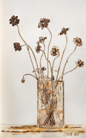
Lie de Thé is one ink I was sure I was going to love. Like this ink will be forever married to my favorite pen kind of love. It didn't turn out that way. While Lie de Thé has great sketch behaviors (it washes well with an interesting color shift and leaves a sturdy, sepia line), it is a bit too saturated to be an solo act. It takes over the image. You see the color first, then the art. I think I'll try diluting it and see if that helps things. As is, it's not quite what I'm after. Unfortunately, I find Lie de Thé to be downright ugly as a writing ink, but that is very subjective. Many, many people love this color, so you be the judge. Written review on Rhodia Dotpad no. 16. Chocolate Cosmos sketch was done with Lie de Thé in a Stillman and Birn Gamma series book. The spectacular orange of the wash is dulled considerably by the compression on this forum's uploader, so you'll have to take my word for it. Care was taken to ensure color accuracy.
- 14 replies
-
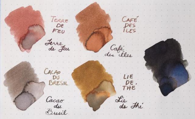
I thought it would be interesting to compare the four Herbin browns. Top is Rhodia dotpad; bottom is Strathmore watercolor paper. Terre de Feu and Cacao du Bresil are two of the best sketching inks I've found. Lie de Thé is a gorgeous drawing ink that washes into a bold orange and sepia, but I never draw with it because it is such an ugly color to write with. I haven't found much use for Café des Îles. I considered including Ambre de Birmanie (one of my new favorites), but I consider it a yellow. Parker Quink Black (really a dark, dark blue) on the far right was added because Cacao du Bresil reads grey among the other browns. Anyone have a favorite? Hate them all? Prefer something else similar?

