Search the Community
Showing results for tags 'lacquer'.
-
Hi, I've put into one article some information how to start with urushi on fountain pens. - tools you will need (from surface to brushes and abrasives) - materials, types of lacquer - basic practice advice - "recipe" for basic tamenuri https://tamenuri.com/how-to-start-with-urushi/ I hope you will find it useful. Right now due to COVID it may be tricky to order some of these products. In Europe all of them are available at DICTUM. Japanese shops (Watanabe Shoten, Kato Kohei) will not deliver right now to most destinations (Japan Post suspended deliveries).
- 13 replies
-
- urushi
- urushi diy
-
(and 2 more)
Tagged with:
-
Pilot Lady - Lacquer Over Metal (1970s) 004.jpg
OldTravelingShoe posted a gallery image in FPN Image Albums
From the album: OldTravelingShoe's Random Pics of Japanese Fountain Pens
© (c) 2023 OldTravelingShoe. All rights reserved.
- 0 B
- x
-

Pilot Lady - Lacquer Over Metal (1970s) 002.jpg
OldTravelingShoe posted a gallery image in FPN Image Albums
From the album: OldTravelingShoe's Random Pics of Japanese Fountain Pens
© (c) 2023 OldTravelingShoe. All rights reserved.
- 0 B
- x
-

Pilot Lady - Lacquer Over Metal (1970s) 003.jpg
OldTravelingShoe posted a gallery image in FPN Image Albums
From the album: OldTravelingShoe's Random Pics of Japanese Fountain Pens
© (c) 2023 OldTravelingShoe. All rights reserved.
- 0 B
- x
-

Platinum Bonito + Pilot Lady (1970s) 001 OVERVIEW.jpg
OldTravelingShoe posted a gallery image in FPN Image Albums
From the album: OldTravelingShoe's Random Pics of Japanese Fountain Pens
© (c) 2023 OldTravelingShoe. All rights reserved.
- 0 B
- x
-
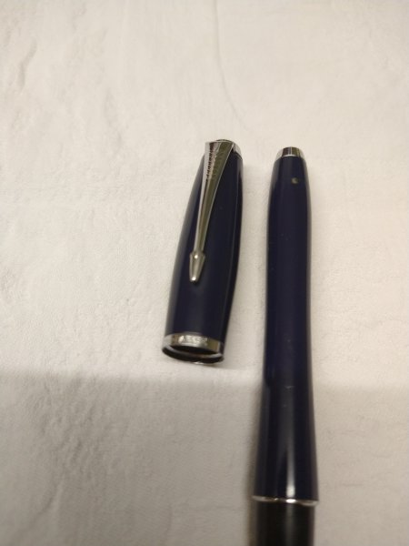
A Warning to be careful with Lacquered pens I own a few pens that have lacquered finishes. The first lacquered pen that I bought is a Parker Urban, in the ‘Navy Blue’ finish with chrome trim. I bought it in 2013, and I always used to post the cap on the end of the pen whenever I wrote with it. Being slightly-obsessive about having things arranged ‘just-so’, I always posted the cap so that its clip was aligned with the centre of the pen’s nib. This habit is actually useful if one’s pen has a hooded nib, like a Parker “51”. Aligning the clip of the posted cap with the nib of a “51” means that one always has an obvious visual indication of the position of that pen’s nib. Anyway, back in 2021 I was about to post the cap of my Navy Blue Urban when I noticed this: It is a small scuff in the lacquer, through which one can now see the brass of the pen’s body. OK, it is only small, and is hardly ‘the end of the world’. But it made me realise that lacquer (on this pen at least) is not as durable as I had assumed that it would be. Now, it may be that this lacquer on this pen is, for whatever reason, less durable than the lacquer on other pens. Or it may well be the case that I am especially ham-fisted, or clumsy in the way in which I post the cap on this pen, but… If you are, as I am, a person who would find a small scuff mark like this one to be disappointing, I advise you to take care when posting the cap on any lacquered pens that you own. I no longer post the caps on the few I own that have lacquered finishes. Slàinte, M.
- 8 replies
-
- lacquer
- lacquered pens
-
(and 3 more)
Tagged with:
-

Parker Urban in ‘Navy Blue’ lacquer - scuff mark where lacquer has been worn away by ‘posting’ the cap.jpeg
Mercian posted a gallery image in FPN Image Albums
From the album: Mercian’s pens
In case anyone is interested, I took (& have uploaded) this photo to show where I have worn away a small part of the lacquer on this pen’s barrel by ‘posting’ its cap. I bought this pen in 2013, and I always used to ‘post’ the cap on the back of the pen while writing with it. In 2022 I discovered this small scuff-mark, where the lacquer has worn away, and through which the brass of the pen’s body can now be seen. I am fairly sure that ‘posting’ the pen is what has caused the scuff-mark, because it is exactly in-line with the clip of the pen when I post it - and because I always ‘post’ the cap in exactly the same way, so that the clip aligns with the pen’s nib. Since I found this small scuff-mark I no longer ‘post’ the nib on this pen, or on any of the other lacquered pens that I own.
- 0 B
- x
-
- parker urban
- parker
-
(and 4 more)
Tagged with:
-

News from Chinese lacquer workshop to pen lovers all over the world
Zhizhai_Lacquer posted a topic in China, Korea and Others (Far East, Asia)
Hello, We are writing to inform you of the service of our Chinese lacquer workshop. Our workshop named "Zhizhai". Our lacquer workshop in Guangdong that introduces traditional Chinese lacquer techniques. At the end of this year, we plan to have a fun project for fountain pen lovers. We are professional lacquer ware craftsmen. Our main works are lacquer ware and furniture, interiors of hotels and luxury cars. From time to time, at the request of a friend, I apply natural lacquer to their private fountain pen. We don't know how to use this site at all. Should I write in this comment section if I have an event for this fountain pen lover? If you know how to effectively inform us of an event, please let us know. We started Instagram with the help of Japanese friends because of internet regulations in China. Because Chinese lacquer techniques are little known in the world. In the future, we will post many rare Chinese traditional patterns on Instagram. And although they are mainly samples of authentic lacquer ware, we can express the pattern with a fountain pen. This is our Instagram account. @zhizhai_lacquer This is our website. We have prepared a basic knowledge page for real lacquer. Chinese lacquer culture uses so many colors, all of which are real lacquer. https://www.zhizhai.shop/ We look forward to your support and advice. Thank you very much for your interest in lacquer culture. Zhizhai Xiao Guan -
Hi, A story is quite typical for me. I get interested in something, the idea "cooks" for some time, and then blow and burns. And get another PhD in something, be it building a car, making DYI cosmetics, grinding nibs, and most recently - URUSHI. Instead of writing to much, I'll show some pictures. Below I'll try to explain what is it all about. My journey is being documented on my Instagram account : https://www.instagram.com/tamenuri_boru/ http://gakko.pl/piora/1.jpeg http://gakko.pl/piora/2.jpeg http://gakko.pl/piora/10.jpeghttp://gakko.pl/piora/11.jpeghttp://gakko.pl/piora/12.jpeg http://gakko.pl/piora/15.jpeghttp://gakko.pl/piora/24.jpeghttp://gakko.pl/piora/25.jpeghttp://gakko.pl/piora/8.jpeghttp://gakko.pl/piora/8.jpeghttp://gakko.pl/piora/7.jpeghttp://gakko.pl/piora/6.jpeghttp://gakko.pl/piora/3.jpeg
-
Do-It-Yourself Lacquer Work - Best Options For Faux Urushi?
spaceink posted a topic in Pen Turning and Making
I recently fixed a crack in the cap of a Parker Big Red, but the repair work has left a rather unsightly blemish on it. I've been an admirer of Japanese lacquer work and am thinking of using that pen to do a DIY faux Urushi pen similar to the methods used here with Edison's project: http://edisonpen.com...pearl-project-2 In no way do I want to use actual Urushi, owing to its toxicity and price. My questions: 1) What kind of lacquer should I use? Or would it be easier to use enamel paint, like the ones by Testor's? 2) If I use lacquer, what's an inexpensive way to color it? Would using wood stains work? 3) How much time to let each layer cure? 4) What's a good hardener or thickener to create the random-seeming patterns like in the Edison project? Or should I just let the lacquer thicken over time? 5) What grades of grit are best to get for this? Thanks in advance for your guidance. -
S. T. Dupont D Line Black Laquer And Gold. An Elegant And Austere Pen
columela posted a topic in Fountain Pen Reviews
First Impressions (9/10) I came to own this pen as a result of an unintended visit to a jeweller´s shop during a short holiday visiting my in-laws. We went to this shop to buy a silver picture frame as a present for my mother in law, but as they also sell some pens and watches I was wondering around while my dear Mrs. went around her business. They largely sell Montblancs , a few Montegrappas and half hidden behind some golden lighters was this beautiful gem. As I showed some interest the shopkeeper was very kind to take it out of the display cabinet and put it in my hand. I initially thought " why should I want another black bird ? " But they were so kind to let me try it and the nib experience was soo god that I was thrilled . Fortunately my wife came back to us, having finished her purchases and looking at me playing with the pen she decided to buy it for me as a present for our still distant wedding anniversary. And that is how I came to own this beauty of a pen. Appearance(10/10) The box which contained the pen was well made, but without any ostentatious or peculiar features. This just a stunningly elegant, understated and classy pen. The black lacquer is just perfect, and the gold trims are very becoming. The shape of the pen is a variation of the cigar and flat top classic pen shapes, with a very stylized twist. The clip is also good, with the classic S T Dupont rhomboid logo on top of the clip. The gold ring at the body before the section just says ST Dupont PARIS. The finial has a capital D as a major feature Design/Size/Weight (9/10) On the hand the pen is very comfortable if unposted, as when it is posted it tends to go out of the centre of gravity so it becomes more difficult to control. Otherwise it is quite a light and pleasant pen on the hand. Length capped: 146 mm Length uncapped:134 mm Length posted:166 mm Weight: 48 g Nib (10/10) The best part of this pen is the nib experience. This is an EF 18 k gold nib. It is a true EF but it is juicy and slides gracefully on the pen without the slightest feedback or scratchiness. It was the nib that sold this pen to me, and it is one of my best nibs without a doubt. Filling System (8/10) This pen comes with a standard cartidge-converter system. It works well, but it is a bit of a disappointment in such an expensive pen to have this limited ink capacity. On the other hand , it takes large international cartidges. Cost and Value (9/10) For the price my wife paid, I am very satisfied with what I have got. However, this pen was bought in a sale in a tax-free area, so the normal price would have been double. I doubt that I would have let her bought the pen Conclusion (9.3/10) I am very happy with this pen particularly thanks to the excellent nib performance. Otherwise it is a beautiful and classy pen, perhaps lacking a bit of emotion or a “je ne sais quoi” factor to make it really unique. -
I have replicated the content in my blog. Happy reading ! Below is a link to the same: Rhymes of the Parker Sonnet It is often said that the Parker Sonnet, was originally designed to succeed the elegant simplicity of Parker 75 pens. The 75-series had already run successfully for over two decades. With a classical yet distinctive Arrow clip, the Sonnets were to carry this legacy through the millennial year and beyond. Geoff Hollington, a London based designer was tasked to make the sonnet rhyme and in due course of time he came up with eighteen different designs for Mark 1 Sonnets, which were successfully released in 1994. You can find a detailed bible on anything and everything about Parker here. THE LAQUE FIREDANCE My Dad had got the lacquer firedance fountain pen back in 1996-97. It was during my schooling years when I had a Camlin Sleek and a Flair Success (a pelikan lookalike) as my grail fountain pens. Those days, it was somewhat mandated (though not strictly) to use fountain pens in government schools, while gel pens had just begun their proliferation, among the private ones. Needless to say, my greedy eyes were fixed on the laque firedance (and a Camlin Premier) from the moment I laid my eyes on the pen. I never knew for years, that it had a gold nib, which was why I was not allowed to carry it to school. Luxor India still sells this pen in its online shop, at a price close to $ 100, as I write this review. DESIGN (5/6) The firedance has a mottled lacquer pattern in dark red and black with sparking golden trims. It’s Mark I and a part of the first eighteen sonnets released in 1994, with a distinctive golden arrow clip. A golden dazzle preludes the sonnet from the finial end running along the arrow shaped clip before converging with the marbled arabesques of red and black, with the final shimmer from a minimal cap-band. The clip starts with an arrow head before transforming into a slender shaft towards the broader vanes, ending up with the finial rings. Some of the Mark II Sonnets released in 1998 came up with a much broader cap band, which can go well or worse given your taste. http://i1302.photobucket.com/albums/ag127/soniknitr/Sonnet/DSC_3637_zpsea4wqph5.jpg On pulling the cap off (yes it’s a snap-on cap), you can notice the golden rings at the start and end of the black plastic grip section. The final symphony is of course played by the usual suspect - the 18k monotone nib glistening at the end of the grip. http://i1302.photobucket.com/albums/ag127/soniknitr/Sonnet/DSC_3650_zpsjbhkgfm0.jpg The cap mentions a few things in a subtle golden font, the name PARKER SONNET, Parker’s traditional arrow through an oval logo and the date of manufacture, IY here refers to the year of 1996. In some of the sonnets, you can see the country of manufacture embossed too. (usually I have seen FRANCE) Further to this, you can observe a unification of design at finial ends of both cap and barrel. A simple black disc does mark the finality in design at both ends of the sonnet. http://i1302.photobucket.com/albums/ag127/soniknitr/Sonnet/DSC_3674coll_zpsrxkmmtz6.jpg FILLING SYSTEM (5/6) On removing the barrel from the grip, you would instantly notice a gold plated metallic thread section, inside which the converter is plugged. With circular cross sections, the parts make an easy fit. A traditional cartridge-converter filling system with a Parker Deluxe Converter gives you an ink-capacity of around 0.5 mL, which might seems limited for extensive writers. http://i1302.photobucket.com/albums/ag127/soniknitr/Sonnet/DSC_3692_zpsmexc1fuz.jpg NIB - ALL THAT MATTERS (4/6) The nib comes in four different nib designs (18k two-tone, 18k monotone, gold-plated steel and steel) across five stock widths - EF, F, M, B & BB (and special widths in OB & I). The firedance has a 18k monotone nib which looks compact and is efficient. The tail end of the nib specifies the composition (75% Au) of the gold-alloy used with the traditional diamond hallmark of P-Arrow-P on the left. PARKER and 18 K imprints rest on the body, while an arabesque decor runs along the inside tines towards the shoulders of the nib, encompassing the circular breather hole in between. There is an outer curve which encloses the nib aesthetics. This one is a medium nib and lays a wet line with a hint of feedback. http://i1302.photobucket.com/albums/ag127/soniknitr/Sonnet/DSC_3705_zpsuvckdjd3.jpg Thin fins constitute the feed which along with the nib screws back into the grip section. There is the nib size mentioned in a triangular region at its end. http://i1302.photobucket.com/albums/ag127/soniknitr/Sonnet/DSC_3708_zpsu3xhaiyv.jpg PHYSICS OF IT (4/6) – RELATIVELY SPEAKING With a cylindrical lacquer coated metal body, it does give a good feel of length, albeit with a bit of imbalance, while posted. The overall weight of the Sonnets has a significant contribution from the cap. The posted cap might leave you with a dragging feel of top-heaviness. Uncapped Length ~ 12. 3 cm Posted Length ~ 14.3 cm Nib Leverage ~ 1.9 cm Overall Weight ~ 20-25 g http://i1302.photobucket.com/albums/ag127/soniknitr/Sonnet/DSC_3722_zpsifqgtwrb.jpg A girth of 1 cm at the grip might seem kind of average but it does match the overall design. http://i1302.photobucket.com/albums/ag127/soniknitr/Sonnet/DSC_3726_zpsgn99iu6k.jpg ECONOMIC VALUE(6/6) It retails at around USD 100-105, and might be available at lower street prices. It seems to be a good buy given the unique make of a lacquer coated pen with a 18k gold-nib. However, you have to be aware that there are a lot of Chinese fakes flooding both the online and offline markets, some of which could be easily identified from the diamond hallmark (P-Arrow-P ) on the nib. OVERALL (4.8/6) This 18k nib has a wet flow, with a hint of feedback. The nib is flexible and lays a broader line with a little pressure. There is no significant variation among the horizontal and vertical strokes. These wet lines take almost 7-10 secs to dry with a traditional pilot blue-black ink on MD paper. http://i1302.photobucket.com/albums/ag127/soniknitr/Sonnet/DSC_3740_zpsr0w8imju.jpg Thank you for going through the review.
- 28 replies
-
http://i.imgur.com/L1KmlxA.jpg The Danitrio Mikado is the only repeat in my collection. And it's for a good reason. The pen is just an amazing writer and it's ebonite construction makes it incredibly well-balanced. I own one Ao (blue) Roiro-Migaki and one Shu (red) Roiro-Migaki Mikados in the flat-top version, clipless. They also available in the round-top version. Both flat- and round-top version are available with and without clips. http://i.imgur.com/JSkqnd0.jpg The signature is of Koichiro Okazaki, also known as Kogaku. He is a master Maki-e artist commissioned by Danitrio to do both urushi pens as well as Maki-e pens. I love that Danitrio's urushi pens are signed by the artist. It really makes a point of the man who put so much skill and work into making these pens a reality. The signature also just looks pretty cool =] http://i.imgur.com/k6ARh3S.jpg Interestingly, the Bock #8 nib, which most of the bigger Danitrio pens use, has changed slightly over time. The blue one has the older version, while the red one has the newer version. http://i.imgur.com/U5ep2cd.jpg From top: Danitrio Mikado in blue urushi, Danitrio Mikado in red urushi, Danitrio Densho in blue urushi, Danitrio Sho-Genkai in raw ebonite, and a Lamy Safari in charcoal. The Densho is an older pen that I got in a trade and the blue urushi is little lighter. The Densho is also an eyedropper but it has a #6-size nib. It's very light and comfortable and the clip makes it more convenient to carry but I much prefer the looks and writing experience of the Mikado. With it's large ink capacity and clip, it would make a great daily carry. http://i.imgur.com/yhABwkY.jpg The Mikado pens are Japanese eyedroppers, which is an eyedropper with a shut-off valve. You fill the pen with an eyedropper or syringe and when you want to write you unscrew the knob at the end and it opens up the valve. Here you can see the seal that meets with the inside of the section, cutting off ink-flow when the shut-off valve knob is screwed down. http://i.imgur.com/US5q6im.jpg The Mikado is a big pen! But it's very light for it's size and the large grip section is very comfortable for long writing periods. Underneath the Mikado is a Nakaya Piccolo. Nakaya pens are more normal-sized in width but for people who prefer oversized pens, I think Dantrio pens would generally be more comfortable. I'm not really qualified to determine the difference in urushi quality, but to my eyes both Danitrio and Nakaka look fantastic. Danitrio's urushi is done by master Maki-e artists though, which is why they have that nifty signature, that I love so much. http://i.imgur.com/oQtbCOo.jpg Even though the Mikado is really big capped, uncapped it's a very reasonable length. The nib is huge and proportional to it's size. http://i.imgur.com/rODHMY5.jpg http://i.imgur.com/sDqiNn0.jpg Danitrio Sho-Genkai with the old-style Bock #8 nib and Mikado with new-style Bock nib. http://i.imgur.com/i32l0to.jpg A trio of Danitrio eyedroppers. http://i.imgur.com/VhpKpZF.jpg A trio of Dantrio #8-size nibs. http://i.imgur.com/RYYol92.jpg http://i.imgur.com/KWdbwsc.jpg The red urushi is so bright and absolutely flawless. Kogaku, the Maki-e artist, who did the lacquer work on both my Mikado pens, did a fantastic job. http://i.imgur.com/ya2MuQk.jpg http://i.imgur.com/GbE1XuW.jpg Writing sample http://i.imgur.com/2ZUQ3Ik.jpg The fine nib has some slight feedback but is very smooth and a fantastic writer. The medium is just a bit bigger in writing width than the fine and has less feedback. The broad nib is ridiculously smooth and ridiculously wet, and much wider than the medium. It's a fun nib and would make a great starting point to a custom grind. http://i.imgur.com/uue0bLm.jpg From top: Blue Mikado, Red Mikado, Lamy Safari, Raw Ebonite Sho-Genkai, and Blue Densho. My next pen is either going to be a Namiki Emperor or a third Danitrio Mikado in a more exotic finish like Nashiji-nuri or one of the Hanazono collection colors. For my hand, it's just the perfect oversized pen.
-
http://i.imgur.com/wOBHQP8.jpg Edison Pens is one of the most well-known of modern American companies. The company, initially the work of penmaker Brian Gray solely, now has several employees. Together, they turn out custom pens and production pens in wild-colored acrylics and ebonite, and even celluloid, when it was available from American Art Plastics. Now, celluloid pens from Edison are made only when the rod stock is customer-supplied. I got into fountains just about two years ago, and was quite immediately taken with them. Six months or so into my fountain pen journey, I bought a cappuccino Nouveau Premiere. The pen was well-made and beautiful, but was just too thin for me to use comfortably. I ended up gifting the pen to one of my penpals upon learning her birthday was coming up. http://i.imgur.com/gbdmufZ.jpg After coming across photos of the collaboration between Edison and lacquer artist Ernest Shin, I was taken aback by how gorgeous the pens were. Eventually, I caved and made the initial inquiry to Ernest and my order was placed. I went for the the Edison Pearl, in the Black-Gold-Clear Kara-nuri finish. The finish requires many layers and results in a stunning mottled pattern of black urushi, gold powder, and transparent light brown urushi. http://i.imgur.com/GHMW5YE.jpg Edison/Hakumin Pearl and Lamy Safari. This is a simplification of the lacquering process, but this is basically how the process works: 1. A few layers of raw urushi are applied and cured, then black urushi mixed with albumin (as a stiffener) it applied in a random pattern of dots and swirls on the pen. The stiffener in the urushi results in the pen having slightly raised dots of black urushi. 2. A layer of raw urushi is applied and 23.5kt gold powder is brushed over the entire pen. 3. Several layers of transparent, light brown urushi is applied, curing and sanding between each layer. 4. Then finally, the pen is sanded smooth and polished. The result is that that parts where the stiffened black urushi was applied is black and the gold powder shines through the urushi in the other parts. It’s really something to see and it’s impossible to capture it in photographs. This finish was used for a limited edition Pearl between Edison and Hakumin Urushi in 2010 or so, and has long been sold out. Ernest agreed to make me a pen just like the LE, though my pen is only signed without the numbering. Edit: Ernest emailed to say that while the pen is Karanuri, it is applied differently than the LE. http://i.imgur.com/FyE8kI7.jpg From top, Romillo Eo #9, Edison/Hakumin Pearl, Newton custom Gibby, Eboya Kyouka (medium-size) After I ordered I was given an estimate of 6 months for the pen to be finished. Ended up taking around 11 months. While Ernest did update me on the progress of the pen when I asked, he was not very proactive about it, even when he was behind schedule. However, aside from the lack of proactive updates, I’d say the ordering/waiting process was pretty smooth and pleasant. http://i.imgur.com/JoglrkC.jpg Pearl slightly out of a Taccia pen kimono. The packaging is the same as any other Edison, which is fine with me. I do wish, however that a pen kimono was included. I bought a Taccia pen kimono from nibs.com and the Pearl stays in that. http://i.imgur.com/DlAOgmA.jpg Nakaya Piccolo and Edison/Hakumin Pearl. Now to the pen: The Pearl, I’ve read, was inspired by the Nakaya Piccolo. Having the pens side by side, it’s very obvious. The peaked ends aren’t as severe and the Pearl is slightly longer, but major design points are present in both pens. http://i.imgur.com/eDUO0Ru.jpg From top, Nakaya Piccolo, Romillo Eo #9, Newton Orville (medium-size), Eboya Kyouka (medium-size), Edison/Hakumin Pearl, Danitrio Flat-Top Mikado http://i.imgur.com/5SzjJ2l.jpg Edison/Hakumin Pearl and Romillo Sil #9 The urushi models are built on black ebonite pens and everything seems as you would expect from Edison: smooth threads, tight tolerances, no play in any of the threaded parts. The lacquerwork is also first-rate and I love seeing Ernest’s kanji signature on the end of the barrel. http://i.imgur.com/ocalrJa.jpg Edison/Hakumin Pearl and Romillo Sil #9, both uncapped. The nib is a standard 18kt two-tone Edison nib made by JoWo. In my case, a fine nib. This is where we first get to a disappointment. The nib was very smooth — which was the problem. It was so smooth, it had the worst baby’s bottom I’ve ever seen. A little scribbling would get the nib to write and it would continue to write as long as I held the nib to the paper. Lift the pen for more than a second or two and it was back to skipping. I'm sure Brian Gray would have made it right had I asked but I was more disappointed in the fact that nibs being tested is used as a selling point and I can't see this pen as having been filled and tested. You literally could not more than a word or two before you'd get skipping and have to tap the nib onto the paper and get the ink flowing again. http://i.imgur.com/5cKqJT7.jpg Writing sample with Sailor Souten ink on Clairefontaine Triomphe paper. Normally, I wouldn’t feel comfortable enough to work on a pen in this price range myself but I figured I could buy a new gold JoWo nib unit from Mottishaw or someone else fairly easily should I mess up the nib. After an hour or so of very slow and very careful work, being sure to roll the pen as I worked to avoid flat spots, I managed to get rid of the baby’s bottom. Since that time, it’s been smooth sailing with the Edison/Hakumin Pearl. http://i.imgur.com/48EsBTF.jpg The nib was a bit of a disappointment, especially since the fact the nibs are tested is used so often as a selling point of Edison Pens, but I’m pleased with the pen and I would buy it again. Ernest’s lacquerwork truly is amazing and I look forward to seeing what kinds of designs and finishes he comes up with in the future.
- 11 replies
-
Mods - please delete, posted in more apt sub-forum
-
- diy urushi
- lacquer
-
(and 1 more)
Tagged with:
-

Heeeeeelp ..... Chipped Lacquer On Waterman Serenite Fountain Pen Blue Lacquer & Silver
HMA Kieran posted a topic in Waterman
I'm really keepings all fingers crossed that someone here can help me and I apologise if I have posted this in the wrong forum but I've spent a lot of time searching FPN and I haven't been able to find an answer yet .... I bought a fabulous Waterman Serenite Fountain Pen Blue Lacquer & Silver fountain pen several years ago for a very good price because the previous owner had damaged the clear lacquer on the main body by carrying it in a metal pen-holder so there are two small patches opposite sides of the barrel where the clear lacquer has worn or was scratched away. I looked at it under a 20 x lens and the blue lacquer seems fine but the edges where the clear lacquer was chipped away seem to be flaking a tiny bit so I'm wondering if there is any thing I can use to repair or seal the clear lacquer so that the damage doesn't spread ? I apologise for not posting photos of the pen and the damage but I haven't got a good camera and it's too late tonight so I'll try to take some tomorrow. Nail varnish ? Humbrol clear varnish ? Artists' varnish ? Other clear model varnishes ? Automotive scratch repair stuff ? Scratch remover for plastics or acrylic windows ? Automotive clear scratch repair stuff (It's seems like a clear varnish in a pen type dispenser) Any help would be gratefully appreciated ! -
Hi, I have a small chip on the barrel of my Jinhao X250 fountain pen. The barrel is metal with a deep red and black finish. What would you folks use to touch up the chip/scratch ? Nail polish, touch up paint for cars ? Especially want to hear from those who've fixed this sort of thing in practice. Having said all this, it might be more economical to buy another pen, since they're AUD $3.49 with free postage. This is the model:
-
I have never seen a review of the Caran d’Ache blue lacquer Varius. I think this pen is a great addition to people who wants to know more about the lacquer version of this Caran d'Ache model. This is my first fountain pen review and I hope to write more reviews for the fountain pen community. Please feel free to comment on this post. I hope to contribute more to the fountain pen community. I will like to thank Sbre Brown, FP geeks, and the Pen Habit for getting me started on fountain pen reviews. First impression This pen is something special. The first thing that catches the eye is the blue lacquer. From what I can tell, it is a navy or dark blue. I will argue this is the prettiest of the lacquered Varius because the color really contrasts well with the silver plating. The color reminds me of the staedtler product with the pencils and erasers, which I used throughout school. I just love lacquer and always wanted to own a pen made with the material. When people think of lacquer, they think of Nakaya, Sailor, or Namiki. I am pretty sure they never thought of this Swiss brand. score 5 out of 5 Appearance This is a very thin pen which is a characteristics of many Caran d'Ache pens. They are usually very thin and a gripping section that is even thinner than the pen body. I usually have very big pens. My everyday carry is a Lamy Al-star and my biggest pen is a Homo Sapien Bronze. But the blue and silver body will make anyone fall in love with this pen. The pen body is hexagonal with the beautiful Caran d'ache labeled cap perfectly aligned to the 6 sided blue and silver body. The hexagonal cap has smooth edges capped a cylinder top with the words Caran d'ache and the logo CdA. I got to admit that Swiss engineering make this pen aesthetically pleasing and very precise. Well done Caran d'Ache. The clip is a very functioning that can easily clip to any shirt and even jean pockets. Tension of this clip is just enough to secure the pen while having enough give to operate it with relative easy. The metal cap is a fingerprint magnet. I personally have no problem with it, but some people certainly do. If you hate fingerprints on your pen, I would not recommend this pen score 5 out of 5 Size/ weight The pen capped at 5¼ inches and uncapped at 5 inches. Capped, this pen stands at 6½ inches. The diameter of this pen at its largest section at ½ inch and the smallest section at ¼ inch. I will say this is a very decent size pen, but the section is a little small for my hands. I will hold it a little further back. I can still write with this pen for long sessions. This is a heavy pen. It is a smaller pen, but the metal certainly make this a very substantial pen on the hands. I like heavy pens so I definitely like the weight of this pen. I will advise this pen to be uncapped because it is a little back heavy when its capped. Without the cap, this pen is extremely well balanced. score 4 out of 5 Filling mechanism This is a standard/ international cartridge converter pen which will have some people groan. I personally have a power filler visconti and while I enjoyed it, its not too upsetting for some pens to have with cartridge converter. For the retail price, I definitely expect this pen to have a piston filler. I understand that the company might not want to put in a piston filling mechanism because this pen is pretty small with a small piston knob will certainly make this pen difficult to operate. score 3.5 out of 5 Nib The pen is nothing without the nib. This is a 18K Medium nib with a plastic feed. Decorated with the beautiful scroll work, this is a very small nib. It writes smoothly when you write on its sweet spot. It has a preference on how you hold it. If you angle the pen towards you to admire the nib design, the nib will become scratchy. I have to adapt to its sweet spot, but it was not hard to figure it out. This pen has a lot of tooth so you definitely feel like writing with a fountain pen. This pen writes like a true European medium. I have compared the Pilot Vanishing point and the Visconti Homo Sapien. The VP writes just a tad bit thicker Varius with the gushing Homo Sapien writing the broadest. It is very consistent with flow when I filled this pen with Waterman Serenity blue. It only skips once or twice after I had this pen, but once I started writing it is just magical. This pen does not flex well, while it can give some line variation, it is a pretty small difference between flex and unflex. I will not use this pen for any spencerian script. Score: 4 out of 5 Price At retail price of over $1115.95 at gold Spot, this pen is MORE THAN the Montblanc 149 and that is a piston filler. I saw this pen at the back room of Fountain Pen Hospital for $495 used. I am screaming inside because this pen is certainly NOT worth $1000+ dollars. The writing experience plus the blue lacquer is just not worth $1000. Luckily, I bought this pen off an auction on Ebay used for about $300. I will say this pen is a steal for me. The owner really took care of this pen and I will treasure it like its previous owner. Retail: 0 out of 5 Me: 5 out of 5 Conclusion It is not everyday that someone can find this pen for the price I got it. The color just POPs. I am really impressed by the design. It is a beautiful Swiss design and I am proud to say I found my accidental grail pen. Here in the U.S., not a lot of people appreciate Caran d’Ache due to price and its not a Montblanc, Visconti, nor a Pelikan. I think I will looke into Caran d’ache more often in the future assuming the price is right. Score 4.417 out of 5 Total
- 6 replies
-
- caran dache
- varius
-
(and 3 more)
Tagged with:
-

Black Laquer Of Waldmann Pocket Fountain Pen Diminshes
Oruc Gazi Kutluer posted a topic in Repair Q&A
Hi there, The lacquer on the barrel of Waldmann pocket fountain pen has gone I asked the distributor of the firm, unfortunately they have taken down the shutters in Turkey. Thereby, I decided to find my own solution. I applied 3 thin acrylic paint coats on the barrel, then I will be working on polyurethan varnishes for finisihing. Yet, i am not clear wether is the best option or not.. Should I use waterborne paints and dense shellac finisih? I need more recommendations and advices.. Thanks for sparing your time.. -
How Much Does Repair Or Restoration Effect Value?
oceanica posted a topic in Fountain & Dip Pens - First Stop
II recently received a Namiki limited edition seahorse pen described as " gently used " no papers, with wooden box. The box is correct, the pen is also. Unfortunately, there is a small scuff near the edge of the cap, not affecting the design, that can ( if one is looking ) be seen by the naked eye. More significantly, it appears the the end of the pen barrel has been damaged and somewhat poorly repaired. I am wondering how much this would effect the value. Also, do these types of issues fall under the " gently used " category? Your advice would be appreciated.- 4 replies
-
- pricepenmaki-e
- pilot
- (and 5 more)
-
I am not putting this post in the Repair forum as this is not really a repair question but rather a lacquer-finish protection question. There may be no solution but I figured that it would not hurt to ask, and by putting this post in the "First Stop - Frequently Discussed Topics" forum, I thought that I might get more help/suggestions than by posting in the repair section. I received a nice pen with a lovely lacquer finish that has a small knick/divot in the lacquer. I am sure that the person who gave me the pen did not notice it (but I did); the pen is lovely and I am looking forward to using it. While the knick/divot does not reach the brass base of the pen, I would like to add a little protection so that the knick/divot does not grow over time. Has anyone added any sort of protective covering to a knick/divot in a lacquer finish? That is, does anyone know what I might be able to put over the knick/divot in order to prevent it from further damage? I do not want to affect the rest of the pen by putting anything on the pen that might ruin the lacquer finish and, while I have considered the simple fix of using clear nail polish, I am not sure how the nail polish might affect the lacquer. Any help or suggestions that you can provide will be greatly appreciated.


004.jpg.f080c3c62f8f8511491defeea9116087.jpg)
002.jpg.1fb408e9fd90762356f84c519db94511.jpg)
003.jpg.686d632c79c1176098786e67d8353dae.jpg)
001OVERVIEW.jpg.fef308b26a915fffe511d91da2f0f526.jpg)

.jpg.830d3441941b7a2f1ee111f746b2ac14.jpg)
.jpg.73c2f366e4b1f34b79a391b8482cf0ae.jpg)
.jpg.0f1838836742d86faa1d93bd7f4cfb17.jpg)
.jpg.313aef7b2f476ca0b6bb075e68ba073e.jpg)
.jpg.ab5032637ea72107f1a9b981e4b9f4ee.jpg)
.jpg.76e4b0765b7fe12506ac457c3610fcf9.jpg)
.jpg.9c16d59f5ae8eea2afea317308e312ca.jpg)
.jpg.4e3a30765df0f21c190dde98b3940f04.jpg)


