Jump to content

Search the Community

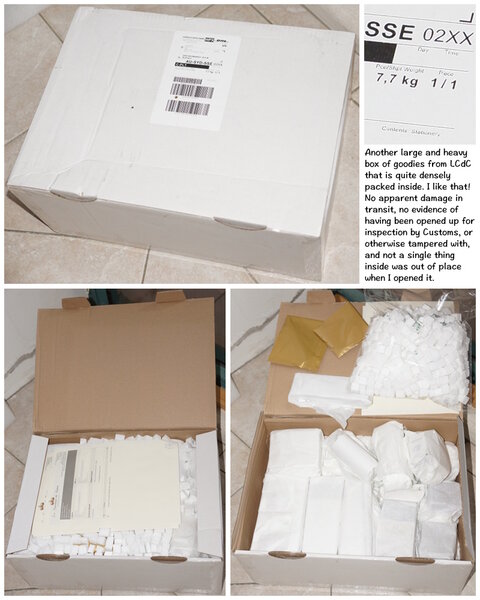
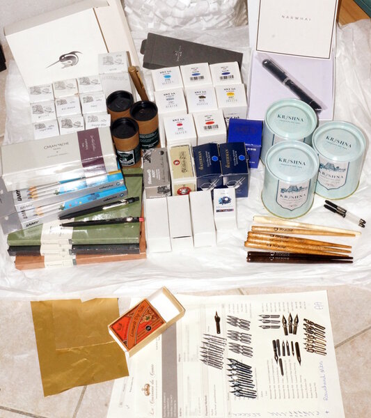
Showing results for tags 'la couronne du comte'.

  • Search By Tags

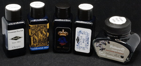
    Type tags separated by commas.
  • Search By Author

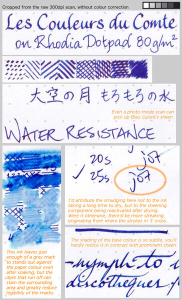
Content Type


Forums

  • FPN Community
    • FPN News
    • Introductions
    • Clubs, Meetings and Events
    • Pay It Forward, Loaner Programs & Group Buys
  • The Market Place
    • The Mall
    • Market Watch
    • Historical Sales Forums
  • Writing Instruments
    • Fountain & Dip Pens - First Stop
    • Fountain Pen Reviews
    • Of Nibs & Tines
    • It Writes, But It Is Not A Fountain Pen ....
    • Pen History
    • Repair Q&A
  • Brand Focus
    • Cross
    • Esterbrook
    • Lamy
    • Mabie Todd Research/Special Interest Forum/Group
    • Montblanc
    • Parker
    • Pelikan
    • Sheaffer
    • TWSBI
    • Wahl-Eversharp
    • Waterman
  • Regional Focus
    • China, Korea and Others (Far East, Asia)
    • Great Britain & Ireland - Europe
    • India & Subcontinent (Asia)
    • Italy - Europe
    • Japan - Asia
    • USA - North America
    • Other Brands - Europe
  • Inks, Inc.
    • Inky Thoughts
    • Ink Reviews
    • Ink Comparisons
    • Co-Razy-Views
    • Th-INKing Outside the Bottle
    • Inky Recipes
  • Paper, and Pen Accessories
    • Paper and Pen Paraphernalia
    • Paper & Pen Paraphernalia Reviews and Articles
  • Creative Expressions
    • Pen Turning and Making
    • Pictures & Pen Photography
    • The Write Stuff
    • Handwriting & Handwriting Improvement
    • Calligraphy Discussions
    • Pointed Pen Calligraphy
    • Broad (or Edged) Pen Calligraphy

Blogs

  • FPN Board Talk
  • Incoherent Ramblings from Murphy Towers
  • The Blogg of Me
  • FPN Admin Column
  • Rules, Guidelines, FAQs, Guides
  • Musings on matters pen
  • Marketing & Sales
  • Iguana Sell Pens Blog
  • Newton Pens' Blog
  • Peyton Street Pens Blog
  • holygrail's Blog
  • A Gift For Words
  • I Don't Have a Name; So This Will Do
  • Karas Kustoms' Blog
  • Debbie Ohi's Inky Journal
  • Sus Minervam docet
  • Crud!
  • Clut and Clutter
  • Federalist Pens

Product Groups

  • FPN Pens
  • FPN Inks
  • FPN Donations
  • Premium/Trading/Retailer Accounts

Categories

  • Fonts
  • Tools & Software
  • Rules for Notepads & Paper

Find results in...

Find results that contain...


Date Created

  • Start

    End


Last Updated

  • Start

    End


Filter by number of...

Found 13 results

  1. La Couronne du Comte – Marquis de Dangeau Green The Dutch pen boutique “La Couronne de Comte (LCDC)“ is a well-known player in the fountain pen world. Founded in 2008, their Tilburg shop and accompanying webshop offer a wide range of fountain pens, inks and other office paraphernalia. Recently, LCDC has released a small number of fountain pen inks. From their Nobless Oblige collection comes this Marquis de Dangeau Green. The ink’s name refers to Philippe de Courcillon, Marquess of Dangeau (1638-1720). He was a French courtier, officer and memorialist under Louis XIV. The colour of the ink is inspired by the depiction of the Marquis in a Hyacinthe Rigaud painting from 1702. This specific shade of green is present in the rich robe worn by Monsieur de Courcillon. At its heart, this is a yellow-green ink with plenty of yellow in the mix. Even though it is a lighter colour, the ink remains very readable in finer nibs. It’s also a very heavy shader – too much so for my taste. With dry pens, the combination of light colour and fairly extreme shading makes for a bad combination. I really recommend wet pens and broader nibs for this ink. Due to the more saturated line, the colour of the ink gets much more expressive and the shading becomes a lot softer. Marquis de Dangeau Green really must be matched with wet pens & broad nib. Used this way, the ink provides some wonderful aesthetics. Love it! The chromatography shows a complex mix of dyes – light-blue, yellow, and rose. And this combination of dyes works remarkably well. The chroma looks quite similar to Rohrer & Klingner’s Alt-Goldgrün, but this LCDC ink is much more yellow-leaning. From the bottom part of the chroma, you can already deduce that most dyes detach from the paper when it comes into contact with water. This is not a water-resistant ink. To show you the impact of saturation on the ink’s look & feel on paper, I made some scribbles where I really saturated portions of a piece of 52 gsm Tomoe River paper with ink. This gives you a good idea of what the ink is capable of in terms of colour range. LCDC’s Marquis de Dangeau has a fairly extreme contrast range, from wispy light green to a fairly dark yellow green. This translates to harsh shading, especially when used in dry pens that lean more towards the left side of the saturation spectrum. With wet pens, your writing moves more towards the saturated part of the spectrum, and shading becomes much softer and certainly more beautiful. With the heavy saturation, the rose undertones also rise a bit to the surface, adding some interesting complexity to the ink’s colour. Technically, the ink felt a bit dry-writing in my Lamy Safari test pens and produced too light a line, with shading that is way too heavy. This is clearly visible in the quotes below, that are written with a dry M-nib Lamy Safari. The sweet spot for this ink is the broader nib and/or wet pen – as evident in the paper names and quote source lines. In the writing samples below, I use my typical variety of different paper types. This gives you a good feel for what the ink is capable of. On each scrap of paper, I show you: An ink swab, made with a cotton Q-tip 1-2-3 pass swab, to show increasing saturation An ink scribble made with an M-nib Safari fountain pen The name of the paper used, written with a B-nib Lamy Safari A small text sample, written with the M-nib Lamy Safari Source of the quote, with a Pelikan M cursive italic nib Drying times of the ink on the paper, with the M-nib Lamy Safari I’ve also added a photo to give you another view on the ink. Scanned images and photos often capture different aspects of the ink’s colour & contrast. That’s why I present them both. In this case, the photo captures the ink's shading best, although it looks too yellow. The scan exaggerates the shading, and looks a tiny bit too green in the swabs. Marquis de Dangeau looks good on both white and cream-coloured paper. With hard-surface paper, the shading tends to be stronger, which detracts from the overall looks. This ink works best with paper of low to medium hardness. Drying times are in the 10 second range, climbing to 20 seconds on hard-surface paper. With low quality paper, there is a just-visible amount of feathering and quite some see-through. Bleed-through is limited though, and mostly there on the horrible Moleskine paper. Overall, a well-behaving ink. Writing with different nib sizes The picture below shows the effect of nib sizes on the writing. Marquis the Dangeau can handle all nib-sizes but looks at its best in broader nibs and with wet-writing pens. I love the way it looks in my Pelikan M205 Demonstrator which sports a gold M cursive italic nib. Related inks To show off related inks, I use my nine-grid format, with the currently reviewed ink at the center. This format shows the name of related inks, a saturation sample, a 1-2-3 swab and a water resistance test – all in a very compact format. This ink from La Couronne du Comte looks unlike my other yellow greens. It has some of the DNA from R&K Alt-Goldgrün, but with more yellow in the mix. Inkxperiment – Wolf Moon As a personal challenge, I try to create interesting drawings using only the ink I’m reviewing. I really enjoy these inkxperiments, that are such a fun extension of the hobby. And they are excellent for showcasing all the colour range nuances that are present in the ink. Inspiration for this inkxperiment comes from the now fast-approaching full moon of January – also known as the Wolf Moon. This full moon was named the “Wolf Moon” by Native American tribes for the wolves that would howl during winter nights, communicating with their pack and to protect their territory. The spiritual meaning of the Wolf Moon is a reminder that there is an unseen connection to your own “pack” that is worth recognizing and honoring. The inkxperiment is a direct and literal translation of the Wolf Moon concept. I started with an A4 sheet of HP photo paper and painted in the background with heavily water-diluted ink, applied through a piece of kitchen paper to create the texture. Next, I painted in the full moon, with a tiny amount of bleach added afterward. I then used multiple water/ink mixes and a triangular potato stamp to add the trees. To complete the drawing, I added the wolf silhouette, popping out from the winter woods and howling at the moon. The resulting piece shows quite well what can be achieved with this yellow-green ink in a more artistic context. Inkxpired – computational art I love experimenting with pen/ink/paper and have added another layer as part of the hobby. I’m exploring computational art, inspired by the ink drawings I do during ink reviews. Another fun offshoot of the hobby… and all that starting with a few drops of dye-coloured water on paper. For this computational derivation, I tried to create more of a winter-feel. I did a square cut-out of the inkxperiment and applied a filter that highlights the moon. Next, I used a pixel sort filter on the trees, which creates the winter woods effect. I finally changed the tone of the picture to shift to a more cold-looking green. I quite like the end result, which makes for a great New Year’s card. Conclusion La Couronne du Comte Marquies de Dangeau Green (quite a mouthful) is a really nice-looking yellow green, that works best with broad nibs and/or wet pens. A lovely colour, and one with beautiful shading (if you avoid dry pens). Also, a wonderful ink to draw with, and one that I enjoyed a lot. Technical test results on Rhodia N° 16 notepad paper, written with Lamy Safari, M-nib Back-side of writing samples on different paper types
  2. From the album: First look

    A+ for effort in packing all those goods so neatly, densely, and securely. It's a shame a couple of (very minor) items indicated on the enclosed packing lists are missing from the parcel's contents:

    © A Smug Dill


    • 0 B
    • x
  3. A Smug Dill

    DHL shipment from LCdC delivered 4/7/2022

    From the album: First look

    A+ for effort in packing all those goods so neatly, densely, and securely. It's a shame a couple of (very minor) items indicated on the enclosed packing lists are missing from the parcel's contents.

    © A Smug Dill


    • 0 B
    • x
  4. A Smug Dill

    Bleu Cuivré among other 30ml ink bottles

    From the album: Ink review

    The label on the bottle of Les Couleurs du Comte Bleu Cuivré is dull and dark to the point of being illegible. I don't have any other commercial 30ml bottled ink product that's nearly quite as bad. It's a shame, because the ink itself should be comparable quality-wise to Cult Pens's Iridescink Maureen, or other inks in Diamine's own standard product catalogue.

    © A Smug Dill


    • 0 B
    • x
  5. A Smug Dill

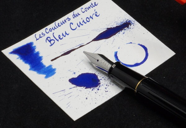
    Bleu Cuivré swatch cards

    From the album: Ink review

    Yes, yes; I'm aware I spelt the name of the ink wrong.

    © A Smug Dill


    • 0 B
    • x
  6. A Smug Dill

    Bleu Cuivré after soaking

    From the album: Ink review

    The type of paper is/written on the part of the sheet shown here. See if you can read it. The paper was dumped face down in a shallow tray with about 1.5cm of water, and soaked for about 15 minutes. That it was face down did not prevent colour that washed off the ink marks from quickly staining the surrounding area.

    © A Smug Dill


    • 0 B
    • x
  7. A Smug Dill

    Bleu Cuivré chromatogram

    From the album: Ink review

    Done on a strip of medium-speed filter paper. I touched my Pilot Plumix M nib (whose feed was connected to a converter with the ink) to the filter paper for a second, so should give a vague idea of how much ink I deposited on the filter paper at the starting point. I'd say that were quite a bit of dye in that one little spot! Does that make the pen ‘wet’, the ink ‘saturated’, or both, or neither?

    © A Smug Dill


    • 0 B
    • x
  8. From the album: First look

    One of La Couronne du Comte's four shop-exclusive ink colours, which I think are produced by Diamine.

    © A Smug Dill


    • 0 B
    • x
  9. Look what was just delivered! I wasnt expecting this until the new year, but thanks to La Couronne du Comte they have sent me part of my order early, just in time to have a new pen to play with tomorrow! For once I think Im going to defer the pleasure! Wishing all FPN members a happy and peaceful festive season
  10. New-style, bi-color 18 Kt gold nib. A Medium, custom ground to a crisp cursive italic by Oxonian Not so incidentally, the new style nib has basically the same writing characteristics as the old style nibs. It is pleasantly springy. The size, however, seems very slightly larger than my other CS #6 nibs. This nib has been custom-ground and tuned, of course, but it writes very smoothly with just enough feedback and medium ink flow. The fine lines are actually even finer than they appear in the document scans, above, and this is with an ink that is generally regarded as "wet" (although I don't find it so). Nebula meets of couple CS Belliver siblings - Red, White & Blue and Shingle (left to right) I did not perform a quantitative rating for this review. I really haven't found any reasons to deduct even fractions of points. So, assume a "perfect" score. Note that that is not the same as a "best" score. And now, a moment of silence for the Conway Stewart Belliver. I hope it comes back. It's been a terrific model, in my opinion. Happy writing! David


×
×
  • Create New...