Search the Community
Showing results for tags 'kyonooto'.
-
Kyonooto inks are made by or for Takeda Jimuki company and are available in two lines: Kyo No Oto and Kyo-Iro. Kyo no Oto inks are said to be traditional japanese colors that has been used since heian era (roughly 1000 years ago),and expressing a tinges that have been nurtured in long history and profound culture for long time. I'm a huge fan of both lines and wanted to try two new inks as soon as I learned about them. Unfortunately, the cost of shipment from company's Rakuten shop is bonkers so I canceled my ordered. Happily, one of FPNers - MythicalUnicorn sent me a nice batch of ink samples to try. Hisoku was one of them. Thank you Daniel. Hisoku can be described as a light steel blue with shading. It's averagely saturated and with average flow. The color, though, appeals to me. I think it looks cool. Drops of ink on kitchen towel Software ID Color range Oxford, Kaweco Classic Sport, broad nib No name calendar paper, Kaweco Classic Sport, B Tomoe River, Kaweco Classic Sport, broad nib Water resistance
-
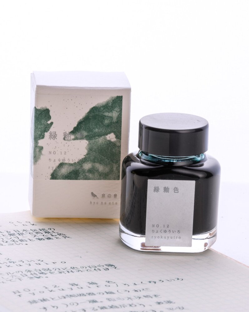
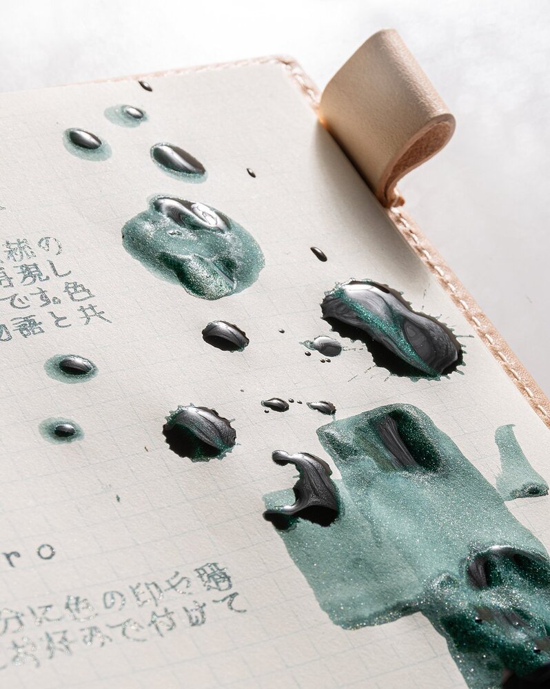
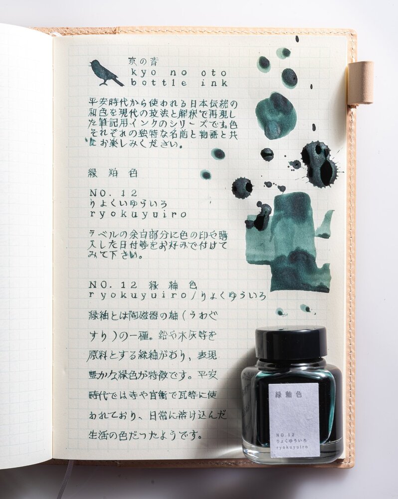
Hello Folks, First time posting here and it might not be a review as per the review standards over here (eg. all the tests and examples etc) but I promise I will make it up with great pictures to showcase the ink. I am mostly active over at reddit and some of the people here might have probably noticed my posts there. Call it a showcase instead of a review if you may. We are talking about one of TAG Stationery's two new inks for 2021 (no.11 & no.12) and I was early enough on the order to get the NO.12 Ryukuyuiro ink. Fresh arrival from Japan just a couple of days back. There is not much information about these new inks yet (atleast in the english forums) except some japanese reviews that I have seen on twitter via TAG's official twitter account. So let's get started on the pictorial journey with a beauty shot as a writing setup on the table. My tools of choice - Midori MD notebook (A5) grid pages & Pilot Custom Heritage 912 (FA nib). The packaging is same as other kyo no oto inks with a variarion of showing ink on the packaging (which has been unique to each ink). It's a shimmering ink, a first for kyo no oto range. Both their new colors are shimmering inks. This one is a deep dark green with silver shimmer. At some angles and how the light falls on the writing, sometimes it feels like there is gold & silver mix. I do not speak or understand japanese, the text written here is a copy from the info leaflet that came along in the box. The ink in its wet glory - unlike most of the kyo no oto inks have been on the drier side, this one feels reasonably wet (initial impressions), good saturation and ofcourse shimmer. I love how most of my inks look on the ivory midori paper. After the dry-down. In this picture it looks like there is silver as well as gold shimmer. Maybe an illusion. On the writing sample the silver is prominent. Jacques Herbin 350 Vert Atlantide seems to be the closest match to this ink. Hope you like my shot, quick post here and would try to make some more posts over here. Thanks for dropping by on my post and if there are any questions I would try my best to answer it here. Cheers, AJ
- 26 replies
-
- ink review
- japanese
-
(and 2 more)
Tagged with:
-
To be honest I don't know much about the company. Some time ago Algester posted topic about Tag Kyoto branch inks. The bottles and colors presented on their site looked nice so I've decided to try some of these inks. I've managed to buy two on Rakuten and I'll review them. The inks are made by or for Takeda Jimuki company and are available in two lines: Kyo No Oto and Kyo-Iro. Kyo no Oto inks are said to be traditional japanese colors that has been used since heian era (roughly 1000 years ago),and expressing a tinges that have been nurtured in long history and profound culture for long time. Kyonooto inks are: Aonibi Imayouiro Kokeiro Nurebairo Yamabukiiro Kyo-iro inks are: Cherry Blossom of Keage Flaming Red of Fushimi Moonlight of Higashiyama Soft Snow of Ohara Stone Road of Gion @Aelie has sent me a sample of Kokeiro. Thank you James! Not only for the sample but also for allowing me to post the scan of the note you've written with Kokeiro. The color isn't really saturated and the inks feel watery, the way some J. Herbin inks do. And I like it - J. Herbin is my favourite ink maker (ex-aequo with Sailor) and I enjoy subtler inks from time to time. Kokeiro can be discribed as yellowish green, not unique but still intriguing enough to capture attention. The flow is very good and I haven't observed feathering or bleedthrough. I've used 2 ml of the ik (sample from Aelie) and I want more Drops of ink on kitchen towel Software ID Tomoe River, Kaweco Classic Sport, B Leuchtturm 1917, Kaweco Classic Sport, B Oxford, Parker 45, Medium 14 ct nib (for those of you interested in what this can possibly mean - it's a recipe for cabbage cooked according to five elements cuisine) Note from Aelie, Neenah Classic Linen Writing Paper, classic natural white color, Pilot Lucina, fine nib Mini - comparison
-
To be honest I don't know much about the company. Some time ago Algester posted topic about Tag Kyoto branch inks. The bottles and colors presented on their site looked nice so I've decided to try some of these inks. I've managed to buy two on Rakuten and I'll review them. The inks are made by or for Takeda Jimuki company and are available in two lines: Kyo No Oto and Kyo-Iro. Kyo no Oto inks are said to be traditional japanese colors that has been used since heian era (roughly 1000 years ago),and expressing a tinges that have been nurtured in long history and profound culture for long time. Kyonooto inks are: Aonibi Azukiiro (new ink) Imayouiro Kokeiro Nurebairo Yamabukiiro Kyo-iro inks are: Cherry Blossom of Keage Flaming Red of Fushimi Frosting of Arashiyama (new ink) Moonlight of Higashiyama Soft Snow of Ohara Stone Road of Gion As soon as I discovered that two new inks were produced I ordered them. Sadly the package went missing. When I lost hope that I would ever receive it, it appeared suddenly and from nowhere after almost three months of delay. Crazy. Anyway as some of you may know I've become huge fan of these two line opf inks. The colors aren't generic. We've seen most of them elsewhere but they offer some unexpected twist I enjoy a lot. I even like their black ink - Nurebairo (it's one of three black inks I have at home, the other two being Octopus Schwarz and J. Herbin Perle Noire). I was really curious about new colors. I hope that some of you were interested in them as well because there'll be plenty of photos. Azukiiro can be described as nice mix of red, purple and, maybe, reddish brown in places. It seems azuki-iro is one of traditional japanese colors: The ink doesn't look similar to what you see above. As I don't know japanese language I would gladly ask some of our japanese friends to help with the word meaning but I would venture to say the color might be reminiscent of Adzuki beans color (but I may be wrong). When you enter japanese name of the ink 小豆色 in google you'll receive a lot of pictures with hues between red, purplish red and others. Check here. In wet pens the color may be close to black in some places and it looks reach. I enjoy it and I would say that characterictics are mostly good. No feathering, no bleedthrough, no cloggiing, skipping, hard-starts. But there's an issue - this ink takes ages to dry. Not in all pens and not on all papers but when I used it in Yard-o-Led medium nib on Tomoe it took 70 seconds to dry. It's not good choice for lefties. Drops of ink on kitchen towel Software ID Color range Tomoe River, Yard-o-Led Viceroy, medium nib Leuchtturm 1917, Kaweco Classic Sport, B Rhodia, Yard-o-Led Videroy, Medium Fantastic Paper, Yard-o-Led Videroy, Medium CIAK, Kaweco Classic Sport, broad nib Oxford Optic, Yard-o-Led Viceroy, medium nib Water resistance
-
A red-purple with some black sheen if there is a LOT of ink. The name means 'colour of red beans', and refers to the tradition of using red beans and rice as an essential part of Japanese religious ceremonies.
- 6 replies
-
- kyo no oto
- kyonooto
- (and 5 more)
-
- 9 replies
-
- kyo no oto
- kyonooto
-
(and 8 more)
Tagged with:
-
To be honest I don’t know much about the company. Some time ago Algester posted topic about Tag Kyoto branch inks. The bottles and colors presented on their site looked nice so I’ve decided to try some of these inks. The inks are made by or for Takeda Jimuki company and are available in two lines: Kyo No Oto and Kyo-Iro. Kyo no Oto inks are said to be traditional japanese colors that has been used since heian era (roughly 1000 years ago), and expressing a tinges that have been nurtured in long history and profound culture for long time. I was able to get and try all the inks in the series and review them. Basically I share my thougts about each ink in review, so here I'll just post some scans of all the inks together. Kyonooto inks are: Aonibi Imayouiro Kokeiro Nurebairo Yamabukiiro (山吹色)All together Leuchtturm 1917, Kaweco Classic, broad nib Clairefontaine, Kaweco Classic Sport, broad nib Linen paper, Kaweco Classic Sport, broad nib Oxford, Hero 5028, stub 1,9 CIAK, Sheaffer Balance, EF nib Water resistance Packaging I find Kyonooto inks packaging very elegant and aesthetically pleasing. The bottles are nice and practical although not really good looking. The boxes on the other hand are stunning. Minimalistic yet elegant and well thought. I always throw away boxed but in this case I'm going to keep them. Price and availability These inks are well priced if you happen to live in Japan. Sadly shiopping costs and additional fees (taxes) make Kyonooto inks quite pricey for westerners. I've bought all the bottles from Rakuten so price per bottle was around 20-24 $. You can het them an Amazon for 30 $ / bottle. Expensive, I know. Are they worth it? Well, objectively speaking this inks are nice but are in no way technologically advanced inks. I enjoy them because I like the colors, I like packaging and, I absolutely love to discover new things. If you're the same and can afford getting them to make yourself pleasure, go ahead, you shouldn't regret. The same is truth however for much ceaper inks. Choice is yours to make Colors I prefer Kyonooto line to kyo-iro line because the colors are much more interesting. I would risk to say that Takedajimuki's managed to create a line of unique colors. Practically all of them are interesting and none is really generic. I enjoy all of them except Imayouiro. I don't hate it but I would never find any use for it - unless one day I have a pink - obsessed daughter to write letters to My two favs are Kokeiro and Aonibi but I really enjoy Yama-bukiiro and Nurebairo (yes, I know, it's black, and no, I didn't have any neural accident). Inks behaviour Kyonooto inks like fountain pens and papers and it's mutual friendship. None of them will cause feathering or bleedthrough. Sadly none of them is water resistant so if you need / want water resistance look for other inks. Drying times are reasonable with one exception - in really wet nib Nurebairo can take ages to dry. On the other hand this stealth black offers really smooth feel to it and I guess longer drying time is price you have to pay for this velvety feel. As for fading - time will tell. I'll put samples on Clairefontaine near the window and update this post in a month or two.
-
To be honest I don’t know much about the company. Some time ago Algester posted topic about Tag Kyoto branch inks. The bottles and colors presented on their site looked nice so I’ve decided to try some of these inks. I’ve managed to buy two on Rakuten and I’ll review them. The inks are made by or for Takeda Jimuki company and are available in two lines: Kyo No Oto and Kyo-Iro. Kyo no Oto inks are said to be traditional japanese colors that has been used since heian era (roughly 1000 years ago),and expressing a tinges that have been nurtured in long history and profound culture for long time. Kyonooto inks are: Aonibi Imayouiro Kokeiro Nurebairo Yamabukiiro Kyo-iro inks are: Cherry Blossom of Keage Flaming Red of Fushimi Moonlight of Higashiyama Soft Snow of Ohara Stone Road of Gion Aonibi comes in nice, practical bottle Ink Splash I must confess I'm a fan of this color. In my opinion it rocks. It's not strongly saturated but it offers vintage vibe that I enjoy a lot. It leans slightly toward Slate Grey. Also the flow in most pens is great. The ink felt dry in my St Dupont Fidelio but , for example, in Kaweco or FPR Guru the flow was excellent. In very wet pens it may cause some bleedthrough on bad quality paper. Drops of ink on kitchen towel Software ID Tomoe River, Kaweco Classic Sport, B Leuchtturm 1917, Kaweco Classic Sport, B Oxford, Hero 5028, stub 1,9 Clairefontaine, FPR Guru, M Clairefontaine, Sheaffer Balance, EF nib Water resistance Comparison
-
To be honest I don't know much about the company. Some time ago Algester posted topic about Tag Kyoto branch inks. The bottles and colors presented on their site looked nice so I've decided to try some of these inks. I've managed to buy two on Rakuten and I'll review them. The inks are made by or for Takeda Jimuki company and are available in two lines: Kyo No Oto and Kyo-Iro. Kyo no Oto inks are said to be traditional japanese colors that has been used since heian era (roughly 1000 years ago),and expressing a tinges that have been nurtured in long history and profound culture for long time. Kyonooto inks are: Aonibi Imayouiro Kokeiro Nurebairo YamabukiiroKyo-iro inks are: Cherry Blossom of Keage Flaming Red of Fushimi Moonlight of Higashiyama Soft Snow of Ohara Stone Road of GionYamabukiiro comes in nice bottle Ink splash Yama-bukiiro has interesting color, maybe even unique. Not everyone will get crazy about it but in broader nibs it does rock. The ink behaves well - I haven't observed any problems. Drops of ink on kitchen towel Software ID Tomoe River, Kaweco Classic Sport, B Leuchtturm 1917, Kaweco Classic Sport, B Oxford, Hero 5028, stub 1,9 Clairefontaine, Sheaffer Balance, EF nib