Search the Community
Showing results for tags 'kwz ink'.
-
Well, I suppose this is also something of an introduction, as it’s my first post to the forum after lurking awhile. So I might as well give a little background. I’m an artist, and I’ve used dip pens for most of my adult life. I had an old LAMY Safari Vista lying around, and rediscovered it recently. It had been loaded with Noodler’s Walnut, so I can now attest that you can leave a LAMY filled with Noodler’s Walnut for over 8 years and not have a clogging problem, not that I’d advise doing this. Anyway, more pertinent to the titular question: I am essentially new to fountain pens and their inks, and new to journaling with a fountain pen. I am also a sucker for anything coffee related. I am interested in the KWZ ink “It Smells Like Coffee”. But I cannot seem to discover exactly what type of ink it is. Is it iron gall? Pigment? Dye based? Then, I have follow-up questions. What are the archival implications for journaling with an iron gall ink, vs. a pigment or dye based ink? I use a LAMY F nib. Clearly allowing the Noodler’s Walnut to just sit about in there for years on end did not do anything nefarious to the pen, but if I lapsed like this with another type of ink, would there be heck to pay? How long does an unused but filled pen (LAMY if you want particulars, because it’s all I have) have before trouble starts? What is the best choice for keeping a journal acid-free/archival? Thanks so much - like I said, I’ve been lurking. I’ve been impressed with the forum… from the kind and informative answers, to the well thought out “Start Here” thread. I haven’t been terribly successful using the search engine, so I apologize in advance if my KWZ ink question in particular has been asked before.
-
From the album: First look
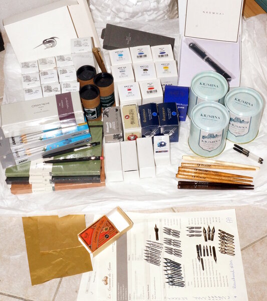
A+ for effort in packing all those goods so neatly, densely, and securely. It's a shame a couple of (very minor) items indicated on the enclosed packing lists are missing from the parcel's contents.© A Smug Dill
- 0 B
- x
-
- la couronne du comte
- product catalogue culling
- (and 7 more)
-
desaturated.thumb.gif.5cb70ef1e977aa313d11eea3616aba7d.gif)
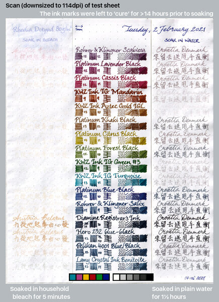
15 iron-gall inks after soaking in water and bleach
A Smug Dill posted a gallery image in FPN Image Albums
From the album: Ink performance testing
Lamy Benitoite was also included at the end, because there seems to be some uncertainty and conjecture online as to whether it has any iron-gall content.© A Smug Dill
- 0 B
- x
- 5 comments
-
- iron-gall
- water resistance
- (and 8 more)
-
desaturated.thumb.gif.5cb70ef1e977aa313d11eea3616aba7d.gif)
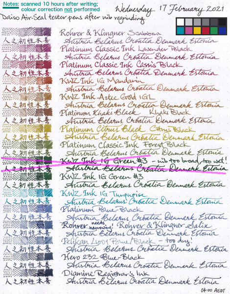
15 iron-gall inks written with Daiso Air-Seal pens after nibs were reground
A Smug Dill posted a gallery image in FPN Image Albums
From the album: Ink performance testing
I couldn't stand how woolly and blobby some of the lines written with the tester pens look, especially in the actual testing pad and notebook (not Rhodia Dotpad) I'm using for the year-long experiment, and so I reground the nibs on all of the pens. Note: Colour correction — which usually makes the image darker overall — in GIMP was not applied after the scan, but I have included the reference colour patches from the same scan. I wanted to show you how dark Diamine Registrar's Ink looks to the scanner, without any doubt as to whether I artificially darkened it or increased the contrast.© A Smug Dill
- 0 B
- x
-
- iron-gall
- diamine registrars
- (and 6 more)
-
desaturated.thumb.gif.5cb70ef1e977aa313d11eea3616aba7d.gif)
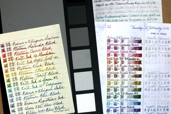
15 iron-gall inks written with Daiso Air-Seal pens before nibs were reground
A Smug Dill posted a gallery image in FPN Image Albums
From the album: Ink performance testing
The ‘before’ scan for the test sheet here: All written with Daiso Air-Seal fountain pens like this one:© A Smug Dill
- 0 B
- x
-
- iron-gall
- diamine registrars
- (and 6 more)
-
desaturated.thumb.gif.5cb70ef1e977aa313d11eea3616aba7d.gif)
Colour of KWZ Ink IG Turquoise after some time has passed
A Smug Dill posted a gallery image in FPN Image Albums
-
Something very strange has happened to my my Kwz Ink Maroon. As far as I know there were two versions of this ink and mine is the second release. I really liked it but haven't used it very much. A couple of days ago I inked up a pen with it and it was writing a little deeper on the brown tone than I remember, but still very much maroon in colour. A day later, the colour has changed to a rather dull rusty brown. This isn't an iron gal ink. I wondered if my ink logs of it were the same and checked and they were still a nice maroon colour. I thought that maybe there had been a contamination of inks from the last fill so I filled a new pen with it and tested a dip nib on different papers - same effect; after about 24 hours it dries to a dull brownish rust colour. The ink is still in it's box, so it hasn;t been left exposed to bright sunlight. There's no SITBI and the ink smells fine and looks maroon in the bottle. I think I've ruled out everything which leaves the ink dyes as the only possible issue. Anyone else experienced this?
-
Chromo's are different , but they come pretty close
-
KWZ Ink Liquid Words 2018 - deeper purple color in a special edition of the KWZ ink on the occasion of Pen Show Poland 2018 in Katowice. Comparison: Liquid Words 2018 KWZ IG Gummiberry, Pelikn 4001 Violett, J.Herbin Violette Pensee [ Error upload failed ]
- 13 replies
-
- kwz ink
- pen show 2018 poland
-
(and 1 more)
Tagged with:
-
I recently learned that, for this year’s birthday, I get to import some fountain pen inks! It's still a couple of months away but I just couldn't wait. The problem being that I can’t try out any samples beforehand. The price of importing them wouldn't be worth it, for me. Which means I usually read a lot of reviews before buying any inks, and that has worked for me so far! This time, however, I’m having a hard time finding enough reviews. So I’m asking for help in figuring out which ink colors I want. I’m already fairly sure of the brand I want: I’ve always liked the idea of very resistant and colorful inks, so I’d like to try and get my hands on some KWZ Iron Gall inks. But I’ve read tales of IG inks losing color after being opened. Is that a worry for KWZ? SPECIFIC COLOR QUESTIONS: All colors - I’m very fond of shading, and I’d like for the inks not to be too dark… by which I mean I’m okay with dark colors, I just don’t want anything too greyish or black-looking. BLUES - I also already have an IG blue so I won’t be looking at those. GREENS - I’m very interested, but I’m finding it hard to pinpoint all the shades. How similar are IG Green #1 and #2? What about #3 and #4, and what about IG Green Gold? I’ve also heard that #3 borders on black. BROWNS - the contenders being IG Gold and IG Mandarin. How similar is Gold to Green Gold? Is Mandarin a pure brown or does it have warmer orange undertones, and how much do they show? VIOLETS - what are the differences between the Violets and Gummiberry? It is my understanding that Violet #2 is duskier, Violet #3 is more vibrant, and Gummiberry leans more towards blue. Is that correct? Do any of the above tend to shade, and how much? Paper - I use white paper most of the time, but I also have a couple of nice ivory/cream paper notebooks (specifically pollen paper) I'd like to write on, so does anybody know if any of these looks particularly good on ivory paper? Thank you very much for all your help!
- 18 replies
-
- iron gall
- iron gall ink
-
(and 3 more)
Tagged with:
-
-
-
-
-
Hi. I just want to share my ink comparison. Maybe it will be helpful for somebody. Here is a list of my tested inks: Pelikan 4001 Brilliant Black, KWZ Ink IG Gummiberry, KWZ Ink IG Red 3, KWZ Ink Maroon, KWZ Ink Red 1, KWZ Ink IG Green 1, KWZ Ink IG Green 3, Private Rserve Ebony Blue, KWZ Ink IG Turquoise, KWZ Ink Azure 4, KWZ Ink Azure 5, Private Reserve Electric DC Blue, KWZ Ink IG Blue 2, KWZ Ink Blue Black, KWZ Ink IG Blue Black. Chris
- 7 replies
-
- kwzi
- private reserve
-
(and 2 more)
Tagged with:
-
Grey Plum is one of those colors that I was most excited about in the recent Group Buy from KWZ Ink. The swab posted on the site was all I had to go by, and I admit, I wasn't thrilled by the color there. But I liked the idea of the color, and I like most of Konrad's more complex colors, so I gave it a try. Y'ALL. This is GREAT. Okay, so here's a review overview, with closeups and comparisons below: Right away, Grey Plum reminded me of one of my favorite discontinued inks, Sailor Chu-shu. There just aren't many purple-leaning greys out there. This is a swab where the inks were laid down very heavily (to try to get sheen and to see hue clearly). This means that the color is probably more intense than you'd usually see with a pen, but you see differences and similarities in a different way than writing samples. As you can see, Grey Plum is darker, greyer and cooler than Chu-shu in the swab; Chu-shu often comes off as a near-purple, while Grey Plum is a pretty definite gray. I washed the picture and swab below with water, to see what kind of behavior emerged, and got a really complex and interesting cool wash with blue to violet hues. I really like the tones, but it should be noted that the water resistance doesn't look particularly great - if you're sketching, prefer to go back over washes if needed. You might think you see sheen above, but that's a trick of the scanner. This ink is pretty matte, even on paper that encourages sheen. There's a tiny bit of something, but I don't think you'd ever see sheen under normal conditions. (I don't think you'd want it on this ink anyway.) How does it behave? Dry time is moderate. This is Tomoe River paper, so a 10-15 second dry time is decent. I didn't notice any problems with the other papers I tried. The shading is very pleasant, and great occasionally. I think someone who cared more might be able to draw out more shading (see the "s" in "so good" in the Manners section). The feel is great, just like all the other KWZI's I've tried. The flow is nice, startup is prompt, and it cleans up with no muss. (I have not left this ink in a pen for very long, though; I'll let you know if this changes at all.) The smell, unlike former KWZ inks, is hardly noticeable, on par with Diamine's normal aroma in terms of notability. It's faintly soapy or astringent - in fact, it's really familiar, and I wish I could put my finger on it. The smell of the last batch was my least favorite thing, so I'm happy it's changed. Allure is a really personal thing, but I love this ink. Dilutions is a category intended to show how ink behaves as water is added. It's very non-scientific; the first pass is pure ink, and then I briskly swish the brush for a second or two in clean water, dab it on the rim of the water jar, and make a new swash. It can reveal hidden undertones, or weird plateaus of saturation, where ink looks the same for several dilutions, even as the amount of water increases. This was not a hugely successful attempt this time, and I'm not sure why. It does show the kinds of washes you might get, and that you can probably dilute this ink down to get kind of a fun violet. As you might expect from the above picture and dilutions and swab, there's not a lot of water resistance. I usually perform a couple tests: I put drops on a grid of lines, leave them for 10 seconds, and then blot them carefully. This is the mildest form of water that writing might be exposed to - a tiny bit of condensation from a glass, say. I also write a phrase and then briskly wash it with a brush for ~5 seconds - not scrubbing exactly, but adding friction. I let it sit for 3-5 seconds, then blot. This usually erases any inks that lack water resistance. If they're resistant at this stage, I do an overnight soak. Grey Plum holds up okay to a little bit of water or alcohol, and mostly vanishes with a brush. While it may have minimal water resistance, this is not an ink I'd use for cases where I'd want to be sure of my notes. Appearance in different nib widths is good across the board. It's not overpowering in a bold nib or too wimpy in a extra-fine. I usually write a whole paragraph with each so I have an idea of what they'd look like on a page. (Ideally I'd do a page of each, but life is short, and the inks together give me a good feel for whether an ink will over or underwhelm in large quantities.) If I had to pick a favorite width, it would be broad. I did test Grey Plum on Leuchtturm and Piccadilly papers. I think it looks best on the warm to bright whites. It looks great on Leuchtturm, but Piccadilly is too warm, and it looks dull and flat. (Unfortunately, my scanner doesn't pick up warm paper tones well, so you'll have to trust me.) Fortunately, most papers are less yellow than Piccadilly. On my terrible office paper, I do see some fuzziness of line in a bold nib. Not a surprise - this is not a paper made for liquid ink of any kind. I don't see bleedthrough to the next page, just spots to the back. (No bleedthrough or feathering for either Leuchtturm or Piccadilly, though.) It's totally usable, even on the cheap paper, though it definitely has more presence on the Tomoe River seen above. Overall, I really like this ink, and hope Konrad keeps making it. It brings something new and interesting to my ink stash, and it is a real pleasure to use, too. Paper used: Tomoe River for the two-page spread above. Pens: The title is done with a 1.9mm Franklin-Christoph Music nib. As a lefty, I find italic sort of challenging, and I never practice - and yet I am always sad when things come out poorly. Oh well. The first page is written with a Goulet Jowo medium nib, fairly wet and smooth. The second page is that same medium nib (in the middle paragraph), an EF Goulet nib (top paragraph), and B Jowo from Scriptorium Pens (bottom paragraph). All are fairly wet, though I think the EF is a bit drier than the M and B. All these nibs went through the same pen and feed - I just pulled at the end of each paragraph. Brush: For washes and dilutions, I used a Isabey squirrel mop travel brush. It lays down a ton of water, and cleans up like no one's business.
-
This is exactly the color range that I adore. And the KWZ is really nice. There's some sheen on good paper. Excellent quality. Couldn't ask for more.
-
Once upon a time in fpn, someone asked what was everyone's favorite ink color or what would it be if it didn't exist. I said, "harbor twilight." I wanted a blue of a darkening twilight sky that was also waterproof (or water-resistant). I've seen blue inks that have come close, but not close enough, until this ink - created by a Ph.D. chemistry student from Warsaw who brands his inks KWZ Inks. He and his partner sat at the table next to mine at the Poland Pen Show in Katowice, and if I had returned on Sunday, I would have taken a dozen photos and bought more inks. I can order the inks, though, so I am not berating myself too badly. I only met KWZI at the show, but he told me that he is a member of fpn who isn't particularly active here; he's more active on the Polish fountain pen board, and he's busy making these gorgeous inks. I will ask him to take a photo of his ink colors and share them with us - along with ordering information or details about his inks. At least four of his inks darken - over a day, over a month. This ink. Blue #3, isn't one of them, but what's better is that it stays the same dark, beautiful blue and doesn't change to teal, for instance (I'm looking at you, Waterman Mystere Bleu). There was testing of the waterproofness at the show, and the blue held fast, and while there was some washing off, legibility was not affected at all, and the washed ink was still blue. The water-resistant blue inks I've tried and tested leave black ink, which, you know, is better than nothing. But this blue remains blue. As the photos show, I'm using Blue #3 (I love this name) in a Pelikan Toledo 710 with a Mottishaw stub fine nib on Tomoe River Paper. I scribbled notes on a cheap notepad - no feathering. I didn't test the ink more than that, and this is not a review or an "Inky Thought." It's more of a Show-and-Tell. I love this blue ink!


