Jump to content

Search the Community

Showing results for tags 'ku-jaku'.

  • Search By Tags

    Type tags separated by commas.
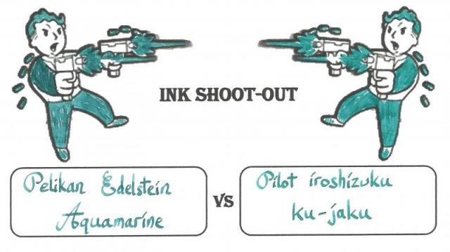
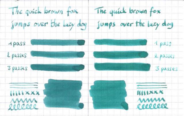
  • Search By Author

Content Type


Forums

  • FPN Community
    • FPN News
    • Introductions
    • Clubs, Meetings and Events
    • Pay It Forward, Loaner Programs & Group Buys
  • The Market Place
    • The Mall
    • Market Watch
    • Historical Sales Forums
  • Writing Instruments
    • Fountain & Dip Pens - First Stop
    • Fountain Pen Reviews
    • Of Nibs & Tines
    • It Writes, But It Is Not A Fountain Pen ....
    • Pen History
    • Repair Q&A
  • Brand Focus
    • Cross
    • Esterbrook
    • Lamy
    • Mabie Todd Research/Special Interest Forum/Group
    • Montblanc
    • Parker
    • Pelikan
    • Sheaffer
    • TWSBI
    • Wahl-Eversharp
    • Waterman
  • Regional Focus
    • China, Korea and Others (Far East, Asia)
    • Great Britain & Ireland - Europe
    • India & Subcontinent (Asia)
    • Italy - Europe
    • Japan - Asia
    • USA - North America
    • Other Brands - Europe
  • Inks, Inc.
    • Inky Thoughts
    • Ink Reviews
    • Ink Comparisons
    • Co-Razy-Views
    • Th-INKing Outside the Bottle
    • Inky Recipes
  • Paper, and Pen Accessories
    • Paper and Pen Paraphernalia
    • Paper & Pen Paraphernalia Reviews and Articles
  • Creative Expressions
    • Pen Turning and Making
    • Pictures & Pen Photography
    • The Write Stuff
    • Handwriting & Handwriting Improvement
    • Calligraphy Discussions
    • Pointed Pen Calligraphy
    • Broad (or Edged) Pen Calligraphy

Blogs

  • FPN Board Talk
  • Incoherent Ramblings from Murphy Towers
  • The Blogg of Me
  • FPN Admin Column
  • Rules, Guidelines, FAQs, Guides
  • Musings on matters pen
  • Marketing & Sales
  • Iguana Sell Pens Blog
  • Newton Pens' Blog
  • Peyton Street Pens Blog
  • holygrail's Blog
  • A Gift For Words
  • I Don't Have a Name; So This Will Do
  • Karas Kustoms' Blog
  • Debbie Ohi's Inky Journal
  • Sus Minervam docet
  • Crud!
  • Clut and Clutter
  • Federalist Pens

Product Groups

  • FPN Pens
  • FPN Inks
  • FPN Donations
  • Premium/Trading/Retailer Accounts

Categories

  • Fonts
  • Tools & Software
  • Rules for Notepads & Paper

Find results in...

Find results that contain...


Date Created

  • Start

    End


Last Updated

  • Start

    End


Filter by number of...

Found 8 results

  1. A Smug Dill

    Pilot Iroshizuku Syo-ro vs Ku-jaku

    From the album: Shades of colour

    My Canon CanoScan LiDE 300 scanner does not seem to capture subtleties in green very well, and so leaves post-scanning colour-correction with not a lot to work with. Here, instead of not showing green where there should be some, there is too much green in both colours, but especially Syo-ro. It didn't help that the two ink colours are nigh indistinguishable when written very wet, and somehow the Pilot MR's steel F nib appeared to be writing increasingly wetter with time, even though I didn't see any tine misalignment under a loupe, and the tine gap while seemingly wide for a Japanese nib did not appear to be the problem. Trying to close the tine gap didn't help; and neither did swirling the nib around briefly in dilute solution of aqueous ammonia and dishwashing detergent. I ended up smearing detergent directly onto the nib and rubbing it vigorously, then dunking it into >90°C hot water. That seemed to have more of an effect in taming the wild ink flow witnessed earlier.

    © A Smug Dill


    • 0 B
    • x
  2. A Smug Dill

    Pilot Iroshizuku Syo-ro vs Ku-jaku

    From the album: Shades of colour

    My Canon CanoScan LiDE 300 scanner does not seem to capture subtleties in green very well, and so leaves post-scanning colour-correction with not a lot to work with. It didn't help that the two ink colours are nigh indistinguishable when written very wet, and somehow the Pilot MR's steel F nib appeared to be writing increasingly wetter with time, even though I didn't see any tine misalignment under a loupe, and the tine gap while seemingly wide for a Japanese nib did not appear to be the problem. Trying to close the tine gap didn't help; and neither did swirling the nib around briefly in dilute solution of aqueous ammonia and dishwashing detergent. I ended up smearing detergent directly onto the nib and rubbing it vigorously, then dunking it into >90°C hot water. That seemed to have more of an effect in taming the wild ink flow witnessed earlier.

    © A Smug Dill


    • 0 B
    • x
  3. A Smug Dill

    Pilot Iroshizuku Syo-ro vs Ku-jaku

    From the album: Shades of colour

    The colours here are closer than the scanned image to how I perceive them when staring at the page, but still not quite right. I think they look too blue, while in the scanned image they look too green. The differences between the two ink colours are really subtle; Syo-ro is just ever-so-slightly bluer and a teensy bit more muted than Ku-jaku, so images that lean either blue or green would obscure the differences.

    © A Smug Dill


    • 0 B
    • x
  4. A Smug Dill

    Seven teal and teal-black inks

    From the album: Shades of colour

    (colour-corrected and scaled down to 120dpi in GIMP)

    © A Smug Dill


    • 0 B
    • x
  5. Ink Shoot-Out : Pelikan Edelstein Aquamarine vs Pilot Iroshizuku ku-jaku When playing around with the new Pelikan Edelstein Ink of the Year 2016 Aquamarine, I couldn't help but notice its similarities with that other blue-green Pilot iroshizuku ku-jaku. The idea arose that it would be fun to put these inks into close comparison, and find out which of them I like the most. Enter... the Ink Shoot-Out. A brutal fight where two inks do battle for four rounds, after which the winner is announced. In the left corner - the challenger: Pelikan Edelstein Aquamarine. In the right corner - the reigning champion: Pilot iroshizuku ku-jaku. Which champion will remain standing at the end of the fight ? Let's find out... Round 1 - First Impressions Both inks make a very fine first impression. I really like their colour - both of them are a nice blue-green of green-blue, which gives them something of an exotic look. The inks seem evenly matched, but nevertheless there are some differences: iroshizuku ku-jaku is a bit more saturated, which gives it a richer feelthe shading on iroshizuku ku-jaku is more evenly spread across the lines, which makes for a more aesthetic lookku-jaku is a tad more blue than the edelstein aquamarine. For me personally, this makes it look nicerThe is no obvious win by knock-out in this round, but the iroshizuku ku-jaku wins this round on points. Round 2 - Writing Sample I did the writing sample on a Rhodia N°16 Notepad with 80 gsm paper. Both inks behave perfectly, with no feathering and no show-through nor bleed-through. With the EF-nib, the Edelstein Aquamarine was on the dry side, while the iroshizuku ku-jaku had no problem with the finer nib. I will not hold this against the Edelstein ink - once you know that it writes a littly drier, you can simply adjust to a broader nib size. With a fine nib e.g. the Edelstein Aquamarine behaved just fine. In this round, the champions are evenly matched. Let's call it a draw. Round 3 - Ink Properties Both inks have similar drying times in the range of 15 to 20 seconds on the Rhodia paper. Both inks also behave admirably on the smudge test, where a moist Q-tip cotton swab is drawn across the written word. For the droplet test, I drippled water onto the grid, and let it sit there for 15 minutes, after which I removed the droplets with a paper towel. On this test, I find that the Edelstein ink has better water resistance. The original lines are better preserved, and much less smeared than with the iroshizuku ink. The difference between the champions is minimal, but this round goes to the German champion - on points. Round 4 - the Fun Factor Welcome to the final round. This is a purely personal impression of the inks, where I judge which of them I like most for doodling, drawing, and just doing some fun stuff. Here I must say that I like the iroshizuku ku-jaku much better than the newer Edelstein Aquamarine ink. I find that the iroshizuku ink flows a bit wetter, making it easier to draw with. And I also like that ku-jaku is a bit more on the blue-ish side. My guess is that - in the future - I will reach faster for my bottle of iroshizuku ku-jaku, and will use the Pelikan Edelstein Aquamarine less often. The Verdict Both inks are wonderful additions to my collection, and both are certainly very well-behaving inks with a lovely blue-green colour. But in the end, I find that Pilot Iroshizuku ku-jaku has the edge over the newer Pelikan Edelstein Aquamarine. As far as I'm concerned, iroshizuku ku-jaku has won this shoot-out on points, and remains the reigning champion !
  6. So there I was, merrily beginning my weekly bonding ritual between my favorite bottle of Iroshizuku Ku-Jaku and my pens. Having unscrewed the cap, I found the white inner cap liner stuck fast to the mouth of the bottle. Seems I screwed down the cap too hard the last time I used the ink. While trying to pry open the cap liner, of course Murphy's Law came into effect, I accidentally prodded too hard and it flew right off together with a generous splash of ink spilling out onto my tablecloth and shirt. Which is why I'm scrubbing all the fabrics under the tap right now. With the amount of ink spilled, however, I wonder if I'll ever get it all out. (Thankfully this happened with Ku-Jaku and not one of my permanent inks like Sailor Sei Boku...) Does anyone have tips on how to completely clean out this sort of big ink spill on fabric? Any advice/experience-sharing would be much appreciated. In the meantime, may you all stay safe from the sneak attacks of Murphy's Law!
  7. http://www.rdwarf.com/users/wwonko/images/fpn/iro/08-Ku-jaku-header.jpg Iroshizuku - Ku-jaku (Peacock) - CRV - Group Review - 2015-05 The Iroshizuku Group Review color for May 2015 is Ku-jaku ”Peacock”. It is a blue-green, which seems to vary a lot in color based on pen and paper and even has sheen in the right combination - very like the flashy tail of the bird it is named for. Please post your reviews and scans of the ink in this thread. If you want to a partner for a Co-Razy View (CRV) of this ink, please write it up and mail it to Lou Erickson. (PM for the address.) If you want to do a Co-Razy View on your own, please do! Other reviews are welcome, too. NOTE: I have a new address as of January! If you have sent me things in the past, please PM for the new address - the old one will stop forwarding eventually. You can look at the full description of the Iroshizuku Group Review to see how this should work and what we’re doing.http://www.rdwarf.com/users/wwonko/images/fpn/iro/08-Ku-jaku-product.jpgThanks to Rachel Goulet, who gave permission to me to use their beautiful product photo and swab.More thanks to Amberlea who gives so much of her time to herding these inky kittens. Many apologies for the lateness of the post this month. It's been a busy time. I hope you've tried the ink out and have something to share!
  8. Jadie

    Iroshizuku Kung Te-Cheng

    I've always like Noodler's Kung Te-Cheng, but its quick-drying times, chalky texture, and high maintenance means I'm limited to using it in my Platinum Preppy eyedropper....until now. http://farm4.staticflickr.com/3682/9429776061_7d1caf655a_c.jpg P1050685 by Jiadepix, on Flickr At last! A serendipitous mix of Iroshizuku Yama-budo and Ku-jaku has given me an ink with all the lovely indigo color of KTC and none of the fuss. Best of all, the flow is silky smooth and easy to clean....perfect! http://farm8.staticflickr.com/7442/9429777231_8bf8e5a9a8_c.jpgP1050688 by Jiadepix, on Flickr 'Course, the color isn't 100% matching, and I'm still in the process of tweaking my formula (which consists of just throwing random colors together), but I do remember it was something like 60% Yama-budo and 40% Ku-jaku. I like how the Iroshizuku clone is slightly more blue than the original KTC...gives it a cooling effect that's easy on the eyes. http://farm3.staticflickr.com/2844/9429778169_6a37c1e033_c.jpgP1050689 by Jiadepix, on Flickr The difference is most noticeable on white papers like my Rhodia dot pad, but on yellow or cream colored papers the two inks are virtually indistinguishable. I call that success! http://farm6.staticflickr.com/5328/9429779193_181f8f4d16_c.jpgP1050695 by Jiadepix, on Flickr And to end this all, if anyone's interested, I'm currently selling off my bottle of KTC (Preppy included), as well as another purple, the discontinued MB Violet. Cheers!


×
×
  • Create New...