Search the Community
Showing results for tags 'kobe'.
-
As well documented in Visvamitra's epic review of all the Sailor Kobe inks, there are many interesting inks in this line. Sumiyoshi brown is one. Many, if not most, browns on the market today have a strong red component, and there are very few cool browns available. This ink is one. I find it has a very vintage vibe to it. The origin of this ink could be in the Japanese brush painting tradition, but perhaps someone with better knowledge of this could confirm that. This ink is not a match for the classic Parker Penman Mocha, but it leans much more in that direction than many other brown inks available today. I like this ink quite a bit. The change from the usual fare is welcome, and the handling is classic Sailor. The ink is also almost totally waterproof. The usual papers were tested: Mohawk via Linen=MvL, Tomoe River=TR, Hij=Hammermill 28 lb inkjet. The images were taken with an old Canon Powershot P50 indoors in natural light or in the shade. While some ink is washed away, the vast majority stays behind. Quite impressive.
-
I ordered a sample of #49 alongside my bottle of #45, just to check it out. Both are rich, complex inks, but #45 is so severe that, if you're looking for a Grey-green, #49 might be an option worth looking at? Here's to mysteries worth exploring!
-
Hydrangea (Birmingham) vs Himeajisai “Hydrangea” (Kobe #57) FP inks The Birmingham version goes on a greyish blue but dries to a violet-periwinkle. Both very pretty.
- 20 replies
-
- birmingham
- kobe
-
(and 1 more)
Tagged with:
-
-
As many know from Visvamitra's epic review of the Kobe Nagasawa line of inks made by Sailor, these are the most extensive line of Sailor inks. Originally they were 50 inks. But they've been adding a new ink every now and then so the line is up to #55 or #56 now. This is #52. I love sepia inks, but as dpritch's epic review of Sepia inks shows, the color range on this ink is quite large. And this one is kind of over at the red-brown range which often gets called "sepia" in the labeling and marketing romance of inks. This is one of the few inks that when I received it and inked up, I was a bit disappointed. The color wasn't anything what I would call "vintage sepia". Now perhaps the folks at Kobe Nagasawa and Sailor have an example of a vintage sepia ink that appears now like this hue. And to it's credit the ink does have a nice golden-brown undertone instead of the typical red. But whenever I look I it I still see "red-brown". I have so many of these kinds of inks that I'm reluctant now to consider a new brown ink for the collection. There's nothing wrong with the handling of this ink. It's classic Sailor. Wet, lubricated, saturated. There is some nice subtle shading with the ink that probably isn't captured in the images. My typical test papers are: Mohawk via Linen=MvL, Tomoe River=TR, Hammermill 28 lb inkjet paper. The last is the driest of these papers in that an ink that feels nice on other papers can have some resistance there. Somewhat water resistant but a lot of ink washes way and that could obscure what one wants to save. A very interesting ink drop. There's possibilities here.
-
Title sums it up, but for more info I'm looking to start collecting these after having completed Kingdom Note, Pen-and-Message, SanKoDo, lines and most of Bung-Box's lines (still waiting on a couple seasonal inks to show up... looking at you Ebisgold)
- 26 replies
-
- sailor
- nagasawa kobe
-
(and 3 more)
Tagged with:
-
I'm on a quest to find the perfect ink for each of many different color and other categories. Here's what I have for greens thus far For greens, I'm looking for two different types of greens: Light green - a beautiful vibrant light tea green with lots of shading.Green - a solid green with some shading and/or sheen, not too blue or yellow, and not dark or olive green. For this review, I've done a comparison of the following inks thus far: Diamine - Emerald Ink sample vialNagasawa Kobe - #19 Minatogawa Lime Ink sample vialVinta Inks - Sea Kelp Leyte 1944 Ink sample vialColorverse - Albert Ink sample vialPenBBS - #159 Bitter Herb Ink sample vialPilot Iroshizuku - Chiku-rin 15 mL ink bottleDiamine Inkvent - Mistletoe 7 mL ink bottleColorverse - Sea of Tranquility Ink sample vialMonteverde - Olivine Ink sample vialI'll update with PenBBS Forgive Green, Diamine Elf, Diamine Holly, and Diamine Sherwood Green once I get all of those inked up in every pen. For each ink, I test on CD Apica notebook, Life Noble notebook, Rhodia dot paper, Tomoe River paper, and HP Premium32 paper. I accidentally bought the cream-colored Life Noble Notebook to use for this, so the colors come out different on that. The pens I'm using are a flex pen (Waterman or Noodler's Creaper with a Waterman nib), Pilot Metropolitan, Lamy Safari, and 2 Nemosine stub pens. Please ignore my "Green" and "Light Green" headings for pages. That was to help me space out the ink samples in my notebooks, but I didn't always categorize inks properly based on what color I guessed they'd be. I also had to start over on the Chiku-rin because I didn't clean the pen out properly, which made it come out way more yellow than the ink actually is. There are also a few drips and smears from other inks because I'm not super careful about stacking paper. I'm not particularly concerned with water resistance in general, so I didn't intentionally review that aspect of any ink. I accidentally spilled some water on Diamine Emerald on TR. As you can see, it's not super water resistant, lol. I had a hard time taking images that looked properly lit and accurately captured the ink colors. Mad props to all those lovely reviews on FPN with beautiful images. If anyone has any tips/suggestions about how they do their ink review photos and uploads, please let me know.
- 13 replies
-
I have always loved and used Herbin Rouille D'Ancre, which, for all its quirks (listed elsewhere) I find to be a unique "Gentleman's Pink". . . . . until I discovered a near doppelganger which, ulp, might be an improvement on the original (although similarly loathed by reviewers on here!). . . . . and then yesterday a third, although this one tends a bit more "rust" . . . . which might also make it the salmon/coral that I have been searching for but not yet found? Still in the heady days of first love here, so I'll report back with clearer spectacles as the roses fall off, but here's a first sample: Another arrangement: I didn't label them as a kind of a quiz! One is the French original, one is from Japan (ergo costly as a US import), and one is from Germany - but which is which? (I'd be happy to tell, if anyone is interested!)
- 12 replies
-
- herbin
- rouille dancre
-
(and 8 more)
Tagged with:
-
Recently purchased a sample of this ink from Vanness. Looks like I will be needing more of this Kobe #65 Shinjuku Jet Black. It's a very well behaved dark black ink with a hint of blue. Excellent flow, generous without gushing No feathering Some show through Good lubrication No troubles with ignition Modest water resistance but I reckon not permanent. A highly useable, yet, interesting black ink for daily use and joy. Won't let you down and provides a bit of sheen plus a hint of blue for a richer experience. Can see it compared to Pilot Iroshizuku Take-sumi, which is another black ink with something extra. Paper is Tomoe River. The red ink is Taccia Aka that itself is an amazing ink. takesumi shinjuku comparison by Ja Ja, on Flickr shinjuku chroma by Ja Ja, on Flickr
-
This is a limited edition ink from Nagasawa Kobe, Monet Violet, to celebrate a Zurich Museum exhibition in Japan. One of the painting exhibited is a Monet's Water Lily Pond. Obviously the ink is violet, to replicate the colour of water lilies. PACKAGING This ink comes in a gorgeous box. http://s1.homezz.com/201503/5915/50375_z.jpg I unfolded the box and scanned it (and joined the two parts with software): http://s2.homezz.com/201503/5915/50369_o.jpg As you can see it's the box that attracts me and motivated my purchase. And the bottle, very pretty as well: http://s1.homezz.com/201503/5915/50374_z.jpg It comes with a piece of paper introducing the ink. http://s2.homezz.com/201503/5915/50370_z.jpg SPLASH Photo and scan. The scan is bluer than it actually is. http://s2.homezz.com/201503/5915/50371_o.jpg SAMPLE The colour, however, is not so special as the box. It's a moderately saturated violet. The shading is very nice. It doesn't sheen in normal writing (quite a letdown considering it's a Sailor). It's well behaved as other Sailors. In terms of water resistence, the darker part actually holds up quite well to water. http://s0.homezz.com/201503/5915/50373_o.jpg COMPARISON In case the handwriting is not easy to read, these are: (left) Monet Violet, Iroshizuku Murasaki-shikibu, Sailor Kingdom Note Sasakia charonda, Private Reserve Tanzanite, Sailor Nioi-sumire. (right) Diamine Pansy, R&K Solferino, R&K Magenta, R&K Cassia, Iroshizuku Yama-budo. Monet Violet and Murasaki-shikibu are quite close in terms of saturation, MS being more red and MV more blue. The rest are more saturated. If you really like the colour of Monet Violet, I think you can mix Iroshizuku Murasaki-shikibu with Ajisai and get a similar colour. I might try that myself sometime. http://s2.homezz.com/201503/5915/50372_o.jpg CONCLUSION Don't get me wrong. I do like this ink. I like the colour. It's quite beautiful. However it just lacks that little something special to be limited edition and to match the nice box. And normally I like more saturated inks. I like this ink, a lot. Maybe I'll love it the more I use it. And the more I look at the box.
-
Sailor Kobe #3 Kyuu-Kyoryuuchi "old Foreigner's Ward Sepia"
white_lotus posted a topic in Ink Reviews
There have been a number of reviews of the Sailor Nagasawa Kobe line of inks, most recently by visvamitra showcasing the whole line. Starting with #1 https://www.fountainpennetwork.com/forum/topic/299898-sailor-kobe-01-rokko-green/?p=3497945 And his review of #3 https://www.fountainpennetwork.com/forum/topic/299024-sailor-kobe-3-old-foreigner-ward-sepia/?p=3485273 The usual test papers: MvL=Mohawk via Linen, Hij=Hammermill 28lb inkjet, TR=Tomoe River. Unfortunately the iPhone seems to not understand dark brown, and always thinks "black". It is so wrong. I've fiddled with the settings to no avail. Anyway, this is a wonderful, yummy ink. Surprisingly with some water resistance. And as always with Sailor custom inks, a very interesting chromatography. -
Very recently I have developed a keen interest in the "ink" side of the fountain pen hobby versus the pen side. The Japan store exclusive inks in particular such as the wonderful Kobe Nagasawa ink line. Up until now my ink choices have tended toward the safe European brands such as Montblanc, which sadly don't offer much in the way of sheen, though do often produce nice shading. My new interest in Sailor inks has seen me build up a small collection of Sailor Pro Gear fountain pens. The Sailor Pro Gear Slim in particular. When you have a million new inks to try, the cartridge converter filling system of the Pro Gear is very welcome. Although I have had a Sailor King of Pen Demo for a few years now I have never considered the other models such as the Pro Gear Standard, Slim, Mini, or even other Sailor lines such as the Realo, 1911 or Profit. The flat ends of the Pro Gear with its anchor finial is much more preferable to me than the torpedo 1911 or Profit models. Sailor Pro Gear's fall into 3 distinct categories, with pricing given accordingly. The pricing usually holds irrespective of whether it is a shop-exclusive or part of their standard production line. The Pro Gear King of Pen is normally around $800-$900, the Pro Gear Standard around $300 and the Pro Gear Slims around $150-$250. Thankfully (for my wallet) the size of the Pro Gear slim isn't too small...so I can potentially collect them all (uh oh!). The Nagasawa Kobe line of inks utilise the flat mason jar, which thankfully isn't a problem if your filling them using Sailor Fountain Pens as they fill from the breather hole (unlike Western fountain pens where you have to dunk the whole nib and part of the section in!). I'll be honest, these flat jars are a pain when using my Omas, Danitrio even Pilot 823....but to be fair they are designed to be used with Sailor fountain pens. So I decided to go all in with their proprietary system and buy some Sailor fountain pens. I'm starting to build quite a collection. Luckily their nibs are awesome, with just a hint of feedback which is EXACTLY how I like my nibs. I HATE overly smooth nibs, they make my handwriting look out of control. I originally bought the Sailor Pro Gear Slim (properly called the Nagasawa "beside") Tarumi Apricot with H-F (Hard-Fine) nib. I had been eyeing this one for quite some time. You can see the Kobe Tarumi Apricot ink in the crappy picture of the ink pot and pen under the nib. As you can probably tell the inspiration for the Nagasawa Kobe Pro Gear slim is taken from their ink line. I believe they also do this with their Pro Colour 500 line, some featuring the latest 60+ colours. I then caved and bought the Gokuen Toshi Fresh Green also with H-F nib, pictured here with a writing sample using ink of the same name; ...and then I couldn't resist getting the other two Suma Rikkyu-Rose H-M nib and Rokko Island Sky H-EF nib. I think I might like Suma Rikyu-Rose and Rokko Island Sky the best, for the nibs as much as the colours. The EF nib is wickedly smooth with a generous flow- much nicer than the H-F and H-MF. The H-M nib is just glorious, gliding smoothly across my Hobonichi planner. I have it inked up with a sample of the Suma Rikyu Rose which has some lovely shading and complexity to it. On Hobonichi TR paper it glides across juicily with just a touch of Sailor feedback to keep your writing under control. I don't normally like pink inks or pink things but both ink and pen are winners. Here they are; I should also mention all the Kobe Nagasawa Pro Gear Slim fountain pens have a shimmer to them. Which make them even more special. I believe Kobe Nagasawa do this with a number of their store- exclusive pens, including the aforementioned ProColour 500. I guess I'll have to check those out too. Here are the writing samples on Rhodia grid pad; All in all very neat little pens at a neat little price- especially given your getting a 14ct gold nib tuned to perfection with a generous flow. Although I can use the pen un-posted I find its much more comfortable posted, and probably a must for most. The only other slight negative is the minuscule ink capacity in the converter. Luckily I bought about 50 Kobe ink samples so I'm glad of the opportunity to switch out the inks regularly. I really like the colours of these Nagasawa "beside" fountain pens, though I know they will be too bright bordering on the intolerable for some. I much prefer them to the demonstrator PG Slim's that can be found in the standard Sailor line. They really are bright happy addition to my otherwise quite serious fountain pen collection. Here are some bonus shots- Enjoy! And... Just one more... I didn't think it worth doing a separate review for essentially the same pen. So here is the Kingdom Note store exclusive Kintoki Carrot which can you believe it has a carrot etched onto the 14ct gold nib! Unfortunately there is no matching carrot finial. Or any shimmer. However it does sport an elegantly mis-matched cap and barrel, and the Sailor anchor looks very distinguished as always. It sports a H-MF nib. Here it is; Check out that nib! One last group shot;
-

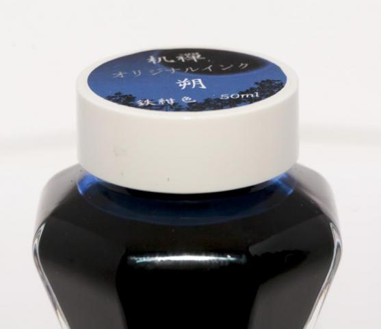
Pen And Message Saku Deep Blue My First Old Style Sailor Bottle.
catalyst posted a topic in Ink Reviews
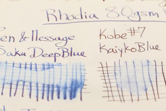
I became aware of the world of fountain pens (other than Montblanc) through Goulet on Youtube earlier this year and got sucked in. I write a lot so initially this was all justified, but now its clearly gotten out of control. Goulet no longer sell Sailor, so it took a couple months, but I then became aware of Sailor and how supposedly great Sailor inks were. Of course it was not long after that I became aware of their special store inks. I also found out that I missed out on when Sailor was offering the old style tall bottles more commonly with their regular inks, and everything I was buying now comes with the short stubby ink bottle, which is boring at best. I do not think the short bottles should be used on Sailor's inks which tend to be more expensive. Anyways, a goal of mine has been accomplished, I have acquired Pen and Message Saku Deep Blue in the old style bottle. I love the look of the bottle, but as so many have stated the cap can get stuck. I would have to say Pelikan Edelstein make the best bottle I have tried: They look great, feel solid, they are heavy with a wide base and the cap always works. I have never tried the Akkerman bottle. Ok tangent over. I adore this ink so thats a plus as well. Overall I love this ink, the look, the feel, the sheen, how it behaves so similarly on so many different papers. I still cant pick a favorite blue, but this is definitely a contender. I don't know anything about the ink or the company, so I'll just skip to the photos and the review in the photos: I decided since I was taking photos I would take photos of all the pens and ink bottles I have acquired this year since starting my addiction, but I kept the focus on the Saku for this review: If someone knows what this says on the top I would appreciate a translation: I'm no calligrapher, I havent even read a book, I just looked up letters online, so be easy on the handwriting haha. Review on HP Premium Laser 32lbs: Written with an italic dip pen: On 68gsm Tomoe River Paper vs Kobe #7 Kaikyo Blue, Bungubox Omaezaki Azure Sea, Bungubox 4B, Sailor Jentle Blue, Diamine Midnight, Diamine Blue-Black, Kobe #38 Kitanozaka "Kitano Hill" Night Blue, MIXTURE: Sailor Kiwa-guro and Sei-Boku, Pilot Iroshizuku Shin Kai, Pelikan Edelstein Tanzanite, Lamy Blue-Black: Water-resistant testing on Rhodia:These inks do ok after being left to dry for about 12-15 hours, especially considering they are not marketed to be water resistant. It does appear that there is some component of the ink remaining after putting water on it for about 30 seconds. More on Rhodia with a Brause #361: Saku Deep blue written with an italic dip pen on 90gsm Optik Paper from a Black n Red notebook vs Sailor Jentle Blue, Akkerman #5 Shocking Blue, Organics Studio Nitrogen Royal Blue, Bungubox 4B "Bung Box Blue Black", Bungubox Omaezaki Azure Sea, Kobe #2 Dock Blue, Kobe #7 Kaikyo Blue, Kobe #14 Maya Lapis, Sailor Jentle Souten:- 10 replies
-
- sailor
- pen and message
-
(and 7 more)
Tagged with:
-
Hello FPN. My first post here, and a bit of a crosspost from /r/fountainpens, but I figured I would tap your infinite wisdom while I can! I'm currently in Japan, and have picked up quite a few inks so far: Iroshizuku Tsuki-YoBung Box Sapphire "First Love"Bung Box Kabayaki Hamanako EelCustom Green Sailor ink for Morita Pen Shop in OsakaSailor Maruzen Eternal BlueKWZ Ink IG TurquoiseKobe Ink #6 BordeauxKobe Ink #44 Seaside HomeSailor Jently Yama-DoriANYWAYS, while my wallet is crying no, my fountain pens are crying yes, so I'm turning to you guys: If you were in Japan right now, what inks(obviously ones that I haven't gotten yet) would you get/recommend. Would love to hear your guy's opinions! Side note, Iroshizuku is so(relatively) crazy cheap here! Like $14 a bottle.
-
Sailor makes such fantastic inks, especially greens. Spurred by the generosity of our very awesome Claudia, I've put together a five-way comparison of pine green Sailor inks. You know, for those of you who need a reason to buy more. Er, right. Thanks, C.! Writing Samples http://i900.photobucket.com/albums/ac209/jasonchickerson/_FUJ0123.jpg Lamy 2000 F/M on Clairfontaine Triomphe http://i900.photobucket.com/albums/ac209/jasonchickerson/_FUJ0124.jpg Lamy 2000 F/M on Rhodia R http://i900.photobucket.com/albums/ac209/jasonchickerson/_FUJ0121.jpg Lamy 2000 F/M on Tomoe River The first thing I noticed in comparing these inks is how similar Tokiwa-matsu (current version) is to the discontinued Epinard. In writing, they are close enough to identical to my eye. Unless one plans some pointed pen calligraphy (see below) or other specialized use, owning one is enough. If I had to choose one, I'd pick Tokiwa. It is more lubricated and in a broad nib pen, which I didn't use here, will sheen more. The real standout for me in this comparison was Maruzen Jade, which is gorgeous, gorgeous, gorgeous. It's like someone asked J. Herbin to recreate Tokiwa/Epinard and this dreamy, muted wisp of an ink is what they came up with. I love it. The two Kobes were also less saturated than Tokiwa/Epinard, but they differ in hue more than Jade. The Kobes also felt thinner and less lubricated than the other three inks here, making them less pleasant to write with. Swatch Washes (three times fast!) http://i900.photobucket.com/albums/ac209/jasonchickerson/_FUJ0119.jpg Sakura Koi Water Brush on Clairfontaine Triomphe http://i900.photobucket.com/albums/ac209/jasonchickerson/_FUJ0118.jpg Sakura Koi Water Brush on Rhodia R http://i900.photobucket.com/albums/ac209/jasonchickerson/_FUJ0120.jpg Sakura Koi Waterbrush on Stilman & Birn Gamma Series I'll let the swatches stand for themselves, except to say that they all show very little water resistance. I would not expect any of these inks to hold a line for pen and ink washes. I'm so sure that I didn't bother trying. And for those that are unfamiliar with Stilman & Birn, they make some of the best sketching journals around. This is cotton rag paper more akin to watercolor paper than stationary. Chromatography http://i900.photobucket.com/albums/ac209/jasonchickerson/croma_FUJ0128.jpg From left, Tokiwa-matsu, Epinard, Maruzen Jade, Kobe #1 and #49 Each chromatography strip received a single drop of ink. The larger diameter circle and apparent amount of ink in the Tokiwa-matsu suggests that ink has a higher amount of lubrication/surfactant. Interestingly, though Tokiwa is more complex than the other inks here, all these inks save Kobe #49 utilize the same or very similar dyes in different combinations. #49 lacks the more waterfast dark blue dye that I suspect is responsible for sheen in the other inks. Purty Writing (that's Texas twang, ya'll) http://i900.photobucket.com/albums/ac209/jasonchickerson/_FUJ0125-Edit.jpg Zebra G nib (dipped) on Original Crown Mill Pure Cotton Tokiwa-matsu has become one of my go-to inks for pointed pen calligraphy. It behaves extremely well, holds a fine hairline and works on many papers. The only downside of Tokiwa for calligraphy is that when this much ink is put down, the ink sheens so heavily red that it no longer appears green. Maruzen Jade performs just as well as Tokiwa, sheens just a bit, and maintains its green hue. I would definitely add this to my calligraphy ink line-up. The other inks simply don't have the lubrication/viscosity properties required for this type of calligraphy out of the bottle. Plus, though they lack saturation, they show almost black on the page. http://i900.photobucket.com/albums/ac209/jasonchickerson/_FUJ0126.jpg http://i900.photobucket.com/albums/ac209/jasonchickerson/_FUJ0126-2.jpg Equally useable but Jade stays green, while Tokiwa sheens red Conclusion If I could pick one ink of the five shown here, it would be Tokiwa-matsu. I love the color, love the sheen, love the bottle. Luckily, it is one the only ink shown here that is available outside Japan without pricey importing through a third party. I am taken with Maruzen Jade, as well. But it's long gone, I'm told. Kobe inks are available through Cool Japan on Ebay ($20).
-
Sailor makes a number of store-exclusive inks for shops in Japan. The inks available fro, the Kobe Nagasawa shop is practically a line of inks all on it's own. Current up to 62 inks as of this writing. They are perhaps the easiest of the store exclusive inks to obtain, especially at reasonable prices. They can be found at Vanness Pen Shop online store, as well as Nagasawa's own page on Amazon. You can also get them through cool-japan on ebay. This particular color doesn't seem to get much interest. I bought a sample while ordering some other inks. For starters, there's nothing wrong with this ink. It is a vintage-style, less saturated ink, in a traditional color: indigo blue. It's pleasant to use without issues at least for me, in the pen I've been using with it. No sheen, but it does have some nice shading. It seems to have some water resistance. Pen: Gate City Belmont (M-steel) Papers: MvL=Mohawk via Linen, TR=Tomoe River, Rhodia=Rhodia 90g ivory. Camera: iPhone 7
-
Sailor makes a number of store-exclusive inks for shops in Japan. The inks available fro, the Kobe Nagasawa shop is practically a line of inks all on it's own. Current up to 62 inks as of this writing. They are perhaps the easiest of the store exclusive inks to obtain, especially at reasonable prices. They can be found at Vanness Pen Shop online store, as well as Nagasawa's own page on Amazon. You can also get them through cool-japan on ebay. This particular color doesn't seem to get much interest. I bought a sample while ordering some other inks. The name also appears as Minatojima Island Blue. There's some reviews from a few years back that complain of excessively long dry times with this ink. I didn't experience that to be true, but the nib, while quite wet, was a fine. Perhaps it would be an issue with wider nibs. The ink is fairly saturated, but not to the level of say Kobe #14 Maya lapis, which is often used as a point of comparison with this ink. This doesn't have as much red in it as that ink either, and it seems to have a bit more gray in it's value, it's not as bright blue as #14. There's some definite shading, some pink sheen that amazingly sometimes even appears on the absorbent paper such as MvL (which never shows sheen). It's a strong looking, professional blue. Depending on the paper, I don't think the dry times are that bad for papers such as Rhodia, Tomoe River. The ink is not water-resistant, it tends to spread to the back side of the paper and run, so don't count on saving any writing in such cases. There are many blue inks in this line, over 27%, and they all vary in saturation, and relative degree of red vs green in their hue, it may well benefit the potential buyer to get some samples of inks they think they'll like. That way they can give an ink a reasonable test before an actual purchase. While a few of the most popular inks go out-of-stock on occasion, they are usually readily available. Pen: Edison Mina (F-steel) Papers: MvL=Mohawk via Linen, TR=Tomoe River, Rhodia=Rhodia 90g ivory. Camera: iPhone 7
-
For a little while now I've been happily buying a bottle of Kobe ink every other month. They came in at about 16.99 with free shipping. Seemed reasonable enough and they usually slipped in under the attention of the import duties due to everything on the label being in Japanese. Today though, I was left in shock. They are now 27.99! That's almost double the price. I didn't notice the huge price jump or see anyone mention it. I'm not sure I really want to pay that price for ink; especially when there are so many others around that are under a tenner and are good inks. Does anyone know of a UK or European outlet that has reasonable prices for Kobe inks?
-
Sailor Kobe Nagasawa #1 Rokko Green (Upper Green) I bought this ink quite a while ago, late 2015, and actually never got around to even using it, let alone writing a review. Shame on me, right? This is a murky green, and lovers of this color range can rejoice in the wonderful range of colors encompassing this term. And Sailor makes some nice ones. The ink leans slightly towards blue rather than yellow. It's quite dark, but not as dark as BB Dandyism. It's more green than Sailor Miruai and less neutral than KWZ Foggy Green, the latter being the nearest in color from the KWZ range that I have. It has good flow and lubrication. The shading is more than minimal, but not great, just enough to show it's really a fountain pen and not a felt tip marker. Fairly dark but recognizably green. It has some water resistance, and on the papers I tried, was quite fast-drying compared with other inks. Some show through and a little bleed through on the cheaper inkjet paper, which may compromise writing on the verso depending on the nib being used. Sorry I don't have an ink droplet as the Beaumont pneumatic-filling mechanism aren't conducive to emptying a drop at a time. Some people have said this ink is close in color to the long gone MB Racing Green. At present, readily available in Japan, also via Amazon (US), Vanness Pens. Maybe a few other places. Pen: Edison Beaumont (F-steel) Papers: MvL=Mohawk via Linen, TR=Tomoe River, Hij=Hammermill 28 lb inkjet, Rhodia=Rhodia 90g ivory. Camera: iPhone 7
-
- 7 replies
-
- ink review
- kobe
-
(and 1 more)
Tagged with:
-
I don't think having both this one and Oku-yama is necessary, but if Oku-yama is a little too red/pink for you, then this one might be worth a look: Nice sheen: Comparison with Oku-yama (Oku-yama on the left, Kounan Maroon on the right): And again:
-
This is a really nice ink, but it's essentially an Iroshizuku Shin-kai clone. If someone is looking for a bluer, more interesting alternative to Sailor's usual Blue Black, then this is the ink to get. It behaves perfectly; I just wish it weren't as close to an ink I already own and use all the time. http://i1085.photobucket.com/albums/j426/moducasse/IMG_000133_zps046220e3.jpg http://i1085.photobucket.com/albums/j426/moducasse/IMG_000134_zps28dae7ff.jpg Interestingly, Tomoe River makes the two inks look completely different. It brings out the blue in the Shin-kai (fourth line), while bringing out the gray in the Nagata Blue (last line). http://i1085.photobucket.com/albums/j426/moducasse/IMG_000136_zps340acbd9.jpg
-
If you ever wanted a slightly more serious looking Asa Gao with less shading and playful light blue highlights, this is probably what you're looking for. Will fit better in office/business use while still retaining the overall hue of Asa. I've included a scan of Asa with the same scanner parameters, you can save both images on your computer and quickly flip between them to get an idea of the differences. To me Maya looks like a less contrasty version of Asa (less difference between highlights and lowlights in the shading).
- 2 replies
-
- kobe
- maya lapis
-
(and 1 more)
Tagged with:
-
I'm not trying to compete here with visvamitra and his amazing review series of the complete Kobe line. But I have had this ink for a while, and thought I'd reviewed it, but I never did. So when I inked it up and decided to work in a review. This is a wonderful ink, and just really great. The only think I noticed was that there was a little bit of staining on the converter. It washed right out with plain water when cleaning the pen, but I thought I should mention it. Papers as usual are MvL=Mohawk via Linen, Hij=Hammermill 28 lb inkjet, TR=Tomoe River. Fairly water resistant in that there's enough ink left on the paper, but in a wash there's a lot of ink going all over the place. A deep rich blue dye. The photo of my review for the inkjet paper is blurry, so I'm passing on posting it here. Maybe I'll try and take a pic tomorrow.
-
Here's a review of No. 26! Hope you like it! Certain members of this forum have been a big influence in this purchase...with all of those reviews they keep posting http://i1279.photobucket.com/albums/y529/lovementos/Ink/SNKNo26WadamisakiBlue_zps38a513a1.jpg




.thumb.jpg.a72a0b7d2f7cce6831d6f268d85f3251.jpg)


