Search the Community
Showing results for tags 'john mottishaw'.
-
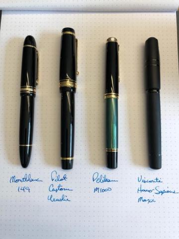
The (Japanese) Elephant in the Room Pilot Custom Urushi I won’t bore you with the specifications, basic descriptions, or construction components of this pen, because they have been covered in other reviews of this pen. Instead, I’d like to tell you how I feel about owning this pen, which I received about a month ago... Long enough for the honeymoon to be over and to be able to take a critical look at this pen. Some background: I have been using fountain pens since I was about ten years old. I have a small collection of top-drawer pens, including Montblanc 146 & 149, Pelikan M800 & M1000, Visconti Homo Sapiens Dark Age Maxi, Nakaya Neo Standard, Parker 51’s and the ubiquitous Lamy 2000. I’ve always loved thick pens, and at my age, arthritis is starting to develop so I love them even more. I began searching for a new pen because while I was happy with the width of the grip on my 149, I was unhappy with its length. Likewise, I liked the length of the grip on the M1000, but not the width. I purchased the Nakaya six months ago and love the urushi finish, so I focused my search on Japanese pens. With some advice, I zeroed in on the Pilot Custom Urushi. I purchased my pen from nibs.com and was shocked when the card was personally signed by John Mottishaw, indicating that he set up this pen. (The other two pens I ordered from them were adjusted by his team and I’ve heard through forums that he is reducing his work. I feel lucky. Thanks, John!) NIB: The pen has a huge and wonderful medium nib, which writes very similarly in width to the Pelikan M1000’s fine nib. It has a touch of bounce, which is much less pronounced than my M1000 and Visconti Dream Touch nibs. I find that I have to pay very close attention to the latter two nibs because they require very precise pressure, which can be fatiguing in long writing sessions. I do not discern any feedback with this nib, which is slightly disappointing when compared to my Nakaya, but something I can live without. GRIP: The most important part of this pen for me and its main selling point. For me, it is utter perfection. It is slightly longer than the M1000, very similar to the width of the 149, and fits my hand like it was custom made for me. (Maybe that’s the “Custom” in the name.) The slight taper is very comfortable as well. I was worried that the gold band embedded in the grip could be felt, but I was pleasantly surprised that it feels seamless. I am able to write for hours without my fingers cramping or my knuckles burning. I couldn’t be happier with the grip on this pen! Here, the pens are aligned by the threads so you can really compare the grips: FIT & FINISH: This pen feels like it was made under a microscope. The build quality and tolerances are quite literally amazing and much better than any of the other pens that I own. When I unscrew the barrel to access the converter, I can feel absolutely no feedback. (I had to look to make sure it was coming apart as it was that smooth.) The metal bands feel cool to the hand and not plasticky like on the M1000. Under a loupe, the black filling in the lettering on the cap band appears to have been perfectly applied and the contrast with the gold looks really great. However, the black lettering makes the clip on the cap look cheap and out of place because PILOT is merely stamped into the metal and not filled with black paint like on the band. I would have greatly preferred the clip and band to match. Also not matching are the end cap on the barrel and the finial on the cap. The cap finial has a gold band while the body’s does not, and to me, it makes the barrel look unfinished and overlooked. URUSHI: If I didn’t know better, I would have thought that this pen was made of high quality plastic. I cannot easily discern what is urushi and what is plastic. It feels very highly polished and is one of the most reflective pens that I own. I ordered mine in black instead of vermillion because my brain has a hard time filling a red pen with blue ink (I know, I’m strange), so the vermillion pens may have a more pronounced urushi look. This also may be a testament to the quality and finishing of the plastic as well (no seams or manufacturing marks). I would have been quite happy to pay a lot less for this pen sans urushi, but do appreciate the amount of labor that went into creating this writing instrument. CAP: This is the most ridiculously, comically large cap ever. It is so big that I can’t store this pen in any of my pen cases, including my Montblanc single pen case made for the 149. (The case microscratched the cap while pulling it in and out.) It fits into my Nakaya pen kimono, but that parking spot is reserved for the Neo Standard. I found a folding pen case at Montblanc that it fits into, but because of the size of the cap and necessary storage case, I do not see myself taking this pen with me when I travel. A shame, really. FINAL THOUGHTS: If I had to buy this pen over again, I’d absolutely do it. While I have some quibbles about the pen overall, the wonderful feel in my hand and fantastic nib are what makes a great pen great… At least for me.
- 16 replies
-
- pilot custom urushi
- montblanc 149
- (and 3 more)
-

Before And After - Pilot Decimo Extra Fine To Medium > Architect Point
RobertJWarren posted a topic in Fountain Pen Reviews
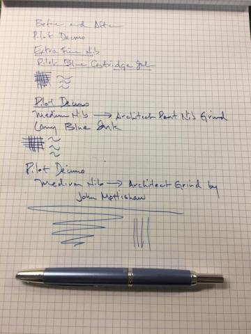
Hi all I bought this Decimo last year with an EF nib. Never used it very much at all. I have learned that I don't prefer the narrow line of a japanese EF nib. So, last week while perusing Classic F Pens site, I thought why not try a John Mottishaw modified Architect Point (grind). Received it yesterday. See the picture below. https://www.flickr.com/photos/126999499@N06/33180623081/in/dateposted-public/- 1 reply
-
- grind
- architect nib
-
(and 4 more)
Tagged with:
-
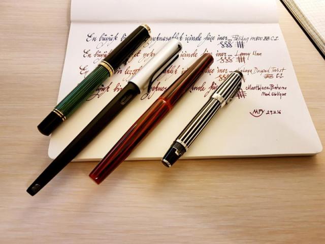
Hi, I learnt a lot from this forum and here is my payback...I want to share my comparison of couple of my Italic pens/nibs. Enjoy... The pens/nibs are: 1-Pelikan M800 BB Cursive Italic by John Mottishaw. Line variation ~x4 (1.0mm/0.25mm) 2-Lamy 1.1mm (standard calligraphy pen). Line variation ~x1.8 (0.9mm/0.5mm) 3-Nakaya Decapod Twist Aka Tamenuri BB Cursive Italic by John Mottishaw. Line variation ~x3.6 (0.9mm/0.25mm) 4-Montblanc Boheme Oblique Medium (original Montblanc nib; no customization). Line variation ~x2.0 (0.8mm/0.4mm) The meaning of the sentence in the pics is "The biggest pleasures become mundane if they are repeated excessively" Observations: John Mottishaw's Cursive Italic nibs are similar to Osmoroid/Manuscript calligraphy pens in terms of nib sharpness but feels not as cheap. They are definitely sharper than Lamy Italic nibs but not so much as to bother for daily writing. Nib is sharp but not too sharp to catch paper. Given that stubs are too blunt for me Cursive Italic is definitely perfect for my taste. These pens can perfectly be used for daily writing. I asked John to make Pelikan 1.0mm and Nakaya 0.9mm. Based on my measurements they are exactly as I wanted... Finally, for daily note taking, 1.0mm seems little bit too bit. My miniscules are getting too big for my taste. On the other hand 0,8mm is too small to some enough line variation. Therefore, for me 0.9mm is the optimum nib size for daily note taking. Let me know what you think... Thanks
- 7 replies
-
- john mottishaw
- cursive italic
- (and 3 more)
-
WOW, WOW, WOW, WOW, WOW, WOW! OMG! And did I say WOW? I'm lost for words at the minute. Both with the pen and the import costs! ha. I also had the Snowflower converter as well. Just filled it with my favourite ink, Tsuki-yo. I went for a medium nib as I was worried the fine may be too fine. I could have been wrong. LOL. However the nib just feels great and 'sings' across my Design-Y notebook so well. OMG I am in pen heaven. Heki-tamenuri? I thought the Brown would be thicker than it is over the Green, and there is one little 'blob' of Brown on the pen which is a slight disappointment to me, BUT I have to realise it is hand made. Oh yeah, and the nib is not perfectly lined up with the 'fin' either! now i am being anal I know. Enjoy! Im off to write more with it.
- 46 replies
-
- dorsal fin
- nakaya
-
(and 2 more)
Tagged with:
-
I just received my Namiki Falcon with the John Mottishaw Spencerian customization. I thought I would share my initial thoughts and how this FP compares to my Serwex MB with flex nib that I've had for a few weeks. Right out of the box both pens worked very well, but have very different feels in relation to flex pressure. Both have comparable line variations, but the Falcon goes a little further each way. Line Variation The biggest difference is the Falcon has much better thin line definition. The Falcon can produce thinner lines that are crisper that allow for extremely small loops or counter forms without lines bleeding into each other. The Serwex looks very close in the picture, but in reality the Falcon is much better at line definition - note the smallest loops and how the Falcon stays tight and clear. Another difference worth mentioning is how much sooner the Falcon can produce the thick lines. Because the nib on the Falcon flexes so easily and fast you can transition quicker and smoother. The Serwex requires a little "getting up to speed" stroke meaning the thicker lines don't always happen at the top of a stroke whereas the the Falcon can produce thick as soon as you turn on a dime. I also noticed how much easier it is to create wedge shapes with the Flacon. Because the nib snaps back faster you can sit at the start or end of a thick line for a split second and that will create the crisp wedge shape rather than tapered strokes like the Serwex. Ink Flow The second biggest difference is ink flow. The Spencerian customization includes an increase in ink flow to the feed. This REALLY shows. The Falcon just won't railroad for me. The increased ink coupled with the thinner line definition just screams quality. How John Mottishaw is able to achieve both is a mystery - I'd think one would counter the other, but they work together perfectly. Even the thinnest lines from the Falcon can produce some shading if you look closely. The Serwex railroads constantly and typically the fix is to unscrew the barrel and push a little ink up the converter into the feed. Feel/Feedback The Serwex is definitely smoother because it feels like a nail compared to the Falcon. The Falcon Spencerian tip is scratchy, but not nearly as scratchy as I anticipated, and if you have a VERY light touch it will glide. People seem to freak out in some threads about the nib grind. I find it requires a soft touch, but it's not difficult if you have experience with a fine paint brush or creating small details. The Falcon's tip is so fine that the thinnest lines require a soft yet confident quick stroke. Basically you need to know where you are going and be confident with that stroke - you can't move slowly, plotting your way around or the thin lines of the Falcon will look shaky because the nib will hit every bump in the paper grain. Move fast and soft like a ninja! If you want to move slower you need a steady and VERY light hand for the thinnest of lines or you can add a tiny amount of flex to lubricate the line a little more. You get OPTIONS!! The sound is sort of cool. Just like in the famous youtube Falcon video. SWOOSH, scraaaaaaaatch, SWOOSH, scraaaaaaatch... It's a very artsy sound. The nib bounce/rebound is very different. It surprised me just how easily the Falcon flexes. I'm use to the Serwex which requires IMO double the force. The Falcon also rebounds faster and stays right on top of the feed immediately ready to flex again. The Serwex requires a slower hand or the nib railroads. Also, because the Serwex requires more pressure and a slower hand it is a little more tiring to use, and creating smooth transitions from thin curves to thick curves is actually pretty hard compared to the Namiki. The Serwex requires so much pressure that thin to thick transitions can be abrupt and lack a smooth form. Transitions with the Falcon are easier to produce and look more natural. Customer service I'd also like to add both companies that sold me the pens were very good to deal with. I purchased the Serwex MB with a flex nib from Fountain Pen Revolution. There was no contact, and none was needed. They did included an additional Serwex eyedropper pen listed for $5 and an additional non flex nib for free. Delivery time was around 5 business days. I purchased the Namiki Falcon with the famous John Mottishaw custom Spencerian grind from Nibs.com. I asked them a few questions via email and they replied within minutes. I was actually shocked with their speed. Once I was ready to order they answered a few more questions, sent the invoice with detailed descriptions of the pen and grind and ink flow work to be done. John worked on the pen either that day or the next morning as it was ready to go in about 24 hours. I asked if they had this grind already done and in stock as the turn around time was so fast. They said no that John grinds them as the order for this pen comes in. The pen was in the mail that day (Thursday) and I received the pen on Monday! THEY ARE FAST! The pen shipped with the new redesigned Pilot box which looks a little smaller from front to back and it has a really cool, solid window in the lid. They also included an extra blue cartridge of ink and blotter paper along with the standard cartridge and standard converter. Other Thoughts When the Serwex cap is posted it spins freely which feels sort of cheap. It locks on very well, but I wish it didn't spin. That would improve the overall experience IMO. Also, the FPR flex nib could use some visual enhancements. It would be great if it was high polished and a different FPR font and orientation imprint was used. Add some scroll work and it would be a huge improvement. The Falcon's gold furniture is MUCH richer looking in person. I've looked at every picture and video on the internet of the Falcon, and the gold clip and band look even better in person - darker, richer in color. Conclusion Having both pens I love the Falcon w/Spencerian much better, but for $20 the Serwex MB flex probably can't be beat. I recommend both and would suggest to decide based on budget. The Serwex makes a better everyday writer because the nib is harder, less scratchy and cost makes this pen a tool and not an heirloom. The Falcon is more enjoyable to use IMO and screams quality. If what you desire is a great Spencerian style or thick and thin line variation then the Namiki is by far better. Fabriano paper with Noodler's Eel Turquoise and Apache Sunset.
- 4 replies
-
- john mottishaw
- namiki
-
(and 3 more)
Tagged with:


