Search the Community
Showing results for tags 'jentle'.
-
Sailor Shikiori Chushu (Four Seasons - Autumn: Mid-Autumn)
A Smug Dill posted a topic in Ink Reviews
(Another quickie which is largely a by-product of my testing my desk pens...) Colour: I like it, it's a very pleasant dark grey tending towards the cooler side of the spectrum. I think it sorta fills a gap between Iroshizuku fuyu-syogun and Iroshizuku take-sumi which isn't filled by any of the colours in the Iroshizuku range (including shin-kai). On the other hand, there is nothing outstanding about it. Flow: Flows well enough, but not overly wet. That is a good thing. Drying time: Very quick with my 'Japanese fine' nibs, with basically no smearing after 5 seconds. My pen with the fude nib seems apt to leave a blob of ink at the top of my zeroes, and those are still prone to smearing after 20 seconds. Water resistance: Very good. Ghosting and bleed-through: None whatsoever observed from writing on the Rhodia paper I used. Shading: Some, but not very pronounced. Sheen: Not that I can see. -
Ink Tests For The Common Office - Sailor Jentle Tokiwa-Matsu
LordBaggins posted a topic in Ink Reviews
Ink Tests for the Common Office - Sailor Jentle Tokiwa-Matsu Today in my Ink Tests for the Common Office series I am reviewing Sailor Jentle Tokiwa-Matsu, aka Pine Green. When I received this ink in my latest sample-haul, this was the first one I grabbed. I sincerely doubted that I would have cause to use a green ink in the office for anything other than corrections, and only having three pens, I did not think that I would be using it much until my collection inevitably grows. So without further ado, let’s move on to pictures! Chromatography There is a whole lot going on here, from teal-blue, sky-blue, pine-green, a light burnt-umber, and pale-yellow. It's definitely a pretty combo. White-Copy Paper I am beginning to realize that sheen is very, very rarely going to happen on standard office paper. Honestly, that's okay, because for work I don't want too-too much going on to draw attention to the fact that this is neither blue or black. It is slightly on the wetter side of things, and does feather and bleed-through, just slightly less than Namiki Black. As long as you don't swipe/drop water all over the page, or smear the ink, you probably wouldn't notice, at first, that the ink is not an office-standard color. Because of how wet the ink is, I would not recommend this for two-sided documents on standard Staples white copy. As with my previous review, alcohol was not available. Bleach caused the ink to almost disappear, except for the barest of yellow remnants. Photocopy Pursuant to the recommendation of namrehsnoom, I am including an image of what the ink looks like after photocopying. It is interesting to note that smearing and water damage didn't seem to show up much, if at all. If one were able to mop up a spilled drink quickly enough, a b/w photocopy of the document would probably look just fine. This gets me thinking...maybe I should add Dr. Pepper or coffee reaction tests in the future...hmmm. Moving on. Longer Writing Sample - White Copy Yellow Legal Pad In longer writing samples, the bleed-through and show-through start becoming more noticeable, but so does the shading. There was no bleed-through on the Staples yellow legal pad, which is really starting to impress me for cheap paper. Because the yellow paper doesn't suck up the ink as much, smearing was much more prevalent. Staples Copy Shading Yellow Pad Shading Even on cheap paper, the shading shows up, although it is not super noticeable. Final Thoughts: Surprisingly, I feel comfortable using this ink in the office. I would not use this ink for signing my name, however, as water and bleach can mess with longevity too much. And, while I would certainly use this ink for notes on the legal pad, and possibly corrections, I would not use this on any two-sided documents (which, lucky for me, are anathema in my office). If you like more reserved greens, or just want to rebel in inconspicuous ways, I think you might want to give this ink a shot. For this review I used a Xerox 3220 Scanner set to Color at 300dpi, an iPhone 7s back-camera with no filters and set to large, a Brother MFC 8810DW photocopier, and some beautiful, industrial florescent lighting, as one would most often find in these circumstances. Disclaimer: I received this sample from Anderson Pens at my own expense. I am not being compensated for this review, or sponsored in any way. Colors may appear differently on different screens. The images and opinions in this post are mine and mine alone. -
Sailor Shikiori Kinmokusei (Four Seasons – Autumn: Gold Osmanthus)
A Smug Dill posted a topic in Ink Reviews
Another quickie review, on another 'four seasons' colours in the Sailor Jentle Ink line for which I came too late to the party, and missed out on getting it in a 50ml bottle at the old pricing. Colour: I love orange – especially when it's the colour of the garment I'm wearing, which means it's far more in others' faces than in mine, although that's not the case here – either bright and intense, or deep and dark, and I love the colour of Sailor kinmokusei, which certainly does not disappoint me in the way Iroshizuku yu-yake and Noodler's Operation Overlord Orange did. (I only just opened my bottle of Monteverde Topaz in the Gemstone Collection range, to scratch a couple of words on this test page with a dip pen and a mapping nib as a comparison, so I haven't got a very clear or detailed view yet of how it compares with Sailor kinmokusei over more extensive pieces of writing.) Feathering: None observed. Ghosting and bleed-through: None, either from writing or from repeated passes with a soaked cotton swab. Drying time: Very fast, for writing done with an EF nib with (usually) moderate-to-wet flow; there is almost no observable smearing in just five seconds. My zeroes with a 'broader' nib tend to leave one or two wet spots around the oval shape, and there is some smearing of the '30s' even though the '25s' mark did not smear. Water resistance: Forget about it. Shading: Very subtle, if any, along a single stroke of the pen or an unbroken line, in spite of the range of shades this ink can display. I don't have a problem with that. Sheen: None that I can see on the Rhodia paper I used, and that's fine by me. My verdict: I like this ink, it is well-behaved, but with the 'new' pricing for 20ml bottles in the Sailor Shikiori line, I'm not going to rush about to buy spare bottles just yet, especially when I haven't spent enough time using Monteverde Topaz or perhaps trying Diamine Pumpkin. -
http://i900.photobucket.com/albums/ac209/jasonchickerson/_FUJ0110.jpg http://i900.photobucket.com/albums/ac209/jasonchickerson/_FUJ0109.jpg Written review on Rhodia dotpad #16 http://i900.photobucket.com/albums/ac209/jasonchickerson/_FUJ0103-Edit.jpg Desiderata Mercury Flex Pen, Zebra G nib, OCM Pure Cotton Paper http://i900.photobucket.com/albums/ac209/jasonchickerson/_FUJ0111.jpg Sakura Koi Water Brush, Strathmore Watercolor Paper http://i900.photobucket.com/albums/ac209/jasonchickerson/_FUJ0113.jpg Souten is my newest ink purchase. I bought it because I lack a blue light enough to use in pointed pen calligraphy that still reads blue when a lot of ink is laid down. This one does, and it works really well for this purpose. As an ink for everyday writing, I'm not quite so impressed. Like most Sailor inks I've tried, Souten is on the wet side. It's not extremely lubricating, though, and I find my pens write with a bit more feedback than I'd prefer. One area where Souten really shines is dry time. I did the test three times just to make sure. This ink dries on non-absorbent papers like Rhodia in under 5 seconds! For comparison (sorry, I don't have access to any comparable blue hues at the moment), Herbin's Bleu Nuit dried in 12 seconds (very respectable) and Shin-kai dried in 16 seconds (average). Reasonable care was taken to ensure color accuracy, etc.
-
Sailor, as most of you are aware is one of the Big 3 companies in Japanese fountain pen industry. Apart from some great nibs, Sailor does manufacture some amazing inks. Probably, Sailor is the only Japanese company that has released many more variants of ink along the lines of store-speciality inks than under its own umbrella. The ink I am reviewing is the old Sailor Jentle Sky High Ink with product code (13-1000-241). It been one of my favourite blue inks, although I do have a bottle of similarly hued and a gentler newer Souten (13-1005-205). Here goes the review. Below is a link to the review on my blog.Sailor Jentle Sky High Ink (Old) Review Bottle/Packaging Sailor Sky High came in a 50 ml bottle and looked like the below one. It was packaged in white cardboard box with everything except brand and volume of ink, in Japanese There is a plastic funnel insert to help fill your pen with ink, which in my humble opinion is equally useless, given the pan-like structure of the bottle.Writing with Sky High The ink is a well behaved with absence of any noticeable feathering on most papers. Depending on the paper thickness there could be some ghosting in case you have used multiple layers of ink, else it a pretty much 'no worries' vibrant blue ink.Feathering: None Ghosting: A bit on Muji notebook Color Variation: Great, Vibrant from light to dark azure shades Sheen: Towards Violet & Red Wetness: High-Medium-Low Saturation : High-Medium-LowWater Resistance: High-Medium-Low Ease of Cleaning: Easy-Moderate-DifficultShading: High-Medium-LowFlow: Good-BadLubrication: Good-BadDrying Time: 30 seconds+ Water Resistance: High-Medium-Low Price: High-Moderate-Low (Around $ 12 as landed price in 2014) Digital Colour Meter Nibs Main SuppliesPelikan M200 Cognac - Italic Nib Muji B6 PP Cover Notebook, Dotted PaperThank you for going through my very first fountain pen ink review.
-
-
http://i900.photobucket.com/albums/ac209/jasonchickerson/tokiwa-matsu%2003.jpg http://i900.photobucket.com/albums/ac209/jasonchickerson/tokiwa-matsu%2002-2.jpg http://i900.photobucket.com/albums/ac209/jasonchickerson/tokiwa-matsu%2004.jpg http://i900.photobucket.com/albums/ac209/jasonchickerson/tokiwa-matsu%2001.jpg http://i900.photobucket.com/albums/ac209/jasonchickerson/tokiwa-matsu%2002.jpg http://i900.photobucket.com/albums/ac209/jasonchickerson/tokiwa-matsu%2001-2.jpg http://i900.photobucket.com/albums/ac209/jasonchickerson/tokiwa-matsu%2005.jpg Tokiwa-matsu is not a color I would normally love. I like my greens on the warm side, but this is a definite pine that borders on emerald in some light. Yet there is something very special about it. I wish it were better behaved on cheap paper, but I guess there is no perfect thing. It should get plenty of pocket time in any case. Tokiwa looks especially nice on ivory paper. Quick sketch of a sphere on cheap Strathmore watercolor paper. Notice how the line does not hold at all with a light wash. I haven't done any proper sketching with this one and I'm not likely to; it will be relegated to background washes if anything. Strangely, it may work for skies... Care was taken to ensure color accuracy, but it was a tough one. It seems I could only get the Tokiwa-matsu or the Alt-goldgrün to look right, never both. Hopefully it's not too far off.
- 25 replies
-
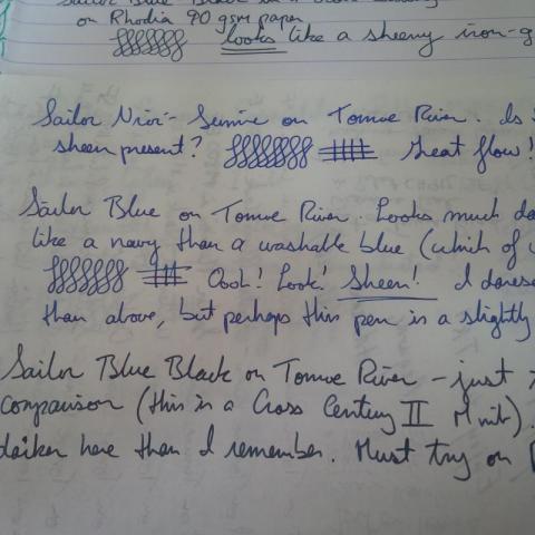
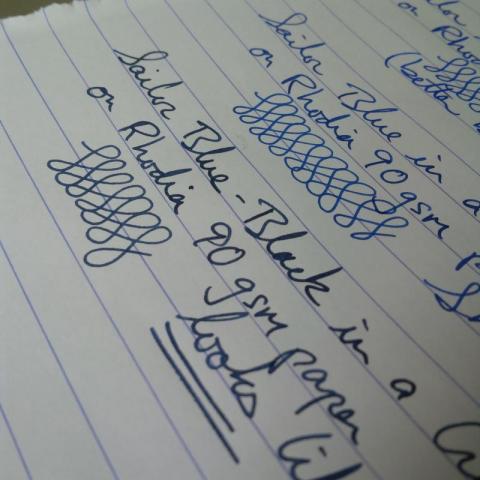
I have a few Sailor inks and I am always gobsmacked by their excellent flow and behaviour. There was a thread a while ago about loyalty to ink brands, and Sailor has mine. Unfortunately, due to a conspiracy of geography of miserliness, none of the Sailor shop exclusive inks are within my possibility space. I've always liked the colour of Parker Quink Washable Blue when wet, and have recently discovered the less ephemeral Diamine Sargasso Sea (and its sheen!) Due to reports of staining, Sargasso Sea only inhabits my less expensive pens. I'm on a mission to find a well-behaved blue with similar saturation. Naturally I turned to Sailor. I've compared Nioi-Sumire from the Four Seasons line, bog-standard Jentle Blue, and it's cousin Jentle Blue-Black. I have a bottle of Sei-Boku, but I don't consider it as well-behaved as the Jentle inks. YMMV. Written comparisons on 1) no-name writing pad, 2) Tomoe River (sample graciously PIF'd by alc3261), and 3) Rhodia 80 gms (not 90 as incorrectly written). Enjoy!
- 13 replies
-
http://sheismylawyer.com/She_Thinks_In_Ink/2015-Inklings/2015-Ink_0096.jpg
- 33 replies
-
- de atramentis
- private reserve
- (and 8 more)
-
Hi all, I wondered if anyone knows where I might find a bottle or two of Sailor Jentle Peche? I know it's discontinued, but someone here might know where I could find some. Thank you so much! Also, I welcome any closer dupes for this ink too, if you know of any. Again, my thanks to you.
-

Are Discontinued Sailor Jentle Inks Still Around?
Chrissy posted a topic in Th-INKing Outside the Bottle
I have seen some bottles of Sailor Jentle ink for sale that look like the older style labelled bottles that were discontinued. However, I don't know if the new colors were first issued in the older style bottles with a label color that matched the ink shade so they looked identical to the old colors. When Epinard, SKy High, Grenade, Apricot and Ultra-Marine were discontinued, were the replacement colors issued straight away in bottles that had the same labels? Or were the new colors only issued with new type bottle labels? I'm only asking because I have seen some bottles with the older style labels on sale and am not sure if they are the old colors or new colors. If I could read the labels I might know which shade they are. -
I'm coming rather late to Sailor inks. The two "Jentle" inks I've tried so far, the Doyou (dark brown) and Shigure (deep purple) are making an excellent impression. I've using the Doyou for long enough to rank it as a favorite. It's only my second day with the Shigure, so I want to give it a bit longer before making any final judgments, try it in a variety of pens and see how it goes, but so far it's doing great. But this isn't about how good they are as inks. I'm wondering about the naming of this product line. Of course, this must have come up here before, but when you google something like "Jentle ink spelling site:fountainpennetwork.com", you get an unwieldy number of results. Sailor's own site doesn't seem too helpful on this either. Although I suppose I could Email them. Why Jentle? Is this a deliberate advertising misspelling of Gentle, to make it a trademark? Was it an unintended misspelling, which they then stuck with? Is it a Japanese word? A word in some language other than Japanese or English? An acronym or abbreviation? Or what? Just curious if anyone has the answer.
-
Bought the new Sailor Jentle inks in a fit of spending last week. Not too into very dark colors so will probably not get the last 2 colors, Doyou and Miruai. Otherwise these are the new colors that replace the previous set. This is the first time I am doing this type of comparison. So excuse me if some of the observations are a little newbie-ish. _Tokiwa Matsu is probably my favorite. I love green inks, particularly ones that are yellow hued. _Some of the colors appear, look and behave differently on different pens. Eg Nioi Sumire looks distinctly purple on the broad pen, but is more blue on finer pens. _Oku-yama is my most sheening ink right now. Love the metallic green sheen over the burgundy brown color. _Sailor inks have a very interesting smell that is distinctive, even when you write.