Jump to content

Search the Community

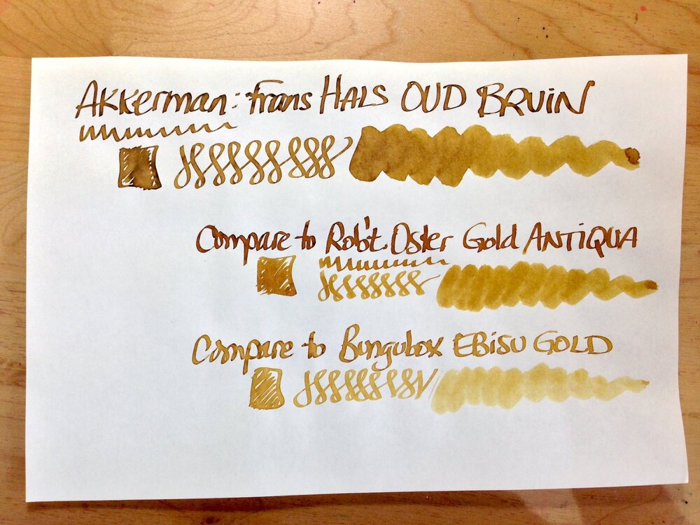
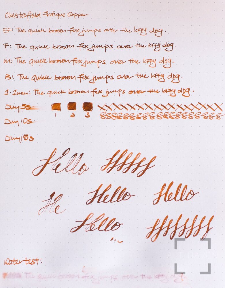
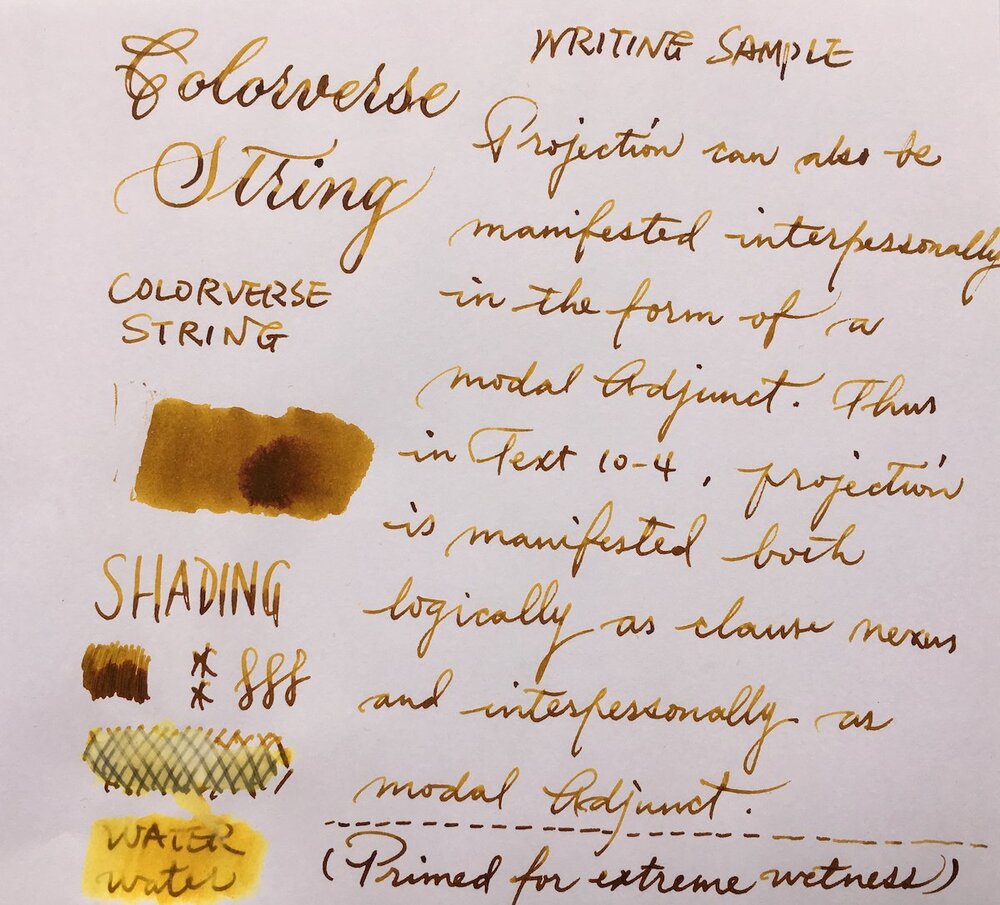
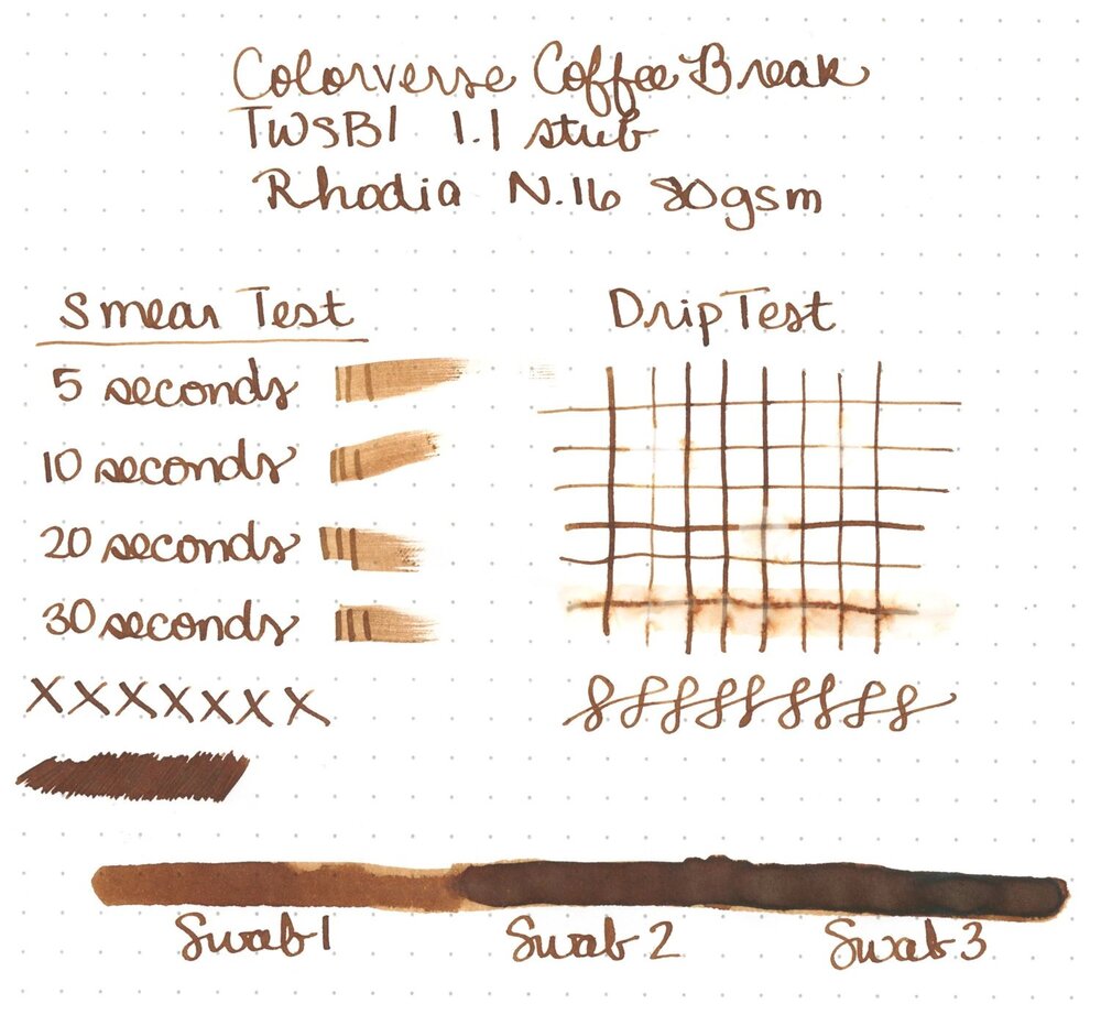
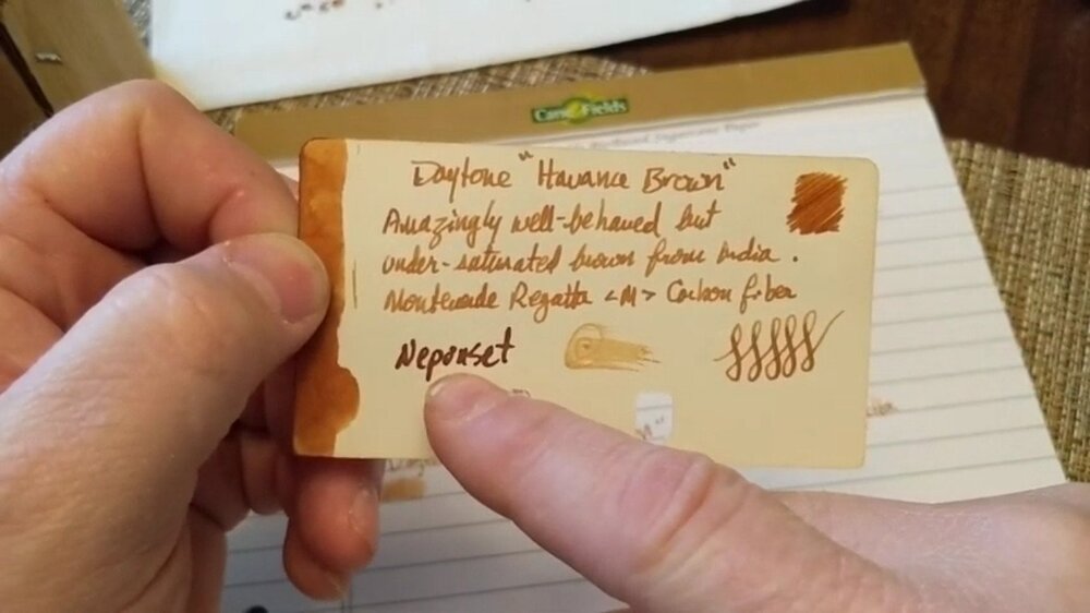
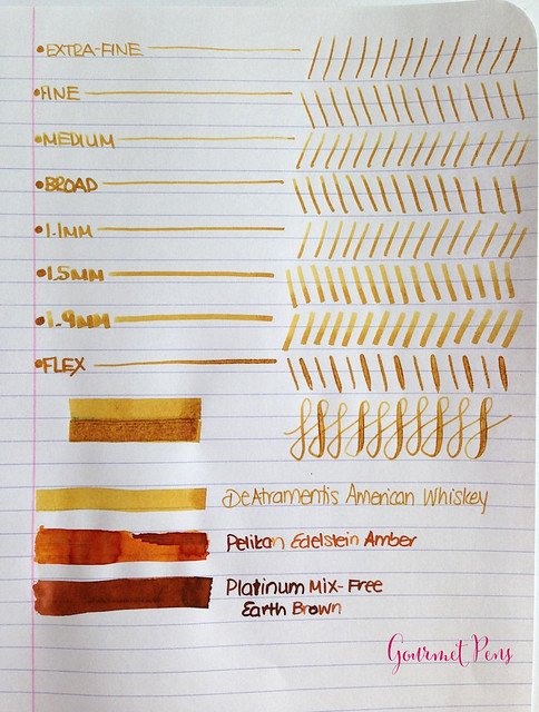
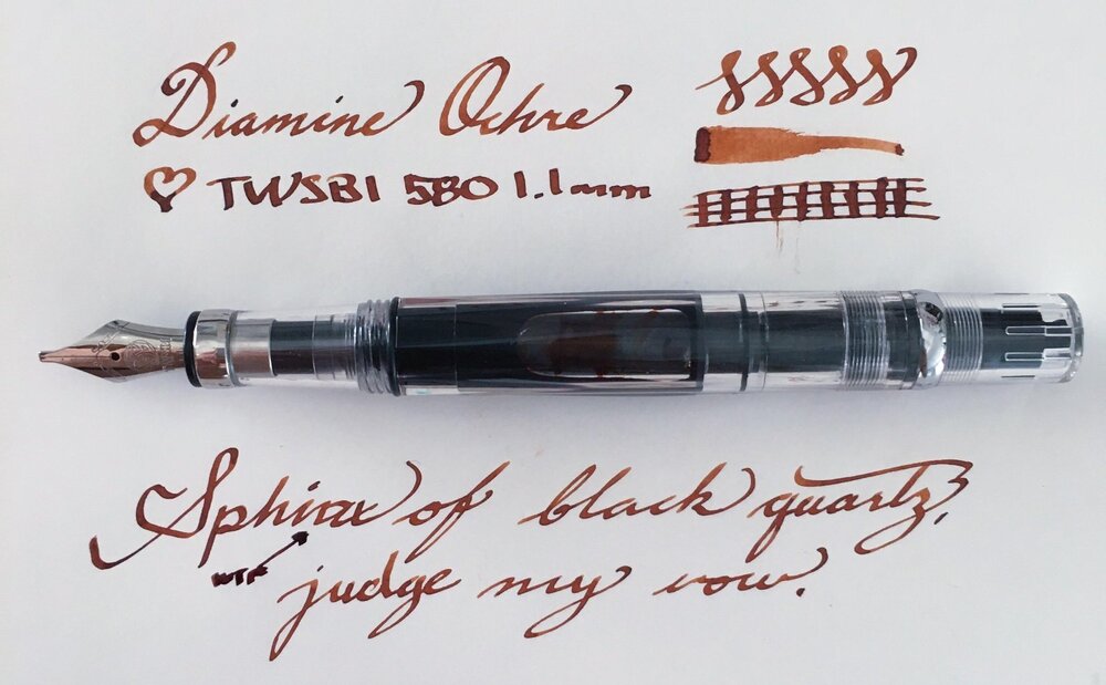
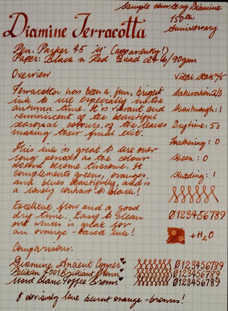
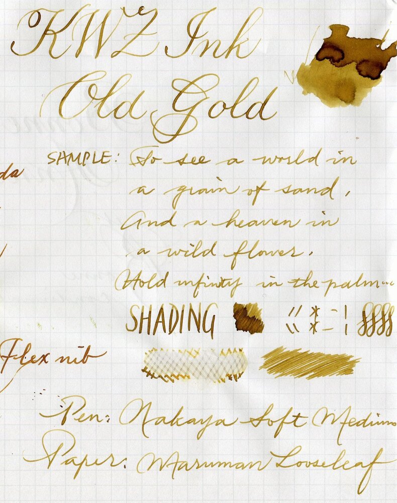
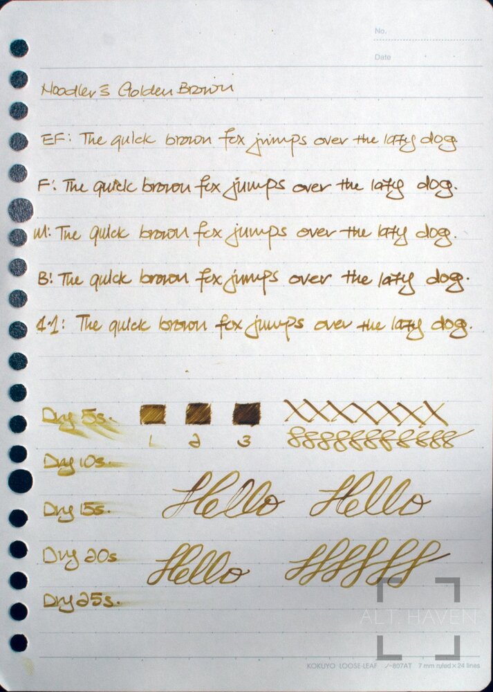
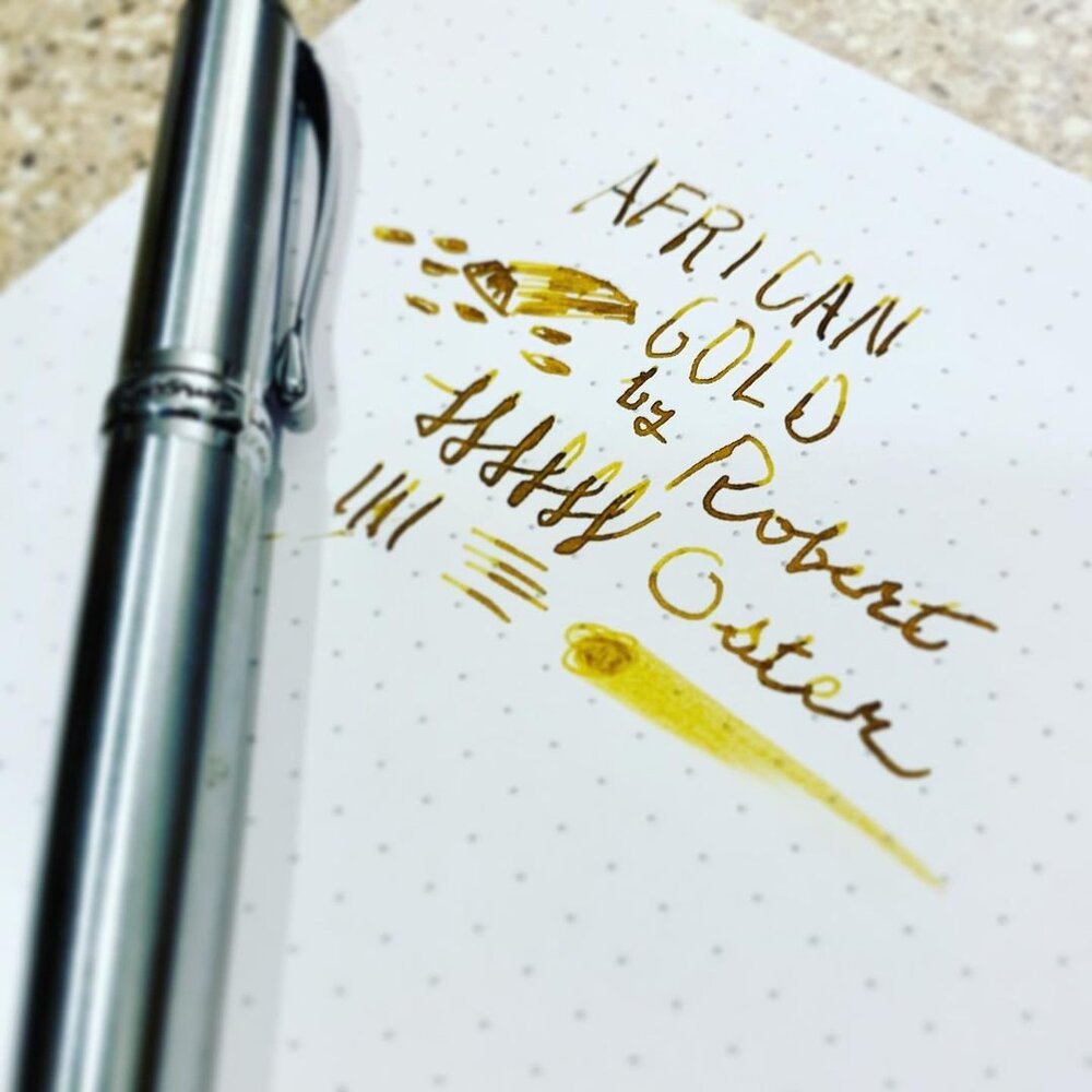
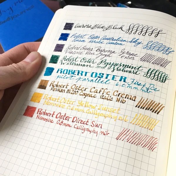
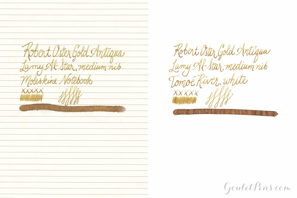
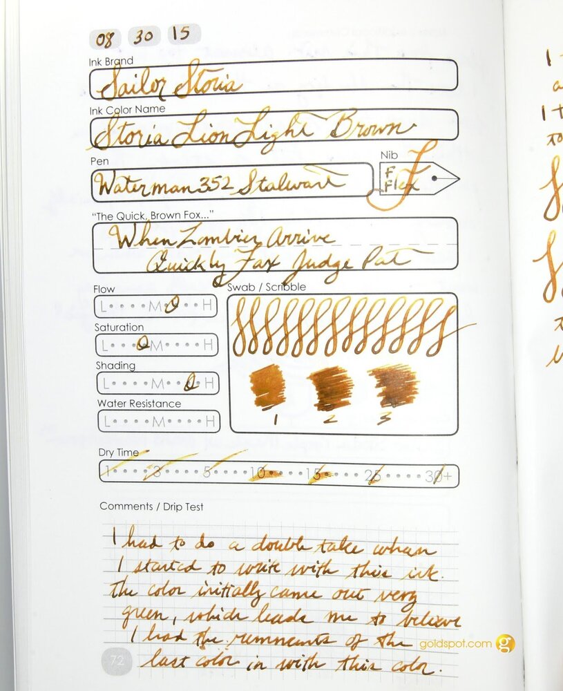
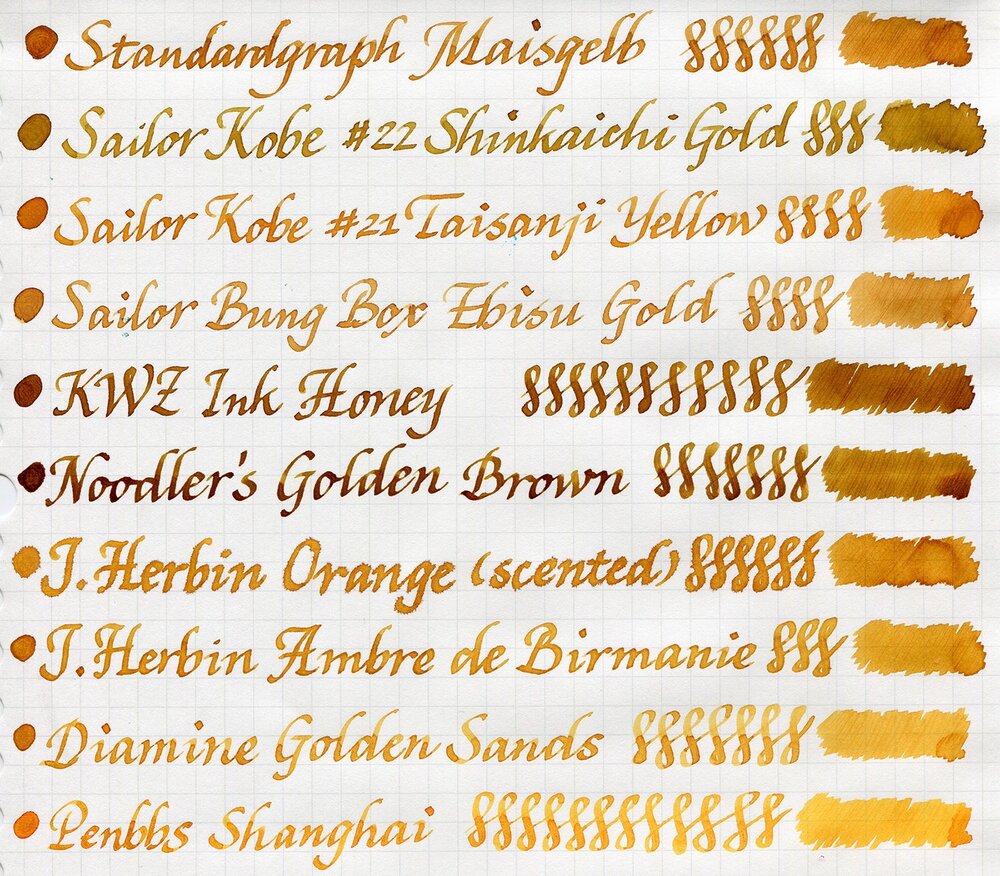
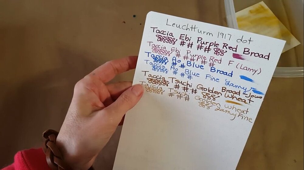
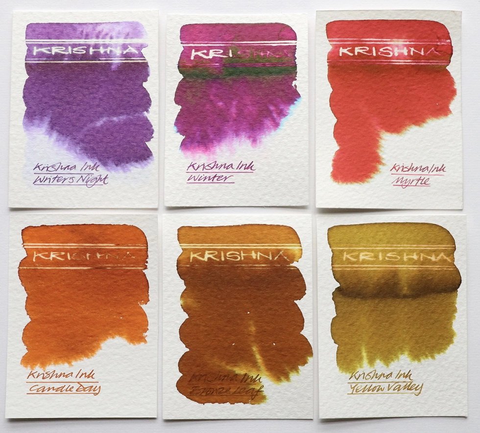
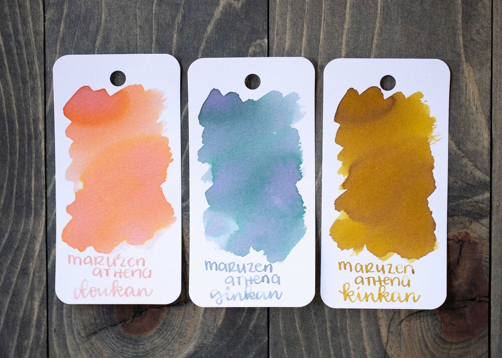
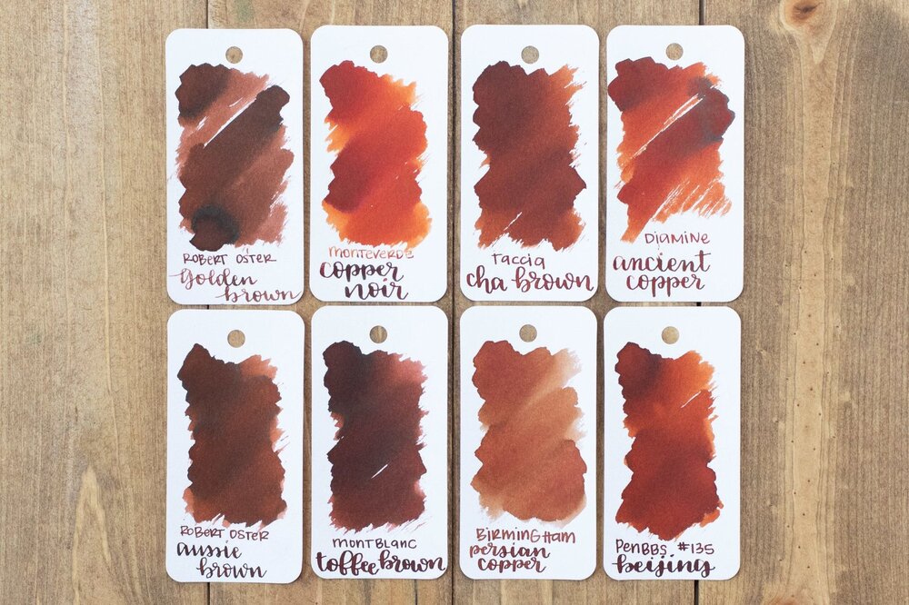
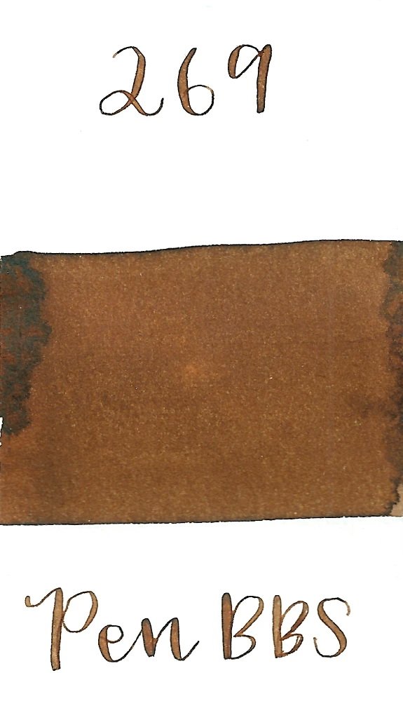
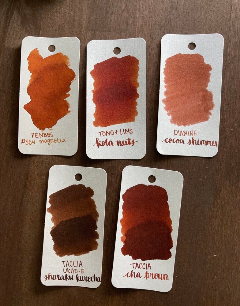
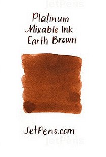
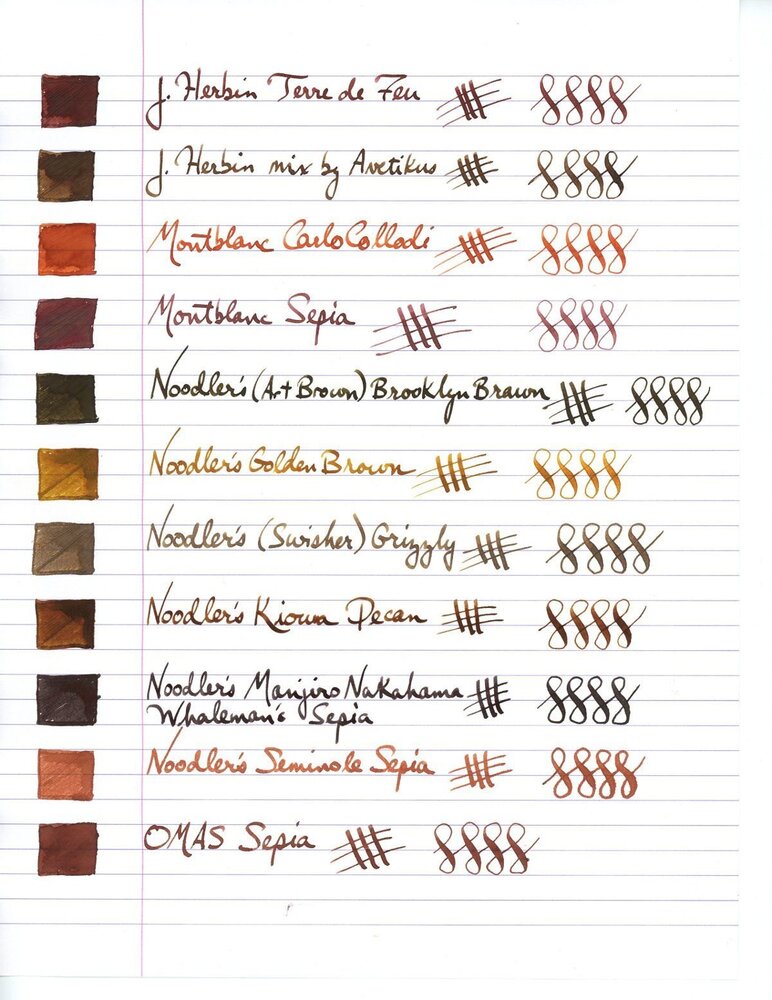
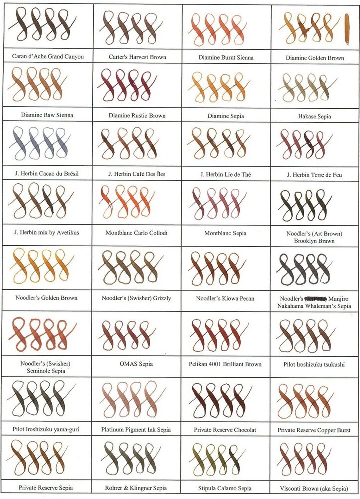
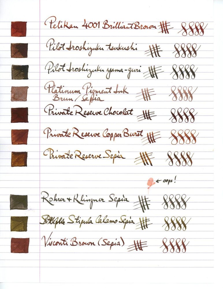
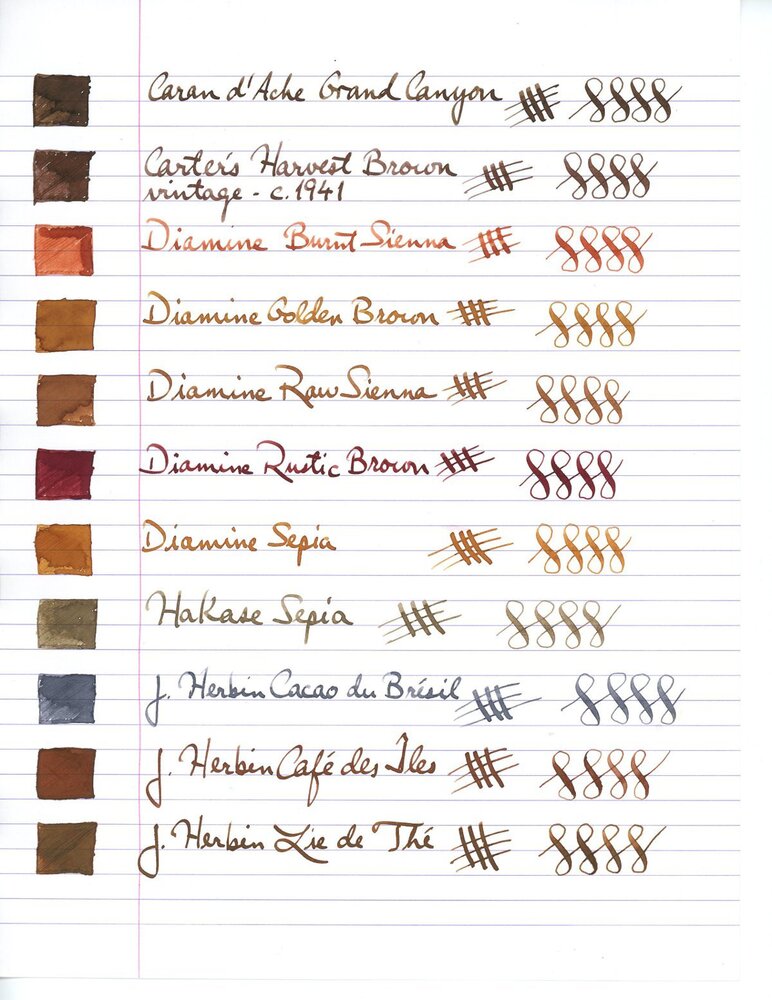
Showing results for tags 'j. herbin'.

  • Search By Tags

    Type tags separated by commas.
  • Search By Author

Content Type


Forums

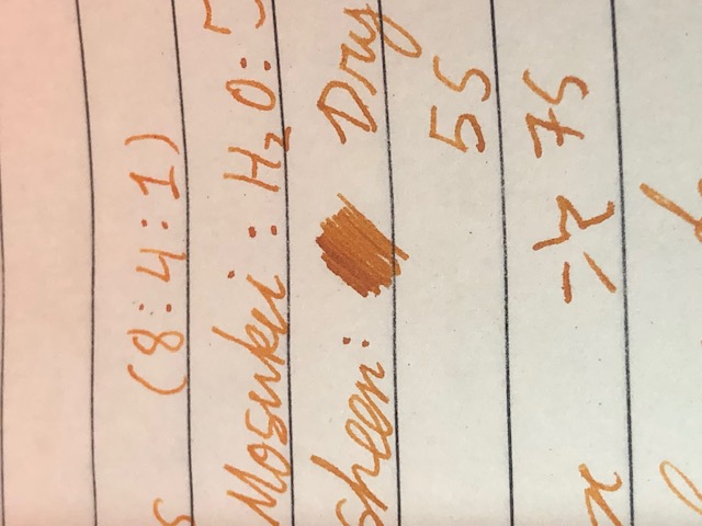
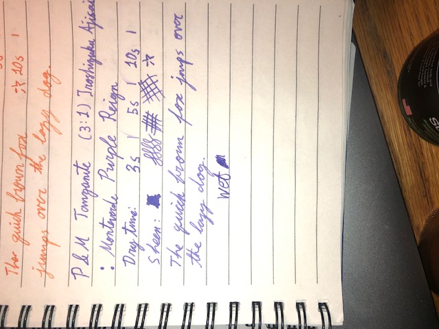
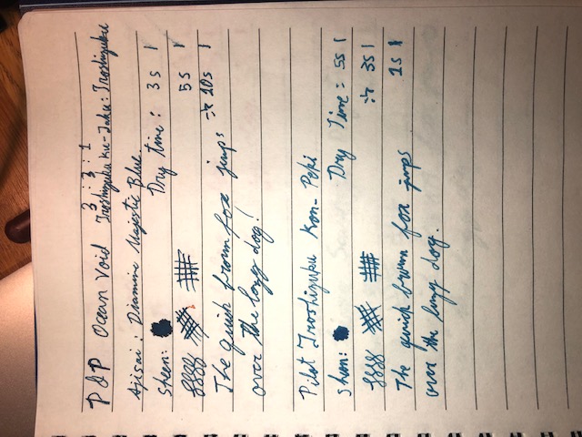
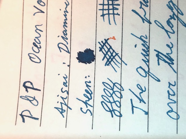
  • FPN Community
    • FPN News
    • Introductions
    • Clubs, Meetings and Events
    • Pay It Forward, Loaner Programs & Group Buys
  • The Market Place
    • The Mall
    • Market Watch
    • Historical Sales Forums
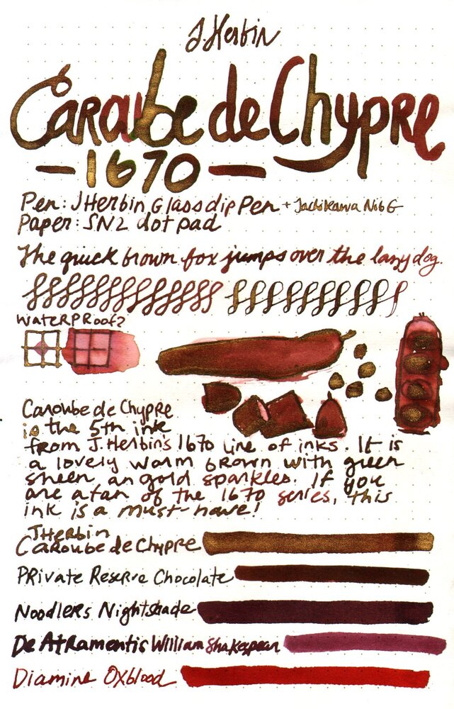
  • Writing Instruments
    • Fountain & Dip Pens - First Stop
    • Fountain Pen Reviews
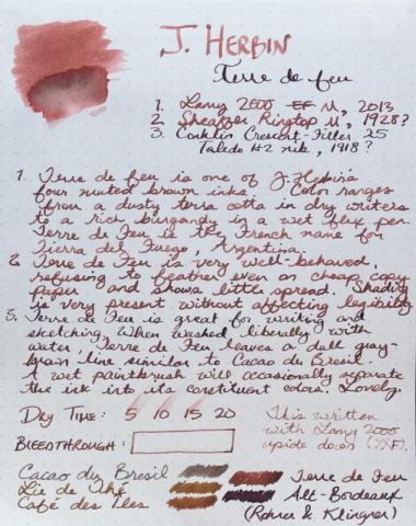
    • Of Nibs & Tines
    • It Writes, But It Is Not A Fountain Pen ....
    • Pen History
    • Repair Q&A
  • Brand Focus
    • Cross
    • Esterbrook
    • Lamy
    • Mabie Todd Research/Special Interest Forum/Group
    • Montblanc
    • Parker
    • Pelikan
    • Sheaffer
    • TWSBI
    • Wahl-Eversharp
    • Waterman
  • Regional Focus
    • China, Korea and Others (Far East, Asia)
    • Great Britain & Ireland - Europe
    • India & Subcontinent (Asia)
    • Italy - Europe
    • Japan - Asia
    • USA - North America
    • Other Brands - Europe
  • Inks, Inc.
    • Inky Thoughts
    • Ink Reviews
    • Ink Comparisons
    • Co-Razy-Views
    • Th-INKing Outside the Bottle
    • Inky Recipes
  • Paper, and Pen Accessories
    • Paper and Pen Paraphernalia
    • Paper & Pen Paraphernalia Reviews and Articles
  • Creative Expressions
    • Pen Turning and Making
    • Pictures & Pen Photography
    • The Write Stuff
    • Handwriting & Handwriting Improvement
    • Calligraphy Discussions
    • Pointed Pen Calligraphy
    • Broad (or Edged) Pen Calligraphy

Blogs

  • FPN Board Talk
  • Incoherent Ramblings from Murphy Towers
  • The Blogg of Me
  • FPN Admin Column
  • Rules, Guidelines, FAQs, Guides
  • Musings on matters pen
  • Marketing & Sales
  • Iguana Sell Pens Blog
  • Newton Pens' Blog
  • Peyton Street Pens Blog
  • holygrail's Blog
  • A Gift For Words
  • I Don't Have a Name; So This Will Do
  • Karas Kustoms' Blog
  • Debbie Ohi's Inky Journal
  • Sus Minervam docet
  • Crud!
  • Clut and Clutter
  • Federalist Pens

Product Groups

  • FPN Pens
  • FPN Inks
  • FPN Donations
  • Premium/Trading/Retailer Accounts

Categories

  • Fonts
  • Tools & Software
  • Rules for Notepads & Paper

Find results in...

Find results that contain...


Date Created

  • Start

    End


Last Updated

  • Start

    End


Filter by number of...

  1. Hello Fellow FPNers - I'm in love with J. Herbin Emerald of Chivor, not only for its gorgeous teal color but for its shimmering qualities, its saturated color and its wetness. Can anyone recommend another ink that has all these qualities but is a blue ink, rather than teal? Must be saturated, not milky or muted.
  2. This collection has been made in an intensive attempt to find the most ideal and complete shades of brown color fountain pen inks over the internet and as long as writing with a medium size fountain pen is what I'm concerned of, the "infinity symbol" on a regular paper is the thing I've considered saving these samples. I've also benchmarked the index card samples for those which were not available in infinity sample. All the top-rated fountain pen inks – even those which are not mentioned here probably for the lack of a quality brown ink – have been taken into account. ~ Here's the list ~ Akkerman Hals Oud Bruin Akkerman SBRE Brown Chesterfield Antique Copper Colorverse #25 String Colorverse Coffee Break Daytone Havana Brown De Atramentis American Whisky Brown Gold De Atramentis Havanna De Atramentis Scottish Whiskey Diamine Ancient Copper Diamine Chocolate Brown Diamine Desert Burst Diamine Golden Brown, Carter's Harvest Brown, Diamine Raw Sienna Diamine Ochre Diamine Terracotta Diamine Tobacco Sunburst Faber Castell Hazelnut Brown J. Herbin Café Des Iles J. Herbin Caroube De Chypre J. Herbin Lie de The J. Herbin Terre d'Ombre KWZ Honey KWZ Iron-gall Aztec Gold KWZ Iron-gall Mandarin (Corrected Version) KWZ Old Gold L'Artisan Pastellier Callifolio Cannelle Leonardo Sepia Classico Monteverde Copper Noir Monteverde Joy Sepia Monteverde Scotch Brown Noodler's Golden Brown Noodler's Kiowa Pecan OMAS Sepia Private Reserve Chocolate Private Reserve Copper Burst Private Reserve Sepia Robert Oster African Gold Robert Oster Antelope Canyon Robert Oster Caffe Crema Robert Oster Gold Antique Robert Oster Toffee Sailor Kobe #22 Shinkaichi Gold Sailor Storia Lion Light Brown Scribo Classico Seppia Standardgraph Maisgelb by @lgsoltek Taccia Tsuchi Golden Wheat Vinta Heritage Brown Vinta La Paz Diplomat Caramel Krishna Bronze Leaf, Krishna Yellow Valley L'Artisan Pastellier Callifolio Anahuac L'Artisan Pastellier Callifolio Itzamna L'Artisan Pastellier Encre Classique Ocre Jaune Maruzen Athena Kinkan PenBBS #135 Beijing PenBBS #269 45th POTUS PenBBS #504 Vernal Equinox Platinum Mix-Free Earth Brown Taccia Ukiyo-e Hokusai Benitsuchi Tono & Lims Kela Nuts Vinta Terracotta Vinta Ochre Note: the absorption of the ink to the paper could vary. Before purchasing any of the inks above be aware some of them are dry while the others are wet. Plus, based on the fountain pen model and paper you use, the colors could look different. Make sure to use fountain pen inks only, otherwise your fountain pen will clog. Stay away from drawing, calligraphy, lawyer, and India inks. They are not designed for the fountain pens. Platinum and Sailor have some pigmented-based inks; avoid them. Take all these into account.
  3. namrehsnoom

    J. Herbin - Gris Nuage

    J.Herbin - Gris Nuage La Société Herbin, Maître Cirier à Paris, was established in 1670. This makes J. Herbin probably the oldest name among European ink makers. Today, Herbin produces a range of beautiful fountain pen and calligraphy inks, writing instruments, gift sets and accessories. Herbin inks are made in France, and the finishing touches on the bottles are still done by hand in Paris. J. Herbin is probably best known for their inks in the “La Perle des Encres” series. In this review the stage is taken by Gris Nuage, one of the grey inks in the Herbin line-up. The ink is aptly named: it really looks like the rain-carrying clouds in a heavily overcast sky. To my eye, there are hints of purple and green hidden within this stormy-grey ink. Gris Nuage has a pencil-like appearance: it’s a really light graphite-grey, that only works well with certain pen/nib combinations. Good examples are a wet Pelikan with F-nib, or a dry Lamy Safari with B nib. With such combinations, the ink looks great. Choose the wrong pen/nib mix though, and the ink gets too light for my liking. J. Herbin inks are packaged in simple 30 ml bottles. These bottles are not well-suited for piston-fillers though – they are not very deep, and piston-filling from a half-empty bottle can be a challenge. My trick is to fill an ink-sample vial with ink, and piston-fill my pen that way. Gris Nuage makes a great match for my Pelikan M101N Grey Blue with F-nib, which is the beauty in the pic below. Gris Nuage has quite satisfactory lubrication, even in drier pens like my Lamy Safari. But it’s definitely a very light grey, especially in drier pens where saturation can be quite low. To illustrate the colour span of this J. Herbin ink, I did a swab on Tomoe River paper, where I really saturated portions of the paper with ink. Gris Nuage has a fairly broad colour span, but without too harsh a contrast between the light and darker parts. This translates to elegant shading when writing – providing you have selected the right pen/nib combo. Choose wisely… On the smudge test – rubbing text with a moist Q-tip cotton swab – the ink behaved perfectly, with no visible smearing. Water resistance is quite good – the ink survives even longer exposures to water, leaving a light grey residue on the paper, which remains very readable. This is also apparent from the lower part of the chromatography. This makes Gris Nuage an ink that can be used at the office. Drying times for this ink are in the 5-10 second range, depending on the type of paper (with the Lamy Safari M-nib). The only exception was Tomoe River paper (both the 52 and 68 gsm versions), where drying times climbed to 20 seconds. I’ve tested the ink on a wide variety of paper – from crappy Moleskine to high-end Tomoe River. On each scrap of paper I show you: An ink swab, made with a cotton Q-tip 1-2-3 pass swab, to show increasing saturation An ink scribble made with a Lamy Safari M-nib fountain pen The name of the paper used, written with a Lamy Safari B-nib A small text sample, written with the Pelikan M101 Grey Blue with F-nib Source of the quote, written with a Platinum 3776 Century B-nib Drying times of the ink on the paper (with the M-nib Safari) The multi-paper writing test shows Gris Nuage’s biggest weakness: this ink only works well with certain types of paper. You really need hard-surface paper for best results. Otherwise you either get ink spread (i.e. the line you write is not crisp but spreads out a bit) or some feathering. This happened on quite a number of papers in my test set, even on high quality paper. Not so good! With Moleskine and GvFC paper, there is some show-through and quite a bit of bleed-through. Technically not the best of inks. Because scans don't always capture an ink's colour and contrast with good precision, I also add a few photos to give you an alternative look on the ink. Writing with different nib sizes The picture below shows the effect of nib sizes on the writing. All samples were written with a Lamy Safari, which is typically a dry pen. I also added a couple of wet-writing visiting pens – a Pelikan M101N Grey Blue with F-nib, and a Platinum 3776 Century with a broad nib. This clearly shows you need the right pen/nib combination to get a good-looking result. My favourite is the Pelikan with F-nib – with this combo Gris Nuage looks great, with good saturation and beautiful shading. Related inks To compare Gris Nuage with related inks, I use my nine-grid format with the currently reviewed ink at the center. This format shows the name of related inks, a saturation sample, a 1-2-3 swab and a water resistance test – all in a very compact format. Gris Nuage sits somewhere in the middle between other greys in my collection. I can’t help but see a bit of purple/green in the ink’s spectrum… Inkxperiment – mountain lake As a personal challenge, I try to create interesting drawings using only the ink I’m reviewing. I find this to be a fun extension of the hobby, and these single-ink drawings often present a real challenge. These inkxperiments allow me to explore the colour-range nuances that are present in the ink. I love doing them! This time, I’m experimenting with some landscape drawing techniques I discovered on Pinterest. Using paper cut-outs and cotton pads as drawing tools to paint a mountain lake landscape… I started with a piece of 300 gsm watercolour paper. Using different mixes of water/ink, I drew in the mountain ranges with the paper stencils and cotton pads. The lake’s border and the fisherman were painted in with undiluted Gris Nuage using a small brush. I finally added the trees and birds with my Lamy Safari M-nib pen. The end result gives you a good idea of the colour range that can be achieved when using Gris Nuage in a more artistic context. Conclusion J. Herbin Gris Nuage is a tricky ink: use the right combination of pen/nib/paper, and you get a beautiful looking colour that works really well. But deviate slightly from this optimum, and the result quickly deteriorates. In my opinion, that’s too much to ask from the user … you just want an ink that works in most circumstances. Gris Nuage can be beautiful, but it’s not a grey I would recommend. There are many more good-looking grey inks that can handle a much broader range of pens, nibs and paper. Technical test results on Rhodia N° 16 notepad paper, written with Lamy Safari, M-nib Backside of writing samples on different paper types
  4. visvamitra

    Orange Indien - J. Herbin

    http://www.jherbin.com/images/logo_ship.jpg J. Herbin is known to be the oldest name in ink production in the world, and their inks 'l'Encre de la Tete Noire", "Perle des Encres," (The Jewel of Inks) and "l'Encre des Vaisseaux" (The Ink of Ships) were produced as early as 1700. M. Herbin was a sailor, and from his many journeys to India he brought back to Paris formulas for manufacturing sealing wax. His special lacquer formula improved the quality of the seals in adhesion and neatness, helping him to become famous throughout the kingdom. J. Herbin is also the oldest name in ink production in the world. By 1700, the company was producing “l’Encre de la Tete Noire,” followed by “Perle des Encres,” (The Jewel of Inks) and “l’Encre des Vaisseaux” (The Ink of Ships). J. Herbin made ink for Louis XIV, and a black ink for the sole use of Victor Hugo, author of The Hunchback of Notre Dame and Les Miserables. These formulas still reside in our company headquarters in Paris. At the moment company belongs to Exaclair Inc, that has rights to brands like Clairefontaine, Rhodia, Brause or G. Lalo. J. Herbin offers 30 standard colors: http://www.zany.co.nz/Images/Assets/2555912/6/J+Herbin+Fountain+Pen+Ink++Available+in+30+Colours.jpg Ambre de Birmanie Bleu Azur Bleu Myosotis Bleu Nuit Bleu Pervenche Bouquet d'Antan Bouton d'Or Cacao du Bresil Cafe des Iles Diabolo Menthe Eclat de Saphir Gris Nuage Larmes de Cassis Lie de The Lierre Sauvage Orange Indien Perle Noire Poussiere de Lune Rose Cyclamen Rose Tendresse Rouge Bourgogne Rouge Caroubier Rouge Opera Rouille d'Ancre Terre de Feu Vert Empire Vert Olive Vert Pre Vert Reseda Violette Pensee Orange Indien is one of my favourite orange inks. It's well behaved, moderately saturated and have excellent flow. I prefer iroshizuku's Yu-Yake but this one is a keeper. During two years I've used 1 and 2/5 bottles. Quite a lot. Ink on Kaweco AL Sport broad nib http://imageshack.com/a/img912/6462/dz862X.jpg http://imageshack.com/a/img905/3163/RJ3g1n.jpg Ink splash http://imageshack.com/a/img673/2112/sbtoon.jpg Drops of ink on kitchen towel http://imageshack.com/a/img537/4503/RsDUNV.jpg Software Id http://imageshack.com/a/img538/1207/MyK5HK.jpg Oxford Recycled 90 g, Kaweco Sport Classic, B http://imageshack.com/a/img905/3253/P8u08S.jpg http://imageshack.com/a/img538/6107/q1N5SR.jpg http://imageshack.com/a/img661/7860/B9I94l.jpg http://imageshack.com/a/img540/2982/5RdlgD.jpg CIAK, Omas Ogiva Alba, M http://imageshack.com/a/img673/7351/1QkrFp.jpg http://imageshack.com/a/img538/6982/nPCzOC.jpg http://imageshack.com/a/img537/4825/wUM4k2.jpg http://imageshack.com/a/img905/3783/mKXtha.jpg Porównanie http://imageshack.com/a/img908/2994/oKb5nj.jpg http://imageshack.com/a/img538/1806/7eMDcq.jpg
  5. J.Herbin - Vert Olive La Société Herbin, Maître Cirier à Paris, was established in 1670. This makes J. Herbin probably the oldest name among European ink makers. Today, Herbin produces a range of beautiful fountain pen and calligraphy inks, writing instruments, gift sets and accessories. Herbin inks are made in France, and the finishing touches on the bottles are still done by hand in Paris. Recently, I've been looking into Herbin's "La Perle des Encres" series. The subject of this review is "Vert Olive" - a lovely looking yellow-green, but with an annoying Jekyll&Hyde character as will soon become clear. On first impression, I liked the colour a lot: a beautiful yellow-green that is excellent for personal journaling. One thing I quickly noticed though: this ink is not made for my usual Lamy Safari test pens. In the dry Safari pen, the ink is too unsaturated and pale, and feels very dry. Not usable at all. For this review I therefore switch to wet Pelikan pens that do the ink much more justice. Pelikan = Dr. Jekyll, Safari = Mr. Hyde - avoid dry pens with this ink! With the wet Pelikan pens the ink looks quite gorgeous even with an F-nib - not an ink for the workplace, but one to enjoy for personal journaling. Vert Olive has a fairly broad colour span, ranging from a wispy almost yellow colour to a fairly green olive when heavily saturated. This translates to a strong shading ink, but one with pleasant and aesthetic shading without too much contrast between the light and darker parts. I really like what I see here. On the smudge test - rubbing text with a moist Q-tip cotton swab - the ink behaved fairly well. There is a lot of yellow smearing, but the text itself remains perfectly legible. From the bottom part of the chromatography you can see that a grey residue remains. This is confirmed in my water tests: this ink can survice contact with water. The yellow-green colour partially disappears, but a grey ghost of your writing remains on the paper, still clearly readable without too much effort. Not exactly water-resistant, but still not bad at all. When doing writing samples on different paper types, the Jekyll & Hyde character of the ink comes into play. Vert Olive shows noticeable feathering on a number of papers in my test set. Cheap paper is the obvious candidate, but even some of my high-quality papers show some feathering with this ink. There are also a fair number of papers where the ink exhibits significant show-through and even some bleed-through. Again: a mix of low- and high quality papers. Quite unpredictable! Fortunately for me, my daily journaling paper works quite well with this ink: it looks really good in my Paperblanks journal, with good saturation, no feathering and no see-through. Lucky me! Vert Olive is a very slow-drying ink though, and takes ages to dry on most non-absorbent paper - often upwards from 30 seconds with my M-nibbed Pelikan pen. I've tested the ink on a wide variety of paper - from crappy Moleskine to high-end Tomoe River. On each scrap of paper I show you:An ink swab, made with a cotton Q-tip1-2-3 pass swab, to show increasing saturationAn ink scribble made with a Pelikan M-nib fountain penThe name of the paper used, written with a Pelikan B-nibA small text sample, written with an M-nibbed PelikanThe origin of the quote, written with a Parker Sonnet with M-nibDrying times of the ink on the paper (with the M-nib Pelikan) The Parker Sonnet worked really well with this ink. It produces a slightly more saturated line than my Pelikan pens. It darkens up the ink a bit, making it even more lovely to the eye. But the truth remains: Vert Olive works really well with some paper, but can be a pain in the butt if you make the wrong paper choice : feathering, see-through, bleed-through. Wonderful when it works, frustrating when it shows its dark side. Writing with different nib sizesThe picture below shows the effect of nib sizes on the writing. At the top I show you some writing samples with my Lamy Safari test pens. Here the ink looks too pale and unsaturated, failing to impress me. The bottom part shows the ink in my wet Pelikan pens, allowing the ink to come to life and show its potential in all its glory. Vert Olive is a beauty, but only when combined with a wet-writing pen, and when used on the right type of paper. Related inksTo allow for a good comparison with related inks, I employ a nine-grid format, with the currently reviewed ink at the center. Each grid cell shows the name of the ink, a saturation sample, a 1-2-3 swab and a water resistance test - all in a very compact format. Inkxperiment - travelerWith each review, I try to create an interesting drawing using only the ink I'm reviewing. This is often quite challenging, but it has the advantage of showing the ink's colour range in a more artistic setting. I enjoy doing these little drawings immensely - it's quite a fun extension of the ink hobby. Yellow-leaning inks often look amazing in drawings, and Vert Olive is no exception. The ink looks truly gorgeous in painted scenes. For this inkxperiment, I used HP photo paper to bring out the best of Vert Olive. I first created the block-patterned background using lightly applied ink. Next I painted in the traveler with a brush, using multiple layers of pure ink. I then drew in the passport stamp with an M-nibbed fountain pen. The resulting picture looks really nice, and shows off the beauty of Vert Olive. Definitely a superb drawing ink! Inspiration for this drawing comes from a photo of a small statue photographed in backlight with light streaming through a coloured curtain. I was intrigued by this background, and tried to create a similar effect in my drawing. For this I used a piece of old anti-slip material (the stuff you put beneath your carpet), that I put on top of the HP photo paper. Next I painted over the material with a brush, creating the checkered background pattern. I then used a fine brush to paint in the traveler silhouette with pure Vert Olive. The picture is completed by drawing in the passport stamp as a symbol for traveling. I quite like the end result that illustrates what can be achieved with Vert Olive as a drawing ink. ConclusionJ. Herbin Vert Olive is a gorgeous yellow-green, that looks amazing when combined with wet pens and with the right type of paper. But it can also be very frustrating with dry pens, and be incompatible with quite a number of paper types (feathering, see-through & bleed-through). Drying times a very long (often over 30 seconds) making it an ink that's only useful for personal journaling, when you're not in a hurry and enjoy the slow pace of putting your thoughts on paper. Personally, I love the ink when it shows it's Jekyll side, but am totally frustrated with it when Mr. Hyde appears. You're warned! Choose your pen & paper wisely, or suffer the consequences ;-) Technical test results on Rhodia N° 16 notepad paper, written with Lamy Safari, M-nib Backside of writing samples on different paper types
  6. Hello everybody! It's my first time in this subforum, so please alert me if I'm doing something wrong. I have somehow accumulated over 20 different bottles of ink and 50 samples in the past two years. Love the variety, but some of these bottles don't get much use, and the ink in them just ages on my shelf. That's been bothering me a lot, since they're actually superb inks that just have had the bad luck of ending up in the hands of someone who doesn't appreciate them the way they deserve. So I'd like to send some of these out as big 5ml samples to anyone who's interested, in exchange for the same courtesy. I feel that that way, each of us gets to try new inks, and since everybody would pay postage, it wouldn't cost one more than the other. Full-sized bottles: De Atramentis AubergineDiamine AmaranthDiamine Ancient CopperDiamine Autumn OakDiamine Asa BlueDiamine BilberryDiamine Classic GreenDiamine Earl GreyDiamine Golden BrownDiamine Majestic BlueDiamine OxbloodDiamine SyrahJ. Herbin Bouquet d'AntanJ. Herbin Lie de ThéJ. Herbin Poussière de LuneKWZ HoneyKWZ MaroonNoodler's Heart of DarknessRohrer & Klingner Alt-GoldgrünRohrer & Klingner HelianthusRohrer & Klingner SalixRohrer & Klingner SepiaSailor Jentle/Shikiori MiruaiSailor Jentle/Shikiori Oku-YamaSailor Jentle/Shikiori Rikyu-ChaSailor Jentle/Shikiori Tokiwa-MatsuSailor Jentle/Shikiori Yama-DoriSailor Nano Sei-Boku Samples: Diamine China BlueL'Artisan Pastellier Callifolio Heure DoréeSailor Jentle/Shikiori Waka-UguisuJ. Herbin Vert OliveSuper5 Frankfurt
  7. Since J. Herbin released the beautiful Rouge Hematite as the first in their the-new 1670 Anniversary line it has been through several iterations. The first release was, in my eyes, as close to perfection as Rouge Hematite could ever be; deep and rich without being dark or dull, shimmery and sparkly without being garish or gaudy. The ink's sheen was not simply caused by what we're all familiar with, which is sheen induced by (according to Nathan Tardif) drying ink crystalizing. Rouge Hematite had its sheeny component resting at the bottom of the gorgeous bottle waiting to be shaken—a minutes-long process with the bottom new and full. It looked not gold or red, but almost like a maroon-tinted wax (until shaken). And then, from the inky shadows (see what I did there?), came the whiners. The ones who know not how to maintain a good hygiene schedule for their pens. And with their ignorance came the clogging. With the clogging, complaints. So J. Herbin, listening to their customers (which is usually a good thing), took a good portion of the heavily-sheening component out. The second formulation still has the same type of sheeny bits, but just way less than the original. But since haters gonna hate hate hate, the third iteration of the once-perfect ink came soon after, with barely any of the gold-inducing sediment at all. This, as Henry Hill once said, is the bad time. The third iteration was sheen-less. The third iteration was boring. The third iteration was wrong. And thankfully, J. Herbin heard RH's faithfuls' complaints. They made the announcement that they re-instituted the sheening component to match the good ol' days. Or did they?… Yes. Well, sort of. But first, I'll backtrack. When the company released the second ink in the Anniversary series, Bleu Ocean, a lot of people, including myself, were disappointed that the ink lacked any sort of sheen. Many had wished it would be given a similar, but silver-colored, sheen component. When I tried it I couldn't even coax any good old crystal-based sheen from it. It was a nice shade of blue, but without the signature sheen, and coupled with the fact that it wasn't half as well behaved as Rouge Hematite—RH can be used with a flex nib on cheap paper and still retain its sheen and shading—it was a bust for many. More recently, us sheenoholics have praised the release of J. Herbin's Stormy Grey 1670. In contrast to the earlier Rouge Hematite, Stormy Grey has a blatantly golden pigment component to impart its sheen. With the original RH, once the sediment was shaken and integrated into the ink the only difference was that the ink took on a bit of a chalky look in the bottle; it also took quite a while for the sheen component to settle back down to the bottom of the bottle. Stormy Grey's golden component, whatever it really is, is very consistent and exceedingly easy to see as it swirls around in the ink after shaking it. It also settles back to the bottom MUCH quicker. Now, back to the most recently released Rouge Hematite version (what I dub the fourth version). The fourth version of RH seems to have the same sheening component in it as Stormy Grey. It's obviously metallic when it's at the bottom of the bottle (not waxy looking, like the original), and it settles very quickly like Stormy Grey. Instead of the original formulation's smooth "fog" of gold/green sheen that would settle over the red ink when spread with a q-tip, the newest version has star-like "pinpoints" of gold spread fairly evenly over the entire q-tip sample. I'm not going to say it's inferior to the original version (mainly because I haven't even done a writing sample with it yet), but it is different, and I think people buying it with the understanding from the company that the original formula is back need to know the differences. I'll be doing a new review of the most recent version in the next few days. When it's out I'll link to it from this thread. Now for the comparison pictures! Left to right: Original version, Second version, Fourth version: http://imagizer.imageshack.us/v2/xq90/538/1GzS1a.jpg http://imagizer.imageshack.us/v2/xq90/661/7vDUYL.jpg Original Version: http://imagizer.imageshack.us/v2/xq90/661/2RoPFk.jpg Second Version: http://imagizer.imageshack.us/v2/xq90/537/ujBGrt.jpg Fourth Version: http://imagizer.imageshack.us/v2/xq90/673/ovuTGg.jpg Left to right: Original version, Second version, Fourth version: http://imagizer.imageshack.us/v2/xq90/673/rorNxl.jpg Original Version: http://imagizer.imageshack.us/v2/xq90/661/dZq7Ha.jpg Second Version: http://imagizer.imageshack.us/v2/xq90/661/4iJYeo.jpg Fourth Version: http://imagizer.imageshack.us/v2/xq90/538/xs7Eq2.jpg Original Version: http://imagizer.imageshack.us/v2/xq90/905/8O3cbM.jpg Fourth Version: http://imagizer.imageshack.us/v2/xq90/673/q6ILau.jpg http://imagizer.imageshack.us/v2/xq90/673/XSNAOZ.jpg Here's what Stormy Grey's sediment looks like: http://imagizer.imageshack.us/v2/xq90/746/ofYoGc.jpg And now on the page: http://imagizer.imageshack.us/v2/xq90/908/GYZE0R.jpg Left to right: Fourth version, Second version, Original version: http://imagizer.imageshack.us/v2/xq90/661/I7UZzn.jpg Again, this comparison is just about the inks' properties in general; I still haven't filled a pen with the newest version yet. I'll post back when I have some more to say about the most recent version.
  8. jovanzhang

    Four Finalized Ink Mixes

    These have been sitting in my pens and bottles for months by thus point without any issues. No solid chunks, no odors or bubbling, no color loss. I especially like the golden brown and purple. I call these colors: -Golden Sands -Tanzanite -Ocean Void -Oasis (Instead of Deep Teal) Anyone like any one of them in particular?
  9. J. Herbin - Éclat de Saphir La Société Herbin, Maître Cirier à Paris, was established in 1670. This makes J. Herbin probably the oldest name among European ink makers. Today, Herbin produces a range of beautiful fountain pen and calligraphy inks, writing instruments, gift sets and accessories. Herbin inks are made in France, and the finishing touches on the bottles are still done by hand in Paris. J. Herbin is probably best known for their inks in the "La Perle des Encres" series. In this review, I take a closer look at Éclat de Saphir - a good-looking blue-with-a-bit-of-purple ink, that to my eye belongs to the Royal Blue / Sapphire Blue family of colours. The ink writes very purple when wet, but quickly dries to a standard royal-blue colour, with the purple still there just below the surface. The ink is quite saturated, and works well with all nib sizes and with all types of paper (white as well as more yellow ones). Shading looks best in M-nibs and broader, but remains subtle without too much contrast between the light and darker parts. Quite nice. The ink has excellent lubrication, even in drier pens like my Lamy Safari. With wetter pens like my Pelikan M120 with M-nib, the ink leaves a very saturated blue line, and in the process loses most of the shading. My guess is that with wetter pens, you need broader nibs to bring out the shading again.. To illustrate the colour span of Éclat de Saphir, I did a swab on Tomoe River paper where I really saturated portions of the paper with ink. This perfectly illustrates the ink's colour range, which moves from a fairly light to a really dark royal blue. The purple undertones surface most easily in the lighter parts of the swab. On the smudge test - rubbing text with a moist Q-tip cotton swab - the ink behaved perfectly, with only minimal smearing. Water resistance is not so good: the ink disappears quickly from the page, but leaves behind a ghost image of the original text, which can still be read when using some effort. Your writings will not be lost, but it's definitely not a water-resistant ink. Éclat de Saphir dries fast on all my test paper, typically in the 5 to 10 second range. That was a surprise, because it writes with a really wet line - I would have expected longer drying times from this ink. I've tested the ink on a wide variety of paper - from crappy Moleskine to high-end Tomoe River. On each scrap of paper I show you:An ink swab, made with a cotton Q-tip1-2-3 pass swab, to show increasing saturationAn ink scribble made with a Lamy Safari M-nib fountain penThe name of the paper used, written with a Lamy Safari B-nibA small text sample, written with an M-nibDrying times of the ink on the paper (with the M-nib)Éclat de Saphir looks great on both white and more yellowish paper. I didn't detect any noticeable feathering, only with the notoriously bad Moleskine paper some barely visible feathering is present. With the lower quality papers in my test set (Moleskine, Generic paper), there is however significant show-through and a tiny bit of bleed-through. You can check this for yourself at the end of the review, where I show the backside of the writing samples. Writing with different nib sizesThe picture below shows the effect of nib sizes on the writing. All samples were written with a Lamy Safari, which is typically a dry pen. I also added a visiting pen - a wet Pelikan M120 with an M-nib. Here the ink leaves a very saturated dark-blue line, taking away most of the shading that shows up with drier pens. The ink contrasts very well with the paper, even in my EF nibs. With run-of-the mill office paper, you typically need smaller nib sizes to compensate for the lower quality of the paper. Combine this with fast drying times, and you have an ink that is quite at home for office-related note-taking. And even though Éclat de Saphir looks like a standard Royal Blue, there remains that purple undertone that makes it just that bit more interesting. Related inksTo compare Éclat de Saphir with related inks, I use a nine-grid format with the currently reviewed ink at the center. This format shows the name of related inks, a saturation sample, a 1-2-3 swab and a water resistance test - all in a very compact format. I hope that you'll find this way of presenting related inks useful. It's a bit more work, but in my opinion worth the effort for the extra information you gain. Inkxperiment - Visit to the Lands of FaerieAs a personal challenge, I try to create interesting drawings using only the ink I'm reviewing. I find this to be a fun extension of the hobby, and these single-ink drawings often present a real challenge. It also gives you an idea of what the ink is capable of in a more artistic setting. For this abstract landscape, I experimented with using HP premium photo paper as a medium. I started off by wetting portions of the paper with water, and drawing in the horizon line with the trees and parts of the foreground. The water on the photo paper lets the ink bleed out nicely. I then applied some bleach - purely as an experiment to bring in some highlights. Next I completely submerged the paper in water, and added some drops of ink. This reacted nicely with the photo paper, resulting in the light blue-purple haze that covers most of the drawing. Once dry, I painted in the fence and little girl in the foreground. I quite like the end result, which shows off the eery magic of Faerie land. You also get a good idea of what Éclat de Saphir is capable of in a more artistic setting. ConclusionJ. Herbin Éclat de Saphir has a royal blue style colour with a definite purple undertone. The ink works great with all paper types, is well saturated, and shows good contrast with the paper even in the finest nibs. This is an excellent choice of ink for use at the office - not too extravagant, but still playful with that purple undertone just below the surface. Personally, I'm not particularly fond of this type of blue - but there's no denying that this is a very good ink. If you like the colour, you will not be disappointed if you give Éclat de Saphir a try. Technical test results on Rhodia N° 16 notepad paper, written with Lamy Safari, M-nib Backside of writing samples on different paper types
  10. RoyalBlueNotebooks

    Transatlantic Crv

    My second CRV ever. Thank you, amberleadavis! I'm glad I got to see so many inks. I had never seen any of them on paper in person. These are not all the pages, I'm trying to come up with things to doodle in the other pages. Seitz-Kreuznach Palm Green and Pelikan 4001 Dark Green. Seitz-Kreuznach Palm Green + Rohrer & Klingner Verdigris
  11. Waxes used: - J. Herbin supple wax, Ivory - Atelier Gargoyle sealing wax, Ivory Paper used: - G. Lalo Verge de France 100g laid paper (envelope) Method: - Chunk of wax placed in brass spoon and heated over a denatured alcohol lamp. Round 1 - Detail The impression made in the J. Herbin wax (left) has what I would describe as "higher acutance," thus appearing "sharper;" however, there is no less detail in the Atelier Gargoyle impression. http://i.imgur.com/RTxnQEzl.jpg Winner: Tie Round 2 - Mailability I conducted this test in two phases. In phase one, I slowly folded the envelope through the middle of the seal. The J. Herbin wax cracked a fold angle of around 60°, while the Atelier Gargoyle wax did not crack, even when folded 180° and the paper creased; impressive! http://i.imgur.com/wdhshzLl.jpg In phase two, to simulate postal sorting machines, I passed the seals through a vegetable peeler. http://i.imgur.com/JCZLFzel.jpg The J. Herbin wax did not fare the vegetable peeler well. The Atelier Gargoyle wax remained intact(!) during this test, so I continued mauling the seal with a peeler until the paper actually tore (note the "tear" did not go through the lining of the envelope). I believe even this could have been avoided if there weren't so much "blobbage" protruding from the seal (my fault). http://i.imgur.com/xjRa2G3l.jpg Winner: Atelier Gargoyle Round 3 - Properties Specific heat: The J. Herbin wax has a markedly lower specific heat than the Atelier Gargoyle. The former (using my method) easily overheats, causing bubbles to occur. I found the latter immune to accidental overheating; however, it did cause the seal used to make the impression to get hotter. Both drawbacks can be mitigated with various techniques. Viscosity: The J. Herbin wax is much more viscous at a given temperature. I found it possible to pour the J. Herbin wax onto the page and "sift" the paper to form the correct blob shape. With the Atelier Gargoyle wax, I found it easer to use the spoon or the wax stick itself to shape the blob. I prefer the less viscous Atelier Gargoyle, but it's really a matter of preference. Smell: I didn't think I'd be including this one till I noticed the Atelier Gargoyle wax smelled like yummy incense. The J. Herbin wax smells like burning wax - not a bad, but not better! Winner: Tie IV. Cost Each stick of Atelier Gaygoyle wax is, as measured by eye, at least double the volume of each stick of J. Herbin wax. Thus, the Atelier Gargoyle wax is 25% cheaper by volume. Winner: Atelier Gargoyle Conclusion For use on documents or anything that won't be on the exterior of a piece of mail, I would be happy to use either wax, though I would prefer the Atelier Gargoyle. It has superior properties, smells delicious, is cheaper, and is sold by the very friendly proprietors of ateliergargoyle.com (no affiliation). Winner: Atelier Gargoyle
  12. Here's my review of Lie de Thé (alt + 0233 = é) A dark, oxidized tea stain brown. I ordered a 30ml bottle of this when I also ordered a sample of Pelikan Edelstein Smoky Quartz. I asked about 20 different people at work if they could notice the difference between the two. They could not. I really wish I'd ordered the largest bottle of this. As soon as I'm low, I'll definitely order the largest bottle of this I can. Honestly, I really liked Pelikan smoky quartz. But they have their heads so far up their own bums that the $30 for 50ml (Honestly I don't even think my bottles of pilot iroshizuku are worth $30/bottle, even with the nigh-perfect bottle) just blew my mind. I bought a sample of it and a 30ml BOTTLE of Lie de Thé for $8. And when you are putting it down in as fine a line as anything, even a 1.1 italic does, you can't clearly tell a difference, the value proposition of smoky quartz just fell through the floor. Enter the new champion. Lie de Thé. I adore brown inks. They feel arcane. Simple. Valuable. In the pictures are a Lamy F, B, and 1.1 stub. But this ink just oozes simple beauty. it shades heavily. No water resistance. It just does the one thing it aims to do, emulate the feeling of writing a letter to someone in Victorian times. The ink is just so gorgeous. It shades heavily. No sheen. It works well on garbage paper without much feathering or any drama. Flow is on the wet side of neutral (no noodlers dark matter) and is simply happy to flow in every single pen I try it in (shown are Lamy F, B, and 1.1 stub) No real feathering or bleed on bad paper. Mild water resistance. You will be able to see shadows of the writing, but nothing serious. If you are interested in smoky quartz, in the wettest pens, it will have a TAD more black or grey vs this. But to be frank, try a 30ml bottle of Lie de Thé. If you like it, get a bottle of smoky quartz. Lie de Thé is one of the greatest values in brown inks ever made. I love brown, and this is a staple in my collection. As long as I have Lie de Thé, I don't need to spend such an absurd amount on Pelikan's bizarrely overpriced special editions. I really wish ink makers would realize that ink is not the product that should be sold for such a premium.
  13. visvamitra

    Lie De Thé - J. Herbin

    Lie de The is one of my all time favourite inks. My favourite colors are: brown, orange, greean and yellow. Lie de The has them all. It's one of these antique looking yellow-sepias with gold tones. Stunning. Simply stunning. It seems it's quite popular recently - there was quite a lot of Lie de The reviews. It doesn't surprise me Lie de The is cool. If you haven't read S-K review , do it now. it's one of the best ink reviews I've ever seen. I hope mine won't disappoint you in comparison with tremendous work S-K put into his review. Let's start from the bottle. Nice but not practical. http://imageshack.com/a/img537/7264/Dtq2Ww.jpg http://imageshack.com/a/img661/5333/5E6It3.jpg http://imagizer.imageshack.us/v2/1024x768q90/537/XiCAA7.jpg I went to forest. I took piece of paper with me and two inks: Lie de The and Fuyu - Gaki. That's how Lie de The looks like a second after spilling it on the paper on a sunny day. http://imageshack.com/a/img913/5029/ajGysU.jpg After a while and some drying time and filling the holes with Fuyu-Gaki Lie de The look this way. http://imageshack.com/a/img742/5840/cxEAke.jpg http://imageshack.com/a/img538/4/fNdzN0.jpg INFO Producer: J. Herbin Color: Lie de The Bottle: 30 ml, nice, not practical Saturation: good Flow: very good in all pens I've ever filled with it Shading: beauty INK SPLASH http://imageshack.com/a/img909/8335/6IupeK.jpg DROP OF INK http://imagizer.imageshack.us/v2/1024x768q90/540/f0PJ1n.jpg CHROMATOGRAPHY http://imageshack.com/a/img674/150/TbmeNy.jpg SOFTWARE IDENTIFICATION http://imageshack.com/a/img537/404/3C7hXP.jpg COLOR RANGE (made with PS gradient tool) http://imageshack.com/a/img673/7930/2id9eH.jpg Calendar - TWSBI 580 1.1 http://imageshack.com/a/img540/6551/Bkwznr.jpg http://imageshack.com/a/img673/2496/UCHShJ.jpg Good quality copy paper http://imageshack.com/a/img661/8596/Do9d3c.jpg http://imageshack.com/a/img661/1963/0MGPQv.jpg http://imageshack.com/a/img631/6316/seaZqe.jpg
  14. jandrese

    21 Turquoise Inks

    Recently, I became obsessed with light blue inks especially if they are turquoise, whatever that means. Turquoise is described as greenish blue but most inks with that name are basically blue with one or very few dyes. Chromatography with these inks is not very exciting. Many of them are, however, very beautiful (to me at least) and have uncommonly good writing properties perhaps because of their simplicity and relatively low dye content. Sheen is possible with some of these ink, at least on Tomoe River paper, but water resistance is uniformly not good. That said Pelikan 4001 Turkis Turquoise, Noodler's Midway Blue (ok, not a turquoise for sure), Noodler's American Eel Turquoise, and of course, KWZ IG (iron gall) Turquoise hold up surprisingly well to water. Diamine Shimmertastic Tropical Glow, Diamine Marine, and Noodler's Turquoise are probably closest to dictionary greenish blues strictly considered turquoise. Noodler's Turquoise is a little over saturated to have much fun with though. Both Shimmertastic inks are really fabulous inks to write with and look incredible. The glitter really does not seem to hamper performance nor harm the pen. Amazing inks even if not shaken to get max glitter effect. Would love to see glitter free versions of these inks made available. Some standouts at this time for me are Pelikan 4001 Turkis Turquoise for its beautiful color, versatility, sheen potential, and moderate water resistance. Lamy Turquoise is great too, good writing performance, some shading, and maybe some sheen. J. Herbin Bleu Pervenche is really nice too. I need more time to really study these inks....the differences between many are subtle. Platinum Mix Free Aqua Blue is really pure cerulean - ish blue. It's also somewhat dilute and I really did not like it at first but now I kinda like it some. Levenger Blue Bahama looks quite nice but feathers some on everything but Tomoe River paper. Let me know your thoughts. From top to bottom: Pelikan 4001 Turkis Turquoise Noodler's Midway Blue Levenger Blue Bahama KWZ IG Turquoise Diamine Turquoise J. Herbin Bleu Pervenche Diamine Havasu Turquoise Diamine Marine Robert Oster Signature Australian Sky Blue Diamine Eau de Nil Diamine Shimmertastic Blue Lighting De Atramentis Forget-me-not Diamine Aqua Blue Noodler's American Eel Turquoise Lamy Turquoise Noodler's Turquoise Platinum Mix Free Aqua Blue Noodler's Navajo Turquoise Diamine Shimmertastic Tropical Glow Sailor Jentle Ink Sky High Sailor Jentle Ink Souten Paper is Tomoe River Turquoise inks reduced size by Jon Andresen, on Flickr Turquoise inks wash reduced size by Jon Andresen, on Flickr
  15. Hi everyone, I've been lurking on FPN for a bit, but never really contributed to anything... until now. While walking around Central I discovered that Joint Publishing's branch stocks a good variety of calligraphy products! I'm so excited that I decided to create an account just to share here. The items they stock include J. Herbin pens, nibs and inks, including the 1670 editions, pen holders, Brause nibs, variety of Rhodia and Clairefontaine paper pads, gift sets, quills, some fountain pens. I don't know when they started stocking these, but the saleslady says they are probably adding more in the future. Really worth checking out especially if you're in the area!
  16. After reading many postings on this and other forums regarding J. Herbin's 1670 inks and their apparent ability to clog pens, I decided to share my experience with them after some 6 months of usage on several pens on an almost daily basis. Hope this is helpful. Like many pen enthusiasts the world over, I became truly hooked to the idea of using J. Herbin's inks after watching some videos depicting their shinning and sheening characteristics, specially those of Emaraude de Chivor, which is without a doubt, the most fascinating ink on this earth for those of us creative types (I'm a designer and photographer). Yet, after doing my proper research on them, I came across many, many posts, stating that these inks were the equivalent of Armageddon for the majority of fountain pens. A few lone voices claimed otherwise, but the general consensus was to stay away from them. Low and behold, I ordered 3 bottles: Emaraude de Chivor, Blue Ocean, and Stormy Grey. I filled 2 Lamy Safari pens with Ocean Blue (M nib) and Stormy Grey (F nib) and then I filled an Al-Star with a stub 1.5mm nib with Emeraude. After using them for nearly 3 months (refilling the same pens or inking similar pens), I've had experienced no flow issues whatsoever. No hard starts, no skipping, no clogging of any sort. The only "issue" I got to experience is that the finer the nib, the less gold flecks that will end up on your paper. After this initial test, I decided to convert my brand new transparent Kaweco Sport Classic with an M nib into an eyedropper and the ink I decided to fill it up with was Ocean Blue. Kaweco's are known to have starting and skipping issues when brand new. Mine not only turned to be and excellent writer right away, but the conversion also helped turn the feed into a very wet one. After 3 months of constant use, I'm yet to experience issues. BTW the gold flecks look gorgeous laying on the barrel and match the pen nib, clip and markings in a lovely way! One thing that I have noted thou is that the gold flecks tend to get everywhere into the pen. My eyedropper has some flecks -with ink- stuck between the feed and the section, it also appears trapped in some parts of my converters and, needless to say, they are also present on the feeds. Yet, so far, they seem to be quite easy to clean off. The only bad experience I've had so far has been with a Kaweco AL-Sport that I filled with Stormy Grey. Right after filling it, all it came out the nib were gold flecks, not a single drop of ink! I shook the pen hoping for the specks to settle but it never worked. I had to extract the ink from the cartridge, and then it all took to clean and unclog the pen, was a standard rinse with water. This pen has since been inked-up twice with other inks and so far, it works flawlessly. The AL-Sport uses a different feed than that of the Classic, so maybe it is a bit more restrictive. I have also used the Emeraude ink on my Pilot Parallel pen without any issues. The only thing I should note here is that the gold flecks didn't show on the lettering work I did with this combination. I will fill it up again and update this post to reflect the outcome. So, to recap, I truly consider these inks to be pretty safe for most pens and they seem pretty easy to clean-off. I will refrain myself from putting them on vintage pens or expensive ones just to remain on the safe side. But other than that, they all prove why J. Herbin has been around for more than a hundred years!
  17. As you may have noticed from my previous review (Diamine Shimmertastic Sparkling Shadows), I do not dislike that much sparkling inks, and I do not dislike sheeny inks either. For this reason I ordered online a bottle of J.Herbin 1670 Emerald of Chivoir, as I've been told to be something like "the Grail ink" for those who likes this kind of properties. I received instead Caroube du Chypre, and since I like browns, I just decided to keep it and give it a try. Caroube du Chypre is a well behaving brown, quite complicated colour, made by a prevalent ammount of magenta/red tones over the turquoise and yellow component. In addition to the ink there are some extremely think golden particles that leaves a glittery effect while writing. The flow is consistent and appears to be a fairly wet and well lubricated ink, my architect grinded B nib litterally glides on paper. No clogging or hard starts for this ink, quite interesting as there are particles in it. I've to say that compared to the Diamine Shimmertastic series, Caroube du Chypre seems to have thinner particles that need less effort to be mixed to the rest of the ink. Shading is quite good on all the paper I've tested it on, with better result with less absorbent ones. No bleedthrough or feathering observed. This ink has some water resistant, but I won't be advertising it as waterproof. There are still two aspect to cover about this ink, the first one is surely the sheen. This ink, on the right paper, and using a good ammount of ink, leaves on paper a lovely green sheen, wich recalls in my architect head, something like the copper rust. Even if this is not a work appropriate colour, I find this ink brilliant, because it's a clever mix between a antique looking brown, discreet golden particles, and a really perfect matching green sheen. I think that J.Herbin found a really good mix to make something glittery wich does not recall "my little ponies" or "Barbie" but something wich can be bought by an adult without being ashamed. The second aspect is related to the ink comparisons I've made: I've got a doubt over the main "ingredient" this ink is made from. I possess a bottle on J.Herbin Terre de Feu, which looks really the same ink, just without golden particles. It's that possible? The answer is "maybe". I don't know much about inks composition, but even if how the ink behaves and looks on paper makes me think that this anctually is the same ink, the fact that Terre de Feu doesn't have the same green sheen, makes me think they're somehow different. I know that this is quite irrelevant to the discussion, but I think is an interesting argument of discussion. When I'll be reviewing Terre the Feu I'll do the comparison between cromatographies and probably we'll have our answer. So, the usual final question: Is this ink worth it? I like this ink, I like this ink a lot. Behaves well, doesn't clog your fountain pen, has sheen, has everything you want if you like this particular kind of inks. So, if you're the type who like drawing, if you like making holiday card with fancy ink and so on, this is a really good option: with 20 € you have a 50 ml bottle. It's a little expensive, but the bottle is pretty (not really practical, bute really pretty) and the ink is "something else", not a common ink. If you don't like glitters, just leave it on the shelf, it's not made for you. COPY PAPER SCHIZZA & STRAPPA PAPER TRACING PAPER SHEEN GLITTER CROMATOGRAPHY INKDROP
  18. Yesterday evening we received our first shipment of J. Herbin's newest 1670 Anniversary Ink-- Caroube de Chypre. We've been using it all morning and have concluded it looks like glam hot coco. It's an incredible ink color with deep red/brown base tone and green/gold flecks. They're now in stock and can be bought on our website or by phone at 410-992-3272. We also have 2 store fronts in Maryland if you're in the area! Swatches below. Best, The Pen Boutique Team http://i.imgur.com/4p3YKPt.jpg http://i.imgur.com/PcIyK4T.jpg
  19. DrDebG

    Such Lonely Ink!

    Do you ever visit those inks that you have hidden away in some drawer for a long time? Has your opinion changed? I have traveled back to my home after been gone for many months, and have been reunited with my ink collection here. I had forgotten, however, my ink sample collection here. I decided to fill my fountain pens with the ink samples that I had left here and compare my thoughts recorded in my "ink journal" from the first time I sampled the ink with my thoughts today. For the sake of brevity, I will omit pens and papers used, since they are the same for both samples. I also rate my inks on a scale of 1 to 10, with 10 being the best. For my first batch, I compared five J. Herbin inks: J. Herbin Bleu Pervenche: First Sample: April 2013: Wonderful ink with fantastic flow in all pens used. Moderate drying time. Little water resistance. Great shading and has a lovely red sheen to it. Love the color! Rating: 7 Today's Sample: Wonderful flow in this medium point on both papers. The color is very nice and is definitely one of my favorites. I love the shading and sheen, especially on Tomoe River paper. I am ordering a bottle today! Rating: 8 J. Herbin Rose Cyclamen: First Sample: February 2015: Vibrant but pretty pink. Flows nicely. Moderate dry time, no water resistance. Doesn't shade much. Rating: 7 Today's Sample: Nice flow in this medium point on both papers. The purply-pink is almost eye searing, and would be great for markups and writing cards. I have other inks near this shade so I don't need a bottle of this now, but will consider for the future. Rating: 7 J. Herbin Eclat de Saphir: First Sample: February 2015: Nice blue with a purple tone - definately my kind of blue. Moderate dry time, no water resistance. Rating: 8 Today's Sample: How have I overlooked this ink? I love it! The color is brilliant, yet elegant. While I have other blues in this shade, I am ordering a bottle of this today! Rating: 9 J. Herbin Rouge Bourgogne: First Sample: August 2014: Nice red with blue undertone. It dries fairly fast, with no smearing. I like the way it shades. It flows well through this nib. Rating: 7 Today's Sample: Nice red with lovely shading. No sheen, however. While I like the red, I have others that I prefer but I may reconsider when I buy my next red. Ratiing: 7 J. Herbin Terre de Feu: First Sample: June 2015: Fascinating color - fire earth. Love the rusty brown hue. Has some shading, but no sheen. I do like the way this flows through my pen. I'm not a huge brown fan, but I like this. Rating: 8 Today's Sample: Wow! I had forgotten all about this ink. This is an unusual color with a warm feel to it. I like the way it writes best, though. Most browns are a bit dry, but this seems to flow easily through my nib. I don't need a brown in this shade right now, but this one will top the list for my next brown. Rating: 8 More to come!
  20. jasonchickerson

    J. Herbin - Terre De Feu

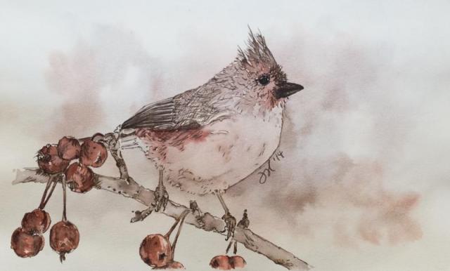
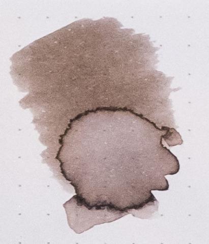
    Forgive my reviewing an ink that has been reviewed thoroughly before. This is my first review and I wanted to start with an ink that I have a lot of experience with. The written review was done in the Rhodia dotpad. The Titmouse sketch was done with J. Herbin's Terre de Feu and Cacao du Bresil in a Stillman & Birn Gamma Series sketchbook. Edited to add color wash detail, which I previously forgot to upload. Reasonable care was taken to ensure color accuracy.
  21. jasonchickerson

    J. Herbin - Cacao Du Bresil

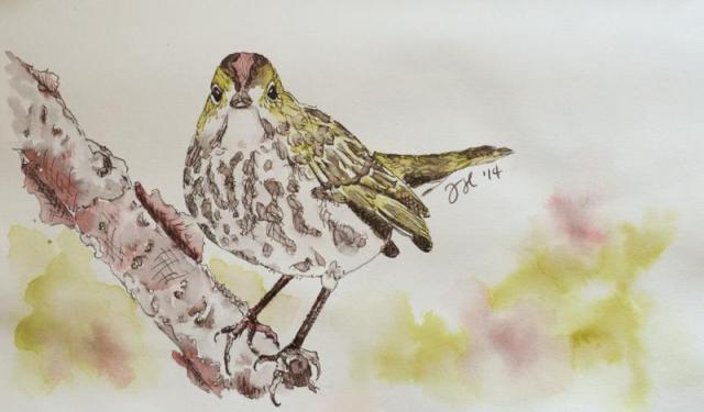
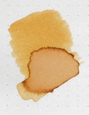
    Cacao du Bresil is my most used ink. I keep it in my daily carry pen 90% of the time. It is so versatile, understated and beautiful. If you can't tell, I quite like it. Warbler sketch was done with Cacao du Bresil, J. Herbin Terre de Feu and Rohrer & Klingner Alt-goldgrun in a Stilman and Birn Gamma Series sketchbook. Reasonable care was taken to ensure color accuracy.
  22. write to me often

    J. Herbin Vert Empire

    I really like green inks. For a while, I wrote down everything with green inks and Sailor Jentle Epinard and J. Herbin Vert Empire was my favorites. So here is a J. Herbin Vert Empire ink review. You can also check the link for bigger photos http://www.banasikcayaz.com/2012/10/j-herbin-vert-empire-ink-review-j.html
  23. AgentVenom

    J. Herbin - Stormy Grey

    Ink Review: J. Herbin - Stormy Grey Grade: 68.75% Paper Tested On: Norcom Composition, Staples 20lb, 85g Clairefontaine, 90g Rhodia, Post-it Note. Disclaimer: I do not have a bottle of this ink. I've only used samples. J. Herbin Stromy Grey (JSG) is the first and only ink that I have ever used that has an added component. I wasn't afraid of cleaning any of my pens out, but I was very curious as to how well JSG would write. I wondered if JSG would flow well or be dry or feel gritty. I do think that there does seem to be some added feedback while using this ink, but I don't find it unpleasant. It actually reminded me a lot of using a No. 2 pencil. I know a lot of people won't like that, but I found it enjoyable since I find that it makes me feel like I have more control over what I'm writing. I also found it fitting since the color of this ink reminds me of graphite lead. I think it's also important to note that the color of my sample looks very different to images that I've seen online. Granted I may not be using as dense a paper as the retailers do for their color swatches, but I feel like the JSG sample I have has a warmer tone to it. As you can see in the chromatography test I did, my JSG sample leans more towards a purple or lilac hue when it separates. I enjoyed the color, but I think you should be aware there may be some differences in what you actually get. It could be anything from environmental factors (i.e. exposure to air) or even how well the bottle was shaken before the sample was drawn. JSG seems to be a nice ink that has staying power. It's not listed as being a permanent ink, but I'd say it's pretty bulletproof. The same cannot be said for the glitter that is in the ink. The gold came off easily even with just a normal pencil eraser. Which, frankly is to be expected. The dry times are good on more absorbent paper, but can start to creep closer to the 20 second mark on good paper like Rhodia's 90g web notebook. JSG's color is easily cleaned, but be prepared to see some left over glitter in the next ink that you put in your pen. I didn't leave JSG in my pens for very long, so I can't comment on how hard it is to clean after it's sat for an extended amount of time, but I think if you use common sense you shouldn't have too much trouble cleaning out this ink. At the end of the day, no one knows your pens better than you do. Don't expect a lot of shading from this ink. JSG is all about the glitter and glam. I can't say that JSG has a lot of uses other than just for the joy of writing. The glitter doesn't really scream "work friendly". I see this more as an ink that you will enjoy personally, or others will enjoy if you write them a letter using JSG. Overall, JSG is a nice ink. It's a good gray color that I was surprised I like all on it's own. With the added glitter, it becomes truly unique.
  24. jasonchickerson

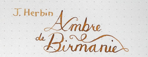
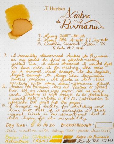
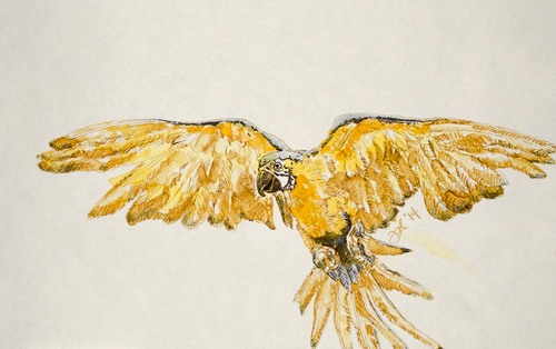
    J. Herbin - Ambre De Birmanie

    I am seriously in love with this ink. It will be in my daily carry pen for a while. Or at least until my bottle of Shin-kai arrives. This ink loves a dip pen, too. Forgive my heavy-handed example above, but perhaps you can see the promise. In better hands, this would be remarkable dipped. Sketch was done with Ambre de Birmanie, J. Herbin Bouton d'Or (the most useless ink I've ever put in a pen) and a touch of Iroshizuku Shin-kai. Not a success but that is hopefully more my total lack of experience with these three inks than anything else. I still have hope. Reasonable care was taken to ensure color accuracy.


×
×
  • Create New...