Jump to content

Search the Community

Showing results for tags 'j herbin'.

  • Search By Tags

    Type tags separated by commas.
  • Search By Author

Content Type


Forums

  • FPN Community
    • FPN News
    • Introductions
    • Clubs, Meetings and Events
    • Pay It Forward, Loaner Programs & Group Buys
  • The Market Place
    • The Mall
    • Market Watch
    • Historical Sales Forums
  • Writing Instruments
    • Fountain & Dip Pens - First Stop
    • Fountain Pen Reviews
    • Of Nibs & Tines
    • It Writes, But It Is Not A Fountain Pen ....
    • Pen History
    • Repair Q&A
  • Brand Focus
    • Cross
    • Esterbrook
    • Lamy
    • Mabie Todd Research/Special Interest Forum/Group
    • Montblanc
    • Parker
    • Pelikan
    • Sheaffer
    • TWSBI
    • Wahl-Eversharp
    • Waterman
  • Regional Focus
    • China, Korea and Others (Far East, Asia)
    • Great Britain & Ireland - Europe
    • India & Subcontinent (Asia)
    • Italy - Europe
    • Japan - Asia
    • USA - North America
    • Other Brands - Europe
  • Inks, Inc.
    • Inky Thoughts
    • Ink Reviews
    • Ink Comparisons
    • Co-Razy-Views
    • Th-INKing Outside the Bottle
    • Inky Recipes
  • Paper, and Pen Accessories
    • Paper and Pen Paraphernalia
    • Paper & Pen Paraphernalia Reviews and Articles
  • Creative Expressions
    • Pen Turning and Making
    • Pictures & Pen Photography
    • The Write Stuff
    • Handwriting & Handwriting Improvement
    • Calligraphy Discussions
    • Pointed Pen Calligraphy
    • Broad (or Edged) Pen Calligraphy

Blogs

  • FPN Board Talk
  • Incoherent Ramblings from Murphy Towers
  • The Blogg of Me
  • FPN Admin Column
  • Rules, Guidelines, FAQs, Guides
  • Musings on matters pen
  • Marketing & Sales
  • Iguana Sell Pens Blog
  • Newton Pens' Blog
  • Peyton Street Pens Blog
  • holygrail's Blog
  • A Gift For Words
  • I Don't Have a Name; So This Will Do
  • Karas Kustoms' Blog
  • Debbie Ohi's Inky Journal
  • Sus Minervam docet
  • Crud!
  • Clut and Clutter
  • Federalist Pens

Product Groups

  • FPN Pens
  • FPN Inks
  • FPN Donations
  • Premium/Trading/Retailer Accounts

Categories

  • Fonts
  • Tools & Software
  • Rules for Notepads & Paper

Find results in...

Find results that contain...


Date Created

  • Start

    End


Last Updated

  • Start

    End


Filter by number of...

  1. J Herbin Rose tendresse (Tenderness pink) According to the J Herbn website : “Rose tendresse (Tenderness pink): this is the rose of love and the flowers of the same name and symbol of love. The color represents the feeling of love and also tenderness shared by 2 lovers.” What a load of Disclaimer: It's hard to be impartial when I viscerally dislike this ink, both the colour and its behaviour. I have tried to be as factual as possible. I love roses, especially pink ones. But this ink reminds me of Pepto-Bismal. It is low on lubrication, has no water resistance, and the writing experience will Lamy Safari (it was decent with M/B nibs) and Pilot F3A was dismal. However, the Hongdian M2 liked it, I didn't. However, I couldn't touch the pens filled with this ink and was relieved to empty them I think I have to mix it with some of my darker Herbins to give it more lubrication and change the colour as fast as possible If you like this shade of pink, you would need a wet pen and smooth buttery nib. Ink is legible despite the scans. Chroma: Writing Samples: I’m glad I used a wet/smooth Hongdian M2 and not the usual Kakuno nib. The UEF is a reverse Hongdian Ef nib. The First Ef is Hongdian, and then Lamy. You can see the stark difference between the two EF nibs and their dry times. It’s pleasant in the first and unpleasant in the Lamy. Ink is legible despite the scan. Photo: Photos are taken at a northern light window. It's interesting how the photo doesn't capture Midori's cream paper. I'm not sure if I took this photo on a sunny day or under the artificial light. Comparison: Water test: Left side (10 seconds under running water. After 24 hours). Kitty's heart was washed away with all this tender love 😛 Art Work: The colour was a creative killer for me. I tried my best, but well you can't win them all. Rapture Paper is a Talens pocket book. inks: Colorverse Methuselah Grove used with a fude nib. J Herbin Rose Tendresse. The green I believe is Octopus Write and Draw Green Tiger. Zoo Part of yearlong Inktober challenge. It's a bit obscure, but I put the cage on the glasses, you can interpret it however you want Paper is an A4 Strathmore for sketching, so not for ink use. To give you an idea of size it is 10 times the size of the paper above. Inks used: Diamine Master of Puppets Kala Nostalgia Gemstone Onyx (Brown grey ink) and J Herbin Rose tendresse and finally the Tiger cub and rose The green ink is Octopus Write & Draw Green Tiger. Paper is Talens pocket book. · Pens used: Hongdian M2 EF (reverse and normal), Lamy (EF/F/M/B/ Stub 1.1), Pilot F3A · What I liked: I’m still thinking about this one, emptying the pens. · What I did not like: Everything.... · What some might not like: Lack of lubrication, colour? · Shading: A bit with M/B/ 1.1 nib · Ghosting: Yes, on cheap paper. · Bleed through: Yes, on cheap paper. · Flow Rate: Wet · Lubrication: Dismal with Lamy. M/B nibs were OK. Hongdian Ok. · Nib Dry-out: Did not notice. · Start-up: Ok with Hongdian M2 Don’t bring pink roses for Lamy Safari, match made in hell. · Saturation: Ugh! · Shading Potential: It depends on the paper. · Sheen: No. · Spread / Feathering / Woolly Line: A bit with semi-flex. · Nib Creep / “Crud”: Did not notice. · Staining (pen): No. · Clogging: Did not notice. · Cleaning: Very easy. · Water resistance: Non-existent. · Availability: 10ml, 30 ml bottles, cartridges. Please don't hesitate to share your experience, writing samples or any other comments. The more the merrier
  2. yazeh

    TR68gsm Rose tendresse.jpg

    From the album: 1 -January-Feb 2025 reviews

    © yazeh


    • 0 B
    • x
  3. yazeh

    Rose tendresse.jpg

    From the album: 1 -January-Feb 2025 reviews

    © yazeh


    • 0 B
    • x
  4. namrehsnoom

    J. Herbin - Terre de Feu

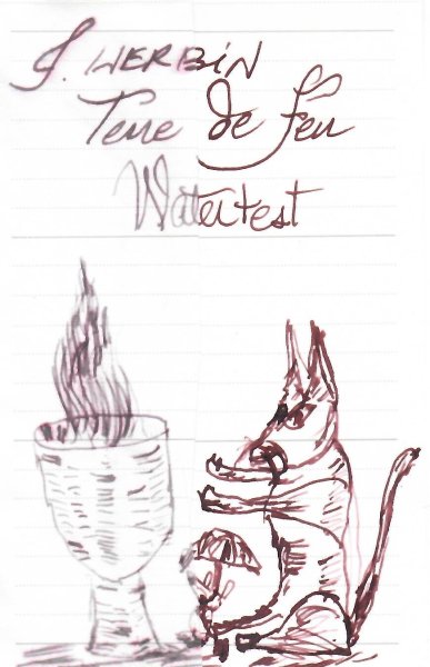
    J.Herbin – Terre de Feu La Société Herbin, Maître Cirier à Paris, was established in 1670. This makes J. Herbin probably the oldest name among European ink makers. Today, Herbin produces a range of beautiful fountain pen and calligraphy inks, writing instruments, gift sets and accessories. Herbin inks are made in France, and the finishing touches on the bottles are still done by hand in Paris. A couple of weeks ago, @yazeh did an excellent review of Terre de Feu, but didn’t enjoy writing with it due to its low lubrication. I then remembered I also have a bottle of Terre de Feu in my stash. As such – a good time to load up a couple of pens with this ink, and add my own impressions. Terre de Feu is a red-brown ink that fits its name well: it makes one think of scorched earth, burnt land, and vast deserts where nothing ever grows. The ink’s colour doesn’t speak to me as a writing ink: a full page of it looks a bit too “bricky" - for me, the aesthetics don’t really work. I hunted around for a pen/nib combination that makes the most of the ink, and finally found one with an Esterbrook Estie with 1.1 stub. Terre de Feu looks a bit flat with low shading on most papers, but with the Estie 1.1 nib it gets more depth and character. The added line variation of the stub, and the enhanced shading you get definitely lift up the aesthetics. Use the ink for drawing though, and we get a completely different story. Terre de Feu works great for artwork, giving you a wide spectrum of brownish, red and red-orange tones. A pleasurable ink to work with. Terre de Feu lays down a fairly wet line with good contrast to the page. It works well across the complete nib-range from EF to stubs. The biggest technical drawback of this ink is its lower-than-normal lubrication. This is something you can physically feel while writing. I didn’t like the feel of it in my Safari test pens. Also, on hard & smooth paper the low lubrication translates to something of a “sticky” feel – it’s not exactly scratchy, but there is some resistance and unpleasant feedback. Wetter writing pens alleviate this, but they also increase the ink’s saturation, making it a lot darker and losing most of the shading. For me, the combination of wet pen and stub-nib worked the best. It corrected the lubrication issue, whilst maintaining the shading and line variation. On the smudge test – rubbing text with a moist Q-tip cotton swab – the ink behaved perfectly with only minimal smearing. Water resistance is quite good: most of the colour washes away, but a grey-black residue remains that is easily readable. This ink can survive accidents. This is also visible in the bottom part of the chromatography. Starting with this review, I have also added the way a splash of ink behaves on a kitchen towel. It gives some extra information of how easily the component dyes separate from one another. Terre de Feu is a fast-drying ink on the more absorbent papers in my test set (5-10 second range). On hard-surface paper drying times increase to the 15-20 second range with my Safari M-nib test pen. I’ve tested the ink on a wide variety of paper – from crappy Moleskine to high-end Tomoe River. On each scrap of paper I show you: An ink swab, made with a cotton Q-tip 1-2-3 pass swab, to show increasing saturation An ink scribble made with a Lamy Safari M-nib fountain pen The name of the paper used, written with a Lamy Safari B-nib A small text sample, written with my Yard-o-Led Standard with F-nib Source of the quote, written with an Esterbrook Estie with 1.1 nib Drying times of the ink on the paper (with the M-nib) Since this is my first review of 2025, I’ve started with a fresh set of quotes – this time from the novels of Patrick Rothfuss. There’s only a handful of them, but they are well worth reading. “The Slow Regard of Silent Things” is easily my favourite novella of all time. Terre de Feu handled all papers well, with no visible feathering – it even managed to cooperate with the dreadful Moleskine paper. On the lower quality paper, the backside has become unusable though due to see-through and some bleed-through. In my experience, the ink lacks a certain crispness – the edges of the writing look a bit fuzzy and not well-defined. Shading is present but not very strong due to the medium saturation range of the ink (see saturation sample above). The writing samples above are shown as photos. Red-brown ink colours are difficult to capture right, and in this case the photos seemed to capture the colours most accurately. Below I also present a scan of some writing samples – the shading gets exaggerated a bit in the scan, and the red undertones are a tiny bit too pronounced. Below you can find some enlarged details of writing samples. Shading is most pronounced on the Sakae Iroful paper, which seems to work well with this J. Herbin ink. Writing with different nib sizes The picture below shows the effect of nib sizes on the writing. All samples were written with a Lamy Safari, which is typically a dry pen – writing with the Safari was not pleasant, due to bad lubrication. But with the dry writers you do get more of the red tones, which I liked. Wetter pens increase saturation, giving your writing a browner look. I ultimately liked the ink best with my Esterbrook Estie with 1.1 nib – this combination worked well: you still get more of the red tones, and the nib coaxes some really nice shading from this Terre de Feu. Related inks To compare J. Herbin Terre de Feu with related inks, I use my nine-grid format with the currently reviewed ink at the center. This format shows the name of related inks, a saturation sample, a 1-2-3 swab and a water resistance test – all in a very compact format. There are lots of similar inks in this colour range that are technically superior to this Terre de Feu – take your pick. Personally, I think Callifolio Inca Sol (which I misnamed Inca Gold) is a good-looking alternative – it’s more sepia-toned with less red in it, and looks a bit better when you have written a full page with it. Inkxperiment – Space Flowers : Mars As a personal challenge, I try to create interesting drawings using only the ink I’m reviewing. I find this to be a fun extension of the hobby, and these single-ink drawings often present a real challenge. It also gives you an idea of what the ink is capable of in a more artistic setting. I experimented with some flower drawings in my most recent ink shoot-out. From this came the idea to do a short mini-series of eerie-looking space flowers. The strong red components in Terre de Feu made it obvious that this first drawing in the series depicts Martian flowers. I started with an A4 piece of HP photo paper. I first painted in the rocky backdrop, using water-diluted ink applied through a kitchen towel (which provided the rock-veined texture). Next I blotted out the sun with some cardboard, and used a cotton pad with heavily diluted ink to paint the sky. The red tones in Terre de Feu really came alive here. Against this backdrop, I used a glass dip-pen and pure ink to add the Martian flowers. The resulting drawing shows quite well wat can be achieved with Terre de Feu as a drawing ink. Inkxpired – computational art I love experimenting with pen/ink/paper, and have added another layer as part of the hobby. I’m exploring computational art, inspired by the ink drawings I do during ink reviews. Another fun offshoot of the hobby… and all that starting with a few drops of dye-coloured water on paper. I started by applying a lens-blur filter to the drawing that overexposed the image, and followed up with a polygon filter while keeping the colours of the original painting intact. The result is a more abstract looking piece. Conclusion J. Herbin Terre de Feu is a red-brown ink that suffers from some technical issues, most prominent being its lack of lubrication. The colour is not really my thing though, and as a writing ink there are many technically superior alternatives for you to consider. But I really did like the ink for doing artwork – the red tones easily separate from the brown and fully come to life when drawing. Technical test results on Rhodia N° 16 notepad paper, written with Lamy Safari, M-nib Backside of writing samples on different paper types
  5. yazeh

    J Herbin Terre de Feu

    J Herbin Terre de Feu A reddish brown, which is named after the Tierra del Fuego (land of fire) archipelago at the southern tip of South America. According to J Herbin: “This brown ink has a red tone a reminder of the burnt lands and vast deserts where nothing ever grows.”. I was really looking forward to this ink as a drop of it on a bill was winking at me from my desk However, the writing experience was opposite of the many positive reviews I saw on internet. It refused to flow in most of my pens. Reviewing this ink was the equivalent of being in a Star Trek mirror universe. Everything was the contrary for me. Ink is wet, with lower-than-average lubrication. It doesn’t like copy paper, and it has very long dry times. However, all the reviews I checked, were raving of its qualities. So take my review or all the others with a grain of salt For those of you who dabble in art and washes, this ink can be addictive. I couldn't stop doing washes with this ink. Chroma: Writing Samples: Scan is off. There's no purple in this ink. I've added photos, so you can see the real deal Photo: It's a sunny day, photos are close to what I see Comparison: Water test: Left side 10 seconds under running water. Art Work: I recently saw a documentary on Musketeers (the rowdy special forces of their day) and did a few sketches while watching, hence no cat and mouse. The paper is Talens Mixed Media Pocket book paper. The blue ink, is De Atramentis Document & Artist Cyan in a brush pen, diluted. The grey ink in the first drawing is Kala Nostalgia Gemstone Sillimanite Not related to any musketeer, cat and mouse were out for a brisk walk, near a pond and were thinking of · Pens used: Pilot F3A (Ef /semi-flex), Lamy Safari(EF/F/M/B/ Stub 1.1), Jinhao 450 with fude nib not shown, and Waterman W2. · What I liked: Drawing , doing washes and appreciating drops of it on different papers. · What I did not like: Writing experience, especially with a Stub. · What some might not like: Long dry times. · Shading: Yes, there’s some. · Ghosting: Yes, on cheap paper. · Bleed through: Yes, on cheap paper. · Flow Rate: Wet · Lubrication: Low · Nib Dry-out: Did not notice. · Start-up: Refused to write with many pens, some even after priming. · Saturation: Medium · Shading Potential: Depends on paper. · Sheen: No. · Spread / Feathering / Woolly Line: Yes, with a wet pen. · Nib Creep / “Crud”: Did not notice. · Staining (pen): No. · Clogging: Did not notice. · Cleaning: Rather easy · Water resistance: Ok. · Availability: 10/ 30 ml bottles, and cartridges. Please don't hesitate to share your experience, writing samples or any other comments. The more the merrier
  6. yazeh

    J Herbin - Lie de Thé

    J Herbin Lie de thé Lie in French is the residue, lees or dregs deposited in teapots. I'm hoping our tea drinking members can give us the correct term This ink brings me fond memories. Many years ago, I scrubbed the tea stains of my mother's teapot, thinking it would please her. She wasn't. I'd removed the secret to her great tea, she informed. Lesson learned Ink is a lovely brown shading ink with the most amazing chroma. Dry times are longer than usual but can be mitigated with finer nibs. I enjoyed using this ink for sketching. The ink looks amazing on Iroful paper, it shades from dark gold/ sepia to dark brown. Ink has decent water resistance and lower than average lubrication. Chroma: Writing Samples: d Photo: Comparison: Water test: Left side 10 seconds under running water. I did two by mistake. I thought I post them both, note the difference Art Work: Mousey is trying to read the Cat's fortune in a cup of tea J Herbin Lie de Thé R&K Königsblau Noodler's Lexington Gray Paper is Talens mixed media sketchbook. · Pens used: Pilot F3A (EF/semiflex), Lamy (EF/F/M/B/ Stub 1.1), · What I liked: Colour. Sketching. And wiping the nib in a tissue. · What I did not like: Nothing much. · What some might not like: Long dry times. · Shading: Yes. · Ghosting: Depends on nib/ pen/ nib size. · Bleed through: Same as above. · Flow Rate: Average. · Lubrication: Slightly below average. · Nib Dry-out: Did not notice. · Start-up: Ok · Saturation: Medium. · Shading Potential: Very good. · Sheen: No. · Spread / Feathering / Woolly Line: A bit with wet pens on cheap copy paper. · Nib Creep / “Crud”: Did not notice. · Staining (pen): No. · Clogging: Did not notice. · Cleaning: Easy · Water resistance: Quite good. · Availability: 10/30/ 100 ml bottles, cartridges. Please don't hesitate to share your experience, writing samples or any other comments. The more the merrier
  7. yazeh

    20241113_073203.jpg

    From the album: 0 - Oct-Nov 2024

    © yazeh


    • 0 B
    • x
  8. yazeh

    Watertest -liedethe.jpeg

    From the album: 0 - Oct-Nov 2024

    © yazeh


    • 0 B
    • x
  9. yazeh

    Chroma-Lie deThe.jpeg

    From the album: 0 - Oct-Nov 2024

    © yazeh


    • 0 B
    • x


×
×
  • Create New...