Search the Community
Showing results for tags 'ink reviews'.
-
Not a review, but an extensive Japanese ink reviewer. Another place to look before purchasing Happy Ink Days Archives I discovered it whilst looking into Ken Takeda's inks
-
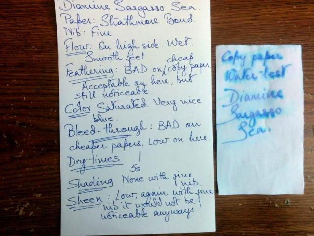
Diamine Sargasso Sea. Nice Color. Terrible Feathering, Bleedthrough
zahiradil posted a topic in Ink Reviews
Very disappointed with this ink. The ink is a nice blue color, saturated, and thats the only good thing about it. It feathers terribly, bleeds through much more than my other inks, and is very prone to smearing. Flows too easily. I cannot recommend this ink. Perhaps Diamine needs to make adjustments to it. Good points: Saturated, nice blue color. Bad points: Everything else!!! -
I was kindly sent this beautiful Shimmer Set to review some time ago by Diamine. Unfortunate events have meant I have only just been able to get them on here. I welcome your thoughts and feedback as always. Black n Red, Taroko Breeze and Fabriano Notebooks respectively
- 2 replies
-
- diamine
- diamine shimmer 2018
- (and 7 more)
-
Oh I wish this one had a different name! I humbly offer Mehndi - which is exactly this colour, and the past of which is applied on hands and feet to celebrate special occasions and weddings.... I digress...
-
- diamine inks
- diamine shimmer
- (and 6 more)
-
Champagne dear? Don't mind if I do! Black n red, Taroko Breeze and Fabriano Notebooks respectively,
-
- champagne dear
- pink champagne
- (and 5 more)
-
This is appearing lighter on my screen than in real life but true to life in the swatch Black n red, Taroko Breeze, Fabriano Notebooks respectively,
-
- diamine
- diamine dragon blood
- (and 5 more)
-
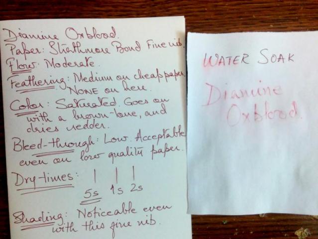
Diamine Oxblood is a fairly well behaved ink. Unlike the other Diamine I have (Sargasso Sea), the Oxblood feathers a lot less. Its a nice red color, goes on brown and dries redder. But its not really the Oxblood red that one might see on Oxblood dyed leather goods. See attached image.
-
Here is the video:
- 3 replies
-
- glare pens
- glare inks
- (and 6 more)
-
Hello! I am a long-time member here but have been lurking more than contributing... in fact, not quite contributing much either, to my embarrassment. I see a lot of wonderful reviews here and am a little overwhelmed sometimes. It's a really great forum and a great resource for fountain pen users out there. Some of you might know me by my username, which is also the name of my blog. I come from Singapore and am left-handed. I love beautiful pens and colourful inks. Recently I received a request from one of the members here, @OCArt, to share my series of Iroshizuku Ink reviews. I have done reviews for the whole series of 24 inks, split into 4 different blog posts. They contain some description, translation, and interpretation of the ink names, as well as my experience with swabbing and my own version of "chromatography" work. I include the links in the photos below, so you can click any photo to be taken to that particular series of inks (I made 6 mini ink reviews per blog post). Hopefully this can be interesting or useful to some of you! Feedback is always welcome. (Also, drop me a note if this post should not belong here! Thank you!)
- 8 replies
-
- iroshizuku
- inks
-
(and 3 more)
Tagged with:
-
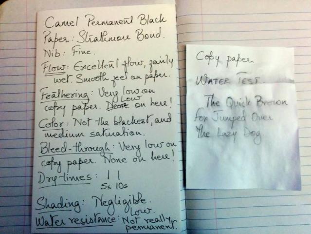
I picked up a bottle of Camel Permanent Black on a trip to India. It is a very inexpensive ink, and costs about 30 cents for a 60 ml bottle. Its not a very dark black though, more of a dark gray but it is very neutral with no color shifts. Flow is excellent, feathering is low, and is a great value for its price. Dry time is just around 6 secs on cotton content bond paper. Please see the attached image
-
Anyone using an ink named for Edgar Allan Poe is probably expecting a gothic tone and a bit of drama and this ink did not disappoint. It could certainly be called a blood red but without being gory or unpleasant to the eye, The scan came out a bid darker than the original. The ink was wet in my Jinhao 450 with a Fude nib and showed slight shading. In my FPR Dilli it was lighter and shaded better. The Dilli has been on the dry side and railroads a lot when flexed. I advanced ink through the feed to counter that and ended up with a nice big ink drop on the page. It definitely looked like a drop of blood. The ink behaved well on the Tops Docket Gold paper as well as on cheaper quality paper. The drying time could have been better but it was certainly within a usable range if you are careful, but might not be the best choice for lefties. This is by no means a bright red ink in my opinion it is subdued enough for full pages of writing. I would recommend it to teachers for grading, especially in language arts (how fun would that be?). I plan on buying a full bottle of this when my ink budget allows.


