Search the Community
Showing results for tags 'ink mix'.
-
Ink Mix – Depuydt Green 2 parts : Pelikan Edelstein Tanzanite 5 parts : Pelikan Edelstein Golden Beryl A colleague of mine is entering retirement shortly, and I wanted to present her with a personalized greeting card for this occasion. And to make it even more personal, I decided to create a special-edition green colour using a mix of the Pelikan Edelstein inks Tanzanite and Golden Beryl. I tried out some combinations in an Ink Shift experiment, and the current mix turned out to be a beautiful muted moss-green. And because it’s a personalized ink, it gets her name: “Depuydt Green.” “Depuydt Green” is brewed by mixing 2 parts of Edelstein Tanzanite with 5 parts of Edelstein Golden Beryl. This mix resulted in a stunning muted grey-moss-green colour that totally fits my taste and that is worthy of the occasion. For the writing samples in this review, I used a mix without the Golden Beryl shimmer particles. For the drawing, Golden Beryl’s golden shimmer was allowed into the mix (and I must admit that it works quite well within this Depuydt Green). See below for a swab with the golden shimmer particles included. This new ink writes fairly wet and well-lubricated in my Safari test pens. Contrast with the paper is excellent, even with EF nibs. This Depuydt Green shades nicely too – not harsh, but with a soft presence and aesthetically very pleasing. I like this mix a lot! To show you the impact of saturation on the ink’s look & feel on paper, I made some scribbles where I really saturated portions of a piece of 52 gsm Tomoe River paper with ink. This gives you a good idea of what the ink is capable of in terms of colour range. Depuydt Green has a medium tonal range. Contrast between light and dark parts is not too harsh, resulting in soft and elegant shading. For me, the sweet spot for this ink lies in the less saturated range – which translates to dry-writing pens and/or finer nibs. I prefer to use this mix with EF/F/M nibs, where the moss-green colour comes out the best. The resulting mix shows fairly good water resistance, undoubtedly inherited from its Tanzanite heritage. Short exposures to water flush away the yellow component dyes, leaving a blue-grey residue behind that remains perfectly readable. This is also clear from the bottom part of the chromatography. This added water resistance makes Depuydt Green a good ink for use at the office. I have tested the ink on a variety of paper – from crappy Moleskine to high-end Tomoe River. Below I show you the ink’s appearance and behaviour on different paper types. On every small band of paper, I show you: An ink swab, made with a cotton Q-tip 1-2-3 pass swab, to show increasing saturation An ink scribble made with an M-nib Safari fountain pen The name of the paper used, written with a B-nib Safari A small text quote, written with the M-nib Safari Source of the quote, written with a Pelikan M200 with M-nib Drying times of the ink on the paper (with the M-nib Safari) The Depuydt Green mix behaved perfectly on most of the paper types I used, with excellent behaviour all-around. It even works with the notoriously bad Moleskine paper: just a tiny bit of feathering, but you still get bleed-through (so you won’t be able to use the backside of the paper). Drying times with the M-nib are fairly short in the 5-10 second range. The ink looks good on both white and cream-coloured paper, but the muted grey-green look works best with pure white paper. The scan above shows a bit too much yellow. I therefore add a photo of the same writing, which is almost spot-on colourwise. Related inks To compare this mix with related inks, I use my nine-grid format with the currently reviewed ink at the center. This format shows the name of related inks, a saturation sample, a 1-2-3 swab and a water resistance test – all in a very compact format. Depuydt Green looks fairly similar to Graf von Faber Castell Olive Green (which has a touch more yellow in the mix). Inkxperiment – A History of ICTS I always enjoy doing a small drawing using only the ink I’m reviewing. In this case, the inkxperiment was used on the invitation card for the thank-you party we’re organizing. The drawing summarizes the history of our university’s IT department. Its origins are pictured in the circles on the left: the University Computing Centre (abbreviated URC in Dutch), the Computer Science group and the Administrative Information Processing group (abbreviated AIV in Dutch). These groups merged over time to form the current IT department (ICTS in Dutch, symbolized by the pyramid on the right – and written out in ASCII code on the pyramid), with Annemie as our CIO. With the help of all our co-workers, we built a smoothly running organization that is prepared for the future. Our department’s one-liner motto’s are enscribed in Pigpen cypher code on the drawing. Oh… and you may have noticed the little fisherman in the drawing … it’s not always work-work-work, we sometimes take a break 😉. For this inkxperiment, I started with an A4 piece of HP photo paper. I taped out the pyramid and some other parts with washi tape, and used water-diluted ink to fill in the background, with a darker region at the bottom. After removing the washi tape, I used a piece of cardboard with pure Depuydt Green (with shimmer particles) to draw in the lines – resulting in a nice shimmer effect. Next I drew the circles on the left and filled circles and pyramid with ink. I added the circuit-board lines with a dip pen and bleach (this ink mix reacts really well with bleach). Finally I drew in my co-workers, and added the capping stone to the ICTS pyramid (which symbolizes the end of a career). The result is a one-image history of our university’s IT department, that also shows what can be achieved with this Depuydt Green ink mix in a more artistic context. In my opinion, this ink is simply great for drawing! Inkxpired – computational art I love experimenting with pen/ink/paper, and have added another layer as part of the hobby. I’m exploring computational art, inspired by the ink drawings I do during ink reviews. Another fun offshoot of the hobby… and all that starting with a few drops of dye-coloured water on paper. For this computational derivation, I applied a couple of filters that zoomed in on the main subject, and added a mosaic of colours, that I toned down to a more muted pallet. The end result is not too bad, but in this case I like the green original more. Conclusion Depuydt Green is an ink mix that really impressed me: it is a stunningly beautiful muted moss-green that works well with all kinds of nibs and papers, and that is especially nice for drawing. Fabulous!
- 6 replies
-
- ink mix
- depuydt green
-
(and 3 more)
Tagged with:
-
Ink Mix – Kung Fu Caine 2 parts : Pelikan Edelstein Golden Beryl 1 part : Pelikan Edelstein Apatite Pelikan Edelstein Apatite is the new Ink of the Year 2022. I knew it wasn’t my type of colour, but I collect these Edelstein inks, and so didn’t want to miss this one. Apatite is a really bright and in-your-face blue… a full page of it is just too much for me. I got the feeling though that it might be a nice base colour for some ink mixes. So I resurfaced Edelstein Golden Beryl – a golden yellow that works well with wet & broad nibs, but not so well with my usual F and M pens. I tried out some combinations in an Ink Shift experiment, and the current mix turned out to be a really beautiful yellow-green. This yellow-green reminded me of the long grass in the garden, that is populated by those small green grasshoppers – almost invisible until they jump away. Grasshopper… that brings back memories... it was the nickname of Kwai Chang Caine in the 70’s TV series Kung Fu (played by David Carradine). As a kid, I really enjoyed this series, so I decided to name this ink mix “Kung Fu Caine”. “Kung Fu Caine” is brewed by mixing 1 part of Edelstein Apatite with 2 parts of Edelstein Golden Beryl. The resulting mix is a really beautiful yellow-green colour … a substantial improvement over the parents’ colours. This new ink writes fairly wet and well-lubricated (inherited from Apatite) in my Safari test pens. Contrast with the paper is good, even with EF nibs. Like Apatite, this Kung Fu Caine mix is a strong shader – not too harsh though, but aesthetically pleasing. I like this mix a lot! To show you the impact of saturation on the ink’s look & feel on paper, I made some scribbles where I really saturated portions of a piece of 52 gsm Tomoe River paper with ink. This gives you a good idea of what the ink is capable of in terms of colour range. Kung Fu Caine has a medium tonal range. Contrast between light and dark parts is not too harsh, resulting in well-defined and elegant shading. The resulting mix has zero water resistance. Short exposures to water flush away all colour, leaving only some yellow-green smudges. This is also clear from the chromatography : at the bottom part, you can barely see where the original dyes were put on the coffee filter paper. A good ink for journaling, but not one for use at the office. I have tested the ink on a variety of paper – from crappy Moleskine to high-end Tomoe River. Below I show you the ink’s appearance and behaviour on different paper types. On every small band of paper, I show you: An ink swab, made with a cotton Q-tip 1-2-3 pass swab, to show increasing saturation An ink scribble made with an M-nib Safari fountain pen The name of the paper used, written with a B-nib Safari A small text quote, written with the M-nib Safari Source of the quote, written with a Pelikan M120 Green-Black with F-nib Drying times of the ink on the paper (with the M-nib Safari) The Kung Fu Caine mix behaved perfectly on most of the paper types I used, with only a tiny bit of feathering on the lower quality papers. Bleed-through was only present with the Moleskine paper, but even there it was not too bad. Drying times with the M-nib are mostly paper-dependent ranging from 5-10 seconds on absorbent paper to 10-20 seconds on paper with a hard surface. I quite enjoy the way it looks on the Paperblanks paper, which is what I use for daily journaling. The scan above greatly exaggerates the contrast in the shading. Below you’ll find a photo of the same writing samples, that gives a truer impression of reality. A difficult ink to capture... the colour is more in the direction of the scan, the contrast is more like in the photo. The colour is best captured in the more zoomed-in scans: B-nib detail, saturation swab, related inks... Related inks To compare this mix with related inks, I use my nine-grid format with the currently reviewed ink at the center. This format shows the name of related inks, a saturation sample, a 1-2-3 swab and a water resistance test – all in a very compact format. Kung Fu Caine looks very similar to kyo-no-oto moegiiro and Diamine Meadow. Inkxperiment – Embracing Diversity I always enjoy doing a small drawing using only the ink I’m reviewing. Inspiration for this little piece comes from some pics I saw on Pinterest. People come in all kinds of hardware & software configurations… big & small, multiple skin tones, many belief systems, a multitude of personalities. On an individual level, I embrace this diversity, and I mostly enjoy my interactions with other people, regardless of inevitable differences. But scale up the group, and individuality is quickly wiped out and replaced by mob dynamics with binary thinking and loss of nuances. This never ceases to amaze me! Oh… and you may have noticed that I included a cat in the drawing… cats have personalities too! For this inkxperiment, I started with a piece of 300 gsm rough watercolour paper and a 4x3 grid. I used water-diluted ink to fill in the background, and added some texture with Q-tips dipped in ink. I then used a piece of cardboard with pure Kung Fu Caine to draw the borders of the 12 rectangles. Next I drew in a variety of people (and the cat) with a glass dip pen. Final accents were done with my B-nib Lamy Safari. Yellow-green inks are usually very rewarding to draw with, and this ink mix is no exception. The resulting drawing gives you a good idea of what can be achieved with Kung Fu Caine in a more artistic context. Inkxpired – computational art I love experimenting with pen/ink/paper, and have added another layer as part of the hobby. I’m exploring computational art, inspired by the ink drawings I do during ink reviews. Another fun offshoot of the hobby… and all that starting with a few drops of dye-coloured water on paper. For this computational derivation, I zoomed in a bit on the inkxperiment picture, and used a colour scheme that adds some extra contrast to the drawing. Conclusion Kung Fu Caine is an ink mix that really impressed me, and that’s definitely ways better than the original Apatite and Golden Beryl. It is a stunningly beautiful yellow-green that works well with all kinds of nibs and papers, and that is especially nice for drawing. Another great thing: you’re at the controls here: do you want the colour to be a bit more yellow or a bit darker green… just add a drop of Golden Beryl or Apatite to steer the mix in the direction you want. Fabulous! Backside of writing samples on different paper types
- 4 replies
-
- ink mix
- pelikan edelstein
-
(and 3 more)
Tagged with:
-
Ink Mix – Murky Waters 3 parts : Pelikan Edelstein Jade 2 parts : Pelikan Edelstein Onyx I have a bottle of Pelikan Edelstein Jade, that turned out to be of a colour that's not really my thing (to put it mildly - I simply cannot stomach it). From the Platinum Classic Black series, I got the idea of darkening up the ink... maybe that could be a way to salvage my bottle. I tried a number of different proportions of Edelstein Jade and Onyx (documented here on the forum), to come up with a combination that I liked - Murky Waters. "Murky Waters" is brewed by mixing 3 parts of Edelstein Jade with 2 parts of Edelstein Onyx. The resulting mix gives a really dark grean-leaning teal colour, that is quite stable. This new ink writes wet and well-lubricated in my dry Safari test pens. Contrast with the paper is excellent, even with EF nibs. The ink also exhibits aesthetically pleasing soft shading. To show you the impact of saturation on the ink's look & feel on paper, I made some scribbles where I really saturated portions of the Tomoe River paper with ink. This gives you a good idea of what the ink is capable of in terms of colour range. Murky Waters has a narrow tonal range, and is definitely a well-saturated ink. The limited colour span explains the soft shading that is apparent in writing. The resulting mix is also fairly water-resistant. Short exposures to water flush away the Jade components of the ink, but the black remains, and is still very readable. This is also clear from the chromatography: at the bottom part, the black dye remains well fixed to the paper. This makes it a good candidate for use at the office. I have tested the ink on a variety of paper - from crappy Moleskine to high-end Tomoe River. Below I show you the ink's appearance and behaviour on different paper types. On every small band of paper, I show you: An ink swab, made with a cotton Q-tip 1-2-3 pass swab, to show increasing saturation An ink scribble made with an M-nib fountain pen The name of the paper used, written with a B-nib A small text sample, written with an M-nib Drying times of the ink on the paper (with the M-nib) Murky Waters behaved perfectly on most of the paper types I used, with only a tiny bit of feathering on the lower quality papers. Bleed-through was only very present with the Moleskine paper, but even there it was not too bad. Drying times with the M-nib are paper-dependent ranging from 5-10 seconds on absorbent paper to 15-20 seconds on paper with a hard surface. I quite enjoy the way it looks on the Paperblanks paper, which is what I use for daily journaling. Related inks To compare this mix with related inks, I use my nine-grid format with the currently reviewed ink at the center. This format shows the name of related inks, a saturation sample, a 1-2-3 swab and a water resistance test - all in a very compact format. Inkxperiment - a fistful of flowers I always enjoy doing a small drawing using only the ink I'm reviewing. For this inkxperiment, I started with a piece of 300 gsm rough watercolour paper that I thoroughly wetted with water. I then added some drops of Murky Waters to start the flowers. Once dried to the point of dampness, I added a bit of bleach, and ten minutes later again a tiny bit of Murky Waters to the flower heart. I then painted in the background with a Q-tip and heavily water-diluted ink. Finally I drew in the flower stems, completing the drawing. Conclusion Murky Waters is an ink mix that I like, and that definitely saved my bottle of Jade. A nice dark green-leaning teal that works well with fine nibs, and that is fairly water resistant. This is an ink that will get used in my EDC pens that I carry with me to the office. All in all a successful mixing experiment. Technical test results on Rhodia N° 16 notepad paper, written with Lamy Safari, M-nib Back-side of writing samples on different paper types
- 11 replies
-
- pelikan edelstein
- jade
-
(and 3 more)
Tagged with:
-
I was given some Poussière de Lune for Christmas, which was lovely. But I would prefer it to be a touch redder. I've tried blending it with Sheaffer Skrip Red, and that works, but even at 3 Poussière to 1 Skrip, it's a bit too red. Has anyone played around with something like this? I'm surprised relatively little of the Skrip makes so much difference. The perfect mix for me is probably around 5 or 6 to 1, but before I work on it further, I thought I would ask for some advice...
-
I like Pelikan Royal blue. I started writing with this ink and have used it for many years without ever using any other, in the era of one pen / one ink. I still like how it behaves and looks. It's just a pity it tends to fade and on some papers more than others tends to look somewhat washed out. I like the colour shade, I know it tends slightly towards purple, but then again it would not be Royal otherwise. I also like how it flows, the fact that it's quite dry on absorbent paper, and can shade nicely especially on coated paper. Since I also like Pelikan pens, with time I have built up quite a reservoir of Royal blue, not by choice but by chance, since many Pelikan pens, especially special/limited editions, come with a complementary bottle of Royal blue. Nowadays that I've moved also to other inks, although with a great prevalence of blues, I'm often using my reservoir of this ink for experiments. Typical tentative mixes are blue + black, blue + purple. I'm not so fond of blue + green, although I have used this ink in view of its purplish tinge to make some blue-green inks look more neutral. This mix I'm showing here is a not so obvious: blue + blue. I happened to think, as this experience is already confirmed by adding either black or purple to this ink, that adding some darker, more saturated ink to Royal blue may affect it positively, and that should work also by adding another blue. I did not have to think a lot about it, I have a sample bottle of Sargasso sea, and since I like this Diamine ink, I also have a full bottle. The sample bottle is half full and the perfect available darker shade to add some character to Royal blue. I had planned to try different ratios but it also happens that I like the first tested ratio, and did not go ahead to try others. Pelikan Royal blue 4 parts to Diamine Sargasso Sea blue 1 part. I'm using a vintage bottle of Royal blue, which was unopened when I got it a few years ago, but is now in use since a while (more than 1 year surely). I do not notice much difference vs current royal blue, perhaps just a tad more greyish. The bottle I used two separate ordinary metered syringes, to avoid contaminating inks, and put 4 ml of Royal blue + 1 ml of Sargasso sea in a sample vial. I then just closed and stirred the vial. This is what it looks like, you can already see the mix is less purple than Royal blue. I then tested the resulting mix vs the two starting inks. A very quick comparison. Some brief impressions The mix is darker than Royal blue and lighter than Sargasso The mix is less purplish and more blue than Royal blue The mix has a faint turquoise hue The mix has some shading although more evident on glossy paper The mix is dry on copy paper and more wet on glossy paper, much like Royal blue The mix has no sheen compared to Sargasso The mix looks more contrasted and less faded vs Royal blue dry time is about 10 seconds on copy paper and about 25 seconds on glossy paper, when dry it does not smudge further a closer look vs Sargasso, it's still quite saturated despite being less concentrated The pen used was a Wing Sung 3008 with a Lamy B nib (don't judge the sloppy writing...) I have not tested compatibility, but I am not expecting problems with these two inks. The vial will sit there on my desk for a while in any case. Then I'll probably fill a nicer pen and take it to work.
-
Ostrich Flower Series ink inter-mix, on Flickr pretty much self explanatory I suppose ... anyway after the initial sampling I posted while ago. I go out and do the inter-fix. This is how I do it, I use industrial / lab syringe to measure exactly 0.6ml each of 2 ink and had them mixed in a 2ml lab sample vile ( the same kind of plastic container usually ink sampler come in but its 2ml instead ). I had them then stored in cool covered ( no light ) for about 3 weeks to made sure the mix do not come with some unexpected chemistry experiment. Then its onto the color table, all are put onto the paper using a Glass Dip pen, paper is Rhodia dot pad paper, and 3 patches of standard graphic use graphite pencil 2B,4B, and 6B are included for those who want to colour balance the photo for better accuracy. Some surprise in the mix but most are expected. I think I might go off& get some extra bottle of certain colours to made a full 30ml of a certain mix This is how the ink come in ( 15ml per bottle X 12 colours )
- 4 replies
-
- ostrich ink
- flower series
-
(and 1 more)
Tagged with:
-
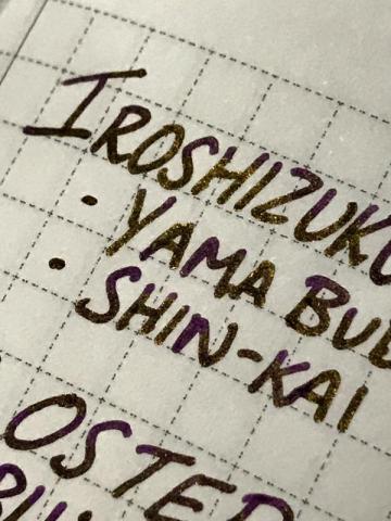
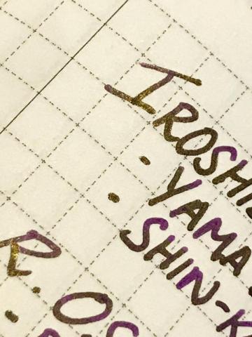
A saturated, slightly dusty purple with strong gold sheen(the writing samples below were from a fairly dry pen). Not much shading but diluting with water and using a wetter pen may bring it out. I've had it in my pen for 2 days and the ink doesn't seem to be doing anything strange, not too sure about staining but none of the inks used in the mix usually stains much. I don't have the exact ratio but it's mostly pilot iroshizuku Yama budo with some shin-Kai and blue denim(Robert oster), possibly 4:1:1. Lubrication:4/5 Flow:4/5 Dry time:4/5 Water resistance:3/5(runs but definitely readable) No bleedthrough or feathering, slight show through on the copier paper. Sorry for the sloppy photos, I did try to take them in different lighting situations. I might try diluting it or playing with the ratio if anyone's interested. 😊
-
Hi guys!! I require your guidance and expertise to try and make my own Blue Blacks. What I have at hand are the 40ml bottles of Parker Quink Black and Quink Blue. I was wondering if I could mix and make my own blue blacks using these two. I use a Lamy Safari F and 1.1 nib for my daily writing. I use ordinary notebooks nothing fancy. Could you please give me a ratio that would give me the right color for the ink or your favorite blue black color? I want it to look dark but not too dark that it really looks black. I hope you got me. How do I mix the inks the right way? Anything else that I need to look out for when mixing these shades please let me know. Thank you all! Pete :")
- 42 replies
-
- blue black
- parker quink inks
-
(and 3 more)
Tagged with:
-
Hey, Has anyone mixed J. Herbin Cloud Grey with another colour with good results? I'd be interested in finding a combination as I find the grey a little too pale for me. Also what ratio? Thanks!
-
I'm mixing my own colours. I keep samples in these small airtight lab tubes. I kept this small amount overnight with the tube standing upright. Next day, the ink is still sloshing all over the tube, but it seems like some of it is "stuck" to the walls of the tube. Is this surface tension from the tube? I believe if I keep it upside down, the amount WILL eventually go down, and will not stain. I was actually worried about it staining my pens, but having tried it, it doesn't. Any inky thoughts?
-
This was a mix intended to use up Noodler's #41 Brown. #41 Brown is a pleasant, well-behaved ink, but too unsaturated for daily use. This mix achieves a darker, professional, more muted color that is medium-wet, 92% bulletproof, and shades well. Incidentally the color seems to be reminiscent of Diamine's Safari/Salamander The photo looks more accurate than the scan, although neither shows the green component well. My old scanner apparently doesn't like HP 24lb Laserjet paper. Photo Scan
- 9 replies
-
- 41 brown
- navajo turquoise
-
(and 3 more)
Tagged with:
-
Hi Everyone, Here is the mix i use every day as an alternative to black... Green is my favorite color and every black ink i have is not black... ITS DARK GREY So, if i don't have yet a REAL BLACK, i prefer to use a DARK GREEN. In the test i use the Sheaffer Stylist M Nib. Cheers
-
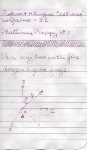
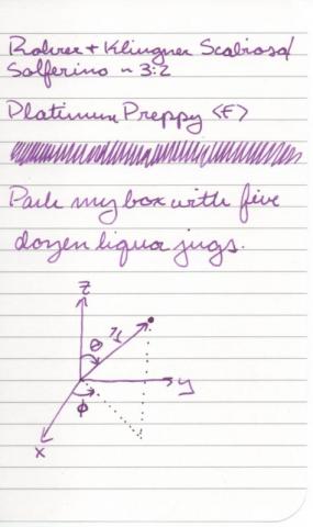
Here today with another ink mix. Another pair of Rohrer & Klingner inks, this time Scabiosa and Solferino, 3:2. The resulting color dries dark enough to make it usable for taking notes and even doing homework, as long as your professors aren’t too picky. :-) It has the positive effects of the IG (water resistance, low feathering and bleeding…) while still being nice and vibrant. Speaking of water resistance, here are the results of the soak test: Like my previous partial IG mix, it remains readable after getting wet, though I certainly wouldn’t count on it being good for writing my memoirs while scuba diving. The paper used for this test is a page from my pocket sized Ecosystem journal, and all inks would bought with my own money and all opinions expressed above are entirely my own.
-
My mother bought me a beautiful bottle of Iroshizuku Shin-Ryoku for Christmas, and while I love the color (a very vibrant green), it just wasn’t getting much use because vibrant colors don’t have a good place in my academic writing. Plus, it’s not at all water resistant. So, I decided to try mixing it with a bit of Noodler’s Heart of Darkness, and this is what emerged: It’s a 4:1 mix of green/black and the result is a dark green that exhibits lots of shading, a pretty wet flow, and reasonably fast dry times. Oh, and water resistance! That’s the result of a thorough soaking. The green spreads a bit depending on the paper (how absorbent/coated it is) but the black component is still perfectly readable. I’ve been using this ink for a few weeks now on my homework and lately in my Seven Seas journaland it is behaving wonderfully. I do find that sometimes I get bits of writing that are lighter than others, but this is usually alleviated by inverting the pen to make sure the ink inside is well mixed. Paper used is M by Staples arc refill, and all opinions expressed above are completely my own. :-)
-
Hello! Here today with a quick overview of an ink mix I prepared yesterday morning. On the R&K website they say that their inks can be mixed without any negative consequences (except for sepia), so I decided to give it a try with some Salix that I already had and some Verdura that I ordered a sample of just for this experiment. They were mixed approximately 1:1, and the resulting color is a dark teal (ish). I did not do any color adjusting, but the scan appears pretty true to reality on my screen. Also, forgive my bad handwriting - my new VP is being a pain in the butt and skipping on a lot of my downstrokes, which makes me fear that it has a case of baby bottom… Anyway, I of course had to do a soak test as well. I only let the page “cure” for a few hours, so I don’t know if the IG component would have darkened more if I left it overnight. Still, what is left is readable, though not preferable: All in all, I really enjoy this color and I like that if it gets wet, it’s not a total loss. This is my big reason for wanting water-resistant ink - so that if it gets spilled on all my writing doesn’t disappear, not because I enjoy writing in the rain. :-P Btw, the paper used for the writing sample is Staples 24lb bright white inkjet paper and all inks were bought with my own money and all opinions expressed above are my own.


