Search the Community
Showing results for tags 'ink comparison'.
-
An email I received today from the guys at Birmingham Pen Co. Introduced me to their new ink comparison tool, the Inkvestigator. As one of their fans, I’ve often found it difficult to decide between some of their inks that appear to be very close to one another. This new tool helps with some of that decision making. It is found at the bottom of the INKS pull down menu, and for the moment is only operational for their line of “Crisp Inks,” although that is still a considerable number of inks. You click on the ink you are interested in on the list, and its swatch appears below. Then you can add as many inks as you want to view together. They appear as stacked tiles, which you can then drag and drop to move them around for comparisons. You can lay part of one over another to fit them on the relatively small portion of the page allotted for viewing, and rearrange them however you please. You may remove one or all the swatches with the provided buttons. It’s a useful and welcome tool for their website, and will become even more functional when their complete line of inks can be viewed. More good work from Birmingham. (No affiliation). https://www.birminghampens.com/pages/inkvestigator
- 7 replies
-
- birmingham pen company
- birmingham ink
-
(and 2 more)
Tagged with:
-
Paperblanks makes beautiful notebooks and diaries with off-white paper. I've used various Paperblanks notebooks for journaling and found the paper to be of good quality. Not overly smooth (i.e. not coated), but well-behaved with all but the wettest fountain pens and with a nostalgic feel, like old paper. Having been so encouraged, I bought a 2019 diary from Paperblanks, in the expectation that the paper would be the same. Guess what? it isn't. At first glance and first feel, the paper appears to be the same as that used in their notebooks but in fact it responds totally different to fountain pen inks. I decided to do a quick test and got interesting results. On the positive side, this paper (despite being off-white) really brings out the colour of the ink. The colours are a joy to look at. Also the paper has a pleasantly "grainy" writing feel, a sort of texture that offers lots of control while still being pleasantly smooth. No fibers, no plasticy feel as with some coated papers, just a really nice writing experience. The degree of control also makes it easy to jot readable notes when on the move (cars, buses, trains, planes). On the negative side... As you can see, there's a profound "mottling effect" that's caused by the ink being absorbed into the paper in some spots, which leads to colour differences. The inks that mottle most also cause the most bleedthrough and are pretty much unusable. The Herbin inks fall in this category, which surprised me a bit because I consider Herbin inks to be extremely well-behaved. But not on this paper... The best-behaved inks on this paper, i.e. the ones with only very little mottling or no mottling at all, are Sailor Kiwa-Guro (bottom line in above image) and Platinum Blue-Black. Both are pigment inks. By far the wettest writing sample is from an '80s Sheaffer Targa M with Platinum Blue-Black: There's a ton of Platinum ink on the page, but zero mottling, zero showthrough, zero bleedthrough. Remarkable. The only non-pigment ink that comes close is Pelikan 4001 Blue-Black, which also doesn't mottle or absorb. Diamine Ancient Copper is also well-behaved on this 'difficult' paper. The purpose of this comparison is not to burn down Paperblanks diary paper, but to show how much inks differ from each other in how they interact with paper. Their properties really vary widely. The amount of ink deposited on the page (wetness) is *not* the deciding factor, it's really all about the chemical composition of the ink and how the paper responds to that.
- 3 replies
-
- paperblanks
- diary
-
(and 2 more)
Tagged with:
-
Birmingham Pen Parcel March April W/ Some Herbin To Compare
radellaf posted a topic in Ink Comparisons
Some Birmingham Pen Co and Herbin inks. The bottom row is the April 2018 Pen Parcel 5-ink set: South Side Market Boysenberry, Enterprise Tower Aluminum, Mary Lou Williams Piano Girl Pink, George Ferris Jr. Fair Wheel Blue, and Allegheny Courthouse Justice Blue. The top rows are March's set plus some others for comparison. The Herbins are just colors I wanted to try and finally bought 10mL bottles of, plus some comparison colors from 30mL ones I already had. Halogen: Daylight:- 7 replies
-
- birmingham
- herbin
-
(and 1 more)
Tagged with:
-
Following is an Ink Comparison. please forgive me if i make a mistake, today is my first day on this forum and i am trying to learn as well. anyways below are some pics of the writing i did earlier Scanned images These are Pictures from my camera (sorry about the focus i was trying to create an effect ) flickr link for HD pics https://www.flickr.com/photos/43346273@N07/
- 8 replies
-
- ink comparison
- ink review
-
(and 1 more)
Tagged with:
-
Here's a lovely turquoise ink that's certainly one of my favorites. The word "crisp" comes to mind when I use it. I can imagine myself floating in an inner tube in the Havasu Falls lagoon, writing a journal entry with this ink. http://imagizer.imageshack.us/v2/xq90/909/62g4ZV.jpg
- 2 replies
-
- havasu turquoise
- turquoise
- (and 5 more)
-

Compared.... J. Herbin Terre De Feu- De Atramentis
Morbus Curiositas posted a topic in Ink Comparisons
Hello FPN friends Just to let you know I have published a comparison of two Reddish inks i have reviewed seperately before... J Herbin Terre de Feu and De Atramentis wine ink Merlot You can find the comparison here https://www.fountainpennetwork.com/forum/index.php/topic/270999-allied-forces-j-herbin-de-atramentis-terre-de-feu-merlot/ Hope you will enjoy it... Regards Peter -
*Reposted from my blog* To follow up on my post from yesterday, I did a quick comparison of three green inks that are currently in my possession. I haven’t written up the full review of Aventurine yet (actually I have now, it's here), but my review of Verdura is here and eventually I’ll do a review of Shin-Ryoku as well (for a neat mix that uses Shin-Ryoku, you can lookhere…), but here’s the quick and dirty side-by-side: A few notes on the scan - the Aventurine looks pretty true to life, at least on my monitor. The Verdura comes out a little bit light, and the Shin-Ryoku is a touch washed out, but not drastically so. Anyway, I didn’t want to do any color adjusting because what would probably make one look the best would screw up the other two. :-P After seeing them all together, I would call Aventurine the purest green of the three. It’s like the color of the most perfect lawn that your neurotic neighbor spends waaayyyy too much time maintaining. Shin-Ryoku has a lot more blue component and is more like the color of a spruce tree. As for Verdura, I stick with my original description and would call it a vibrant shamrock green, the color of stuff that emerges around St. Patrick’s Day. All of these inks are similar in terms of behavior - no water resistance, smooth flow, not too much feathering and bleeding on good paper, and easy to clean out of your pen. If you aren’t too picky, Verdura is by far the cheapest, at ~$12, and then there’s Aventurine at ~$23 and Shin-Ryoku at ~$28 (online prices for 50 mL bottles here in the States). Given that I already have a nearly full bottle of Verdura and half a bottle of Shin-Ryoku, I probably won’t spring for Aventurine anytime soon, but perhaps it will be next on my list of greens when the time comes… Which one is your favorite?
- 1 reply
-
- iroshizuku
- pelikan
-
(and 3 more)
Tagged with:
-
I received an email from Fahrney's Pens advertising new Edelstein long catridges. Upon checking the Fahrney's site, http://www.fahrneyspens.com/Item--i-363266S?src=WP200714SENTTOEL&utm_source=Newsletter&utm_medium=Email&utm_content=Inhouse&utm_campaign=140710, I found the option for Edelstein Sapphire Blue. Since I had purchased a lot of Parker Penman Blue Sapphire ink before it became impossible to find and since I have been using Private Reserve American Blue catridges for the travel needs of my pens taking international size cartridges, I have not tried Edelstein Sapphire Blue ink; having a lot of Parker Penman Blue Sapphire ink, I have not needed to buy bottled ink. Since the picture of an ink blob on the Fahrney's site looked promising in regard to color, I wanted to ask how the Edelstein Sapphire Blue ink compares in color to my beloved Parker Penman Blue Sapphire and my substitute Private Reserve American Blue. Has anyone used each of these inks? If so, how do they compare in color? In particular, how does the color of Edelstein Sapphrie Blue compare to the rich deep color of Parker Penman Blue Sapphrire? Thanks! : )
- 4 replies
-
- parker penman
- blue sapphire
- (and 8 more)
-
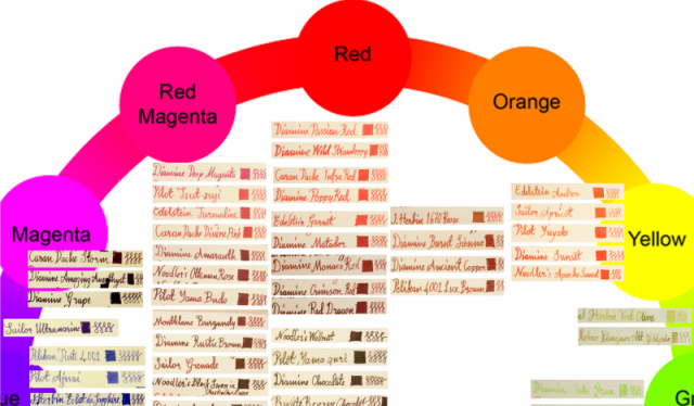
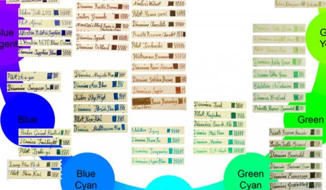
I tried to create an ink wheel. It is not 100% perfect but it at least gives an idea about where each of my inks fall on the color wheel. The original file is in powerpoint format and 10MB. So, posted screencaptures as png files. First picture is the whole wheel. The rest are closeups...the color samples are obtained with a dip pen and the paper is daler rowney sketch paper (100g/m2). You can find more detail on how I obtained the samples with dip pen on my other post "color samples"....let me know what you think and more importantly enjoy...
- 9 replies
-
- ink comparison
- wheel
- (and 7 more)
-
Servus* FPN Friends This is a quick comparison of the blue inks I currently own. It's nothing fancy not a full test, but I hope it is still amusing I also made a quick test of the water resistance... But then again it's just a quick test... Extensive reviews of the inks will be posted soon. I like all the blues posted. Some are more smooth, some are dry some are wet, but that's all for a more extensive review... It is not completely fair to compare the water resistance of the De Atramentis inks with the other inksin the review. The De Atrmanentis inks are document inks for doctors,lawyers and the notary for example... they are bombproof. Still these inks are blue so they are in the comparison... I love vivid vibrant blue inks.... (although I like other blues and colours too off course)....J Herbin has lovely inks but there Bleu Azure is or Perchevance is too much... I would love to get any ddvice on a nice vibrant blue which still can be used at work. I really love De Atramentis , but simply name me your favourite blue ink (of any Brand) I am curious already to hear about your favourite blues(s) Thank you and enjoy Kindest regards, Peter * Tyrolean greeting means "hello" and funnily enough goodbye also
- 7 replies
-
- blue inks
- ink comparison
-
(and 1 more)
Tagged with:


