Jump to content

Search the Community

Showing results for tags 'indigo'.

  • Search By Tags

    Type tags separated by commas.
  • Search By Author

Content Type


Forums

  • FPN Community
    • FPN News
    • Introductions
    • Clubs, Meetings and Events
    • Pay It Forward, Loaner Programs & Group Buys
  • The Market Place
    • The Mall
    • Market Watch
    • Historical Sales Forums
  • Writing Instruments
    • Fountain & Dip Pens - First Stop
    • Fountain Pen Reviews
    • Of Nibs & Tines
    • It Writes, But It Is Not A Fountain Pen ....
    • Pen History
    • Repair Q&A
  • Brand Focus
    • Cross
    • Esterbrook
    • Lamy
    • Mabie Todd Research/Special Interest Forum/Group
    • Montblanc
    • Parker
    • Pelikan
    • Sheaffer
    • TWSBI
    • Wahl-Eversharp
    • Waterman
  • Regional Focus
    • China, Korea and Others (Far East, Asia)
    • Great Britain & Ireland - Europe
    • India & Subcontinent (Asia)
    • Italy - Europe
    • Japan - Asia
    • USA - North America
    • Other Brands - Europe
  • Inks, Inc.
    • Inky Thoughts
    • Ink Reviews
    • Ink Comparisons
    • Co-Razy-Views
    • Th-INKing Outside the Bottle
    • Inky Recipes
  • Paper, and Pen Accessories
    • Paper and Pen Paraphernalia
    • Paper & Pen Paraphernalia Reviews and Articles
  • Creative Expressions
    • Pen Turning and Making
    • Pictures & Pen Photography
    • The Write Stuff
    • Handwriting & Handwriting Improvement
    • Calligraphy Discussions
    • Pointed Pen Calligraphy
    • Broad (or Edged) Pen Calligraphy

Blogs

  • FPN Board Talk
  • Incoherent Ramblings from Murphy Towers
  • The Blogg of Me
  • FPN Admin Column
  • Rules, Guidelines, FAQs, Guides
  • Musings on matters pen
  • Marketing & Sales
  • Iguana Sell Pens Blog
  • Newton Pens' Blog
  • Peyton Street Pens Blog
  • holygrail's Blog
  • A Gift For Words
  • I Don't Have a Name; So This Will Do
  • Karas Kustoms' Blog
  • Debbie Ohi's Inky Journal
  • Sus Minervam docet
  • Crud!
  • Clut and Clutter
  • Federalist Pens

Product Groups

  • FPN Pens
  • FPN Inks
  • FPN Donations
  • Premium/Trading/Retailer Accounts

Categories

  • Fonts
  • Tools & Software
  • Rules for Notepads & Paper

Find results in...

Find results that contain...


Date Created

  • Start

    End


Last Updated

  • Start

    End


Filter by number of...

Found 9 results

  1. TAG Kyoto - kyo-iro - Soft Snow of Ohara TAG is a stationary shop in Kyoto (Japan) that produces some interesting soft watercolour-style inks. With the kyo-iro series they produce a line of inks that that are inspired by the city's many beautiful and historic sights. Each of these inks is dedicated to a specific town in the Kyoto area. The inks come in 40 ml bottles, packaged in luxurious thick paper with a texture that feels like heavy watercolour paper. In this review the spotlight is on Soft Snow of Ohara. This ink is best described as a muted grey-violet-blue, an intriguingly complex colour that is named after winter scenery found in the village of Ohara near Kyoto. During ice-cold winter mornings the snowy landscape can take on a violet-blue tinge... that's the colour captured by this kyo-iro ink. I really like this subtle and delicate soft grey-purple, that seems to shift from violet to blue depending on the quality of the light. Soft Snow of Ohara is also nicely saturated and relatively wet-writing compared to other TAG Kyoto inks. Shading is simply gorgeous - not too much contrast between the light and darker parts, which makes for an aesthetically pleasing effect. And this beautiful shading even shows up in finer nibs, which is a feat that not too many inks can pull off. The ink looks great on both white and yellow paper: delicate, understated, elegant simplicity. To show you the impact of saturation on the ink's look & feel on paper, I made some scribbles where I really saturated portions of the Tomoe River paper with ink. This gives you a good idea of what the ink is capable of in terms of colour range. As you can see, Soft Snow of Ohara moves from very low to relatively high saturation, without resulting in extreme contrast between the light and darker parts. This translates to elegant & subtle shading over a wide range of nib sizes. The ink's chromatography looks rather monochromatic at first sight, but a closer look shows a range of undertones in the ink - grey, blue, purple, red. Subtle complexity that translates to a beautiful writing ink. In swabs the ink appears like a greyed-down violet, while in writing it's more of an indigo-blue. As is apparent from the lower part of the chroma, the ink has very low water resistance. This is confirmed in my tests: water quickly obliterates your writing, leaving only unreadable smudges on the paper. I've tested the ink on a wide variety of paper - from crappy Moleskine to high-end Tomoe River. On every small band of paper I show you: An ink swab, made with a cotton Q-tip 1-2-3 pass swab, to show increasing saturation An ink scribble made with an M-nib Lamy Safari The name of the paper used, written with a B-nib Lamy Safari A small text sample, written with the M-nib Safari Source of the quote, with a Pelikan M120 with F nib Drying times of the ink on the paper (with the M-nib Safari) Soft Snow of Ohara behaves well on my test papers, with only a tiny (almost invisible) amount of feathering on the more absorbent papers. On lower quality paper there is quite some see-through and bleed-through. Drying times were mostly in the 5 to 10 second range with the Lamy Safari M-nib. The ink looks great on both white and more yellow paper, and lays down a well-saturated line on the page. Writing with different nib sizes The picture below shows the effect of nib sizes on the writing. Kyo-iro Soft Snow of Ohara can handle all nib sizes without problem. With the EF nib, you still get a nicely saturated line. Shading is present in all nib sizes. As usual, broader nibs accentuate the ink's shading capabilities, which never gets too harsh but always remains subtle and elegant. I like the greyed down character of this ink, that adds a layer of sophistication to what would otherwise be a simple indigo-blue. Plus points for character! Related inks To compare Soft Snow of Ohara with related inks, I use my nine-grid format with the currently reviewed ink at the center. This format shows the name of related inks, a saturation sample, a 1-2-3 swab and a water resistance test - all in a very compact format. Of special note is the comparison with kyo-no-oto sakuranezumi, which I also like a lot. When you see them side by side, Soft Snow of Ohara is obviously more blue-leaning, while the purple dominates in sakuranezumi. Robert Oster Purple Rock comes close, but is a touch more purple. Inkxperiment - moment of zen With every review, I try to create an interesting drawing using only the ink I'm working on. These inkxperiments show what the ink is capable of in terms of colour range. They are my favourite part of doing an ink review: simply playing around with the ink, and having lots of fun. Inspiration for this drawing comes from the Dreamworks film company logo with the fishing boy sitting on the moon. From here it shifted to a scene with a boy fishing at a lake within a cave. I started with a piece of HP photo paper. This has become one of my favourites for ink drawings: inks really look much more vibrant on this medium. To create the background I covered the photo paper with a wet piece of kitchen towel, and then applied strongly water-diluted ink with a brush. The ink filters through the kitchen towel onto the photo paper, creating a nicely textured background. Next I used a brush with 1:1 water water-diluted ink to paint in the cave contours. The final scene was drawn in with my Safari fountain pens and pure Soft Snow of Ohara. The end result gives you a good idea what can be achieved with this kyo-iro as a drawing ink. Conclusion TAG kyo-iro Soft Snow of Ohara is a beautiful greyed down indigo-blue that is a real pleasure to write with: nicely saturated, relatively wet-writing, looks great on all paper types. The muted tone of this ink provides an extra dimension of elegance and simplicity, and gives extra character to what would otherwise be another indigo-blue. Really well executed! Soft Snow of Ohara is also a fine drawing ink, that I enjoyed a lot. Another great ink from TAG Kyoto. Technical test results on Rhodia N° 16 notepad paper, written with Lamy Safari, M-nib Back-side of writing samples on different paper types
  2. TheVintagelife

    Wancher X Sailor Japan Blue

    Background Here is a short review (and lots of pictures) of the Wancher Japan Blue limited edition fountain pen. This is a Wancher pen with Sailor base. TLDR - it is a beautiful made, striking pen whcih writes like a Sailor pro gear slim/1911 Std but feels more substantial (in a positive way) in the hand. It is a great collector's item as it is a limited edition, but also a very functional writer. Speaking of being LE, that is somewhat diluted by several repeat runs (I think 3 now). Packaging I personally don't care much for packaging, but a pen of this price probably warrants a good effort, which can double as display case. Wancher does not disappoint. The pen comes in a nice packaging which splits open from the middle to reveal the pen. Not much else is supplied except the pen, the converter and some papers about the pen. But this is nice understated display case which has my approval. Appearance & Design - The pen is, simply put, gorgeous and writes very well. The pen has a beaten aluminium body and cap dyed with real indigo flowers to provide an absolutely beautiful deep blue colour that veers to purple at some angles from the light. the hand hammered pattern is exquisite, and (according to Wancher) is meant to invoke the designing on the guards of samurai swords (Tsuba). The section is a black standard to Sailor's pro gear slim and 1911 Std pens. The finial has a sailor logo. there are 5 Chrome rings: at the top and base of the cap, before the section threads, and at the beginning and end of the metal part fo the barrel. The one at the bottom of the cap is a thick one (about 0.5 inch) and has the words "Oita made" and "Japan Blue" engraved. Here is a picture of the pen uncapped, with the nice (though for my tastes a bit small) Sailor 14K medium nib on display: There is no clip. This causes the pen to roll on a desk without a roll stop. It may have been a design decision to showcase more of that beaten metal pattern, but I personally don't think that a clip would be amiss. Some more pictures near the window (where the purple gleam comes through nicely : Construction & Quality The construction seems to be of the beaten aluminium tubes attached to an resin base. This means there is a step down at the top and bottom extremes where the aluminium tubes end and the black resin is exposed. Construction is to a high standard. Everything feels dense, solid and just right. there is a satisfying heft to it, which makes it easier to hold (though see my comments on writing comfort below). The only asterisk to this is that the inner cap liner disengaged from the cap and came with the barrel once. I had probably screwed in the barrel too tight on that occassion but this should not have happened. Nevertheless, after I firmly pushed the cap liner into place, it has never come off again. Weight, Dimensions and ergonomics I would call this a medium size, but weighty pen. The size dimensions (which are below) are very similar to a pelikan M600 or between a duofold centennial and international. However, the weight is higher than either because of the aluminium body (but still, I wouldn't call this pen heavy). Length/ weight (capped): 133.3mm (5.25 inch) / 36 gms (the website says 45 gms for some reason; but my pen definitely weights 36gms) Length/ weight (uncapped) : 122 mm (4.8 inch) / 19 gms Length (posted) : 163 mm (6.42 inch) The posting is not deep at all. The cap basically covers the exposed resin part at the very bottom of the barrel. But it is very secure as there is a clicking mechanism to hold the cap in place. The pen is longer and heftier than both its close cousins the Sailors pro gear slim and 1911 std. It is therefore more comfortable to hold than either. But not perfect, because : the pen is just about long enough to use uncapped, but I find it marginally small. However, I find it marginally back weighted when using it capped (the cap is almost half the weight, after all, and doesn't post deep)! Solution: to stop cribbing, and just get used to one of them! Nib & Performance It has the 14K smaller Sailor nib found in the Pro Gear Slim and 1911 Std. and mine is a M. It writes beautifully as expected of a Sailor, but like all their 14K hard nibs, there is very little springiness. There is that typcally Sailor 'pencil like' feedback, and the flow is good, without being gushing. The pen did write a little dry out of the box when I received it, and I had to work on the feed and nib a wee bit to get it just right. I don't mind, but a pen of this price shouldn't require user mod to work perfectly, especially since a lot of buyers will not be comfortable tinkering with such a costly item. Some writing samples: First with Pelikan Edelstein Topaz: This one with Lamy Azurite (sorry about the bleed through from the other side); which I think is the perfect shade of ink for this pen! Filling System & Maintenance – It has basic Sailor CC as filling mechanism; which as you know...em..works. But it doesn't hold much ink, which may disappoint some. I mostly don't mind as I like changing pens and inks often. Cost & Value – It costs about $ 550. The value will depend if you want an EDC, in which case you can get the same sailor nib and performance on a cheaper pen, such as any std. Pro Gear Slim or Sapporo. If you like this size of pen, a Pelikan M600 will generally be cheaper. However, if you like pens which are unique, made of unique materials, and still function as perfectly good writers, then this may appeal to you. Conclusion Beautiful pen and glad to have bought it. I wish they found a way to put a 21K sailor nib without increasing the cost and thickness (as I really love those); but it is still great as it is.
  3. Hello again to all my FPN friends, I happened to have 2 pens of similar flow and nib size inked with these and thought it might be helpful to compare them. Both are iron-gall inks and somewhat similar in color. However, at least in my experience, Hero 232 is much drier than Pelikan 4001 Blue-Black. It's so dry that it stopped flowing at all in the pen I used for this comparison once the converter wasn't completely full. The dryness may be due to high iron gall content. I assume this because when I flushed the pen, there was a notable strong smell of fresh blood that I've only experienced before with the super-charged iron gall ink ESSRI. Hero 232 usually has the same smell many other Chinese inks, as well as Pilot Blue-Black, but when mixed with water in the sink the iron smell took over. So all you vampires out there will probably enjoy Hero 232. General observations: - The Hero is drier than the Pelikan. - The Hero is darker and more saturated than the Pelikan. - The Pelikan shades easier than the Hero. - The Hero can produce a nice, deep indigo when fully saturated, slightly reminiscent of my favorite Kung Te-Chung. - In China, the Hero is one tenth the price of the Pelikan. - Both are iron gall inks, but not so much as to harm your pens or leave sediment behind. - On absorbent paper, both are almost completely waterproof. The Hero looked completely unchanged, but some slight fading with the Pelikan. - Both are great inks if you have wet pens. The pen used for the Hero 232 writing is a Pelikan P30 with soft 14k broad nib. The pen used for Pelikan Blue-Black writing is an ebonite FPR Himalaya fitted with an extremely flexible steel Artus/Degussa oblique broad ("BS") nib and feed. I just scribbled this out on a cheap notepad, so I don't know how different they would look on better papers like TR or Rhodia. Comparison Close-ups: Hero 232 Close-up: Pelikan 4001 Blue-Black Close-ups:
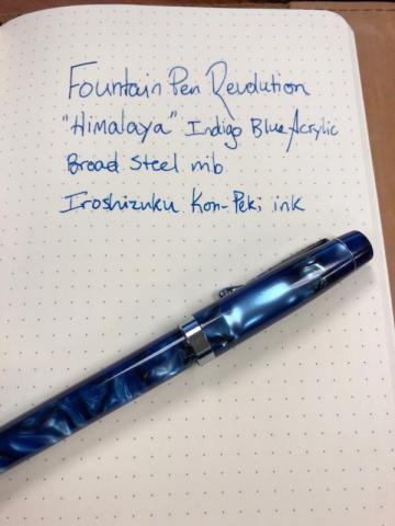
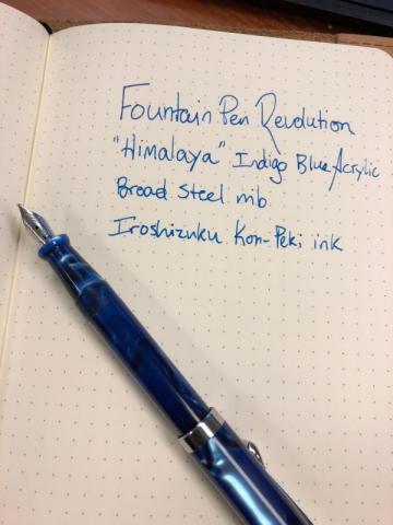
  4. A while back, I purchased a fountain pen called the Indus from Fountain Pen Revolution. With that pen, you get an integrated, piston-filler (capable of full disassembly) with a very smooth steel nib with ebonite feed. However, that pen had some quirks (like a wiggly clip, a weird smell, and a very skinny grip) that made it less than perfect, even at that price point. I still like and use my Indus, mainly because of its most excellent nib, but I don't love it as much as I could. For those who don't know, Fountain Pen Revolution (hereafter FPR) is a brand dedicated to low-cost fountain pens, all of which are manufactured in India. India produces some excellent pens--evidenced by the fact that some well-known brands (Stipula and Esterbrook come to mind) rebrand and price-up lesser-known Indian brands for the US fountain pen market. FPR is run by Kevin Theimann, a wonderfully friendly chap who is likely to send you a personal email thanking you for making an order. He's good people, and I'm hoping he succeeds with this business model. After getting my Indus, and perusing some other models on the FPR site, I was intrigued enough to try again. This time, I went for the "Himalaya" model: A thicker pen than the Indus, with a push-pull piston converter (think Noodler's Neponset), and the same #5.5 steel nib and a larger ebonite feed. I chose the Indigo Blue acrylic finish. When I opened the pen, all I could say was "Wow." The blue acrylic is simply stunning, with deep chatoyance and multiple swirls of color. I have two other pens with similar finish: a Levenger True Writer Classic and a Retro 1951 Tornado, and the Himalaya is more beautiful than either of those. The pen is of medium length and width, I’d say; almost the perfect size. I have large hands, and it fits me perfectly. I’d wager smaller hands would find it just as comfortable. The screw cap can be removed in one full rotation, and posts securely with an almost undetectable click. Posted, the pen measures just about 6 inches, which to my mind is just about the perfect length for writing. The grip section is nicely tapered with a flare at the nib end to keep your fingers from sliding off onto the nib. I’d almost wish the nib were larger, but the way this nib writes I can’t complain about that. The pen’s converter works perfectly. It screws into the section and there was already some silicone grease on the threads to ensure a good seal. I’ll make a note to replenish that from time to time. I inked it with Pilot Iroshizuku Kon-Peki to match the pen’s aesthetic, and did a quick writing test. Again, wow. This pen writes. On a scale of 1 to 10, with 10 meaning the nib slips across the paper as if it were made of ice, I give it a solid 8.5. My Waterman Expert 3 medium is a 9, and my TWSBI Diamond 580 broad is a 9.5. The Himalaya is a very smooth writer, and it’s already destined for my regular EDC rotation. I keep coming back to the price of this thing, but I can’t ignore it. I can’t think of another pen under $30 that looks and writes as well as this one. And don’t give me Lamy Safari and Pilot Metropolitan, those pens are good and all, but *yawn*. This is a beautiful pen with character, one that you won’t be afraid to take to the boardroom, and also one you won’t be too afraid of losing. If you haven’t yet checked out FPR, I recommend you do so today: the site is www.fountainpenrevolution.com.
  5. richofthetower

    Ink Like A Purple Yam?

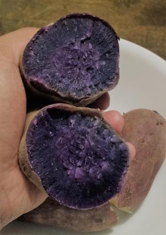
    Hey all you ink lovers, My wife is a big, big fan of purple. Even our wedding had lots of purple accents in it. But, personally, I've never thought too much about the color. Until, I got into fountain pens. And furthermore, until I recently chowed down on an ube. Allow me to explain: the Filipino ube (Dioscorea Alata, local pron. "OOH-beh") is a yam with a sweet-ish purple/indigo flesh indigenous to Southeast Asia. In the Philippines, it is prized as the essential ingredient of various sweets, and that is how I, being of Filipino extraction, am most familiar with it. However, it is also very nice after a simple boiling. Behold, plain-looking spud on the outside, tuber royalty within: I haven't eaten one of these in months - before my pen obsession began. Mid-bite, I gazed into its deep indigo insides, stopped chewing and thought, "If only I could find an ink of that hue!". It would be gorgeous and serve as a nostalgic reminder of a childhood stuffing my face with sweetened, creamy cakes and tarts. Now, I've seen various posts on the FPN and elsewhere in regards to purple inks, but I think the subject could stand a bump. What inks do you think would match this vibrant veggie? Or simply, what is your favorite indigo ink? Regards, Rich
  6. Mew

    Sailor Shousaikan Seiran

    A rich blue-indigo ink made by sailor for a shop located in Tokyo. http://i.imgur.com/IxVROmv.jpg http://i.imgur.com/wsq3ONE.jpg Close-ups on Graphilo paper http://i.imgur.com/fmbxYl8.jpg http://i.imgur.com/yFcB7qI.jpg http://i.imgur.com/iIXJqUV.jpg On Tomoe. I didn't really have anything to write, so i wrote random stuff. http://i.imgur.com/2Rpjxu5.jpg I hope you like this review. Feel free to leave suggestions for future reviews. Thank you.
  7. white_lotus

    Noodler's (Swedish) Stockholm Indigo

    Well, I feel a little bad about posting a review of an ink that is most likely unobtanium. A sample was sent to me early last year, and I've only now gotten to actually trying the ink. It was apparently a Noodler's custom ink for perhaps a Swedish Pen Club. I don't remember the exact circumstances surrounding this ink. I don't know if it was a one-off, or something that is restocked. Perhaps there is someone in Sweden or Stockholm who could clarify matters. A vintage style blue kind of like a royal blue. This ink for some reason seemed dry to me, which usually isn't the case with Noodler's. The ink dries almost instantly, and is totally waterproof. I forgot to do a chromatography before I emptied the pen. The pic for the Mohawk via Linen is very accurate to my eyes comparing on screen and on paper. Here the ink looks brighter and darker, almost like PPS, which this ink definitely is not.
  8. dneal

    De Atramentis Indigo Blue

    Yesterday I posted a quick look at De Atramentis' Atlantic Blue. Here's the other ink I picked up - Indigo Blue. Photo http://i200.photobucket.com/albums/aa163/roomdog/Ink/DeAtramentisIndigoBluePhoto_zps71d44c50.jpg Photo Cropped http://i200.photobucket.com/albums/aa163/roomdog/Ink/f0142b44-b82d-4c1b-ad1d-c9052676b615_zpsfe27c300.jpg Scan http://i200.photobucket.com/albums/aa163/roomdog/Ink/DeAtramentisIndigoBlueScan_zps12c313fd.jpg Scan Cropped http://i200.photobucket.com/albums/aa163/roomdog/Ink/1126bb31-b079-469d-b1ad-ad3170692515_zpse439adb1.jpg
  9. requiescat

    Diamine Indigo, Handwritten Review

    http://yoonhalee.com/images-inks/diamine-indigo.png


×
×
  • Create New...