Search the Community
Showing results for tags 'hooded nib'.
-
parker21 HELP! How do I remove the nib and ink collector from the hood of my Parker 21 Super
Fudanshi62 posted a topic in Parker
I'm trying to realign the nib and hood of my Parker 21 Super but the nib unit is stuck to the hood and I can't get it out. Please help!- 4 replies
-
- parker
- hooded nib
-
(and 1 more)
Tagged with:
-
Pen: 802 Make: Wing Sung Cost: $4 Nib: F Packaging & Accessories: (5/10) The pen came wrapped like a gag Christmas gift. The pen itself was wrapped in bubble wrap and around that, layers and layers of mustard colored packing tape. Took some time and effort to get to the center but pen was undamaged so I was happy. Appearance & Design: (6/10) The Wing Sung 802 appears to be designed after the Parker 45. The cap has a flat top divided by a plastic black band near the top above the clip. The top of the cap is black plastic and says "802". Near the top of the grip section is a thin transparent "viewing" band. On the end of the barrel is a metal jewel. The only design issue I've seen is that you can't put the cap all the way on. You have to leave a tiny gap between where the grip section and barrel meet or the nib can bend. I had to straighten it once already. The colors it comes in are limited to: black, teal, burgundy and taupe. It appears to only come with a fine nib. Construction & Quality (7/10) The pen doesn't feel cheap. In the barrel where the it screws into the grip section the plastic is thicker than the rest of the barrel. Which would seem to reduce the chance of the plastic cracking from use. The Aerometric filling system is about 2.25 inches long, has transparent sac and works well. I have had the pen on its side, nib up, and nib down and each time it has started. I also left it in my backpack for the weekend and it started right away. No issues with leaking or creeping either. Weight & Dimensions: (6/10) Even when the pen is filled it is very light. It's easy to write with but when posted it is a little off balanced by the metal cap. The pen is about 5 inches long and 5.5 inches when posted. The grip section is about 1.25 inches long. The dimensions are comfortable and compact. Nib & Performance: (9/10) As you might assume, the WS 802 has a hooded nib. The nib writes smoothly and wetly and occasionally there are just hints of feedback which are delightful. There has been no leaking or creeping and it always starts when left for 5 minutes or 50 hours. The nib is good, the filling system works well it performs very well. Filling System & Maintenance: (7/10) The pen doesn't really need much maintenance. Everyone who owns pens with Aerometric filling systems knows the joys of the repeated fill and empty with water to clean the ink out of that kind of pen. That is probably the most high maintenance part of this pen. Cost & Value: (10/10) For $3.80 this pen is absolutely worth it. I got the one in black and love it. If it got broken or lost I would buy another one probably the teal one. Conclusion: (50/70 - 71% My only complaint is how light the pen is. I wish it has a little more weight to it. But that is my only complaint and more than likely I will buy another to keep in my pen rotation.
-
Where Can I Find Replacement Nibs And Feeds For A Fountain Pen With Hooded Nib?
EdwardM posted a topic in Repair Q&A
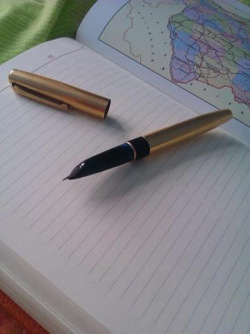
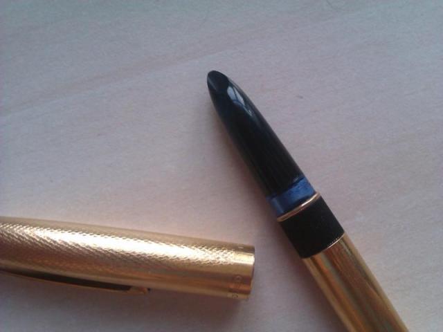
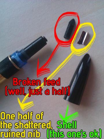
Hello FPN, This is my first post here, although I've been reading the forums since a few weeks. I have a Montegrappa pen, about which I don't know much: just that it is over 20 years old and used to write heavenly. I started using it a few weeks ago, when I began liking fountain pens. I have lots of them, but all of them cheap (none from plastic though), except this Montegrappa pen (if someone can identify it I'd be very thankful). The problem was that, although it wrote better than a phoenix's feather, it was scratched and bitten by me when I was very little, and also had its nib crooked. How I ruined the nib & feed Being an idiot, I tried to straighten the nib even if it worked perfectly. After lots of hard work I managed to shatter the nib and break the feed in half. And now I can't find a replacement nib and feed for it. The rest of the pen is PERFECT, I just need new nib & feed. So where can I find replacement feed and nib for it? I tried to use nibs and feeds from other pens, but I have no other pen with hooded nib, and all the nibs are feeds are GIGANTIC compared to what it had, they obviously will never fit. Is there a universal feed and nib size for fountain pens with hooded nibs? What should I do? I have already punished myself by writing with this thing, but I don't think I can stand it much more, it's not a bad fountain pen but it bears no comparison with the Montegrappa. Attached photos. -
This is certainly the most shocking / awe inspiring news from the Chinese Fountain Pen market that came surfaced recently .... well ... take a look yourself Parker China had the pages taken down already but the leak is out .... first photo show text say " new generation Parker 51 " , 2nd photo show comparing to original P51 , the last photo shown steel cap with steel nibs and gold plated ( look like VPD ) cap with 18K nib ; not much info, but look like a Chinese market only model and is rumored to be made not by Parker themselves but a long time local partner ( guess we know who ). No pricing yet and no info regarding as if its real or marketing testing the water ( Parker did once or twice try something like that in Chinese market ).
- 49 replies
-
Jinhao 51A, Another New ( Or Is It Renewed ) C/c Filling Hooded Nib
Mech-for-i posted a topic in China, Korea and Others (Far East, Asia)
Guess what, we have Wing Sung 613, Hero just got us 616 plus, and Jinhao obviously not wanting to be left behind I guess .... we have da da da .... Jinhao 51A ( courtesy of my window shopping around for summer hiking supply, somehow end up showing me this ... ) .. look like there is 3 solid color version ( black, burgundy and blue ), 5 Demo version and 2 wooden barrel ( with metal section / converter coupling ) finishes. -
I understand the original "new" Duo carts had issues. But if you order the blue or green one, it's the new-new version that fixes some issues, such as leaking. Anyone have one? How do you like it? They're awfully purty-lookin'. Also, does it come with a little bottle of ink? What's the ink? (Aurora Black, I would imagine, but I can't seem to find the answer anywhere)
-
I like Frank Underwater's name for this filling mechanism so that's what I'm using. This has been my go-to pen for about a month now. The Wing Sung 601 is a high-quality writing instrument. I recommend it highly. Having said that, my first impressions were less favorable. This is a pen that's grown on me. It's short on bling. From Wing Sung, that goes to the 618 which I find miles more fun to look at.It's not particularly big or chunky, so no check there.It’s not unique like the Moonman M1 Wood and Brass or the PenBBS 308. Let alone anything from TWSBI.The design is clearly a throwback to the Parker 51 via the Hero 616. I have more than one 616 in pen storage.It’s another hooded nib pen. That puts it on the tame side of the street. For me, hooded nib pens don’t invite tinkering the way regular nibs do. I’m always concerned I won’t be able to get them back together again correctly.It's the filling mechanism. Wing Sung has taken it upon themselves to resurrect the Vacumatic filling mechanism. And they’ve improved the design. And they sell the pen for under US$10 on taobao . I like the idea that Wing Sung actually made two generations of this filling mechanism. The first used a rubber diaphragm which, while close to the original Parker design, was less efficient and potentially less durable. The revised design uses a piston which performs better and should last longer à la Edison's Draw Filler. Wing Sung moves beyond the Edison design by included a spring in the mechanism, making it possible to fill the pen with one hand. (Two hands if you keep one on the bottle of ink.) The pen is very similar in length to the Wing Sung 618 but a bit slimmer because the cap isn't threaded. Left to Right: Wing Sung 601, Hero 616 Jumbo, Wing Sung 618, Hero 338, Hero 565 Length: 138mmUncapped: 128mmPosted: 152mmSection diameter: 11.2mmWeight inked: 20g capped / 12.9 uncappedUpon closer inspection, it looks as if the 601 may share the same section as the Wing Sung 618. The two pens already share common nib and feed. Perhaps the collector assembly is also shared. It would make sense. Wing Sung 618 Left/Black - Wing Sung 601 Right/Gray My writing experience with this pen has been outstanding. The pen is reliable and fits well in the hand. I prefer writing with the pen unposted, but the cap is light enough and posts deeply so that writing with the cap posted is certainly doable. The 601 is comfortable for quick notes or extended writing. It’s not particular about writing angle and offers a solid sweet spot with just a bit of feedback. The nib is hard so there’s no line variation to speak of, but that’s to be expected. It does reverse writing pretty well. The nib and feed write moderately wet and put down a fine line. The nib feels finer that than the nib on my Wing Sung 618 but that is likely the ink. Or just me. I’d expect the 618 to write more boldly than the 601 just on looks alone. At the end of the day, the pen is on the conservative side of the spectrum. One might even say boring. Maybe I didn’t help things by getting it in gray. But I love that it is very good at its intended purpose and advances the art in ways that aficionados can appreciate but regular users just find useful. More pictures and comments here.
- 53 replies
-
- chinese pens
- draw filling mechanism
-
(and 2 more)
Tagged with:
-
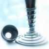
Hmmm.. so I got my order of the new Hero 616Plus delivered almost for a week and of course instantly I tear off the packaging and get to the pen and was keen on trying to see how it goes, but even a single eyeball give me suspicions .. hard to say but I sense something really different here .. call it a hunch whatever and well ... my engineering spirit just had to prop up .. so out come all the current retro hooded models and my calipar, well even without the calipar I can see something there and some measurements proved that am on the right track . OK let's hack these open then so I gather in the lot Wing Sung 601, Wing Sung 613, Hero 616Plus and a current production Hero 616 ( std / mid / jumbo ) First the barrels, caps, and sections; well look like we should give Hero 616 credit where credits due ( all these models simply show that they were all based on the old 616 in general layout / size / profile ) ... guess what ............ they are all the same bar the finishing and colours, I can use any of the hood on any of the 4 pens without issues , Caps likewise, but well .... barrels ... well actually their external dimension is the same but they have different threading machined / molded .. the 601 of course had its own barrel / ink container, the 616Plus barrel actually now spotted 4 re-enforcement rib inside barrel end and thus will not fit the other models. The current 616 and the 613 barrel interchange but they will not fit the 616Plus having too short a threaded part making them screwed in short Now here's the interesting part , the innards of all 4 pen ( sort of ) From top, Wing Sung 601 , Hero 616 , Wing Sung 613 & finally Hero 616PLus ...................... first thing first notice the different ink collector ; the 601 and 616 use ABS while the 613 use plastic ( polycarbonite likely , transparent clearly for the Demo ), and the 616Plus, well there's no ink collector at all .. Then the nib ... except for the old 616 .. all of them now use the 18.5X3.3mm hooded nib, yes the new 616Plus do not re use the old 616 nib but now use the same as Wing Sung so you are welcomed to put onto it all those nice fat calligraphy options; Now carefully check the ink collector nib end ... all of them had a rounded straight tubular part at this end which usually hold the nib and also engage the hood inside ( which had a like shaped indent to mate to that ) sealing the whole assembly .. this is molded in with the ink collector but its a separate silicone composite part on the new 616PLus. As you can see there is a black part inside the outer transparent coupler part on the 616Plus and this is actually the locking sleeve which also hold the ink nipple for the converter, this is machine push fitted into the transparent coupler and sealed in there is the integral single piece ink collector feed which then are sealed shut barrel end by another piece which sit the ink nipple / converter acceptance part. The mentioned front piece of silicone sealing plug on the front just go onto the feed from the front and can be pulled off, it will snugly fit into the hood / section's inner indent ( and sometime stuck there when that unscrewed ). Except for the 616Plus, all of the ink collector can be simply pulled off from the coupler straight. Which of course give us all the misery of trying to match the nib position to the hood. The 616Plus simply is all fixed and you screw in the hood and it either fit right or its not ( and all 4 fit right ) Guess Hero does not just went out and put C/C onto the 616, they rework the whole mechanism but retain the general profile / size / styling .. not a bad job , and nicely done indeed, and now I am going to figure how I want to put them back together .. you know there's literally loads and loads of color combo to be had , and finally there's one single model I did not put here, the Wing Sung 3006 which, even without a calipar; I can clearly see that its based on a different sized pen ( its size actually the same as the Hero 329-2 )
- 24 replies
-
- hero 616
- wing sung 613
-
(and 3 more)
Tagged with:
-
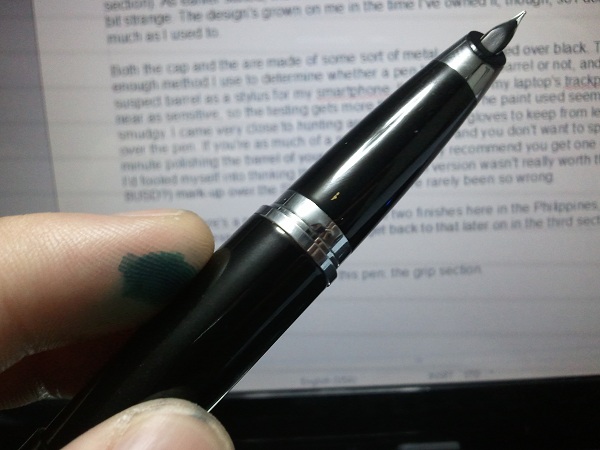
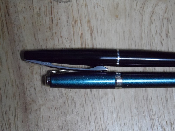
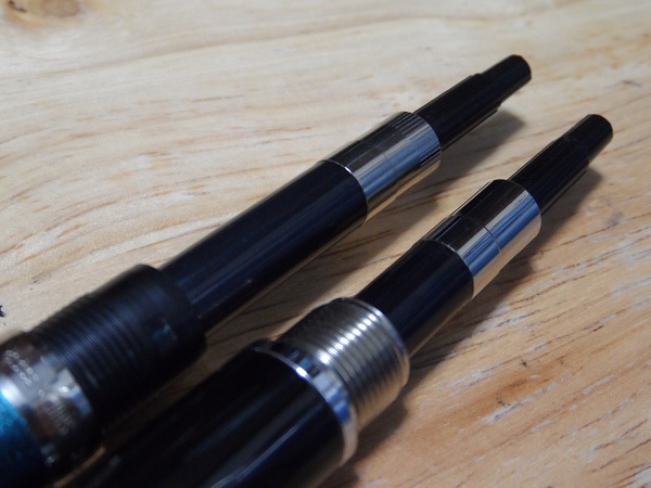
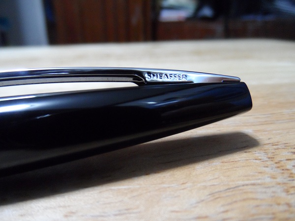
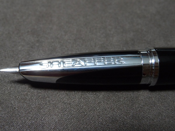
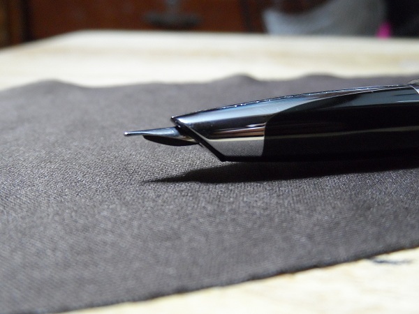
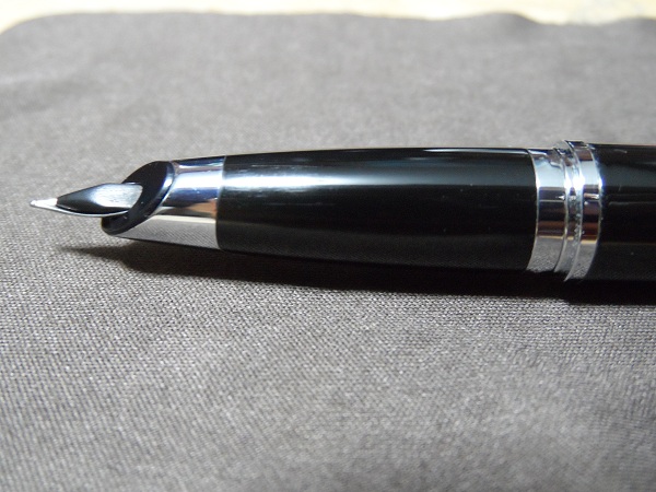
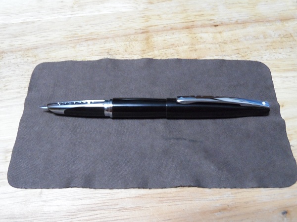
SHEAFFER TARANIS (Stormy Night) Review: Someone Had To Write One Eventually Leaving my choice in tag lines aside, I'm fairly sure that the title of this article managed to turn some heads all on its own. This is, after all, a review of an extremely interesting pen, one possessing the weight of expectations that it live up to its being released in Sheaffer's Centennial year, a polarizing (read: love-it-or-hate-it) design, and one heck of a cool name. … I'm something of a mythology freak, if that explains things. Now, I've had this pen for a while now, and have had the time to get to know it fairly well. I'm one of those crazy types who attribute personality quirks and attitudes to fountain pens, so if that sort of thing disagrees with you, then I'm proffering my apologies. And yes, “proffering” is an actual word. This review will be divided into three sections, namely: Build Quality & Design, Usability & Writing Performance, and, last but not least, a section wherein I'll give my exhaustive opinion on whether or not this pen is truly worth buying; I can't think of an appropriate enough name for it just yet, nor do I really see the need to think one up. So, I'll get right to it, then: BUILD QUALITY & DESIGN: I'll be honest here: I was one of those people that nearly gagged when I saw the first pics of the Taranis emerge online. I happened to be drinking a cup of hot chocolate at the time, as I recall, so that bit about me nearly choking isn't even close to figurative. It looked to me like Sheaffer took more than a few design cues from Lamy's line of pens, to put it nicely. Really, I'm almost a hundred percent sure that there are loads of other people who'd agree that the Taranis looks something like a Lamy 2000 wearing Sheaffer colours (er, not literally, since the Lamy 2000 is also black, albeit with a matte finish). Others, however, maintain that it looks quite a bit like Pilot/Namiki's also-prolific Vanishing Point fountain pen while posted. My opinion? They're not too far off the mark, come to think of it. After all, when viewed from straight on in just the right lighting, the strip of metal that bisects the section looks very nearly as obtrusive as the VP's clip. Considering how many people defer from using the VP simply because the clip gets in their way while, that's saying something. Ah, but I'm getting a bit ahead of myself. Sorry, it's just rather difficult to avoid talking about the grip section, which I'm fairly sure is one of the reasons Sheaffer designed it the way they did. Anyway, let's start with another, slightly less controversial design element, the first thing most people will see while the pen is pocketed: the clip. …. Wow, what a clip. The clip is by no means ostentatiously designed, but it stands out all the same. To be frank, it's just... a really large clip. By my measure, the clip is exactly 60mm, or 2 2.5/8in. long, and is roughly 4.5mm wide (I am NOT getting the Imperial measure for that, online converter or no). The base of the clip, including the lengths not really attached to the top side of the cap, is 20mm long, with the company's name emblazoned in block lettering on the right-hand side of the pen, a la Lamy 2000 (see what I mean?). Also, Sheaffer's iconic White Dot is positioned near the top of the clip, as per the norm. Speaking of the White Dot, I can't be a hundred percent certain, as this is only my second Sheaffer pen, but the Dot looks to be rather smaller. The Dot on my Prelude is 2.5mm across, while the one on the Taranis is only 2mm across, give or take a few micrometers. Whether or not the Dot's diameter changes across Sheaffer's line of pens, I have no idea. I'll remember to bring a ruler, maybe even a caliper, along with me the next time I go shopping. Regardless of its diameter, though, the White Dot looks perfectly at home on the Taranis's monolith of a clip, which in turn fits in quite well with the overall design of the pen. This is in spite of its being nearly half as long as the entire pen itself. It just works. Then again, beauty, as they say, is in the eye of the beholder. Keep that in mind, since you'll probably need to repeat that to yourself ad nauseum once we get to the grip section. The cap itself is relatively plain, but in a good way. It tapers sleekly from the base to the top, and ends in a sort of rounded square shape. I'm told that these squared -off ends (it's duplicated in the barrel of the pen) are a throwback to an earlier Sheaffer design— the Imperial, I believe. There's not much else to say about the cap, really, save for the fact that it's a slip-on cap. The manner in which the clip is attached to the cap is also noteworthy. As you can see here, barely a third of the clip's base is actually in contact with the cap, there being gaps on either end, which I assume are meant to increase the springiness of the clip, which, by the by, is really rather stiff. It's a bit difficult to flex it wide enough to accommodate denim jacket pockets, but it's very secure. I tried clipping the pen to a fairly thin dress shirt pocket, and the pen stayed safely in place even while I was jumping around. Literally. Just... don't ask if there was any ink spilled. Please. *ahem* Um, so... where was I? Oh, right, the barrel. The barrel of the pen is very nearly a repeat of the cap, minus the clip. I've placed the pen next to a ruler in this picture to illustrate my point. I probably ought to have touched upon this sooner, but what the heck: The cap itself is precisely 66mm long by my measure, while the barrel of the pen is just a tad longer, at 72mm long (that's not inclusive of the silver band that separates the barrel from the grip section). As earlier stated, the barrel tapers to a rounded square end which, at first, I thought to look a bit strange. The design's grown on me in the time I've owned it, though, so I don't mind it nearly half as much as I used to. Both the cap and the are made of some sort of metal, and painted over black. There's a simple enough method I use to determine whether a pen has a metal barrel or not, and it involves using suspect barrel as a stylus for my smartphone. I've tried using my laptop's trackpad, but it's nowhere near as sensitive, so the testing gets more than a little iffy. The paint used seems fairly durable, if a bit smudgy. I came very close to hunting around for a pair of gloves to keep from leaving fingerprints all over the pen. If you're as much of a neat freak as I am, and you don't want to spend every other minute polishing the barrel of your pen, then I strongly recommend you get one of the matte finishes. I'd fooled myself into thinking that the Icy Gunmetal version wasn't really worth the 360-peso (roughly 8USD?) mark-up over the Stormy Night finish. I've rarely been so wrong. Also, yes, there's a price gap between those two finishes here in the Philippines, despite their costing the exact same amount elsewhere. I'll definitely get back to that later on in the third section of this article, as you'll see I have good reason to. Okay, now on to the busiest part of this pen: the grip section. … Well, what can I say? Sheaffer seems to have outdone itself in sheer brashness of design here. If anything, I'm both nonplussed and in awe at their having the guts to display the company name so aggressively on the section. If you're worried about the metal portion interfering with your grip, by the way, then let me put your anxieties to rest: the section is designed in such a way that one will almost always manage hold the resin bit of the section (unless they have extremely unorthodox grips, that is), which I find very pleasant to the touch. The metal band also has the bonus benefit of helping one properly orient the nib, which neutralizes the one common problem I've found with most hooded/semi-hooded nibs. On a related note: the “ears” on the Lamy 2000 help me in much the same way, which is why I'm actually grateful for them. Hmm, what with all the references I'm making to the Lamy 2k, I may as well just follow this up with a comparison of the two pens. It's a thought. Also, as you can sort of see here, there's a gold-painted indication of the nib's grade. That single strip of gold you see was a full-fledged “F” when I first bought this pen, but apparently it rubs off rather easily. I can see why some would think that displaying the nib grade on the underside of the section would clash with the overall design lines of the pen, but I personally thought it rather pleasant to look at, and vaguely reminiscent of how older, more pragmatic fountain pens would have similar markings stamped onto their barrels or grip sections. It looked a bit retro, I suppose you could say. As of the time of this writing, the demarcation has completely vanished, leaving the resin portion of the grip section completely unmarked. It's a shame, really, and I'm going to miss it quite a bit. I can just barely make out the edges of the section's metal band, which are almost in direct contact with the resin part of the section. The edges appear to be the slightest bit rough in some areas, though it's hardly noticeable to me without the aid of a magnifying glass. That is to say, unless you're really going out of your way to look for the tiniest flaws in detailing and artifacts of the manufacturing process, kinda like what I'm doing at the moment, you'll probably not notice it at all. Of course, considering how minute the flaws, I could've just been unlucky enough to pick up a Taranis with unit-specific problems, so your mileage may vary. Also, there seem to be three very slight outward-protruding dents in the metal part of the section located just above the metal band that is visible while the pen is capped. As far as I can tell, these are what keep the cap in place, though I'm not entirely certain. They're relatively unobtrusive, but it's hard not to notice them once you know they're there. You have my apologies. With regards to the pen's durability, I have to say that I'm impressed. As earlier stated, both the cap and the barrel are made of some sort of metal (I'm not an expert in metallurgy, so I can't identify the metal with any degree of certainty), which instantly raises my estimation of a pen's durability. I can't say the same for the finish, however, as the paint— or coating, whatever you wish to call it— already seems to show faint signs of posting. I'm taking great care to avoid aggravating this by posting no deeper than is absolutely necessary, meaning that I only go so far as to keep the cap from wobbling while I'm writing. This is one of the drawbacks of a friction fit, I suppose. So far, I've had a very good impression of this pen. In point of fact, there's hardly a thing discussed that I don't like about the Taranis. Of course, no pen being perfect, there has to be a point where things have to start to going downhill, even if only for a short while. For me, this is that point. And, no, it's not a minor thing to me, either. Things deteriorated rather quickly the moment I first unscrewed the barrel. As you can see in the following picture, the threads that attach the barrel to the section are imperfect. While I'm not unduly worried about long-term wear and tear, the corresponding thread on the barrel also being made of metal, it's still sloppy work, which is inexcusable in anything save for a disposable fountain pen, which this most definitely is not. Still, that could be counted as nitpicking, since it doesn't really impede the pen's performance or durability whatsoever. What I can NOT excuse, however, is the new converter that came with the pen. Sorry, I believe I've misspoken. By “new converter”, I do not mean that Sheaffer designed a new converter that's in any way an improvement over their previous one. It does not hold any more ink than the older one in my Prelude, it is not a converter you can disassemble (trust me, that would be a huge help), nor is it any easier to operate. Essentially, it is the same proprietary converter found in other Sheaffer pens. Except that this is infinitely worse. No, really, this converter initially drove me up the wall. This part of the review has been edited several times over now, since the scathing rant that it kept on deteriorating into was in no way helpful to understanding the pen, nor was it the sort of thing that one would expect in a professional, if casually written, review. Suffice to say that it revolved around the terms “penny-pinching”, “inferior quality”, and “flashing”. By “flashing”, of course, I'm referring to the artifacts left behind by a careless or unpolished injection-moulding process. You see, though it's not immediately apparent in these photographs, there is a palpable difference between the older Sheaffer converter (above, with striations) and the one that came with the Taranis (below, without striations). For one thing, the latter feels much cheaper to the touch. Whether this is the result of Sheaffer cutting production costs by switching out the original materials with cheaper alternatives or the production process merely being, I'm sorry for the word, shoddier, I have no idea. I have suspicions towards both, really, but as earlier stated, I'm no metallurgist, so I can't be entirely sure that the former claim isn't any spurious. I'll now say that I'm only basing my theorizing on what I've seen and felt (maybe even smelled) during my scrutiny of this pen. As the issues I'm experiencing may just be the unit specific (think Murphy's Law), don't make any hasty generalizations you may regret, or could get me into trouble (haha); I still recommend that you take a look at a few Sheaffer pens for yourselves and draw your own conclusions. After all, a conclusion drawn from a sample population of one can hardly be considered a statistically significant finding. Consider the above my disclaimer. Perhaps the one thing that I really can't help but hate about the converter is the fiddly piston knob. While with most converters, even the older Sheaffer one, the piston knob essentially just rotates in place, the converter in the Taranis has a whole new dimension of movement: lateral wiggling. … For some odd reason, my use of the word “wiggling” just then seemed to take a lot of the seriousness from the paragraph. Bah. Anyway, even on a full reservoir of ink, there's an extra bit of leeway one can turn the knob with. Perhaps there's a gap in the interior of the converter's mechanism, or perhaps I actually am supposed to be able to disassemble the converter, and simply didn't try hard enough (I don't really mean that seriously, mind you). Either way, it makes the converter feel as if it's about to fall apart or spit out a huge wad of ink onto my shirt. And as shown here, there are many flashing marks present on the knob and the reservoir itself (the Taranis is the one with a chunkier knob, on the right). I scratched off a few of these, but then gave up for fear that I'd inadvertently break something. To try and be fair, though, it does its job as a converter very well, and apart from a few instances when I've had to clean the inner side of the pen's barrel of ink (by my guess, some ink had escaped via the gap between the section and the converter), I've had no troubles whatsoever with it. I still fear for the filling system's long-term durability though, and find operating the converter more unpleasant than otherwise. I haven't a camera or lighting system good enough to make this out, but looking inside the grip section, you'll find a proboscis of sorts that plunges into the aperture of the converter, which I find stabilizes the inkflow somewhat, and prevents skipping even with prolonged sessions of fast writing. The one caveat I have to offer here is that you'll want to take extra care when installing a converter here, as you may accidentally damage this proboscis or the opening of the converter. And one more note on design: You'll recall that the ends of the pen taper of into rounded square shapes, yes? To my joy, when you lay the pen flat on an even surface with the “Sheaffer” branding on the section facing right up, the ends of the pen are perfectly plumb, meaning that the bottom end of the rounded square on the barrel draws a perfectly parallel line with whatever surface you're laying it on. It's an admittedly miniscule detail, but I'm still glad that Sheaffer went out of their way to be precise here, as it makes up very slightly for their supplying a low-quality converter with the Taranis. Alright, one last thing about the converter before I lay the matter to rest: If you've a stock of older Sheaffer converters, then I recommend that you take great care with them. If the supplied converter here on the Taranis is any indication of what Sheaffer will start rolling out with the rest of their pens, then you'll really want to have several backups. Some branches here in the Philippines offer Sheaffer proprietary converters for sale individually, pricing them at around $10 (an estimation). If you think it worth the price, then I needn't say that you should go for it. Now, I've been rambling for quite a while now on how durable the pen is, and how much I like its looks. Strangely enough, this being a fountain pen and all, I've yet to refer to how well it writes! I really ought to fix that: USABILITY & WRITING PERFORMANCE I've touched upon a lot of things that should've been left for here in the previous section. As such, my including “usability” here in this section is starting to seem somewhat moot. Well, they say that it's better to learn from your mistakes than to ignore them, so I'll remember that fro when I write another review. Just to recap, though: The grip section is very nice to the touch, thanks to the utilization of resin. The metal band on the section is in no way cumbersome for its being there, but then again, I have what most people would call a standard grip, I can't really speak for left-handed hook writers and the like. The paint, or rather, coating (it's a bit hard to tell, and I don't want to have to chip the finish just to find out which it is) feels nice to the touch, and is nearly as grippy as the section itself, though I'm nonetheless still very glad for the resin. This pen would have become an instant favourite with me if both the barrel and cap had been made of resin, but that's perhaps asking for too much. Take care not to drop the pen or post too hard, as that may ruin the finish. Then again, this problem could easily be resolved, perhaps, if one were to purchase any of the four other finishes, particularly the matte-textured ones. I didn't have a black a glossy black pen, which appears to be something akin to a woman's LBD (little black dress) here in fountain pendom, so I thought that this would be a good chance to remedy that situation. My Lamy 2000 (which is, sadly, away for repairs for the next month or two) doesn't really count, I feel, as it has a matte finish. As for me, I already have a polishing cloth for my glasses handy at most times, so problem solved. The clip, while a controversial design element in its own right, is very well designed, and would have gotten something like a 9/10 from me in usability if this were a scored review. Apart from being slightly stiff, which really isn't a problem for a lot of people, there's absolutely nothing bad about it whatsoever. Also, and I failed to mention this earlier, the upper 2cm of the clip is more an aesthetic projection than anything else. Looking at the clip from the side once again, and with my Prelude for comparison, you'll see that the usable portion of the clip is just as long on the Taranis as it it in the older pen. Basically, the clip on the Taranis is long simply for the sake of being long, and possibly for making the clip somewhat sturdier. As a result, the Taranis stands out a good 2cm taller than any other pen in the same pocket while clipped. All things considered, it seems to me that Sheaffer went out of its way to make this pen one you can't help but notice. That's not a bad thing per se, but there is a limit to what can be considered in good taste. Thankfully, that's a boundary that Sheaffer, at least in my opinion, managed to respect. Now, on to the part of the review that I'm fairly certain a lot of you were looking forward to: the writing sample: As you can see, the Taranis definitely has a fine nib. I wouldn't go so far as to call it an extra-fine, though it does seem to come rather close. There's been talk of the Taranis's nib grades being different from that of other Sheaffer pens, that they're closer to the Asian nib grading than the Western grading on other Sheaffer pens. I don't know about you, but if this writing sample isn't conclusive proof to that effect, then I doubt anything will be enough to set your doubts aside. The pen wrote well out of the box, though I must admit that I have it a thorough flushing before inking it up. The tines were slightly misaligned at first, but I won't hold that against Sheaffer, really, since a lot of manufacturers ship pens with imperfectly tuned tines; I'm of the opinion that any fountain pen enthusiast ought to learn basic FP care, maintenance, and repair. Sure, it'd be great if every manufacturer thoroughly tested and tuned each of their pens prior to shipping, but that'd hardly be economic of them, what with the sheer amount of manpower required for such tasks. Besides, there's almost nothing a brass shim, an extremely fine-grit buffer, and a pair of soft-nose pliers can't fix, when they're used properly. I'd say that the nib was fairly smooth, though hardly butter-on-glass smooth. Don't expect too much smoothness out of a Fine nib, especially one as fine as this. Still, for the narrow line width it offers (and let's face it, as much fun as a BB nib is to write with, such a broad nib is hardly ideal for taking down notes or writing on lower quality paper, which students such as yours truly are often forced to resort to), the nib gives off a reasonable amount of feedback. I'd say it was a bit “talkative”, but perhaps the feedback would better be described as “whispering”, since there really is very little noise when writing. It's also a wet writer. Far from being being the Nile river during heavy rains, it nevertheless leaves a reasonably saturated line that lubricates the tipping material well, contributing to the overall smoothness of the writing experience. The feed keeps up well during quick scribbling, leaving no traces of skipping whatsoever. I messed up a bit in the first scribble, as you can see; there's a portion that looks as if the line had doubled back on itself, branching off slightly from the single scribble. That was my fault, as I'd bumped my elbow into something while scribbling, rotating the pen in my hands. I'm not certain whether this pen can keep up during prolonged shorthand writing or with grand flourishes, as I do neither, but the results look favourable, based on what I've seen so far. One thing that bothers me, though, is this: Why is the breather hole covered? SO, SHOULD YOU GET IT? Yeah... that's the title I'm sticking with. Anyway, though this review has been extensively coloured by my own experiences and opinions, I sincerely hope that you've been able to draw your own conclusions. I've done my utmost to ensure that the reader will have as thorough an understanding of this pen as possible, short of actually trying it out for themselves. In other words, I just did my best to save you a trip to the brick & mortar and the local bookstore. I had way too much free time =_= Overall, the pen is a very good writer. Apart from a few complaints regarding the materials used in constructing... some of its components, such as the easily-marked finish of this particular version or the... *cough*, and the fact that the design is about as polarizing as it comes, there's simply nothing to hate about the pen. It's a wet writer, but it plays well with thinner papers, too. You'll probably still experience bleedthrough if you use it with particularly bad paper, but that shouldn't be a problem if you're okay with sticking to one side of the page. It feels great in the hand, too, in case I hadn't stressed that enough earlier on. Before I got this pen, I thought that the people who raved about resin pens and how they were highly superior to mere plastic pens were simply being elitist. Now that I've gotten to play with good-quality resin for a significant amount of time (even if it was only used in the pen's grip section), I now feel I ought to revise my opinion of resin pens, and resin pen fans, in general. They had something going for them, after all! ************ Now, if you'll recall, I made a reference to something that bothered me regarding the Taranis's pricing earlier on (much earlier on) in this review. This is, as far as I can tell, an inconsistency unique to the Philippines, so unless you happen to live there/here or are simply curious, there's no real need to read on. The pricing for the Taranis according to Sheaffer, it's MSRP, if you will, is $145 for the Stormy Night (reviewed), Icy Gunmetal, and Sleek Chrome fountain pens, while the White Lightning and Stormy Wine fountain pens both cost $165 apiece. Here in the Philippines, however, the Stormy Night and Sleek Chrome cost PHP2,700, which is under $65 at the current exchange rate, while the Icy Gunmetal costs slightly more at PHP3,060 (approx. $73), despite there being no price difference elsewhere. The real shock lies in the prices of the White Lightning and Stormy Wine finishes, both of which come with a gold-plated trim instead of the chrome of the other three pens. They're still equally priced, but at an eye-watering PHP11,500, approx. $274. I mean, I know gold is a scarce resource and is only really used with luxury items and the like, but the price disparity is silly, bordering on insane! Even considering EVAT (a tax here in the Philippines) and shipping fees, I sincerely doubt that there's any viable reason that the total is over $100 above the SRP elsewhere. The following off-the-top-of-my-head theories are pure speculation, so remember to take them with a grain of salt. Anyway, it could be that the more economically-priced three pens here in the Philippines are of an inferior quality to the self-same models sold elsewhere, which is why Sheaffer can afford to cut down so much from the MSRP. If that is indeed the case, then that'd explain certain... things that have come to my attention regarding the build quality of the reviewed pen. I find that a bit unlikely though, due to the fact that it'd be much too cumbersome a solution to really work out. But if that indeed is the case, then I'm calling out racism (just kidding )! Another possibility that comes to mind is the fact that Sheaffer could have shaved off over half the price of the three chrome-trimmed fountain pens in an effort to attract more budget-conscious buyers, then bumped up (more like skyrocketed, really) the price of the other two pens, which would be more attractive to the image-conscious buyer anyway, in order to make up for their losses. … Yeah, I don't think that makes much sense either. ************ And there you have it, my exhaustive review of the Sheaffer Taranis Stormy Night fountain pen. I hope that I managed to help out anyone who's considering this pen, even if only somewhat, and that you all enjoyed reading this review. If any of you could contribute towards solving the price discrepancy between the chrome-trim and gold-trim models, then that'd give me one less thing to idly think about Now, time for a well-deserved nap. Cheers! Kevin
- 41 replies
-
- sheaffertaranis
- hooded nib
-
(and 2 more)
Tagged with:
-
Oh ... this for you ladies ..... Well other than all the big names , China do had a school of small independent brand, and many fashion designer brand that made pens, most are OEM of others model but some do have their original design, and sometime you bump into something unique, interesting and well this happen to be one. This is the 里莜-莜米-Mini Fountain Pen. The brand 里莜 curiously had an English name "Liveinyou" No I am not writing it wrong , this is how the brand spell it in one word and " Live in you" is their marketing slogan. So this is in their 莜米 series , and the model is simply refer to as the Mini Fountain Pen 里莜-莜米-Mini in pink ( packaging ) by Mech for i, on Flickr Clearly pattered after the style of the pocket pen / Vest pen, but its got its own twist. its an all metal construction with a C/C filling ( custom shortened converter ) with a .... ding dong .... hooded nib , and its got eight color option ( Black, White, Pink, Turquoise, Soft Mint, Lemon Yellow, Race Blue, & Cream Beige ). Surprisingly sturdy and well made and some measurements 9mm/10.2mm girth ( barrel and cap ) 102mm uncapped 110.5mm capped 131mm posted 20g weight non inked 里莜-莜米-Mini in pink by Mech for i, on Flickr 里莜-莜米-Mini in pink ( posted ) by Mech for i, on Flickr
- 15 replies
-
- liveinyou
- hooded nib
-
(and 2 more)
Tagged with:
-
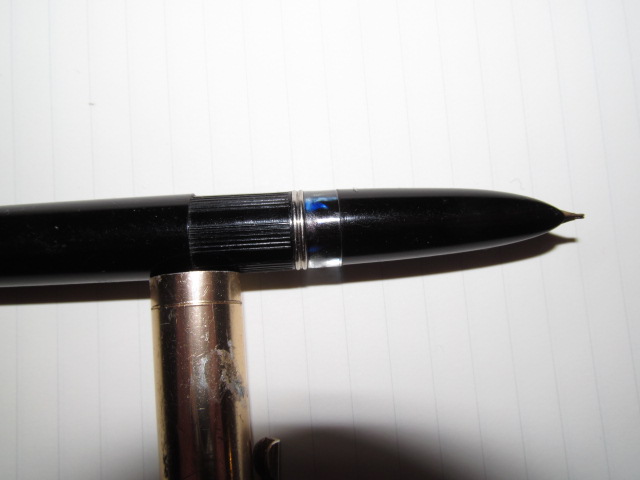
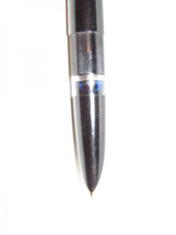
Hopefully my educated guess is correct in attributing this to Tropen, and thus I'm posting in the correct place! Got this given to me at Christmas, and finally got around to posting some pics in the hopes that someone can tell me something about it. The cap, I suspect is from a Waterman (and pretty beaten up at that), but the rest of the pen appears to be in mint condition. Feels surprisingly well-built, the nib being the only thing that lets it down a little; it's one of those pinched together tips. Only markings are the "Cadillac" on the barrel, and "Dauer Feder 1" on the nib (which is what lead me here to Other European brands). Syringe filler (is that the correct term in this instance?), and funky inlaid metal design on the hood. I know its value is likely the square root of zero, but I haven't quite been able to bring myself to ink it up yet; it's so clean and shiny! If anyone can tell me anything at all, I'd be fascinated to know. Thank you muchly. Cheers, Al
- 6 replies
-
- cadillac
- hooded nib
-
(and 2 more)
Tagged with:
-
Hello, I'm relatively new to fountain pens, I've used Lamy Safaris for years when I was in school, but didn't know that much about fountain pens. Recently I've become more interested in them. Several months ago I was gifted a Waterman Hemisphere and am quite happy with it. Of course it's not the best Pen out there and it's somewhat small for me. Enough introduction for now. I like the design of Parker 51, 21 and those pens which look very similar. The hooded nib, the relatively unpretentious design. I would like to get a similar pen. It doesn't need to have a gold nib, actually a steel nib is what I would prefer die to the affordability. Of course you can get vintage Parker pens on eBay but I'm not really experienced with buying vintage pens. I can't assess how well their conditions is. Another option are pens like the Hero 616, which design-wise are copies but many people complain about their quality. Caps that cratch the barrel each time you use the cap, leaking bladders and so on. To get to the point: I' like to have a Pen like the Parker 21. Could you more experienced fountain pen users give me some advice? Is it possible to get a Parker 21 on eBay for a reasonable price? I mean I don't want to pay as much as I would pay for a really decent new pen. Are there copies of the Parker 21 or 51 whose quality is good enough to be used for some time without having ink all over your desk? Or are there maybe other modern pens with a hooded nib (not the Lamy 2000, Vanishing Point or something in this price range)? I'm looking forward for some tips. Thank you!
-
My first review has to be handwritten, hasn't it? http://c7.staticflickr.com/9/8501/28971094030_76a56e0ff4_c.jpg This is the most unlikely pen in my collection. More than a year ago, at the very start of my pen craze, a friend gave it to me and said: "I'm sure it's no more than a novelty piece, but try it - maybe the funny thing can write". Well, it can! The fine hooded nib is smooth as glass. Inked with Parker Quink Black, this little croco wasn't funny at all. A serious writer. However, after the second filling the Caiman started to misbehave. There were problems with ink flow, and I had to "boost" it with the piston. http://c7.staticflickr.com/9/8538/28971103310_d6b1898236_c.jpg Besides, the pen proved itself unsuitable for long writing sessions. The section is too thin (for my hand at least). Of course, there's an ornamental band you can grip at, but after a page or two you begin to hate it all: the section, the crocodile ornament, your fingers. The shape of the pen, its dimensions - all seem fit for posting. Save the cap itself. It refuses to sit on the barrel, so you have to use the Caiman unposted, no matter you like it or not. Back to the appearance. The hooded nib is "guarded" by two little jewels. Putting some imagination into gear, we can suppose that together they represent the caiman's head (eyes, snout, open mouth with a nib protruding from it). OK, so we've got a zoomorph pen here! The barrel and the cap are metal, laquer-coated. The coating is rather thin and prone to scratches. The clip is stiff, and it's very hard to slip the slip-on cap off. VERDICT: hardly usable. Smooth nib doesn't justify an ugly design and uncomfortable body. For laughs I received it, for laughs I keep it. http://c4.staticflickr.com/9/8428/28643899243_e22f3a889a_c.jpg What a shame! I wrote "Cayman" (like Cayman Islands), and the little pet is called "caiman", yes, with an "i". Shame on me! A bit of trivia: Caimans live in Central and South America, rather far from the river Nile, so the choice of ink (in French, Eau de Nil means "Nile Water") is not SO obviousDo you know that Crocodile's flagship pen, a Duofold wannabe, is marketed as "Fierce Alligator", no less? http://c5.staticflickr.com/9/8602/29230639036_9b5a3a0928_c.jpg http://c1.staticflickr.com/9/8075/29230625896_439455563b_c.jpg http://c7.staticflickr.com/9/8484/29164393702_38d1421763_c.jpg Specs: Length - Capped 5.375" - Uncapped 4.75" - Posted 5.875" Diameter - Grip .34" - Barrel .48" Weight - 22 g. (source: https://www.fountainpennetwork.com/forum/topic/235187-chinese-pen-reviews-c215-y016-j163-j3000-specifications/) Another review, more positive: https://www.fountainpennetwork.com/forum/topic/234955-chinese-pen-reviews-crocodile-215/ And one more, very positive: https://www.fountainpennetwork.com/forum/topic/287824-crocodile-215/
-
Please Help Me Identify This Mystery Pen
sandy101 posted a topic in Fountain & Dip Pens - First Stop
I wom this pen on e-bay this week-end, and it is proving to be a nice wee writer. Unfortunately, the badge or jewell that may have been on the cap has been detatched and there are no markings on the pen to indicate where it is from. It is resin/plastic or acryllic, there is an ink window, and it is a piston filler (which initally made me think of Pelikan). It is a push cap - and the section where the cap fits is crenelated. It also has a hooded nib, and all the images catalogues I've looked through do not show a Pelikan with a hooded nib - so it may not be a Pelikan. Another candidate may an Aurora 88, but I doubt it as the colours on the band don't match. The pen is a bit beat up - which indicates it was well used, so I'm thinking it's probably not the top of the range. Does any one have any thoughts? (The ink is Diamine's Velvet Blue)- 6 replies
-
- hooded nib
- piston filler
-
(and 1 more)
Tagged with:
-
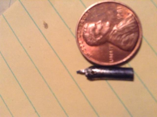
I recently picked up a vintage Scripto Fountain pen with a hooded nib for less than $2 at a flea market. I brought it home and opened it up. The ink sac is in fairly good shape, holds ink but could be replaced. The nib and feed ( see picture) was very damaged and chipped. Does anyone know where I can find a nib, feed and new sac that will fit this pen? If you need more pics let me know, it will do no good to look on eBay, I don't buy from there. Thanks
- 2 replies
-
- scripto
- hooded nib
-
(and 1 more)
Tagged with:
-

Hero 336 - Hooded Nib - Buttery Smooth
mehandiratta posted a topic in China, Korea and Others (Far East, Asia)
HERO - 336 Over the period of past 4-5 months i have started collecting Chinese Fountain pens which i will be reviewing one by one. This review is about the pen which was recommended to me by Mr. Subramaniam of ASA Pens after i have collected lot of Chinese Fountain Pens from local market of Old Delhi (Nai Sadak & Sadar Bazaar). And I am surely not disappointed at all. Hero 336 I have review the pen here in detail .....https://mehandiratta.wordpress.com/2015/02/20/pen-review-hero-336-hooded-nib/ I LOVE THE PEN -
First Impressions (8)For a dollar forty, I wasn’t expecting much, but this pen proved to be a great value for the price. It is a true fine nib, and I have not had any problems with it thusfar. Appearance (9)The design of this pen is a gold gridded body with a black cap, black section, and a steel hooded nib. The pen feels less wide in person than it appears in the photos. Construction (8)This pen has seemingly very good build quality for a Chinese pen. It is made of metal and is a little heavy, I don’t have an exact weight but it feels like it is about the same weight as my Jinhao x450. Nib (5)The nib on this pen is a fine hooded steel nib. It has no flex, and is a little bit scratchy, but it is still usable, and I was able to make it a little bit smoother after a bit of tweaking. (Brown paper bag). Although this is not very descriptive, this nib did not seem very wet or very dry, and is in the middle. If I had to pick one side I would say that it is just a little bit wet. Filling System (4)This pen takes standard international cartridges or a converter. It ships with a screw converter. I am not sure whether it is my pen or my converter, but I can never fill the converter more than about 2/3 full, which makes it a lot less practical as it needs to be filled much more often. I will update this once I get a chance to see whether it is the pen or just the converter. Cost and Value (10)This pen is about as good of a deal as you can get, I got mine for 1.40 USD shipped from EBay. The buy it now price is around $7, but you can easily get it for cheaper in in auction with patience. Conclusion (7)All in all, this is a great pen for the price. The nib is a little scratchy, but it is not that bad. The design is excellent and the build quality is great for a pen of its price. For $1.40, it is all you could want and more. Pictures Below (Sorry for small size) http://i.ebayimg.com/00/s/ODU1WDEwMDA=/z/DPwAAOSw0vBUc1DN/$_14.JPGhttp://i.ebayimg.com/00/s/NzQ0WDEwMDA=/z/aEwAAOSw2XFUc1DK/$_14.JPGhttp://i.ebayimg.com/00/s/MTAwMFgxMDAw/z/3asAAOSwj0NUc1DT/$_14.JPGhttp://i.ebayimg.com/00/s/OTE3WDEwMDA=/z/xCwAAOSwAL9Uc1DQ/$_14.JPGhttp://i.ebayimg.com/00/s/MTAwMFgxMDAw/z/3hIAAOSwj0NUc1DW/$_14.JPG
-
The next entry in my "Cheap Chinese Pen I got from eBay" series is the... Duke Uranus M25 Fountain Pen Price: $5.90 Nib: Extra Fine, Steel, Hooded Country of Origin: China Filling System: Piston (push type) http://gizmosauce.com/img/duke_m25_01.jpg Appearance: 8 / 10 The first thing I noticed about the Duke Uranus M25 is that it's a really tiny pen, similar in size to a Jinhao 611. It's short and thin, and probably fits in with the bullet/missile style of pens that have been popping up. Its design is simple and classy, if not slightly understated. The top of the cap and end of the barrel are tapered to a rounded end that culminate with a small chrome button, which I think is a nice touch. The clip has a simple design, but it's extremely tight and won't clip to a shirt pocket without a fight. The pen's design is not a flashy one, but there are two things that I really like about it: I love the Chinese writing down the side of the cap. In general, I think Asian writing is beautiful to look at. I have no idea what any of it says, but I think it's pretty.I like the nib and section. It has this shark-like shape to it...I think they call it a cayman mouth style. I think it's kind of cool looking.http://www.gizmosauce.com/img/duke_m25_02.jpg http://www.gizmosauce.com/img/duke_m25_05.jpg http://www.gizmosauce.com/img/duke_m25_03.jpg Build Quality: 8 / 10 The cap and barrel seem to be made of some lightweight metal. It could be brass, but I think it's more likely aluminum. The section is mostly metal, too, I think, but the coupler threads that attach to the barrel are plastic, so it makes screwing and unscrewing the section feel slightly cheap. The pen comes with a push-type piston converter. It's very common among inexpensive Chinese pens, but it's the first time I've ever used one. Seems cheap, but it works fine. It includes a small ball (glass or plastic, I can't tell) in the reservoir to agitate the ink to keep it from settling at one end of the converter or the other. It's a very nice touch. Because the nib & section are so small, I had no problem filling it from a sample vial. The converter worked perfectly to fill the pen. http://www.gizmosauce.com/img/duke_m25_04.jpg http://www.gizmosauce.com/img/duke_m25_08.jpg http://www.gizmosauce.com/img/duke_m25_09.jpg http://www.gizmosauce.com/img/duke_m25_10.jpg Nib: 10 / 10 The nib was supposed to be Extra Fine, so I expected it to be on par with the Fine nib on my Pilot Metropolitan. But the line put down by the M25 is a little heavier than the Metro. I'd probably classify it as a Fine. My handwriting is very small, and I hoped for a true Extra Fine, but I was somewhat disappointed in the line weight from this pen. It's possible that the ink I'm using (Diamine Oxblood) is contributing to that. Other than the thicker-than-desired line weight, the nib performs wonderfully. It's a SUPER smooth writer. Most F and EF nibs give some feedback (or are downright scratchy), but this nib glides over the paper with ease. It's also a pretty wet writer for an EF (which might also contribute to the thicker line weight). I encountered a few skips, but nothing too out of the ordinary. BUT WAIT...on a whim I attempted some reverse writing (flipping the pen over and writing with the back side of the nib). Holy cow...it's perfect! The line weight is super thin, and because it's a wet writer, it never runs out of ink. Writing like this has its cost though: it's pretty scratchy. I may whack it with a little micro mesh to try to smooth out that side of the tines...but the nib isn't replaceable, so if I mess it up, I'm stuck with the results. Because the section is hooded, only the very tip of the nib is visible. There is no way to remove/replace the nib (there are probably special tools that might allow this, but you can't just pull it out if you need to give it a good cleaning or to swap it for another nib). http://www.gizmosauce.com/img/duke_m25_06.jpg http://www.gizmosauce.com/img/duke_m25_12.jpg http://www.gizmosauce.com/img/duke_m25_13.jpg Comfort: 8 / 10 I've written several pages with this pen today, and I've had no hand cramps. The open end of the barrel flares out a bit, and if you run your finger over it, it feels a little sharp. But, when writing, it's not noticeable at all. The finish of the cap and barrel is a little slick, and the pen has slipped out of my hand a few times. Because of this, it's probably not a great pen for travel. As I said earlier, this pen is tiny. People with larger hands might not find it comfortable. You can post the cap, but it's not a secure fit and the cap will come off while you're writing. I have small hands, so I have no problem writing with it un-posted. If shorter pens don't work for you, you won't like this pen. For the sake of comparison, here's the Duke Uranus M25 (second from the top) alongside a Noodler's Ahab (top), a Pilot Metropolitan (third from top), and a Monteverde Invincia (bottom): http://www.gizmosauce.com/img/duke_m25_11.jpg Overall Score: 34 / 40 At first, I considered the Duke Uranus M25 to be a decent pen. But now that I've discovered how well it writes when reversed, my satisfaction with the pen shot upward. It's a nice, classy pen that is capable of writing as a Fine (normal) and as an Extra Fine (reversed). The nib is butter-smooth under normal use and puts down a pretty consistent line. This little $6 pen performs very well, and is an exceptional value. Other reviews in my "Cheap Chinese Pens I Got from eBay" series: Crocodile NCR64 / 806 Green Celluloid Fountain Pen
-
Yiren 3156 – Russet Brown version Standard disclaimer first: I received this pen from Kevin at JustWrite Pens (www.JustWrite.com.au), in return for an impartial review. I initially wasn’t going to put up a post about it, because it just didn’t ‘grab’ me – but figured others might benefit from the review regardless, even if it’s not entirely favourable. I’m also doing this because Kevin stressed that he’d rather I didn’t “pull my punches”, by only reviewing the pens I can wholeheartedly recommend. So here it is, the Yiren 3156 – I won’t be scoring this out of 10, just trying to give you a clear idea of what you’re getting if you buy this pen. ______________________________________________________________________ 1. Appearance & Design – A lovely looking pen, until you uncap it… (!) When I received my shipment of pens for review from JustWrite (most of them valued under AU$20, though a few were priced in the $40s and $50s, and one was valued at $105!), this was one of the pens that immediately caught my eye. There’s something about the colour that I really like – a kind of warm ‘russet’ brown, almost a reddish-brown, with gold accents that blended in nicely. I really wanted to try it out… Until, that is, I removed the cap of the pen. It was one of those, “Oh, that’s not quite what I was expecting” moments. Under the cap, I found a chrome-accented grip section, with a hooded nib. Matching gold colour would probably have looked better – though I suspect that the chrome / stainless steel will be less susceptible to corrosion with use – but that wasn’t the main concern. The diameter of the grip section is seriously small – with a significant ‘step up’ to the barrel. http://i.imgur.com/sSIzFIr.jpg http://i.imgur.com/IMJil3Z.jpg OK, OK, I’m probably overstating my reaction – I was surprised, rather than disappointed. And I actually quite like hooded nibs on my pens, as I find they tend to be finer writers, and less prone to drying out than for other pens. So in itself, this is not a deal-breaker. … 2. Construction & Quality – Seems solidly built, and durable Overall the pen is well-designed, composed mostly of metal and plastic. There are no obvious blemishes or flaws, and (as indicated above), I think the colour of cap and barrel go nicely with the trim. The clip is sturdy, and will hold well in a pocket. The grip section threads securely into the barrel, and the slip cap ‘clicks’ securely into place. … 3. Weight & Dimensions – A typical ‘mid-sized’ pen – at least outwardly! This is another ‘mid-sized’ pen, that weighs in at around 34g (including converter). It’s 141mm when capped; 116mm uncapped; and 161 when posted. It posts reasonably securely, too, though you wouldn’t want to ram the cap on too hard! The main ‘problem’ with this pen is the grip section. While the diameter of the pen barrel sits at a comfortable 11.5mm, that ‘steps down’ to around 9.5mm. The section also boasts three ‘facets’, though (see below), which probably reduce the ‘effective’ diameter (in terms of pen grip) to maybe 7mm. … 4. Nib & Performance – A smooth, fine nib, that writes nicely – the grip section is the problem here! Inked up with Visconti Sepia Brown, this pen laid down a fine line, and wrote very smoothly. I really enjoyed that aspect of the writing experience. My main problem with this pen, though, is with the grip. Because the grip section is comparatively narrow – and maybe because it’s metallic? – I find myself having to grip tighter than I’m accustomed to. To make it worse, the grip is ‘faceted’ to accommodate a tripod grip. Not sure how to describe it any better than that – hopefully the pictures will make it clear what I mean! This made the ‘effective’ diameter of the grip even narrower. From that point of view, my children might find this pen more comfortable to write with – for me, it was a bit of a strain. Maybe I could TRAIN myself to hold the pen more loosely? But after a page of writing, I was beginning to feel a bit of cramping in my fingers and hand… http://i.imgur.com/vm1a8ZZ.jpg … 5. Filling System & Maintenance – A standard cartridge/converter pen To give the Chinese manufacturers their due, more often than not their pens are designed to take standard international cartridges – and come with a cheap cartridge converter (Hero is the main exception on this score). The Yiren came with a ‘slider’ converter – I normally prefer the ‘twist’ type converters, but this converter operated smoothly and worked well – so full points on that score. http://i.imgur.com/gy807GO.jpg … 6. Cost & Value / Conclusion – An inexpensive pen – but won’t be everyone’s cup of tea Priced at around AU$20, this pen won’t be everyone’s cup of tea – there are other pens that are better value for money, especially (for example) the Baoer 388, or the new Jinhao 599s. If you like hooded nib pens, though – and don’t mind the smaller grip section – this pen could be for you.
- 6 replies
-
- chinese pens
- yiren
-
(and 1 more)
Tagged with: