Search the Community
Showing results for tags 'heavy'.
-
Jinhao 650 - 'deep Sea Bright Pearl' – The Brass Behemoth
TheVintagelife posted a topic in Fountain Pen Reviews
While I do not write too many reviews, posting this here, since I thought this is an interesting pen and there are very few reviews online, unlike the more common Jinhao models like the x450/750/159/992 etc. General notes: This is one of the variants of the Jinhao 650. As far as I can tell, there is another in a red wood variant. This pen cost me the equivalent of $15. Not the cheapest Jinhao or indeed, Chinese pen out there, but still lower than most offerings of ‘upper end’ Chinese brands like penBBS, Moonman, Kaigelu, Lorelei etc., so firmly ‘mid range’ as Chinese offerings go. The pen in this review, therefore, will be judged according to the standards expected of this price range. The entire pen appears to be constructed of brass. The cap has a black laquer paint with gold-color plated clip and ring; the barrel is the same black laquer paint with the signature feature of this pen – the mother of pearl and abalone strips cut in small rectangular stripes(longer side arranged along the length of the pen) and arranged neatly in rows – 3 down and 6 around – 18 in total. The section appears to be plastic coating on a brass base. As regards the hardware – the clip is a sword and shield design, with the shield carrying the jinhao logo of a horse drawn chariot. The shield part of the logo is chrome while the rest of the clip (basically the sword part) is gold-color plated. The pen is a cartridge converter and comes with a aged-brass accented converted. the clip-ring is visible. There are other gold-finsihed rings at various places in the pen - namely - bottom of cap; joint between the thicker middle portion of the barrel and the thinner tail-end, and at the top of the section. the cap is a push-to-lock/ pull to open variety. It has a standard #6 two tone jinhao nib with 18KGP printed and the jinhao chariot motif. The nib was advertised as a 0.7mm line (which I’d say is on the broad side of medium or a Japanese broad). However, I find it to be provide a thinner line – about 0.5mm Now, on to the qualitative review and some comparisons. Build quality : 3.75/5: For $15, you get a really well built tank of a pen. Nothing rattles and everything feels solid. The execution is almost at par with plus $100 except for a couple of minor points: 1) The gold plating, while otherwise very well executed, appears to scuff easily. I already have some scuff marks around the bottom of the clip despite handling the pen very gently till date. It appears that the underlying chrome/brass will eventually show through in places sometime in the future 2) The ring at the bottom the barrel rotates freely and is not fixed to the barrel. I do not know if this is by design or just my piece, but I don’t think this should be the case. (The top finial is the same gold finish as the clip and bands. It looks pink in this picture, probably because of the uneven lighting) Dimensions and Ergonomics 3.5/5: the pen is bloody heavy. Like really. Heavy. It is 65gms (2.2 oz) with cap on, and 36 gms (1.2 oz) without the cap. It is not overly lengthy though – at about 142mm with capped, 124mm uncapped, and 170mm posted. It posts securely but not deeply. The disappointing thing about the posting is that the cap does not travel all the way to the ring at the bottom of the barrel where there is a step up to the middle part of the barrel (see pic below). If the ring on the cap ended up flush with this step up point, I think it would have both looked neater and been a more comfortable length. As it is, I wouldn’t recommend posting as it backweights the pen too much. Having said that, I do not find the weight overly uncomfortable (when un-posted). I like bigger (though not necessarily very heavy) pens, and while this is certainly the heaviest pen I own, it is surprisingly usable. This is mainly because the weight is mostly in the middle of the barrel (when un-posted) and this makes the pen very well balanced with the webbing between the thumb-forefinger taking the weight naturally. Here is the pen next to the decidedly mid-sized Moonman M600s which also has the same general shape and price range (plus black finials and section). The length of the two are almost similar (with the 650 edging it slightly). But the 650 is appreciably thicker and more than twice as heavy (note that line width of the Jinhao's writing is very close to that of the 'F' nib in the Moonman - more of that later). As you can see from the un-capped pictures - it has a short section with a step down from the barrel. However, I did not experience any discomfort in gripping the pen on this account (note: I do hold the pen quite low down - very close to the nib). It helps that it is a push to lock design and hence there are no threads. the section has a plastic feel and therefore is not very slippery. However, it can get slippery on prolonged use. Appearance – 4.25/5 : it is an attractive design, which is bold but (in my opinion) just short of loud. The gold-accents are done extremely well for a pen of this price range. This is usually what looks cheap in most low end pens, but that is not the case here. The mother of pearl and abalone strips look the real deal – they have great depth and chatoyance and vibrancy of color – held up against the light, they look 3D – the pictures do not come close to doing them justice. It is amazing that this kind of material is being used a on $15 pen. My only nitpick in this category is that that the drop in diameter between the middle of the barrel and the section on one end, and the bottom finial on the other, gives this almost a ‘kit pen’ type of appearance. This is personally off-putting though many won’t care. If the reduction in diameter served a purpose in helping the pen post flush with the bottom ring, it could be forgiven, but that is not the case, as discussed above. Writing performance: 4/5 The standard #6 jinhao nib is a very smooth and wrote smoothly out of the box. The ink flow was not the wettest, but not overly or unusably dry either; just on the dryer side of medium. By this I mean, medium blues like the Lamy blue I used for this review showed up lighter than the really wet pens, but amazingly, the nib kept up very well to fast writing, never skipped; and only rarely had a false start (that too if kept uncapped for a while). If used after a couple of days, the first stroke of the first letter may be a little thinner and then the pen immediately reverts to its normal line. Overall, I would say a really good writing experience out of the box. Jinhao feeds are known to take a bit of time to really be primed, so, as expected, it became slightly wetter (about medium wetness) in a couple of days. It also helped that I ran a razor along the slit of the feed (just once was enough). Now I feel that the nib performs just as I would like. Quite happy really. I was considering using one of the ‘wet Taiwan nibs’ from Bobby at esty; but after a few hours of trying one, I reverted to the Jinhao. I have too many ‘gushers’ already and the line was too fat for my liking, talking of which… As mentioned above, this nib is finer than some of the other Jinhaos I have used, which is pleasant surprise (for me- personally like a medium-fine rather than a medium-broad). The supplied cartridge converter does not have the greatest suction – I struggle to fill the entire tube despite repeated tries, which is a pity since it doesn’t have a great capacity to begin with (I’d say about 0.8 ml). However, it seems to be supplying the feed adequately as the feed has never dried up amidst writing, which has happened in a couple of my Moonmen/penBBSes. A small written sample is below. Notice how the Lamy blue shows up into its 'middle' darkness for most part. Value: 4.5/5 : Are you kidding me – actual abalone and mother of pearl strips in a $15 pen and a build quality this good, makes the pen absolutely worth the money spent. I am deducting half a point since it may be a bit too heavy to be a daily writer for some and hence may find itself in a weird middle space of being too weighty for copious writing, but not a ‘posh’ enough to be a signature pen. However, as an occasional dalliance and a conversation piece (I lost count of how many colleagues asked me how expensive this pen was only to be shocked when I told them), it’s a great bargain.- 7 replies
-
- jinhao
- chinese pens
-
(and 6 more)
Tagged with:
-
Greetings, fountain friends, I’ve been an offline observer to this wonderful community for some time now, and it has influenced me in many of my pen decisions and handwriting expansions. I'm an Irish doctor working in England, and in my spare time, I am a keen German language user, chess player, philosophy and psychology enthusiast, and now beginning to dabble in the world of writing. I’d like to begin to give back with my own opinion regarding an undoubtedly biased view on my favourite fountain pen purchase to date – the Lamy 2000M Stainless Steel (my model is a fine nib, and I like to rotate between Diamine Oxblood, Teal, and Montblanc Toffee Brown). Excellent reviews for this well-known model – most prominently the original makrolon edition – already exist in this forum, and further afield. However, I would like to write something about the SS version of this pen, which has attracted mixed-to-negative reviews regarding it’s 1) weight, 2) similarity without difference, and 3) price. I do not pretend to be impartial regarding this particular piece, and I must suggest that this is an opinion primarily for those who are closer-than-not to a purchase regarding this model with the attributes I will discuss, later, and go some way to defend the model fit enough to be considered both distinct and worthy of purchase and recognition. 1). Weight. The most notable set of specifications is the weight of this pen – both in-and-of-itself, and in contrast to the lighter, original version. For convenience, the total (54g), body (34g), and cap (20g) weights are significantly heavier than the makrolon version (typically 25g, 15g, and 10g, respectively). Particularly when the cap is posted, this can be a considerable contributor to writing fatigue, back-heavy imbalance, and an uncomfortable writing experience with poor stamina for even those with larger hands. I think this is an unfair area of criticism, and rather, should be a binary factor for those who like heavy or light pens. Consider a fountain pen reviewer who takes on a ballpoint pen – by the very nature of the pen’s mechanism, this will be reviewed much more poorly than it’s capillary counterparts by the nature of what makes the pen a writing instrument. I believe that weight – as well as dimensional size – are factors in review that should be areas of distinction, rather than comparison, when considering models of pens (even when such models are within the same branding). Therefore, I think that those who favour heavier, metal pens should take interest in the Lamy 2000M as distinct in interest even from those who use the original makrolon Lamy 2000. Whereas the first example I provide is clearly an extreme version of the issue described, here, I think that the factors of size, weight, and filling system are considerable enough to be whittled down to pens that address those precise categories rather than having (e.g.) a Kaweco Liliput scolded by a user who’s daily driver is the MB 149. 2). Similarity without difference. Apart from the material use and the weight of the pen, criticism is offered by reviewers who perhaps borrow too much influence from these paradoxically drastic differences, by finding nothing new offered by this version once the novelties are stripped away. I believe this is an easy mistake that we all can make when we overanalyse versions with heavy influences in one area or another and seeing it as a simple marketing rehash. I’d like to offer the opinion that these two factors bring about differences in performance and suitability in preference that are drastic enough to address an entirely different audience to attract those that were perhaps failed or disappointed by the Lamy 2000 in its original format. The material and weight provide a unique writing experience that is (I’d argue) much more palpable than the difference between modern steel and gold nibs. It is difficult to capture the sensory, tactile, and phenomenological experience in the differences between both versions without robbing the reader of an hour’s time, but there is something tremendously satisfying about the gravity and industrial nature of this instrument. I think it more excellently captures the Bauhaus movement than it’s makrolon parent, but aesthetics aside, even the differences in brushing material and the lack of a two-tone/material compartment provide a different experience to those deliberately sensitive enough to notice a difference. Clearly, there are differences which I think are rather miniscule (the plating on the hinged clip, or the placement of the Lamy logo, for example), whereas others are perhaps discriminatory to those who prefer other attributes (the removal of the ink window seems to be a sore point for many consumers, as is the smoother metal finish of the grip). However, when it comes to the ultimate endpoint of a writing instrument – the writing – then this pen deserves a mention distinct from the original as being paradigmal in it’s feeling, experience, and output. Everything else is style and preference. 3). Price. Finally, the Lamy 2000M is noted as being approximately 50% more expensive than the original*. This is an area of criticism, compounded further when the two areas addressed, above, are neglected in final consideration. One could talk endlessly regarding the economics of price, but I believe there are a few more objective factors to consider before discussing the differences in the intangibles: Stainless steel is a difficult material to manufacture, and clear that it is at least a significant percentage of the pen that this instrument is fashioned with (I have yet to see a demonstrator video in which the pen is sliced in half at various angles for a more accurate opinion on this, though the innards are made from essentially plastic on disassembly). The weight specifications should be enough to reassure most to a reasonable standard of this. Lamy is also a brand of (at least in my experience) good and efficient quality – perhaps the Ikea of manufacturers when it comes to template design with the odd-revolutionary product. With this comes a certain level of brand investment, especially as an edition of an item that sits on permanent display in an art museum. More subjectively, those wishing to purchase something metal, heavy, and made by a manufacturer such as Lamy, will find themselves justifying this purchase (rightly or wrongly), as it is a widely-recognised and reliable model of a pen that has already been proven to survive over long periods of time, but utilises their preferred categories of material choice and weight. Stainless steel is also tremendously robust, and provided that the user is aware of the interplay between it and the more sensitive innards, then this pen should act as its own safeguard against wear, damage, and accidents that will inevitably creep up in the coming years and decades. C). A worthy purchase for those who can discern it. The conclusion may seem as weak as point 2) that I make above – clearly, this is a pen that will satisfy those who will be satisfied by it just as much as it is the same pen without its differences. But I write this piece (which is also my first – constructive feedback would be very much appreciated from the community) in biased defence and justification to what is a wonderful writing instrument that I believe has been treated unfairly even in favourable reviews (who towards the end may conclude that the makrolon version is better simply because it is essentially the same, and more affordable). I argue here that these are two distinct pens that should not be compared any more than a small and a large pen be reviewed by an individual who is more/less suited to one or the other. That is not to argue the Lamy 2000 out of hands who love it – I merely stress that there are differences that are more significant in the review of such pens than are given credit (some which are not even available in filters for online pen retailers, e.g., weight) that will eliminate certain pens from consideration even if they are identical in other superficial aspects. Furthermore, I wish to offer the opinion that such differences then go on to contribute meaningful changes both in hand and on paper, and that these should be noted as both distinct, and as incomparable to pens with category differences such as weight that are paradigmal. Lastly, this is a pen that will suit some, and not others. For those that it will suit, however, will depend more on attributes and qualities of pens that make it knowingly or unknowingly both more appealing and satisfying in acquisition and use than variants (Lamy 2000) and competitors (when considering weight, e.g., Faber-Castell Basic Metal). Clearly, other factors also play a role (i.e., price, availability, European nib sizes, etc.), and some which I have not noted, here. But for those who can discern their ideal pen yet find themselves a little underwhelmed by the community’s reaction despite its pedigree and performance, I hope this piece can help to explain some of the feeling on both sides. Thank you for your time. Schreiber *Thank you to 1nkulus, who corrected my original gross approximation as being double.
-
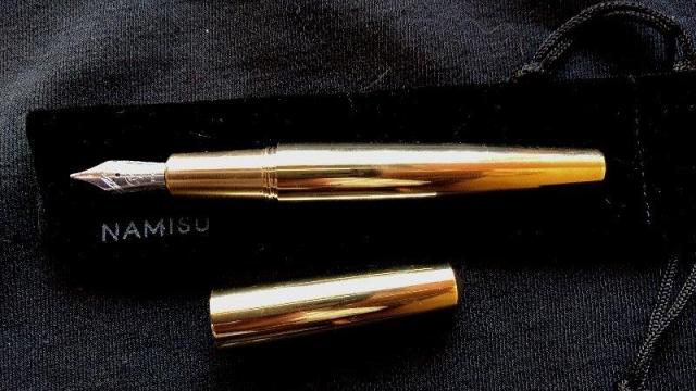
Namisu Nova - Brass Whilst I don’t mind using plastic/resin pens, my preference is for a well-balanced metal bodied pen. I like my tools to feel solid – give me a metal-bodied camera over a plastic one, give me a metal watch etc. I don’t mind weightier pens and find a badly balanced pen will be tiring to use even if lighter than a well-balanced pen, but I don’t write at great length anyway – generally it’s short letters, and at most a couple of hours of intermittent note taking. I had tried a Tactile-Turn Gist in Stainless Steel and liked it apart from its unposted length, and posted balance. I’d tried a Kaweco Liliput in brass and liked it as a trouser pocket pen for occasional notes but found it too slim for prolonged use and was tempted to try a Kaweco Sport (I probably still will) but whilst browsing for pens came across Namisu. The brass Nova was on offer, it came from Scotland so no horrible Customs fees, used Bock #6 nibs rather than #5 and seemed a very good price. ______________________________________________________________________ Appearance & Design (1-10) – Minimalistic but lets the brass shine It came in a simple but perfectly adequate black cardboard box embossed with Namisu in one corner. Inside the pen was nestled in a black velvet pouch resting on a typical flock insert. The packaging is certainly nice enough for giving this pen as a gift, without being so costly that you wonder how much of the pen’s cost was the box. No cartridges are supplied (I am surprised they don’t include a single cartridge) but the pen is fitted with the standard reliable Schmidt converter (I think this was an optional extra when the Nova was launched through Kickstarter, but comes as standard with pens purchased through their web site). The pen itself is minimalistic to the point that some may find bland, but that minimal design does emphasize the material the pen is made from – this pen shouts brass! Shape wise it’s a pretty standard chubby torpedo/cigar shape with a plain cap. It’s about as minimal as you can get. I’ve seen it described as a Nakaya Piccolo clone, and with the conical ends it does bear a family resemblance, although the Nova is longer and it’s taper is noticeably more exaggerated as well as having a more minimal section without the pronounced ring around the nib. It’s arguably closer to the Nakaya Naka-Ai in taper (but a little shorter). For me it’s more elegantly shaped than the Piccolo, but not as elegant as the Naka-Ai (although if I could afford a Naka-Ai I’d obviously want urushi…). I can’t get overly excited by the design – I think it’s got the edge over the Karas Kustoms Nakaya ‘homage’ (clipless Ink), but it’s basically just another cigar shaped pen with a step down to facilitate a minimal look when capped. If you want a similar design but not in metal look towards, Bexley, Edison or any number of companies. If you want a better designed metal torpedo look at the Namisu Orion. As with all clipless designs, with minimalism comes the possibility of a rolling pen. My desk is usually so cluttered there’s nowhere for it to roll, but for those weird tidy desk people you might want to consider a pen stand (or taking a Dremel to your office desk when your boss isn’t looking). I don’t carry pens in my shirt pocket and as it’s not going to easily fall out of a jacket the lack of clip doesn’t bother me – it might you. There is an inexpensive leather sleeve available too. The polished brass looks lovely when new (or freshly polished); it’s a gorgeous looking material, but bear in mind it is unlacquered so will tarnish. Anyone who’s owned a Kaweco brass pen will know how it will age if left – brass doesn’t develop as rich a patina as copper but will ‘matte’ with time and darken slightly. I’ve been wiping this down with a cloth after each use, but I doubt I’ll keep it up, and like the way my Kaweco Liliput has aged with use. You could probably remove the nib and apply lacquer if you really wanted to… 7/10 – lovely material and well executed, but not particularly original. … Construction & Quality (1-10) – Truly excellent I’ve had experience of other pens that started out as Kickstarter projects and they’ve tended to show odd machining marks and extremely minor manufacturing flaws – nothing that I felt critical of, just what you’d expect from a small machine shop. My brass Nova is a different proposition in that there’s not a mark on it (well there wasn’t when it arrived!). I don’t know whether Namisu do their machining in house or use a specialist machining company- they promote themselves as a Design Company and it might well be that they don’t do the manufacturing themselves. Either way this is beautifully machined with perfect threads, no grinding of metal or slight gaps where parts meet. The cap unscrews smoothly with around a single turn. Highly impressive. With my grip my thumb rests on the step down to the section, but the threads aren’t sharp and whilst I can feel the step I don’t find it uncomfortable. 10/10 – No faults found … Weight & Dimensions (1-10) – Long enough to comfortably use unposted. Heavy! I’ve realised that any pen that is designed to be used unposted needs to be at least 120mm and preferably longer if I’m going to write at any length. At 128mm uncapped this is fine for me – capped it’s around 140mm. It’s not a svelte pen (slightly under 16mm at its widest and around 12mm on the section) but personally I find very slim pens uncomfortable for prolonged use. Weight wise it’s a real beast… Capped it’s 89g, but 26g of that is the long cap – at 63g uncapped it is still a very heavy pen. Having said that it is very well balanced – slightly front weighted but not ridiculously so. It might be twice the weight of an uncapped Jinhao 159 but in use it’s so much better balanced you wouldn’t realise it. It’s not a pen I would want to write with for hours on end, but after half hour I don’t feel any hand fatigue. It’s not designed to be posted, but it will post reasonably securely if you don’t mind seriously risking scratching the barrel and turning a heavy pen into a really heavy pen. Surprisingly although the balance isn’t as good when posted, the cap doesn’t throw the balance off as horrendously as my Tactile Turn Gist or Faber Castell E-motion (personally though I’ll use it unposted). Photos compare it with a Pilot Custom Heritage 91 (near enough identically sized to the CH74) 7/10 – Heavy, but well balanced. Not overly long, but usable unposted … Nib & Performance (1-10) – Moderate flow with my inks. Smooth, reliable but dull. It comes with a Bock no. 6 nib in a standard Bock housing. Steel nibs are included in the base price with titanium available for an extra £45 at current prices. The steel nibs are available in Extra Fine, Medium or Broad, with titanium in extra fine or medium. Owning both fine and extra fine nibs in steel I can see why Namisu only offer the one – the difference between them is pretty marginal. Extra-fine is only slightly narrower than a typical Japanese medium. Obviously you can buy replacement Bock nibs from several places (shout out to BeaufortInk for excellent service). You can also fiddle around and fit other no.6 nibs onto the feed should you wish.For this pen I ordered a Broad steel nib purely because it was one I hadn’t tried. On the positive side it was smooth straight from the box, didn’t skip and delivered an even flow with Iroshizuku and Diamine inks. It’s a perfectly decent nib, but I found the broad was barely wider than the medium nib, lacked the slight ‘springyness’ the extra fine has and needs too much pressure to get any line variation. It’s well behaved, but to my mind a little dull. My recommendation would be to with the very good extra-fine steel or try the titanium, but nib preferences are very personal. I can’t say the nib performs badly in any way, it’s just not to my taste and will probably be replaced and used as a base for a cursive grind. In the meantime I’ll swap in either an extra fine or the 1.1 stub (another nice nib in my experience). If you’ve used other pens with Bock no.6 nibs you’ll know what you like. I’ve not had a badly performing No.6, and my only issues with Bock nibs have been with No.5s, both of which required some smoothing and flow adjustment, but were good performers once fixed. 6/10 – Solid performer but not to my taste – other nib options might score an 8 … Filling System & Maintenance (1-10) – Standard Schmidt converter included.The pen is easy to disassemble with the nib housing unscrewing allowing easy replacement and cleaning. A standard reliable Schmidt converter comes fitted with the pen, and the body is long enough to take both long and short international cartridges. 8/10 … Cost & Value (1-10) – Great valueYou can only purchase Namisu directly from their web site. It was on offer when I purchased mine, and there was also a discount for signing up to their newsletter. At full price it retails for around 75% of the cost of an all brass Tactile Turn Gist and 60% of an all brass Kustoms Karas Ink with the same nib, which I think makes it very good value. Obviously exchange rates will vary… 9/10 … Conclusion (8/10) – Be tempted If you like metal pens and don’t mind a weightier writer I’d recommend seriously considering this beast. It’s well enough balanced that I don’t find the weight a big problem – I could write for longer with this than many lighter pens in my collection, although I admit I wouldn’t choose this to write with for hours at a time. For me once I’ve swapped the nib it will regularly be used as a letter writer. I bought this before trying the Namisu Orion and personally find the Orion a better design, but this is still a pen I will enjoy having in my collection. Namisu produces runs of pens and don’t always have all their pens in all materials and finishes available so if it appeals I wouldn’t hang around for too long. 8/10 – Not a pen for everyone, but does what it does very well at a very good price …
-
Good evening everyone once again. This is a light hearted review of a serious pen! Preamble (skip this bit if you find it boring): Today, I have been fortunate to manage to have the same day off work as my partner (our schedules NEVER match up). Couple of days before the bank holiday madness kicks in, so the great outdoors beckoned… So, with the great UK weather being unpredictable, a trip to the coast was off the menu, and I was in need of a pen case for a couple of pens I have, so predictably, a pen shop expedition was order of the day. As per usual, we headed out some 30+ miles to “Penbox” in Epworth, as I knew that the owner, Steve, typically keeps a nice selection in, plus, there are a number of old style quality cafe’s in the village, which really makes it a nice trip. We didn’t ring thru prior, as the shop is a treasure trove for writers, and is always fun to look thru all the displays. It has to be said, that an internet only method of shopping is quick, more eco-friendly and frees up time to other things. Call me old fashioned, but a real shop, with a real face and, goods you can pick up and browse through, is much better (don’t forget the pause for an English Breakfast in the cafe nearby). Anyway, shortly after arrival, the plans proceeded to become rapidly unglued. As one enters the shop, near the counter is a small display case, and within it is a collection of Graf Von Faber Castell “pens of the year”. I should have turned around there and then, I really really should. Fifteen seconds thru the door, and too late. “She who must be obeyed” spotted it. Graf von… 2011, in Jade. So, after browsing, drooling and general really pleasant talk about pens and everything else pen related, we pressed pause for an hour and hit the nearest cafe. Suitably refreshed, we returned and then, yes, I got a small pen case to fit two pens, we also acquired the aforementioned Graf Von Faber Castell 2011 in Jade. “She who must be obeyed” absolutely fell in love with it. First impressions. Workmanship. It is just a work of art, but without doubt, fully engineered. From the shiny finish with the Jade inlays, of which one of them itself has an engraved pattern itself, it just screamed quality. It glows………. Second impression. The cabinet was duly unlocked and the Jade beauty was handled for the first time. It felt truly gorgeous in the hand, a decent heft, weighty but felt balanced. I have never really like the look of them in photos in the past, the caps seem a bit odd and there is a step rearwards of the section/grip, which is so far back, it is just not noticeable at all. However, in the flesh? Ooooh, it’s a different beast then. AH, what the heck, we made the purchase. Third impression. As usual, home, cuppa, and a calming down after causing severe damage to the credit card. The box, sat on the table, the contents hidden, awaiting the proper opening. Unboxing. Wow. The box is HEAVY. It isn’t as big as a Conway Stewart Winston or Churchill, but is waaaay heavier. As per most pens in this price point, they are a box, within a box, within a box, which normally grates on me a bit as I usually ditch boxes and stick my pens in pen pouches. However, this was just one eye opener after another. The innermost box, is made of some dark wood with a deep green lacquer and is highly polished. It is of a size and finish that really complements the pen and for once, (if this was MY pen) I would not put this in a pen pouch unless it comes to work, but would be returned back into it’s nest at bedtime for sure. Quality lead on quality. Overall Look of the pen. Victorian. I got to say it looks Victorian. Erm, quick rethink. Deco. Victorian/Art Deco, if that could ever exist. On it’s own it looks huge, but when placed next to other pens, such as a TWSBI, it is really not that huge after all, maybe the cap is making the eye think it is bigger than it is? Either way, I would say, without resorting to a tape measure, it is Pelikan M800/M1000 size. Very pleasing to the eye. The nib. This one came in a “fine” and is in good proportion with the rest of the pen. It looks pretty. We dared to dip it tonight and have a play on Rhodia paper. Oh. I mean, oh, as in WOW. I do like fine nibs from time to time but are not my weapon of choice, but this one is stunning. Loaded with Waterman inspired blue, it laid down a lovely wet line. On first touch. No messing, no prepping, no faff, touch on and away we go. Smooth. It felt like a medium nib in smoothness. It had a firmness in use, with a hint of spring or softness, but that is just me “looking” for these qualities, which were definitely there. This is, by far, the nicest fine nib I have ever used. The cap. Big. Shiny. Heavy. Inlaid at the end, with what looks like a stone or a piece of shaped jade, very jewel like in shape/design. The clip is also well engineered, with a sprung hinge, which feels rock solid, but smooth to use. Again, it is in keeping with the overall design and adds to the overall “style”. As a note, we won’t be stuffing this little baby in the top of a shirt pocket in the near future. Others might, and the clip would do the biz, but, not for us, ta. Posting the cap. The cap posts, but as the cap is heavy, no. Don’t do it. It looks nice but it does make it too back heavy, although it does look nice. It posts with a firm push and feels very secure, but, no. It is such a balanced pen without, don’t do it. Keep the cap in your other hand and enjoy the feel of it. Filling system. This is a piston filler and is accessible via a blind cap. The action is smooth and has lots of travel. It hints at a reasonable capacity, but not tested it yet. There is also a small ink window near the section in a smoked grey. I am not sure how good this is, as it is quite dark, but then a totally clear one would detract from the overall look. Look up to a light bulb/outdoors? Yep, tried it and it looks like it works, but having only dipped the pen, can’t verify it. Sorreee. The section. I am not a fan of all metal sections. There, I said it. However, after living with a yard o led for a while now, I have got to appreciate them and make small allowances (give my hands a good wash prior to a good writing session, reduce the oils on my fingers). The section has a very pleasant profile and is in keeping with the overall size, and for most people would be a pleasant diameter to use. A resin section just would not work here, it would kill the overall look for sure. The diameter and length of the section really makes the centre of gravity work as it should. So what now? The pen has now just had a good rinse and will then be fully loaded with Waterman inspired blue for at least a couple of fills. Once done, my good lady will decide on her ink of choice going forward, which we will dip and try, then away we go, it will for sure be in her regular rotation. Pens are nice to collect, but all of our pens are purchased to be used, and not hidden away. Cost? RRP is unpleasant. I won’t divulge the actual price we paid, but it was heavily discounted against RRP, and reduced again from the published web price. Pen dealers will always have a degree of price adjustment to work with, and (I hope) that they still manage to make some profit. That is an advantage of going to a bricks and mortar premises. Web prices CAN be lower than in a shop, BUT the price on the web is usually as quoted. You can always discuss prices with a human face to face. Computers, no. If anyone is looking for a pen like this, I do recommend visiting your local pen emporium (if you are fortunate to have one close enough) and get talking to them. Pics Just a few snaps, show and tell. They just don’t do the pen justice and for sure there are much better ones out there in the wild, either way, hope it gives you an idea. And Finally The big question. If I was in the market for such a pen, would I buy one for myself. No. Loving the Deco look, really loving it, but it is just that-bit-too-bling for my own personal tastes. It has an exclusive look/feel, is a stunning piece, but it’s not me.
- 5 replies
-
- graf von
- faber castle
- (and 4 more)
-
Does Anyone Know The Mekanism Of This Pen?
H1N posted a topic in It Writes, But It Is Not A Fountain Pen ....
Hello I bought a group of vintage pens few days ago from an antique shop, one of them is unknown to me, it's heavy ballpoint pen, when I removed the body to see what inside, I found this...!!? -
Finger Knitting, Fine Motor Skills, And Fp's
Intellidepth posted a topic in Fountain & Dip Pens - First Stop
Long story short, I wish to help a 4 year old develop fine motor skills for writing/drawing. Child has very short attention span so I need multiple activity types to develop fine motor finger control to alleviate boredom. My son's school holds an annual finger-knitting competition and parents have told me it makes a huge difference to their kid's writing control. (Everyone's finger knitting then gets made into a collective object such as a rug and donated/auctioned.) So that's one idea. What other ideas do you have? Thanks. Edit: forgot to mention that the best fine motor control drawing this child has made was with my heavy metal Jinhaho I brought to a session once - light years ahead of when the child uses pencils or lightweight biros. The child has sensory difficulties, so I suspect the weight made a huge difference to the child's ability to control the nib, and the ready flow of ink meant the child didn't need to apply pressure downward as well as try to control horizontal/vertical strokes at the same time.- 3 replies
-
- finger knitting
- fine motor
-
(and 3 more)
Tagged with:
-
Hi, I have been using Duke M01 for some time and now I want to try a different one. I am looking for a medium/thick and heavy (35g or more uncapped) one. Besides this I am looking for one made of metal or some mate material. Up until now I've found several fountain pens but still none of them is perfect. For example rotring 600 has a perfect weight but it's far too slim. To sum up I'm looking for a medium/thick heavy metal fountain pen. My budget is about 200 us dollars. Also I will be using F or M nie. If you have any suggestions please tell me. Have a great day.
-
Suggestions For A Flex Nibbed, Heavy, Big Pen, In Uk
Alexcat posted a topic in Fountain & Dip Pens - First Stop
And reasonably affordable.....not asking much, am I ? Would welcome any ideas or suggestions. Am still pretty new to this, so, any guidance re flex is much appreciated. Thanks Alex -
Posting Problems(Pen Top, Not In The Mail)
Alexcat posted a topic in Fountain & Dip Pens - First Stop
I did ask this earlier, but got no replies....trying again... I have a Faber Castell e-motion, the white one, and I love it. The one thing which drives me daft is .......the top will not stay on. It wiggles and falls off with no attempt at clinging on. Anyone else find this? It *is* a pretty heavy beastie, even unposted, but I like that. Alex- 4 replies
-
- e-motion
- faber castell
-
(and 3 more)
Tagged with:
-
Heavy Pens, Preferably Piston Filled/refillable With A Bottle. Hand Tremors
Ana2008 posted a topic in Fountain & Dip Pens - First Stop
Does anyone know of any heavy fountain pens out there? I mean substantially heavy. Preferably refillable ones, like a piston fill one. I have developed "Essential Tremor." This is a condition that causes my hands, arms, and head to shake involuntarily, sort of like Parkinson's Disease, but different. I hate it, because hand writing, which I love to do so much, has become difficult and messy. Using heavy pens helps a lot, but the only heavy pens I've found are ball point pens. Does anyone have any suggestions? What is the heaviest fountain pen you have ever used?- 40 replies
-
My beloved husband of 33 years passed away in the early hours of Wednesday morning, after having another stroke. When I saw him on Tuesday, it was heartbreaking; but I know he is at peace now. The reason Im writing this is because I want to buy myself a special pen, to use to write in a Filofax which I'd just recently bought, just things about us, and him....trying to help myself. Anyway, Im pretty new here, and I know that everyone's tastes in pens differ greatly, but I would be so grateful for any suggestions. The Filofax is a beautiful grey Malden A5, and I had not started using it, so I decided I wanted to keep it for this. I also recently got some lovely grey inks.....the grey/ silver theme seems to fit this purpose perfectly. He had silver hair(used to kid me that it was black when we first met, which is true) so Im thinking of something grey or silver .....but not something I would have to polish to keep pristine. Budget....around £100, but willing to go to £150. I had a gift from a friend of a bit of cash, so it would be a nice and specific way to use it, rather than just being lost in gobbling up bills and daily ordinary things. Oh, and Ive discovered that I like the sight of a beautiful full nib, rather than the hooded type(learned that after getting a Parker 51, which I like, but not as much as I thought I would) and am fond of quite big, weighty pens. And I favour a fine nib. Hoping this makes sense...Im pretty fragile right now... Alexcat