Search the Community
Showing results for tags 'handwritten'.
-
http://i1128.photobucket.com/albums/m496/gclef1114/Tutuguans/0212151616a-1.jpg
- 1,035 replies
-
- tutuguan
- handwritten
- (and 7 more)
-
Pen Review - Jinhao 886 (Colorful Cute Bullet) - Amazing Writer
mehandiratta posted a topic in Fountain Pen Reviews
I am amazed by the n number of inexpensive pens without the compromise on quality front from major of the Chinese pen manufacturers especially Hero and Jinhao.... There are other expensive Chinese pen also there with the likes of duke, kaigelu.... Recently i got hold of lot of Jinhao pens which I will be reviewing in future days to come one by one. Today I am reviewing "Jinhao 886" what looks like an big bullet... Design & Built : The pen looks and is built like a bullet. Its construction quality is amazing. Not very heavy not that light also. Just apt for its size. Yes, this is a small size pen which looks very cute. Comes in variety of colors like neon green, blue, gold, black, and red. These are the only colors that i have seen up till now. The pen looks very cute and beautiful. I have recently developed craze for small pens. Acquiring Kaweco Lilliput, Kaweco Ice Sport and Pilot Petit 1 recently. And yes i believe this pen stands out there as among the best. Also I am trying to get one small pen customized but that for the later. The pen barrel and cap are metal which are painted in various finishes. The cap itself is small and gets easily posted at back. The cap easily comes out in 2 turns. AND yes one more thing just like Jinhao 159, this pen has threaded section and cap easily snugs in to the pen after 2 turns. The built quality is impeccable for such lowly priced pen. The clip of the pen is sturdy and tight with choir logo at the top of clip, visible in pic above. There is silver colored center-band which is in tapered profile towards the barrel. The Section is made of black colored plastic which seems to be of good quality unlike the foul smelling Walitys. For further review and more images and handwriting samples would request you to please visit my blog LINK- 75 replies
-
- jinhao
- made in china
- (and 6 more)
-
Thanks for reading.
-
Hey everyone, thought this might be a fun little thread/ball to get rolling. What are everyone's favourite song lyrics? Handwritten posts only! I'll start off with one of mine, Pages by ATB feat. Haline
- 3 replies
-
- handwritten
- song
-
(and 1 more)
Tagged with:
-
-
The Marlen Aureus was a pen I didn't plan to buy, as I was completely unaware of its existence. So you could call it an impulse buy - one that has made me think twice about doubting my impulses.
-
ASA – Galactic Jumbo Demonstrator ASA – Galactic was my first demonstrator. I never liked the demonstrators but i decided to go ahead with the purchase and amazingly I was the first one to buy this. Following is my review of the pen. Design & Build: My first demonstrator is a jumbo sized pen which has a fogged finish. The pen looks like what it is named “Galactic” The real beauty comes out when you ink up this pen. Aaaaah so beautiful. I have suddenly started liking the demonstrators. The pen is beautifully engraved with company logo on the barrel and also my name is engraved on the cap (Special thanks to Mr. Subramaniam). Made out of acrylic the barrel is in fog finish with crystal clear bottom and screw in crystal top at the cap. Filled with ink. Uncapped Pen with my Name engraved on Cap The grip section is again made of acrylic resin and i love the way the it shows ink spread out unevenly. It has a big nib which complements the pen perfectly. Clear Crystal Top and Bottom Built wise i believe it needs certain care as this is a acrylic pen. For further details and handwritten samples and review please click ASA GALACTIC
- 4 replies
-
- asapens
- demonstrator
-
(and 8 more)
Tagged with:
-
ASA – Galactic Jumbo Demonstrator ASA – Galactic was my first demonstrator. I never liked the demonstrators but i decided to go ahead with the purchase and amazingly I was the first one to buy this. Following is my review of the pen. Design & Build: My first demonstrator is a jumbo sized pen which has a fogged finish. The pen looks like what it is named “Galactic” The real beauty comes out when you ink up this pen. Aaaaah so beautiful. I have suddenly started liking the demonstrators. The pen is beautifully engraved with company logo on the barrel and also my name is engraved on the cap (Special thanks to Mr. Subramaniam). Made out of acrylic the barrel is in fog finish with crystal clear bottom and screw in crystal top at the cap. Filled with ink. Uncapped Pen with my Name engraved on Cap The grip section is again made of acrylic resin and i love the way the it shows ink spread out unevenly. It has a big nib which complements the pen perfectly. Clear Crystal Top and Bottom Built wise i believe it needs certain care as this is a acrylic pen. For further details and handwritten samples and review please click ASA GALACTIC
- 24 replies
-
- asapens
- demonstrator
-
(and 8 more)
Tagged with:
-
Hero 9018 Fude, Nos Rotring Ink, Quick Impressions
Sailor Kenshin posted a topic in China, Korea and Others (Far East, Asia)
As stated in my siggy line, I collect fude-nibbed fountain pens, so when I learned of this model I was eager to try it. And as I had also found one of my first (long-gone) inks ever, I was really set to go. http://farm8.staticflickr.com/7405/10743006043_dc229463ef_z.jpg http://farm3.staticflickr.com/2887/10742725276_2828846c47_z.jpg This is a fat, thick and heavy pen, and its plastic section has some texture, which makes holding it somewhat easier. As noted, the pen is back-heavy when posted. But it's still writing! I don't know whether it's the massive fins on the feed or because the section spent some time sitting in the bottle soaking up ink before I fished it out and stuck in a partly-loaded cart. Both pen and ink are from fleabay. The pen came from China quicker than the ink came from England, lol. Any other fude fans out there?- 10 replies
-
- fude
- new old stock ink
-
(and 2 more)
Tagged with:
-
The pen I am reviewing today and actually using for quite long is Wality 52 PD. And this is my every day carry (edc) pen. Th detailed review of same with the handwritten samples and size comparison can be found on my blog here. Wality 52 PD This is actually the second Wality pen I bought after Wality 69 A, because i liked the way 69 A wrote. Wality pens are manufactured by Airmail Pen Company based out of Mumbai, India. Like 90% of my pens this pen also was procured from ASAPENS also. It is also available at Fountain Pen Revolution albeit at Higher price. Design: This pen arrived along with my other Wality pens like 71JT, 70 AM and Pilot 78G BB Nib. This actually is my second Wality pen and it happens to be a piston filler. It comes in variety of colors like green, teal, burgundy, blue and black. Wality 52 PD - Uncapped Like my previous Wality pen this also gives a certain pungent odor and from what i have come to know is that they they have used a LDPE plastic, which smells a bit. I washed it with detergent water and also kept it overnight in detergent water but still a faint smell persists which now at the time of writing review has subdued. The pen is a classic design and has an amazing build quality for an inexpensive pen. Unlike many Chinese pens (no offence) this pen has a certain character and recall value. Classic Design with matte finished silver cap and clip inspired from the skyline series. And has that feel and character to it which makes it my EDC pen. Wality 52 PD - Classic Vintage Look The pen actually feels quite solid in hand and has certain heft to it. The cap top and bottom of pen are rounded and pen itself is quite straight without any tapering towards bottom or top. Rounded top and bottom The Nib is monotone gold colored and the cap has inner lining of plastic and actually the matte silver metal is molded with the plastic. Also there is a inner plastic lining to prevent ink drying. Metal matte silver finish cap molded with plastic cap Nib is Monotone - Gold Color The pen cap open in 2 1/2 turns. The Clip is also silver colored and quite sturdy and springy at the same time. No complaints whatsoever in those regards. Wality 52 PD - Close up of Cap Wality 52 PD - Clip Wality 52 PD - Inner cap lining There is an ink window on the barrel just below the threads which actually is beneficial to get the idea of ink levels. Wality 52 PD - Ink Window This piston filler mechanism at the bottom is separated from main barrel via a silver colored 'O' ring.This retro look classic design pen is built for lifetime and rough tough usage. Full marks to the build quality. Further details and images available here @ MY BLOG
- 10 replies
-
- wality
- piston filler
- (and 6 more)
-
HERO - 336 Over the period of past 4-5 months i have started collecting Chinese Fountain pens which i will be reviewing one by one. This review is about the pen which was recommended to me by Mr. Subramaniam of ASA Pens after i have collected lot of Chinese Fountain Pens from local market of Old Delhi (Nai Sadak & Sadar Bazaar). And I am surely not disappointed at all. Lets see what are the goods and not so goods about this HERO 336. Hero 336 Design & Built: As far as design is concerned it is a decent, simple, sleek looking pen and you surely might see lot of iterations of the same in the market, thus there is nothing exciting about this pen. As far as i know it comes in four colors, black, navy blue, dark green & burgundy. It is made of plastic which is fairly finished. Hero 336 - posing for camera The cap is of yellow gold colored aluminum and the gold color of the clip is somewhat different from gold color of the cap. The clip is quite springy but yes it gives a bit screechy noise and feels a bit flimsy which in actual is not. The Clip has "Hero" engraved on it and the bottom of the cap i.e. center band displays the model no. and made in china marking. Hero 336 - Cap Also there is gold color metal part screwed at the bottom of barrel, which is purely aesthetic. Hero 336 - Gold plated metal bottom screwed in to bottom of barrel The construction quality is far above acceptable for such a low priced pen, actually it is well built for general everyday rough tough use. It easily takes few drops here and there. The inside of cap has metal springy clips which actually tightens the grip around the section when pen cap is closed and it works pretty fine. Hero 336 - Closeup of Nib and Cap For Further details like nib and balance and more images and my handwritten writing samples i request you to please go through my Blog
- 7 replies
-
- heropens
- fountain pen review
- (and 7 more)
-
Unique Pens recently came out with new fountain pen which is a quite subtle design. I quickly grabbed the pen as soon as Mr. Subramanian of ASA Pens shared the image of the same with me. Below is my review of the pen which i have been using for past 2 weeks. Click Piston Filler Design & Built: I purely bought this pen for its looks and after my first demonstrator which was Galactic, i wanted to explore the territory of demonstrator pens. This pen is a small sized sleek piston filler pen. It comes in 5 translucent colors, Clear, Blue, Red, Green, & Brown. Out of all those Clear looks the best because it shows you the actual color of the ink sloshing inside the pen. It also comes in solid colors by the name of Tulip. The pen is made of ABS plastic which is quite okay. it is an elegantly designed little pen which will be suitable for people with small and regular size hands. The pen is prone to smudges if you have oily hands. Click Majestic - Uncapped The cap has metal gold plated crown shaped cap which is quite firmly placed on top of cap. Top of Cap There is center band with 2 grooves also running around again in golden color. There is also inner lining of plastic inside the cap, probably to keep ink from drying out. Click Majestic - Cap with Gold plated clip The pen opens in 2-3 turns and top of grip section also has gold plated metal ring which ads to the beauty of pen. The only let down i see the gold paint over the engraving done at the barrel which doesn't appeal to me. Barrel and Piston Filling Mechanism Also in above image you might see one more gold plated band which separates the barrel section from the piston filling mechanism. I must tell you that i love the piston filling mechanism better than eyedropper. This pen can be easily cleaned as it can be easily dismantled into individual parts. The build quality of pen is just okay as the ABS plastic used looks flimsy even though it might take lot of falls and has certain bit of flexibility also. It gives you a feel that if you try to manhandle the pen it will come apart. So i did not messed around with the pen. Uncapped Pen Close up of cap opening and Nib Would request you to please go further on webpage CLICK MAJESTIC for detailed review including handwritten review and samples.
-
- clickpen
- uniquepens
-
(and 6 more)
Tagged with:
-
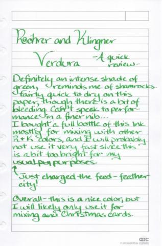
I felt that given the festive nature of today, I should do a quick review of the most outrageous green ink I have (to be fair, I only have two green inks, but even still, this one is pretty outrageous): The paper used was a Staples Arc notebook refill. This paper is not as coated as say, Clairefontaine, but I found that this ink bled through a little bit even in my Rhodia. No feathering there though… Anyway, here is a close-up of just after I pushed a bit more ink into the feed: I think that the problems I had with my pen running dry was a combination of writing too fast for the wide nib and that I was writing on my lap, where I wound up with a funny angle happening as I got further down the page. The pen used, by the way, was my Nemosine Singularity with a Goulet 1.5 mm stub. And here is the back of the page: So, that’s that! I bought this ink with my own money and all the opinions expressed herein are entirely my own. I don’t regret buying this bottle at all - sure it’s not a color I can get a ton of use out of, but it’s a really fun, vibrant hue and R&K ink is pretty cheap ($12/50 mL) and good to use for mixing. Also, if you are going to be celebrating St. Patrick’s Day with a few pints, please do try to make good choices. :-)
-
As promised, here's my review of the Nakaya titanium Piccolo Writer with a broad stub nib. My handwritten review is at the bottom, but I wanted to add some thoughts with each photo, so the text of the handwritten review is not going to completely match the review as posted - sorry about that! Here it is, in all its glory Note the pointed ends. On an urushi or maki-e Piccolo, this is a soft, conical shape. On the titanium Piccolo, it's weapons-grade The machining/lathing marks you see here are continued on the grip; they provide a very pleasant texture! This grip is not slippery at all, which had been one of my concerns with this pen as I have somewhat oily skin. The delightful stub! As I noted in my earlier post, there is some exposed gold where the ruthenium plating was ground off in the process of stubbing this nib. In use, I never notice this. A group shot. From left to right: Sheaffer Legacy I in sterling silver with gold trim, Pilot Art Silvern in sterling silver (from 1976 with earlier clip), Nakaya titanium Piccolo Writer, Parker 61 Flighter in steel. I wanted to show the difference in metals, mainly: the titanium has more of a greyish hue, and because of the lathing marks the finish is somewhat matte; I wish I had a Lamy 2000 in brushed steel to compare. Sizewise, you can see that it is short but stout; I believe the section diameter is roughly the same as an Aurora 88 large or a Montblanc 146. Same group, uncapped. The written review! All measurements and weights from the Classic Fountain Pens website (nibs.com) Some additional thoughts: would I recommend this pen? First, I would have to ask you some questions: 1) Do you like heavy pens?2) Do you like metal pens?3) Do you like Nakaya nibs? If you answered yes, then yes, this is the pen for you Expanding on my written review, this will never be my all-day writer, but for jotting notes in meetings or signing on documents, it's perfect. John Mottishaw knows how to stub a nib - it glides over the paper with the barest hint of feedback - just enough to give me a good amount of control. I hope everyone enjoyed the review! If you have any questions, fire away
-
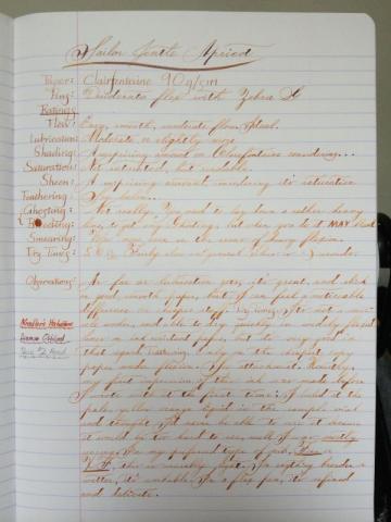
Flow: Easy, smoth, moderate flow. Ideal. Lubrication: Moderate or slightly more. Shading: A surprising amount on Clairefontaine considering how pale it is, but it does shade, absolutely, but only on good paper. No such luck, or rather, harder to get on Staples bagasse and/or cheaper. Saturation: Not saturated, but readable. Sheen: Again, a surprising amount, considering its saturation. Feathering: See below… Ghosting/Bleeding: Not really. You need to lay down a rather heavy line to get any ghosting, but when you do it, it MAY bleed. Smearing: None, even in the areas of heavy flexion. Dry times: About 15 seconds for a moderately wet Japanese XF line. Observations: As far as lubrication goes, it's great and slick on good smooth paper, but I can feel a noticeable difference on cheaper stuff. DRY TIMES: It's not a miracle worker, and able to dry quickly in widely flexed lined on ink resistant paper, but it's very good in that regard. FEATHERING: Only on the cheapest copy paper under flexion (a terrible idea anyway). See Staples bagasse attachment. Honestly, my first impression of this ink was made before I wrote with it the first time; I looked at the pale, yellow orange liquid in the sample vial and thought, I'd never be able to use it because it would be too hard to see, well, I was mostly wrong. In my preferred type of nib fine or XF, this is unusably light. In anything broader or wetter, it's workable. In a flex pen, it's refined and delicate.
- 13 replies
-
- sailor
- jentle apricot
-
(and 6 more)
Tagged with:
-
I saw this the other day I thought I would share it with all my fountain pen friends... http://cfptommiller.blogspot.com/2014/05/the-power-of-handwritten-note.html Here are some tips to remember when sending a handwritten note: Use a plain, non-standard sized white envelope. Using a traditional envelope will make your note look too much like a bill or other junk correspondence. Try to find cards and envelopes that are sized like birthday cards or greeting cards that you would find in a card store.Handwrite the addresses on the envelope. This goes without saying, but typing the address and using a pre-made return label do not convey a personal touch.Put an actual stamp on the envelope for postage. Please do not use a postage machine to stamp the envelope. Go buy a book of stamps and do it right!Write everything in blue ink. Studies have shown that writing in blue ink is preferable.Keep your message short. The point is to make the prospect, client, or center of influence feel special. Keep it short and simple, with little or no mention of business. Express gratitude, appreciation, or encouragement instead of the usual utilitarian purpose behind most correspondence.Make sure your handwriting is legible. Don't rush your writing to the point you appear sloppy and dysfunctional. Give the impression that you took your time to write them a nice note.
- 14 replies
-
- notes
- handwritten
-
(and 1 more)
Tagged with:
-
Do you want to write a heartfelt letter to your loved one, but don't know how to write one? Don't worry, just share some of your fondest memories and moments with us, and our professional writers will craft a sincere, straight from the heart letter for you, all in your own handwriting. BeautifulHandwrittenLetters.com.
- 5 replies
-
- letters
- handwritten
-
(and 4 more)
Tagged with:
-
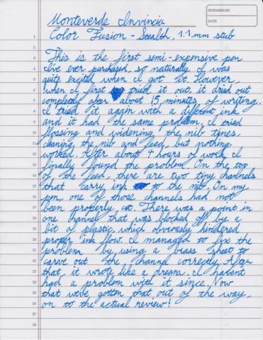
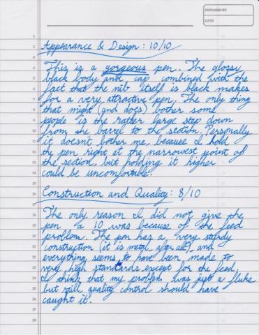
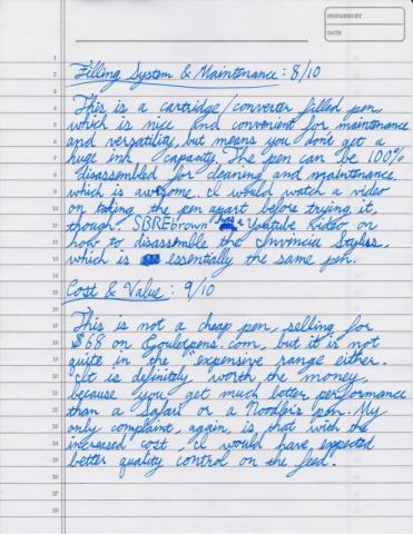
Monteverde Invincia Color Fusion - Handwritten Review
yourNibs posted a topic in Fountain Pen Reviews
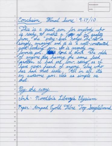
Hey, everybody, here is a review of my new favorite pen: the Monteverde Invinicia Color Fusion - Stealth Black with a 1.1 mm stub nib. I had a problem with the feed that I managed to fix (I explain in more detail in the handwritten part), but I don't think anyone should be afraid of that if you are considering purchasing this pen. It was such a strange problem that I think it was just a factory fluke. Anyways, here you go. Enjoy: Hope this was helpful to someone. youNibs- 2 replies
-
- monteverde
- invincia
-
(and 1 more)
Tagged with:
-
I have just come across this blog by Christina Vanko. http://www.cristinavanko.com/modern-day-snail-mail I wonder if she is a member of FPN.
- 12 replies
-
- handwritten
- forum
-
(and 1 more)
Tagged with:
-
Kinda Casual 're-View' Of Possibly Everyone's Most Hated Pen: Zebra V-301
Sailor Kenshin posted a topic in Fountain Pen Reviews
Well? is the Zebra V-301 the worst pen, ever? I don't know...I kind of liked it when it first came out, and being a fan of inexpensivecoughcoughcheap pens, I was compelled to try it. It wouldn't start until multiple dips. Later I read that this may have had something to do with its odd feed, more like that of a felt pen. I don't have my original purchase any more. But there's been a lof of forum chatter about these lately. So naturally I bought a couple of them again. Well....maybe not the WORST pen, but will not make my Favorites list. http://farm4.staticflickr.com/3725/9714553622_68c8b3d049_z.jpg I think Jetpens or Walgreen's sells them. The pen itself looks like this: Much better pics than I can manage! I don't have a 'ratings' system. Granted my reviews are very subjective. At the price, if you're willing to dip and dip until it starts, this may be worth a try as a Pen You Can Lose, No Regrets. The rest is here. Don't tell anyone, but it's growing on me.- 3 replies
-
- zebra v-301
- handwritten
-
(and 2 more)
Tagged with:
-
I was roaming around at the local book/pen store last week, where I broke down and bought a bottle of inkJ. Herbin Rouge Hematite 1670 Anniversary Edition. This is a red ink that’s got some sort of pigment in it which causes it to shade bronze. It’s original formulation was so full of this beautiful pigment (at least I think it’s pigment?), and that it would clog pens and resulted in a reformulation after being on the market for a year. I love inks that have fun shading properties, and I love this ink. http://nibcrease.files.wordpress.com/2013/07/p1020133.jpg First, the ink comes in this lovely little square bottle, with a wax seal on the front and a wax-seal-looking cap to make it look all old-timey-classy-like. Fortunately the cap is really a twist-off cap so opening the bottle isn’t a one-way street. My one complaint here is that the bottle neck is so narrow and long. Combine this with added obstacle of highly saturated red ink all over the lip, and you get bloody red hand every time you fill a pen up because you’ve got to get your pen through the narrow neck, where the pen barrel, and probably your fingers too, touch the lip and sides of the neck. I wider opening here would have been welcome. http://nibcrease.files.wordpress.com/2013/07/p1020129.jpg I had imagined the red would lean a little more on the blue side, but is more of a magenta/pink sort of red. Very bright, and the metallic shading is more bronze than gold. Other pictures I’ve seen of it made it look more like gold. It did seem that way at first, but the next day, the ink had definitely settled into a darker and warmer bronze look than gold. The writing sample is written on a sheet of Black ‘n’ Red notebook paper, using my Oberthur Sequoia Pen, with a custom ground italic stub nib. Don’t mind the smear over the layering example. That was the result of some wet paper towel drifting over it after I blotted out the drip test. http://nibcrease.files.wordpress.com/2013/07/p1020128.jpg And a close-up look at the sediment that makes that wonderful shading. The bottle comes with a little warning that this ink is highly saturated, and should not be left in a pen for days at a time. I found it did gunk up my Oberthur Sequoia a bit, but I did in fact leave the ink in there for about 5 days, and after a little bit of hard starting, it did seem worse for the wear. Mind you, I DID take the nib, feed, and section apart and wash each piece thoroughly when I was done, and a TON of inky gunk came out. I would not recommend using this ink in a pen you can’t take apart and clean piece-by-piece. http://nibcrease.files.wordpress.com/2013/07/p1020135.jpg In general, I was expecting a lot from this ink. While it did have some surprises for me color-wise. It has exceeded my expectations in terms of characteristics and behavior. It’s not an everyday ink by far, but if you’re looking for an ink for a special-occasion (and have a not so special pen to use for that occasion), I can’t think of very many inks that are as special as this one. Please see more images of this review as well as more reviews at http://nibcrease,wordpress.com!
- 18 replies
-
- j herbin
- rouge hematite
-
(and 2 more)
Tagged with:
-
Hello All, I recently read an article about a man who completed a handwritten copy of the bible, which he was going to ceremoniously present to a local church. Understanding that within the last few hundred years, copying by hand was required if one wished to replicate a written work - are there people that still do this? As I dwelve into the land of FPs, calligraphy and penmanship I've considered copying books as a way to entertain me while I practice my writing. Unfortunately I get bored doing repetitive exercises (yes, I know that exercises are important too....) so I'm looking for something more exciting to fill my time practicing. If people still do this, any tips?
- 8 replies
-
- calligraphy
- penmanship
-
(and 3 more)
Tagged with: