Search the Community
Showing results for tags 'green-black'.
-
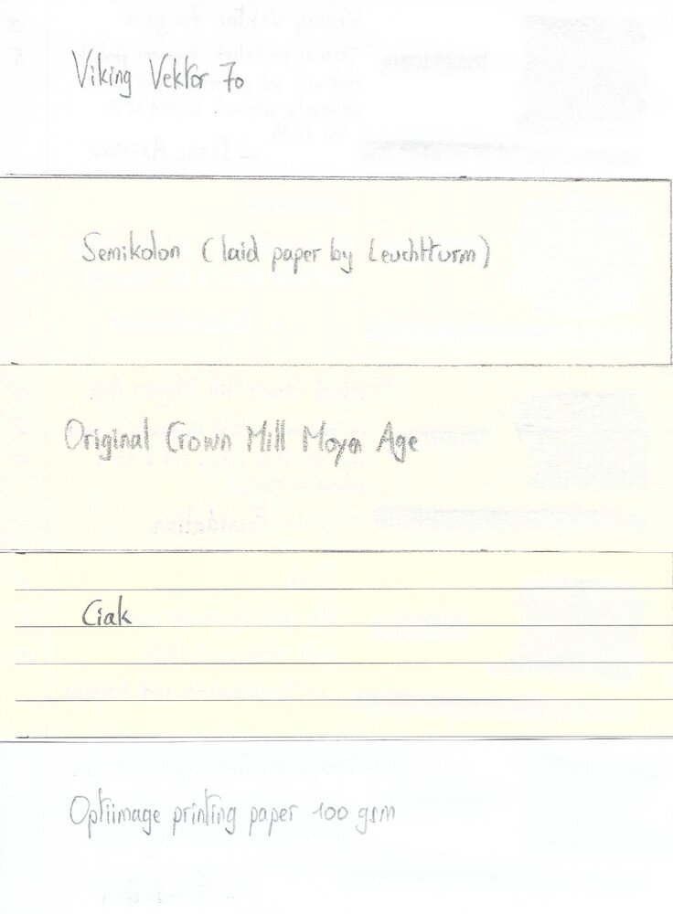
Noodler’s Zhivago Noodler’s was established in 2004, and is probably the smallest ink company in the world. Nathan Tardiff’s mission is to provide us affordable fountain pen inks with a decent colour selection. Most of his Noodler’s inks are bullet proof – meaning fraud proof and waterproof. The focus of this review is on Zhivago, a saturated green-black with a faded look. Zhivago comes in the typical no-nonsense Noodler’s packaging: a simple 3 oz bottle, filled to the brim. The ink is advertised as bullet proof. I personally don’t care about the fraud proof aspects, but appreciate the strong water resistance when using this ink in my EDC pens. As always with this type of ink, pen hygiene is important: regular cleaning of your pen can help avoid nasty surprises. The ink’s colour is a nicely saturated dark green-black. Almost black in fine nibs, but more of a murky green-black when used in broader nibs or dry pens. I personally like the washed-out look of this ink, especially when used in a dry Lamy Safari with a B / 1.1 nib. With this combination, the ink looks gorgeous. Zhivago is perfect for the workplace: a serious looking colour, and almost 100% waterproof. And the green undertone makes it look more interesting than a standard black ink. The ink itself writes a very saturated line with good lubrication in my Lamy Safari test pens. The dark colour and strong saturation make it an outstanding ink for EF/F nibs. Shading is almost absent in finer nibs, but with broader nibs the ink gains some depth, and becomes less one-dimensional. The ink has a fairly limited dynamic range, without much contrast between light and dark areas. To illustrate this, I did a swab where I really saturated portions of the Tomoe River paper with ink, pooling it on. With the right pen/nib combination, you can coax some great-looking soft shading from this ink. I personally love Zhivago’s looks when used in a Lamy Safari with 1.1 calligraphy nib. On the smudge test – rubbing text with a moist Q-tip cotton swab – there is quite some smearing, but the text itself remains crisp and clear. Water resistance is near-perfect. A bit of the green disappears, but all text remains undisturbed on the paper. Even with longer exposures to water (30 seconds under running tap water), the ink remains firmly attached to the paper. A waterproof ink indeed! The chromatography confirms this: the dyes remain firmly attached to the paper in the bottom part. You can also see that the coloured dyes in the mix are most likely to detach from the paper. I’ve tested the ink on a wide variety of paper – from crappy Moleskine to high-end Tomoe River. On each scrap of paper I show you: An ink swab, made with a cotton Q-tip 1-2-3 pass swab, to show increasing saturation An ink scribble made with a Lamy Safari M-nib fountain pen The name of the paper used, written with a Lamy Safari B-nib A small text sample, written with the M-nib The source of the quote, written with a TWSBI Micarta v2 with F-nib Drying times of the ink on the paper (with the M-nib Safari) Zhivago looks equally good on white and more creamy paper. It is a near-perfect writing ink: across my test set of paper types, I noticed no feathering, and very minimal bleed-through or show-through. The Moleskine paper forms the litmus test: no visible feathering, and even on this horrible paper there is only a tiny amount of bleed-through. Excellent technical behaviour! Drying times are around the 10 second range with the Lamy Safari M-nib. This Noodler’s ink not only looks good, it can also handle any paper you use. This includes typical copy paper you find at the office. As such, I can really recommend this ink for use in an EDC pen. I’ve used Zhivago in my Kaweco Liliput with F nib for the past month, and found the ink perfect for use at the office. At the end of the review, I also show the back-side of the different paper types, in the same order. Since scans alone are not always enough to give you a complete picture of the ink, I also provide you with a few photos for an alternative look at Noodler’s Zhivago. In this case, I think the scans capture best the way the ink looks in real life. Writing with different nib sizes The picture below shows the effect of nib sizes on the writing. Zhivago manages to look good in all nib sizes from EF up to the 1.9 calligraphy nibs. The ink writes a very saturated line, and as such works great in even the finest nibs. Shading is not the ink’s forte – you need dry pens with broad nibs to coax some shading from Zhivago. For my EDC pens, I don’t care too much about shading. For work settings, I appreciate Zhivago’s waterproof aspects, and the off-black faded green looks. Related inks To compare Zhivago with related inks, I use my nine-grid format with the currently reviewed ink at the center. This format shows the name of related inks, a saturation sample, a 1-2-3 swab and a water resistance test – all in a very compact format. I have a number of green-blacks in my collection, and they all look different. Zhivago is the only one though that shows true water resistance. Inkxperiment – Ghostwalker With every review I try to do a single-ink drawing that shows what the ink is capable of in a more artistic setting. The most fun part of every ink review: I really enjoy brainstorming the drawing’s setting, and the experimentation with different techniques. I’m constantly amazed at the broad range of hues/tones that one can coax from a single ink. Almost unbelievable. For this inkxperiment I used an A4-sized piece of HP photo paper. I taped out the tree trunks, and sponged in the background using a dish-washing sponge and heavily water-diluted Zhivago. For the sun, I used more concentrated ink applied in a circular pattern. Once dry, I removed the tape, and painted in the tree trunks with a piece of cardboard and pure Zhivago. I finally used a brush with pure Zhivago to add the figure of the ghostwalker. I was fairly surprised by the amount of green buried within the almost black looking Zhivago. Hadn’t expected this! Conclusion Noodler’s Zhivago is the perfect office ink: well saturated, can handle crappy paper with ease, is totally waterproof. And it looks great too! I like the washed out faded green undertones that are present in what appears to be a black ink at first glance. Highly recommended for use in an EDC pen. Technical test results on Rhodia N° 16 notepad paper, written with Lamy Safari, M-nib Backside of writing samples on different paper types
- 28 replies
-
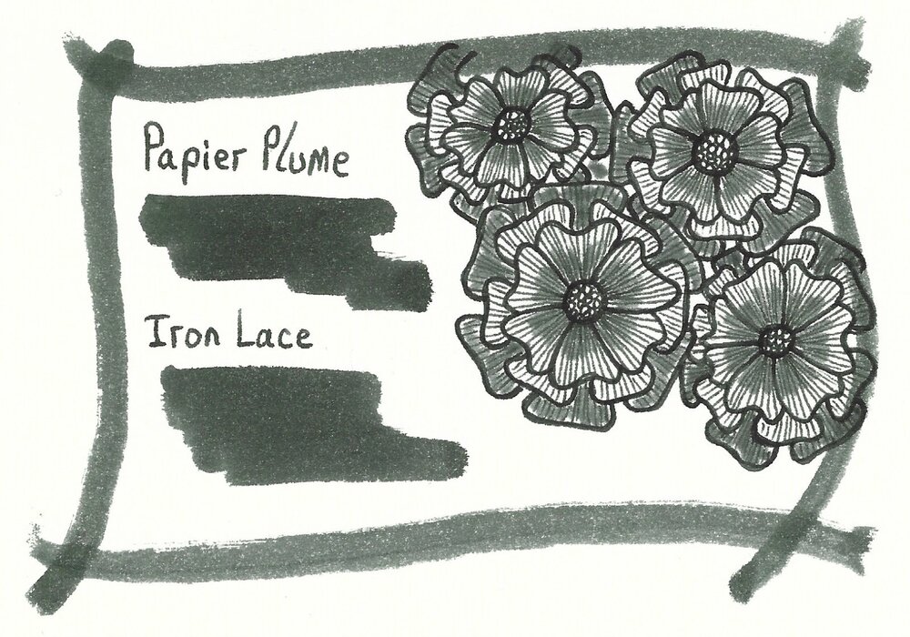
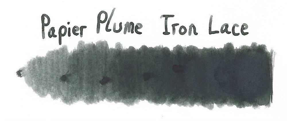
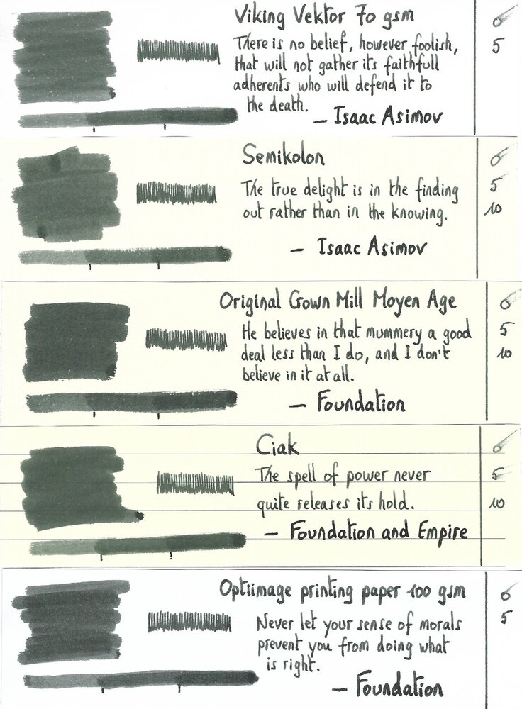
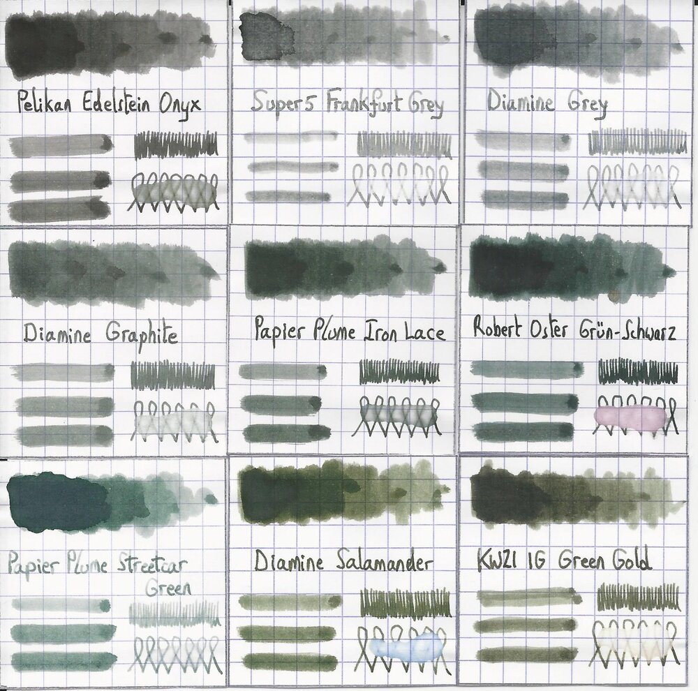
Papier Plume – Iron Lace (New Orleans Collection) Papier Plume is a stationary shop in New Orleans, that’s best known on this forum for their “New Orleans Inks”, that celebrate the rich colours and history of the city. One of their inks in this series is Iron Lace, a black ink with a strong green undertone. This ink from the New Orleans Collection is inspired by the iron lace galleries and balconies in the French Quarter. These intricate designs from wrought or cast iron can shift from black to green depending on the oxidation level of the iron. The Iron Lace ink captures this aspect just right: it’s a black ink at heart, but with a strong green component, that surfaces mostly in swatches. On the bottle it says “A Not-So Basic Black”, and they are totally right. This is not a dull and boring black, but one with layers of complexity that makes it a very interesting ink to write & draw with. The ink itself writes fairly wet with good lubrication in my Lamy Safari test pens. Quite a contrast with some of the other New Orleans inks. Saturation is excellent, even with EF nibs. The ink has a small dynamic range, without much contrast between light and dark areas. To illustrate this, I did a swab where I really saturated portions of the Tomoe River paper with ink, pooling it on. The limited contrast range translates to soft & elegant shading that looks aesthetically pleasing. Shading is just visible with the EF nib, and becomes more prominent with M-nibs and above. But it’s always subdued, giving just that extra touch of elegance to your writing. On the smudge test – rubbing text with a moist Q-tip cotton swab – there is quite some smearing, but the text itself remains crisp and clear. Water resistance is surprisingly good, both with my still water test (letting drops of water sit on the page for 15 minutes) and with a running water test. The ink easily survives watery accidents, making it an excellent ink for use at the office. The chromatography confirms this: the dyes remain firmly attached to the paper in the bottom part. I’ve tested the ink on a wide variety of paper – from crappy Moleskine to high-end Tomoe River. On each scrap of paper I show you: An ink swab, made with a cotton Q-tip 1-2-3 pass swab, to show increasing saturation An ink scribble made with a Lamy Safari M-nib fountain pen The name of the paper used, written with a Lamy Safari B-nib A small text sample, written with the M-nib The source of the quote, written with a Pelikan M101N with M-nib Drying times of the ink on the paper (with the M-nib) Iron Lace has a slight tendency to feather on the lower quality papers in my test set, most obvious when using a wet pen (see e.g. the source of the quote on the HP and Optiimage printing paper). I noticed no issues with better quality paper or when using finer nibs (M-nib or below) on paper of lesser quality. The ink writes smoothly with good lubrication, and provides excellent contrast with the page. Writing looks good on both white and more yellow paper. Drying times are fairly low – in the 5 second range with my Lamy Safari M-nib. All in all a fine ink for use in an EDC pen. At the end of the review, I also show the back-side of the different paper types, in the same order. A small amount of bleed-through is present on some of the lower-quality papers (Moleskine, generic notepad paper), but nothing too bad. Since scans alone are not always enough to give you a complete picture of the ink, I also provide you with a few photos for an alternative look at Iron Lace. Writing with different nib sizes The picture below shows the effect of nib sizes on the writing. Papier Plume Iron Lace manages to look good in all nib sizes from EF up to the 1.9mm calligraphy nib. With the very fine nibs shading is just visible, but starting at F/M and above the soft and eye-pleasing shading adds extra character to your writing without being overdone. I personally prefer Iron Lace in drier pens, where it writes a bit less saturated, and where the ink’s subdued shading is much more prominently visible. With wet pens, the more heavy saturation tends to overwhelm the ink’s shading, making your writing look more flat (my opinion). Related inks To compare Iron Lace with related inks, I use my nine-grid format with the currently reviewed ink at the center. This format shows the name of related inks, a saturation sample, a 1-2-3 swab and a water resistance test – all in a very compact format. I added Pelikan Onyx – which is a pure black – as a reference point. This clearly shows the green undertones that are present in Iron Lace. Diamine Graphite comes close in colour, but is lighter in nature (dark grey instead of black). Inkxperiment – Eye in the Sky With every review I try to do a single-ink drawing that shows what the ink is capable of in a more artistic setting. The most fun part of the ink review, and I quite enjoy brainstorming and then implementing these little pieces. Inspiration comes from the Alan Parsons song “Eye in the Sky”, with the lyrics: “I am the eye in the sky … Looking at you … I can read your mind”. I used these elements as the theme for the drawing. For this inkxperiment I used a piece of 300 gsm rough watercolour paper. I started by drawing in the outer eye surrounded by a geometric pattern. I then added the inner eye looking over the cityscape. Everything was drawn with Q-tips using different water/ink ratios. I finally added the details to the eye and the houses using a Lamy Safari pen filled with Iron Lace. In this more artistic setting, Iron Lace beautifully shows its green undertones. Conclusion Iron Lace from Papier Plume is a very well executed addition to their New Orleans line. A beautifully complex black with green undertones, that deviates enough from true black to make the ink quite interesting. Technically the ink is near perfect: good flow, well saturated, subtle shading, looks good in all nib sizes and on all paper types. I personally prefer the ink in drier pens, where the shading is more present. If you like off-black inks, this one is definitely worth your attention. Technical test results on Rhodia N° 16 notepad paper, written with Lamy Safari, M-nib Backside of writing samples on different paper types
- 20 replies
-
- papier plume
- new orleans collection
-
(and 3 more)
Tagged with:
-
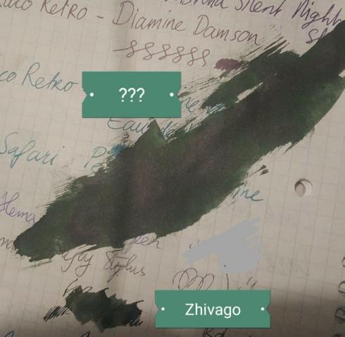
Hello! I've bought some second-hand fountain pens, which arrived the day before ysterday. Most still had some ink in them, a few dried, so I've let them soak for two days. This particular ink was in a still functioning as is pen and kind of struck me: I thought it was Noodler's zhivago at first (little blob below it) but it's a more intense green. It really looks almost black in the darker parts. The previous owner thought it might have been Robert Oyster green black, but wasn't sure since she had over 800 colors.. 😂 Any guesses whether that may be the color? Or any other guesses? I really like it.. 😂 Any help is appreciated!
- 8 replies
-
- green-black
- green ink
-
(and 1 more)
Tagged with:
-
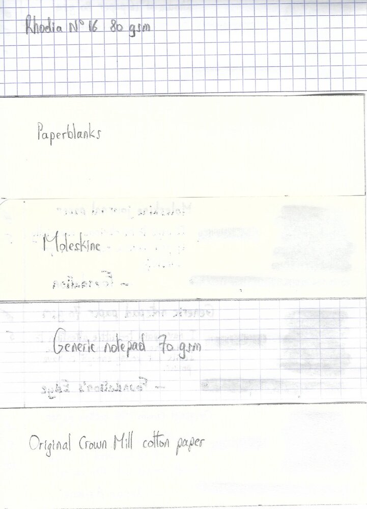
Robert Oster Signature - Grün-Schwarz Robert Oster is an Australian ink maker that is well-known for his unique range of colours. On his website he describes our shared love quite eloquently: “Robert Oster Signature originates from one of the most famous wine producing regions of the world, the Coonawarra district of South Australia, an idyllic setting wit great influence on the senses. There is my inspiration. It’s a joy to share it with you.” Well, we are certainly fortunate to have inspiring ink makers like Robert to satiate our thirst for glorious inks. In this review I take a closer look at Grün-Schwarz – my very first Robert Oster ink. And boy, am I impressed ! This is without question a very very interesting colour – green-black, a rather unusual combination. In swabs the green in the ink is very obvious, in writing the ink leans more towards the dark side (and I mean that in a good way, not in the sense of Darth Vader). The ink feels very “old vintage” to me. A colour that reminds me of ages past – when gentlemen were still wearing pocket watches, cars were little miracles on wheels, and television showed silent movies in black&white. This is a great colour that is sure to give that little extra oomph to your writing. The ink is equeally at home with personal journaling as within a business setting. The ink is also nicely saturated, and writes very well in all nib sizes. Shading is present but subdued – just as I like it. On the smudge test – rubbing text with a moist Q-tip cotton swab – Grün-Schwarz behaved acceptably. There is obvious smearing, but the text remains very legible. Water resistance is totally non-existent though – even short exposures to water completely obliterate your writing. On the droplet test, all that remained where some reddish blobs. In case you’re wondering – this green-black ink has a very complex composition with some reddish dyes included in the mix. As the chromatography shows, Robert Oster really is an ink magician – from the chroma, you would never guess that it derives from a green-black ink. I’ve tested the ink on a wide variety of paper types – from crappy Moleskine to high-end Tomoe River. On every small band of paper I show you: An ink swab, made with a cotton Q-tip1-2-3 pass swab, to show increasing saturationAn ink scribble made with an M-nib fountain penThe name of the paper used, written with a B-nibA small text sample, written with an M-nibDrying times of the ink on the paper (with the M-nib)Grün-Schwarz behaved perfectly on most paper types, with only a hint of feathering on the Moleskine paper and the Faber-Castell paper (which both showed significant show-through and a bit of bleed-through). Drying times are mostly around the 10 second mark. The ink looks beautiful both on the white and the more yellowish paper. The ink’s appearance differs widely across the paper types – from dirty green to almost black. In my opinion, it looks really nice on Tomoe River (very green) and on Original Crown Mill cotton paper (almost black). I also show the back-side of the different paper types, in the same order. Conclusion Robert Oster Grün-Schwarz has a very unusual colour with a strong vintage feel to it. It’s a nice wet and saturated ink, with good contrast on all types of paper. I immediately fell in love with the colour of this ink – a pity though about the total lack of water resistance. Nevertheless, I enjoyed the ink immensely, and will definitely try more of Robert’s creations. Technical test results on Rhodia N° 16 notepad paper, written with Lamy Safari, M-nib
- 8 replies
-
- robert oster
- green-black
-
(and 2 more)
Tagged with:
-
Here's a good dark green. I've been looking for something that was an actual dark *green*, and not just a muddy colored brownish, yellowish colored one. Not that there's not a place for a more earthy color, but I was really looking for a dark true green. This is a good one. The color is so dark, it could with the right wet fine nib be mistaken for black with a bit of character. The green equivalent to blue-black. This one dries quickly and has a Diamine wet flow.
- 11 replies
-
- diamine
- green-black
-
(and 1 more)
Tagged with: