Search the Community
Showing results for tags 'green gold'.
-
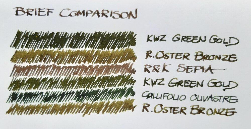
Just a brief note on a recent comparison: a bottle of Robert Oster Signature Bronze had been lingering in my ink drawer until I decided to use it a new acquisition by Atelier Veleray (more on that in the near future). It turned out greener than I'd expected, similar to KWZ Green Gold but slightly lighter. The attached image is an unprocessed photograph hastily taken with a smartphone. Still, it comes close to what I see on paper, especially in the lower part, where Bronze and Green Gold are separated by Callifolio Olivastre. In the upper part, where the two inks are next to each other, Green Gold appears a bit too dark. The other two inks included as a kind of control in the comparison are Callifolio Olivastre (in a Diamond Point with a flexible broad nib) and Rohrer & Klingner Sepia (in a Delta Tech & Web with a stub nib). KWZ Green Gold came from a Montblanc 149 with a medium nib and the Atelier Veleray pen sported a broad nib I had from a Visconti Rembrandt. Bottom line: nice colour and a well-behaved ink. As my interest in shading increases, Bronze may replace the darker KWZ Green Gold among my favourites.
- 11 replies
-
- robert oster
- kwz
-
(and 6 more)
Tagged with:
-
desaturated.thumb.gif.5cb70ef1e977aa313d11eea3616aba7d.gif)
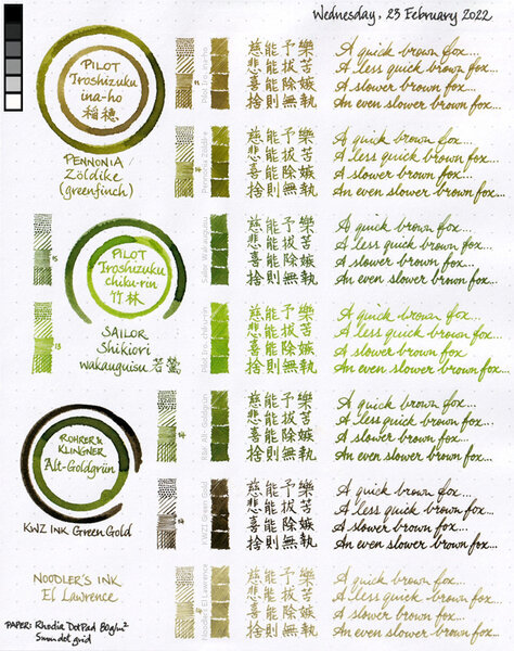
Seven inks colour comparison sheet 2022-02-23
A Smug Dill posted a gallery image in FPN Image Albums
From the album: Shades of colour
My scanner seems to be noticeably deficient in picking up green, with or without the reference greyscale and/or colour patches being scanned alongside a sheet of writing; my eyes certainly see more green on the physical artefact. As a result, Noodler's El Lawrence and KWZ Ink Green Gold both appear in the scanned image as without any greenness, even though there should be some hints of very muted green in both.© A Smug Dill
- 0 B
- x
-
desaturated.thumb.gif.5cb70ef1e977aa313d11eea3616aba7d.gif)
Seven inks colour comparison 2022-02-23 (rearranged)
A Smug Dill posted a gallery image in FPN Image Albums
From the album: Shades of colour
My scanner seems to be noticeably deficient in picking up green, with or without the reference greyscale and/or colour patches being scanned alongside a sheet of writing; my eyes certainly see more green on the physical artefact. As a result, Noodler's El Lawrence and KWZ Ink Green Gold both appear in the scanned image as without any greenness, even though there should be some hints of very muted green in both. The rearranged fragments that appear in this image were taken from this: https://www.fountainpennetwork.com/forum/gallery/image/9891-seven-inks-colour-comparison-sheet-2022-02-23/© A Smug Dill
- 0 B
- x
-
I am really enjoying using KWZ inks (other than the vanilla scent), and I've been looking into finding my perfect olive green ink. One of my requirements is good water resistance -- it does not need to be 100%, but the writing has to withstand being touched with damp hands or a small spill and still remain easily legible. I hoped KWZ I.G. Green Gold was going to be it, but when my bottle arrived, I've found that it's really more like a somewhat olive-leaning dark green. Not a green-gold as one might imagine (or olive). In a moment of inspiration, I decided to see what will happen if I mix I.G. Green Gold with KWZ Honey. Honey is a translucent and "layerable" honey-caramel color that can shade to off black if piled on. I.G. Green Gold is a very saturated low transparency ink. Both have silver sheen outline, but I.G. Green Gold just barely a hint of it, whereas Honey sheens silver around the letters very easily on good paper. Here are my results. No precipitate or odd behavior found so far. I very much like the first mixture and will be using it from now on in an empty Iroshizuku bottle. KWZ "Olive #1" : KWZ I.G. Green Gold 3/4 : KWZ Honey 1/4 KWZ "Olive #2" : KWZ I.G. Green Gold 2/3 : KWZ Honey 1/3 Both together:
-


.jpg.4ac20772527725bffaacdec6fce395c4.jpg)
