Search the Community
Showing results for tags 'green'.
-
TAG Kyoto – kyo-no-oto – moegiiro TAG is a stationary shop in Kyoto (Japan) that produces some interesting soft watercolour-style inks. With the kyo-no-oto series they produce a line of inks that replicates traditional Japanese dye colours. According to available only info, the manufacturing process of the kyo-no-oto inks follows traditional dying techniques dating back to the Heian era between the years 794 and 1185. The inks come in 40 ml bottles, packaged in luxurious thick paper with a texture that feels like heavy watercolour paper. In this review I take a closer look at moegiiro. This is a great-looking yellow-green ink, beautiful colour and shading, well-saturated in all nib sizes and on top of that... a happy colour that makes you almost smell the fresh sprouting leaves on spring trees. I guess you can already feel that I'm smitten with this ink ;-) Inspiration for this ink's colour comes from fresh green sprouts in early spring: the Japanese word moegiiro derives from the words "moe" (to sprout) and "negi" (onion). During the Heian era, this fresh yellow-green colour was particularly fashionable as the colour of youngsters. In the tales of Heike, the famous kyudo (Japanese archery) master Nasuno Yoichi wears armour painted in the moegiiro colour as a symbol for the young warrior. The ink writes with good lubrication in my Safari test pens, not at all dry like some other kyo-no-oto inks. The colour is simply wonderful ... I personally like yellow-greens a lot: fresh looking, spring feeling, happy, feel-good. This moegiiro ticks all my boxes, and I immediately took a liking to it. A prime candidate for my 2020 top 3 of inks. I've tried a number of TAG Kyoto inks to date, and love them all. These inks totally fit my tastes. I'm so glad I tried them. The ink feels at home with a broad spectrum of pens, nibs and paper. It writes with good lubrication, even with dry pens like my Safari. The line it produces is nicely saturated, even with fine nibs. Shading is great, without too much contrast between the light and darker parts - just as I like it. And this elegant shading is even present in finer nibs! To show you the impact of saturation on the ink's look & feel on paper, I made some scribbles where I really saturated portions of the Tomoe River paper with ink. This gives you a good idea of what the ink is capable of in terms of colour range. As you can see, moegiiro has a medium colour range. The ink moves from a light yellow-green to a much darker light-green, without a sharp contrast between these extremes. In writing, this translates to subtle shading which is aesthetically very pleasing. The ink's chromatography shows a wonderful complexity with light-blue, yellow and the resulting light-green in the mix. The light-blue dyes fix more readily to the paper, while the yellow dyes are much less water-resistant. The bottom part of the chromatography seems to indicate a small measure of water-resistance. In practice, a very faint light-blue ghost of your writing remains when the ink comes into contact with water. It can still be read when you put some effort to it, but this is definitely not a water-resistant ink. I have tested the ink on a wide variety of paper - from crappy Moleskine to high-end Tomoe River. On every small band of paper I show you: An ink swab, made with a cotton Q-tip 1-2-3 pass swab, to show increasing saturation An ink scribble made with an M-nib Lamy Safari The name of the paper used, written with a B-nib Lamy Safari A small text sample, written with the M-nib Safari Source of the quote, with a Pelikan M120 with F nib Drying times of the ink on the paper (with the M-nib Safari) Moegiiro looks great on all my test papers, with no visible feathering. With the lower-quality papers there is some bleed-through present. Drying times were mostly just above the 5 second mark with the Lamy Safari M-nib. The ink looks great on both white and more yellow paper, and behaves well across all my test papers. Writing with different nib sizes The picture below shows the effect of nib sizes on the writing. Kyo-no-oto moegiiro can handle all nib sizes without a problem. With the EF nib, you still get a nicely saturated line with even a touch of just-visible shading. Shading is elegantly present starting with the F-nib, and looks beautiful in broader nibs. Because of moegiiro's medium colour span, shading is never harsh and looks very eye-pleasing. Related inks To compare the yellow-green moegiiro with related inks, I use my nine-grid format with the currently reviewed ink at the center. This format shows the name of related inks, a saturation sample, a 1-2-3 swab and a water resistance test - all in a very compact format. This kyo-no-oto ink is different from my other light greens, although Diamine Kelly Green and Meadow come close (the Diamine inks have a touch more yellow in them than this TAG Kyoto ink). Inkxperiment - the Ellcrys With every review, I try to create an inkxperiment using only the ink I'm working on. Such a one-ink drawing is a great way to show off the colour-range nuances that are present in the ink. These inkxperiments are the favourite part of my reviews: always great fun and a good way to stretch my creativity and drawing skills. The yellow-green freshness of moegiiro is reflected by the springtime leaves on the trees outside my window. This inspired me to use a tree as the subject of this inkxperiment. I love the Shannara fantasy novels of Terry Brooks. In the "Elfstones of Shanarra" the Elven princess Amberle Elessedil melts with the Elcryss - the magic sapient tree that protects the border with the Forbidding where the demons reside. I started with a quick outline sketch of the drawing I wanted to make. I then used a piece of 300 gsm rough watercolour paper, on which I drew a background with Q-tips using water-diluted ink in a number of different ratios. Next I drew in the Ellcrys tree with my Safari M-nib fountain pen. The three circles represent the three incarnations of the Ellcrys. The first Ellcrys was born of Aleia Omarosian, the second Ellcrys arose with Amberle Elessedil, and the third incarnation appears in the NexFlix Shannara Chronicles when Arlingfant Elessedil merges with it. The foliage of the tree was stamped in with a piece of dishwashing sponge and different water/ink ratios. Final highlights were added with a brush and pure moegiiro. The resulting picture shows quite well the colour-range nuances that can be achieved with kyo-no-oto moegiiro as a drawing ink. Conclusion TAG kyo-no-oto moegiiro is an awesome yellow-green! A fresh happy colour that is a pleasure to write and draw with. This ink works great with any combination of pen/nib/paper: lovely fresh colour, great shading, good saturation. I really enjoyed using it. If you like yellow-greens, you owe it yourself to get a bottle of this! Technical test results on Rhodia N° 16 notepad paper, written with Lamy Safari, M-nib Back-side of writing samples on different paper types
- 8 replies
-
- tag kyoto
- kyo-no-oto
-
(and 3 more)
Tagged with:
-
@Penguincollector started a Blue Pen Club thread. It was so cool to see all the blue pens. We decided that more colors of pens should get a Pen Club. Up next is green pens because it is now Spring in the Northern Hemisphere, though it might not feel like it. Green is showing up more in nature. Enter the Green Pen Club.
-
Private Reserve Spearmint This is my first review of anything and I am excited to do more!
- 15 replies
-
- newbie
- private reserve
-
(and 5 more)
Tagged with:
-
Ferris Wheel Press Emerald Gardens Ferris Wheel Press is a design and stationery company based in Markham, Ontario, Canada. They have been making fine stationery products for over 10 years now, constantly seeking innovation and refinement. I never tried their inks, and only knew them from their iconic round bottles. So, I decided to add a small bottle to a recent order, and went for this green Emerald Gardens. This is an ink from their 2024 FerriTales collection – an interpretation of the story of the Beauty and the Beast. The box pictures the princess’s rose garden, a reference to Emerald Gardens’ green colour with its green & gold shimmer. Emerald Gardens is at heart a beautifully executed leaf-green that looks fresh and young, like newly born leaves on a tree in early spring. I absolutely love the colour and the way it breathes life and growth and joy. Emerald Gardens makes a great first impression! That green colour not only looks fantastic, but it’s also nicely saturated and shows some impressive shading (strong but not too harsh). The ink works well with both white and cream-coloured paper and can even cope with the lower quality papers in my test set. This is an ink that has all its bases covered. I’m totally not into shimmer, but in this case, I must admit that the shimmer combines nicely with the ink. The choice of green & gold particles works well … it’s not an obtrusive shimmer, and it adds a dimension of vibrancy to the base ink colour. For this review I didn’t shake the bottle and used shimmer-less ink in my pens (I still only trust the full-shimmer experience with my dip pens). Emerald Gardens has a fairly small colour range, with not too much contrast between light and dark parts. The lighter parts still have good contrast & saturation, meaning that the ink will work well with dry pens and fine nibs. This is an ink that cooperates nicely with any pen. Also the small saturation span translates to softer shading. With Emerald Gardens, the shading is very much there, but remains well balanced and never looks harsh. Top marks for this ink! On the smudge test – rubbing text with a moist Q-tip cotton swab – there is a fair amount of smearing, but the text itself remains perfectly readable. The bottom part of the chromatography suggests that the ink can survive fluid attacks, but sadly that is not the case. Water resistance is all but non-existent: all that lovely green disappears; only a faint grey ghost of your writing remains that can be deciphered if you have a degree in cryptography. Not an ink to use if water resistance is on your list of requirements. I’ve tested the ink on a wide variety of paper – from crappy Moleskine to high-end Tomoe River. On each scrap of paper I show you: An ink swab, made with a cotton Q-tip 1-2-3 pass swab, to show increasing saturation An ink scribble made with a Lamy Safari M-nib fountain pen The name of the paper used, written with a Lamy Safari B-nib A small text sample, written with the M-nib Safari The source of the quote, written with a Lamy Dialog 3 with M-nib Drying times of the ink on the paper (with the M-nib Safari) Ferris Wheel Press Emerald Gardens handles all papers well, even the crappy ones. With low quality paper there is just the tiniest amount of feathering (if you look really hard). Even Moleskine paper is handled very well, with only a touch of bleed-through. This ink looks lovely on both white and cream paper, which is quite a feat. Drying times are surprisingly short at about the 10-15 second mark, even on Japanese paper. As a writing ink, this Emerald Gardens gets top marks. Scans and photos can show different aspects of an ink, which is why I usually present them both. Below you’ll find a photo of writing samples on a selection of the papers used. Below you’ll find some zoomed-in parts of writing samples. It shows e.g. the really good quality of this ink on Moleskine paper. You can also see that the shading is quite heavy, but due to the soft contrast between light and dark parts the shading remains aesthetically pleasing. It definitely brings the best out of your fountain pen. Again, this is really well executed. I’m usually not a fan of heavy shaders, but Emerald Gardens shows that heavy shading can look fabulous if the contrast is just right. Writing with different nib sizes The picture below shows the effect of nib sizes on the writing. Emerald Gardens looks good in all nib sizes. With the EF nib, contrast and saturation are impressive and the writing is crisp and clear. You even get some of that lovely shading. With wet pens, the ink gets more saturated, but retains that fresh and vibrant youthful look. This is an ink that can handle any pen/nib combination with ease. Related inks To compare “Emerald Gardens” with related inks, I use my nine-grid format with the currently reviewed ink at the center. This format shows the name of related inks, a saturation sample, a 1-2-3 swab and a water resistance test – all in a very compact format. Diamine Emerald comes close in colour but is more subdued. The Ferris Wheel Press ink has a bit more vibrancy, and looks more lively to me. Inkxperiment – Soulmates With every review I try to do a single-ink drawing that shows what the ink is capable of in a more artistic setting. The most fun part of the ink review, and I quite enjoy brainstorming and then implementing these little pieces. This is the second drawing in a new series – “Counting … one TWO three”. So this is number two – a simple scene with two trees and two persons. In this case, a chance encounter in the park where two strangers meet – the start of a long friendship. Life is good! For this inkxperiment I started with a piece of A4 HP photo paper. I covered the sun, and used some cotton make-up swabs to paint in the sky. I then used a dip pen and painted in the main parts of the trees using pure ink. For the finer branches, I simply used my fountain pen. I finally added the boy and girl walking in the park. The small dog is just a little extra: in my mind, the boy is walking his dog, and encounters the girl. “Such a cute doggie” … the conversation gets started, and the friendship begins. I enjoyed using “Emerald Gardens” for drawing, and this inkxperiment shows well what can be achieved with this ink in a more artistic context. Inkxpired – computational art I love experimenting with pen/ink/paper, and have added another layer as part of the hobby. I’m exploring computational art, inspired by the ink drawings I do during ink reviews. Another fun offshoot of the hobby… and all that starting with a few drops of dye-coloured water on paper. For this computational derivation, I kept it really simple. All I did was applying an urban art filter to the original drawing (the same one as in the previous picture in this series). I like the colour scheme of this one as well. Conclusion Ferris Wheel Press Emerald Gardens is a great green. Good looks: vibrant & youthful, a joy to write with. On a technical level the ink is near perfect: it can handle any combination of pen, nib and paper. A well-crafted ink! This is my first encounter with the brand – if all their inks are as good as this one, I’m sure that I will explore more of them. This Emerald Gardens gets top marks from me. It’s hard to go wrong with it. Technical test results on Rhodia N° 16 notepad paper, written with Lamy Safari, M-nib Backside of writing samples on different paper types
- 12 replies
-
- ferris wheel press
- emerald gardens
-
(and 1 more)
Tagged with:
-
Hi everyone, Is anyone else getting more practical with their ink choices? Although I have dozens of ink options, brands, and colors I find myself wanting to ink more with blues, blacks, greens and useable colors over the more whimsical colors like pinks, purples, reds, yellows or oranges. Don't get me wrong, I still love and use a sheen or shade (no shimmers). I just find myself wanting more suitable ink colors for day-to-day usage. Is it just me? My favorite inks to fill pens with recently are Organic Studios Nitrogen, Noodler's Heart of Darkness, Monblanc Irish Green, Diamine Salamander and Diamine Majestic Blue. I also have a Lamy Studio with a fine 14k nib filled with Baystate Blue that I use regularly. I have other pens filled with reds, browns and the purple/pinks, however, they rarely get used and I find aren't practical for everyday writing. I also happen to like Diamine Wagner that my Bordeaux LeGrand is inked with. It's a yellow-ish light/medium green (think olive) and I'd love to find more times to use it. Am I going nuts to want to resort to more basic colored inks? Like I mentioned above, I still use inks with sheen and I really like to see shading. Yet, when it come to colors and situations, the blues, blacks and greens are what I'm reaching for over the (to me) much less useful colors. Don't get me wrong, I love me some Claret and Apache Sunset. Who doesn't like a bit of Imperial Purple or a ribbon of Honey Blast? I just can't find a daily use for them. Sure, I can use them when I do some of my transcribing. But I don't feel the color when I'm doing so. A color switch would be more of a function of a change for the sake of the change. How do I make a color fit what I'm doing? Even if it's just the few times I write for pleasure. What do you think? Where are you at? Has anyone else here moved to more practical ink colors? Happy Holidays
-
Wearingeul – The Adventures of Tom Sawyer I’m sure I have more than enough inks already, but sometimes an opportunity rises to explore a new brand that wasn’t on my radar before. A couple of weeks ago Scrittura Elegante – a stationery shop from the Netherlands – announced that they would stop their business. Definitely a sad thing: this lovely little webshop carried some interesting and lesser-known brands, with Wearingeul being one of them. They started a sale to empty the warehouse, and I took this opportunity to place a final order, loading up on a couple of Wearingeul inks. Wearingeul is a stationery brand from South Korea, that gets its inspiration from arts & literature. In their own words: “We re-interpret novels and poetry with colors. You can find characteristic inks with stories and also notes/papers which are suitable for ink users.” For my very first experience with the Wearingeul brand, I decided to go with a green ink – “The Adventures of Tom Sawyer” (Mark Twain). And boy, was I pleasantly surprised! This ink’s colour is right up my alley... a muted, toned-down, pale grey-green that looks stunningly beautiful. It’s soft on the eyes, looks really delicate and shows lots of depth and complexity. Also an ink with a few quirks, that you need to get familiar with, and one that demands the right pen/nib/paper combination. For my part, I’m completely enamoured of this pale green beauty. It’s my loveliest discovery of the year! The Adventures of Tom Sawyer writes very light but is still quite readable. For me, the end-result works, with a soft & delicate look on the page. A really nice ink for personal journaling. The ink writes with fairly low lubrication in dry pens (like the Safari), and is therefore best paired with wet writers. I also enjoy it most with fine-nibbed pens: these tend to concentrate the ink on a smaller surface, making it look just a bit more saturated. You get less shading, but that’s a plus for this ink because its shading tends to be a bit too extreme and needs some taming. For this review, I had to resort exclusively to photos: my scanner greatly exaggerated the contrast between light & darker parts, and the results were definitely not what the eye sees. To illustrate the colour span of this Wearingeul ink, I did a swab on 52 gsm Tomoe River paper, where I really saturated portions of the paper with ink. The Adventures of Tom Sawyer shows a very wide saturation range, from a wispy pale grey-green up to a saturated grey-green with blue undertones. Due to this wide contrast range, the ink is a strong shader. Not really suited for dry-writing pens that lean towards the left side of the range – shading can become too extreme, with the light strokes showing insufficient contrast to their darker counterparts. For me, the ink looks best with fine-nibbed wet pens, that explore the right side of the saturation range. With these, the ink looks superb and shows great aesthetics. On the smudge test – rubbing text with a moist Q-tip cotton swab – the ink behaved perfectly. There is no visible smearing at all. Water reisistance is also remarkably good. A lot of the colour dissipates, but a light blue line remains that is still perfectly legible. Well done! That is much better than most non-waterproof inks. This is also evident from the bottom part of the chromatography. The chroma also clearly shows the complex mix of dyes that constitute this ink. Fascinating! I’ve tested the ink on a wide variety of paper – from crappy Moleskine to high-end Tomoe River. On each scrap of paper I show you: An ink swab, made with a cotton Q-tip 1-2-3 pass swab, to show increasing saturation An ink scribble made with a Lamy Safari M-nib fountain pen The name of the paper used, written with a Lamy Safari B-nib A small text sample, written with an Esterbrook Estie with Journaler nib Source of the quote, written with an Edison Collier with 1.1 nib Drying times of the ink on the paper (with the M-nib Safari) This Tom Sawyer ink writes fairly scratchy in my Safari pens with subpar lubrication. It really needs wet writers. Furthermore, I prefer the ink’s looks when paired with fine-nibbed pens – they tone down the otherwise a bit too heavy shading. This Wearingeul ink can handle all types of paper. It even writes well on Moleskine: no visible feathering, and just a touch of bleed-through. From my writing tests, I also discovered that the ink works best on rougher-surface paper. You get a thinner & sharper line! With very smooth coated paper, the ink spreads out a bit on the surface, resulting in a broader line with less defined edges, and it just doesn’t look at its best. Like I hinted at before: a quirky ink that you need to get acquainted with. I used photos for the writing samples above to get the most accurate results. In scans, the contrast gets blown up, and looks totally unrealistic – see the scan below. My scanner really messed this one up! Writing with different nib sizes The photo below shows the effect of nib sizes on the writing (written on Rhodia N°16 80 gsm paper). The initial lines were written with Lamy Safaris. The EF and F concentrated the ink, and worked remarkably well (although lubrication is quite horrible). But M and above with the dry-writing Safari result in too harsh a contrast, and mess up the inherent beauty of the ink. I therefore added a couple of wetter-writing visiting pens. This Tom Sawyer ink is definitely a tricky one – you need to hunt for the right pen/nib combination. The ink looks great in the Estie with journaler nib (basically an M-based stub), and the Collier with 1.1 nib. Searching for this goldilocks combination is definitely worth the effort though: you are rewarded with a great-looking result – pale grey-green, pastel-toned, soft and delicate. Related inks To compare this Wearingeul with related inks, I use my nine-grid format with the currently reviewed ink at the center. This format shows the name of related inks, a saturation sample, a 1-2-3 swab and a water resistance test – all in a very compact format. The Adventures of Tom Sawyer is fairly close to fumisome chorlophyll – these are definitely related. The ink is quite different from the other grey-greens in my collection. Inkxperiment – Christmas Trees As a personal challenge, I try to create interesting drawings using only the ink I’m reviewing. For me, that’s where the fun starts: experimenting with the ink to see how it behaves in a more artistic context. I love doing these little drawings – always good for a fun couple of hours. Since it’s almost Christmas, I just had to do an inkxperiment that fits this time of the year. So I decided to draw a Christmas tree. And although I can appreciate the dressed-up versions that have entered many people’s houses, I do enjoy the trees more in their natural habitat where they create an oasis of tranquility. There are some pine tree woods just around the corner from where I live, and I enjoy an evening walk there to decompress after a long day. I started with an A4 piece of HP photo paper. I drew in the background with cotton swabs, starting with heavily water-diluted ink, and gradually adding more ink to the mix. I then used a brush to draw in the trees, starting with heavily diluted ink for the background, and moving toward pure Tom Sawyer for the trees in the foreground. To complete the drawing, I added the man and his dog walking through the woods, and the couple of birds in the distance. The resulting picture shows really well what can be achieved with this Wearingeul ink in a more artistic context. A very fine ink to draw with, and one that hides a whole range of shades that can be extracted from it. Nice! Inkxpired – computational art I love experimenting with pen/ink/paper, and have added another layer as part of the hobby. I’m exploring computational art, inspired by the ink drawings I do during ink reviews. Another fun offshoot of the hobby… and all that starting with a few drops of dye-coloured water on paper. I started by using a neon filter to darken up the original scene. I then used a colour filter to add some contrast and brighten up the result a bit. This created a night-time variant of the original inkxperiment. Finally, I removed the birds from the drawing (it just felt wrong with these birds flying around at night). Conclusion Wearingeul The Adventures of Tom Sawyer is a beautiful ink – a delicate and pale grey green that looks so lovely. Not an easy ink though! Don’t expect to just plop it in a pen and get good results. No, this is an ink you need to get intimate with, learn to know it … and once you do, it rewards you with some spectacular results. A wonderful discovery, and one of the nicest inks I’ve tried this year. Technical test results on Rhodia N° 16 notepad paper, written with Lamy Safari, M-nib Backside of writing samples on different paper types
- 15 replies
-
- wearingeul
- the adventures of tom sawyer
-
(and 2 more)
Tagged with:
-
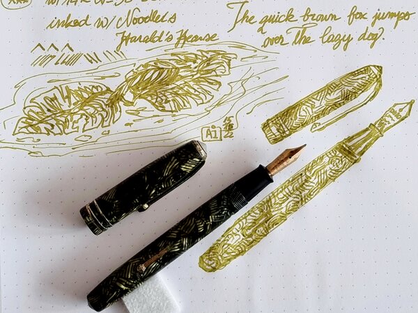
Long due thread... In a page devoted to Italian pens, this topic is calling all the expressions of one of the most recognizable Italian materials ever used in fountain pens: the mythical Arco celluloid! Made worldwide famous by the Officine Meccaniche Armando Simoni (OMAS) in Bologna in their Extras and Paragons, Milords and Princesses and Damas, and proposed here and there by other brands and independent manufacturers, the Arco celluloid is the quintessence of "italianity" in pens: warm, refined, flamboyant and unique. Judging by the prices fetched by Arco celluloid pens in these days, is seems that the "Arco fever" is strongest than ever, and I can understand why... Let me begin with a few photos of some of my Arco:
- 148 replies
-
- arco celluloid
- omas
- (and 4 more)
-
- 7 replies
-
- robert oster
- diamine
-
(and 2 more)
Tagged with:
-
Robert Oster Signature - Eucalyptus Leaf Robert Oster is an Australian ink maker that is well-known for his unique range of colours. On his website, he describes our shared love quite eloquently: "Robert Oster Signature originates from one of the most famous wine producing regions of the world, the Coonawarra district of South Australia, an idyllic setting with great influence on the senses. There is my inspiration. It's a joy to share it with you." Well, we are certainly fortunate to have inspiring ink makers like Robert Oster to satiate our thirst for glorious inks. In this review, I take a closer look at Eucalyptus Leaf. Catherine from Sakura provided me with a sample of this ink to play around with - much appreciated! Eucalyptus Leaf is an enchanting mossy green, with a slightly brownish streak to it. This is definitely my kind of green! It looks absolutely beautiful on all kinds of paper. This ink shows tons of shading, without too much contrast between the light and darker parts, exactly as I like it. It really enhances your writing, and clearly shows that your words have been written with a fountain pen. Nicely executed! To show you the impact of saturation on the ink's look & feel on paper, I made some scribbles where I really saturated portions of the paper with ink. This gives you a good idea of what the ink is capable of in terms of colour range. As you can see, Eucalyptus Leaf strikes just the right balance in its colour spectrum, with not too width a gap between the light and darker parts. This explains its expressiveness, and the aesthetics it shows off in its shading. Like most Robert Oster inks, Eucalyptus Leaf has zero water resistance. Short exposures to water completely obliterate the text, leaving next to nothing on the page. As the chromatography shows, only a faint pale-pink residue remains on the paper. Smudge resistance is acceptable: although there is lots of smearing of the ink, the text itself remains perfectly readable. I've tested the ink on a wide variety of paper - from crappy Moleskine to high-end Tomoe River. On every small band of paper I show you:An ink swab, made with a cotton Q-tip1-2-3 pass swab, to show increasing saturationAn ink scribble made with an M-nib fountain penThe name of the paper used, written with a B-nibA small text sample, written with an M-nibDrying times of the ink on the paper (with the M-nib)Eucalyptus Leaf is a well-behaving ink on most paper types, with no visible feathering (except on Moleskine paper, which should not come as a surprise). With lower quality paper you can experience some bleed-through. The colour looks great on both white and more yellowish paper, which I also appreciate. The ink dries quite quickly within the 5-10 second range (with the M-nib). I also show the back-side of the different paper types at the end of the review. No troubles there, except with the Moleskine paper, which shows significant bleed-through. All in all, a well-behaving ink. Writing with different nib sizesThe picture below shows the effect of nib sizes on the writing. All samples were written with a Lamy Safari, which is typically a dry pen. I also added a visiting pen - a wet-writing Parker Sonnet with F-nib. With this pen the ink leaves a very saturated line, which diminishes the expressiveness of its shading. In my opinion, this is an ink that looks at its best with drier pens (like the Safari), where you get more contrast between light and darker parts, which improves the aesthetics of the shading. Related inksTo compare Eucalyptus Leaf with related inks, I use a nine-grid format with the currently reviewed ink at the center. This format shows the name of related inks, a saturation sample, a 1-2-3 swab and a water resistance test - all in a very compact format. I hope that you'll find this way of presenting related inks useful. It's a bit more work, but in my opinion worth the effort for the extra information you gain. Inkxperiment - Fawlty FlowersAs a personal challenge, I try to create interesting drawings using only the ink I'm reviewing. For me, this brings some extra fun to the hobby, and these single-ink drawings present a real challenge at times. With these small pictures, I try to give you an idea of what the ink is capable of in a more artistic setting. For this drawing I used Moleskine 200 gsm Cold-Pressed Watercolour Paper. I soaked the outline of the rectangle with water, and applied a line of ink, letting it bleed out. Here the brownish streak in the ink really comes to the surface. I then drew the flowers using ink diluted with a bit of water (in different ratios). The stems and leafs were painted in with pure Eucalyptus Leaf. This mini-picture gives you an idea of what can be achieved with this ink in a more artistic context. ConclusionRobert Oster Eucalyptus Leaf is a beautiful mossy-green writing ink, that really excels when used for drawing. The ink shows great shading with drier pens, that leave a not too saturated line. Overall, I enjoyed using it. I only got a sample, but this is an ink that definitely deserves a full bottle. Technical test results on Rhodia N° 16 notepad paper, written with Lamy Safari, M-nib Back-side of writing samples on different paper types
- 14 replies
-
- robert oster
- signature
-
(and 2 more)
Tagged with:
-
About this ink: This is a special or seasonal ink made by Sailor for Bung Box. The name of the ink can be broken down as: Tsuyu つゆ= dewdrop Hikari ひかり=light, shine So in my head I read it as Light shining on a dew drop. It matches a local tea, "Tsuyuhikari つゆひかり is a variety of a green tea plant that is grown in Omaezaki, Shizuoka-prefecture in Japan," according to my friend and colleague, Jesse (aka PenJockey.) Rumor has it if you request to sample this ink at Bung Box, they will brew you a cup of tea that perfectly matches this ink. TESTING: Although I am generally not a fan of Green inks, I found this ink intriguing. It goes down as a light -- almost neon or bright lime green -- and begins to change almost instantly. It picks up strong olive green and light gold brown tones, almost dusky notes. Only in the Swab do you see it stay the same color as what is in the bottle. The ink is quite wet, even in my dry 15 year-old Namiki Vanishing Point pen (F). I found it shaded nicely from light green to a deeper green. It takes roughly 7-8 seconds to be smear proof. As I wrote I noticed some sections of my writing were lighter and some were more of a light olive green. There is shading, from light to a medium tone. Paper used was HP 32 pound Prem. Laser. I submit only a full scan as the camera kept moving toward blue. http://i296.photobucket.com/albums/mm186/webgecko1webgeckos/BB_Tea%20Dew%20Drop_zpsxdjzytkq.gif
- 29 replies
-
La Couronne du Comte – Marquis de Dangeau Green The Dutch pen boutique “La Couronne de Comte (LCDC)“ is a well-known player in the fountain pen world. Founded in 2008, their Tilburg shop and accompanying webshop offer a wide range of fountain pens, inks and other office paraphernalia. Recently, LCDC has released a small number of fountain pen inks. From their Nobless Oblige collection comes this Marquis de Dangeau Green. The ink’s name refers to Philippe de Courcillon, Marquess of Dangeau (1638-1720). He was a French courtier, officer and memorialist under Louis XIV. The colour of the ink is inspired by the depiction of the Marquis in a Hyacinthe Rigaud painting from 1702. This specific shade of green is present in the rich robe worn by Monsieur de Courcillon. At its heart, this is a yellow-green ink with plenty of yellow in the mix. Even though it is a lighter colour, the ink remains very readable in finer nibs. It’s also a very heavy shader – too much so for my taste. With dry pens, the combination of light colour and fairly extreme shading makes for a bad combination. I really recommend wet pens and broader nibs for this ink. Due to the more saturated line, the colour of the ink gets much more expressive and the shading becomes a lot softer. Marquis de Dangeau Green really must be matched with wet pens & broad nib. Used this way, the ink provides some wonderful aesthetics. Love it! The chromatography shows a complex mix of dyes – light-blue, yellow, and rose. And this combination of dyes works remarkably well. The chroma looks quite similar to Rohrer & Klingner’s Alt-Goldgrün, but this LCDC ink is much more yellow-leaning. From the bottom part of the chroma, you can already deduce that most dyes detach from the paper when it comes into contact with water. This is not a water-resistant ink. To show you the impact of saturation on the ink’s look & feel on paper, I made some scribbles where I really saturated portions of a piece of 52 gsm Tomoe River paper with ink. This gives you a good idea of what the ink is capable of in terms of colour range. LCDC’s Marquis de Dangeau has a fairly extreme contrast range, from wispy light green to a fairly dark yellow green. This translates to harsh shading, especially when used in dry pens that lean more towards the left side of the saturation spectrum. With wet pens, your writing moves more towards the saturated part of the spectrum, and shading becomes much softer and certainly more beautiful. With the heavy saturation, the rose undertones also rise a bit to the surface, adding some interesting complexity to the ink’s colour. Technically, the ink felt a bit dry-writing in my Lamy Safari test pens and produced too light a line, with shading that is way too heavy. This is clearly visible in the quotes below, that are written with a dry M-nib Lamy Safari. The sweet spot for this ink is the broader nib and/or wet pen – as evident in the paper names and quote source lines. In the writing samples below, I use my typical variety of different paper types. This gives you a good feel for what the ink is capable of. On each scrap of paper, I show you: An ink swab, made with a cotton Q-tip 1-2-3 pass swab, to show increasing saturation An ink scribble made with an M-nib Safari fountain pen The name of the paper used, written with a B-nib Lamy Safari A small text sample, written with the M-nib Lamy Safari Source of the quote, with a Pelikan M cursive italic nib Drying times of the ink on the paper, with the M-nib Lamy Safari I’ve also added a photo to give you another view on the ink. Scanned images and photos often capture different aspects of the ink’s colour & contrast. That’s why I present them both. In this case, the photo captures the ink's shading best, although it looks too yellow. The scan exaggerates the shading, and looks a tiny bit too green in the swabs. Marquis de Dangeau looks good on both white and cream-coloured paper. With hard-surface paper, the shading tends to be stronger, which detracts from the overall looks. This ink works best with paper of low to medium hardness. Drying times are in the 10 second range, climbing to 20 seconds on hard-surface paper. With low quality paper, there is a just-visible amount of feathering and quite some see-through. Bleed-through is limited though, and mostly there on the horrible Moleskine paper. Overall, a well-behaving ink. Writing with different nib sizes The picture below shows the effect of nib sizes on the writing. Marquis the Dangeau can handle all nib-sizes but looks at its best in broader nibs and with wet-writing pens. I love the way it looks in my Pelikan M205 Demonstrator which sports a gold M cursive italic nib. Related inks To show off related inks, I use my nine-grid format, with the currently reviewed ink at the center. This format shows the name of related inks, a saturation sample, a 1-2-3 swab and a water resistance test – all in a very compact format. This ink from La Couronne du Comte looks unlike my other yellow greens. It has some of the DNA from R&K Alt-Goldgrün, but with more yellow in the mix. Inkxperiment – Wolf Moon As a personal challenge, I try to create interesting drawings using only the ink I’m reviewing. I really enjoy these inkxperiments, that are such a fun extension of the hobby. And they are excellent for showcasing all the colour range nuances that are present in the ink. Inspiration for this inkxperiment comes from the now fast-approaching full moon of January – also known as the Wolf Moon. This full moon was named the “Wolf Moon” by Native American tribes for the wolves that would howl during winter nights, communicating with their pack and to protect their territory. The spiritual meaning of the Wolf Moon is a reminder that there is an unseen connection to your own “pack” that is worth recognizing and honoring. The inkxperiment is a direct and literal translation of the Wolf Moon concept. I started with an A4 sheet of HP photo paper and painted in the background with heavily water-diluted ink, applied through a piece of kitchen paper to create the texture. Next, I painted in the full moon, with a tiny amount of bleach added afterward. I then used multiple water/ink mixes and a triangular potato stamp to add the trees. To complete the drawing, I added the wolf silhouette, popping out from the winter woods and howling at the moon. The resulting piece shows quite well what can be achieved with this yellow-green ink in a more artistic context. Inkxpired – computational art I love experimenting with pen/ink/paper and have added another layer as part of the hobby. I’m exploring computational art, inspired by the ink drawings I do during ink reviews. Another fun offshoot of the hobby… and all that starting with a few drops of dye-coloured water on paper. For this computational derivation, I tried to create more of a winter-feel. I did a square cut-out of the inkxperiment and applied a filter that highlights the moon. Next, I used a pixel sort filter on the trees, which creates the winter woods effect. I finally changed the tone of the picture to shift to a more cold-looking green. I quite like the end result, which makes for a great New Year’s card. Conclusion La Couronne du Comte Marquies de Dangeau Green (quite a mouthful) is a really nice-looking yellow green, that works best with broad nibs and/or wet pens. A lovely colour, and one with beautiful shading (if you avoid dry pens). Also, a wonderful ink to draw with, and one that I enjoyed a lot. Technical test results on Rhodia N° 16 notepad paper, written with Lamy Safari, M-nib Back-side of writing samples on different paper types
- 12 replies
-
- la couronne du comte
- marquis de dangeau
-
(and 2 more)
Tagged with:
-
From the album: OldTravelingShoe's Random Pics of Fountain Pens
© (c) 2022 by OldTravelingShoe. All rights reserved.
- 0 B
- x
-
- conway stewart
- cs 58
-
(and 5 more)
Tagged with:
-
From the album: OldTravelingShoe's Random Pics of Fountain Pens
© (c) 2022 by OldTravelingShoe. All rights reserved.
- 0 B
- x
-
- conway stewart
- cs 58
-
(and 5 more)
Tagged with:
-
From the album: OldTravelingShoe's Random Pics of Fountain Pens
© (c) 2022 by OldTravelingShoe. All rights reserved.
- 0 B
- x
-
- green
- conway stewart
-
(and 7 more)
Tagged with:
-

Inky T O D - Color Swatches - Green - Please Post Your Pictures And Tell Us Your Thoughts
amberleadavis posted a topic in Co-Razy-Views
Members ask ... What is the best GREEN for (insert purpose). This thread is not for comparisons or detailed reviews. Merely for you to show us some of your samples. Also, some greens are actually blue or yellow so let's not get to crazy with eliminating colors. If it looks GREEN to you, put it here. 4/26/21 FPN has installed new software and we have a new server. I'm in the process of hiding my threads where the images are no longer in the same location. I'm uploading the images to the FPN server and I'm adding the name of the ink in the post so that you can search within the thread for a particular ink. Also, TheRealScubaSteve says I must include a picture of a "Real" Swatch. Here is Nicolas Hayek, president of the watch company, Swatch. http://ris.fashion.telegraph.co.uk/RichImageService.svc/imagecontent/1/TMG7866146/m/swatch_1670679a.jpg BTW, Blue was here. Brown was there. Red was in the woods. Did you ask about violet (or was it vioLeNt) purples? Green was leafing us. Orange is bouncing around. Black is back. Here be Pink. Yellow is Spot On. Jim says we must share our Black-n-Blues or was it Blue-Blacks? -
-
-
-
-
-
-
-
-
TACCIA Ukiyo-e Hokusai sabimidori TACCIA is a Japanese stationery company, that - as far as I know - is now part of the Nakabayashi group. They offer high-quality fountain pens, inks, pen-rolls, notebooks, etc. More specifically, TACCIA produce a line of inks, inspired by the unique look of Ukiyo-e paintings from Japan’s Edo period (17th century). Ukiyo-e prints are woodblock prints where the work of an artist is carved into wood by woodworkers, and pressed onto paper by printers. This allows the production of multiple prints of an artwork with some different colours as well. In this review, the centre stage is taken by sabimidori, a rust-green ink with a strong copper sheen, inspired by colours appearing in woodprint paintings from the Japanese artist Katsushika Hokusai (1760-1849). Hokusai is best known for his “Thirty-Six Views of Mount Fuji” series of prints, with the mountain appearing as a central theme. In this case, the rust-green colour is inspired by the colour of the tree-leaves in the painting of “the village of Sekiya on the Sumida river”. The Met museum describes the scene as: “the speed and urgency of the galloping horsemen stand in contrast to the solitary and static image of Fuji capping the horizon like an omniscient observer and marking that which is eternal. The raised road that winds into the depths of the print directs our gaze to the mountain, as do the trees that function as a framing device.” Sabimidori is not only a beautiful green-leaning teal, but also one with a number of tricks up its sleeve. Most surprisingly: the wet ink looks bright blue, but quicky dries to a muted blue-green. It’s definitely a teal, but one that leans strongly towards the green side – I really like the colour that coalesces from the bright blue liquid. Next, sabimidori – which means “rust green” – hasn’t stolen its name: the rust comes from the heavy copper sheen that the ink shows on many types of hard-surfaced paper. This TACCIA ink is also a heavy shader. Usually, I’m not a fan of heavy shading, which can look harsh and angry, but with blue-green inks the result can work really well. With sabimidori, you get an aesthetically pleasing look with blue undertones in the light parts and a green-copper look in the darker parts. These complement each other wonderfully well. As you might guess, this ink is totally to my liking and surely one of the better inks I tried this year. The ink comes in a 40 ml bottle, that is packaged in a beautiful box showing the corresponding Ukiyo-e painting. Lovely packaging for an excellent ink. To show you the impact of saturation on the ink’s look & feel on paper, I made some scribbles where I really saturated portions of a strip of 52 gsm Tomoe River paper with ink. This gives you a good idea of what the ink is capable of in terms of colour range. Sabimidori has a medium dynamic range, without too much contrast between the light and darker parts. The ink is special though: blue-leaning in the lighter part of the spectrum, and becoming greener the more it saturates. The red-copper sheen appears in the most saturated parts, and is even visible in a scan. The result is an ink that almost looks multichromatic, with really nice contrast in the shading. Shading is most obvious in wider nibs, but you already get some with the EF nib, which is quite impressive. The aesthetics are superb, and add tons of character to your writing. If you use high-sheen paper – like Tomoe River – and look at your writing from an angle, the “rust” component is very obvious. Sabimidori then looks like a blue ink, with a very prominent copper sheen. Wonderful stuff! TACCIA’s ink makers have really outdone themselves with this sabimidori. The ink’s chromatography shows a blue-heavy ink with yellow in the mix, which results in the green-looking appearance. From the chroma, I would have expected a more blue-leaning ink, not the rust-green teal that appears on paper. There definitely is some complex chemistry going on here! The bottom part of the chroma shows the bright blue that remains when water washes away the yellow dyes. This is confirmed in the water test: the ink is fairly resistant to water, and can survive an accident. A lot of the colour disappears, but a bright blue ghost of your writing remains that is quite readable, even after 30 seconds under streaming tap water. That makes sabimidori an ink you can use at the office – where it will certainly attract some well-deserved attention. I’ve tested the ink on a wide variety of paper – from crappy Moleskine to high-end Tomoe River. On every small band of paper I show you: An ink swab, made with a cotton Q-tip 1-2-3 pass swab, to show increasing saturation An ink scribble made with an M-nib Lamy Safari The name of the paper used, written with a B-nib Lamy Safari A small text sample, written with the M-nib Safari Source of the quote, written with a Pelikan M405 with cursive-italic F-nib Drying times of the ink on the paper (with the M-nib Safari) Sabimidori looks good on all types of paper, but I personally like it best on the more cream-coloured variety which enhances its green complexion. No feathering in general, just a teeny tiny bit on HP multipurpose paper. Some bleed-through on low-quality paper, but nothing too excessive. The ink expresses itself totally different, depending on the paper used – from blue- to green-leaning teal. I simply love this complexity … you get totally different experiences from a single bottle! Drying times for sabimidori are on the long side, with up to 30 seconds on hard-surface paper. I’ve also added a few photos to give you another view on the ink. Scanned images and photos often capture different aspects of the ink’s colour & contrast. That’s why I present them both. In this case, scan & photo are very close-matched, with the photo closest to what my eyes can see. One thing that I feel obliged to mention: sabimidori is not the easiest ink to clean out of your pens. It stains a lot, and needed extra effort to completely remove. It’s devilishly difficult to remove it from non-shiny plastic: I couldn’t completely clean it from re-used cartridges using only tap water: soap and hot water were needed. This is not an ink I would use in a clear demonstrator! Writing with different nib sizes The picture below shows the effect of nib sizes on the writing. The EF-nib already shows the shading that the ink is capable of. Depending on the nib, you get more blue or green, but always a good-looking result. Shading truly is a feast for the eyes – it is heavy, but the blue & green parts complement each other really well, resulting in an aesthetically pleasing look. Related inks To compare sabimidori with related inks, I use my nine-grid format with the currently reviewed ink at the center. This format shows the name of related inks, a saturation sample, a 1-2-3 swab and a water resistance test – all in a very compact format. The ink is different from other green-leaning teals in my collection. Murky Waters is a mix of my own: 3 parts Pelikan Edelstein Jade with 2 parts Edelstein Onyx. Inkxperiment – Cradle of Life With every review, I try to create a drawing using only the ink I am reviewing. These small one-ink pieces are an excellent way to show the colour-range nuances that are hidden within the ink. And I totally enjoy the fun couple of hours these inkxperiments provide me: playing around with the ink in a creative way. Not surprisingly, the inkxperiment is for me the most enjoyably part in the making of a review 😉 Inspiration for this inkxperiment comes from the namesake Lara Croft movie I revisited recently: a fun constant-action adventure movie. Definitely not a brainy movie, but the title got me thinking about the origins of life. In puddles of nutrient-rich water on infant Earth, complex molecules arose, that – given aeons of time and billions of tries – resulted in self-replicating structures, that ultimately form the building blocks of life. And from these humble beginnings come the variety of species we know today, like the majestic pine forest… For this drawing, I started with a piece of A4 HP photo paper. I first drew the land borders, drawing them with water into which I dripped pure ink. The colours are real… bright blue, bright green, teal – all this from that single sabimidori bottle. Next I created the sky for the pine forest, printing a pattern with a piece of kitchen paper dipped in ink. I then drew the spheres where the “life cooking” happened, that created the complex molecules. All that in puddles of nutrient-rich water, which I drew with Q-tips dipped in multiple water/ink ratios. Finally I used my fountain pen to draw the pine forests, and to add some texture to the water. The final picture gives you a good idea of what can be achieved with sabimidori as a drawing ink. Inkxpired – computational art I love experimenting with pen/ink/paper, and have added another layer as part of the hobby. I’m exploring computational art, inspired by the ink drawings I do during ink reviews. Another fun offshoot of the hobby… and all that starting with a few drops of dye-coloured water on paper. Conclusion TACCIA Ukiyo-e Hokusai sabimidori is a wonderful rust-green teal. An ink with unexpected complexity, that has a lot going for it. I love its looks on paper, with the great aesthetics of shading and sheen. This is one of the nicest inks I tried this year. If you like teals, you cannot go wrong with this one: highly recommended! Technical test results on Rhodia N° 16 notepad paper, written with Lamy Safari, M-nib Back-side of writing samples on different paper types
-
Sui-gyoku is one of three new Pilot Iroshizuku colours released late in 2021. Photo: Scan: (Some other colour comparisons can be found here.) p.s. No show-through, no bleed-through, and no sheen observed.
- 29 replies
-
- pilot iroshizuku
- iroshizuku
-
(and 4 more)
Tagged with:








desaturated.thumb.gif.5cb70ef1e977aa313d11eea3616aba7d.gif)