Search the Community
Showing results for tags 'gray'.
-
Here's another newer ink that hasn't got a lot of color samples online yet. It's a nice gray color on the cool end of gray. Good wet flow. Some water resistance. No misbehaving. Dries pretty quick. I've been trying to decide whether to get Albert Einstein ink from Montblanc in a full bottle. I got a sample through some magical series of events, and tried it. I was wanting to see if I would like this one better. Honestly, I like them both. Einstein is a more neutral gray than this one. Sadly, it looks like I'm going to have to get both.
- 2 replies
-
- organics studio
- arsenic
-
(and 1 more)
Tagged with:
-
desaturated.thumb.gif.5cb70ef1e977aa313d11eea3616aba7d.gif)
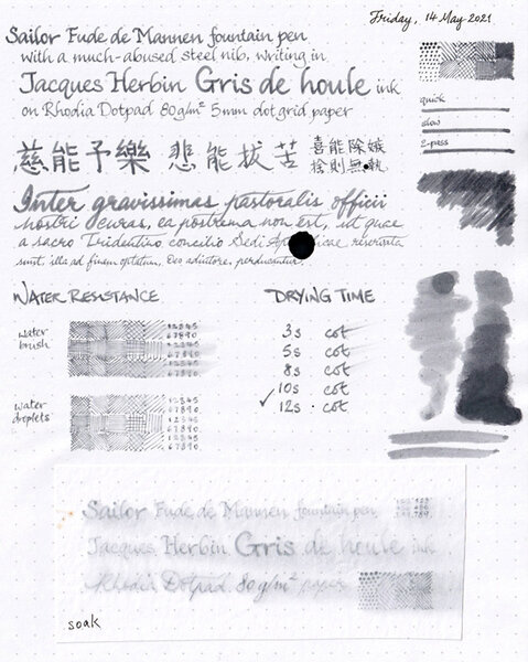
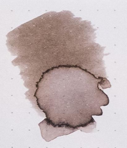
Jacques Herbin Gris de Houle review sheet overview
A Smug Dill posted a gallery image in FPN Image Albums
-
- jacques herbin
- les encres essentielles
- (and 5 more)
-
From the album: Ink review
On Rhodia Dotpad 80g/m² paper, using a Sailor Fude de Mannen pen with a bent nib.© A Smug Dill
- 0 B
- x
-
- jacques herbin
- les encres essentielles
- (and 5 more)
-
desaturated.thumb.gif.5cb70ef1e977aa313d11eea3616aba7d.gif)
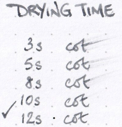
Drying time for Jacques Herbin Gris de Houle ink
A Smug Dill posted a gallery image in FPN Image Albums
-
- jacques herbin
- les encres essentielles
- (and 5 more)
-
desaturated.thumb.gif.5cb70ef1e977aa313d11eea3616aba7d.gif)
Water resistance of Jacques Herbin Gris de Houle
A Smug Dill posted a gallery image in FPN Image Albums
-
- jacques herbin
- les encres essentielles
- (and 5 more)
-
From the album: Ink review
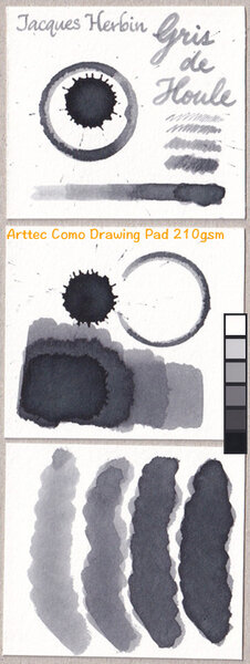
On Arttec Como Drawing Pad 210gsm paper for mixed media art.© A Smug Dill
- 0 B
- x
-
- jacques herbin
- les encres essentielles
- (and 5 more)
-
May I know the lightest gray/grey ink you have tried? My current is J. Herbin in the shade Gris Nuage. I'm in search of the lightest gray/grey ink.
- 11 replies
-
- ink
- ink review
-
(and 3 more)
Tagged with:
-
Sailor has doubled the number of ink colours in its Manyo line of inks recently, by adding another eight in the second half of 2020, after first introducing the product line in 2019. I don't have any of the first eight, but with COVID inspiring all that panic buying, and a significant discount on offer for pre-orders for the new colours, I ordered the four relatively more subdued and/or sombre ones; and, after much delay, they finally arrived. Chigaya, which is probably the most sombre looking of the lot, was the first bottle I opened. (When I was developing the chromatography strip for this ink, I though a Dementor from the world of Harry Potter was going to come at me. Ridiculous!) The drawing on the bottle label seems to suggest a good range of shading out of a warm grey ink; but, writing on Rhodia Dotpad 80g/m² paper, it just looks mostly like a black ink. The Sailor Fude de Mannen pen I used struggled to write when inked with Diamine Registrar's Ink, but has no problem with Sailor Manyo Chigaya. On the other hand, it doesn't write quite as wetly or broadly as when I used KWZ Ink Warsaw Dreaming in that pen. So, I'll say the 'wetness' of this ink is moderate, somewhere between those other two inks I mentioned. There is some shading, but it is very subtle. There is no sheen that I could see. Water resistance is very good, if the measure is how legible writing would be after a looong soak. However, colour will definitely get lifted off the page on contact with water; and the bluish component of the run-off is apt to stain the area covered by that body of water. All in all, I'd say this is a decent but boring ink; and I can't think of why I would prefer it to, say, Monteverde Black Ash or Standard Bindery Stargaze.
-
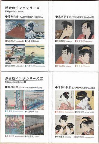
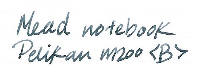
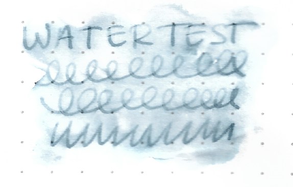
Taccia overview: Taccia is a Taiwanese-American brand started in California, that has been recently been bought by the Nakabayashi company. Nakabayashi is a maker of a long list of home and office products who have, under the Taccia brand, begun making fountain pen inks. All Taccia inks are made in Japan. There is some speculation as to whether Sailor makes the Taccia inks, but I have found no evidence to prove this. What I can say, according the the information I was able to gather is that at the time when Nakabayashi bought Taccia and wanted to release inks under that brand, they entered into an agreement with Sailor for the purposes of expert ink consultation. A couple of the Taccia standard line bear a striking resemblance to Sailor Jentle/Shikiori inks. Outside and within the standard line, they have a few unique inks. Also, Taccia inks I have tried do not have that "Sailor-made smell" you are all so familiar with. The Ukiyo-e Ink Series was released overseas in 2019. In March 2020, a second series of 8 inks was released. These are for Utamara Hiroshige and Kitagawa Utamaro. I saw the release post on the Nagasawa Instagram page and emailed them directly for order. As of this publication, other Japanese bungu retailers have received stocks. They were Y1,600 or USD15 for each 40ml bottle of ink. The below translated names in Japanese and English are credited unchanged to Nagasawa Kobe Stationary store. Second Series Taccia Ukiyo-e Includes: 歌川広重(Hiroshige Utagawa) 1.広重浅縹(Hiroshige asahanada) 2.広重瑠璃(Hiroshige Ruri) 3.広重中紫(Hiroshige Nakamurasaki) 4.広重藍鼠(Hiroshige Ainezu) 喜多川歌麿(Utamaro Kitagawa) 5.歌麿紅桜(Utamaro Beni Zakura) 6.歌麿青紫(Utamaro Aomurasaki) 7.歌麿薄墨(Utamaro Usuzumi) 8.歌麿梅紫(Utamaro Umemurasaki) I’ve only opened one of the inks so far, and that is Taccia Hiroshige Ainezu. Now let’s get into the review. Online images are unhelpful. Taccia's own marketing materials do not give a fair representation of any of the inks I've tried. I would have sworn, from seeing their images and sample writing, that Ainezu was going to be a blue-black ink. I was way off. Ink bottle opening will fit large nibs comfortably, they are 40ml glass bottles with metal caps. The packaging is lovely, and far larger than the bottle needs in space to fit, which is nice, as this means the box artwork is easier to admire. Packaging & Bottle Each bottle comes packaged with a sturdy card. I've included both series below. The good stuff. Tomoe River Paper 52gsm White This is a gray ink, through and through. What I am able to cypher from the Kanji is that Ainezu means indigo-tinged gray. The kanji: 藍鼠 藍 ai / indigo 鼠 nezu / dark gray Ink Characteristics 1. Well-behaved 2. No feathering 3. No bleed-through 4. Acceptably wet 5. Smooth flowing, not gushing 6. Good shading in right pen [light to dark gray] 7. Easy cleaning with a few flushes 8. No staining discovered 9. Unexpected water resistance Other Ink properties you might find interesting is the ink goes on as a super-dark gray, almost black. It lightens as it dries which makes writing easy on the eyes. This is the opposite effect of Montblanc Spider Web Grey, which goes on nearly invisible when wet and dries darker. I prefer the former over the latter. As for the sheen, it is seen in the borders between light and dark, and is red and coppery. It does not overwhelm. The ink also looks quite light or dark depending on the paper and pen used. The shading also varies greatly under these conditions. Rhodia Dotpad Life Bank Paper Mead notebook paper / college ruled There is barely any feathering, which is quite good considering the wetness of the pen (and the terrible quality of the paper). It only shows up on close inspection. Even in this image it is difficult to spot. Water drop test Rhodia Water drown and dab test Rhodia Rubbed in and swirled. Pretty good. Both water tests left for 2+ minutes. Ink also dry for 2 minutes. Dry times Pretty average. Comparison Tomoe River Paper 52gsm Cream That's it! I do believe that we should receive this second set at some point, as we have had everything except for the special editions and the jeans ink available outside of Japan. Finally, of the newer ink manufacturers, Taccia is definitely a personal favorite. And I've been on a gray ink kick, so this was a welcome surprise. To be honest, I would't have really minded if it was another blue-black. I like those too. And that's the end of my first review. Hope you enjoyed this. I may do the remainder once I’ve tried them and if this was helpful to anyone. Happy inking and thank you for your time.
-
The new Sailor Mouseyo ink! Does anyone have any suggestion for a mix that would yield a shading grey with minimal pink sheen? I have a few (mainly Diamine and Pilot iroshizuku) grey inks here, but I wouldn't know where to begin.
-
http://inks.pencyklopedia.pl/wp-content/uploads/P.W.-Akkerman-Nr-29-Hofvijver-Grijs-nazwa.png Manufacturer: P.W. Akkerman Series, colour: Nr 29 Hofvijver Grijs Pen: Waterman Hemisphere "F" Paper: Image Volume 80 g / cm2 Specifications: Flow rate: good Lubrication: good Bleed through: possible point Shading: noticeable Feathering: unnoticeable Saturation: good A drop of ink smeared with a nib http://inks.pencyklopedia.pl/wp-content/uploads/P.W.-Akkerman-Nr-29-Hofvijver-Grijs-kleks.jpg The ink smudged with a cotton pad http://inks.pencyklopedia.pl/wp-content/uploads/P.W.-Akkerman-Nr-29-Hofvijver-Grijs-wacik.jpg Lines http://inks.pencyklopedia.pl/wp-content/uploads/P.W.-Akkerman-Nr-29-Hofvijver-Grijs-kreski.jpg Water Resistance http://inks.pencyklopedia.pl/wp-content/uploads/P.W.-Akkerman-Nr-29-Hofvijver-Grijs-woda.jpg Sample text http://inks.pencyklopedia.pl/wp-content/uploads/P.W.-Akkerman-Nr-29-Hofvijver-Grijs-txt.jpg Ink drying time 5 sec. Other tests carried out: Sample text in an Oxford notebook http://inks.pencyklopedia.pl/wp-content/uploads/P.W.-Akkerman-Nr-29-Hofvijver-Grijs-Oxford.jpg Sample letters in a Rhodia notebook http://inks.pencyklopedia.pl/wp-content/uploads/P.W.-Akkerman-Nr-29-Hofvijver-Grijs-Rhodia.jpg Ink drops on a handkerchief http://inks.pencyklopedia.pl/wp-content/uploads/P.W.-Akkerman-Nr-29-Hofvijver-Grijs-chromatografia1.jpg Chromatography http://inks.pencyklopedia.pl/wp-content/uploads/P.W.-Akkerman-Nr-29-Hofvijver-Grijs-chromatografia2.jpg
- 4 replies
-
- p.w. akkerman
- hofvijver grijs
-
(and 1 more)
Tagged with:
-
Early Pelikan 400 with a strange color change Any explanation for this type of color change? The stripes are uniformly gray on the barrel, where it was not covered by the cap and green where they are covered by the cap.
-
Birmingham Pens Emerald View Park Oxidized Brass Based on the positive review of some of the inks from the Birmingham Pens shop in Pittsburgh, PA I ordered the full sampler pack of 30 inks. I know some won;'t be to my taste, but many seemed quite interesting. The inks certainly win the award for the longest names. I stashed the samples away for relatively easy access, and this was the first ink I blindly selected for review. Interestingly (or not) it has also been reviewed recently. This is a dark gray ink with a strong blue undertone. To me it appears as dark gray in most light, but often will appear as a dark, neutral blue. It's quite neutral in appearance, and would go well in a business setting. Normally I don't favor gray inks but this one is quite nice. It is also quite water resistant. It has decent saturation, but is easy to clean from the pen. The ink seemed quite shady across a broad range of papers, and has some sheen on Tomoe River. The handling was very good with no show through or bleed through experienced, no hard starts or skips, just a pleasant writing experience. Pen: Pelikan M400 (M) Papers: MvL=Mohawk via Linen, TR=Tomoe River, Rhodia=Rhodia 90g ivory. Camera: iPhone 7 using Camera+ app The images were fairly decent, but the FPN uploader seems to modify the images making the ink appear darker and with less range than in reality. As always with ink reviews, you may want to order a sample prior to diving in on a full bottle.
-
- birmingham
- blue black
-
(and 1 more)
Tagged with:
-
Sailor just released a new color to both the Sailor 1911 Standard and Large fountain pens. Similar to the Fresca Blue, the new Anchor Gray color is exclusive to North American retailers. Our initial shipment arrives any day and the pens are on sale as a pre-order and will ship as soon as they arrive. We only have a limited number of pens available in all 7 nib sizes. https://www.penchalet.com/category.aspx?hue=13&keyword=Sailor%201911%20Anchor%20Gray%20Fountain%20Pen
-
Kingdom Notes second series of bespoke inks from Sailor was themed "Wild Birds". This was back in 2013 I believe. When I fell down the rabbit hole of bespoke inks I was fairly selective and for whatever reasons I didn't get many from these series, except of course, Lidth's jay. Recently an inky friend in Japan sent me a couple KN samples so I could review them. Falco peregrinus is one. Normally gray inks don't interest me even though they probably shade better than black inks, but I always prefer the latter as they are decisive. Black is an ink for serious writing and correspondence. To me, black always looks so right on the page while grays typically make me shudder and cringe, especially those that look like pencil. If I wanted to write with a pencil I would have used a pencil! Anyway, this gray does not suffer from that deficiency. In my wet Edison Premiere, this wet ink writes very dark, dark enough to be near black. It's a kind of "cool" black as I see a little bit of purple/violet in the dye mix. I was thinking when I asked for a sample of this ink that I wouldn't like it because it's gray, but in fact I do. It's very wet, very saturated. Perhaps in a dry pen it might become more "gray-like". Pen: Edison Premiere (F-steel) Papers: MvL=Mohawk via Linen, TR=Tomoe River, Hij=Hammermill 28 lb inkjet, Rhodia=Rhodia 90g ivory. Camera: iPhone 7
- 1 reply
-
- sailor
- kingdom note
-
(and 2 more)
Tagged with:
-
Hey guys, I recently tried a sample of Diamine Grape and really loved the color. However, the ink is a bit weird and gets a little cloggy if left for a couple days in a pen. I have been looking at Lamy Dark Lilac swatches online and I really love the color as well. I am considering getting the ink, then making my own mixes to achieve a darker purple when I am in the mood for it. Does anyone have any experience with making grayish purples like Diamine Damson or a dark purple like Diamine Grape? I don't want to purchase two bottles of purple ink - as I am likely never going to use them up. I think getting the lilac ink will let me play with both - bright and dark purples if things go to plan. I look forward to hearing your experiences! Thanks!
- 13 replies
-
- lamy
- dark lilac
- (and 4 more)
-
Sometimes inks are not made for being used at work, for taking notes, for normal correspondence... but they are so gorgeous that you simply don't mind what other people could think of you and keep using them like there's no tomorrow. The review which is going to follow is the complicated love story between me and Diamine Shimmertastic Sparkling Shadows. Diamine Shimmertastic Sparkling Shadow is a interesting grey ink, dark enough to be definitely usable, with high ammount of nice shading on every paper, and lots of nice gold glitters. Like most Diamine Inks, has really good characteristics: marvellous flow (despite the presence of glitter I've never experienced cloggings), well lubricated, smooth feeling when writing with every type of nib, no feathering, not a single bleedthrough (even under the third swab test). Dry times are fairly long, and it's not waterproof. But let's sto wandering around the main thing around this ink: It's a glittery ink. Glittery inks are not made for everyday based use, it's unlikely you'd be signing a paper with this kind of ink, it feels unprofessional and not respectful in front of the person you're writing to. I definitely agree, I respect the social convention by not using it if inappropiate, but I really cannot give a look to this ink without finding it gorgeous. It's a wonderful grey ink (and it's definitely not easy find a good grey ink) that gains a sort of third dimension by the adding of extremely thin gold particles. It ends to be an ink suitable only for drawing, for other artistic purposes, for signing holiday cards or doodling around... But the pleasure you feel while writing, the shining trace of ink you leave on the paper is something I find difficult to find in other inks. Ink with such glittery particles are usually known to be difficult to clean, I've to say that this particular one it's a little more difficult to clean and needs a little more mantainance, but just a little, cleaning is not a big issue in my opinion. So, the usual final question is : It is worth it? A bottle of 50 ml of this ink costs around 12€, and you acquire a huge ammount of a extremely well ingeneered ink. It's up to you, in my opinion this ink is worth every cent, but I like using it for different and personal reasons. If you want something you're like to use every day probably this is not made for you. If in doubt, buy it, for 12 € it's worth trying. COPY PAPER SCHIZZA & STRAPPA PAPER TRACING PAPER INKDROP CROMATOGRAPHY SHIMMER CLOSEUPS
- 11 replies
-
- diamine
- shimmertastic
-
(and 5 more)
Tagged with:
-

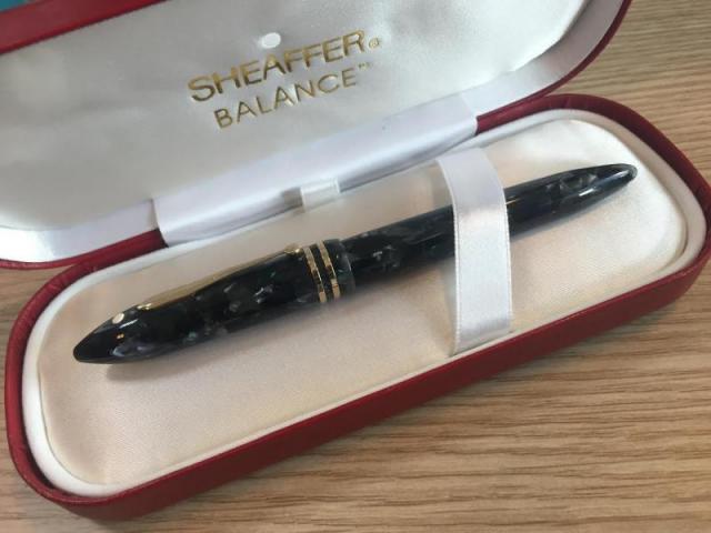
Oh What A Colour! - The Regular Balance Ii In... The Gray Marble?
FrozenLand posted a topic in Sheaffer
I thought that the only 90s. Balance in gray is the limited edition, the well-known sac-filler. However, I recently acquired a cartridge model in gray with dark-blue and forest-green accents (these are not well visible on the photo below, unfortunately). I have never seen s photo of such version - am I right, that it can be quite rare? -
Grey Plum is one of those colors that I was most excited about in the recent Group Buy from KWZ Ink. The swab posted on the site was all I had to go by, and I admit, I wasn't thrilled by the color there. But I liked the idea of the color, and I like most of Konrad's more complex colors, so I gave it a try. Y'ALL. This is GREAT. Okay, so here's a review overview, with closeups and comparisons below: Right away, Grey Plum reminded me of one of my favorite discontinued inks, Sailor Chu-shu. There just aren't many purple-leaning greys out there. This is a swab where the inks were laid down very heavily (to try to get sheen and to see hue clearly). This means that the color is probably more intense than you'd usually see with a pen, but you see differences and similarities in a different way than writing samples. As you can see, Grey Plum is darker, greyer and cooler than Chu-shu in the swab; Chu-shu often comes off as a near-purple, while Grey Plum is a pretty definite gray. I washed the picture and swab below with water, to see what kind of behavior emerged, and got a really complex and interesting cool wash with blue to violet hues. I really like the tones, but it should be noted that the water resistance doesn't look particularly great - if you're sketching, prefer to go back over washes if needed. You might think you see sheen above, but that's a trick of the scanner. This ink is pretty matte, even on paper that encourages sheen. There's a tiny bit of something, but I don't think you'd ever see sheen under normal conditions. (I don't think you'd want it on this ink anyway.) How does it behave? Dry time is moderate. This is Tomoe River paper, so a 10-15 second dry time is decent. I didn't notice any problems with the other papers I tried. The shading is very pleasant, and great occasionally. I think someone who cared more might be able to draw out more shading (see the "s" in "so good" in the Manners section). The feel is great, just like all the other KWZI's I've tried. The flow is nice, startup is prompt, and it cleans up with no muss. (I have not left this ink in a pen for very long, though; I'll let you know if this changes at all.) The smell, unlike former KWZ inks, is hardly noticeable, on par with Diamine's normal aroma in terms of notability. It's faintly soapy or astringent - in fact, it's really familiar, and I wish I could put my finger on it. The smell of the last batch was my least favorite thing, so I'm happy it's changed. Allure is a really personal thing, but I love this ink. Dilutions is a category intended to show how ink behaves as water is added. It's very non-scientific; the first pass is pure ink, and then I briskly swish the brush for a second or two in clean water, dab it on the rim of the water jar, and make a new swash. It can reveal hidden undertones, or weird plateaus of saturation, where ink looks the same for several dilutions, even as the amount of water increases. This was not a hugely successful attempt this time, and I'm not sure why. It does show the kinds of washes you might get, and that you can probably dilute this ink down to get kind of a fun violet. As you might expect from the above picture and dilutions and swab, there's not a lot of water resistance. I usually perform a couple tests: I put drops on a grid of lines, leave them for 10 seconds, and then blot them carefully. This is the mildest form of water that writing might be exposed to - a tiny bit of condensation from a glass, say. I also write a phrase and then briskly wash it with a brush for ~5 seconds - not scrubbing exactly, but adding friction. I let it sit for 3-5 seconds, then blot. This usually erases any inks that lack water resistance. If they're resistant at this stage, I do an overnight soak. Grey Plum holds up okay to a little bit of water or alcohol, and mostly vanishes with a brush. While it may have minimal water resistance, this is not an ink I'd use for cases where I'd want to be sure of my notes. Appearance in different nib widths is good across the board. It's not overpowering in a bold nib or too wimpy in a extra-fine. I usually write a whole paragraph with each so I have an idea of what they'd look like on a page. (Ideally I'd do a page of each, but life is short, and the inks together give me a good feel for whether an ink will over or underwhelm in large quantities.) If I had to pick a favorite width, it would be broad. I did test Grey Plum on Leuchtturm and Piccadilly papers. I think it looks best on the warm to bright whites. It looks great on Leuchtturm, but Piccadilly is too warm, and it looks dull and flat. (Unfortunately, my scanner doesn't pick up warm paper tones well, so you'll have to trust me.) Fortunately, most papers are less yellow than Piccadilly. On my terrible office paper, I do see some fuzziness of line in a bold nib. Not a surprise - this is not a paper made for liquid ink of any kind. I don't see bleedthrough to the next page, just spots to the back. (No bleedthrough or feathering for either Leuchtturm or Piccadilly, though.) It's totally usable, even on the cheap paper, though it definitely has more presence on the Tomoe River seen above. Overall, I really like this ink, and hope Konrad keeps making it. It brings something new and interesting to my ink stash, and it is a real pleasure to use, too. Paper used: Tomoe River for the two-page spread above. Pens: The title is done with a 1.9mm Franklin-Christoph Music nib. As a lefty, I find italic sort of challenging, and I never practice - and yet I am always sad when things come out poorly. Oh well. The first page is written with a Goulet Jowo medium nib, fairly wet and smooth. The second page is that same medium nib (in the middle paragraph), an EF Goulet nib (top paragraph), and B Jowo from Scriptorium Pens (bottom paragraph). All are fairly wet, though I think the EF is a bit drier than the M and B. All these nibs went through the same pen and feed - I just pulled at the end of each paragraph. Brush: For washes and dilutions, I used a Isabey squirrel mop travel brush. It lays down a ton of water, and cleans up like no one's business.
-
I don't have many inks that are 'just' grey so I thought this one would be an interesting addition to my hoard collection. Also, I was curious about a grey colour in a series called 'chromatics'… In summary: Use this on absorbent papers, not Rhodia et al unless you are trying for a very specific look. With that caveat, this can be a useful ink for casual note taking and informal messages, even in an office setting. Your message will seem much less forceful than with a black ink, so consider it for situations where consensus-building is important, e.g. voluntary sectors. With a very wet writer (like the Platinum Century John Sorowka custom nib in the samples) you could absolutely use this for corporate signatures, especially, perhaps, if you want to subtly distance yourself from the message. Love letters seem unlikely. Review: Soak test: Rhodia No 18 dotpad again: Rhodia R paper: Stock 'cartridge' paper (apologies for the corporate branding! It was the only pad I had to hand!): Apologies again for corporate pad (but it is what I write most of my text on). (If you want to calibrate your monitor, the blue in the logo is Pantone Blue 072 U.) The Lamy nibs are both the Z50 steel nibs. Hope this is useful to someone.
- 10 replies
-
- caran dache
- chromatics
-
(and 2 more)
Tagged with:
-
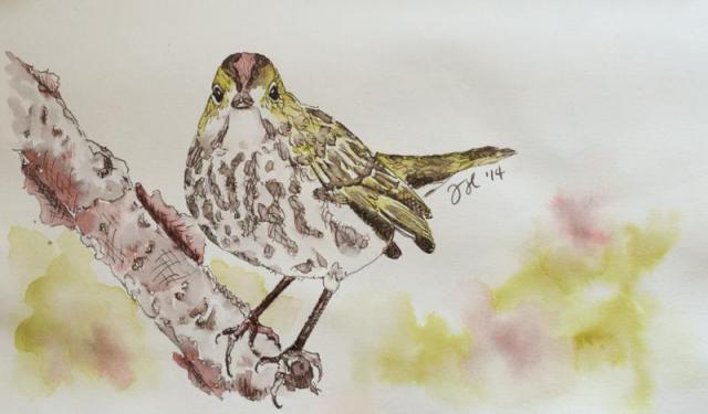
Cacao du Bresil is my most used ink. I keep it in my daily carry pen 90% of the time. It is so versatile, understated and beautiful. If you can't tell, I quite like it. Warbler sketch was done with Cacao du Bresil, J. Herbin Terre de Feu and Rohrer & Klingner Alt-goldgrun in a Stilman and Birn Gamma Series sketchbook. Reasonable care was taken to ensure color accuracy.
-
http://i.imgur.com/lHWE2Rr.jpg I mixed this a while ago; it's simple and it works great and comes out to be a greyish blue. The title in the photo most accurately represents the colour. It's my favourite mixture, please enjoy and let me know what you think
-
As much as I love bright, cheery inks, I’m really a sucker for sort of boring colors - brown, gray, blue-black… I feel like these colors have so much potential to be really interesting with just the right twist, so they hold my interest much more than some of the neon inks. I received a sample of this ink from a friend, though he had no idea that it had also been on my wishlist of inks I wouldn’t mind getting for Christmas. Turns out, I’m quite glad that I did not get a full bottle of it because it is not one of my favorites. This is the first MontBlanc ink I’ve ever tried, and I expected it to feel a bit more… premium. Similar to Iroshizuku, in that it is a joy to put pen to paper. This ink was more troublesome than I am willing to put up with on a regular basis and I frequently had my pen run dry, something that I’ve never had happen with other inks. Granted, it could have been the pen and not the ink, but when I did my swab I found that it dried very fast and did not pucker the paper the way that I expect when paper gets wet. Which leads me to think that this is a dry ink by nature. On the plus side, it is what I would consider 100% waterproof. I promise that I did actually do a drip test on the above sample, but the ink would not budge at all. Overall, this is not an ink that I would recommend. I think that you could get a much better experience by simply diluting a waterproof Noodler’s ink, like Heart of Darkness, and then you still get all the same properties and hopefully better flow. And, when you dilute an ink yourself, you can tune it to exactly the shade of gray you prefer. Full page scan of the review here. This ink was sent to me for the purpose of review and I am not being compensated for this review in any way. All opinions above are my own and you are free to disagree with them if you like.
- 7 replies
-
- ink
- ink review
-
(and 3 more)
Tagged with:
-
I was playing around and made this little combo. De Artamentis Frankincense + Blue Green Mica dust luster = Grayed Interference http://i59.photobucket.com/albums/g318/AlteredPaper/Ferris%20Wheel%20Kisses/Grayed%20Interference%201_zps2c61w4rx.jpg http://i59.photobucket.com/albums/g318/AlteredPaper/Ferris%20Wheel%20Kisses/Grayed%20Interference%202_zpsfiyo7ihu.jpg
-

Fuyu-Syogun (Old Man Winter) - Crv - Group Review - 2015-02
Lou Erickson posted a topic in Co-Razy-Views
http://www.rdwarf.com/users/wwonko/images/fpn/iro/05-Fuyu-syogun-header.jpg Iroshizuku - Fuyu-Syogun (Old Man Winter) - CRV - Group Review - 2015-02 The Iroshizuku Group Review color for February 2015 is Fuyu-Syogun ”Old Man Winter”. It is a cool grey, reminding me of the endless grey skies of the Seattle winters I grew up with. Please post your reviews and scans of the ink in this thread. If you want to a partner for a Co-Razy View (CRV) of this ink, please write it up and mail it to Lou Erickson. (PM for the address.) If you want to do a Co-Razy View on your own, please do! Other reviews are welcome, too. NOTE: I have a new address as of January! If you have sent me things in the past, please PM for the new address - the old one will stop forwarding eventually. You can look at the full description of the Iroshizuku Group Review to see how this should work and what we’re doing.http://www.rdwarf.com/users/wwonko/images/fpn/iro/05-Fuyu-syogun-product.jpgThanks to Rachel Goulet, who gave permission to me to use their beautiful product photo and swab.More thanks to Amberlea who gives so much of her time to herding these inky kittens. Please PM me with any questions. I'll admit this month's ink does little for me, yet I know there are people who adore it. Show me what I'm missing!- 15 replies
-
- co-razy view
- group review
-
(and 7 more)
Tagged with:


