Search the Community
Showing results for tags 'graf von faber-castell'.
-
I like red inks and I use them on every day basis. I'd like to present you short comparison of ten colors. Of course it would be great to compare more reds but then my samples of Oxblood and Monaco Red are empty. Next time. So the inks I've compared are (in alphabetical order): BRILLIANT RED - Diamine http://imageshack.com/a/img834/7010/tg6s.jpg BRILLIANT RED - Pelikan http://imageshack.com/a/img842/8815/x797.jpg BURGUNDY RED - Montblanc http://imageshack.com/a/img843/6245/qxoy.jpg CIEMNY CZERWONY (Dark Red) - Nicpoń* *Nicpoń is chemistry PhD Student that's active on Polish fountain pen network. He'c created limited line of nice, saturated inks in many colors. http://imageshack.com/a/img834/7862/c9n5.jpg GARNET RED - Graf von Faber-Castell http://imageshack.com/a/img834/7862/c9n5.jpg MATADOR - Diamine http://imageshack.com/a/img834/6818/pmh4.jpg MORINDA - Rohrer & Klingner http://imageshack.com/a/img835/3799/pvp4.jpg RED - Hero http://imageshack.com/a/img842/9356/rew0.jpg RED DRAGON - Diamine http://imageshack.com/a/img842/1002/kwg3.jpg RUBY - Diamine http://imageshack.com/a/img836/6886/yi84.jpg There was an accident. I was ready to make "splash painting" with Ruby. The sample was standing near the sink, I don't know why, but I've abruptly turned and my hand pushed the sample. The rest of the ink flow down the sink to some foreign lands. Ruby is a great color, so it's a pity I couldn't compare it this way. SWABS ON SCAN (Canon MP 250) http://imagizer.imageshack.us/v2/1024x768q90/843/9jsta.jpg SWABS ON PHOTO http://imagizer.imageshack.us/v2/1024x768q90/842/jpna.jpg FEW DROPS OF INK ON KITCHEN TOWEL http://imagizer.imageshack.us/v2/1280x1024q90/835/bqr6.jpgTEXT WRITTEN WITH PILOT 78G, B NIB in Oxford notebook http://imageshack.com/a/img838/576/fra5.jpg TEXT WRITTEN WITH PILOT 78G, B NIB in notebook http://imageshack.com/a/img841/5115/eifu.jpg TEXT WRITTEN WITH PILOT 78G (B NIB) IN CALENDAR http://imageshack.com/a/img842/3936/qgzj.jpg TEXT WRITTEN ON CHEAP PAPER (inks are listed as above) http://imageshack.com/a/img845/3366/v4ws.jpg http://imageshack.com/a/img835/7620/sqyd.jpg TEXT WRITTEN ON CHEAP COPY PAPER PRINTED WITH DOTS http://imageshack.com/a/img834/2382/c4e57.jpg http://imageshack.com/a/img834/7564/p4hw.jpg http://imageshack.com/a/img843/7411/bud7.jpg SUMMARY RED DRAGON stomps. It's amazing deep color. I love it. Second and third place are taken by CIEMNY CZERWONY and MORINDA / MATADOR ex-aequo. There are also colors I dislike, namely: Pelikan's BRILLIANT RED (it sucks: I can't find anything interesting about this ink), GARNET RED (moderate flow, dull), BURGUNDY RED (dull, not interesting). What's your opinion? You can choose few inks from the poll.
- 24 replies
-
Hi, I'd like to present you another review that I've made for polish fountain pen forum - that's why the text is not written in english. I'd love to prepare new scans (in english this time) but I don't have time. Anyway, I hope at least some of you will find it useful even tough you won't - probably - understand the text as polish is not the most popular language to learn But then I believe the colors have language of their own. I'm huge fan of GvFC products. Cobalt Blue hasn't disappointed me even though blue is not my favourite color. It's good ink with good properties, a bit pricey, yes. But it's worth the money you pay for it. http://imageshack.com/a/img819/1949/q1h6.jpg http://imageshack.com/a/img820/9682/k6xo.jpg DRY TIME http://imageshack.com/a/img834/5159/uus8c.jpg Waterproof http://imageshack.com/a/img842/6213/mw9ye.jpg SCANS Calendar http://imageshack.com/a/img853/4923/8s7j.jpg http://imageshack.com/a/img819/2074/skxs.jpg http://imageshack.com/a/img819/9247/qem6.jpg http://imageshack.com/a/img822/4843/dod29.jpg Notebook http://imageshack.com/a/img840/5582/iu9m.jpg http://imageshack.com/a/img822/4566/slly.jpg http://imageshack.com/a/img840/6978/s5n4.jpg http://imageshack.com/a/img855/7537/y5gx.jpg RHODIA http://imageshack.com/a/img841/3200/zjijp.jpg http://imageshack.com/a/img829/4755/muev.jpg http://imageshack.com/a/img829/6045/0n32.jpg http://imageshack.com/a/img822/3238/dsnb.jpg http://imageshack.com/a/img841/3845/f6pk9.jpg
-
Graf von Faber-Castell Lapis lazuli This was the 3rd ink, part of 5 ink blind test. Thanks @Lithium466 for the sample. Photo courtesy of Fasber-Castell This is a dryish, faded Royal blue, with almost no water resistance. It needs a wet pen and wider nib. It’s very well-behaved on copy paper, but the colour is boring and does not capture the depth and the beauty of Lapis Lazuli. I doubt any ink can. You’re better off, buying a similar ink, with a cheaper packing and less pretentious or buy the cartridge version. The best thing about this ink was using it for washes and cleaning it. With a few flushes and the pen was clean as a whistle. Chroma: This is the loveliest thing about it. Writing Samples: Instead of using a Japanese Ef nib, I reverse wrote with Lamy Ef. Don’t be fooled by the scan, the shading is subtle. The letter C refers to the code name, as it was a blind test Photo: Comparison: The R&K ink is Königsblau (royal blue). C is GvFC Lapis lazuli. Water test: Left side 10 seconds under running water. Sample was written with glass nib. So amount of nib is more than a normal nib. "Smoking" cats will be submitted to water test 🙀 Art Work: I really enjoyed doing washes with this ink. It’s such a pleasant colour and easy to work with. I will post a few other art works in future reviews · Pens used: Lamy (reverse EF/Ef / F/M/B, BB) · What I liked: Chroma, Drawing with and cleaning. · What I did not like: Writing experience. · What some might not like: Dryish ink. It’s a faded royal blue. · Shading: Yes there, is but not so visible as the scan makes you believe. · Ghosting: Very faint on copy paper · Bleed through: Only with a wet/wide nib, in my case a heavy-handed flex nib. · Flow Rate: Dryish · Lubrication: On the low side. · Nib Dry-out: Did not notice. · Start-up: Ok · Saturation: Pastel · Shading Potential: Meh. · Sheen: No. · Spread / Feathering / Woolly Line: Only with a primed feed with lots of flex. · Nib Creep / “Crud”: Did not notice. · Staining (pen): No. · Clogging: Did not notice. · Cleaning: Very easy. · Water resistance: Dismal · Availability: Cartridges, 75 ml bottles. Please don't hesitate to share your experience, writing samples or any other comments. The more the merrier
- 35 replies
-
- graf von faber-castell
- lapis lazuli
-
(and 3 more)
Tagged with:
-
Graf von Faber-Castell was founded in 1761 and developed into the major manufacturer of wood-cased pencils. With time they started to offer much broader range of products. Few years ago company’s introduced six inks. Recently they’ve added three new colors to the line Carbon Black Cobalt Blue Deep Sea Green Garnet Red Hazelnut Brown Midnight Blue Moss Green Royal Blue Stone Grey Violet Blue is the newest addition to Graf von Faber-Castell line of inks. I was disappointed by last three inks (Deep Sea Green, Royal Blue, Midnight Blue) and always thought that they lack solid violet/purple in the line. Once I saw pictures of new Violet Blue on La Couronne du Comte websiite I was interested to try it, however after reading reviews of the ink I’ve decided to buy cartridges, not a bottle to try it and see how bad it really is. Well, I thought I would hate this ink but it’s not the case. It’s subdued and subtle. In really wet nibs or broader ones it can have some charm, especially for people who enjoys all kind of shades of Lavender leaning weak Violet. I don’t so I qwon’t use this ink after posting this review. What I can say to help you make chouice if it’s worth the money? Well, the flow is decent but not very good, it offers some shading but because the ink isn’t saturated it won’t be prominent / exciting in drier pens. In theory it’s water resistant but In my opinion the faint greyish trace left after soaking the paper isn’t perfectly ligible. In other words – I’m again disappointed by new GvFC ink offering. It’s sad because when they’ve entered the market with first six colors I was in awe. I liked them all (except Garnet Red for everything and black – for color). The last four addtions are average at best. I hope they’ll offer something as good as Moss Green again (we can discuss the color but this ink behaves perfectly well on all pens, in my experience). Be sure to check Lapis review of this ink. He's done great job presenting and describing it, probably in much more objective way than I have done it Drops of ink on kitchen towel Software ID Tomoe River, Kaweco Classic Sport, B Leuchtturm 1917, Kaweco Classic Sport, B Oxford, Hero 5028, stub 1,9 No-name copy-paper – Faber-Castell Ondoro, M Water resistance
-
desaturated.thumb.gif.5cb70ef1e977aa313d11eea3616aba7d.gif)
Opened bottles of ink with no place in my desk as of 5Feb2022
A Smug Dill posted a gallery image in FPN Image Albums
From the album: Odds and ends
150 opened bottles of inks now have no place in my (wife's work-from-home) desk's main storage space, which is absolutely chockers, so most of these now live inside clear, stackable Daiso plastic storage boxes under the spare bed in the same room. Then there are also the 25 Diamine Inkvent Red Edition inks, although technically I can squeeze this into one of the desk's shallow drawers:© A Smug Dill
- 0 B
- x
- 4 comments
-
- r&k sketchink
- platinum
- (and 8 more)
-
desaturated.thumb.gif.5cb70ef1e977aa313d11eea3616aba7d.gif)
How-to: Set, or change, personal info that others can see about me
A Smug Dill posted a blog entry in Sus Minervam docet
It helps to explore this yourself, revisiting once in a while if need be, and keep in mind where each of those personal info fields are entered. Don't leave it until the urge to change something specific to come upon you, and only then bother to ask the question! Invest the time surveying upfront, instead of waste it later waiting for an answer from nobody in particular. Most of the fields shown above are self-evident as to what they are. I think the only ones that could do with explanation are: Security and Privacy: There is only one setting under there, and that is a toggle for whether your online status (including ‘last active’ date or time) is visible to others Content View Behavior: That has nothing to do with what others can see about you, but only where you would like to start reading when accessing content Enable status updates: This toggle enables/disables the public feed on your profile page; if you disable it, then nobody (including you) can post publicly visible ‘status updates’ or any other message against your profile, but if you enable it, then anyone — friend, foe, or complete stranger — can post something there whenever, without waiting for you to initiate and then only reply to what you wrote Notification Settings have nothing to do with what others can see about you, and so is out of scope for this article, and I'm not going to delve into those right now. (You can look here, here, and here to wrap your head around how notifications work with respect to followed content.) N.B. There is a possibility that some of the above settings and data fields may not be available to Bronze members and/or Silver members, but I have no way of testing that or scoping it out. — • — Another way of getting to the Edit Profile dialog, and the way to change your profile photo (or ‘avatar’), is here: — • — Freeform, custom member titles that one enters for oneself are long gone, and have not been a thing since FPN came back from a long hiatus and platform upgrade late in 2020.-
- fight club
- salix
-
(and 101 more)
Tagged with:
- fight club
- salix
- parker 51
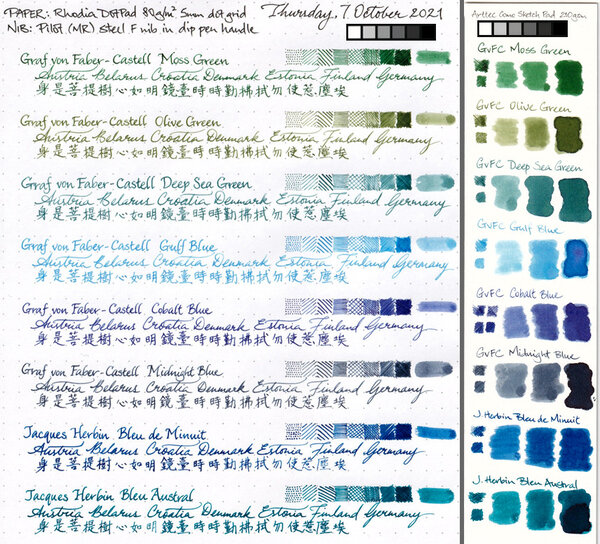
- jacques herbin
- bleu austral
- bleu de minuit
- graf von faber-castell
- moss green
- olive green
- deep sea green
- gulf blue
- cobalt blue
- midnight blue
- parker urban
- night sky blue
- diamine chocolate
- platinum
- vicoh
- kanazawa
- gold leaf
- maki-e
- kanazawa-haku
- modern maki-e
- slender
- feminine
- snap cap
- penbbs
- chinese ink
- lamy 2000
- aurora
- ottantotto
- aurolide
- rose gold
- 888
- limited edition
- solar system
- planets
- jupiter
- giove
- conway stewart
- cs 58
- duro nib
- 14k
- medium nib
- green
- hatched
- sheaffer
- balance
- statesman
- 14k
- fine nib
- 1930s
- sheaffer
- balance
- statesman
- 14k
- fine nib
- 1930s
- webster gold crown
- webster gold crown
- webster gold crown
- jinhao x159
- feed diameter
- size 8 nib
- my foot!
- pilot
- plumix
- ef nib
- bb nib
- stub nib
- steel nib
- pilot
- plumix
- ef nib
- bb nib
- stub nib
- steel nib
- pilot
- plumix
- ef nib
- bb nib
- stub nib
- steel nib
- space
- stationary
- planets
- rubber
- pencil
- ruler
- vjreviews
- vjreviews
- nibsmith
- dan smith
- italic
- nibsmith
- dan smith
- italic
- lamy z52
- lamy studio lx all black
- aurora ipsilon
- faber-castell essentio
- noodlers aircorp blue black
- aircorp blue black
-
-
desaturated.thumb.gif.5cb70ef1e977aa313d11eea3616aba7d.gif)
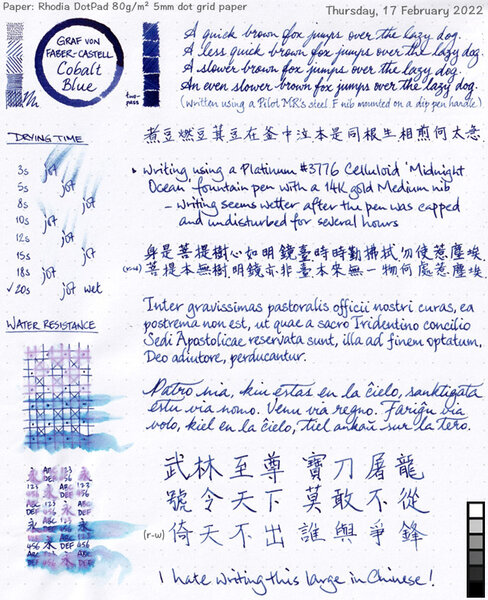
GvFC Cobalt Blue ink review - shading and sheen
A Smug Dill posted a gallery image in FPN Image Albums
-
From the album: Shades of colour
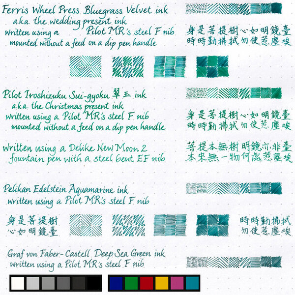
Since I just did this for my wife to select ink colours with which to fill her pens, I may as well scan and post it.© A Smug Dill
- 0 B
- x
-
- ferris wheel press
- bluegrass velvet
- (and 8 more)
-
desaturated.thumb.gif.5cb70ef1e977aa313d11eea3616aba7d.gif)
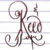
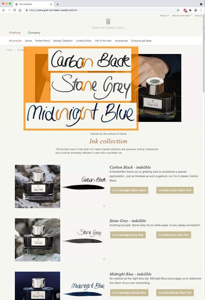
Poorly written minuscule n on GvFC ink bottle labels
A Smug Dill posted a gallery image in Premium Account Albums
From the album: ~Nothing to see here, move along
Image source: Screenshot of https://www.graf-von-faber-castell.com/ink In reply to: https://www.fountainpennetwork.com/forum/topic/266387-graf-von-faber-castell-carbon-black-ink-review/#comment-4498066
- 0 B
- x
-
- graf von faber-castell
- bottle labels
- (and 3 more)
-
desaturated.thumb.gif.5cb70ef1e977aa313d11eea3616aba7d.gif)
Matching inks to Pelikan Classic M20x pens - shortlist
A Smug Dill posted a gallery image in FPN Image Albums
From the album: Shades of colour
Shortlist of inks with which to fill some of my Pelikan M20x pens© A Smug Dill
- 0 B
- x
- 5 comments
-
- jacques herbin
- bleu austral
- (and 8 more)
-
From the album: Chinese pens
The Schmidt steel F nibs on Moonman M100 and M200 pens, as well as the rebranded version on Kaco Edge pens, are just so consistent in how they put down befittingly narrow lines of ink. The cap seal effectiveness of the Moonman M200 pens aren't half bad, either. I filled these pens five weeks ago, and it seems only roughly 10% of the ink in the converters have evaporated in the meantime.© A Smug Dill
- 0 B
- x
- 1 comment
-
- graf von faber-castell
- gvfc ink
- (and 6 more)
-
From the album: Ink performance testing
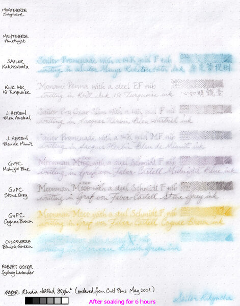
I didn't really set out to test the water resistance of these inks; I'd wanted to compare the paper in two different Rhodia dotPad No.16 notepads ordered a couple of years apart, and these inks just happen to be in pens that are on hand and ready to write. Graf von Faber-Castell claims its inks are indelible. Well, I guess the water resistance of the three I tested here aren't bad. Even though it'd be a struggle to read what was written in GvFC Cognac Brown after a long soak, I must say what's left of the marks on the page are distinct enough to make the text legible if one really tries. I am pleasantly surprised by the water resistance of the two Jacques Herbin inks, even if they aren't are good in that regard as GvFC. I'm disappointed to the same extent that the two Monteverde inks were washed away without leaving a trace.© A Smug Dill
- 0 B
- x
-
The main event is the site-wide discount(s): 10% off the total for orders of value £40 or more¹, and 15% off the total for orders of value £75 or more². The respective discount codes expire on 26 May. Then there are selected items specially discounted, including Faber-Castell Essentio Carbon fountain pens (all nib sizes) for £13.33 ex VAT each — before applying a site-wide discount code! They're probably worth buying at that price for the excellent steel nib alone, never mind whether you may be apprehensive about (numerous) anecdotal reports that their gripping sections cracking. Buy three or more of them, or two pens and a handful of Faber-Castell (‘international standard’) converters, and qualify³ to get, free of charge⁴, a Faber-Castell pencil case filled with a Pitt Artists Drawing Pen, a 2B pencil, an Apollo mechanical pencil, an eraser-tipped Grip pencil, a fineliner and a kneadable eraser as well. 75ml bottles of Graf von Faber-Castell ink are also £13.33 ex VAT each. I think the pens are regularly priced at £25 ex VAT, and the inks £20.83 ex VAT. — ¹ The actual eligibility criterion is order total value of £33.33 or more excluding VAT and shipping. Apply discount code BIRTHDAY10. ² The actual eligibility criterion is order total value of £62.50 or more excluding VAT and shipping. Apply discount code BIRTHDAY15. ³ With eligible Faber-Castell (not GvFC) products in the shopping cart totalling £33.33 or more excluding VAT. ⁴ If the item is in stock at the time for you to add, and you in deed (remember to) add it to your shopping cart before checking out.
- 15 replies
-
- site-wide discount
- graf von faber-castell
- (and 3 more)
-
I'm curious about a few colors in the GvFC line, but have not decided if I want to "pull the trigger" yet, so to speak. Seems like they are well-respected inks, but I can't tell if it's more because of the general impression of a high-end product due to the heavy-duty glass designer bottle, or if the inks themselves stand out in some way. (I must admit, it bothers me that they label their inks as "indelible", but the water resistance part of that is not near-100% like a true permanent ink would have. Almost all of their inks wash off significantly, but do leave something behind. People then give recommendations of GvFC inks for those who want permanence, and it's misleading. Other than trying to avoid having a document tampered with, I imagine vast majority of people who want high water resistance just want it for low susceptibility of their writing to, say, picking up a written page and smearing the writing if one's hands are not perfectly dry, or an accidental flooding of an area where a journal is kept, or any number of sub-optimal long-term storage conditions that involve water or dampness. indelible: (of ink or a pen) making marks that cannot be removed. synonyms: ineradicable, inerasable, ineffaceable, unexpungeable, indestructible, permanent, lasting, persisting, enduring, stubborn, ingrained, unfading, imperishable; More ) That said, I can forgive some semantics, if the product is good otherwise, and I'm curious about the inks themselves. For those here who use the GvFC inks--what do you like about them that makes them stand out? Or else, if not stand out, what do you like about their behavior? Would you get them again if you found other brands' inks in similar enough colors?
- 63 replies
-
- gvfc
- graf von faber-castell
-
(and 1 more)
Tagged with:
-
Graf von Faber-Castell was founded in 1761 and developed into the major manufacturer of wood-cased pencils. With time they started to offer much broader range of products. Few years ago company's introduced six inks. Last year they've added three new colors to the line. This year they've done the same. Three new GvFC colors hit the shelfs. Burned Orange Carbon Black Cobalt Blue Deep Sea Green Electric Pink Garnet Red Hazelnut Brown Midnight Blue Moss Green Royal Blue Stone Grey Turquoise Violet Blue Electric Pink is quite cool.Not as cool as Rohrer & Klingner Solferino but it has some character. The ink behaves well, doesn't cause feathering (unless you use really bad paper) The flow is agood, close to J. Herbin inks. The ink feels rather wet. In wet nibs it can offer nice shading. Drops of ink on kitchen towel Software ID Color range Rhodia, FC Ambition, M Leuchtturm1917, Faber-Castell Ambition, M Moleskine, Faber-Castell Ambition, B Water resistance Mini-comparison
-
Graf von Faber-Castell was founded in 1761 and developed into the major manufacturer of wood-cased pencils. With time they started to offer much broader range of products. Few years ago company's introduced six inks. Recently they've added three new colors to the line. Carbon Black Cobalt Blue Deep Sea Green Garnet Red Hazelnut Brown Midnight Blue Moss Green Royal Blue Stone Grey Another one of three new colors is the line is Midnight Blue. As I started to develop some taste in blue/blacks I was eager to try this one. I've tried it and I'm not satisfied. The ink, contrary to Deep Sea Green, behaves rather well but is really, really boring. The lubrication is average, saturation is average, color is generic. Only bottlem company's logo and price are premium. Bottle content is average. Graf von Faber-Castell is going iin wrong direction :/ Drops of ink on kitchen towel Software ID Tomoe River, Kaweco Classic Sport, B Leuchtturm 1917, Kaweco Classic Sport, B Oxford, Duke, F/M Water resistance
-
I won't add much to previous fantastic reviews of this ink, such as the ones here: https://www.fountainpennetwork.com/forum/topic/335816-gulf-blue-graf-von-faber-castell/ But I will add my subjective impressions of using this ink and some more scans and photographs. Graf von Faber-Castell makes a luxury line of inks in beautiful, heavy glass bottles that will decorate any writing desk and will draw the eye. Despite the high price, the bottles contain 75ml of ink, so price per ml is actually reasonable. Considering other brands that sell in 20-30ml bottles for lower prices, but you get 2-3 times less ink. The packaging overall is top notch quality (personal note: I love the scent of the thick paper the box is made with, or maybe it's the ink used to print the graphics on the box). In my experience with 10 colors of GvFC ink, all are a varying degree of low lubrication and dryness. Some might be "liquidy" coming off the nib, but the overall ink flow will not be high. Colors like Moss Green, Cobalt Blue, and Hazelnut Brown are more saturated and a bit more lubricated. Deep Sea Green and Gulf Blue have little to no lubrication and are very dry, and so they benefit from juicy pens with smooth nibs. Or else you will feel every imperfection of your nib and texture of the paper you write on. Recently I have come to appreciate dry inks for the look they can provide if they are made of different hues of constituent dyes. This is the same type of dry flow and lack of lubrication one might find with certain translucent, multi-hue Sailor Manyo, Sailor Ink Studio, Troublemaker, and other inks of that nature. I am guessing the lack of surfactants, low saturation, and low lubrication are necessary to achieve color separation within a line, because some dyes flow farther than others, thus separating into gradients. Graf von Faber-Castell Gulf Blue is a multi-hue powder blue ink. It reminds me of blue hydrangea flowers, with areas of pale aqua-sky blue in dry areas and shifting to lavender in more saturated areas. It has a similar idea to Troublemaker Milky Ocean, but Milky Ocean is comparatively more purple-shifted and slightly more saturated. I highly recommend broad or cursive italic/stub nibs for this ink to get the most of the color gradient effect. The wetter your pen, the better, both for the smoother writing experience and for the ink to be more prominent on paper. Here is a scan of a mini-review sheet, paper is ivory-toned Fabriano Bioprima 85g with 4mm dot grid: Graf von Faber-Castell claims their inks are indelible. You can go back and forth about the ISO standard the brand uses, but in practical terms, the ink has some but low water resistance. The purplish line remains behind if you dab the wet writing with a paper towel quickly, and you might be able to read the original writing if the lines were thick enough, as you can see on the scan above (the grid lines are very faint compared to the cursive italic writing). The ink is pale to begin with, and the remaining lines are even more so. Here's a scan of some blue-turquoise inks next to Gulf Blue on ivory-toned Nakabayashi Logical Prime notebook paper: Photographs: On Tomoe River 52g "white" in a Hobonichi Cousin planner: Fabriano Bioprima 85g, using water brushes: Comparison with Troublemaker Milky Ocean: Milky Ocean: Milky Ocean:
- 13 replies
-

First Look: Graf Von Faber-Castell Tamitio Calligraphy Set
dms525 posted a topic in Fountain Pen Reviews
I am always on the lookout for new fountain pens with italic/calligraphy nibs. I had recently bought two Graf von Faber-Castell pens and had their nibs ground to cursive italic by Mike Masuyama at the San Francisco Pen Show in August. I was enormously pleased with how these nibs performed. So, when I got an email from La Couronne du Comte in September announcing a new GvF-C Tamitio Calligraphy Fountain Pen set with 3 italic nibs, I didn’t hesitate to order. Actually, it turned out to be a pre-order. The pens had not yet been produced. Then there was a further delay due to production or quality control problems with one of the nibs. I finally received the pen and nib set yesterday. It was worth waiting for. Faber-Castell has two lines of pens, each with several models. Their more expensive series is called “Graf von Faber-Castell” and ranges from the famous “Pen of the Year” (POTY) luxury pens to the Tamitio at a much lower cost. The Tamitio is the only model in the GvF-C range with a steel nib; the other models have 18Kt gold nibs. It also has a different clip and is a shorter pen, although the “Classic” series pens are more slender. The Calligraphy set includes a black Tamitio pen and three italic nibs. The pen is also available with a single round nib in several widths. The barrel is enameled brass and feels substantially weighty. The cap and sections are plated - I have read they are plated with rhodium and elsewhere that the plating is platinum. The nibs are 1.1, 1.4 and 1.8 mm wide respectively. The pen and nibs seem to be of the same high quality as the other GvF-C pens I own. The nibs are rather stubbish, but do write with enough line variation for use in italic or gothic calligraphy. Of course, they can't be compared to the GvF-C gold nibs that were custom-ground for me by Michael Masuyama, but the whole set costs much less that either of the other pens. Most of the Graf von Faber-Castell pens have a form recalling the company’s origin as a maker of lead pencils. They have straight barrels and generally are smaller in diameter than most pens. This concerned me before my first purchases of this make, but I found the Intuition Platino very comfortable and the thinner Snakewood LE in the Classic model quite usable, albeit rather thinner than my personal ideal. The Tamitio’s diameter is between that of the Classic and Platino pens. It is missing the slight flair at the nib end and has a very short metal piece for the section. This makes for a mildly uncomfortable grip. In fact, I am not sure just how I will end up holding this pen. GvF-C pens for size comparison. L to R: Classic (Snakewood LE); Intuition Platino; Tamitio All in all, I am happy with this set. I expect I will accommodate to the ergonomics of the barrel. I’m thinking about getting another Tamitio, so I can use two of the italic nibs at once. David- 9 replies
-
- graf von faber-castell
- calligraphy nibs
-
(and 2 more)
Tagged with:
-
An Intuitive Conversation With The Graf Von Faber-Castell Intuition
sannidh posted a topic in Fountain Pen Reviews
After a long & strong fight with the penavarice-devil , I finally gave in and bought a GvFC Intuition. I went with the 'terra' - the red-orang-ish barrel. I have also replicated the content with some additional pictures in my blog as the images are reduced to a small thumbnail after a short-while. Below is a link to the same: Graf von Faber-Castell Intuition Review Here goes a review of the same: The Intuition With a covetous eye on this pen, since the time I had got my FCD Ambition and then an orange coloured Ondoro fountain pen, it indeed required lady luck's blessings, to get this one at a steeply discounted price. I must say, that there was already a strange sense of loss of colours, after I had given both of my orange coloured fountain pens away - Ondoro (mint & boxed) and later the Pelikan m205. And this was an appropriate treatment for my colour blindnesshttp://lh5.ggpht.com/-a-Tba4pAIVk/VPfDFXW0uAI/AAAAAAAAEBE/0lhEVc5hixI/wlEmoticon-rainbow2.png?imgmax=800. Coming to the Faber-Castell Design(FCD) and the rather luxurious Graf von Faber-Castell(GvFC) line of pens, I must say that they have been able to splendidly highlight the art of convergence of design and utility. The Intuition pen comes in six lines of resin-based designs and two(earlier three) lines of wood-based designs. The wooden designs are called Intuition Platino Wood which is an enhanced intuition design altogether, be it the fluted wooden barrel or the platinum plated cap or an extra-large and more exquisitely designed bi-colour nib. And, it naturally places them in a more premium segment http://lh3.ggpht.com/-xbUGfrYQ50k/VPfDGkDN4aI/AAAAAAAAEBM/SJueZw-VO6s/wlEmoticon-surprisedsmile2.png?imgmax=800. All these design lines come with a fountain pen (with 6 to 7 different nib widths), a roller ball, a propelling pencil (0.7mm) and a ballpoint pen. Presentation (6/6) It’s a chamois-coloured gift box with top and bottom wooden linings, which secures itself by a magnetic catch within the two folds. There is the pen resting in a cardboard box within a chamois-coloured linen bag, which carries the Graf Von Faber-Castell name and their coat-of-arms logo. I someway like the linen, bag because of its differentiated appeal, though not from an utilitarian perspective. There is also a warranty leaflet-cum-manual, which states a lifetime guarantee against manufacturing defects and assures services, in case any need for repair arises. Then, it also illustrates refilling the entire range of GvFC pens and other stationery. http://s25.postimg.org/pcc1oi7n3/Gv_FC_001.jpg Design (6/6) The Intuition range comes in six variants (terra - orange, ivory – off-white/fluted, black - black/fluted/metal cap) with six different nib sizes – EF, F, M, B, OM and OB. Only one of these variants comes with a platinum plated metal cap with a shiny black barrel. Coming back to the pen, once you take it out, it surely looks like a compact enchanting piece of art. A high gloss sheen of the of the barrel and the cap reflects back quite a bit of light. Complementing this sheen, are the dazzling platinum plated trims of the pen. http://s25.postimg.org/u4qwx28mn/Gv_FC_009.jpg On pulling the cap off, you would initially notice the singularity of the barrel, a section sans joints. It’s made out of a single piece of resin, in this case reflecting the colour of earth or ‘terra’, gleaming with an orange smile. At the top end of the barrel, is a twist-metallic crown, which disengages the bi-tone nib section and converter system, from the rest of the body. I just love this element of design! The knob is embossed with the coat-of-arms logo, on the finial. Usually the coat-of-arms logo is used in GvFC pens and FCD pens(Ambition, Ondoro, e-motion) carry the jostling knights logo. Traditionally coat-of-arms is said to represent full-achievement in a heraldic tradition. GvFC has quite a bit of design superiority over the other FCD pens. Towards the nib end, the singular barrel narrows down to a slightly concave section to form a comfortable grip. Despite the glossy and smooth finish, the pen has a subtle but non-slippy grip section. The cap is engraved with GRAF VON FABER – CASTELL, encircling the metallic finial insert which again bears another coat-of-arms logo with its platinum sheen. The cap band says GRAF VON FABER – CASTELL on one side and on the other end it's HANDMADE IN GERMANY. ‘Handmade’ because there are over a hundred steps in the entire manufacturing process of this pen, a majority of which are carried out by hand. The clip on the cap carries the gleam of platinum with a highly efficient and visible spring loaded system. http://s25.postimg.org/xcqcczokv/1_Gv_FC.jpg Filling System (6/6) Once the crown of the barrel is rotated anti-clockwise to disengage the nib & filling system, you would notice a rather classical CC filler system. The nib has a screw fit, and inserts into a metallic sleeve like most of the Faber-Castell fountain pens which I have seen. The nib sleeve has threads which synchronize with threads on the inner barrel, both ending up with an octagonal cross section. The converter has a metallic premium band which friction-fits into the nib section though it does not fit a FCD Ambition section. However, the Ambition converter fits in the Intuition nib section. The converter has a reasonably high capacity of 0.8 – 0.9 mL, and the ink does last for quite a while! I usually have a bias towards piston fillers, but I do appreciate the Faber-Castell converter capacity. http://s25.postimg.org/xgk5t8u27/2_Gv_FC.jpg The nib section carries a six-digit number which denotes the date of manufacture, which I did confirm with the Faber-Castell team. Mine says 011210, which would mean it was manufactured way back on 01-December-2010.http://lh3.ggpht.com/-4LhAicXcVUM/VPfDJ9JciiI/AAAAAAAAEBk/kRvZ6XhRsSM/wlEmoticon-peace%25255B2%25255D.png?imgmax=800 Nib (5/6) – All that matters The 18k bi-tone nib comes in four main widths – EF, F, M & B and two special widths – OM (left) & OB (left). The tail end specifies the nib size and composition (75% Au , 18 ct) of the alloy used. A white rhodium decor occupies the outer tines converging with the iridium tip, while the inner part circumscribing the breather hole gleams golden with engraved stripes. There is a dazzling white coat-of-arms logo resting just above the tail-end. This one is a fine nib and writes quite smoothly with a 'minutely minute' hint of feedback when I use relatively drier inks. It lays down a wet albeit fine line, which will be covered in the last section of this review. With a rather curved shoulder, the nib does portray an apparently smaller size even if it’s quite similar to the size of the relatively flat Ambition nib. [minus 1] http://s25.postimg.org/yhkeidb1r/Gv_FC_008_wb.jpg Below is a comparison to the FCD Ambition (non-premium) sections. You can check the differences between the two converters, the Intuition has got some metallic embellishment. They do use a similar feed. http://s25.postimg.org/fnylldctr/3_Gv_FC2.jpg Physics of it (4/6) – relatively speaking With a cylindrical body of 1.2 cm diameter, it does give a comfortable feel without adding too much weight. The capped length of 12.5 cm is quite similar to a Pelikan m400. In short, it is quite a compact pen when compared to an MB146 or even a thinner Ambition, for that matter. And a compact pen, can have its advantages along with some disadvantages. The weight of this pen has a significant contribution from the resin cap. http://s25.postimg.org/93vtf0ysv/Gv_FC_017.jpg Uncapped Length ~ 12 cm Posted Length ~ 15 cm Nib Leverage ~ 2 cm Overall Weight ~ 29.4 g Uncapped, it’s quite similar to the m400 but slightly shorter than the Ambition. The loss of weight and length is somehwat balanced by the wider grip section, if not completely. http://s25.postimg.org/g9nkhh7vz/Gv_FC_018.jpg Alternatively, you can post it and it’s similar to a posted m400 with a slightly top-heavy configuration. However, I feel comfortable to use it both posted and unposted, although I never have shared the same feeling with Ambition. http://s25.postimg.org/hant6lovj/Gv_FC_019.jpg Economic Value(5/6) Although pen retails around USD 600, it is available at a street price of around USD 430. With end of season clearance sale, I was able to get the pen at a good discounted price (around 50%). Overall (5.3/6)I feel loved by the design and exquisite appeal of this pen on an overall scale, whenever I write with it. No skipping or hard starts right from the beginning, it was quite smooth out of the box. With a stiff nib, it delivers a wet (not broad) line, with the fine nib. The line width closely resembles a Japanese FM nib. For a pelikan 4001 brilliant green ink, it takes around 12-13 seconds to dry up. You may not notice any line variation with horizontal and vertical strokes for this one. http://s25.postimg.org/bp1e2jo6n/Gv_FC_020.jpg It was fun reviewing the intuition. Hope you enjoyed reading it. Thank you for your time. Awaiting your feedback on the intuition... Best, Sonik- 41 replies
-
- graf von faber-castell
- intuition
-
(and 8 more)
Tagged with:
-
Disclaimer: I enjoy doing mini ink reviews for my personal reference, and I'd like to share them with others if they might be of help to gain an insight into the ink's appearance and performance. I generally don't have time to put together super comprehensive reviews, like some of our fantastic reviewers here do (thank you so much for your hard work!), but hopefully these mini reviews will still be useful as another point of reference. Graf von Faber-Castell - Deep Sea Green Recently I became interested in GvFC inks. They seemed overpriced before, and I was severely disappointed with my first encounter with Deep Sea Green. I had bought a set of DSG cartridges for a trip, and when I popped one into a pen in my hotel room and saw the watery, pale tealy green, I thought "This is not what I expected". This is a very dry ink with low lubrication, so that did not predispose me toward it either. I went to a local fountain pen shop next day, bought a set of Visconti Sepia cartridges, and did not look back. That was over a year ago. Fast forward to a few months back. I kept looking at the writing made with this ink as well as at reviews. I have also since become more enamored with inks that 1. have a kind of watercolor look with color complexity (can see constituent dyes separate a bit) and 2. inks that are not so wet that they can provide high line definition with very thin hairlines. To that extent, high lubrication and wet flow are generally exclusive of good line definition and are more synonymous with increased line thickness. There was a good sale on GvFC inks around Black Friday, and so I ended up with 5 bottles of various colors, including this one. I'm very happy to own this ink and other Graf von Faber-Castell inks. It is true: the bottles are absolutely luxurious--the best I have experienced to date of any brand. The way the bottle cap opens so smoothly and is very heavy is just so pleasant. I even love the scent of color print dyes in the cardboard packaging. It's all just perfectly appealing and tactile. The inks themselves tend to be dry, with varying degrees of lubrication depending on color. Deep Sea Green in particular is not well lubricated. However, it is a sacrifice I am now willing to make given the aforementioned conditions. What's cool about this ink is that it is not monochromatic, and it really does look like watercolor. It can be more or less gray or blue, or green depending on concentration, paper, and illumination. Drying time is very fast to super slow--depends on whether you've let it sit and concentrate in a pen. At the end of this review, I am attaching a photograph of how this ink looks once it sits in a pen for a month and becomes fairly concentrated. The periods take close to half an hour to dry at that point (or even longer), until they stop smearing easily. That's an extreme case, but some inks do this more than others. Another ink that behaves like this in concentrated form is J. Herbin Lie de The, which can take multiple hours to fully dry in the dotted spots. Water resistance is quite good: well-defined gray line remains. This ink is an excellent candidate for watercolor-type drawings. While Deep Sea Green can look somewhat similar to J. Herbin Vert de Gris, the two are very different in details. Vert de Gris has a very chalky pastel finish with some watercolor wash, Deep Sea Green looks like watercolor with more in-line hue variation. Bottom line: A+ art and specialty ink. Beautiful and soothing for personal journaling for those who appreciate nuances of color and finish on good paper. I would not recommend it for note taking or professional environment due to lack of lubrication, dry flow, and rather pale appearance when fresh. If you let it concentrate, you will encounter long drying times, which is also not good on-the-go. Papers used in this review are: Fabriano Bioprima 4mm dot grid - a kind of ivory color, lightly textured, uncoated Kokuyo loose leaf A5 - lightly coated white Japanese paper Nakabayashi Logical Prime notebook - coated and super smooth ivory-toned Japanese paper, shows things like sheen and hue variation pretty well Photographs: Scans: Fabriano Bioprima, ivory: Highly concentrated version that took forever to dry in the "dots"; paper is Kokuyo Loose Leaf A5. Ignore the comment about using this for notes and professional environment -- that's before I realized just how long it takes to dry like this..
- 8 replies
-
- gvfc
- graf von faber-castell
-
(and 2 more)
Tagged with:
-

Interview With Count Charles Alexander Von Faber-Castell
Appelboompen posted a topic in Other Brands - Europe
Hi fellow Graf von Faber-Castell enthusiasts, We made an interview with the Count von Faber-Castell and perhaps you find it interesting: https://www.youtube.com/watch?v=eSMiGR6cFqQ P.s. don't forget to subscribe to the channel for more cool videos regarding writing instruments!-
- faber-castell
- graf von faber-castell
-
(and 1 more)
Tagged with:
-
I was recently looking at my profile and debating whether I should add a favorite ink. One of my favorites when using cartridges has always been Graf von Faber-Castell's Hazelnut Brown. Graf's inks no longer seem to be available at the U.S. stores I normally order from (Goulet, Pen Chalet). The manufacturer's site doesn't seem to have a direct-to-consumer sales option. The ink does still appear to be in production, and is available at JetPens, but it seems slightly ridiculous to order a European ink from Japan to go the Americas. Does anyone know the status of these inks in North America? Thanks.
- 6 replies
-
- graf von faber-castell
- goulet
-
(and 3 more)
Tagged with:
-
Brown is one of my favourite colors. I always have at least one fountain pen filled with brown ink. I’d like to compare two premium brown inks that I own. It’s a pity I don’t have new Organic Brown ink by Caran d’Ache because it would suit well this comparison of premium inks. Anyway take a look at HAZELNUT BROWN - Graf Von Faber-Castell http://imageshack.com/a/img854/1536/kdgi.jpg TSUKUSHI - Pilot Iroshizuku http://imageshack.com/a/img849/6075/ybvo.jpg The colors of both inks were inspired by colors of nature: Hazelnut Brown aims – quite well in my opinion – to reflect the color of hazelnuts: http://imagizer.imageshack.us/v2/1024x768q90/850/bx3u.jpg www.adagio.com Tsukushi aims – not so well in my opinion – to reflect the color of field horse tail: http://imagizer.imageshack.us/v2/1024x768q90/811/cr0t.jpg www.djsphotography.co.uk First, let's take a look at the bottles: HAZELNUT BROWN - Graf Von Faber-Castell http://imageshack.com/a/img59/9138/1rpg.jpg http://imageshack.com/a/img835/4257/jqgq.jpg http://imageshack.com/a/img59/8614/iyk1.jpg TSUKUSHI - Pilot Iroshizuku http://imageshack.com/a/img691/6519/h322.jpg http://imageshack.com/a/img69/9100/xpvy.jpg http://imageshack.com/a/img607/3855/ax8a.jpg COMPARED http://imageshack.com/a/img854/9160/2a6a.jpg http://imageshack.com/a/img163/4038/gxao.jpg http://imageshack.com/a/img836/3287/jdfo.jpg Next let's see how they behave on the paper: 1. Few drops of ink on kitchen towel http://imageshack.com/a/img854/9863/2uof.jpg 2. Text written with Pilot78G (B nib) in cheap notebook: http://imageshack.com/a/img843/9537/cdba.jpg http://imageshack.com/a/img703/2799/22fp.jpg http://imageshack.com/a/img822/1115/ei3p.jpg 3. Text written with Pilot78G (B nib) on copy paper printed with dots: http://imageshack.com/a/img819/4166/o4ip.jpg Vertical lines = Hazelnut Brown, horizontal lines = Tsukushi http://imageshack.com/a/img856/8972/hx7w.jpg Corners UL + BR = Hazelnut Brown, BL + UR = Tsukushi http://imageshack.com/a/img838/3428/xieb.jpg Above - Hazelnut Brown, below - Tsukushi 4. Text written in quality notebook http://imageshack.com/a/img829/6894/7wpi.jpg 7. Waterproof or not http://imageshack.com/a/img203/9435/q8we.jpg http://imageshack.com/a/img713/722/h793.jpg http://imageshack.com/a/img823/8622/1dv0.jpg SUMMARY: I like both of these inks, however id I had to choose only one I would choose Hazelnut Brown. It’s warmer and nicer. BOTTLE: I don’t like GvFC bottle. It is, in a way, reminiscent of Iroshizuku bottle, yet I find it rather uglyJ On the other hand the cap used in GvFC is really solid, while the cap in Iroshizuku bottles is quite fragile. If one allows some ink to cake around the rim, and doesn’t use this ink for weeks, the opening of the bottle may be hard and risky. My Shin-ryoku cap cracked while I was trying to open it after a month of noy using the ink. PRICE: I have problem with Pilot pricing politics. Look at Caran d’Ache and Graf von Faber Castell. They offer premium products that cost almost the same amount of money everywhere in the world. It’s OK and fair enough to me. When it comes to Pilot however the price point for Isroshizuku inks differ from region to another. In Japan you can buy a bottle for around 10-15 $. In usa you can have a bottle for 30 – 40 $. In my country – Poland – official MSRP is 55 $. Now, when it comes to GDP, Poland in not really close to Katar or Luxembourg or Monaco and I can find nothing that would justify this price point. Happily, as a Client, I have a choice and I can buy products anywhere in the world. That’s why I bought Iroshizuku bottle for 21,67 $ (shipment included) on Amazon. I like both of these inks and I enjoy them a lot. Are they worth the price? I would say yes. What’s your opinion?
-
http://inks.pencyklopedia.pl/wp-content/uploads/Graf-von-Faber-Castell-Carbon-Black-nazwa.png I present to test the ink Graf von Faber-Castell Carbon Black with a very nice, well-saturated black. Despite beautifully composed black ink has one drawback - quite a long dry up. However, if someone does not mind, you will be very pleased, because the other parameters without complaint. Recommendable. Manufacturer: Graf von Faber-Castell Series, colour: Carbon Black Pen: Waterman Hemisphere, nib "F" Paper: Image Volume (80 g / m2) Specifications: Flow rate: good Lubrication: good Bleed through: unnoticeable Shading: unnoticeable Feathering: unnoticeable Saturation: very good A drop of ink smeared with a nib http://inks.pencyklopedia.pl/wp-content/uploads/Graf-von-Faber-Castell-Carbon-Black-kleks.jpg The ink smudged with a cotton pad http://inks.pencyklopedia.pl/wp-content/uploads/Graf-von-Faber-Castell-Carbon-Black-wacik.jpg Lines http://inks.pencyklopedia.pl/wp-content/uploads/Graf-von-Faber-Castell-Carbon-Black-kreski.jpg Water Resistance http://inks.pencyklopedia.pl/wp-content/uploads/Graf-von-Faber-Castell-Carbon-Black-woda.jpg Ink drying time http://inks.pencyklopedia.pl/wp-content/uploads/Graf-von-Faber-Castell-Carbon-Black-wysychanie.jpg Ink drops on a handkerchief http://inks.pencyklopedia.pl/wp-content/uploads/Graf-von-Faber-Castell-Carbon-Black-chromatografia1.jpg Chromatography http://inks.pencyklopedia.pl/wp-content/uploads/Graf-von-Faber-Castell-Carbon-Black-chromatografia.jpg Sample text http://inks.pencyklopedia.pl/wp-content/uploads/Graf-von-Faber-Castell-Carbon-Black-txt.jpg Sample text in an Oxford notebook A5 (90 g / m2) http://inks.pencyklopedia.pl/wp-content/uploads/Graf-von-Faber-Castell-Carbon-Black-Oxford.jpg Sample letters in a Rhodia notebook No 16 (90 g / m2) http://inks.pencyklopedia.pl/wp-content/uploads/Graf-von-Faber-Castell-Carbon-Black-Rhodia.jpg


