Jump to content

Search the Community

Showing results for tags 'gold nib'.

  • Search By Tags

    Type tags separated by commas.
  • Search By Author

Content Type


Forums

  • FPN Community
    • FPN News
    • Introductions
    • Clubs, Meetings and Events
    • Pay It Forward, Loaner Programs & Group Buys
  • The Market Place
    • The Mall
    • Market Watch
    • Historical Sales Forums
  • Writing Instruments
    • Fountain & Dip Pens - First Stop
    • Fountain Pen Reviews
    • Of Nibs & Tines
    • It Writes, But It Is Not A Fountain Pen ....
    • Pen History
    • Repair Q&A
  • Brand Focus
    • Cross
    • Esterbrook
    • Lamy
    • Mabie Todd Research/Special Interest Forum/Group
    • Montblanc
    • Parker
    • Pelikan
    • Sheaffer
    • TWSBI
    • Wahl-Eversharp
    • Waterman
  • Regional Focus
    • China, Korea and Others (Far East, Asia)
    • Great Britain & Ireland - Europe
    • India & Subcontinent (Asia)
    • Italy - Europe
    • Japan - Asia
    • USA - North America
    • Other Brands - Europe
  • Inks, Inc.
    • Inky Thoughts
    • Ink Reviews
    • Ink Comparisons
    • Co-Razy-Views
    • Th-INKing Outside the Bottle
    • Inky Recipes
  • Paper, and Pen Accessories
    • Paper and Pen Paraphernalia
    • Paper & Pen Paraphernalia Reviews and Articles
  • Creative Expressions
    • Pen Turning and Making
    • Pictures & Pen Photography
    • The Write Stuff
    • Handwriting & Handwriting Improvement
    • Calligraphy Discussions
    • Pointed Pen Calligraphy
    • Broad (or Edged) Pen Calligraphy

Blogs

  • FPN Board Talk
  • Incoherent Ramblings from Murphy Towers
  • The Blogg of Me
  • FPN Admin Column
  • Rules, Guidelines, FAQs, Guides
  • Musings on matters pen
  • Marketing & Sales
  • Iguana Sell Pens Blog
  • Newton Pens' Blog
  • Peyton Street Pens Blog
  • holygrail's Blog
  • A Gift For Words
  • I Don't Have a Name; So This Will Do
  • Karas Kustoms' Blog
  • Debbie Ohi's Inky Journal
  • Sus Minervam docet
  • Crud!
  • Clut and Clutter
  • Federalist Pens

Product Groups

  • FPN Pens
  • FPN Inks
  • FPN Donations
  • Premium/Trading/Retailer Accounts

Categories

  • Fonts
  • Tools & Software
  • Rules for Notepads & Paper

Find results in...

Find results that contain...


Date Created

  • Start

    End


Last Updated

  • Start

    End


Filter by number of...

  1. UpadhyayAbhinav

    Kanwrite Gold and Titanium Nibs

    Hi fellow fountain pen enthusiasts, Does anyone here have any experience with Kanwrite gold and titanium nibs. I am talking about the #6 titanium and gold nibs and also #9 gold nib available with Kanwrite Mammoth. How is the smoothness and softness of these nibs out of the box? Do titanium nibs give more feedback than their steel counterparts? How are flex capabilities of these nibs, especially the ultra flex versions? I am from India and Kanwrite is the largest and most trusted nib manufacturer here. I am planning to buy many pens from them with different nib combinations to figure out my real taste in fountain pens. I already own two Heritages from them with steel nibs. Currently my eye is on Legacy, Mammoth, or even more Heritages. Since gold and titanium nibs are pricier, I wish to know the user experience of others. I love smooth, wet, consistent, reliable writers and appreciate softness. I also intend to get into calligraphy with flex nibs. Any advice is highly appreciated.
  2. Hi fellow fountain pen enthusiasts, Does anyone here have any experience with Kanwrite gold and titanium nibs. I am talking about the #6 titanium and gold nibs and also #9 gold nib available with Kanwrite Mammoth. How is the smoothness and softness of these nibs out of the box? Do titanium nibs give more feedback than their steel counterparts? How are flex capabilities of these nibs, especially the ultra flex versions? I am from India and Kanwrite is the largest and most trusted nib manufacturer here. I am planning to buy many pens from them with different nib combinations to figure out my real taste in fountain pens. I already own two Heritages from them with steel nibs. Currently my eye is on Legacy, Mammoth, or even more Heritages. Since gold and titanium nibs are pricier, I wish to know the user experience of others. I love smooth, wet, consistent, reliable writers and appreciate softness. I also intend to get into calligraphy with flex nibs. Any advice is highly appreciated.
  3. Hi all, I am thinking about buying a Kanwrite Mammoth with a #9 broad nib, I have seen great reviews of it on Youtube and here, but I am torn between buying the steel vs gold nib. I love juicy smooth nibs, but I also like some softness which I have heard is absent in the steel nib. I have searched a lot but there is no review available online as of now for the Mammoth #9 14kt Gold nib. If anyone has used it, please share your experience, if you could post pictures of the nib and its writing, it would be wonderful. I want to know that if the quality of the nib really justifies the 14,000 rupees price jump, and as this would make this a very expensive pen, I would like to know ascertain whether it is a pen which can last a lifetime. Thank you so much to the community.
  4. Hi all, I am thinking about buying a Kanwrite Mammoth with a #9 broad nib, I have seen great reviews of it on Youtube and here, but I am torn between buying the steel vs gold nib. I love juicy smooth nibs, but I also like some softness which I have heard is absent in the steel nib. I have searched a lot but there is no review available online as of now for the Mammoth #9 14kt Gold nib. If anyone has used it, please share your experience, if you could post pictures of the nib and its writing, it would be wonderful. I want to know that if the quality of the nib really justifies the 14,000 rupees price jump, and as this would make this a very expensive pen, I would like to know ascertain whether it is a pen which can last a lifetime. Thank you so much to the community.
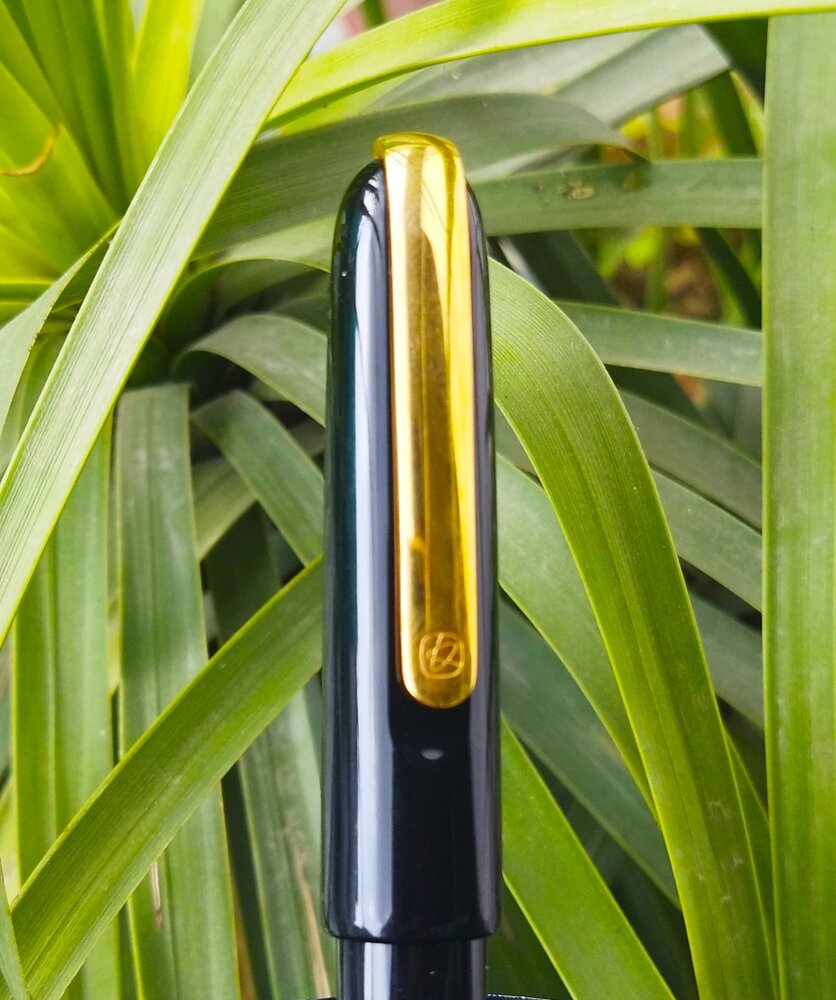
  5. Introduction This is a review of the "Master" from Kaco. I saw precious few reviews of this pen while I was researching for it, for possible purchase, either on youtube or written. I took a chance based on a few comments regarding the quality of the nib, and I am very glad that I did. This is one of those occassions where a gamble pays off. This is one of the best, if not the best, Chinese pens that I own - compared to 5 pens form PenBBS, 5 from Moonman and a couple of Wing Sungs and Jinhaos. This is also the most expensive Chinese made pen that I own, beating the 14K WingSung 698 and the Bock nibbed Moonman 800 (another excellent pen); however at $80, its not expensive for what you get. This pen cost around $80 on one of the discount weeks on Aliexpress. However, the price tends to fluctuate quite a bit from mid 80s to even up to $140...so try to catch a good deal if you can. For anything less than $100 - this pen is an absolute steal. Both for the elegance and ergonomics of the design as well as for the surprisingly springy and precise gold fine nib (which though an interesting quirk to keep in mind as I discuss below). Appearance & Design - This pen as a cigar shaped design (with the cap slightly more rounded than the barrel) which is a classic. The material is a glossy black resin polished to a high shine. there is only one visible accent which is a substantial metal clip. The clip is one of the defining features of this as it is spring loaded; and attached to the top of the cap. The clip also fit into a clip-shaped recess in the cap, so that the clip is almost (but not exacly) flush with the surface of the cap. the clip also has the only visible logo on the pen (besides the nib which I shall come to). Due to the spring mechanism, the clip is extremely ease to operate and very functional; if you care to post a pen this big. Other than that; the pen is understated and elegant. It seems perfect for use at workplace (will I use my most colorway acrylic pens in the workplace with impunity, but some workplaces are more stuffy I am told ;-)) . This seems to be a theme with Kaco - they seem to prefer to make 'business gift' oriented pens in solid colors and have seemingly eschewed colorful resins till now. the pen comes with an oval dedicated pen case, which can be stood upright, whereby it also operates as a pen holder. It has a foam insert with a hole cut out to rest the barrel so that the resin pen does not court scratches from the metal sides of the holder. Apologies as this was left in my office, and I could not fetch that (and a lot more things) given that lockdown was imposed in our country on a weekend night with 4 hours notice! So this link should give a fair idea Opening the cap, one sees an ample hourglass shaped section, followed by a number 6 14k nib in Fine with a minimalist design - just two lines parallel to the shoulders and the logo and below that, the words 14k. there is a broad thermoplastic feed which is similar to (but not same as) as Jowo #6 feed. the section is long and the threads for the cap are precise. The nib seems perfectly proportioned to the size of the pen. Overall, the pen looks stellar and understated. It reminds one of high end Urushi pens from across the East China Sea. It made me renege on my decision to not buy another black black for a while; so that's something. I just wish they offered this model in other solid colors (on this note, there is a steel nibbed, slightly smaller, version of this pen which cost about $30 and is also available in appealing red and white versions. Wonder why they didn't provide options for the 14k model...I'd have loved me a red version...). I also like that it does not look like an obvious rip off any other design - various influences are there (for example the clip is similar (though not identical) to that in the Lamy Imporium, and the body is similar to several Japanese ebonite and urushi pens, it is distinct enough to be an unique design. Construction & Quality– Construction is top notch. Forgot $100; it would not disappoint in a pen worth $300. There is no squeak in turning the threads (either of the barrel or the cap). The polish in the resin body and gold plated clip is top notch with a mirror like finish when new. On the flip side, this causes any gathered lint or dust to stand out, and may highlight even the smallest scratches (which it does; if you are one inspects obsessively). One that note, while the gold plating is of good quality, it does feel a bit soft and scratch prone; I have been accordingly, careful of how I place of the cap on the table etc. The nib and feed attach into a housing which doesn't appear to be removable. At least I was not able to. The nib and feed though can be pulled out with some effort. Weight, Dimensions and ergonomics This is a big pen, bordering on oversize. Smilar to MB149 and Sailor KOP Profit; However, most of the girth is in the cap; the barrel is actually, reasonably slim. Length; weight (capped): 154mm (6.06"); 28gms gms (1 oz) Length; weight (uncapped) : 135mm (5.3”) (measured from tip of nib); 14gms (0.5 oz) Length; (posted) : 161mm (6.34") Section length : 25mm (1”) Section diameter: 11mm to 13mm (0.43 – 0.5 inch) [this is a rough calculation). In short, it is large but not egregiously so. Further, the cap weighs exactly half the total pen weight (due to the substantial clip and the significantly larger diameter); hence it is very light and comfortable when used uncapped. I stress: this pen is perfect as far as ergonomics go. the section is perfectly contoured and the length and weight (uncapped) is just right. Some comparison pictures are below: This is what it looks like next to the PenBBS 380 and the Pilot Justus - both similarly large black pens pens at around 145-150 mm (5.8-6"") posted. This is a comparison with some other pens (left to right: TWSBI 580AL, Sailor Pro gear slim, Kaco Master, Montegrappa Fortuna teak, PenBBS 456) It posts deeply but not securely. You wouldn't need to post this pen; but you can subject to cap possibly falling if you suddenly turn it around. Nib & Performance - Cue: customary bokeh shot of nib It has a very well-tuned #6 nib which extremely springy and relatively soft, for a modern nib. the odd thing is that it has a significant forward curve; this creates an ...interesting sensation, as the apparent angle of the pen to paper is different from your normal holding angle. the forward curve can cause the pen to catch to paper in sudden down-to-up movements; such as rounding a 'g' or bottom-extension of an 'f'; this is more so on rougher papers. This seems to be a conscious design choice, as the pictures in the web listing suggest that this helps appreciate/ fully utilize the springiness of the nib. Even with this, I really do enjoy the nib - it is springy and soft, and really smooth with the required traction to have sufficient control over the written word. While springy, this is not a flex nib, and I wouldn't feel comfortable trying to coax out line variation. Pic of pronounced forward curve of the nib: The feed is a jowo type wide shoulder one; but is perfectly tailored to the curve of the nib. It was a little dry at first, but after a little adjustment, is providing uninterrupted generous supply of ink. Filling System & Maintenance – This is a simple C/C system. The converter is interchangeable with a schmidt K5 converter. The supplied one looks slightly larger but I could be mistaken. Disappointingly, it does not have metal reinforcements at the mouth. the plastic also is slightly cloudy and not crystal clear. However, it is perfectly functional. It is good that it uses the K5 standard, as one can use cartridges in a pinch. (apologies for the bubbles - it was a hurried fill) The nib is a true fine. When I think of fine, I think of this line width. Since this pen supplies, it makes me satisfied. Here is a comparison to well known nibs with similar line widths, namely European fines and Japanese Medium, with the same ink in all (Pilot Iro Yama Guri): As you can see, this nib writes very similar to a Jowo or Bock fine; and also similar to a pilot 14K and Sailor 14K Medium. The Kanwrite F is slightly finer, and the penBBS F is way fatter (its actually closer to a western medium). the Moonman is between the Kaco and the PenBBS. Some longer writing samples; one on Rhodia and the other on ITC classmate (a low cost, but really good, student notebook) Cost & Value – I paid about $80. This is on the lower end for this pen and usually available during sales. At this price, it is a phenomenal deal. I would say, given the quality, ergonomics and writing experience, anything below $125 is a good deal. Conclusion – This is a pen which ticks most boxes. I find it among the most comfortable pens to hold, and the writing experience, even with the quirky angle on the nib, is pleasurable. The build quality and finish is superb. Only concern for me is finding replacement feeds/ nibs in case of damage and the lack of color and nib width alternatives, which would prevent it from being a pen appreciated by a broader spectrum of FP users.
  6. This is a review of “Kaco Master”. It’s the best Chinese Fountain pen I have come across till now.Kaco is a young company which makes some great products. Kaco since its inception in 2011 have launched many pens & accessories . This “Kaco Master” is among their most premium offerings .This has German Made Gold Nib , it doesn’t feel like it’s made by Jowo or Bock. It feels a bit different from those both. I think they are made by special order or made by some other company ! Pros- – Great 14k Gold Nib – Well Tuned Out Of The Box – Soft & Springy Nib – Minimalistic Design – Top Notch Construction – Great Price – Great Packing & Presentation – Hourglass Shaped Section – Have Premium Look – Suitable For Long Writing Sessions Cons- – Only comes in one colour i.e. Black for gold nib. Although the steel nib version comes in many colors. – Don’t post securely. – I can’t expect anything more at this price !!! Packing- Great, The pen comes with a great grey metallic case, which comes in a black box over which “Kaco” is engraved. The metallic oval case has a foam insert in it where the pen can rest. This foam ensures that the pen doesn’t get scratched with the sides of the metal case. Specifications- – Nib Size -Fine Nib 0.5mm – Filling Mechanism: standard cartridges and converter – Capped Pen length: 154mm – Section Length: 25mm – Section Diameter: 12.5 mm – Uncapped Pen Length : 133mm – Diameter: 16.5 mm – Pen weight: 27.5g Appearance & Design- Good, The pen has a classic design. It’s made of great quality black resin which has been highly polished. The clip is of gold color & fit into a clip-shaped recess in the cap & almost aligns with the cap of the pen .The clip is strong & is very functional. It is unique & looks good in my pocket. The clip has a small logo of “Kaco” over it .The pen size is around 133 mm uncapped & 154 mm capped. It doesn’t cap securely.This pen is made in very nice black resin, it is super shiny & feels premium in hand . I wish they had other colors too. It has an hourglass-shaped section & a number #6 14k nib in Fine with “Kaco” logo engraved over. It has a plastic feed. The section is long & threads of the cap are precise. This nib looks good & is similar to JOWO nib but it’s not JOWO. The nib suits the pen size & looks good. This pen is very comfortable for long writing sessions too. Construction- Very Well Made, The construction of this pen is top notch.The pen has been polished well & has been given a mirror like finish on both clip as well as body. It looks pleasing to the eyes , but as a result it attracts dust & micro scratches may be noticeable. The pen is elegant & is a perfect minimalistic office pen. Filling System- This is a simple C/C pen. The converter is interchangeable with a Schmidt K5 converter. It has metal reinforcements in the mouth & it is perfectly functional. You can use standard international cartridges too Nib Performance- Amazing , Kaco Master has #6 nib which is very springy and relatively soft.It is surely better than JOWO/BOCK nibs. This nib has a slight forward curve which makes a different writing angle which is different from others, I think it’s some unique Chinese grind. This is very smooth & gives a distinctive feel while writing. The nib is similar to European Fine Nibs.On the box, it’s written the nib is made in Germany but nib doesn’t look like common nibs i.e. JOWO or BOCK . Conclusion- True Master, This is the best Chinese pen I have ever used & one of the best pens available at this price. I bought it for around $120. The pen is very well made & has a great 14 k gold nib. It has a minimalistic look,which is amazing. The glossy black color looks good but I feel there should be more color options in this pen. I really can’t expect anything more at this price. It is true value for money given the quality, ergonomics and writing experience. It’s a masterpiece about which most people don’t know about !
  7. collectorofmanythings

    Pilot E95S (Elite 95S) Review

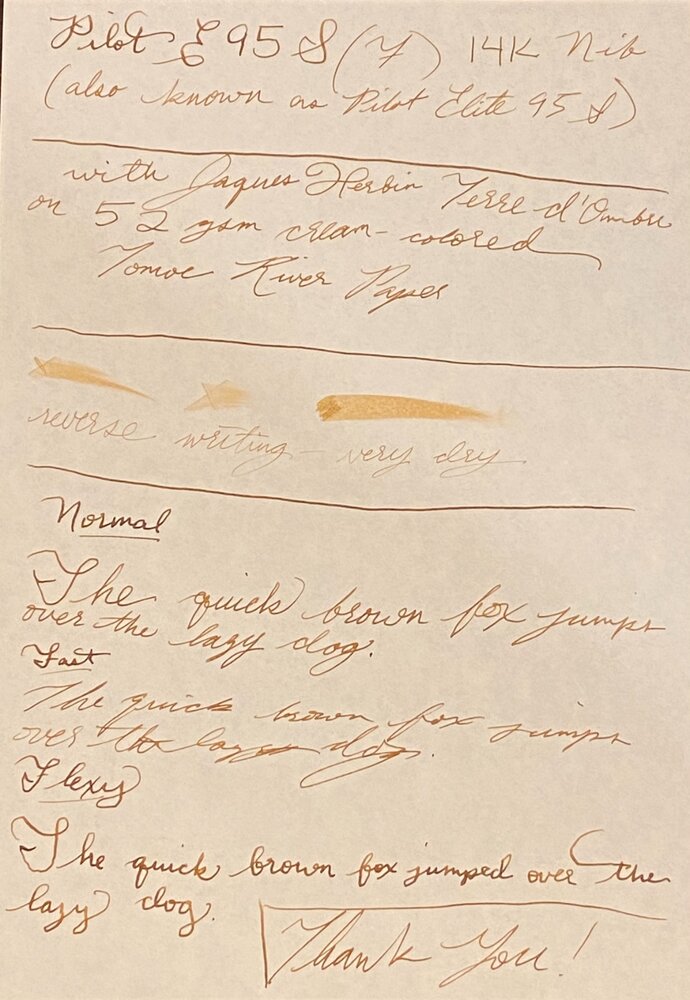
    Hello! First of all, this is only my third review on FPN, so if you can please leave constructive criticism below! I would love to improve the quality of my reviews. The Pilot E95S seems to be like the least expensive gold nib pen that is consistently offered here in the U.S. . The only cheaper one I can think of is the Platinum PTL-5000A, which I would love if it was consistently offered in the U.S., but they seem to constantly discontinue it. So, this is a very popular first gold nib pen. It was my second gold nib, so I did get it relatively early in my fountain pen hobby. For a quick summary of the review, I like this pen. I don’t love it, but it’s is great value, and I definitely recommend it. Design and Build Quality (8.5/10) For the most part, this design is great. It is slim, but comfortable, has a great inlaid nib (which I love), is compact, but bigger when posted, and the feeling of capping and uncapping is great. But, Pilot’s black resin does not hold up to the little metal things on the inside of the cap that hold it on. It has fine scratches on it, which are pretty apparent. Now, I am one of those people who sort of like that, and don’t really want pens to look brand new, I want them to look like I used them. But I can understand how this can annoy some people. That’s why it’s a 8.5/10, instead of a 10/10. Nib Performance and Writing Experience (9/10) This nib is great. I have a fine nib, which is 14k gold and inlaid. It is smooth, and quite soft. I would call this a flex, semi-flex, or soft nib, but a quite soft nib. By that I mean that you can get some line variation, but not that much where you can use it for calligraphy, just a bouncy writing experience. The only thing is it is just a bit particular with inks. Both Noodler’s Walnut and Diamine Chocolate Brown were just a bit too dry for it, and it had some skipping. But all Herbin, Jacques Herbin, and Iroshizuku work great with it from my experience. With them the pen is not especially wet, but I wouldn’t call it dry either. With the writing sample, I used Jacques Herbin Terre d’Ombre, which is currently my favorite ink but might be replaced by Robert Oster Caffe Crema when that ink sample gets to me, and on 52gsm cream Tomoe River Paper. Conclusion This a great pen, and a great value! I highly recommend it. It’s really great! Little Note- It seems like every place I go to except for JetPens sells it as the Pilot E95S for $136, but JetPens sells it as the Pilot Elite 95S for $136 as well. Just a little thing. Edit- It was to commemorate the 95th anniversary of Pilot, but is not a limited edition. It also comes with the Pilot CON-40, but can fit the discontinued CON-20. Now the pictures: The second to last photo shows scratches on the barrel, and the last one shows the metal things on the inside of the cap.
  8. This is my first Santini fountain pen and it's the one I like more till now. I'm a fountain pen lover and my favourite ones are my ebonites. They are all hand crafted by artisans. The one I introduce you now is the Santini Libra Voyager with the superflexy nib. It's a bit special because it's made with care and love by Italian craftsmen who know well their work. These are my first impressions more than a review. Appearance & Design (10) In my view, it's appearance is beautiful. The swirls among blue, turquoise, green, magenta and black in the ebonite are always very nice to watch, it's mesmerising if you turn the pen. The material is precious (rubber with sulfur, badly named as hard rubber); it's name comes from it's similarly with ebony. The design is very well thought-out. It is uncapped in one and a quarter turn. The clip is long but is very tight (too much). The section is long and very comfortable to hold and it tappers up at the end a bit preventing your fingers to meet the nib. It's gurthy enough for my liking. The Santini 18 kt gold nib (superflexy in this piece) has one advantage: you can interchange with other Santini nibs. It can be posted very securely but I do not recommend you to do it because with time you can damage the surface of the ebonite (if you like posting, do it with care). The pen is exquisitely beautiful and the workmanship is top notch. The ebonite warms to my hand and the pen is a comfortable writer. Construction & Quality (9) Outstanding construction and quality. The pen is beautifully made. Ebonite is a precious material for me. The fountain pen is handcrafted (I give a high value to pens made with experienced hands more than inyected plastic, for example). This pen is made by artisans and well engineered. The quality of the threading is outstanding. It has very comfortable long section. Perfect and beautiful cap band. The clip is very tight, it's a pity. It's the only bad detail and that's the reason to have a 9 instead of a 10. The polishing is very good and the pen is full of well made details. I remember that Da Vinci said "details make perfection and perfection is not any detail". Weight & Dimensions(10) Weight: 31g Length: 145mm. 135mm uncapped Cap length: 68mm Cap diameter: 17mm Body diameter: 15mm (max) It has a perfect balance. It is a not very lightweight nor heavy and comfortable pen. It's a gurthy pen but not too much, I feel that dimensions like the perfect ones. The grip is 11.4mm at its narrowest and is very comfortable between your fingers. It's slightly hour-glass shaped and flares out closest to the nib so your fingers won't slip. Nib & Performance (10) The nib is a Santini 18kt gold extra fine and flexy (they call it superflexy but it's really a nice and very good semi flex), so it's performance is assured. It does not require a lot of pressure to flex but it doesn't open like a wet noodle. It writes beautifully and with very good and nice line variation if you want and very good snap back. You can choose among plenty of different nibs with different sizes (it's one of the best companies if not the best in the world about offering diferent nib options) and plating. Mine has a bit of feedback (I prefer that characteristic better tgan the glassy nibs) and it's juicy, without being a gusher. The nib comes with an ebonite feeder to keep a well flow. Santini makes their nibs and I really appreciate that. I think in Italy only Aurora and Santini make their own nibs. Filling System (10) I like piston filling systems. The pen encapsulates a Schmidt piston component with a ratcheting sound that alerts you when you've filled the pen completely. It has a ink capacity around 1.1~1.2 ml. Schmidt is a well-known German quality brand and their piston component is reliable and as sturdy as a classic piston filling system. If you have any problem, Santini has a repair service that if it is like their fabulous customer support and service, I wouldn't think about that. I know you have to store the pen with care and without light and to dry it well after washing but I prefer the feeling of ebonite when you touch it and it looks beautiful. Cost & Value (10) The quality/price ratio is very good. 369 € including shipping is a fair price. But the good point is it's value, it's a fountain pen made by hand, if you take only that into account, it's real value is very high. Beside that it's made with care and love and perfectly engineered. Katrina (customer service) is so kind and professional. The way she supports and deals with you is outstanding and they send you the pen very fast. Conclusion (Score, 59/60) I feel very happy with this fountain pen. It is beautiful and very well made, with love by artisans. Very well engineered and thought-out. I am also very satisfied with their customer kindness. I think we do well to support handcrafted fountain pens. I am perhaps a bit viassed because I do love ebonite. The price is more than right if you consider the artisan work. They are all craftsmen. They also package the fountain pen beautifully. Santini does not appear to invest in marketing and I think they sell most of their products directly to the end customer. I think that their pens are of perhaps superior material and quality than the better known Italian brands. This pen will remain one of my best. I have become a fan of Santini. I would like to give my congrats to all Santini team, they are great. Best regards to everybody. Take care Miguel Ángel.
  9. I'm loving my new Sailor Pro Gear <H-M>. So now of course I am curious about Sailor pens with <S-M>. But I can't find them for sale anywhere. Do they even exist? 21k? Which models? Maybe as a replacement nib?
  10. OldTravelingShoe

    20220928_155046.jpg

    From the album: OldTravelingShoe's Random Pics of Fountain Pens

    © (c) 2022 by OldTravelingShoe. All rights reserved.


    • 0 B
    • x
  11. I always see the Platinum 3776 on lists of great lower cost gold nib pens, but then I read more and find people saying it's really toothy, scratchy, or just has a lot of feedback. I personally want a nib that glides, as little friction as possible. What's your experience with the lower cost Platinum (and Sailor, et al) gold nibs? Are they really as scratchy as people say?
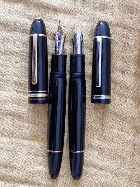
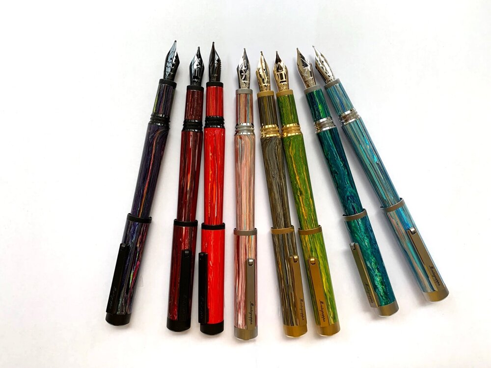
  12. Special offer of all the Montegrappa Zero Zodiac Limited Edition (14Kt gold nib) Immediate shipping.
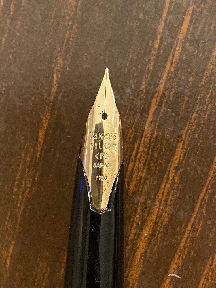
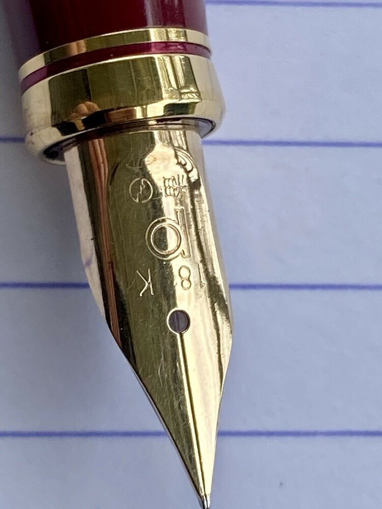
  13. It has two B s on it, the one on the left being flipped horizontally. Other than these two letters there are not any helpful marking on this nib.
  14. Clicbait? Absolutely! And I'm sure already done before So that Preppy original nib met an unfortunate early demise, and I had a spare Lamy Z50 laying around...but then I got a Z55 in the mail, so it was only natural to try it on the Preppy! The Preppy will however live with a Z50, which feels even worse on the Preppy than it was on a Lamy Logo. Lightweight pen, light plastic feed/nib holder and scratchy nib don't go well together..but at least that's a functional pen.
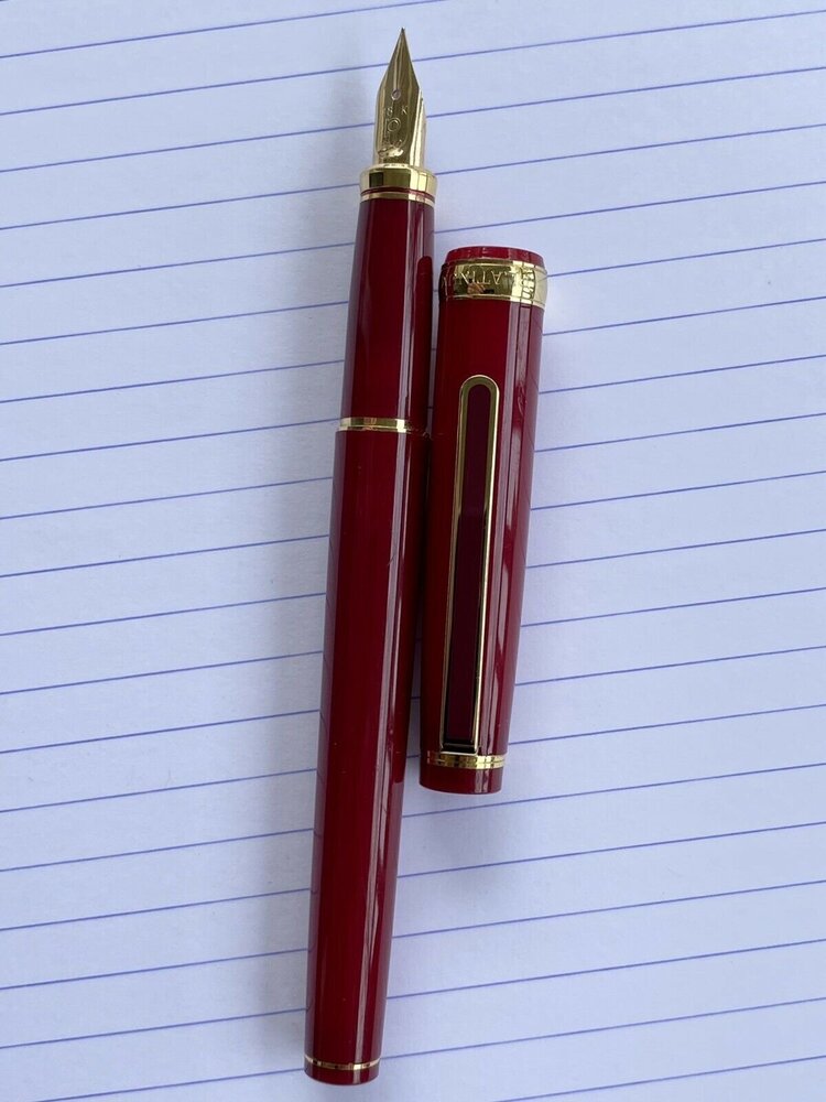
  15. I recently bought this pen in an eBay auction and was wondering the model of it? It looks a lot like a Vicoh, but these have a different, plain gold clip and a rounded top. A similar looking clip comes on the PTL-5000A, but they have a different cap band, section trim and a 14k nib instead of 18k. Just wondering if anyone knew what it was? Attached are 2 pictures of the pen, a Platinum Vicoh and a Platinum PTL-5000A
  16. E.H. Tersono

    Loving a New Sonnet

    During a recent sale, I picked up a blue Sonnet with a broad gold nib (Blue CT). I'd had some challenging experiences with a few older Parker pens, and despite the fact they don't seem to get much love I wanted to try a new in the box model just to see what that was like. Turns out that I absolutely love it. I'm writing in my A5 Tomoe River notebook which is my diary for everything, reflections, To Do lists, et al. I'm using Pilot tsuki-yo ink and it's like seeing the ink for the first time because the pen puts down so much of it that I get pink and purple sheen and variations in the blues. The pen glides across the page, like friction isn't even a thing that exists in the universe. It certainly changes how I write because it's so large, but it never fights me on the up or down strokes, it never feels like it's catching on the paper. I don't have many fancy pens, mostly Kaweco Sports, Lamy Safaris, and such. But this is the nicest pen I've ever owned or written with. So much better than the vintage Parkers I've tried, and easier to take care of. I did also order a fine nib because they were on such a great sale, but returned it as I didn't at all enjoy how it wrote. My Kawecos and low end Pilots with F and EF nibs wrote more smoothly than the Sonnet with an F that I got. But, I'm very happy with the broad. It does something that I just can't do with any of my other pens, I can write quickly, easily, and get a beautiful experience of the ink.
  17. After trying a vintage 51, and two vintage Sonnets, I want to try a new out of the box Parker pen with a gold nib. I really liked the way the 51 wrote, and one of the Sonnets, they felt nearly frictionless and the way I write that's helpful. They were all Medium nibs. The options for that, at the best price I can find here in Canada at the moment, are: Parker 51 re-issue"next-generation" in Plum, "Deluxe" model with Fine 18k nib. OR Parker Sonnet Classic series Black lacquer, palladium trim, Fine 18k nib (rhodium finish). The 51 is slightly more expensive, but for the purposes of this let's say they're both about $160 USD. And they're both only available at these prices in the Fine nib, so there's that. Thank you for your votes and wisdom, and scolding, and whatever else you have in store for me.
  18. E.H. Tersono

    Does a nib need to be straight?

    This is a medium Sonnet I just received, from a reputable shop, which was sold as "new old stock." The nib looks bent to me, but it writes pretty nicely. Perhaps a little scratchy in one direction, but wildly better than the custom ground nib I unexpectedly got from another shop. So this has me wondering, should the nib on this pen be straight? Or are there benefits to nibs shaped like this? Or is it a flaw that needs to be returned and corrected? (None of the photos on the site showed it from the side, so it wasn't clear that it would look like this when I ordered.)
  19. I'm at a complete loss trying to figure out why this is happening. The nib unit for my Santini Italia Calypso Mother-of-Pearl pen, which houses a rhodium-plated 18K gold nib and an ebonite feed supporting it, has just been returned to me from Italy after repair. I bought a bottle of Waterman Mysterious Blue ink from a local department store a couple of weeks ago, while the nib was still away. After flushing and drying the nib unit, I decided to fill the Calypso pen with this ‘safe’ ink first, to test how the repaired nib writes. The first few pages of writing samples were sufficiently ‘wet’ on the page, that the ink marks exhibited sheen on Rhodia DotPad 80g/m² paper. I reported back to Santini that the nib is all good, thanks very much; and I set the pen aside — properly capped, of course. I picked up the pen not even two days later, and to my utter surprise, it wrote (“Sunday, 10 October 2021” below) extremely faintly. I thought the ink may have dried out somewhat in the nib and feed the pen was hard-starting, but there was no skipping or breakage in the lines of ink, so that wasn't what it was doing. Pushing the nib a bit harder, I got slightly more colour out of it, but it still looked nothing like Waterman Mysterious Blue ink. Eventually, I primed the feed by turning the piston knob, and the colour became a bit closer to blue (or teal-black). I've marked out in the image below —with straight magenta lines — where or each time I primed the feed. Only after the nib and feed were literally dripping ink (and cleaning it up with a paper towel) did the colour of the writing return to what I thought Waterman Mysterious Blue ink looks like. I emptied the contents of the ink reservoir into a sample vial, then flushed, cleaned and dried the nib unit. After reinstalling the nib, I gave the pen a fresh fill from the same bottle of ink as before, and started a second test sheet to check if the issue persists over the following couple of days. In the meantime, I compared the ink extracted from the pen and the ink still in the bottle by chromatography, just in case something has contaminated or denatured the ink from the first fill after it passed through the nib and feed into the reservoir. Nope, it doesn't appear to be the case. What it does look like, however, is that the blue and violet dyes have somehow been filtered out, such that then nib was only laying down the turquoise dye in the ink when I wrote with it after it was capped for a day or so, as opposed to the ink evaporating and getting more concentrated with dye (thus appearing darker). Can anyone explain what's actually happening?
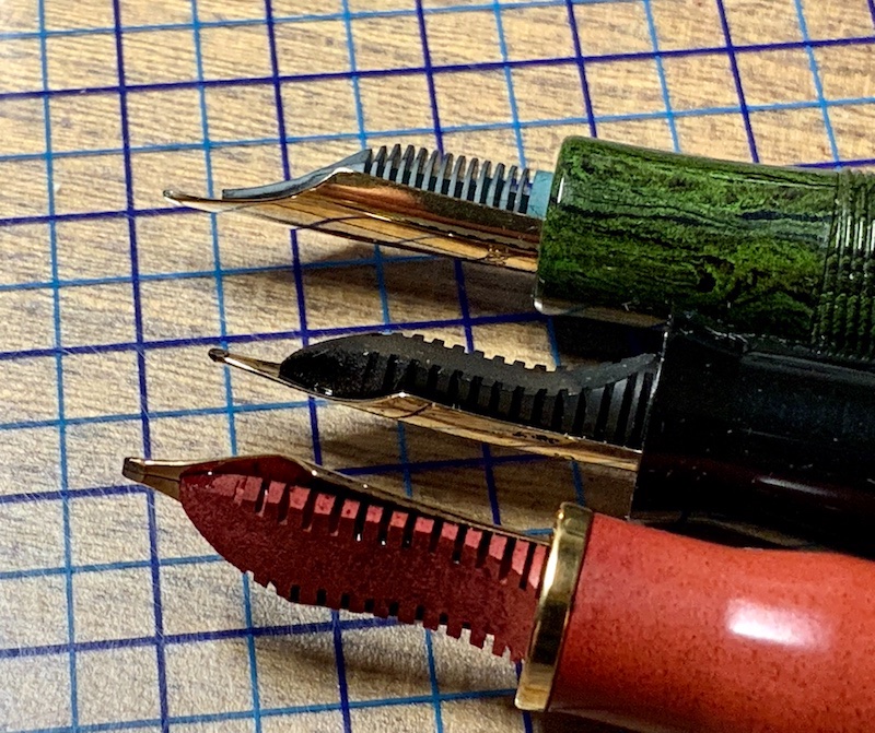
  20. “First look” Review: Radius1934 Superior Primissima Monterosso Introduction Radius pens were made in Italy from 1934 until sometime in the 1950’s. Very little is known about the history of the brand, even by such authorities on Italian fountain pen history as Letizia Jacopini. Here is a link to her brief article: Radius - FountainPenwww.fountainpen.it › Radius. Apparently, Radius was the top of the line brand of its parent company, S.A.F.I.S. And the Superior was Radius' top of the line model. It was made in Turin, as is the Radius1934. The Radius1934 company was established quite recently, and has just issued their first product, named “Radius1934 Superior Primissima” after the founding date of the original company and their best-known model. I believe the founder of the new company is a collector of Radius pens. I do not know if he has any connection with the historical company. This pen was released in 5 resins, each named after a different one of the Cinque Terre villages on the Ligurian coast of Italy. Each color was limited to only 12 pieces. I was fortunate to be able to secure one in the Monterosso (marbled red) color. I ordered mine with a broad nib which I had custom ground to cursive italic. First Impression, Appearance and Design The Radius1934 Superior is a standard tapered cylinder with conical ends. It is about the same size as a Pelikan M800. I was impressed with both the look and feel of the pen. The materials and fit and finish exude quality. The section is tapered with a flare at the end. It is very comfortable for me. The cap unscrews in about two turns. The clip is the same design as the vintage Radius Superior. It goes into a shirt pocket easily and holds securely. Size comparison: Left to right - Pelikan M800. Leonardo Momento Zero Grande. Aurora 88 (with custom binde). Radius1934 Superior. Nib and Performance The 14 Kt nib is reported to be made by Bock, but the feed appears to be a custom ebonite feed. The feed appears identical to that made by Leonardo for their Momento Zero Grande pens. The nib has rather long tines and is just a little flexible and springy. My nib was custom ground by the “nib whisperer” (his self-designation) who works for the vendor. It is moderately smooth and very crisp, loaded with the Radius-branded ink that came with the pen. With this ink, the nib seems on the dry side but with consistent flow and quick starting after an overnight rest. Feed comparison (All with Bock #6 14Kt nibs): Top to bottom - Standard Bock Feed. nib. Radius1934 Superior Feed. Leonardo MS Grande Feed. Writing Sample Filling system The Radius1934 Superior is a piston filler. The pen fills in 10 turns of the piston. The piston appears to be stainless steel and feels very solid. It turns smoothly. It seems to hold just about 1 ml of liquid. Cost and value This pen is priced at around USD500. It is at the high end for a resin pen, yet less than many pens of similar quality with gold nibs and piston filling. I judge it to be fairly priced. Conclusion Radius1934 is a new pen company producing pens modeled after those of the historic Radius pen company. Their first release is a very limited edition of 60 pens in 5 resins - black, amber, red, green and blue - each named after one of the Cinque Terre villages. On first encounter, this seems to be a top quality pen. It is well made with attractive materials and high-end features. I am happy to find another new Italian pen maker of fine writing instruments, and I am looking forward to what other pens they will release. I will update this first look after I have used the pen for a while, if further experience dictates a need. David
  21. collectorofmanythings

    Conway Stewart Dandy Opinions

    Hello! I’ve been looking into possibly getting a modern Conway Stewart. I personally prefer gold nibs, and like the look of their Dandy model. I was wondering if any of you have any opinions on modern Conway Stewarts and/or this model. I haven’t seen really any review for it anywhere. Thanks, W. Major
  22. Like Brian Goulet loves his Custom 74 and Kerry from Pens and Tea loves her Platinum 3776 Century and I personally love my Sailor Pro Gear Slim Mini. Do you personally like your first gold nib more than other pens that write, look, feel, etc. better? Thank you for your responses! W. H. Major
  23. Hello! I was wondering if any of you know or have ever tried to put a JoWo #5 size gold nib in an Esterbrook JR Pocket pen, specifically one from fpnibs.com. Thank you for your help! W. H. Major
  24. Jobesmirage

    Conklin Pen Identification

    Hi Everyone, I picked up one of these a while ago and I don't know enough about Conklins to correctly identify this pen and was wondering if anyone knew the model/name?
  25. Hello, new here this is my first post. I am a fountain pen newbie, looking to learn more about them! I recently acquired a late 90’s titanium-gold Cross Townsend with 14k gold nib. Unfortunately there’s dry ink in it from many years ago. I am soaking and flushing it to clean it. Using only water and converter. My question is: How can I clean the dry ink off of the nib itself, without damaging the gold? There’s an ink patch near the base as well as along the breathing line. 14K nib units seem to be very hard to find these days, so I want to use minimally invasive techniques to clean the pen up if possible. any advice would be appreciated. Thanks


×
×
  • Create New...