Search the Community
Showing results for tags 'glitter'.
-
I ordered a sample of Nemosine's new Blue Snowball Nebula Twinkle from Goulet to try out. My first impression was that there is a scary amount of glitter in even the small sample vial. I wouldn't put it into a pen I was scared to dismantle for cleaning. Unfortunately, the picture doesn't show it well. Sticking with the brand, I loaded it up in a Nemosine Singularity with an 0.8mm stub and made it a part of my daily carry kit for several days. The ink is sparkly. Even on cheap paper, if you look at it right, it shows up. Carrying my pen nib up resulted in a visible ring of glitter around the piston. I recommend agitating the ink before you write (with due care, of course). Surprisingly, the feed didn't seem to suffer at all. I disassembled the pen after a good flush and didn't notice any particulates, and there was no hard start or skipping with this ink. This ink has minimal water resistance, and seems to do best on paper that doesn't quickly absorb it (for the sparkly effect, you want the sparkles to stay on top of the paper). On normal paper, it dries well. It's not the smoothest ink, which I attribute to the glitter.
-
- 3 replies
-
- diamine
- golden sands
- (and 8 more)
-
After buying a bottle of Diamine Sparkling Shadows, I had a quick thought before using it.. Before using inks like this with gold glitter, you are supposed to shake the bottle to evenly displace the glitter, but how does this apply to the ink when it's IN the pen? At some point the ink will settle once again in the pen, so will I need to somehow mix up the glitter again, or not? If so, how should I do it?
-
De Atramentis Sparkly Columbia Blue Copper, Gold, Silver
Sailor Kenshin posted a topic in Th-INKing Outside the Bottle
I've been given the opportunity to test some of Dr. J's De Atramentis Sparkly inks, so thanks to all who made this possible! (Wish my photo skills were more advanced.) I tested the Columbia Blue series, and here, on the same Rhodia Ice paper, lined this time, with the same pens (Hero 359s), I tested the Copper, Gold, and Silver variants. But unlike the Bronze batch, all three of these variants leaked and blobbed (the silver, all over my hands). I don't know what went wrong; all four of the Hero 359 pens have been in use before without blurping, and all four were cartridge-loaded. As mentioned in the Bronze review, Columbia Blue is a nice, readworthy color. The sparkle load is heavy enough so I did not have to constantly agitate the pens to get glitter payout. The notes were finished with Columbia Blue Bronze, and the pen worked as expected, so, as this was virtually the same paper, I will rule this out as the 'bad' element. It's a puzzle, but I still enjoyed the process of using and testing. Here are the photos. Head-On: http://extras.ourpatioparty.com/files/5114/7862/1019/Columbia_Blue_DA-headon-640p.jpg Tilted: http://extras.ourpatioparty.com/files/5014/7862/1020/Columbia_Blue_DA-tilted-640p.jpg The scan:- 4 replies
-
- glitter
- deep dense blue
-
(and 1 more)
Tagged with:
-
http://i900.photobucket.com/albums/ac209/jasonchickerson/20160830_0007.jpg Emeraude on Rhodia Dotpad no. 16. Title drawn with a 1.5mm Brause no. 180 nib and plenty of gum arabic. http://i900.photobucket.com/albums/ac209/jasonchickerson/20160830_0008.jpg http://i900.photobucket.com/albums/ac209/jasonchickerson/20160830_0011.jpg Undiluted (left) and diluted (50%, right) splotches. http://i900.photobucket.com/albums/ac209/jasonchickerson/20160828_0001-2.jpg http://i900.photobucket.com/albums/ac209/jasonchickerson/20160828_0001.jpg Peacock painted with Emeraude de Chivor, Sailor Souten, and a hint of J. Herbin Cacao du Brésil on Stillman & Birn Gamma Series paper. This is a review that I thought I had already done. When I set out to do it again, I realized why I never finished the first time round. Emeraude de Chivor is one difficult ink. It is oversaturated, much too wet, stains everything, and threatens to clog my pen. It also refuses to work with a dipped without plenty of gum arabic, which removes the sheen (but adds gloss). Is anyone actually writing with this ink? I'll admit Emeraude looks pretty good coming out of my wife's mint Kaweco Sport, but I won't be putting it in any of my pens any time soon. Too staining, too clogging, and it smears when dry a la Rouge Hematite. So what on earth could I ever use this for? Well, that peacock looks pretty nice, for one. I love the way three distinct colors can be gotten through dilution: gold/red/black when laid down really thick, a dark emerald green at full volume, a brilliant turquoise when diluted. And it looks great alongside the pink-sheening Souten. Looks like this one is permanently relegated to the art shelf. Now I just have to find some subject matter that requires a glittery teal...
- 21 replies
-
- j herbin
- emeraude de chivor
-
(and 8 more)
Tagged with:
-
As you may have noticed from my previous review (Diamine Shimmertastic Sparkling Shadows), I do not dislike that much sparkling inks, and I do not dislike sheeny inks either. For this reason I ordered online a bottle of J.Herbin 1670 Emerald of Chivoir, as I've been told to be something like "the Grail ink" for those who likes this kind of properties. I received instead Caroube du Chypre, and since I like browns, I just decided to keep it and give it a try. Caroube du Chypre is a well behaving brown, quite complicated colour, made by a prevalent ammount of magenta/red tones over the turquoise and yellow component. In addition to the ink there are some extremely think golden particles that leaves a glittery effect while writing. The flow is consistent and appears to be a fairly wet and well lubricated ink, my architect grinded B nib litterally glides on paper. No clogging or hard starts for this ink, quite interesting as there are particles in it. I've to say that compared to the Diamine Shimmertastic series, Caroube du Chypre seems to have thinner particles that need less effort to be mixed to the rest of the ink. Shading is quite good on all the paper I've tested it on, with better result with less absorbent ones. No bleedthrough or feathering observed. This ink has some water resistant, but I won't be advertising it as waterproof. There are still two aspect to cover about this ink, the first one is surely the sheen. This ink, on the right paper, and using a good ammount of ink, leaves on paper a lovely green sheen, wich recalls in my architect head, something like the copper rust. Even if this is not a work appropriate colour, I find this ink brilliant, because it's a clever mix between a antique looking brown, discreet golden particles, and a really perfect matching green sheen. I think that J.Herbin found a really good mix to make something glittery wich does not recall "my little ponies" or "Barbie" but something wich can be bought by an adult without being ashamed. The second aspect is related to the ink comparisons I've made: I've got a doubt over the main "ingredient" this ink is made from. I possess a bottle on J.Herbin Terre de Feu, which looks really the same ink, just without golden particles. It's that possible? The answer is "maybe". I don't know much about inks composition, but even if how the ink behaves and looks on paper makes me think that this anctually is the same ink, the fact that Terre de Feu doesn't have the same green sheen, makes me think they're somehow different. I know that this is quite irrelevant to the discussion, but I think is an interesting argument of discussion. When I'll be reviewing Terre the Feu I'll do the comparison between cromatographies and probably we'll have our answer. So, the usual final question: Is this ink worth it? I like this ink, I like this ink a lot. Behaves well, doesn't clog your fountain pen, has sheen, has everything you want if you like this particular kind of inks. So, if you're the type who like drawing, if you like making holiday card with fancy ink and so on, this is a really good option: with 20 € you have a 50 ml bottle. It's a little expensive, but the bottle is pretty (not really practical, bute really pretty) and the ink is "something else", not a common ink. If you don't like glitters, just leave it on the shelf, it's not made for you. COPY PAPER SCHIZZA & STRAPPA PAPER TRACING PAPER SHEEN GLITTER CROMATOGRAPHY INKDROP
-
Sometimes inks are not made for being used at work, for taking notes, for normal correspondence... but they are so gorgeous that you simply don't mind what other people could think of you and keep using them like there's no tomorrow. The review which is going to follow is the complicated love story between me and Diamine Shimmertastic Sparkling Shadows. Diamine Shimmertastic Sparkling Shadow is a interesting grey ink, dark enough to be definitely usable, with high ammount of nice shading on every paper, and lots of nice gold glitters. Like most Diamine Inks, has really good characteristics: marvellous flow (despite the presence of glitter I've never experienced cloggings), well lubricated, smooth feeling when writing with every type of nib, no feathering, not a single bleedthrough (even under the third swab test). Dry times are fairly long, and it's not waterproof. But let's sto wandering around the main thing around this ink: It's a glittery ink. Glittery inks are not made for everyday based use, it's unlikely you'd be signing a paper with this kind of ink, it feels unprofessional and not respectful in front of the person you're writing to. I definitely agree, I respect the social convention by not using it if inappropiate, but I really cannot give a look to this ink without finding it gorgeous. It's a wonderful grey ink (and it's definitely not easy find a good grey ink) that gains a sort of third dimension by the adding of extremely thin gold particles. It ends to be an ink suitable only for drawing, for other artistic purposes, for signing holiday cards or doodling around... But the pleasure you feel while writing, the shining trace of ink you leave on the paper is something I find difficult to find in other inks. Ink with such glittery particles are usually known to be difficult to clean, I've to say that this particular one it's a little more difficult to clean and needs a little more mantainance, but just a little, cleaning is not a big issue in my opinion. So, the usual final question is : It is worth it? A bottle of 50 ml of this ink costs around 12€, and you acquire a huge ammount of a extremely well ingeneered ink. It's up to you, in my opinion this ink is worth every cent, but I like using it for different and personal reasons. If you want something you're like to use every day probably this is not made for you. If in doubt, buy it, for 12 € it's worth trying. COPY PAPER SCHIZZA & STRAPPA PAPER TRACING PAPER INKDROP CROMATOGRAPHY SHIMMER CLOSEUPS
- 11 replies
-
- diamine
- shimmertastic
-
(and 5 more)
Tagged with:
-
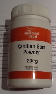
I've been perusing with interest the threads on additives to ink for sparkly purposes. It's past midnight here and one of those connective thoughts has come to mind between two hobbies: hydrocolloids and ink. Therefore need a chemist to weigh in here. Would food additive E415 Xanthan Gum in ultra tiny amounts (it's very very very effective) help suspend the glitter/pearl/mica particles when the pen/vial is still for more even and simpler distribution, yet due to it's unique shear-thinning characteristics allow good flow with just a shake of the pen? For people unfamiliar with E415, page 87 of this collection of hydrocolloid recipes/characteristics contains some of its unique properties including pH tolerances etc. http://khymos.org/hydrocolloid-recipe-collection-v2.3.pdf Random thought. It's used in commercial non-food industries for its shear-thinning properties, as well as in food salad dressings etc. I don't yet own semi-disposable pens nor the glittery/pearly/mica products to try this out, but I do have this... Edit: now it's past 1am and I realised I hadn't made it clear why I thought of this. The particles in the inks appear to be settling out for members in the testing threads both in the vials and in the feeds and causing issues for some, so I was wondering whether xanthan might be a solution.
-
http://i900.photobucket.com/albums/ac209/jasonchickerson/_FUJ0651.jpg http://i900.photobucket.com/albums/ac209/jasonchickerson/_FUJ0651-2.jpg http://i900.photobucket.com/albums/ac209/jasonchickerson/_FUJ0650.jpg http://i900.photobucket.com/albums/ac209/jasonchickerson/_FUJ0650%20copy.jpg http://i900.photobucket.com/albums/ac209/jasonchickerson/_FUJ6440_1.jpg Valentine Card, Rouge Hematite with R&K Alt-goldgrün Card is OCM Pure Cotton paper, Envelopes are OCM Classic Laid paper In expectation of my bottle of Emeraude de Chivor arriving in the mail, I decided it was past time to review its sister, Rouge Hematite. Rouge Hematite is a really interesting ink that I use almost exclusively for card-making. It simply dips better than any other ink out there and the green-gold sheen looks magical when you lay down a lot of ink. It is very staining, though, and ink gets on fingers and transfers back to paper terribly easily. I've ruined more than a few attempts through smudgery. As mentioned in the review, it smears, too. I kept it in my daily carry Lamy 2000 for a few days while writing this review. Thankfully, the gold glitter does not come across strongly in that pen, so it can be used as any other red ink, and does a fine job at that. I have not had any problems with clogging. While I don't really enjoy using red on a daily basis, the performance of this one is quite good. Care was taken to ensure color accuracy, but with an ink like this, where view angle and light source matter a great deal (see second and third pics), what you see may not be what you get when you try it for yourself. EDIT TO ADD: I should point out that my bottle is the fourth iteration of Rouge Hematite, purchased from Goulet Pens toward the end of 2014.
-
Hey guys. I'm almost through my sample of 1670 Stormy Gray, and am absolutely in love with both the base color and the glitter factor. It lead me to wondering.... are there any fine enough glitters that we could add it to bottled ink and get that kind of sheen/shine effect, without destroying pens? Imagine a lovely blue with a silver glitter, or a yellow with green... Has anyone tried? I know there's been some discussion for dip pens, but clearly J Herbin found a way to make glitter FP-friendly.....