Search the Community
Showing results for tags 'geha'.
-

Geha 700 Schulfüller from the 1950s - does anyone recognise this logo on its nib?
Mercian posted a topic in Other Brands - Europe
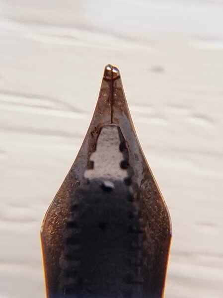
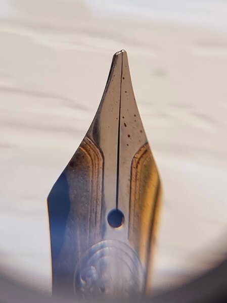
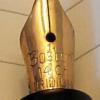
Hi all, I am posting this thread to see whether anyone else recognises the logo on the nib of my late 1950s Geha 700 Schulfüller: The logo to which I am referring is the sun disk with 12 ‘rays’ on it, near the grip-section. None of other Geha 700s that I have seen in photographs have had this, 12-rayed, sun logo. I wonder whether it might indicate something about the nib, e.g. nib width, grind-shape, or degree of hardness/flexibility. This nib is a gold-plated steel nib. It is, as is correctly indicated on the pen’s piston-turning knob, an ‘FK’ nib - an ‘F’ nib with ‘kugel’ (ball) tipping. It produces a mono-width line, unlike many German nibs of the 1950s, which often had very ‘flat’-shaped tipping, and produce a ‘cursive italic’ line. In terms of flexibility, this nib is slightly ‘springy’, or ‘bouncy’; it is not, by any means, a ‘flex’ nib. It is slightly less ‘bouncy’ than is the steel ‘F’ nib on my Pelikan M205 from 2012, or the 14k gold ‘M’ nib on my Pelikan M400 from the 1990s (1991-97). It is much less ‘bouncy’ than is the 14k gold ‘F’ nib on my 1954 Pelikan 400, which nib has one of the flat-tipped ‘cursive italic’ grinds on it. So, has anyone seen this ‘12-rayed sun’ logo on another Geha nib before? Does anyone recognise/know that it signifies anything, or what the different logos ‘mean’? My thanks to you in advance for any answers. Slàinte, M. -
From the album: Mercian’s pens
A photo to show the 12-rayed sun logo on the gold-plated steel nib of my Geha 700 Schulfüller from the late 1950s. I have uploaded this photo to see if anyone else has a Geha nib with the same logo on it - I wonder whether the number of ‘rays’ on the disk of the sun may indicate anything e.g. nib size, shape, or degree of hardness. This nib is an ‘FK’ - an ‘F’ nib with a ‘kugel’ (ball) tipping, as opposed to the flat, ‘cursive-italic’ tipping shape of many German pens of the 1950s. The gold plating has nearly all worn off this nib now, but (in 2024) the nib still works beautifully. This nib is slightly ‘springy’, or ‘bouncy’. It is by no means a ‘flex’ nib; being slightly less ‘bouncy’ than is the steel ‘F’ nib on my Pelikan M205 from 2012, or the 14k gold ‘M’ nib in my Pelikan M400 from the 1990s (1991-97).© Mercian
- 0 B
- x
-
From the album: Mercian’s pens
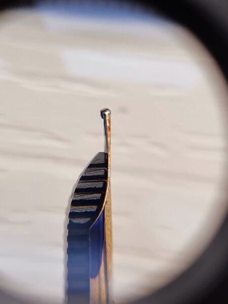
A photo of the gold-plated steel ‘FK’ nib on my Geha 700 Schulfüller from the late 1950s. Almost all of the gold plating has worn off the nib, but (in 2024) it still works beautifully. It is slightly ‘bouncy’ or ‘springy’; not by any means a ‘flex’ nib. It is slightly less ‘bouncy’ than is the steel ‘F’ nib on my Pelikan M205 from 2012, or the 14k gold ‘M’ nib on my 1990s (between 1991 & 1997) Pelikan M400.© Mercian
- 0 B
- x
-
Two Geha Goldschwinge of course. Lots of fossilized ink, it's taking a lot of patience and a little Rapido Eze to bring its (apparently F) nib back to life.
-
From the album: OldTravelingShoe's Random Pics of European Fountain Pens
© (c) 2022 OldTravelingShoe. All rights reserved.
- 0 B
- x
-
From the album: OldTravelingShoe's Random Pics of European Fountain Pens
© (c) 2022 OldTravelingShoe. All rights reserved.
- 0 B
- x
-
From the album: OldTravelingShoe's Random Pics of European Fountain Pens
© (c) 2022 OldTravelingShoe. All rights reserved.
- 0 B
- x
-
From the album: OldTravelingShoe's Random Pics of European Fountain Pens
© (c) 2022 OldTravelingShoe. All rights reserved.
- 0 B
- x
-
From the album: OldTravelingShoe's Random Pics of European Fountain Pens
© (c) 2022 OldTravelingShoe. All rights reserved.
- 0 B
- x
-
From the album: OldTravelingShoe's Random Pics of European Fountain Pens
© (c) 2022 OldTravelingShoe. All rights reserved.
- 0 B
- x
-
When it comes to fountain pen collecting, my primary interest is where it all started for me, that is German student fountain pens from the 1970s. I thought it timely to undertake a review of the key pens of the era and to discuss their differences. For this review, I have focussed on seven pens from my collection, which all date from the mid-1970s, the time that I started primary school in Germany. In the photo above, you can see from left to right: Standard blue Pelikano Model 4. This was released in 1973, although it looks largely the same as the Pelikano 3 that it replaced. Whilst the Pelikano pens were available in red, blue, green, yellow and black, most German shops only carried blue and red pens. Blue was by far the most common colour.Pelikano Model 4 in black: This was released a little later than the blue version and, as far as I am aware, was not sold in great numbers in Germany. I bought this one as NOS from the USA.Pelikano Model 4 Antimacchia: This is an export only model, destined for those nations (e.g. Italy) where kids did not like the metal cap and wanted to see a bit more colour.GeHa: This particular pen is a special edition Jeans model. This special edition gets a different clip as well as a barrel in a jeans-patterned barrel, complete with painted on contrast stitching. GeHa, having less market penetration than Pelikan, pushed the innovation angle. The two key innovations are a reserve tank built into the feed and a cleverly different cartridge. Whilst one can use a GeHa cartridge in a Pelikan (and in any other pen designed to take international cartridges), international cartridges will not fit in a mod-1970s GeHa pen (that all changed, once the GeHa was bought by Pelikan).An ERO office pen: Whilst Pelikan and GeHa had the bulk of the student market, there were many companies producing pens with similar styling. One of these is this ERO office pen.Montblanc Carrera: Up until Montblanc decided sometime in the 1980s that it wanted to be a pure luxury product maker, it produced several lines of pens designed to appeal to older students. The Carrera is the most of common of these.Pelikano Happy Pen: These were an attempt by Pelikan to appeal to older students and to offer some differentiation from the standard Pelikano that was seen as beginner’s pen. I suspect that Pelikan styled this pen to look more like the Montblanc Carrera. Colours aside, it is identical to the Pelikano Model 4. All of the pens above are cartridge fillers. All take two cartridges, albeit the GeHa pen only takes proprietary cartridges and the Montblanc Carrera was also available as a piston filler for the export market. All pens come with steel nibs. In the case of the Carrera, a gold plated nib was available. Student pens are designed to be inexpensive and robust, hence the sturdy steel nib. In the photo below, I compare the standard Pelikano 4 with the GeHa model to highlight the innovations in the Geha. The little orange tab that can be seen at the end of the GeHA fed is for the reserve tank. If you run out of ink and the spare cartridge in the pen has already been used, you can use the clip of the pen to push the orange tab into the feed, thus releasing enough ink to write a number of pages. The orange tab can be reset after use. Whilst I question the utility of the feature, after all the pen already has a reserve cartridge in the barrel, it does make for a nice marketing gimmick. Where the product development people got really clever is to devise a special cartridge that has a thinner end that will only fit GeHa pens and a standard end to fit all pens that use international cartridges. I take my hat off to the person that came up with that one, long before other firms embraced the idea of creating a monopoly for replacement cartridges. GeHa went one better out the door by creating a proprietary cartridge that would also fit other pens. I learned on this forum that a Lamy cartridge can be used (in reverse) in a GeHa pen and I can confirm that it works (you can see used Lamy cartridge in the photo). The photo below shows the Montblanc Carrera. I always wanted one of these as a child, but that had more to do with the clever marketing than it did with the pen’s features. Being roughly twice as expensive as the equivalent Pelikano, I did not acquire one as a child. Now I have several of these. What makes the Montblanc Carrera different to all the others is that it can be easily disassembled for repair. That is a huge advantage for older pens, given that ABS plastic made in the 1970s is starting to go brittle. I have posted an article in Repair Q&A section, where I have put this feature to use, to repair a broken feed. All the other pens in this review are nigh on impossible to disassemble and repair. The other feature that makes the Montblanc Carrera different is that it does not rely on friction alone to secure the cap. The section has small raised metal tabs that secure the cap with a distinct click. To me this is the better solution, as the friction system starts to fail after a couple of years’ use. I have also included an example of the tyre stand that was used to effectively to market the pen, creating a racing car linkage. This stand will also fit Pelikano pens of the era. Most of these pens come with different widths and types of nibs, including the obligatory A (for Anfänger= beginner) for primary school children. The steel nibs are as tough as nails and will keep on working, after a pen has been dropped or employed as a weapon to poke the kid sitting next to the writer (not that I would have done such a thing- at least not that I will admit to it). I will allow myself the observation that when it comes to collecting fountain pens. In my opinion, too much emphasis is placed on the flexibility of gold bibs. If you write with a soft touch, as one is supposed to do, it makes little difference if the nib is a hard steel or a flexible gold nib. All of the pens in this review have been used as daily writers by me and none of them have let me down. So which one is my favourite of all of the mid-1970s pens in this review? For me, the Montblanc Carrera wins hands down. It is just a little better made than the others, has a superior mechanism for securing the cap and can be disassembled for repair. As a child I fell in love with the marketing of the Montblanc Carrera- now I am in love with its features. At no point have I coveted it for the brand, but the allure of the luxury brand is probably the reason that second-hand examples are so much more expensive than any of the others.
- 14 replies
-
With the assistance and guidance of Bo Bo, who has really educated me on Geha pens (they dont even have a chapter in Lambrous book...), I have been hunting down a clean Geha Schulfüllfederhalter from Ebay. ^A clean pen without much wear and tear. It is a slim pen that can be used posted and unposted. It weighs nothing and is very comfortable to hold and use. The materials dont feel exactly high-end (they feel like cheap plastic), but the workmanship is a good example of German design and Deutsche Gründlichkeit: all the parts are engineered very well and everything functions as intended. The piston feels solid and straight away everything works as it should. ^The Geha clip design is a detail that I really like. ^The ink window is nice and clear. Steel nib and what appears to be an ebonite feed. The section can be easily unscrewed from the barrel. The greenish rod activates the unique reserve tank feature of these pens, allowing another 1 to 2 pages before a refill. How does it write? Geha was pointed out to me my Bo Bo as part of my search for a modern pen with a vintage writing experience. Contrary to what Bo Bo and I expected, the nib of my Schulfüllfederhalter is rigid. Under moderate pressure, it can be induced to produce a bit of line variation but clearly this nib was not intended for that. It is not a nail, it offers a bit of cushioning which I like a lot, but normal writing with minimal pressure does not offer even the slightest bit of line width variation. That was a bit of a letdown, but on the plus side this pen writes very well. Line width is what we would now call western-EF and I really appreciate the crispness and thinness of the lines in conjunction with the nibs smoothnessa and degree of control. The nib initially needed a bit of attention, because it loved cursive italic writing at a certain angle (clearly it had been used a lot in exactly the same way for many many years) but did not like any other style of writing. That was easily fixed and the pen is a pleasure to use. For what I paid for it, this actually is a very nice pen and it will be in regular use. That this pen still works 100% after many decades is a testament to how well it was made. The attention to detail and the high degree of engineering more than compensate for the economy-grade materials.
- 10 replies
-
- geha
- schulfüllfederhalter
-
(and 2 more)
Tagged with:
-
Hello everyone. Trying to open the rear (piston) end of a Geha (model 790, I think). Saw Bo-bo's suggestion if using a paper clip in the hole below the piston threads, and am unable to figure out how to use the paper clip to open it. The paper clip only goes in a couple of mm. I've bent the ends of a couple of paper clips and can't figure it out. Thank you in advance. Nick[ attachment=484016:Geha piston detail.jpg]
- 9 replies
-
- geha
- lubricating
-
(and 1 more)
Tagged with:
-
Please Help With Identification Of Multiple Inherited Pens
mira_mff posted a topic in Fountain & Dip Pens - First Stop
Dear members, I have inherited some fountain pens from my aunt who inherited them from husband around 1985. They have been kept in very good conditions, some in original packing I believe. I tried to do some research myself but as I am not expert I would like you to help me identify if they have any value. I managed to identify Geha 722 (as it has original packing and is very nice, I like it myself to be honest) but I have some Pelikan, centropen, I think a Russian one and some others I am not so sure about. I know there is Waterman but I dont know what type it is. I am posting pictures and would appreciate a lot if you could help me. Thank you in advance for this help. BTW, uncle was in professional army at high position and traveled around the world a lot, maybe some of pens he received as gift I assume. The first picture is mixture (on the left starting with a pencil suisse made, then pen I dont know, has Benzinol written on the handle (I guess used as branded gift), then the green one is the Russian one, then Waterman but I dont know type, then Pelilkan, again I dont know type and then Geha 722.) The second is capturing the sets I have, I believe the pen on the right is MontBlanc as the roller pen has it written on it but the fountain pen has only a mark M in some kind of circle or square or what it is, then the middle one is Centropen (but dont know what type) and the one on the left I dont know, there is only some mark which reminds me of Euro but it is probably supossed to mean the nib of the fountain pen but I have no idea what brand that is. -
Respected, I would like to hear your opinions, what kind of ink is the best ink for daily writers? I use Pelikan and Reform inks, and some cheap inks which are not famous. My opinion is that Pelikan ink is the best, especially Pelikan brilliant black. It is very good, smooth and gently. Reform inks are good to, but they are with higher density and for that reason that ink produce little blots on the nib, if I use black ink the black blots are very marked on the nib. Please, recommend me some inks, if you have writing samples please you can attach them at this topic. With special respect, Zlatko
-
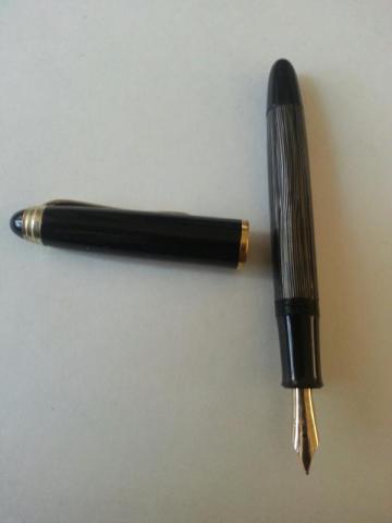
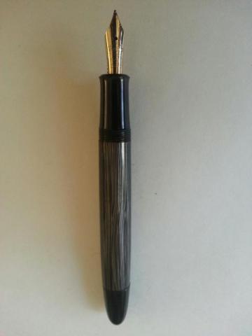
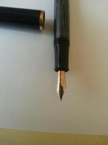
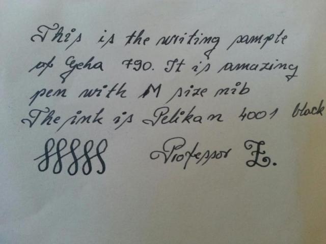
Dear FPN members, I want to share some pictures of my new pen, Geha 790 with M size flexible nib. I searched for that pen so long, and finally I found it. This is something like Pelikan pens, but know what, it is better then pelikan pen. First of all, the design, combination of grey and black color, elegant size, retro style. I never had pen like that. Price, I bought this pen on ebay, and the price was 120 USD+shipping costs. Please, I want to hear your comments... Sincerely yours, Professor Z.
- 11 replies
-
Hi Today saw a well packaged pen arrive via the "Bay". I took a chance on an unknown brand (to me) that looked interesting and a low starting price. It was untested as I think that the seller might not be familiar with a piston filler. This turned out to be a Geha 722. It shows no evidence of ink in the windows and a flush of water brought only enough ink to indicate a possible dip test. Sticker shows Fine for the nib. Can anyone date this pen please? I think I want to try this with a bright red ink. Any suggestions for a good red? (other than a Shiraz) I have tried to do the nib justice with a small compact camera. Why does it take 87 photos to get some decent shots? Enjoy the nib art. Oh! The price £3.99 and free p&p!!!! I feel almost guilty paying so little. K
-
I recently acquired a Geha "Borrelli Design" wooden fountain pen. Works with standard cartridges (I guess) - but I will likely use a converter. I had a Geha Schulfüller (school fountain pen) when I was a kid (learned writing with it) but I have never seen a wooden one. Does anyone have any information about this pen? http://farm4.staticflickr.com/3796/9100657665_76d9b68a8c_z.jpg http://farm6.staticflickr.com/5469/9102803140_18b8419d22_z.jpg http://farm8.staticflickr.com/7448/9102722538_d5bb29c242.jpg I only tried it once so for (with Aurora Blue) and just dipped it. It was a bit scratchy - but maybe that was because due to the dipping and no proper ink supply. The nib is quite fine for a German nib in my opinion. The nib is absolutely firm - no flex at all: http://farm6.staticflickr.com/5483/9100403807_d83a414f90_z.jpg


