Search the Community
Showing results for tags 'fountain pens'.
-
As many of you already know, I recently renewed my website. Pens now have a specific site, at WWW.PENS.IT More modern, easier to use and to buy And the coupon FPN2025 is still active and working, to get the 10% discount immediately.
-
- fountain pens
- coupon
-
(and 2 more)
Tagged with:
-
Is this now normal for Montblanc? I was awarded a 164 in the late 80s, and it came in a very nice clamshell presentation box. The box and pen were lost in a burglary. After a decade, I broke down and bought a new one to replace it. I knew it was authentic. It arrived in a cardboard box. It is a nice box as boxes go, but it's still a box (and a protective soft cloth pouch). I was expecting a clamshell case. There aren't any on their website. Does anyone on the forum know when this change was made? Sorry for the rant. It just irks me.
- 10 replies
-
- montblanc
- fountain pens
-
(and 2 more)
Tagged with:
-
I saw a thread on not participating in InCoWriMo, but I am participating. I thought it fair to hear from our side. I need reasons to use my pens, and letters are my primary way. I have pen pals. I am using the Travelers Notebook calendar insert Weekly and Memo. I have succeeded at InCoWriMo in 2013 and 2019. I hope to succeed like I did last year. I wrote to pen pals, and people on an InCoWriMo list. I also wrote to some companies. When I wrote to Reeses, telling them about my love of their peanut butter cups, and a few of their other candy bars, I got a reply letter. It included coupons! I wrote to a museum in 2013 praising the experience but sorry the pressed penny machine did not work. They sent a reply that included pressed pennies. I am not promising you get these replies, because others did not send any reply. But that is part of the adventure of letter writing. I will try to succeed at InCoWriMo this year, and be a full participant for 2 years in a row. So, are you participating in InCoWriMo? Tell us why.
- 84 replies
-
- fountain pens
- paper
-
(and 1 more)
Tagged with:
-
I sometimes attempt to write haiku. I figured why not have a thread of handwritten haiku we make up ourselves to celebrate fountain pens. I’ll start.
-
Hi everyone, I hope you’re all doing well! I recently received a Montblanc M Red Resin Fountain Pen, designed by Marc Newson, as a gift from my dad. It’s a beautiful pen, and I know Montblanc is known for its high-quality writing instruments, but I’m not too familiar with their pens, especially the limited or special edition models. The pen comes in the original box with the certificate of authenticity, and it looks to be in great condition. I believe it’s a special edition, but I’m unsure of its current value or what it could be worth in today’s market. I would love to get your thoughts—if anyone here has experience with this model or has an idea of what it might be worth, I’d really appreciate your input. Thanks in advance for your help!
- 4 replies
-
- montblanc
- special edition
-
(and 1 more)
Tagged with:
-
Exploring Chinese Calligraphy with Fountain Pens: Share Your Experiences!
2ouvenir posted a topic in Calligraphy Discussions
Greetings fellow fountain pen enthusiasts! I'm starting this thread to connect with others who share this interest and to learn more about your experiences with Chinese calligraphy using fountain pens. Whether you're a seasoned practitioner or just dipping your nib into this art form, I'd love to hear from you! Here are a few prompts to get the conversation going: How did you first become interested in Chinese calligraphy? Do you actively practice Chinese calligraphy with your fountain pens? If so, what pens and inks do you prefer? What challenges have you encountered when adapting Chinese calligraphy techniques to fountain pen writing? Are there any particular resources, books, or online tutorials that have helped you improve your skills? Do you have any favorite Chinese calligraphy styles or scripts that you enjoy writing the most? Feel free to share tips, tricks, favorite tools, or simply your thoughts and experiences. Let's explore the world of Chinese calligraphy together and celebrate the beauty of writing with fountain pens! Personally, I just use a regular Japanese fine for all my Chinese "calligraphy" (some might argue you can only do Chinese calligraphy with an ink brush, I differ) and any fountain pen friendly paper with a light grid layout. The ink should be legible, i.e. not too light. A tip I have is to do reverse writing (if your fountain pen allows) for characters that are extremely complex like 鬢 to get all the details within the confines of your grid, if you decide to have all your characters have the "same size" and equally spaced apart. Before, I go, some inspiration: Looking forward to hearing from you all! Warm regards, 2ouvenir- 3 replies
-
- chinese calligraphy
- calligraphy
-
(and 3 more)
Tagged with:
-
****************************************************************** A Pen and Ink Log ~ For the past several years I've said to myself that there was a need to informally track my use of both pens and inks. Nothing so systematic as a digitalized rotation, but a casual handwritten system to monitor usage. I'm not much of a fountain pen collector, but rather am someone who prefers handwritten notes, correspondence and sketches to their digital counterparts. As such there are a number of pens which are used throughout the year for different writing projects, as well as for detail correcting of student research manuscripts. Here and there I've learned about impressively well-organized systems for keeping track of both pens and inks. As much as I admired what others had set up, they weren't what I had in mind. Since childhood I've been the do-it-yourself type about whatever might be achieved with a pencil lead, ink pen nib or a paintbrush. Working in Central China where brush pens remain in use and in the exact area where paper was originally developed, has reinforced my interest in handwritten documents, without in any sense denigrating contemporary digital innovations. What was in my mind was nothing more than a personalized, handwritten, small-scale notebook which would list the various fountain pens, ballpoint pens, rollerballs and mechanical pencils. The notebook would record each fresh inking of any fountain pen with an entry showing which pen, which ink on which date. By doing so I intended to show myself how frequently any given pen or ink was used, to encourage greater use of all writing resources. All of this remained in the ‘someday phase’ until this afternoon, when I finally decided that it was time to prepare what I'd long been mulling over. I'm posting this in the Fountain Pen Network Montblanc Forum, as most of the writing I do is with Montblanc fountain pens, and more often than not with Montblanc inks. By no means do I urge anyone else to follow what I've done, as it's a purely personal approach, in the same sense that each individual's handwritten journal is highly personal. The small notebook with fish on the cover is called “鱼语” or “fish language”. I'd seen a student using one in class so asked for their assistance in buying one for my use. Now I'm set. For one full week I've lived with no pens inked. It was my first “pen fast” in several years. It feels great to ink three pens to resume handwriting in daily life. Tom K.
- 86 replies
-
- ink
- fountain pens
-
(and 1 more)
Tagged with:
-
Greetings everyone, hello from Belgrade - Serbia. I thought that I have already posted a topic in here the day I joined, but for some reason I can't see my post. Therefore I am going to introduce myself again. Huge fan of cats, blues, vintage guitars, guitar collecting, guitar playing, vintage fountain pens. Best regards - Tinpanalley bluesman.
- 20 replies
-
- fountain pens
- blues
-
(and 4 more)
Tagged with:
-
Hi, everyone! I wanted to introduce myself to this network. I have been a long-time pen enthusiast, and am the owner of luxury pen retailer Truphae, Inc. We specialize in high-end luxury pens from companies like Aurora, Montegrappa, ST Dupont, Visconti, etc...and have great relationships with them as well. We also carry brands such as Pelikan, Cartier, and many others. Our goal is to find the coolest pens around, particularly rare ones that many other people would have a hard time sourcing. We not only sell, but buy and consign as well. Looking forward to getting to know you all better! ~Chris
- 28 replies
-
- fountain pens
- new member
- (and 8 more)
-
From the album: OldTravelingShoe's Random Pics of Fountain Pens
© (c) 2022 by OldTravelingShoe. All rights reserved.
- 0 B
- x
-
20220606_112810 First Meetup Netherlands Pen Club.jpg
OldTravelingShoe posted a gallery image in FPN Image Albums
From the album: OldTravelingShoe's Random Pics of Fountain Pens
© (c) 2022 OldTravelingShoe. All rights reserved.
- 0 B
- x
-
- netherlands pen club
- clubs
-
(and 5 more)
Tagged with:
-

20220606_112056 First Meetup Netherlands Pen Club.jpg
OldTravelingShoe posted a gallery image in FPN Image Albums
From the album: OldTravelingShoe's Random Pics of Fountain Pens
© (c) 2022 OldTravelingShoe. All rights reserved.
- 0 B
- x
-
- netherlands pen club
- clubs
-
(and 2 more)
Tagged with:
-

20220606_112128 First Meetup Netherlands Pen Club.jpg
OldTravelingShoe posted a gallery image in FPN Image Albums
From the album: OldTravelingShoe's Random Pics of Fountain Pens
© (c) 2022 OldTravelingShoe. All rights reserved.
- 0 B
- x
-
- netherlands pen club
- clubs
-
(and 2 more)
Tagged with:
-
I am a long-time fountain pen user/collector. i am new to forums and chat though. I hope this is the proper way to announce this new pen show. I am excited and I don't even know where to start🙂. It will be held September 8 to 10 in Orlando Florida. I think the location is perfect. The Florida Hotel and Conference Center at the Florida Mall is located a short distance from the airport, Disney World and all the other theme parks and attractions. The room rate is $115+tax (resort fee has been waived for us) free parking. One side of the hotel lobby opens into a large vibrant shopping mall. The hotel has agreed to allow our special show rate up to 3 days before the show and 3 days after. This means you can bring the family and enjoy a pen-cation, enjoy the show and all the area has to offer. They also will extend your stay longer at the show rate if rooms are available. All Access Pass: This is the best deal for the serious pen enthusiast. It allows 2 people early entry to show days Fri and Sat and includes a meet, trade, sell pens and a pizza party Thurs night. Door prizes will be given out at the pizza party. It also includes a dessert party Sat night. This pass allows you meet and hang out with vendors and other serious pen people. Price is $50, if you book your 3-night hotel stay early it will be $45. Passes will go on sale in the near future. You must book hotel room first to get discount and be eligible for door prizes. Vendors who book hotel room early will be eligible for door prizes of their own. One lucky vendor will win their 3 -night hotel stay for free! AT THIS TIME ONLY HOTEL ROOMS CAN BE BOOKED TO GET THE EARLY BIRD DISCOUNTS AND PRIZES LATER. PASSES AND VENDOR TABLES WILL GO ON SALE SOON. Hotel rooms can be booked now by calling 1-800-588-4656 or clicking the link below. A website is being developed right now you can follow Orlando Pen Show on Facebook or Instagram. http://www.tinyurl.com/Orlando-Pen-Show-2022 Please share this show info with all your pen friends, thank you all so much for your support! Joe
- 16 replies
-
- pen show
- new pen show
- (and 8 more)
-

In Praise Of The Old Style Visconti Van Gogh “Maxi” Fountain Pen
Quadratus posted a topic in Fountain Pen Reviews
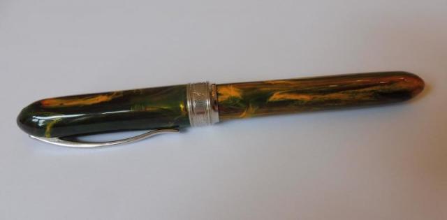
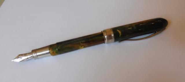
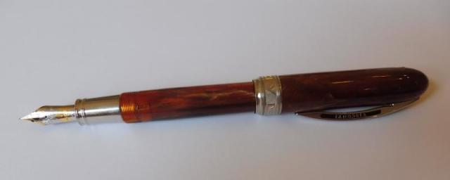
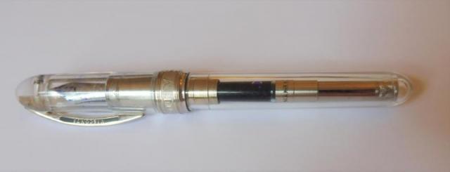
IN PRAISE OF THE OLD STYLE VISCONTI VAN GOGH “MAXI” FOUNTAIN PEN Visconti are a Florentine pen manufacturer founded on 20 October 1988 by two friends who decided to make a business of their passion for fountain pens. The two founders, Luigi Poli and Dante del Vecchio are stars of the long tradition of Italian pen manufacturing. They succeeded in remaining at the top of a highly competitive international market for over 30 years, which is an outstanding achievement when one considers the sad demise of OMAS or Delta. Throughout their history, Visconti have set new standards for imaginative and striking designs, ranging from the very expensive to cheaper “every day” pens, earning a well-deserved devoted following of fountain pen collectors and users. Their “Homo Sapiens” line of pens need no introduction, and most people reading this will own or have seen a “Van Gogh” or “Rembrandt” Visconti pen. Some of the leading online pen reviewers, SBRE BROWN (https://www.youtube.com/user/sbrebrown) and PENULTIMATE DAVE (https://www.youtube.com/channel/UCmPrXpKKggCrGTmAhhMmvBA) have produced many highly entertaining and informative reviews of Visconti pens. In this review, however, I wish to celebrate a now sadly discontinued range of Visconti pens, the “Van Gogh Maxi” which were in production in the first decade of the 2000s (along with their smaller cousins the Van Gogh “Midi” and Mini” versions). The series was also produced as roller ball pens. The larger “maxi” size is one of my favourite pens as it fits my hands beautifully, so I will only be discussing this “maxi” line of the Van Gogh production as this is the type I own. More recently, of course, Visconti have produced a modern line of Van Goghs that are very widely available. They are hugely popular with their bright, fun colours, easily swapped or cleaned steel nibs, filling mechanisms that will accommodate standard size cartridges or converters and general sturdiness. But these are not of the sophistication as their earlier relatives, and they have steel nibs rather than gold nibs, so I will not be covering them in this review. THE VISCONTI VAN GOGH MAXI FOUNTAIN PENS Revealing a collector’s mania side of my character, I have acquired seven Visconti Van Gogh Maxis (VGMs) over the years. They are one of the jewels in my pen collection and are in constant use. I was introduced to the VGMs by Ray Walters, (http://www.vintageandmodernpens.co.uk/http://www.vintageandmodernpens.co.uk/] who is a regular vendor at Pen Shows, on his website and elsewhere. As always, he is charming and persuasive and I think the first pen he sold me was the VGM “Tortoise”. This pen was a discovery and a revelation. I was writing with a pen of different design than the Pelikans and Japanese pens I was used to but with outstanding performance qualities. This purchase was quickly followed by the Musk version: And then, throwing financial discipline to the winds, I also bought the beautiful “Sandal Wood” coloured version from Ray: As I had the income to collect then, I quickly added (from eBay) a Demonstrator version: Later on came a “Starry Night” version: And a “Fantasia”: And finally, an Ivory version (sometime also called a Vanilla, but I think Ivory is more appropriate): There are other colours available, and these sometime turn up on eBay or at Pen Shows. From my online searches, I gather that the other VGM colours are Cappuccino (sometimes called Espresso), Black, plain Green, bright Yellow and Mint Blue. If there are other colours I would be interested to know from readers. Design These pens are in the “oversize” range. They are slightly larger than the Pelikan M800, but slightly girthier and heavier as the weight is increases with the metal central band. Personally I don’t like oversize or very large pens and have therefore never bought the more recent range of large Viscontis like the Homo Sapiens and similar, which I find simply too large and bulky. The VGMs are therefore, for me, at the size limit of what I enjoy writing with, especially as I prefer to post my pens. The pens fit comfortably into my hand while writing (either posted or unposted) As always beauty is in the eye of the beholder, but in my view, these pens are beautiful and very stylish. They have a happy, joyous range of colours with strikingly stylish bodies. Clips Their clips are the signature “Ponte Vecchio” arches and these are very flexible, making them easy to place in a pocket. One controversial aspect of the design is the screw on the top of the cap, which keeps the clip in place. For some this is a serious error in design, detracting from the overall aesthetics with a rather “industrial” and crude intrusion in colourful body. Personally I don’t really notice the screw as I have the cap posted with the clip showing on top, so that the screw always remains in the unseen underside of the pen, but I agree with the critics: Visconti could have produced something more visually pleasing (like the design of the Pineider clips which have a more discreet clip holder mechanism). Locking mechanism The Visconti locking system changed over time. Initially, Visconti used a “3K” twist fastener system, where the cap was secured with a twist locking it on three threads. The system is not really satisfactory: I found that it uncaps inside a pocket which is irritating as then the nib stains ink on a shirt through the inner jacket pocket’s lining. More concerning were reports by some users of cracking of the barrel through the pressure involved in locking the “3K” twist system. So it was discontinued and replaced with threaded locking: Filling system The VGMs have cartridge converter filling systems. The system allows international size cartridges which is helpful as one of the really irritating aspects of Japanese pens or some European pens like Aurora or Lamy is having to use proprietary cartridges! The converters are threaded which makes them secure. They do sometimes have a tendency to “rattle” unless the top section is tightened, which is the case in one of my seven VGMs. Nibs The nib is, of course, the soul of a pen. In this respect, Visconti excelled themselves in producing superlative writing nibs. My own preference is for fine nibs and Visconti’s nibs tend on the wetter side. From my research the VGM nibs ranged from EF, F, M, B and Stub. Generally, the VGMs have 14 carat nibs but I have one 23K Palladium fine nib. These have beautiful decoration as shown below These nibs are wonderful writers. The fine duo tone VGM 14K nibs glide smoothly on the page, with just enough feedback to make the writer conscious of the grain of the paper on which the nib writes. The 23K “Dreamtouch” fine nib is also a joy to write with, although it lacks the flexing quality of the 14K nibs. An added bonus is that these nibs can we swapped between different VGMs, rather like the way Pelikan nibs can be swapped between pens. OVERALL ASSESSMENT These Visconti pens are among the finest pens in my collection (which is mainly composed of Pelikans and Sailors). Their design, joyous range of colours and wonderfully expressive nibs make them a set of pens that give constant pleasure whenever used. Although I would, if pressed, prefer the Pelikan M800 or the Sailor 1911 Large range of pens, these old style Viscontis are a treasure that I cherish. These Viscontis are now sadly discontinued and, in my view, one of the worst decisions taken by the Florentine manufacturer was to produce the modern steel nib Van Gogh series. While these are perfectly decent writing pens, with attractive colouring, they simply cannot match the exquisite precision of the VGM gold nibs and style of their design. If only Visconti would revive them, just as Pelikan has begun to revive old discontinued models! -
OPUS88- Lennon Toolbar Collaboration Halo Pen Review – It’s Absolute Stellar!
punjabi posted a topic in Fountain Pen Reviews
Pros- Huge Ink Capacity Shut-Off-Valve prevent leaks & burps. Unique Ice-Effect Design Well Balanced Good Quality Material used – Scratch Resistant The Jowo nib on my Opus 88 writes flawlessly. Nice Packaging Comfortable even when used capped Fits perfectly even in people with small hands. Affordable Price Tag Good EDC Pen Cons- It takes many turns to uncap – 3 turns!!!! You need to open valve for long writing sessions Some Other Specs You Should Know – Nib Material – Steel Body Material – Resin Fill Mechanism- Eye Dropper Ink capacity -2ml Cap Type- Threaded Postable-Yes Demonstrator- Yes Clip Style- Spring Metal Nib width- Extra Fine, Fine, Medium, Broad & Stub. Closing System- Screw cap Material- Resin Trim Colour – Silver Length Closed – 142 mm Length Barrel – 125mm Length posted-160mm Diameter- 14mm Diameter – Grip10.7 mm Weight-Barrel (Empty)- 0.46 oz / 13 grams Weight(Cap)-0.39 oz / 11 grams Weight – Whole Pen (Empty)-0.84 oz / 24 grams Packaging – Very Nice 👍, this pen comes in a light blue box over which both OPUS88 & Lennon Tool Bar Branding. It looks very very nice with a beautiful white box inside where pen sits comfortably. Their is a very nice eye dropper adjacent to pen. You never get this kind of premium packing at this price point. You will surely like the unboxing experience. Design- Very Nice, The body of the pen is made of very nice resin,it feels good in hand & material is almost scratch proof. The Lennon Tool Bar logo has been engraved on top of The cap. It has OPUS88 written too on back of clip. It looks nice IMO. The overall shape is a hybrid of both the classic flat-top classic cigar shape designs. The pen gradually gets wider as you move towards the middle of the pen and reaches its widest part on the cap.The clip is very sturdy & is reliable. The pen comes with #5 size nib,but I think size #6 nib would have been better. The finials have a mostly flat end, but there is a slight rounding to them which in my opinion looks very good. Their is an O ring at the bottom, which suits the overall appearance of the pen. Their is slight step down on section. The pen takes too many turns to uncap, around 3 which some people won’t like. Filling Mechanism- Good 👍,OPUS 88 has been making great Eyedroppers since many years now, this pen is too a no nonsense eye dropper with a shut off valve.As, you don’t need to apply silicon grease on threads unlike other ED Pens which is a very nice thing .It a simple mechanism & works perfectly. The ink capacity is around 2ml which is on higher side. The shut off valve has some impact on ink flow, but not much.I am personally fan of shut off valve filling mechanism rather than normal Eye dropper. Nib Performance – Good 👍, This pen comes with #5 steel nib. It is made by JOWO but tuned by OPUS88. It is smooth & writes very well out of the box & has very less feedback. The nib has brand name & nib size printed on it . The pen wrote very well out of the box. Overall- Very Nice 👍, This is made by OPUS88 in collaboration with Lennon Toolbar Inks, Both are young companies but they have done really great job with this pen, improving the earlier shortcomings. The pen is very nicely built & a quality product. It’s MRP will be around $90 in USA which makes it strong competitor to other pens available in this price segment. If someone is looking for a clean eye dropper pen around $100 range it’s the best. PS- I purchased this pen from Taiwan through a friend who pre-booked & then shipped to me here. And images shared have been taken by HC LEE, My images couldn’t have done justice with beauty of the pen. My blog link - https://inkpenlover.wordpress.com/2021/06/07/opus88-lennon-toolbar-collaboration-halo-pen-review-and-its-absolute-stellar/?preview=true- 10 replies
-
- opus 88
- fountain pen
-
(and 1 more)
Tagged with:
-
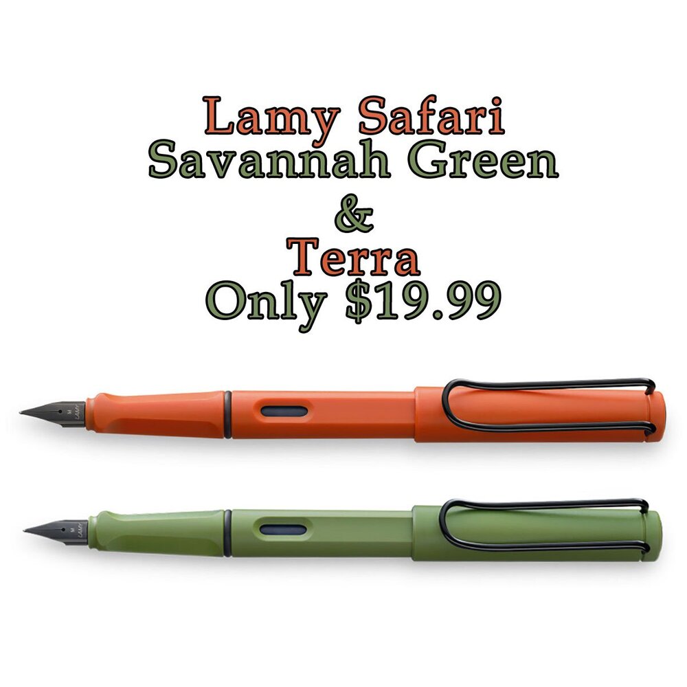
https://www.pensandpencils.net/products/lamy-safari-terra-fountain-pen-fine-041 https://www.pensandpencils.net/products/lamy-safari-terra-fountain-pen-medium-041 https://www.pensandpencils.net/products/lamy-safari-savannah-green-fountain-pen-fine-041 https://www.pensandpencils.net/products/lamy-safari-savannah-green-fountain-pen-medium-041
-
- lamy safari
- fountain pens
-
(and 2 more)
Tagged with:
-

Getting Into Fountain Pens Cheaply (As Much As One Can) In India.
Dimy posted a topic in India & Subcontinent (Asia)
Problem in India with starting with fountain. I won't tell why one should try and use fountain pens, there are enough content on this point. I am assuming one knows why you want to start and are on very tight budget and can't really afford the starter pens (as was in my case) cos lets be honest in India a student is dependent on family and he can't really say that I want 2000 Rs for pen and Ink. No family I know will allow this. I mean one can get 3 Rs dot pen and 5 Rs gel pen, who in sane mind will allow their kid to get something expensive which might be lost, broken or worst stolen on day 1 of school. Just see the number gap one can get literally 1000 dot pens for 1 Metropolitan and 1 bottle of Lamy Ink. Then is the famous reputation of leaky piles. ( false one but still exists). My past experience. My starting with fountains began with goal of improving my non-legible writing to at least legible one. Fountain pens do help in improving writing and if you have any goal of trying to improve it do try them. Back in the day fountains were readily available for cheap 30 to 40 Rs which were worst at best they leaked all over, concept of convertor and cartridge was non existing and nib width and feed was kinder joy surprise. And this is what makes the reputation of fountain pens as leaky mess which should not be used and I too started to think the same. Until a shopkeeper gave me Camlin trinity and said that if this leaks he will change it for free. The pen then was 70 Rs and this was the turning point. Trinity never leaked and I used Trinity and for next 5 years eventually switching to dot for various reasons for next 5 or so years. Ink pens never really got out of my life though and was always used from time to time until in my university where I shifted to full time fountain and ditched dots. mainly cos I felt my writing degrading to bad and more flexibility with work which allowed me to use the pens to full. This was also time when I was exposed to "starter pens" namely Metropolitan and Lamy safari. they were big investments for me but I decided to go ahead and take the plunge and it was totally worth plunge. Main point of cheap fountains and which to choose and which to avoid and why. First a disclaimer I have no Intention of hurting any brand or maker I am just writing my personal experience with the pens I used. Now lets divide Budgets- Cheapest I can suggest- Pen- Camlin Trinity ( Price around 100 Rs)/ Camlin Trinity Elegante (Rs 200 around).This is the cheapest I can suggest to anyone with a fact that it won't have the issues of leaks and will have solid body and OK to good flow. My first trinity is still with me abid with broken nib. Then pen is plastic and metal at cap. The pen is small in hand and very narrow and will be perfect for kids and people with small fingers. Trinity Elegante is larger pen with better look and finish and comes in larger nib size then tiny nib of Trinity. This also writes a bit better. Both have convertor with them. Ink- Parker quink (around 60-80 Rs) / camlin ink there is issue with both of them. Last time I used parker it was too light and got lighter still with time. My 5 year old writings are now quite faded. Not disappeared but fading is there. Camlin on other hand has issue of not being available everywhere and I can't say much about fading as I did not have much experience with it. total cost 180-300. what to avoid here My experience with Pierre Cardin's cheapest fountain of 100Rs has been worst of all. The nib was good and flow was nice with fine lines but body was so flimsy that it actually broke when I tried to remove the snap cap which it comes with....how can I write with a pen which breaks in process of removing the cap. 2nd one did survive the opening of cap (wow what a criteria) but broke eventually and I could bend the body with 2 fingers. So no this is no from me. Other one is classmate octane fountain pen. As good is octane gel and dot the Rs 40 octane is very poor flow pen with paper scratching action. Don't go for this. 3rd Parker Beta, again too scratchy on paper to point one can hear it scratching on paper. 3rd are assortment of who knows what pens of 20 to 50 Rs. got too tired of them in my starting days to ever look at them. for those with a bit budget (under 1000Rs) Pens- Parker Vector GT ( around 400Rs) / Parker Frontier (around 500 Rs) and Kanwrite Desire (around Rs 700) Parker's have same same story as camlin here Vector GT is smaller pen best for small hands and comes with tiny nib while Frontier is larger pen with larger nib size. Both will come with convertor. This will be first proper smooth fountain pen experience and these both don't scratch or give much feedback. they will be good for anyone. Kanwrite is different cup of tea and is proper fountain pen and is all a fountain should. The pen will come with convertor and separate nib sizes of #5 and #6 with options of width. These were absent until now you were stuck with whatever nib you have but here is where things will change. the pen is not without flaws abid need for silicon grease if one wants to convert eyedropper and even for feed when pre coated grease is over else it will leak from convertor. (at least in my case it did). Still this is best I can say to start with fountains under 1000Rs. others one can look at --- ASA Pens have great reputation for making good pens. Never got to try one personally but rarely have I seen bad writing experience (this matters most to me) from anyone who has used them. (will get myself a ebonite pen from them after this lockdown, my First ebonite). Jinhao personally never got to try one so can't say but again they have good reputation for the price point. Ink- Waterman serenity blue (around 450 Rs) this is non-waterproof ink but will work perfectly with any pen and will not bleed or feather on any paper ( never tested on that brown rough registers) and is easy to clean both on cloths and in pens ( you will understand this properties worth after ruining a couple of your shirts). this is my first attempt here so I hope this helps to those who are struggling with starting and are wondering how to get 2000Rs for starting the hobby or as normal pens. pls put any questions You have I will answer them to best of my ability and will try my best to push you in this rabbit hole. PS do point things that I missed or your own experiences would love to hear them.- 39 replies
-
- affordable
- fountain pens
-
(and 1 more)
Tagged with:
-

Pelikan M800 Brown Black- A Review And A Comparison With The M800 Tortoise
Quadratus posted a topic in Fountain Pen Reviews
THE PELIKAN M800 BROWN BLACK FOUNTAIN PEN (SPECIAL EDITION So recently I succumbed to temptation. I had privately taken a resolution that I would be restrained this year- no new pen buying except in the most exceptional circumstances, as I already have over 50 fountain pens (some of high quality and therefore high price…) On the perfectly rational basis that I can only write with one pen at a time, I decided that now was a moment to stop adding and even to start selling pens that are seldom used on eBay… If that sounds like a familiar inner thought cycle to you collectors among my readers, then you are right. However, the tempters par excellence of Hannover keep producing wonderful new pens and Pelikans are probably my favourite writing instruments (with Sailor coming a very close second). But, as my wife wearily says, I can never resist a bargain. This time it was a really fantastic price (over 30% off the normal market price) for the new Pelikan M800 Brown Black. I resisted as long as I could until the eBay vendor was down to his last one and then pressed the “buy” key… I don’t need another M800 having accumulated over a dozen in the past decade. So why?… The simple reason is that I loved the looks of the pen. It was elegant, sophisticated, luxurious. I had the money and it was a real bargain. But I think there is a deeper reason. Owning the pen would give me great pleasure- that is surely justification in itself. To those who say that I don’t need another fountain pen, I will quote King Lear when he is taunted by his rapacious daughters who object to his retaining a retinue of knights after he has abdicated: they are too expensive, they are rowdy and he really does not need an entourage of attendants now he has retired from the throne. His reply is heart-breaking: “O reason not the need! Our basest beggars are in the poorest thing superfluous. Allow not more than nature needs, Man’s life is as cheap as beasts.” (King Lear, Act 2, scene 4). Shakespeare must obviously have been a pen collector… I -we, all of us- collect things not because we actually need them, but because we like them. I like pens so I collect them. That, to me, is justification in itself. So why this particular new Pelikan? Several reasons. It is a very attractive pen.It is admittedly conservative in looks and design, but that’s Pelikan for you. As Peter Twydle wrote in his wonderful book “Fountain Pens“, (Crowood Press, 2009, see crowood.com): “Since Pelikan made their first fountain pen in 1929, the overall concept of their quality pen range has changed very little. The traditional design and the filling mechanism with its enormous ink capacity has stood the test of time and, instead of being subjected to the whims of fashion, has been content with just a steady refining and improvement.” Here a few pictures of the M800 Brown Black. Placed under a desk lamp and it glows with rich autumn hues. Marvellous. I thought it would be interesting to show the Brown Black next to its close cousins the M800 Blue Black, Green Black and Red Black. This new Brown Black is clearly following a tradition and, in my opinion, this is one of the most attractive Pelikan has produced. The Blue Black is elegant, the Green Black is traditional and the Red Black is sophisticated, but the Brown Black has that rich glow, especially in good natural light, that gives it an antique or classical feel, as if it had been designed by a Greek sculptor. It is a very practical fountain penThe Pelikan is one of the most practical fountain pens ever designed. They are so easy to clean, especially as you can unscrew the nib unit. I have quite large hands (I can stretch an octave plus two keys on the piano without difficulty) and I find the Pelikan M800 posted or unposted equally comfortable. Just as important, the M800 has a huge ink reservoir- about 1.37 ml or the equivalent to about two standard cartridges. A fill will last me 4-5 days of active writing, often longer. However, that may reflect the fact that I tend to use “fine” nibs: a “broad” nib would go through an ink reservoir faster. The Brown Black, like all the series, has slightly translucent stripes so that you can check how much ink there is left by holding it up to a light. There is nothing more irritating than not having an ink window, or having to unscrew the body to check the converter to see how much ink is left. ReliabilityPelikans have great quality control. By the time the pen leaves the factory, it will work flawlessly out of the box. That cannot be said of a lot of fountain pen manufacturers who sell pens whose nibs often need adjustment. This is not acceptable if you are paying £300 ($390 or €360) or more for a pen… Comparison with the Pelikan M800 Tortoise A lot of collectors have voiced objections to the Brown Black on the grounds that it is very similar to the “Brown Tortoise” that came out as a limited edition in 2013. I am fortunate in owning both pens, so set out a few photos below to show the difference between the two. The Tortoise is above the Brown Black in the first two photos but below in the third.In my view, the two are different but they are close cousins. The Tortoise has stripes ranging from black to red to dark brown giving a very unique result: the Brown Black has a regular dual colouring that verges towards the bronze. I like both but I can perfectly understand why those who already own the Tortoise have passed on the Brown Black. Conclusion I am delighted with my new Pelikan. It makes a fine addition to my collection and has become one of my daily writers. I know I cannot really justify yet another M800 but sometimes, as a charming Italian aristocratic lady once said to me “Why should life be a punishment?” -
Hey Y'all! What are your favourite fountain pens?! I love my Parker Sonnet with the Black Parker Quink Ink! -Charles
- 131 replies
-
- fountain pens
- favorite
-
(and 2 more)
Tagged with:
-
As the title says these much anticipated bottles are available at a few retailors. I have ordered a bottle from Vanness and one from Pen Chalet.
- 27 replies
-
- noodlers ink
- ink
-
(and 1 more)
Tagged with:
-
At the risk of sounding like SBRE Brown...I'm interested in a written Shootout of the Italians! I'd like to hear from people who have tried both the Montegrappa pens (especially the Elmo) and the Leonardo Officina Furore, both with steel nibs. I am keen to give myself incentive to finish a book proposal, and a lovely new pen awaiting my future might do the trick. https://www.gouletpens.com/collections/montegrappa-elmo-fountain-pens/products/montegrappa-elmo-fountain-pen-blue-cross-gentian?variant=30719087771691 https://goldspot.com/collections/leonardo-furore/products/leonardo-furore-fountain-pen-emerald-blue-rhodium-trim-medium-steel-nib https://pen-venture.com/products/leonardo-officina-italiana-furore-blue-emerald-blue-smeraldo-1?_pos=7&_sid=ef604aa17&_ss=r I've got an average sized woman's hand (a 7+), and a history of tendon issues, so I prefer thick grips, though not heavy pens, with wet nibs and lots of ink capacity. (Current favs are Ranga ebonite in the 3 (although my other Rangas are bone dry), Opus 88 demonstrator and any of my 6 TWSBI Ecos (if I could marry into the TWSBI family, I would). I do not like thin or heavy metal pens (ejected all Jinhao's.) I love italic nibs, but might opt for a bold. Looking forward to hearing from you all.
- 10 replies
-
- montegrappa
- leonardo
-
(and 2 more)
Tagged with:
-
Lamy Safari Mint Fountain Pen Fine + 6 Free Cartridges Only $24.95
PensandPencilsDotNet posted a topic in The Mall
Lamy Safari Mint Fountain Pen with 6 Free Black Ink Cartridges Only $24.95 https://www.pensandpencils.net/products/lamy-safari-mint-fountain-pen-fine?_pos=1&_sid=cffd20e53&_ss=r-
- lamy
- fountain pens
-
(and 1 more)
Tagged with:
-
Since I rotate my 8 pens and my 8 inks, there are many combinations of pen-ink. And then there's the 4 papers which I also rotate. Some combinations work better than others. I'm trying to make sense of this. I ask you to rate the 8 inks and the 8 pens in terms of wetness and dryness. Fountain Pens: Pelikan Souveran M805, Waterman Expert II, Waterman Phileas, Stipula Splash, Sheaffer Sagaris, Sheaffer Prelude, Sheaffer School pen and Sheaffer Cartridge Pen; inks: Pelikan 4001 Brilliant Schwarz (Brilliant Black), Pelikan 4001 Königsblau (Royal Blue), Edelstein Sapphire, Edelstein Onyx, Waterman Encre Bleu (Inspired Blue), Diamine Mediterranean Blue, iroshizuku (Pilot) ama-iro (Sky Blue), Montblanc Mystery Black Is there anything else I should know about these inks? Are there any other inks that belong in my collection? Blue or Black only, please.
- 10 replies
-
- inks
- fountain pens
-
(and 2 more)
Tagged with:
-

Deciding On Whether To Get A Medium Nib Or Fine Nib On A Waterman Hemisphere?
bananaluck posted a topic in Waterman
Hi! So I have some gradual experience with fountain pens from the last time I wrote on this website. My favorite fountain pens that I have found to be a very smooth writing experience for me are the Pilot pens. I especially love the Prera and I hope that Pilot makes more of the solid-color body ones cause they are my favorite. Anyway, those pens are the ones that really work with me. I tend to use a medium nib on the Pilot fountain pens. Now I know a Japanese medium=western fine. However, I find that Western fine can be too scratchy and that Western mediums can be too broad. I want to find a fountain pen that has the same line consistency as the Pilot mediums found in the Preras, Cavaliers, and the Metropolitans that I use. Even my one Kaweco Sport that is medium is an ideal line for me. So I've been looking at Watermans because I just got a rollerball from them and absolutely loved it, but I wanted to try out their fountain pens since I heard that they are of good quality. However, I'm driving myself mad about the nib and which one I should get. Maybe I'm just overthinking things, but I don't want to get a medium with it being broad and me smearing it because I drag my pen across the paper. However, on the other hand, I don't want to get a fine in case it's too scratchy and the line isn't what I want. Please help me!!! I want to be part of the Waterman gang Also, was wondering if the Waterman, specifically the Havana Brown is fast drying or if Waterman inks are fast-drying inks in general. The Pilot inks are wonderful for me, for it never smears even if I brush my hand over it. However, Kawecos aren't really fast-drying inks which I am very surprised about. I thought they were, so I'm wondering if Waterman is fast-drying. I hope it is in my favor! thanks again for the help! looking forward to your responses!


