Search the Community
Showing results for tags 'fountain pen ink artist'.
-

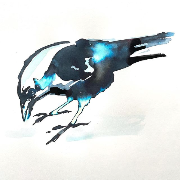
Troublemaker Sinulog Black fountain pen ink with bleach in Rhodia Touch book.
NickiStew posted a topic in The Write Stuff
Just look at that electric blue effect with bleach! This was a throwaway exercise that just came good. I have a feeling that the culmination of this fountain pen ink arts project may well be something along these lines - simple imagery with a harmonious combo of chromatography, serendipity and alchemy, BUT before that possible eventuality there are quite a few more chapters to be explored and documented!- 2 replies
-
- troublemaker ink
- rhodia touch
- (and 3 more)
-
It’s taken a while, but at long last, the mission has been accomplished. Multi-purpose fountain pen inks. Inks that one can write with and inks that one can use for painting and illustration. The perfect limited palette that one can take ‘on the road’ and use however one wishes, whether its writing down one’s thoughts or recording what’s going on around you. What I didn’t want to do, was label up 4 pure off the shelf colours and call it a job done. No. I wanted to create 4 unique colours that would stand up as four beautiful unique fountain pen inks each with their own personality and chromatic behaviours BUT also have the ability to blend with each other and create secondary and tertiary colours. Not as easy as it sounds and as always, there have been compromises along the way. So how do they shape up? Well at this moment in time they don’t have any names, but the recipes are finalised and I’m very happy with them. And they all react with bleach. Blue – this is a deep blue colour that reacts easily with water bleeding out bright turquoise, cyan with a hint of pink. There is also evidence of a delicate red sheen at the edges when dry. As a writing ink, it flows well with evidence of some shading. Red – this is a deep magenta that reacts easily with water bleeding out rose reds but also with yellows at the very edges. This took a long while to get right. As a writing ink, it flows well with some shading. Yellow – I needed to darken this, to give it a darker tone, otherwise it would be difficult to write with it as it wouldn’t read. The ink reacts easily with water bleeding out mottled ambers and lemon at the edges. Because of the deeper tone one needs to add plenty water when wishing to achieve those lighter greens and oranges. This took a long while to get right. As a writing ink, it flows well with great shading. Black – My favourite of them all. This a dark black that reacts easily with water bleeding out greys, blues and reddish browns. For some ochre brown colours this mixes with the yellow superbly. This also took a long while to get right. As a writing ink, it flows well with a hint of shading. So how do they mix? Please see the colour wheel below: The inner ring is a light wash of the black showing the tertiary colour possibilities. And below are some very quick secondary and tertiary colour mixing experiments: I’m confident that these inks can produce most of the colours that a traveller would need without taking up much space in the rucksack. These are now going to be put into production. The food on table image is rendered in the style of John Minton. A simple and graphic example to demonstrate how these vibrant inks can be utilised as well as the wet in wet watercolour techniques. I used 2 Da Vinci travel brushes – an 8 and 5 – as well as a Serendipity dip pen. The palette plate was a cheap plastic 10 dimple dish. Paper used was heavy cartridge, Bockingford 200lb rough and Rhodia dot matrix. For more info, check out my profile page. Thanks. Nick
- 12 replies
-
- nick stewart
- cmyk
- (and 8 more)

