Search the Community
Showing results for tags 'fountain pen ink art'.
-
 Pros- Strong Aluminum Body Nice Nib which has slight flex to it Very Light Weight yet sturdy Good For Long Writing Sessions Unique Design Cons- Cap Spins!!!! – hexagonal pen’s sides don’t always line up between the cap and body. It spins also while posted Converter Not Included Overpriced – Better pens are available at lesser price. Section can work itself loose from the body through writing One pen of mine had a baby bottom, so poor QC. Bad Customer Service. Specs & Things you should know- Material- Aluminium Snap On Cap Clip Material – Metal Clippable- Yes Converter – Not Included Diameter – Grip 7.7 mm Diameter – Max 13.1 mm ED Convertible- No Grip Material – Plastic Length Capped – 14.1 cm / 5.6 inches Length Uncapped- 12.3 cm / 4.8 inches Weight with Barrel (Empty)- 0.34 oz / 10 grams Weight with Cap – 0.27 oz / 8 grams Weight of Whole Pen (Empty)-0.62 oz / 17 gramsgrams Other Key Things – Packaging – Nice, but you should remember it doesn’t comes with converter. Design- Okay!! the pen has Faceted hexagonal body which looks nice but spinning cap is deal breaker for sure. It becomes too long when used posted. Some guys may not like this Slim Grip! Nib Performance – Nib is smooth & flexes a bit when pressure is applied on it. Overall- Unique design but many major drawbacks. And when compared to other pens in this price range it’s total disappointment. Note – I have 3 of these, I purchased these pens from GouletPens , JetPens & Fahrney’s pen. It retails from $55-65. Full Review Link - https://inkpenlover.wordpress.com/2021/05/13/caran-dache-849-fountain-pen-review-great-hexagonal-design-but-it-is-overpriced-has-major-flaws-too/
 -

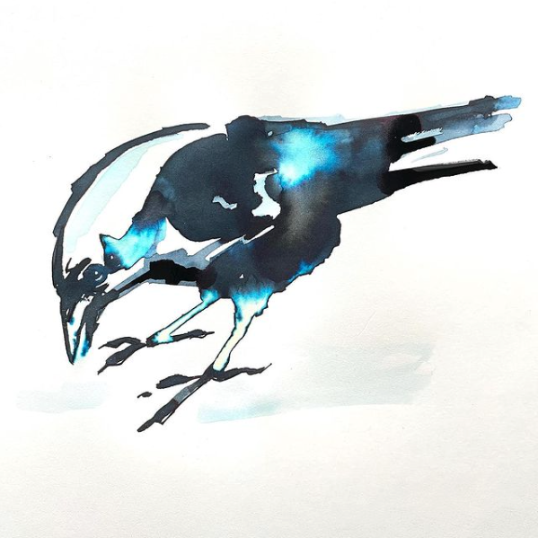
Troublemaker Sinulog Black fountain pen ink with bleach in Rhodia Touch book.
NickiStew posted a topic in The Write Stuff
Just look at that electric blue effect with bleach! This was a throwaway exercise that just came good. I have a feeling that the culmination of this fountain pen ink arts project may well be something along these lines - simple imagery with a harmonious combo of chromatography, serendipity and alchemy, BUT before that possible eventuality there are quite a few more chapters to be explored and documented!- 2 replies
-
- troublemaker ink
- rhodia touch
- (and 3 more)
-

Pocket Notebooks For Ink Geeks
NickiStew posted a topic in Paper & Pen Paraphernalia Reviews and Articles
I have been sent three – The Pebble Stationery Co Tomoe River 52gsm pocket notebook, the Made for Ink Pocket Junglist Special Edition 100gsm Fedrigoni Milk stock with Fluoro cover pocket notebook and one sent a long while ago, the Choosing Keeping Blue pocket book. But I’m also including the Seawhite A6 140gsm all-media cartridge paper sketchbook. Here are some of the images from the tests in the following order: Pebble Stationery Co Tomoe River, Made for Ink Junglist Special Edition, Choosing Keeping Blue and Seawhite. PEBBLE TOMOE RIVER – IDEAL FOR SHEEN AND SHIMMER INKS The Pebble Stationery Co Tomoe River 52gsm pocket notebook is 80 pages and measures 3.5 x 5.5 inches. It’s sewn stitched with a grey linen 350gsm cover and has rounded corners. It usually comes as a 2 pack. First impression are very good. It looks very smart and beautifully finished! This particular pocketbook came with a dot matrix and I liked it straight off because the dots were printed very lightly! They are after all supposed to be there as a guide NOT the main feature. For all of you who have bought into monster sheen and shimmers, Tomoe River is without doubt the best surface available and in my opinion, this book is ideal for the job! See images for proof of this. However! If you want to use this book for illustration and painting, then think again. Because the paper fibre is such a tight knit you will experience severe paper ruckles and very limited chromo effects. And don’t use anything other than a fountain pen nib or brush. A zebra G nib, for example will tear the surface the pieces! Another thing to remember is that 52gsm is incredibly thin and depending on the concentration of ink you apply, there will be show through and the reverse page will be unusable, BUT on the upside – you will be able to drool over the sheening and shimmer effects! And they are the best! At £12 for two you may think this expensive. I’d disagree. It’s a fantastic product! MADE FOR INK JUNGLIST – IDEAL FOR WRITING The Made for Ink Pocket Junglist Special Edition has a 300gsm cover with 52 internal pages of a smooth white 100gsm paper stock. This particular pocketbook is staple stitched and has a dot matrix page layout which for me is too heavily printed. Performance wise – some of the heavier sheening and shimmer inks do bleed through the paper, creating show through. But in general, most inks work well and you will be able to achieve reasonable sheen and shimmer effects. For chromo effects and illustration this pocketbook also works – not brilliant but better than the Pebble. I already use Rhodia dot matrix for handwriting tests and this is very similar. For handwriting and note making this book is ideal with no show through and at £4.65 who’s complaining? CHOOSING KEEPING BLUE – IDEAL FOR ART JOURNALING Next up is the Choosing Keeping Blue pocket notebook for which I posted a review some months back. Here’s the link. The cover is a soft leatherette blue with what I think is a 75gsm tight fibre cream paper stock inside. The 64 page hand made book has rounded corners with a red edging and is staple stitched. This has many of the qualities of Tomoe River paper. Good sheening and shimmer effects. NOT as good as Tomoe but certainly not disappointing. For painting and illustration, this isn’t bad either. This comes labelled as an old fashioned looking product and the cream paper does deliver this if that’s what you’re into. For painting and illustration I got some good results. Despite the cream stock, I liked this and for £5 what’s not to like. SEAWHITE A6 STARTER – IDEAL FOR FOUNTAIN PEN INK ART Last up is the Seawhite A6 starter sketchbook with a black cover and 40 pages of white 140gsm all media cartridge paper staple stitched together. For sheens and shimmers the cartridge paper will flatten the effects but for chromo effects painting and illustration this book is totally recommended and proven and at £1.05 for a book I think they’re amazing. Each pocketbook has it’s advantages and disadvantages so to get the best from ALL of your fountain pen inks you’ll need pocketbooks of various paper types and paper weights and the good news is that there’s a plethora of pocket notebooks on the market for you to try out. That said, do research your pocket notebooks before buying as some are not suitable for fountain pen inks as the papers they use are too absorbent.- 8 replies
-
- pocket books
- nick stewart
- (and 5 more)
-
I have recently posted a CMYK ink mixing tutorial on YouTube which may be of interest to those of you who are into your inks. With many of us in lockdown, this a great opportunity to pursue fountain pen ink investigation. For best results, use fountain pen inks that are as close to the four primary colours as possible: Cyan, Magenta, Yellow and Black. And try to use inks that are pure dyes ie not containing pigment (sludge). This is not brand specific, you can mix and match brands if you wish, just as long as the inks you choose are as near to the primary colours as possible. You can find the tutorial on my YouTube channel. Search under Nick Stewart Ink Art. Have fun and please post your results here. Thanks. Nick
- 19 replies
-
- cmyk
- colour wheel
-
(and 4 more)
Tagged with:
-
It’s taken a while, but at long last, the mission has been accomplished. Multi-purpose fountain pen inks. Inks that one can write with and inks that one can use for painting and illustration. The perfect limited palette that one can take ‘on the road’ and use however one wishes, whether its writing down one’s thoughts or recording what’s going on around you. What I didn’t want to do, was label up 4 pure off the shelf colours and call it a job done. No. I wanted to create 4 unique colours that would stand up as four beautiful unique fountain pen inks each with their own personality and chromatic behaviours BUT also have the ability to blend with each other and create secondary and tertiary colours. Not as easy as it sounds and as always, there have been compromises along the way. So how do they shape up? Well at this moment in time they don’t have any names, but the recipes are finalised and I’m very happy with them. And they all react with bleach. Blue – this is a deep blue colour that reacts easily with water bleeding out bright turquoise, cyan with a hint of pink. There is also evidence of a delicate red sheen at the edges when dry. As a writing ink, it flows well with evidence of some shading. Red – this is a deep magenta that reacts easily with water bleeding out rose reds but also with yellows at the very edges. This took a long while to get right. As a writing ink, it flows well with some shading. Yellow – I needed to darken this, to give it a darker tone, otherwise it would be difficult to write with it as it wouldn’t read. The ink reacts easily with water bleeding out mottled ambers and lemon at the edges. Because of the deeper tone one needs to add plenty water when wishing to achieve those lighter greens and oranges. This took a long while to get right. As a writing ink, it flows well with great shading. Black – My favourite of them all. This a dark black that reacts easily with water bleeding out greys, blues and reddish browns. For some ochre brown colours this mixes with the yellow superbly. This also took a long while to get right. As a writing ink, it flows well with a hint of shading. So how do they mix? Please see the colour wheel below: The inner ring is a light wash of the black showing the tertiary colour possibilities. And below are some very quick secondary and tertiary colour mixing experiments: I’m confident that these inks can produce most of the colours that a traveller would need without taking up much space in the rucksack. These are now going to be put into production. The food on table image is rendered in the style of John Minton. A simple and graphic example to demonstrate how these vibrant inks can be utilised as well as the wet in wet watercolour techniques. I used 2 Da Vinci travel brushes – an 8 and 5 – as well as a Serendipity dip pen. The palette plate was a cheap plastic 10 dimple dish. Paper used was heavy cartridge, Bockingford 200lb rough and Rhodia dot matrix. For more info, check out my profile page. Thanks. Nick
- 12 replies
-
- nick stewart
- cmyk
- (and 8 more)
-
If you follow my blog - https://quinkandbleach.wordpress.com - you'll know that I'm on a mission to find ways of utilising fountain pen inks for other purposes other than just handwriting. Below are four artworks achieved through utilising the ink's natural chromatic qualities and trusting to serendipity to deliver a visual spectacle: Noodler’s Rome Burning Noodler’s Whaleman’s Sepia Noodler’s Burma Road Brown Parker Quink Black
- 13 replies
-
- fountain pen ink art
- chromatography
-
(and 2 more)
Tagged with:

.jpeg.a4b540213c2be880d03b32763872463b.jpeg)
.jpeg.7e07cd13ece83c94159be71e10428a31.jpeg)
