Search the Community
Showing results for tags 'flower'.
-
Hello again to all my FP friends, [This review has been sitting on my desk for months and I finally got around to posting it. Stay tuned for a comparison of Diamine Cornflower and Penbbs #116 Cornflower.] Diamine needs no introduction on this board. Suffice it to say that they have been making inks for over a century and produce many, many beautiful hues, a lot of which are prone to feathering and bleed through on everyday office paper. This ink up for review is from Diamine’s Flower Series. It is named after the cornflower (centaurea cyanus) which can be various shades of blue or lavender. I’ve never seen the flower in person, but by just comparing with various photographs online, the ink looks like a pretty good match to the flower. Diamine Cornflower is a deep and very saturated blue with a dash of purple. This ink dries quickly on absorbent paper, but has an average dry time on nicer papers. Sheening is nice and shading possible with wet nibs on good paper. It can be quite a stunning color with the write combination. Unfortunately, this ink’s downfall as a daily work ink is its tendency to feather and bleed through. Although feathering with finer nibs wasn’t too bad on copy paper, even the Japanese fine nib produced noticeable bleed. Water resistance is passible; a dark purplish line remains legible. This is a lovely vibrant color that reminds me of a dark counterpart to Noodler’s Baystate Blue. The color is also standard enough that it could be used in most professional environments. They only thing that keeps me from buying a bottle is that the feathering and bleed through make it impossible to use on any paper I would run into outside the house. However, if you like saturated, slightly purplish dark blues and mostly use good paper, then this is not an ink you’ll want to miss. *A special thanks to lapis for sending a sample of this ink to me! Pens used (in order): 1. Pilot 78G Fine 2. Lamy Safari Broad 3. Pilot Plumix Italic 4. Noodler’s Nib Creaper Flex 5. Hero 5028 1.9mm Stub Swab Paper Towel Drop 80gsm Rhodia Tomoe River *Many thanks to Lord Epic for kindly sending me some of this paper! Check out that subtle sheen! 70gms Deli Copy Paper Moleskine Water Resistance Comparison (More blues to be added later) Thanks for reading! SDG
- 21 replies
-
- diamine
- cornflower
-
(and 8 more)
Tagged with:
-
Penbbs is a Chinese online fountain pen community similar to FPN. They not only talk about inks but also produce their own inks every year. Each series consists of ten to fifteen inks and 2017 marks the release of Penbbs’ fifteenth ink series. Due to Chinese postal restrictions, these inks are virtually impossible to obtain outside of China. Within China they are extremely affordable (21 RMB or about US$3 per 60ml bottle) and can easily be purchased through the Chinese online shopping giant Taobao. This ink up for review is from Penbbs’ tenth series. It is named after the cornflower (centaurea cyanus) which can be various shades of blue or lavender. Personally, I think this ink is too dark and too purple to match the flower, but it’s a nice purple nonetheless. No. 116 is noticeably bluer than No. 95. It is very saturated (more so in person than in the photos) and has virtually no shading. This ink dries quickly and only shows a little feathering and bleed through with wet nibs. There is slight water resistance as well; the blue and purple components separate and leave a feint line. This is the best performing ink of the four Penbbs inks I’ve reviewed and is the only one I’d be comfortable using regularly on average paper. Penbbs No. 116 is a nice, vibrant blue-leaning purple that behaves itself, but doesn’t stand out as particularly interesting or exciting to me. Pens used (in order): 1. Pilot 78G Fine 2. Lamy Safari Broad 3. Pilot Plumix Italic 4. Noodler’s Nib Creaper Flex 5. Hero 5028 1.9mm Stub Swab Paper Towel Drop 80gsm Rhodia 73gsm Chinese Tomoe River Wannabe (brand unknown) 70gms Deli Copy Paper Moleskine Water Resistance Comparison Note: The comparison shows the ink's color more accurately than the other photos. It really is this dark. Here is Penbbs’ image of the bottle and label for reference: SDG
-
Currently Diamine has two box sets of inks: the Music Set and the Flower Set. Visvamitra has a great comparison of the former. Personally I find the Music Set colours too gloomy. I prefer the bright colours of the Flower Set. Check out the following links for my individual review of these 10 inks: AsterBougainvilleaBurgundy RoseCarnationCornflowerGerberaIrisMarigoldPansyTulipBox The inks come in a sturdy box, separated by some cheap-looking black paper. Sometimes it's very difficult to take out one bottle because it's too tight. Labels Each label features an image of the corresponding flower. Splash Scanned images. Now to writing samples. Except stated otherwise, they are all written with a Pilot Elabo/Falcon Soft Medium. Samples (On Maruman Looseleaf) (On Rhodia Dotpad) (On some cheap no-name notebook paper) Now with dip pen nibs. With a lot of ink put on paper, the colours are richer and show more sheen. (Speedball 3mm nib, on Maruman Looseleaf) (Speedball, on Tomoe River white paper) (Speedball 3mm and Zebra G, on Tomoe River ivory paper) (Folded nib, on Maruman Looseleaf) Sheen (Photo taken in sunlight, from the Tomoe River ivory paper sample.) Water Resistance (before: Maruman Looseleaf) (after) Comparison (with some similar (or not) colours) To conclude My impression of these inks in short: Aster: too pale in writing for my taste, but decent for dipping. Bougainvillea: I love how bright it is. Burgundy Rose: decent. Carnation: a freaky and weird colour with strange sheen, love it. Cornflower: an okay blue with quite a lot of sheen, stains! Gerbera: nice shading, a bit dry for my taste (?) Iris: lovely blurple, stains. Marigold: not bad, but somewhat dry (?) Pansy: rich purple, love it, except that it stains. Tulip: meh, not saturated enough. I love: Bougainvillea, Carnation, Pansy, Iris. I don't like: Tulip, Aster. The rest are ok.
-
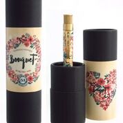
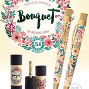
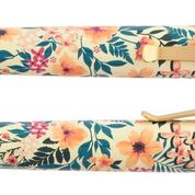
A Pen for a Flowery Friend Here in Maryland we've sprung forward and now we're just waiting for the last of the snow to melt and to get this vibrant pen into our hands. As we speak Retro 51 is sending us their newest popper pen-- the Bouquet. This Popper has a cream colored body with vintage-inspired painted wildflowers flowers and greenery all over. The section, clip, and trimmings are a lux gold color. It's a gorgeous gift for people who love flower patterns and great rollerball pens (think: Easter, Mothers Day, friends with a green thumb). We'll be getting these pens in at the end of this week (3/18 or so), so if you would like to place a pre-order feel free to email us at support@penboutique.com or give us a call at 800-263-2736. Here is the link to the site http://www.penboutique.com/retro-51-tornado-popper-bouquet-rollerball-pen.html
-
Greetings Folks, I'm trying to find an ink that matches the color of the flowers on my mother-in-law's plant (it's a Thanksgiving Cactus). Having a bunch of ink samples sent to my location is cost prohibitive so I need to find the closest ink and commit to a bottle. Attached are a couple pictures of the flowers and one that I used MS Paint to check the color with. I'm thinking possibly something around Herbin Rose Cyclamen, Noodler's Sha's Rose or Qin Shi Huang might work, but I don't have them to check. Any help would be greatly appreciated!
-
Here is a little review of DeAtramentis Dianthus! Thank you to my friend Elle who gave me this ink sample! In short: It is a fun, bright ink with bright saturation. However, it does tend to feather and bleed on less than the best papers. I even had some feathering on Rhodia Premium Ivory - yikes! Overall, while I love the color, the feathering bugs me. And since I already have some very similar colors I opted to not purchase this one. Still a fun color to check out!
-
- deatramentis
- dianthus
-
(and 4 more)
Tagged with:
-
Just a brief announcement and short review of the forthcoming ten new colours in Diamine's Flower set. This new collection will surely be a popular addition to the growing Diamine range and I think the colours certainly will be a hit. Obviously, the names of the inks are subjective: no-one can categorically say that the 'Marigold' for example isn't the same colour as that flower that person has just picked for the table vase. Also, it must be remembered that how I see the scanned examples, isn't necessarily how others may view them on their particular screens. Well, that's just the way of it. So, here they are. Ten inks; ten flowers; coming out in October, so I'm told. As is Salamander! I've tried to pair them up, from the purple/blue, to the red/orange. Carnation was tricky. Judge for yourselves in October. The colours are: Aster; Cornflower; Iris; Pansy; Bougainvillea; Carnation; Burgundy Rose; Gerbera; Tulip and Marigold. I've no idea how the inks will be packaged but as it will be a 'set' I suppose that they will be boxed much like the popular Music offering from last year. No other details I'm afraid - the inks, with the note arrived this morning. Let's just sit back and enjoy!


