Search the Community
Showing results for tags 'fine'.
-
PRELUDE In the search of suitable replacements for a Meisterstuck Doue FP 145 My meticulously planned fountain pen hiatuses are occasionally disrupted by the well-meaning members of my family. Instead of appreciating my carefully timed fountain pen acquisitions, they enthusiastically offer advice on investments, the time value of money, and everything in between. To add a twist to the tale, they threw me a curveball last year by gifting a Meisterstück Doue FP 145 LE, even though I had only bought a total of three fountain pens in the last three years. If we exclude the Opus 88, then it's just two. The Doue 145 is undeniably a beautiful pen, but I found myself wondering if I could ever use it with its slim metal section and rather shortish nib. Determined to find a more suitable replacement, I revisited the local MB Boutique. While Montblanc's customer service remains top-notch for pens within the two-year warranty period, they seem to derive more delight from pens outside the warranty period than their customers do. Faced with the task of choosing two pens to match the value of the pricier Doue, I was drawn to a Naruto LeGrand 146. Then, the salesperson revealed his secret NOS drawer, housing various pens, including a Great Characters Walt Disney FP. Opting for the Montblanc M, not only because its 2018 price, combined with the Naruto, matched the total credit value for the Doue, but also because it simply looked nicer. And here goes the review.... If you like a pictorial blogger view, here is the link: A Review of the Montblanc M in Red PRESENTATION (6/6) Usual MB The usual MB single pen box. The standard Montblanc single pen box with no customisation, with the only variation being the red cardboard sleeve that encases the box. The RED collection boasts a charitable initiative, contributing less than 1% (€5) towards fighting HIV/AIDS programs. It's almost as if Montblanc is tackling HIV/AIDS single-handedly, making minuscule donations of €5 at a time, all while charging the end customer a whopping €540+. As Master Yoda famously said, “Do or do not. There is no try”. The pen securely nestles within a cushioned and somewhat snug slot inside the box, accompanied by a complimentary cartridge filled with black ink. However, it seems that most of the ink inside the cartridge had evaporated during its 5 years of shelf-living. DESIGN (6/6) From the likes of the Apple Watch The Montblanc M, available today in three finishes—Ultra Black, RED, and RED Signature—has been designed by Marc Newson, renowned for his work on the Apple Watch. Newson has successfully blended functionality with elegance, anchoring the design firmly outside the tradition for Montblanc. The shape of the pen is particularly appealing in modern pen terms. It boasts a perfect cylindrical shape with zero taper and rounded ends, except for the flat section, commonly referred to as the “plateau” at the end of the barrel. The platinized clip is a personal favourite; it avoids the cheap look of the Safari, perhaps because it's not oversized and doesn't unlawfully occupy a third of the cap's surface area. The glossy and bright red finish mirrors background lights and hues effectively. Upon uncapping, one notable feature is the novel use of magnets to secure the cap. The snap cap rotates itself to align its magnetic poles perfectly, ensuring the clip and plateau on the barrel are perfectly aligned on a plane. A soft snap securely seals the cap, earning full marks here. According to Red Dot Project award records, the snowflake emblem made of white resin is ultrasonically welded onto the plateau and then milled with a diamond tool to maintain flatness. The design reflects a harmonious flow and is truly eye-catching. The cap, adorned with the snowflake emblem on top like regular Montblanc pens, exhibits impeccable overall quality of work. In certain lighting conditions, the magnetic insert is faintly visible inside the cap. The knurled platinized metal section adds enough weight to balance an otherwise light barrel. Due to the flat plateau on the barrel, the cap cannot be posted. The section, embossed with the MONTBLANC brand name five times on the visible rear ring where the cap snaps on, is somewhat short and not ideal for longer writing sessions. More on that later. FILLING & CLEANING SYSTEMS (4/6) Cartridge & No Converter This is where, like many other fountain pen users, I express my concerns. It's worth noting that this pen only supports standard international short cartridges, and none of the available converters are compatible due to the featured plateau on the barrel. On the positive side, the pen accepts short international cartridges or proprietary MB cartridges, limiting its cartridge capacity to 0.5 ml. The form of the pen, while aesthetically pleasing, somewhat restricts its functionality as part of the design. Perhaps because the pen was conceived in this digital age, the designer didn't anticipate it being used extensively. Additionally, cleaning the section with running tap water is an easy process. NIB - ALL THAT MATTERS (6/6) The two toned rhodium ruthenium stunner The 14k nib is claimed to be handcrafted by Montblanc in a series of 30 steps. Rhodium-coated with a dark grey ruthenium-coated inlay, this nib is a stunner. I particularly love the shape of the nib, which comes in two widths - Fine and Medium, as far as I know. A dazzling cylindrical flow of silvery rhodium bounds the dark grey ruthenium inlay with well-defined contours. Just below the circular breather hole, the 'M' logo rests within an encircled star. The tail end specifies the composition 'Au585' of the gold-alloy, and the brand name 'MONTBLANC' rests just above the tail. Between those, a hallmark of 'StOD' inside a crossed ellipse adds a touch of elegance. As always, the nib itself doesn't mention the width explicitly, but a sticker at the piston end of the barrel provides all the necessary details. Once you turn the nib, you'll behold a somewhat unconventionally shaped black glossy feed that seamlessly matches the curvature of the pen. Apart from an air hole, there is nothing else in the feed, although the nib runs almost medium wet. PHYSICS OF IT (5/6) – RELATIVELY SPEAKING The Newtonian Laws The overall capped length is around 14 cm. As perhaps mandated by Mr. Newson, I have to use the pen un-posted. Although the section has a somewhat comfortable girth, the shortest length of the section of around 2 cm with a step from the barrel does make it less than ideal to use it as a workhorse. The metallic section balances the weight of 19g pretty well. Below are the pictures along with a Conid Minimalistica for a comparative reference. The Minimalistica is super comfortable for me, here are the dimensions for the Montblanc M. Uncapped Length ~ 12.5 cm Total Length ~ 14 cm Exposed Nib Leverage ~ 1.6 cm (A #6 nib has typically 2.4 cm) The weight of the pen is comforting even without the cap. Overall Max Weight ~ 27 g (with a cartridge, without cap ~18.75 g) ECONOMIC VALUE (0/0) FOC for me No comments. No rating, as I paid nothing WRITING & FINAL COMMENTS (5.4/6) Writes well The writing experience is quite pleasant, albeit with a relatively stiff nib. It does possess a hint of tooth and precisely the kind of control you'd expect from a well-tuned nib. There is a certain degree of softness in the nib, though minimal line variation occurs with pressure. Lines dry in 30 seconds with MB Toffee brown ink on Endless Regalia 80 GSM paper, and the line width is sufficient to display some shading. The nib skipped on the black cartridges (the salesman included a couple of cartridge packs), but it performs flawlessly on the brown ones, offering a steady ink flow with no drying issues. However, the length of the section, along with the step, leaves something to be desired in an otherwise excellently designed fountain pen. The nib leverage is minimal, so you inevitably touch the step from the barrel. With sweat, the knurling on the grip loses efficiency, unlike a Conid Kingsize with a titanium section. The weight, balance, and aesthetics of the Montblanc M surpass present standards. I believe Montblanc has successfully created a modern pen. Thank you for going through the review. You can find other pen and paraphernalia reviews here. REFERENCES Mark Newson - M Red Red Dot Project PS. I am posting a fountain pen review after 4 long years and my 2 year old keeps me totally occupied.
- 21 replies
-
- montblanc
- marc newson
-
(and 3 more)
Tagged with:
-
Greetings All, Pardon the sloppiness (and embarrassing typos everywhere, even the first word ), but I wanted to get out this review as soon as possible because I'm so excited about this pen. I've had a lot of bad luck with Chinese pens (Hero's have been anything but my hero), but so far no Jinhao nib has ever failed me and their quality seems to be getting even better. Here are my comments and some writings samples about the new Jinhao 992. It's currently available in all colors on Ebay and probably places like Aliexpress as well. Writing sample on a cheap little notepad: Final Run-down Pros: - Quality construction - Superb converter that holds a good amount of ink - Toothless smooth nib - Flawless flow - Nib and feed easily removable for thorough cleaning (perfect for using those troublesome yet beautiful Noodler's inks) - Lightweight - Cap posts well (no slipping or popping off) - Screw on cap - Great color selection - The price! Cons: - Unbalanced when posted - Might be too small for larger hands when not posted [Addendum: Some pictures from the seller I bought from...]
-
The Ondoro is another of my Faber-Castell Design (FCD) pens. These FCD steel nibs are common across the entire design product range - Basic, Loom, Ambition, Ondoro & e-motion and have been impeccable in my experience. My first pen from the design series was an Ambition. I feel that the Ondoro is structurally a much better pen, though it might lack a bit of aesthetic flair prevalent to the Ambition. Below is a link to this review on my blog: Faber-Castell Ondoro Review The Ondoro line comes with a fountain pen (with 4 different nib widths), a roller ball, a propelling pencil (0.7mm) and a ballpoint pen across three coloured resins - Orange, Black & White (now discontinued) and a wooden one (smoked oak) priced substantially higher. PRESENTATION The Ondoro along with the included converter was hand-delivered at my workplace by A.W Faber Castell India personnel, encased inside this moss-green cardboard box. This colour always reminds me of the Australian Baggy Green Caps. The box has a slider where the pen is placed beneath a fabric band on a felted bed, along with a warranty card and a cartridge. Like the pen, the box does portray certain elements of minimalism. http://1.bp.blogspot.com/-Fc0XQgBbg8g/VeHlxofp3nI/AAAAAAAAFVQ/cm40PCnSoYs/s1600/box.jpg DESIGN - HEXAGON & CHROME (6/6) The pen seems to have an affair with geometry, structurally constituted of two overlapping hexagonal prisms - one orange and other chrome, with domed ends. Bold and minimalistic both in terms of convergence and functionality. The barrel is glossy while the cap is shiny chrome plated metal. Unfortunately the mirror finishes have a magnetic attraction for fingerprints. Faber-Castell calls the barrel material precious resin and it does feel qualitatively substantial. http://1.bp.blogspot.com/-jwgZbMNod34/VeHl7XF8PlI/AAAAAAAAFVY/ozpam9geDiw/s1600/DSC_5717.jpg The metallic cap snaps on and off the barrel with audible clicks. While putting the cap on, the hexagonal facets of the cap need to be aligned with the ones on the barrel. There is some metal at the end of the grip which actually is part of an insert for the nib unit. And there rests the shiny FCD nib. The barrel is designed to converge with the section subtly initiating a concave taper at the end of its hexagonal facets, leading to a comfortably concave grip section. http://2.bp.blogspot.com/-UwY4iHyWtyo/VeHmMQG5zdI/AAAAAAAAFVo/_bxi6lwZDgE/s1600/DSC_5725.jpg The finials at either end have smooth and convex domes, the one at the end of a barrel carries a engraved circle or an ‘O’. http://2.bp.blogspot.com/-2bRPeFtLQrY/VeHmHqEzhMI/AAAAAAAAFVg/gflyaBVtiwU/s1600/DSC_5726.jpg A mirror finish on the hexagonal chromed cap will attract your attention while you keep resisting your instant urges to polish off finger-prints, even after the slightest touch. The dome like finial is etched with Faber-Castell logo of two jousting knights and embossed there is a traditional statement preserving antiquity - Since 1761. The spring loaded clip is shaped like an arc with a concave end. It’s engraved with GERMANY on one side of its loading point. A plastic insert inside the cap gives the snap-on friction. http://3.bp.blogspot.com/-PZkfeOy0kTQ/VeHlwGjb_LI/AAAAAAAAFVI/RXHG6CgwqS8/s1600/cap.jpg FILLING SYSTEM (6/6) The rather small resinous concavity at the end of the barrel unscrews from the barrel with seven turns and it disengages the section containing the nib and CC filling system. There is a mention of e3 on the metallic thread insert, it’s apparently a reference to their old manufacturing plants. http://2.bp.blogspot.com/-r54us3mfHlU/VeHmXs1aUxI/AAAAAAAAFVw/ccQWq8h8GSY/s1600/DSC_5755.jpg The insert for the section threads with the metallic insert in the resin barrel. http://1.bp.blogspot.com/-qscoJSXp5Ls/VeHmkJikquI/AAAAAAAAFV4/l343kFQhwS8/s1600/DSC_5757.jpg The converter says SCHMIDT on the piston along with the brand imprint of FABER-CASTELL Germany on the metallic sleeve. It has a reasonably high capacity of around 1 mL, and the ink does last for quite a while! I usually am biased towards piston fillers, but I like the capacity offered by Faber-Castell or Schmidt converters. In case of GvFC Converters, there is no mention of Schmidt on the converters themselves. This converter will snugly fit many other pens. http://2.bp.blogspot.com/-NSOno4o5b_g/VeHmlIAnTaI/AAAAAAAAFWI/lWTl-pFgC5k/s1600/DSC_5763.jpg NIB - ALL THAT MATTERS (6/6) The nib is made of stainless steel alloy with an iridium tip. The initially available nib sizes featured F, M and B nibs, though an EF was made available later. I went with an F sized nib. Right out of the box, this was a very smooth nib. The nib has a perforated imprint of dots which cover a third of its surface area. There is a subtle absence of any breather hole. The nib-size is embossed above the traditional Faber-Castell Design logo of two jousting knights near the tail. http://3.bp.blogspot.com/-GuGepiLE0h8/VeHmk2nj1EI/AAAAAAAAFWE/zimurJDHyqs/s1600/DSC_5776.jpg The feed is standard grey plastic, with a big filler hole for ink suction, which incidentally is used across the GvFC Intuition & Classic Series. http://2.bp.blogspot.com/-fDBSCfLAAE0/VeHmvEJDeYI/AAAAAAAAFWQ/PTA5tgQflgM/s1600/DSC_5778.jpg Faber-Castell Design (steel) nibs are sourced from JoWo whereas the GvFC nibs (18k except Tamitio) are made by Bock. PHYSICS OF IT (5/6) – RELATIVELY SPEAKING Sans the cap, the pen measures around 12.4 cm, which is quite comfortable for me given the wide girth. The cap can be posted easily. While the posted pen exceeds a 15 cm scale, a steel cap of 17g does make it top-heavy. Uncapped Length ~ 12.4 cm Capped Length ~ 12.8 cm Posted Length ~ 16 cm Nib Leverage ~ 1.9 cm Overall Weight ~ 32 g (Cap Weight ~ 17 g) Some capped, uncapped & posted references with a few pens like GvFC Intuition, Pelikan m205 and TWSBI 580 run below for your reference. Terracotta is much redder than the orange in an Ondoro http://2.bp.blogspot.com/-jVgRyXwdBG4/VeHm9LFmMQI/AAAAAAAAFWY/Dtwhl79Buqw/s1600/DSC_5787.jpg Uncapped the Ondoro almost matches a TWSBI 580 http://1.bp.blogspot.com/-HH2u5rSS3kI/VeHm_94vbnI/AAAAAAAAFWg/IKajNkSc5vE/s1600/DSC_5804.jpg Not really posted! http://2.bp.blogspot.com/-ZWsHc5_wH_I/VeHnGAQDFMI/AAAAAAAAFWo/3qO8OdWoej0/s1600/DSC_5815.jpg ECONOMIC VALUE (5/6) The Ondoro resin versions retail at around USD 125. I purchased it with a good discount, directly from A.W Faber Castell India, as there were some warranty issues with my other Faber Castell pen. I believe it’s a good value for money pen given such a beautiful nib, which can defeat any other. OVERALL (5.6/6) This nib is moderately wet, runs fine and smooth. There is absence of any line variation among horizontals & verticals. The nib has got some spring and a touch of softness. I find the grip very comfortable to hold the pen, you might say a little bit of barrel weight could have blessed this one. I will definitely recommend this pen to you, if you are looking at the Faber Castell Design Series. Being a moderately wet writer out of the box, the Fine nib puts a decent fine line (finer than TWSBI F) which takes around 15 seconds to dry a wet MB Toffee brown ink on MD Paper. http://1.bp.blogspot.com/-LtLB1WGbtKs/VeHnQe4ukTI/AAAAAAAAFWw/rHcuB7G_a0w/s1600/DSC_5837.jpg REFERENCES Faber Castell Ambition GvFC Intuition Faber Castell History Bock Clientele Thank you for going through the review. You can find some more pen and paraphernalia reviews here.
- 32 replies
-
- faber-castell
- ondoro
-
(and 5 more)
Tagged with:
-
I love everything about the Triple Tail. The largeness. The clearness. The non-smellyness. The plunger filling system. The 308 cartridges I can use. Everything, that is, but the nib itself. It's just too darn much for me. It's finicky, which is bad enough. But even when it does work after heat setting, etc -- and even with an ink as simple as 4001 Royal Blue or Waterman Serenity Blue -- it's like writing with a paint brush. And that's before flexing! Before I return it for a partial refund, I thought I would see if anyone has managed to trade it out for a #6 nib? And it not a basic #6, then something else? I saw someone asked Goulet, and the answer was: "Maybe". Have you done it? How'd it go?
-
Q: I Use Western Fine Nibs. What Is The Japanese Equivalent?
A Smug Dill posted a topic in Of Nibs & Tines
Disclaimer: Not my question personally. I have eleven Plaisir and six Preppy pens – with interchangeable sections and nibs, so for the purposes of how ink flows from the cartridge or converter onto the page to form shaped marks by way of the nib, they are identical (to the DPQ-700A desk pen as well) – inked right now, and due to the distinct design of the nib-feed-collector-section, I wouldn't say they are typical or representative of writing with a Japanese fountain pen, manufactured by either Platinum itself or any of the Big Three (Platinum, Pilot and Sailor). The Pilot MR is probably your best bet as try-out models for Japanese steel nibs, as they are often offered very cheaply on Amazon.com, compared to even the domestic Japanese market (in which they're sold as the Pilot Cocoon), if the step-down where the section joins the barrel doesn't bother you. The Pilot Prera, Kakuno, (discontinued) 78G, Penmanship (available with EF nibs only) and Plumix (available with Calligraphy Medium – in other words, italic – nibs only) all share the same type of nib and feed, as do the Pilot P-DPP-1S desk pens, if you prefer a differently shaped or weighted pen. The cheapest Japanese pens with gold nibs are made by Platinum: the KDP-3000A desk pens (with a nominal price of ¥3,000 ex tax), followed by the PTL-5000A models (¥5,000 ex tax), if you prefer to buy and write with gold nibs. Being in the US, you can far more easily avail yourself of grinding services from nibmeisters of renown than most other fountain pen users in the world, so regardless of brand or country of manufacture, you can always just get a nib customised to be your perfect tool of the trade. It would cost someone like me far more to either attend a pen show and engage a nibmeister face to face (and have him or her look at my pen grip and writing technique, in order to adjust accordingly), or send a pen overseas with written instructions, to have a nib modified to my exact requirements and preferences. Now that I have had one pen (out of over 150 in my personal fleet) with a nib customised expertly by Dan Smith, I've become an advocate of after-market customisation services used sparingly, to 'perfect' an crucial asset or resource that one uses for hours on end weekly. Getting a feel for, or even relishing, what each pen manufacturer intended for the writing instruments it produces is a different matter; I can dig the whole "buy a Pelikan for what Pelikan pens are like, and buy a Sailor pen for what Sailor pens are like" thing as a hobbyist, but that's a different matter from acquiring tools of the trade professionally. I was, more than once, unpleasantly surprised by how broad some European pen manufacturers think Extra Fine nibs ought to be, and how thick a line they should make on the page. I'm not just talking about for writing in Chinese hanzi and Japanese kana, either; now that I've learnt more about 'calligraphic' writing in English, I understand that forming each letter of the English letter alphabet with a single pen stroke, much less joining letters to form an entire word in cursive, is not the only way to hand-write in English, irrespective of what they teach in schools in the UK and the US. -
I recently acquired two Sheaffer Sagaris fountain pens, one with a fine nib, the other with a medium. I decided that I preferred the fine nib so I went looking for a fine nib unit to purchase to replace the medium. Since it's the entire unit, it should just screw into the barrel, right? I found a replacement fine nib unit from a seller in England, purchased it, and it has arrived. It won't screw all the way into the barrel that came with the medium nib unit. Hmm... So let's try the fine nib unit from the other pen from the original purchase. It won't screw all the way in either! Oh, futz... It's not due to the length of the converter (or shortness of the barrel.) I tried screwing in just the nib unit; no joy. The gap left between the barrel and the unit flange that nestles up against it is about 1mm. If I can find a flat washer with the proper i.d., o.d., and thickness I can fill the space, but that's a big if (and a big, ugly kludge.) I might have a better result with an o-ring (see ugly kludge.) Time to get out the vernier calipers and take some precise measurements. I suspect that the medium barrel was not threaded to the same depth as the fine barrel, hence the fine nib unit coming up short. It strikes me as very odd that Cross/Sheaffer would manufacture different barrels for different nib units because a more complicated manufacturing process is a more expensive and error-prone process. Can anyone shed some light on why the nib units are not interchangeable or suggest any alternatives for dealing with my situation? thanks, richard -- - You can’t get enough minimalism.
-
An Intuitive Conversation With The Graf Von Faber-Castell Intuition
sannidh posted a topic in Fountain Pen Reviews
After a long & strong fight with the penavarice-devil , I finally gave in and bought a GvFC Intuition. I went with the 'terra' - the red-orang-ish barrel. I have also replicated the content with some additional pictures in my blog as the images are reduced to a small thumbnail after a short-while. Below is a link to the same: Graf von Faber-Castell Intuition Review Here goes a review of the same: The Intuition With a covetous eye on this pen, since the time I had got my FCD Ambition and then an orange coloured Ondoro fountain pen, it indeed required lady luck's blessings, to get this one at a steeply discounted price. I must say, that there was already a strange sense of loss of colours, after I had given both of my orange coloured fountain pens away - Ondoro (mint & boxed) and later the Pelikan m205. And this was an appropriate treatment for my colour blindnesshttp://lh5.ggpht.com/-a-Tba4pAIVk/VPfDFXW0uAI/AAAAAAAAEBE/0lhEVc5hixI/wlEmoticon-rainbow2.png?imgmax=800. Coming to the Faber-Castell Design(FCD) and the rather luxurious Graf von Faber-Castell(GvFC) line of pens, I must say that they have been able to splendidly highlight the art of convergence of design and utility. The Intuition pen comes in six lines of resin-based designs and two(earlier three) lines of wood-based designs. The wooden designs are called Intuition Platino Wood which is an enhanced intuition design altogether, be it the fluted wooden barrel or the platinum plated cap or an extra-large and more exquisitely designed bi-colour nib. And, it naturally places them in a more premium segment http://lh3.ggpht.com/-xbUGfrYQ50k/VPfDGkDN4aI/AAAAAAAAEBM/SJueZw-VO6s/wlEmoticon-surprisedsmile2.png?imgmax=800. All these design lines come with a fountain pen (with 6 to 7 different nib widths), a roller ball, a propelling pencil (0.7mm) and a ballpoint pen. Presentation (6/6) It’s a chamois-coloured gift box with top and bottom wooden linings, which secures itself by a magnetic catch within the two folds. There is the pen resting in a cardboard box within a chamois-coloured linen bag, which carries the Graf Von Faber-Castell name and their coat-of-arms logo. I someway like the linen, bag because of its differentiated appeal, though not from an utilitarian perspective. There is also a warranty leaflet-cum-manual, which states a lifetime guarantee against manufacturing defects and assures services, in case any need for repair arises. Then, it also illustrates refilling the entire range of GvFC pens and other stationery. http://s25.postimg.org/pcc1oi7n3/Gv_FC_001.jpg Design (6/6) The Intuition range comes in six variants (terra - orange, ivory – off-white/fluted, black - black/fluted/metal cap) with six different nib sizes – EF, F, M, B, OM and OB. Only one of these variants comes with a platinum plated metal cap with a shiny black barrel. Coming back to the pen, once you take it out, it surely looks like a compact enchanting piece of art. A high gloss sheen of the of the barrel and the cap reflects back quite a bit of light. Complementing this sheen, are the dazzling platinum plated trims of the pen. http://s25.postimg.org/u4qwx28mn/Gv_FC_009.jpg On pulling the cap off, you would initially notice the singularity of the barrel, a section sans joints. It’s made out of a single piece of resin, in this case reflecting the colour of earth or ‘terra’, gleaming with an orange smile. At the top end of the barrel, is a twist-metallic crown, which disengages the bi-tone nib section and converter system, from the rest of the body. I just love this element of design! The knob is embossed with the coat-of-arms logo, on the finial. Usually the coat-of-arms logo is used in GvFC pens and FCD pens(Ambition, Ondoro, e-motion) carry the jostling knights logo. Traditionally coat-of-arms is said to represent full-achievement in a heraldic tradition. GvFC has quite a bit of design superiority over the other FCD pens. Towards the nib end, the singular barrel narrows down to a slightly concave section to form a comfortable grip. Despite the glossy and smooth finish, the pen has a subtle but non-slippy grip section. The cap is engraved with GRAF VON FABER – CASTELL, encircling the metallic finial insert which again bears another coat-of-arms logo with its platinum sheen. The cap band says GRAF VON FABER – CASTELL on one side and on the other end it's HANDMADE IN GERMANY. ‘Handmade’ because there are over a hundred steps in the entire manufacturing process of this pen, a majority of which are carried out by hand. The clip on the cap carries the gleam of platinum with a highly efficient and visible spring loaded system. http://s25.postimg.org/xcqcczokv/1_Gv_FC.jpg Filling System (6/6) Once the crown of the barrel is rotated anti-clockwise to disengage the nib & filling system, you would notice a rather classical CC filler system. The nib has a screw fit, and inserts into a metallic sleeve like most of the Faber-Castell fountain pens which I have seen. The nib sleeve has threads which synchronize with threads on the inner barrel, both ending up with an octagonal cross section. The converter has a metallic premium band which friction-fits into the nib section though it does not fit a FCD Ambition section. However, the Ambition converter fits in the Intuition nib section. The converter has a reasonably high capacity of 0.8 – 0.9 mL, and the ink does last for quite a while! I usually have a bias towards piston fillers, but I do appreciate the Faber-Castell converter capacity. http://s25.postimg.org/xgk5t8u27/2_Gv_FC.jpg The nib section carries a six-digit number which denotes the date of manufacture, which I did confirm with the Faber-Castell team. Mine says 011210, which would mean it was manufactured way back on 01-December-2010.http://lh3.ggpht.com/-4LhAicXcVUM/VPfDJ9JciiI/AAAAAAAAEBk/kRvZ6XhRsSM/wlEmoticon-peace%25255B2%25255D.png?imgmax=800 Nib (5/6) – All that matters The 18k bi-tone nib comes in four main widths – EF, F, M & B and two special widths – OM (left) & OB (left). The tail end specifies the nib size and composition (75% Au , 18 ct) of the alloy used. A white rhodium decor occupies the outer tines converging with the iridium tip, while the inner part circumscribing the breather hole gleams golden with engraved stripes. There is a dazzling white coat-of-arms logo resting just above the tail-end. This one is a fine nib and writes quite smoothly with a 'minutely minute' hint of feedback when I use relatively drier inks. It lays down a wet albeit fine line, which will be covered in the last section of this review. With a rather curved shoulder, the nib does portray an apparently smaller size even if it’s quite similar to the size of the relatively flat Ambition nib. [minus 1] http://s25.postimg.org/yhkeidb1r/Gv_FC_008_wb.jpg Below is a comparison to the FCD Ambition (non-premium) sections. You can check the differences between the two converters, the Intuition has got some metallic embellishment. They do use a similar feed. http://s25.postimg.org/fnylldctr/3_Gv_FC2.jpg Physics of it (4/6) – relatively speaking With a cylindrical body of 1.2 cm diameter, it does give a comfortable feel without adding too much weight. The capped length of 12.5 cm is quite similar to a Pelikan m400. In short, it is quite a compact pen when compared to an MB146 or even a thinner Ambition, for that matter. And a compact pen, can have its advantages along with some disadvantages. The weight of this pen has a significant contribution from the resin cap. http://s25.postimg.org/93vtf0ysv/Gv_FC_017.jpg Uncapped Length ~ 12 cm Posted Length ~ 15 cm Nib Leverage ~ 2 cm Overall Weight ~ 29.4 g Uncapped, it’s quite similar to the m400 but slightly shorter than the Ambition. The loss of weight and length is somehwat balanced by the wider grip section, if not completely. http://s25.postimg.org/g9nkhh7vz/Gv_FC_018.jpg Alternatively, you can post it and it’s similar to a posted m400 with a slightly top-heavy configuration. However, I feel comfortable to use it both posted and unposted, although I never have shared the same feeling with Ambition. http://s25.postimg.org/hant6lovj/Gv_FC_019.jpg Economic Value(5/6) Although pen retails around USD 600, it is available at a street price of around USD 430. With end of season clearance sale, I was able to get the pen at a good discounted price (around 50%). Overall (5.3/6)I feel loved by the design and exquisite appeal of this pen on an overall scale, whenever I write with it. No skipping or hard starts right from the beginning, it was quite smooth out of the box. With a stiff nib, it delivers a wet (not broad) line, with the fine nib. The line width closely resembles a Japanese FM nib. For a pelikan 4001 brilliant green ink, it takes around 12-13 seconds to dry up. You may not notice any line variation with horizontal and vertical strokes for this one. http://s25.postimg.org/bp1e2jo6n/Gv_FC_020.jpg It was fun reviewing the intuition. Hope you enjoyed reading it. Thank you for your time. Awaiting your feedback on the intuition... Best, Sonik- 41 replies
-
- graf von faber-castell
- intuition
-
(and 8 more)
Tagged with:
-
Periodically I come back to writing with a fountain pen. I cant afford expensive pens but tend to use Fine nibs if available I am old school so big problem is writing checks. Find even fine nibs seem to bleed and form larger lines. Have found it necessary to reverse the nib writing to get an even thinner line though it makes writing more scratchy I assume there may be no real solution??
- 38 replies
-
- ckeck writing
- reverse
-
(and 2 more)
Tagged with:
-
The lip around the feed holder cracked on my fine nib for my TWSBI mini. Fortunately, I contacted TWSBI and they were able to send me a brand new feed holder, free of charge. Wonderful, exactly what I wanted. When I asked for how to then replace the feed holder, I was told you just had to pull and wiggle it out (so friction fit). Well, after probably an hour of trying that and sore fingers, it hasn't budged. And i'm starting to bend some of the fins on the feed. So, anyone had to do this and if so, any advice? I know earlier I did a cursory search of FPN and couldn't find anything on this. Also, the lip around the nib/feed is now completely gone from my efforts in trying to remove it, so I don't have that to help me (or hinder...)
-
First of all I want to mention this review by FPN user sova featuring stunning photos of the Turquoise blue Platinum Procyon. In my opinion the Platinum Procyon receives less attention than it deserves, thus I decided to write a review. I want to provide some information, share my experience using it daily and also take a look at why it might be not hugely popular. Introduction This review is meant to depict my personal opinion and valuation, thus I don't want to use points to rate aspects. Surely comparability is an advantage which makes using points worth considering, but neither am I an expert for the standards used nor could I compare a pen to dozens of first hand experiences with other pens. And frankly speaking in my eyes many reviews aren't objective which to me relativises the value of scores. Because of that I will try my best to describe my experience with this Procyon in a way which allows you to contrast it to your experiences and preferences. Platinum introduced this model in the summer of 2018 and named it after Procyon, the brightest star in the constellation of Canis Minor who in turn got its name from rising before Sirius, the brightest star visible in the night sky. Sirius is also known as dog star. Procyon stands for a distant relatives of dogs, too, the racoon. Hopefully the pictures I took will remind you more of a clear night sky than a racoon however. First Impressions My pen came in a black carboard box along with four cartridges. Platinum specially created three inks called Gold Ochre, Aqua Emerald and Dark Violet which accompanied the Procyon along with a instruction on how to recreate them yourself and a regular blue-black cartridge. Unfortunately this pen doesn't include a converter. The packaging is utilitarian, the unique ink cartridges are nice but I would have prefered a converter. This pen comes in five colours called Deap see, Porcelain white, Turquoise blue, Persimmon orange and Citrus yellow ranging from understated to pretty colourful. The dark blue doesn't attract attention, taking a closer look however reveils its twinkling. According to Platinum this colour is inspired by the deep sea, I link it to the stars. It has about the size of a Lamy Safari and feels solid. Appearance & Construction The Procyon's body and cap are made from laquered aluminium. The Deap See's base layer is of deep blue on which aluminium flake powder was added which gives the blue depth and creates twinkling. In a dark environment the sky-laquer of this pen resembles a starless night, with more light it becomes reminiscent of a clear night which allows one to see thousands of stars. The white one's laquer is smooth and shiny while the colourful versions feature matte laquer. The trim is silver coloured. "Procyon" and "Platinum Made in Japan" are written on the cap in capital latters. Its grip is made from semi-translucent dark grey plastic. Metal threads on both the grip and the body make a stury, long-lasting impression. Furthermore the threads are rectangular making them pleasant to touch. Usually the nib has a good chance to be the most interesting part and I don't want to say this one isn't but it isn't spectacular visually. It looks similar to nib the Preppy, Plaisir and Prefounte use but is larger. It lacks a breather hole and adornment is limited to Platinum's logo and a F or M indicating the nib size. Platinum proudly advertised this pen's new feed as it is able to draw ink from a hole below the nib at about half of the nib's length. This allows you to more easily fill your pen and use up bottled ink because to don't need to insert the entire nib into ink. Cleaning the pen after filling thus also becomes easier. My feed shows signs of Sailor Seiboku. Usually its black and clean. Besides this the Procyon also features the inner cap known from the 3776 Century which is supposed to prevent ink from drying out for up to two years. I didn't test that but notice its effect in comparison to a Waterman Hemisphere for example which lacks a inner cap. In the Hemisphere ink becomes less keen for writing for the first few letters after a day. Thanks to the inner cap this is no problem with the Procyon even with more difficult inks. Two things I don't like: I find the grey material below the semi-translucent plastic of the grip makes this part a bit cheap. I carry my pen in a pencil case in which there is no scissors, only pencils, two ballpoints and markers and treat it carefully but at the end of the barrel the laquer is coming of where the barrel transitions into the end finial as well as in one place on the barrel. That's disappointing to me and makes me apprehensive of the laquers future. Nib and Performance The nib is made from steel. Platinum claims the pentagon shape makes writing feel similar to a gold nib without much explanation of what exactly they imply. It is not soft or flexy but very stiff. As you might expect from a Japanese nib it runs relatively fine. The nib provides some even feedback and is audible when writing. It has medium flow and works very reliably, starts easily every time and feels controlled to me. There is no beautiful adornment but it works. Reverse writing is possible, makes for a very fine line. The flow keeps up well. Filling System and Maintenance Platinum uses a proprietary cartridge/converter system. I find their cartridges and converters to be of high quality and work reliably. While the cartridges contain quite a lot of ink I wished for a bigger converter. As I mentioned above there is no converter included. The converter's mouth is reinforced by a metal collar. Cost and Value The Procyon retails for around 50 US Dollars to 70 Euros. This makes it one of the more expensive steel-nibbed pens and maybe also is the reason it is less often recommended than other competitiors. There is a lot of competition in this price range. Lamy and Pilot for example both offer several pens up to this price range and at least in Europe you are also able to get a Pelikan M200 for this price. Additionally the Procyon will also compete with its new sibling, the Curidas. I think this Platinum has a lot to offer: a very reliable nib, good size and weight generally speaking, a handy feed, an excellent inner cap and a sturdy body. Its features are very reasonable and utilitarian, but maybe not flashy enough to stand out. Conclusion If you are looking for a understated, reliable next-level pen to accompany you in daily life and like its design, you will probably soon appreciate its qualities.
-
Can you believe it? I really did not need another pen, but I got one anyway. The Lamy 2000 Fine - Macrolon. It is my 3rd Western fine, vs. the Waterman Carene and Pelikan M120 Iconic Blue. On paper their line output is almost identical. The Pelikan I would consider slightly wet and the Lamy and Waterman neither wet nor dry. The Waterman is 18K gold, the Lamy 14K and the Pelikan is steel. For me, they were almost all identical in price. The Pelikan is lightest and smallest, then the Lamy, then the Carene, although the Lamy mid-barrel is a bit wider in diameter than the Carene. The Waterman is lacquer on brass. I expected the Lamy to write like the Waterman, super smooth and quiet. I was surprised to find the Lamy and Waterman feel very different from each other. The Lamy writes much more like the steel Pelikan (the 2 German pens vs. the French pen). There is feedback and noise of writing on paper, unlike with the Waterman. The Pelikan is perhaps a bit more scratchy-like and loud but maybe glides slightly better on paper due to the wetter ink flow. The Pelikan is also much more springy than the other 2. I would not call either the Lamy or Pelikan truly scratchy at all, however. For me, these 3 pens are my most comfortable/easiest pens to write with in my collection, with the Pelikan less comfortable due to its thin section and very slight step at the section threads. The Lamy 'dog-ears' do not come into play with me at all. My grip is at the top of the metal section and below the dog ears. I'm not sure if you would call these work-horse pens but I think I could have the longest writing sessions with these 3 vs. any in my collection because of their comfort. What I notice with all 3, the Lamy included, is when I start writing I think about the words on paper and forget about the pen. This may be a great compliment. In fact, it seems like I forget about the Lamy in hand the quickest. From a writing standpoint, I think that is a good thing. With my Sailor King of Pen or Pelikan M1000 I could be 3 pages in and still be oogling at the smoothness of the writing, or how beautiful they are or be marveling at how long I've been able to maintain the sweet spot... my writing comes backseat to the pen with these 'flagships'. From a pen enthusiast's standpoint, that is amazing, from a writer's standpoint (luckily I am not) it is probably a very bad thing. So I consider the 2 gold nibs, Carene vs. the 2000, one is elegant, delicate looking but very solid in hand, glassy smooth and quiet writing and super comfortable, the other is minimalist, form over function, durable, low to moderate feedback and sound, yet smooth and super comfortable. Both with snap on caps, both with unique nib looks. One should be written with the pinky in the air, the other, not. One, very French (French named after the hull of a yacht), other very German (using the very Germanic sounding 'Bauhaus' design language). Both very different, both really enjoyable and interesting in their own right. I'm still trying to decide of my thoughts of my little German school pen, but that springy nib feels great and for now it is my only pocket pen. Edit: I continue to write page after page with this Lamy 2000. I know many don't believe in pen/nib 'break-in' but I have seen references to ink flow and smoothness improving specifically with this pen over the first few days. I can say with confidence my ink flow and smoothness with this Lamy 2000 continues to improve. At this point I am now just feeling subtle feedback. This is really shaping up into a beautiful Fine writer. I will add I did not include my Pilot Custom 823 Fine in this comparison because that pen really writes like a Western Extra fine. But I can confirm at this point my Lamy 2000 is also now writing smoother than my Custom 823, which is also no small feat as the 823 is an outstanding writing pen with a touch of feedback.
-
Hello again to all my FP-friends, Allow me to introduce to you the Jinhao 992’s oddly named and somewhat homely younger sister—the 991. This pen comes in both an EF (0.38) hooded nib and F open nib version. Since the nib, feed, housing, and converter on the F nib version are identical to that of the 992, it goes without saying that the 991 writes just as well and has the same smooth nib and flawless flow. All I had to do was put ink in the converter (I don’t like sticking my pens in bottles), put the converter back in the pen, and within just a few seconds the pen was writing a juicy medium-side-of-fine line. I can’t speak for the EF version because the black hooded nib was just too ugly to look at. Nib options: (Taobao) Color options: (Taobao) Appearance & Design There is no question as to where the design came from: The appearance is my least favorite part about the 991. Who would want to own a fountain pen that looks just like a disposable roller-ball?? The only saving factor is that it’s a demonstrator (and, of course, a fountain pen). The coffee brown tint on this model gives it an extra bit of class over the dull black Uni-ball. Looks aside, the matte finish on the cap and barrel adds a nice tactile feel. The whole pen is notably thinner than the 992 and almost as long as the X750. If you wanted a significantly thinner and lighter alternative to the X750, then you’ll probably enjoy using the 991. The section is long and slender and will be comfortable no matter where you grasp it. The design is utilitarian and comfortable, even if boring and unoriginal. I could easily write with this pen for hours on end with no fatigue. Construction I was at first concerned about the durability of the 991. The plastic is noticeably thinner and has just a tad more “give” to it than that of the 992. The thickness and strength of the plastic reminded me a lot of a Platinum Preppy (see below). In fact, I’d say the 991 is Jinhao’s answer to the Preppy (and a more cost-effective answer at that). Despite these initial concerns, after much squeezing of both barrel and cap on the 991 and a Preppy, the 991 is clearly more durable. If you like Preppies and use them regularly without cracking the cap or barrel, then you’ll love this pen! I’m just slightly more apprehensive with this pen than with the 992 about throwing it in my bag unprotected, but I don’t think you’ll have to wrap tape around the joints to prevent cracking the way I always have to with my Preppies. Jinhao 992 and 991: Jinhao 991 and Platinum Preppy barrels: And now the million yuan question, “Does it come cracked like the 992?” After examining the whole pen with a loupe for quite some time over two days, I can assure you that at least my specimen has NO CRACKS whatsoever. [What might appear to be cracks in the photos below are injection molding seams and a few scratches in the plastic.] I’ll give you an update after a few weeks of use, but I don’t foresee cracking as a problem. The end of the barrel does have a plug in it, but it is quite different than that of the 992. The plug takes up the whole end of the barrel, as is also the case with the finial on the cap. If you’re one of those brave souls who likes to eyedropperize pens, then this pen is worth your consideration. The seal on the barrel plug is airtight. I also filled the barrel with water and shook it vigorously for a while and there were no leaks. My only hesitation about using this as an eyedropper filler is that the pen is very slender and will probably heat up quickly from hand warmth and start burping, as might occur with a Preppy. Also note that, unlike the 992, this pen does not come with an O-ring, so you’ll have to supply your own and probably apply some silicone grease to the threads just to be safe. One nice point is that the threading is much finer than on the Preppy and thus provides a tighter seal. Weight & Dimensions Numbers mean little to me when I’m thinking about what is comfortable in my hand, so here are some comparison shots with other common pens to give you an idea of the physical dimensions of the 991. From left to right: Jinhao 992, Jinhao 991, Platinum Preppy 02, Jinhao X750, Parker 45, Parker 51, Lamy Safari The 991 is a very light pen. It has no heft at all when unposted and feels back-heavy and unbalanced when posted (at least for my small hands). Concluding Remarks Although the 991 lacks much of the appeal of the 992, it also lacks its problems. I’m not fond of the shape and general appearance of this pen, but it’s a pleasure to write with and extremely comfortable to hold (unposted, in my case). This pen was designed to write and write and write effortlessly, although some may be uncomfortable with the slender body and light weight. Nib options are limited to EF and F, but you can easily remove the nib on the open nib model and put in another. TWSBI ECO nibs fit well and perhaps a standard #5 would work as well. I’ll have to get back to you on that once my JoWo #5 architect grind arrives. I recommend the Jinhao 991 over the Platinum Preppy for the following reasons: (1) its nib is just as smooth as an 05 Preppy; (2) its material is sturdier; (3) it comes with its own converter that holds a lot of ink; (4) it comes in several colors with no painted on branding to remove; (5) it’s about half the price of a Preppy, depending on where you live. This pen is a perfect choice for your “fountain penvangelism” efforts and is just nice to have around for trying funky inks you may be afraid to put in nicer pens. This pen is so affordable that, if you can tolerate its underwhelming physique, it’s worth at least owning a couple.
-
Hi FPN, I have been lurking for quite a while but this is my first post on here. I currently own a TWSBI 580 and a Lamy Safari, both in extra-fine, I have been considering purchasing either an Edison collier or a Pelikan m400 pen. I like my nibs to draw quite thin lines having come from Uni-ball pens, and I do not have access to a local store that sells Pelikan pens, I was wondering if someone could provide writing samples for a Pelikan extra-fine nib so I can try to assess the line-width. Thank you for your time, ~Chris
-
Hi everyone, I'm talking about the pen, not the plane. Has anyone used one of these?? I handled one in a local shop the other day and have been thinking about it ever since. It has a nice tactile surface, seems well balanced, and looks pretty cool. At least here in China they cost a lot more than the average Hero pens, retail is around US$27 but that can be had for half that. Before taking the plunge I thought I'd ask around to get some opinions. Thanks!
-
My better half said: "I see that line and I don't want it" Funny English that way but the M605 fine nib wrote out of the box smooth yet more like a fat medium whose line does not pair with its refined looks. Also occasional hard starts, my guess: new pen baby bottoms So I've been thinking about a totally new grind for the Pelikan beak by one of the pros. Any new beaks that you are proud of that you had done on your Pelikans? Italic, stubby? Hornbill? Thank you in advance
-
In this post I will review the Waterman Expert Deluxe Fountain Pen. The one which I have has a fine nib. Official Product Link of the pen Flipkart Link from where I bought the pen Background: I have been using the Waterman Expert for more than 3 years. It is my second waterman pen. Prior to this I had owned the Waterman Phileas and being really satisfied with that I decided to go in for another waterman. This pen also has the fine nib like my Phileas. This was also the most expensive pen in my collection at the time of purchase. In short I had a lot of expectations from this pen even before I had tried it out. Appearance & Design (1-10) - 8/10 - An appealing design. I went in for the deluxe version in black colour. It has a metallic cap with chrome finish. It has five horizontal bands and has a sloping top. The clip has a slit in the middle just like any other waterman. You can also find waterman and paris written at the base of the cap in white over a black band. The barrel is black lacquer over a metal body and has chrome bands to match the cap. It has a steel nib which also matches the cap colour. Overall the pen has only two colours - chrome and black and they are well-coordinated. As a whole the pen follows a cigar shape with it being wide at the middle and narrower at the ends. The grip section is comfortable to hold with the width increasing just above the nib to prevent your fingers from slipping. The pen looks upmarket and has a good design. Construction & Quality (1-10) - 8/10 - The pen is solidly built. The construction quality is good and the pen feels solidly built. There is nothing much to complain and the pen can handle some abuse. (I have never this pen so I don't know what would happen).Even after 3 years of fairly regular use this pen is in good condition. I am happy with the construction. Weight & Dimensions (1-10) - 9/10 - Balanced when unposted. The weight of the pen feels just right. It is neither very heavy nor can you call it light. I have fairly big hands and the pen fits in well posted as well as unposted. This pen is thicker than its sibling, the waterman hemisphere. Personally I find the thickness of the pen to be just right and the hemisphere is too slim for me. This pen has a very heavy cap so I prefer to write with the cap unposted. Having the cap posted seems to alter the balance for the worse and it feels as if you have to hold the pen in your its position rather than it naturally resting in your hand. Nib & Performance (1-10) - 10/10 - Wonderful Nib. The pen I have is with a Fine nib. The nib is made out of steel and there is nothing fancy about it. It is a relatively small in size. What you expect from a nib depends from person to person and this is subjective so one should always take this with a pinch of salt. Here is my opinion... Of all the fine nibs that I have ever tried this is the best. I bought this pen after using the Waterman phileas. That was also a fine nibbed pen and I went for this with similar expectations. The nib is smooth and fast. There have been no issues with any of the inks that I have used with this pen. Being a fine nib the inks are very quick to dry. However off the box the nib was not as smooth and you need to give it some time, write some pages with it and then it shows its true colours. Being a fast and a quick to dry nib it is ideal for note-taking applications or where writing speed is an important factor. I really love this nib and this pen has always remained in my circulation thanks to the nib. Filling System & Maintenance (1-10) - 9/10 - Classic reliable converter. The filling system design and the overall maintenance effort involved with the pen is same as that of any other converter based pen. The converter is the standard waterman converter which can be used across almost all their pens around this range. Since the nib is fine it does not use a lot of ink and a single top up can last a fairly long time. Cost & Value (1-10) - 7/10 I bought my pen online in India from flipkart.com. It cost me around Rs. 5400 that is around USD 80. Depending upon the other pens in your collections you may categorise it as average or an expensive pen. I don't think you can call it cheap in any way. At the time of purchase it was the most expensive pen in my collection. For what it costs it is a pretty simple device. It has the classic looks and performs well. Depending on what you expect from this price point you may either by happy or disappointed. Thus, this again is a very subjective score. In my opinion this pen was "expensive" at the time of purchase but after some years of use I feel that the money was well spend and I am satisfied with my investment. Conclusion (Final score [sUM/6]: X) - 8.5/10 It is a wonderful pen. It is not too fancy but has everything that it should have. Feels like a complete package. It is that sort of pen which very few people will dislike and you will need to put in some efforts to find any shortcomings. It is that pen which may not have many "fans" but which is liked by most of its owners. It is a safe bet to go with and I recommend this pen. Link to my blog where this review is posted
-
A Tale Of The Lesser Flagship Of Montblanc : The Meisterstück 146
sannidh posted a topic in Fountain Pen Reviews
Loved the MB's flagship pen review by Betweenthelines. And then realized, I was yet to post a review on FPN for the lesser one, the 146. As for me, I came across a real Montblanc pretty much later in life, though used to love a pen called Camlin Premier during school days. It came with a 1-pen leather pouch, an additional screw-fit nib and it did have those striped ink windows. I say I loved it, but never wrote with it since it belonged to my dad and I was a small kid. Back in 1999-2000, it cost around USD 5.00 and it was a hefty price tag for any locally made fountain pen. Later I did realize that it was yet another MB 146 inspiration, when I went to a pen store in Calcutta. So here goes my review @ blogger too with some more pics: A Tale of the lesser flagship of Montblanc : The Meisterstück 146 A BRIEFER HISTORY IN TIME MONT BLANC As most of you would know, Montblanc was started in 1906 a Hamburg banker, Alfred Nehemias, and a Berlin engineer, August Eberstein as Simplizissimus-Füllhalter which means Simplistic Fountain pens, after they learnt about fountain pens with ink tanks from the US. By 1908, three other people by the name of Wilhelm Dziambor, Christian Lausen and later Claus Johannes Voss had taken over the business and the company took the name “Simplo Filler Pen Co.” which referred to a fountain pen design with a built-in ink-tank. In 1909, a safety fountain pen made up of hard rubber called “Rouge et Noir” was launched, which actually means Red and Black. The pen consisted of a red cap and a black body, perhaps inspired from a card-game. You can also find a limited edition of the same. In 1910, the company became Mont Blanc, inspired by the highest peak of the Alps (4810 m) and a pen called Montblanc was introduced with a white tip (which would later evolve into a white star in 1913). In 1926, the Meisterstück was launched. By 1929, the nibs were engraved with 4810, the official height of Mont Blanc peak, as an allusion to supreme quality and craftsmanship. The flagship Meisterstück 149 was launched in 1952, evolving from celluloid & brass mechanism to resin & plastic mechanism over the years. For the Meisterstück 146, the ink windows were modified to striped version somewhere around the 1970s from clear blue window and the the two-tone nib was introduced in 1993-94. As far as the model numbers XYZ (146) are concerned, MB did traditionally follow a naming convention, albeit in a rather loose mannerX or 1: Tier of pen, 1 - Top class or Meisterstück 2 - Medium range & 3 - EconomyY or 4: 0 - Safety filler, 2 - Button Filler, 3/4 - Piston FillerZ or 6: Nib size, 9 being the largest MB eventually stopped production of all economy pens in 1992. DESIGN (5/6) The pen is made of glossy 'precious resin' (a custom variant of Polymethyl methacrylateaka PMMA) and is adorned plated rings and bands. Glistening golden with the subtle shine of black preserve a culture while adding a modern luxurious touch. This specific cigar shape was later copied around the world by many leading pen makers, over decades till date. The cigar shape was invented by Sheaffer Balance in 1928. The 146 also comes with platinum plated trims. The resin does feel substantial to hold, but it's also prone to scratches, if due care is not exercised. http://2.bp.blogspot.com/-Bdf5EwHxYco/VaEdqGTo-GI/AAAAAAAAEw0/d-mgo1330LE/s1600/DSC_1786.jpgWith a minimalist piece of design, the clip does start with a tiny piece of elevated ramp. The cap bands and the rings follow the same equation till a ring separating the piston end concludes both dazzle and design. The clip is tension fit and carries a serial number and GERMANY along the ring. On its underside it may or may not carry the engraving of Pix, depending upon the year of manufacture. Montblanc included the trademark post 1997. There are a lot of Chinese fakes flooding both online and offline channels, which is why Montblanc has to come up with newer and innovative trademarks with every model. http://2.bp.blogspot.com/-NRQ0HCyiSbE/VaEdpgbgWkI/AAAAAAAAEww/t6HaP1PAD-I/s1600/DSC_4304.jpgThe cap unscrews with a single turn revealing a dazzling two tone nib along with a striped ink window. I like the ink-windows very much. http://2.bp.blogspot.com/-JDI6YLg1mQs/VaEeC3KPgeI/AAAAAAAAExI/PpEzAndAV40/s1600/DSC_4322.jpg The cap does mention MONTBLANC - MEISTERSTÜCK etched across the broader of the concentric golden bands, in a cross-hatched font while two thinner bands above and below render the differential aesthetics. The finial carries the white-star.http://4.bp.blogspot.com/-t_EFEBqFTIg/VaEdWzZ1XtI/AAAAAAAAEwg/tn6K260KlYI/s1600/CapC.jpg FILLING SYSTEM (6/6) The piston is distinguished by a golden band and has an easy and a hassle-free mechanism. The piston end unscrews with less than three rotations and as the white piston head moves along the ink-windows, ink gushes into the barrel. A brass connector gives the necessary weight to the barrel.http://2.bp.blogspot.com/-OOGMOsyTrIg/VaEd-CQOqHI/AAAAAAAAExA/0Y8dcje74k4/s1600/DSC_4323.jpg NIB - ALL THAT MATTERS (6/6) The dazzling two-two nib is tested by hand, and it comes in eight different widths including the common widths of EF, F, M & B. And this silvery rhodium finish provides both glitter and glamour. A golden decor runs along the shoulders of the nib and it converges across the outer tines onto an iridium tip, while the rhodium silvery finish diverges from the breather hole across the inside of the tines and over to the tail. A bounded layer of arabesques & curves segregates the rhodium and gold decors. Then, there is a dazzling white M logo resting inside the encircled star, above which rest the height of Mont Blanc peak, 4810 (m). This one is a fine nib and writes quite wet and smooth. The tail end specifies the composition (58.5% Au) of the gold-alloy used. Above it rest the specification 14K and brandname of MONTBLANC. There is no width specified on the nib itself, unlike others.http://2.bp.blogspot.com/-15f8N4cwztg/Vf0EnKnBu6I/AAAAAAAAFhM/Yve04cKG-ns/s1600/DSC_6351.jpgA standard black plastic feed with finely spaced fins (earlier ones had ebonite feeds) ensures a good ink buffer for the awesome wetness and prevents hard starts. By the way, I just love the ink windows.http://3.bp.blogspot.com/-tRJBu8G6-gw/Vf0Et4j5lZI/AAAAAAAAFhY/ffaTbAgFWvs/s1600/DSC_6360.jpg PHYSICS OF RELATIVITY (6/6) It does give a comfortable feel to write with the pen without posting the cap. The overall capped length is around 14.2 cm. The pen can be used posted without any feeling of top-heaviness as the weight of the cap is less than a third of the total weight, with a comfortable grip of 1.2 cm.Uncapped Length ~ 12.4 cmPosted Length ~ 15.6 cmNib Leverage ~ 2.4 cmOverall Weight ~ 31 g (Cap Weight ~ 9 g)Below are the pictures along with a Pelikan m805 and a Pilot Custom 823 for your reference. http://2.bp.blogspot.com/-9cEZUiQx1Ow/VaEeVgzlMiI/AAAAAAAAExQ/ebKpXBCOoak/s1600/DSC_4360.jpghttp://4.bp.blogspot.com/-b4ug3mQy5cY/VaEee7RkPyI/AAAAAAAAExg/JKVrY2iUfOc/s1600/DSC_4379.jpghttp://2.bp.blogspot.com/-IXL8Je6WvTI/VaEeZFRv8GI/AAAAAAAAExY/zsBQQ5L1UUM/s1600/DSC_4371.jpgECONOMIC VALUE (3/6) This one defies both logic & gravity and the pen retails at more than USD 750. The price puts most of the fountain pen people off, while getting a pre-owned one from your uncles (well nothing like that! or buying it at a good discount) can save some money. You can also get hold of a MB boutique sales person selling off some older generation demo pens at a good discount. When it comes to the internet, one has to be careful regarding the abundance of fakes in the online marketplaces and the best fakes are costly and are quite difficult to identify without experience. Value for money? I doubt. Heritage Value? High. You can probably pass on the pen to your next generation and they would still recognise it as a brand. Can I pass on the same emotional value with a say, Pilot Custom 845, outside of Japan? I doubt. This will probably need some internet searches, before one realizes the true value of the pen. OVERALL (5.2/6) The writing experience is amazing although I do find the pilot custom 823 and m805 being equally good when it comes to nibs of similar size and constituency. There is a hint of spring and softness in the nib and an absence of any line variation between the horizontal and vertical strokes. The lines dry relatively quickly with a MB Toffee Brown ink taking around 25 seconds on MD Paper. And you get a nice shading too!http://1.bp.blogspot.com/-dDdiKKFeJ94/Vf0ExcEcTAI/AAAAAAAAFhk/gsIvnhXgG20/s1600/DSC_6286.jpgComparatively, a custom 823 with a medium nib, draws a line, thinner than both 146 and m805 fine points and dries quickly. On a smooth MD paper with stock pelikan 4001 inks, it took more than 30 seconds to dry the dots put by the 146 (as well as the m805). Final Toffee Posehttp://2.bp.blogspot.com/-aFyTIagg_s4/Vf0EyWgzXJI/AAAAAAAAFho/-d2kcXs6_UU/s1600/DSC_6304.jpg REFERENCES Montblanc WebsiteGentleman's GazetteForbes Article Model Numbers Thank you for going through the review. You can find some more pen and paraphernalia reviews here.- 22 replies
-
- montblanc
- meisterstück
-
(and 5 more)
Tagged with:
-
Very Disappointing Experience With A Pelikan M805 Stresemann
John545 posted a topic in Fountain & Dip Pens - First Stop
Hi Guys. I have been into fountain pens for a while now, but I hadn't bought any expensive pens until now. My collection mainly consisted of TWSBIs which I have been very happy with. I worked really hard this year for my 2nd-year exams, and I worked pretty hard over the summer in an internship so I decided I would reward myself with my first "expensive pen". I decided on the Pelikan M805 Stresemann for a couple of reasons. 1 - It looks brilliant. I really like the look of the grey stripes down the barrel. I haven't seen a pen that I like the look of so much. 2 - I had heard that Pelikan nibs are some of the best nibs around and write brilliantly out of the box. However, I opened up my new pen this morning and sadly I have never been so disappointed with a purchase. As I was opening the pen it was somewhat clear that I had been sent a pen that was previously a return. For example, the little plastic bag that the pen comes in was all screwed up. (I bought this pen from cultpens in the UK by the way). Now I'm wondering if someone else had a bad experience of this pen, sent it back, and now I've ended up with it. On the barrel, it appears that one of the grey stripes is missing. There appears to be a dark gap where it is missing. I have tried to get a picture of this but it is quite difficult to pick it up on camera! This is something that wouldn't bother me in the slightest on a much cheaper pen, but at £300 I'm not impressed by this. I decided to forget all this as the writing experience is the most important thing. So I inked up the pen with some Iroshizuku Ku-Jaku and began to write with it. The writing experience is extremely disappointing! It's almost as if I am writing with a different pen to that of the reviewers online. The nib is very dry, and not smooth at all. Also, it feels very stiff which I was surprised by as a lot of people say the Pelikan nibs have some spring to them. I grabbed my TWSBI Eco to compare the writing experience, and the eco is the clear winner. Smoother and wetter, at less than a tenth of the cost. A lot of people say that the Pelikan nibs are quite broad. For example, the medium M805 nib in the pen habits review looked more like a broad or even a double broad. So I decided I would go with a fine nib as opposed to the medium nib I usually go for. So I'm wondering, would you guys recommend returning the pen and swapping it for the same pen with a medium nib? Or do you think I would be better getting a refund and buying a different pen altogether? If you think there is a better alternative pen out there I would appreciate any recommendations - I'm looking for a pen with a really wet and smooth nib for the best writing experience possible. Around £300 or less. -
Hi guys, I'm strongly considering acquiring the pen in object, but before I pull the trigger I have a doubt that must be dispelled with your help. I am aware of all the issues of the FA nib & feed relative to ink flow and I'm OK with that. I would like to use this pen just to enliven my handwriting, I'm not going to do Copperplate of flex the hell out of it. Now, the matter that concerns me is the following: is the FA nib fine enough for me? Let me expand: I really appreciate Japanese fine nibs and I found the they allow me to achieve an ideal line width. So, for instance, something significantly wider than a Platinum 3776 SF would be a problem. So, is the minimum line with achievable with the FA nib comparable to the line width of an average Japanese fine nib? Keep in mind I'm talking about regular writing with no deliberate pressure applied. Thanks in advance for your answers.
-
Save 35% off MSRP on Pelikan Extra-Fine (EF) Nib Fountain Pens in Stock at Paper, Ink Pen with discount code extrafine MSRP Regular Price extrafine PriceStresemann M805: $850.00 $680.00 $550.80 M805 & M800: $760.00 $608.00 $492.48 M600: $555.00 $444.00 $359.64 M405: $495.00 $396.00 $320.76 M400: $500.00 $400.00 $324.00 Through Sunday September 9th save on any of our Pelikan Fountain pens in stock with an extra-fine nib. California Resident? We pay your sales tax! Discount is taken during checkout. Please remember to use the discount code: extrafine Stresemann M805: MSRP $850.00 Regular $680.00 extrafine Discount $550.80 M805: MSRP $760.00 Regular $608.00 extrafine Discount $492.48 M800: MSRP $760.00 Regular $608.00 extrafine Discount $492.48M600: MSRP $555.00 Regular $444.00 extrafine Discount $359.64M405: MSRP $495.00 Regular $396.00 extrafine Discount $320.76M400: MSRP $500.00 Regular $400.00 extrafine Discount $324.00 Thanks for looking in. Discount ends at 11:59 pm PDT, Sunday September 9, 2018. Paper, Ink, Pen is an authorized USA dealer of Pelikan fountain pens located in California, USA.
-
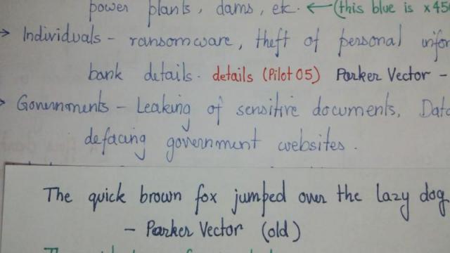
Hello forum, I bought a Jinhao x450 and I had a query regarding the nib. I thought the pen comes with a Medium nib, but it looks to be much finer. Can you confirm from the images ? Is there something wrong with the nib/flow ? You can see it breaks in the "F" and bottom of "G"s. (please zoom the images while examining) Also there is hardly a "hairline" gap between the tines. I cant even see the light through the gap. I love writing with the M nib of my old Parker Vector. The color is deep dark and uniform. But with x450, the lines are almost scratchy and non uniform. I tried to increase the gap by pushing the nib against a wooden board. Its too hard and nothing happens even after repeated efforts. Any suggestions to make the writing medium(ish) ? Can any x450 owners confirm if this is how thin the pen writes ? Also, is it normal for a fountain pen to make scratching noises ? My old parkers make a lot of noise, though their scratchiness is within the limits of "feedback". My new x450 too makes a bit of scratching noise, though it is a little quieter. Ink - Daytone Blue (500ml bottle pack) Thank You (PS: this is my first post on the forum, though I have referred to the FPN many times in the past. I am a newbie to the technicalities of FP, but I have been constantly using them since 2002, throughout my school and college times.)
-
There are already a few Supra Brass reviews on FPN, be sure to check those out. At the end of this review I've copied my thoughts (originally from https://www.fountainpennetwork.com/forum/topic/337221-kaweco-sport-10mm-short-of-love/) about often-heard complaints about Kaweco, which I feel are worth repeating. ^--This photo shows the pen as well as text written with the fine nib (in purple), as well as comparisons with some other pens. This Supra Brass was an impulsive buy. I was saving up to buy a Platinum instead. My son tried it at our local brick and mortar pen store and he handed it to me to try as well. It had a broad nib (didn't have a broad yet), felt great in the hand and wrote really well. I bought it and the Platinum will have to wait a while. As for the design and the material: you either love it or hate it, and I love it. There's just something about brass that I like (you can get the Supra in other metals as well). The design is at once understated, refined and, well, different. Aesthetically, the large #6 nib fits the pen really well and overall it's just beautiful. A totally unique feature is the removable extender piece, which can be used to shorten the pen significantly. Ergonomically, the pen is right for me. But it will be the wrong pen for many people, simply because it is very heavy. Brass is heavy. I have large hands and it doesn't bother me at all. If you require a light pen, then don't consider the Supra. In terms of how well it handles and sits in the hand: brass is smooth but not slippery. Pens with stainless steel sections, such as my Visconi van Gogh, feel very slippery to me and make my fingertips sweaty, with the result that I'm always struggling a bit with my grip. Not so with the Supra: the brass just feels great, it's not slippery at all and long sessions are comfortable. The diameter and the taper of the section are just right for me, and I expect these dimensions will be about right for most people. With the extender section in place, the pen can (and should) be used unposted. Posting it with the extender will make the pen too long, too heavy as well as too back-heavy. If you want a small pocket pen, remove the extender and what remains is something not much larger than a lipstick tube. In this mode, posting is essential and you can screw the cap on the back of the barrel. Posted without the extender, the pen is noticeably less heavy than it is unposted with the extender in place. So the extender not only gives you a size option, but also a weight option. A totally unique feature, that some (like me) will adore, but others might perceive it as a gimmick. Ink capacity depends on the use of the extender. It's a cartridge/converter pen. Without the extender, only a regular standard international cartridge will fit. Even the hyper-small, adorable Kaweco mini-converter (probably the most hated converter ever) won't fit, unless you stop extending the piston at 75%. With the extender piece in place, the pen accommodates all standard international cartridges (both short and tall) as well as full-size converters. Nib and writing. I bought this pen with a broad nib and also ordered a spare fine nib (a spare nib+feed for a Supra costs €26 full retail). Kaweco nibs are relatively cheap and nib swapping is quite literally a 1-minute job with Kaweco pens, which in my view is one of their more attractive features. The nib is #6 size, fairly large, and its size perfectly fits the rest of the pen. The engravings are stylish. The feed is one of the larger feeds I've seen, with a lot of big fins. ^---What it's all about: the F and B nibs of the Supra. Out of the box, the broad defined the word 'smooth'. I can't remember ever having used a smoother nib. To me, smoothness is not the holy grail. I prefer some feedback and character. The broad immediately performed well with Sailor Jentle Blue: wet enough for comfortable writing (including fast writing and signatures) but dry enough to show nice shading. A nice balance. Since I prefer some feedback and just a bit more wetness, I tuned this broad nib a little and quickly got it working exactly according to my personal preferences. But again: out of the box, it was already a very, very good steel nib. ^--This photo shows text written with the broad nib. Then, the fine. In general I prefer nibs ranging from Japanese fine to Western fine, so the broad would probably would not be used that much. It's wonderful for things like postcards, quick note taking, sketching and people with large, flowery handwriting. The fine, however, now that's right up my alley. This is one of the very few nibs that performed perfectly right out of the box, with zero need for any kind of adjustment or tuning. It immediately performed very well with J. Herbin Bleu Nuit and with Sailor Jentle Blue, but I settled on Montblanc Lavender Purple. In terms of feel, this is the best steel nib I own. And although I like the small nibs in my Kaweco AL Sport and Classic Sport pens, the Supra nib is in a totally different league. Smooth but with loads of feeling and character. It's tough stainless steel, yet if you want it to it will give you considerable line variation with very little effort - and it will never, ever scratch, no matter how hard you press down. Line width is surprisingly narrow; check the photo for comparisons with my Pilot Custom 823 F, which is a Japansese fine... In terms of writing sensation, this nib is pure joy. Yes, the pencil-like feedback of my Sailors is still unmatched, but if you'd ask me if the nib of my Custom 823 F is nicer than this steel Supra nib, I'd have to think about it. Really. Also, consider this. If you order an 823 from Japan and the nib is a dud, what are you going to do? With Kaweco, you return a faulty nib under warranty and get a new one. Screw it in and off you go. If you damage it, you pay €26 for a new one and you're back in business. At this price point, the Supra nibs are unbeatable. At any price point, I can't think of a better steel nib. Conclusion. With a street price of about €95 and an extra nib retailing at €26, this indestructible and distinctive pen punches way above its class. People who like line variation but want a pocket pen sturdy enough to derail a train, the Supra is your ticket. Do not dismiss the Supra if you dislike the AL Sport or the Classic Sport - please judge this pen on its own, because the nibs are in a totally different class. This is a pen you'll have to pry out of my cold dead hands. In closing, a brief pros and cons (as I see them) of Kaweco pocket pens such as the AL Sport and the Classic Sport (originally from this topic: https://www.fountainpennetwork.com/forum/topic/337221-kaweco-sport-10mm-short-of-love/), many points of which also translate to the larger Supra: Pro: IndestructibleAwesome designDependable (but see below)As steel nibs go, the price/performance ratio go these nibs is awesome (but see below)Every part can be renewed easily and economically (a new Classic Sport nib+feed costs less than 10 euros)You can use various nibs in the same pen, takes 30 seconds to changeNeutral: It's a pocket pen! Don't buy it if you require 2 mL of your own hyper-special home-brewed ink mixture in a pen.It's a steel-nibbed pen, the nibs are cheap (in terms of price) and are mass-produced by Bock. If you expect it to write better OOTB than your vintage Montblanc 149, then don't buy one. Having said that, personally I really like these nibs. Con: Some new Kaweco nibs are too dry. I'm not making excuses for that, but it's a fact. Accept it, or don't buy one. The dryness will pass. The more you use it, the faster it will pass. Once the pen plateaus out, the flow will be very nice and even on the wet side. If you can't live with the dryness, there are non-invasive tricks you can use or you can seek help from a nibmeister (but note that most of these pens *will* get wetter over time, so if you tune the nib early-on, you might have to re-tune it later). In general, thoroughly and repeatedly flush the nib+feed. After that (not before that!), it will help a lot if you unscrew the nib+feed and put it in a bottle of the ink you intend to use for 12 hours or so. Take it out, clean off with a rag, screw back into the section, pop in a cartridge of the same ink, and you will have accelerated the plateau-ing out process a lot.Some new Kaweco nibs have baby's bottom; if you get one, get another one on warranty (same as with any other new pen) or get a nibmeister to fix it for you
- 8 replies
-
- kaweco
- supra brass
-
(and 2 more)
Tagged with:
-
Another light review, with a few snaps... Preamble (as usual, skip this bit if you don’t like preambles): We have been incredibly fortunate to be able to get our hands on some pretty nice pens over the last few years. The posting of my last review prompted quite a lengthy conversation between “She who must be obeyed” and myself, about the difference between luxury pens, affordable pens and just pens that we have enjoyed. There is such a wide range in the wild, of pens that can be regarded as affordable. However, when a pen costing $2 can indeed be described by some as expensive, and conversely, a $200 pen has been recently described as affordable/reasonably priced. Factor in, the diverse disposable income between different individuals, affordability and value for money can vary widely between from person to person. So, although being fortunate to be able to do a couple of reviews on what are regarded as “high end” pens, I seem to have missed out on having a go at doing a reasonable review on a couple of pens that are family workhorses. In this case, the review here is part of a review of pens “we like”, rather than, “oooh look what we got”. We would like to introduce to you, the Lamy Safari. The Pen Lamy Safari, in charcoal finish, with matching black nib, supplied with cartridge convertor and a free ink cartridge. Purchased online from either eBay or amazon (can’t remember to be honest, but it was one of those two) at the same time as I ordered a pack of A4 writing pads. I think the cost was about £15 at the time, with a matching convertor for another £5. First Impression Arrived in a jiffy bag which contained a small pen sized cardboard box. The box had a small divider in the centre with the convertor on one side. Very business like, no wasting of material in packaging, pen, convertor, box. Done. Box consigned to recycling bin, and now possibly back in the system as brown wrapping paper somewhere. Without a doubt, it felt well made in the hand. It is a light feeling pen, and I believe it is made from similar materials to what lego bricks are made from. Stand on a lego brick with a bare foot, and the brick wins. Every time. The finish is a sort of matt rather than shiny finish and end to end, has no sharp edges or mould flashing. So far so good. More diving into the details. The pen comes with a black finished nib to match, in fine. The cap has a matching clip, in black. More later. Unboxing. Although covered above, if I was new to the pen hobby (takes a huge step back), I would have to say, that it is simple but impressive. Recyclable cardboard packaging, cartridge already in the pen with a cardboard ring to keep it from piercing inside the section, and the convertor by it’s side. Again, if I was new to the hobby, I would have been quite impressed. The pen doesn’t exit from it’s packaging in need of a fanfare, it is too business like. It is obvious straight away that this is intended to be used and used and used. Take the pen out, ink it and get that letter written. Remember, the fancier and bigger the packaging, the more cost is passed to the consumer OR less goes into the pen itself in materials and quality. In this case, I felt that we had at this point, got good value for money. One thing I DID do, is recycle the box and the separator ring, then drop the free cartridge straight into the pen to get it in action. More about that later. Overall Look of the pen. When I was a youngster, many many many years ago, I started my love affair with fountain pens, and have handled some interesting designs (parker 25 as an example). Well, that was (coughs) 40 years ago now. The Lamy looks briefly reminiscent of an old school fountain pen I once came across. Minimalist, functional. However, the Lamy is much more modern looking and for sure looks better made. The aforementioned Parker 25 was a regular fave of mine, futuristic looking and, at the time, a couple of weeks saving with school pocket money was sufficient to snare it. Unfortunately due to youth and the passing of time, it is no longer in my possession. The Lamy seems to have some of the same minimal/modernistic look about it. The nib. This one came in a “fine” and finished in black, to match the pen. The nibs are VERY easily removable, small bit of sticky tape and tug. Brilliant for any tinkerers or cleaning. The size looks in keeping with the overall size and design of the pen, again, functional looking. Had I been that schoolboy once again, this would have been definitely on the list to save up for. Loaded the pen with it’s free Lamy cartridge and tried to write. The best I can now say is that it wrote. It felt dry (definitely NOT scratchy) but wasn’t pleasant. Out with the 30x loupe and there was NOTHING visibly wrong with the nib. Took the nib off completely, again, all good. Then came the lightbulb moment. Lamy cartridge went to the bin, did not stop at go, did not collect £200. Convertor fitted and Waterman serenity blue sucked up. 3, 2, 1, bingo. Instant writing karma. Nice fine line, not scratchy, but not over smooth. Needed using, to smooth it down for sure, but definitely an extra fine to fine line. Nice and wet. The nib is not flexy, but didn’t feel like a hard nail. The nib material is simple pressed steel with some sort of tipping material, which means the nib does have a tiny amount go “give. Again, the nib definitely feels like it is going to deliver years of use. The cap. Functional, furnished with a black shiny clip. It contrasts with the charcoal finish, which is a nice touch. It will post, if you HAVE to, but it doesn’t add anything to the look or usability and looks awful posted. It is a click fit/push fit (slip cap), which is not my favourite method of connecting cap to body, but it is quick and works. Positive with a nice soft click, and I going to say it again, functional. Overall, it works well and should return the owner a good operating life. Filling system. Cartridge convertor. Comes supplied with a free blue Lamy cartridge. I purchased the optional convertor as I do prefer bottled ink. However, I did try the cartridge, and in my honest personal opinion, was just a waste. The ink didn’t play nice at all with the pen so binned it. The convertor is VERY well made, and locates positively, aided by a couple of small locating lugs. Very smooth to fill, doesn’t leak, and reinforces the overall impression of good design and function. The section. Interesting section, it has two shaped facets to promote a “correct” grip. At first, I thought “school pen”, but after a little use, I started to appreciate it. I am not sure if left handers or people with different pen gripping techniques will appreciate it, but, I really liked it. The matt material is not slippy, the end of the section has a nice shaped raised bit to stop fingers going near the nib. Again, good design. Section diameter is a tad on the smaller side for my fat fingers, but for the majority, I am sure will find it reasonable. So what now? It is stuffed into my work bag, in the little area where pens are kept, no case, next to a metal ballpoint. It is loaded with Waterman ink and is in every day use. The nib has indeed polished itself now and writes exactly as it should. I would say the EF nib runs more towards F, but that could be due to the flow properties of the ink, which, the Lamy inks being dry in this pen, MAY now deliver a true EF. However, I won’t go there. Waterman in this pen plays nice. Yes. You read correctly. It is stuffed into my work bag. The pen is robust, and can not only take a good beating, the finish just doesn’t seem to easily pick up scratches, so always looks pretty nice! Keep it in a proper pen pouch and it should stay looking new for a number of years. Cost? £15 for the pen and an extra £5 (approx) for the convertor. Not the cheapest combo on the market, but it is well made for the money (haven’t said value here as it really is subjective). In comparison, a pack of 50 Bic biro’s can be obtained online for approx £10, which, although would last anyone a considerable amount of time, every single bit is disposable and would head direct to landfill. Pics As usual, a few “show and tell” snaps. And Finally The big question. If I was in the market for such a pen, would I buy one? A resounding yes. As either a beginner to the hobby, or for someone who wants a daily beater, yes. If you are saving up to be able to get one of these, again, yes. BUT, if it is going to be your only pen, I would try and save a little longer, and look towards the Lamy Al-Star, which has a range of coloured anodised aluminium bodies/caps and do look a bit higher quality/look/feel. A colleague has had a silver grey al-star for a number of years now, he was gifted as a leaving present from his previous company and it’s his only pen. He loves it. The Al-Star will NOT write any better, it is merely look and feel. But then again, Safari’s come in a huge variety of colours and release different colours from time to time, so plenty of choice. Oh, and DO get the convertor.
-
Help ! So many different brands and models. Where do I start My Extra Fine Wing Sung 3003 has developed some intermittent feed issues. Have given it a though clean a couple of times without any success. Halfway through a drawing is not the time to be coping with a drying out or extra wet inkflow. Rather than fussing too much over a 99penny pen I am thinking about a more reliable pen Reading through a few of the threads I am thinking a Chinese or Japanese nib for line fineness. Simple eye dropper or cartridge would be perfect as I always fill with syringe. If there is a pen with finer nib than my W/S this would be perfect. Budget is tight - certainly below 100 Euro and ideally much less. Fine line and constant ink flow are main need. Shape and colour are unimportant.
-
Greetings Fellow FPNers, Below are some of my thoughts on the Thyer edition of the Jinhao 911. This review turned out sounding a little more negative than I had intended, but don’t let it scare you away from this pen. Many of the good points about the Jinhao 911 have already been discussed in KingRoach’s excellent and much fuller review. My observations agree 100% with his, including the issues of potential scratching and the nib lightly touching the inside of the cap when capped. According to the Thebai Company that sells this pen, it has several distinct differences from the regular Jinhao 911: 1. The nib has been reground from 0.38mm to 0.45mm, given a better feed assembly, and tuned. 2. The plastic threaded part that connects the section to the barrel has been replaced with a metal one (newer Jinhao 911s also have the metal part). 3. A better piston converter has replaced the plunger type (newer Jinhao 911s also have this improved converter). 4. Each Thyer pen is adjusted by hand for optimal performance. 5. The Thebai logo and “Thebai Thyer” have replaced the “Jinhao 911” engraving on the cap rim. I’m not sure if it’s available outside of China, but Seele has kindly provided the link to the Taobao seller whom I bought it from. A Final Word If you want an inexpensive, lightweight, hooded nib “flighter” with a decent fine nib, then this is definitely worth your interest. Just know that the outside of the pen will scratch easily (I can already see scratches on the barrel in addition to those already on the section) and may quickly turn into a “beater” pen. The nib is average but not scratchy and flows alright with a wet ink, producing an even fine line. Is it worth paying a little more for this “hot rod” Thyer version as opposed to the standard Jinhao 911? Since I don’t have the latter to compare with, all I can say is definitely if you really want the fine nib instead of the 911’s extra fine. SDG