Search the Community
Showing results for tags 'ferris wheel press'.
-
Longtime lurker, first time reviewer. I don't currently have a scanner but I was able to take this photo in indirect natural light and to my eye it's a quite close match to what I see on the paper in the same lighting. In artificial lighting I find it skews a little greener, but not noticeably so. transcription of the writing in the image: "Ferris Wheel Press Bluegrass Velvet Lamy Safari F nib, Rhodia DotPad purchased sometime in the mid-2010s (I'm not sure if there's any difference from the current (2024) version, but just in case ) Smear test yielded a dry time of sometime between 10 and 15 seconds. I'm not sure I have quite enough experience with the broad range of inks to REALLY say if it's particularly wet or dry? It's got a tiny bit more feedback in this pen than Waterman Tender Purple does, but that ink with this particular pen is VERY wet. No feathering or bleedthrough, though there is a little bit of ghosting on the reverse (which is honestly negligible unless you're really looking for it). Shading!!! I always get excited when ink shades in an F nib or smaller--I'm an F/EF person and don't have anything broader handy but this is fair shading for an F nib if you ask me I bought this in a 38ml bottle on impulse in a DeSerres--I'm a big fan of this colour already but I am NOT a fan of the bottle. It's quite rectangular (wide one direction, narrow the other) with a narrow opening. It really didn't feel stable when I was filling this pen. I might find an empty bottle to transfer the ink into. Price was a little steep in my opinion--on sale for $25 Canadian dollars for 38ml, however it's made in Canada and I'm personally willing to pay a little bit more for that. Cheers!" Waterproofness test revealed that this isn't waterproof in the slightest--I put the water droplets on the paper the following day, and after the 5 minutes I let the droplets sit for the lines underneath were all but non-existent. The barest hint of the lines remains but I find you have to intentionally look for them. Overall, I really enjoy the colour of this ink and the writing-feel! I had no trouble with leaving the pen uncapped for short periods (maybe 5 or so minutes? I wasn't paying too too much attention to the time, oops) or using it again after a few days. I have a soft spot for darker tealy colours so I can see this being an ink in frequent rotation for me, if I can get over my dislike of the bottle.
- 5 replies
-
- ink review
- ferris wheel press
-
(and 2 more)
Tagged with:
-
Ferris Wheel Press Emerald Gardens Ferris Wheel Press is a design and stationery company based in Markham, Ontario, Canada. They have been making fine stationery products for over 10 years now, constantly seeking innovation and refinement. I never tried their inks, and only knew them from their iconic round bottles. So, I decided to add a small bottle to a recent order, and went for this green Emerald Gardens. This is an ink from their 2024 FerriTales collection – an interpretation of the story of the Beauty and the Beast. The box pictures the princess’s rose garden, a reference to Emerald Gardens’ green colour with its green & gold shimmer. Emerald Gardens is at heart a beautifully executed leaf-green that looks fresh and young, like newly born leaves on a tree in early spring. I absolutely love the colour and the way it breathes life and growth and joy. Emerald Gardens makes a great first impression! That green colour not only looks fantastic, but it’s also nicely saturated and shows some impressive shading (strong but not too harsh). The ink works well with both white and cream-coloured paper and can even cope with the lower quality papers in my test set. This is an ink that has all its bases covered. I’m totally not into shimmer, but in this case, I must admit that the shimmer combines nicely with the ink. The choice of green & gold particles works well … it’s not an obtrusive shimmer, and it adds a dimension of vibrancy to the base ink colour. For this review I didn’t shake the bottle and used shimmer-less ink in my pens (I still only trust the full-shimmer experience with my dip pens). Emerald Gardens has a fairly small colour range, with not too much contrast between light and dark parts. The lighter parts still have good contrast & saturation, meaning that the ink will work well with dry pens and fine nibs. This is an ink that cooperates nicely with any pen. Also the small saturation span translates to softer shading. With Emerald Gardens, the shading is very much there, but remains well balanced and never looks harsh. Top marks for this ink! On the smudge test – rubbing text with a moist Q-tip cotton swab – there is a fair amount of smearing, but the text itself remains perfectly readable. The bottom part of the chromatography suggests that the ink can survive fluid attacks, but sadly that is not the case. Water resistance is all but non-existent: all that lovely green disappears; only a faint grey ghost of your writing remains that can be deciphered if you have a degree in cryptography. Not an ink to use if water resistance is on your list of requirements. I’ve tested the ink on a wide variety of paper – from crappy Moleskine to high-end Tomoe River. On each scrap of paper I show you: An ink swab, made with a cotton Q-tip 1-2-3 pass swab, to show increasing saturation An ink scribble made with a Lamy Safari M-nib fountain pen The name of the paper used, written with a Lamy Safari B-nib A small text sample, written with the M-nib Safari The source of the quote, written with a Lamy Dialog 3 with M-nib Drying times of the ink on the paper (with the M-nib Safari) Ferris Wheel Press Emerald Gardens handles all papers well, even the crappy ones. With low quality paper there is just the tiniest amount of feathering (if you look really hard). Even Moleskine paper is handled very well, with only a touch of bleed-through. This ink looks lovely on both white and cream paper, which is quite a feat. Drying times are surprisingly short at about the 10-15 second mark, even on Japanese paper. As a writing ink, this Emerald Gardens gets top marks. Scans and photos can show different aspects of an ink, which is why I usually present them both. Below you’ll find a photo of writing samples on a selection of the papers used. Below you’ll find some zoomed-in parts of writing samples. It shows e.g. the really good quality of this ink on Moleskine paper. You can also see that the shading is quite heavy, but due to the soft contrast between light and dark parts the shading remains aesthetically pleasing. It definitely brings the best out of your fountain pen. Again, this is really well executed. I’m usually not a fan of heavy shaders, but Emerald Gardens shows that heavy shading can look fabulous if the contrast is just right. Writing with different nib sizes The picture below shows the effect of nib sizes on the writing. Emerald Gardens looks good in all nib sizes. With the EF nib, contrast and saturation are impressive and the writing is crisp and clear. You even get some of that lovely shading. With wet pens, the ink gets more saturated, but retains that fresh and vibrant youthful look. This is an ink that can handle any pen/nib combination with ease. Related inks To compare “Emerald Gardens” with related inks, I use my nine-grid format with the currently reviewed ink at the center. This format shows the name of related inks, a saturation sample, a 1-2-3 swab and a water resistance test – all in a very compact format. Diamine Emerald comes close in colour but is more subdued. The Ferris Wheel Press ink has a bit more vibrancy, and looks more lively to me. Inkxperiment – Soulmates With every review I try to do a single-ink drawing that shows what the ink is capable of in a more artistic setting. The most fun part of the ink review, and I quite enjoy brainstorming and then implementing these little pieces. This is the second drawing in a new series – “Counting … one TWO three”. So this is number two – a simple scene with two trees and two persons. In this case, a chance encounter in the park where two strangers meet – the start of a long friendship. Life is good! For this inkxperiment I started with a piece of A4 HP photo paper. I covered the sun, and used some cotton make-up swabs to paint in the sky. I then used a dip pen and painted in the main parts of the trees using pure ink. For the finer branches, I simply used my fountain pen. I finally added the boy and girl walking in the park. The small dog is just a little extra: in my mind, the boy is walking his dog, and encounters the girl. “Such a cute doggie” … the conversation gets started, and the friendship begins. I enjoyed using “Emerald Gardens” for drawing, and this inkxperiment shows well what can be achieved with this ink in a more artistic context. Inkxpired – computational art I love experimenting with pen/ink/paper, and have added another layer as part of the hobby. I’m exploring computational art, inspired by the ink drawings I do during ink reviews. Another fun offshoot of the hobby… and all that starting with a few drops of dye-coloured water on paper. For this computational derivation, I kept it really simple. All I did was applying an urban art filter to the original drawing (the same one as in the previous picture in this series). I like the colour scheme of this one as well. Conclusion Ferris Wheel Press Emerald Gardens is a great green. Good looks: vibrant & youthful, a joy to write with. On a technical level the ink is near perfect: it can handle any combination of pen, nib and paper. A well-crafted ink! This is my first encounter with the brand – if all their inks are as good as this one, I’m sure that I will explore more of them. This Emerald Gardens gets top marks from me. It’s hard to go wrong with it. Technical test results on Rhodia N° 16 notepad paper, written with Lamy Safari, M-nib Backside of writing samples on different paper types
- 12 replies
-
- ferris wheel press
- emerald gardens
-
(and 1 more)
Tagged with:
-
Hello! I felt the need to create this post since I can't find anyone else talking about it and maybe it's just me that I happened to contaminate two (maybe three?) different ink bottles of the same color. I hope the pictures I took serves as good reference to demonstrate what happened over the course of a year. I've been using Cream Of Earl for the past year until recently, because I thought I had contaminated my bottle of ink (fig. 3) since I sometimes use it to paint with brushes. Lucky me I had a second opened bottle at work (fig. 5), I cleaned every single piece of my pen before refilling it, to my surprise the color on that bottle also had lost its pinkish appearance. I thought maybe I had convinced myself the ink had some pink hues, so I went through my notebook to find the very first time I used the ink and it looked just as I remembered it, also found the swatch I made that year on Tomoe River's white paper (fig. 2) and compared them. As I put the ink on paper, it looks kind of green until it fully dries looks like a grey-beige-sand color, i'm not mad about it but I'm very intrigued, also Ferris Wheel Press has no info about the ink changing its color over time and people haven't talked about it, maybe everyone owning this ink think they messed it up and are too embarassed to speak about it? I also checked my other pinkish inks from Ferris Wheel Press to see if they lost their true color (Strawberry Macaron, Lady Rose & Definetely Peachy) and they look just as the first time I opened them. Anyone else has had this happened to them before with this or any other low saturated ink? fig 1. First swatch from when I first filled my pen with CoE back in 2021 fig 2. Left one is on Tomoe River's white paper, swatched back in 2021. Right ones on Leuchtturm1917 paper. fig 3. Bottle opened January 21st on 2021. fig 4. I received this ink bottle the same day as the other two, except this one I'm sure it has never been opened before nor seen daylight until past week that I opened it to compare the rest. It appears to be slightly lighter than the other two. fig 5. Can't remember the day I opened this bottle but it was around the same week I first opened A) fig 6. Swatch from FWP's page. Thanks for reading! Have a great week xx
- 13 replies
-
- cream of earl
- ferris wheel press
-
(and 7 more)
Tagged with:
-
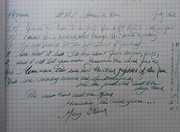
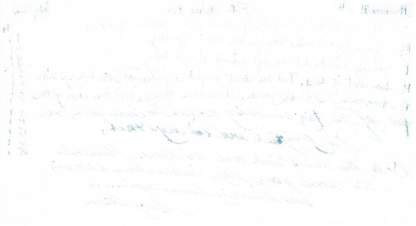
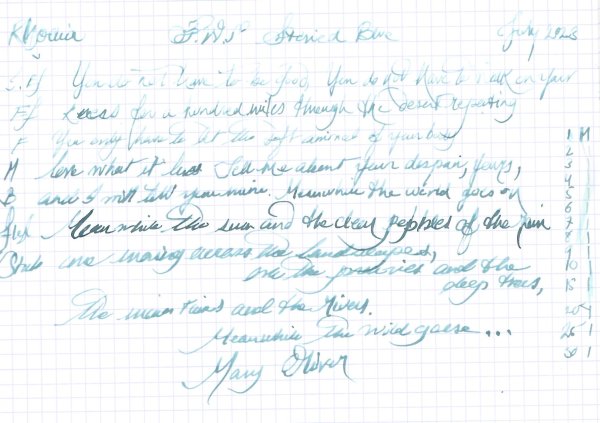
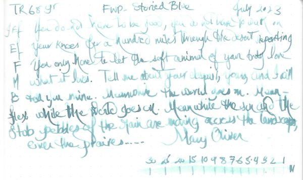
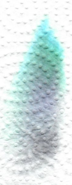
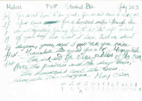
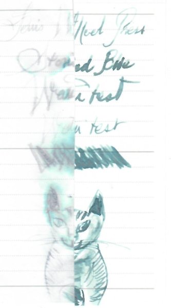
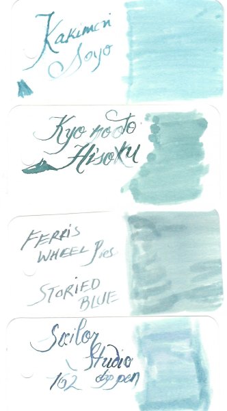
Ferris Wheel Press – Storied blue The brand is known for its savvy marketing and elegant ink bottles. This ink belongs to the Bookshoppe series, with Peter Moss (Green) Wonderland in Coral. You can read more about it here: https://ferriswheelpress.ca/products/storied-blue It’s a nod to Hatchard’s the oldest bookstore in England. In a nutshell, this dry ink was most enjoyable with a B nib, but more specifically for art work, i.e. washes. Otherwise as I prefer water resistance and saturated inks, for me it's a pass. Let's start with the delicious chroma: Writing samples: It doesn't like Hammermill 20 lb with almost all nibs: Photo: (the lighting is not a best) Comparison: Washed off kitty after 10 seconds under running water (nice effects though) and finally an art work, a nod to the ink's name and the nursery rhyme. Talens Notebook (12 x12 cm/4,7"x4.7") · Pens used: Pilot Kakuna Ef/Stub, Lamy Safari (EF/F/M/B), Kanwrite Ultra-flex. · What I liked: Lovely pale colour for writing poetry, and enjoyed doing washes with it. · What I did not like: In general, I prefer inks are water resistant or more saturated. · What some might not like: Dry ink. Flow issues with flex nibs, it doesn't like cheap paper. · Shading: Yes. · Ghosting: On cheap paper · Bleed through: Same as above. · Flow Rate: Wettish. It didn’t flow well with Kanwrite. · Lubrication: Dry · Nib Dry-out: None · Start-up: None · Saturation: Unsaturated · Shading Potential: Massive. · Sheen: None · Spread / Feathering / Woolly Line: No · Nib Creep / “Crud”: No. · Staining (pen): No · Clogging: No · Cleaning: Easy · Water resistance: It doesn’t really make a difference does it? · Availability: 3X5 ml (3 different inks), 38/85 ml bottles. Please don't hesitate to share your experience, writing samples or any other comments. The more the merrier
- 12 replies
-
- ferris wheel press
- storied blue
-
(and 1 more)
Tagged with:
-
-
-
-
-
-
-
-
-
desaturated.thumb.gif.5cb70ef1e977aa313d11eea3616aba7d.gif)
Opened bottles of ink with no place in my desk as of 5Feb2022
A Smug Dill posted a gallery image in FPN Image Albums
From the album: Odds and ends
150 opened bottles of inks now have no place in my (wife's work-from-home) desk's main storage space, which is absolutely chockers, so most of these now live inside clear, stackable Daiso plastic storage boxes under the spare bed in the same room. Then there are also the 25 Diamine Inkvent Red Edition inks, although technically I can squeeze this into one of the desk's shallow drawers:© A Smug Dill
- 0 B
- x
- 4 comments
-
- r&k sketchink
- platinum
- (and 8 more)
-
From the album: Shades of colour
Since I just did this for my wife to select ink colours with which to fill her pens, I may as well scan and post it.© A Smug Dill
- 0 B
- x
-
- ferris wheel press
- bluegrass velvet
- (and 8 more)
-
I love reading everyone's ink reviews, so I thought I would try making one too. The pens used are the Noodler's Ahab and a Muji Fine nib pen.The paper is Hilroy recycled lined - aka, cheapest stuff at Amazon.The spelling is terrible, but until they invent a pen with a spellchecker that can read dyslexic, we are just going to have to make the best of it. I'm heavily dependent on electronic aid to communicate well in writing, but I'm improving. General thoughts about this ink: The colour is lovely and dark. A rich purple-black-blue to it. It's a soothing colour for long writing sessions.It performs well on a variety of cheap papers. Very little feathering even on the stuff they use at work.The flow is just about perfect. It certainly doesn't gush out of the pen, but it comes out when I ask it and doesn't skip a beat.Dry time is moderateIt's very-not water resistant. If I get it wet enough, the writing disappears. For this reason, I'm not sure I'll be using this ink much in the future.
- 15 replies
-
- ferris wheel press
- tanzanite sky
-
(and 1 more)
Tagged with:
-
Anyone heard of Ferris Wheel Press inks? (Or pens, for that matter?) There was a Kickstarter for their inks a while back that would likely be going out to backers shortly, and you can apparently pre-order via their IndieGoGo campaign. I'd only just heard of it yesterday and I must admit that I was instantly smitten with, of all things, the bottle the ink comes in In spite of the "most magical FP ink" billing, the colors aren't particularly grabbing my attention, but that's possibly just my monitor not doing it justice, and the only review I could find was this at Gourmet Pens. Apart from a color swatch of all three ink colors and more pictures of the pretty bottles, there isn't a lot more non-press information to go on, so I was hoping perhaps someone here might have experience with or otherwise be in the know. Trying really hard not to buy one just for the bottle, because that would be a kinda pricey bottle if I ended up not liking the ink...
- 3 replies
-
- ferris wheel press
- ink
-
(and 1 more)
Tagged with:


12_58_52.thumb.png.e1966e2f738e9054f7f9141326018311.png)
13_46_31.thumb.png.26afb3c3a440d08cfb17f4f19dd5f466.png)
13_46_44.png.e2f3beba9bb3a83bd931d0bd2db4abb6.png)
13_47_32.png.5921629837f65e73fc8dc7b887013dd4.png)
.thumb.jpeg.1fdf46aab7cbfc85329beef03395131c.jpeg)

13_53_04.thumb.png.317dfee5a2fa4bfe2e1bb073a6955008.png)
