Search the Community
Showing results for tags 'fashion'.
-
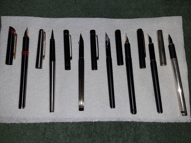
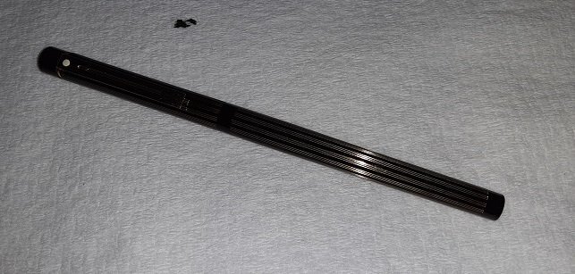
Having purchased an Aurora Ferrari (Hastil) around Xmas last year, I was spurred by Wattz for Ziti's January thread about slim pens to go looking for other pens that were mentioned, especially those in alexwi's list. I love the Ferrari but the cap is super heavy due to the huge brass clip and I wanted to find a few lighter offerings. Here's what I ended up with (soorry for the poor quality of the pics, eh): L to R: Ferrari, Parker 180 Flighter, Sheaffer Slim Targa Pinstripes, Slim Targa matte black/chrome, Hastil matte black, Fashion matte black, Hastil Ciselle, with a Parker 50; even that diminutive pen looks fat in comparison nibs: gold EF, steel M/EF, gold M Triumph, steel M Triumph, gold EF, gold-plated steel F, gold EF (I'm assuming, haven't inked it) Here's another pic of the striped Targa; though the 1st pic prob shows it off better, pics just don't do it justice, the way the gold stripes catch the light is amazing. One small problem it has is there's always a smear of ink across the nib just below the breather hole, that's where that ink spot above came from. I don't recall this happening on the black/chrome one when I had it inked. I've been checking ebay occasionally looking for a 14k F Triumph, though the M isn't too bad. They all write well, the F's and M's smoother than the EF's on the Hastils, of course. The black Hastil and the striped Targa both use carts and the first time I refilled them, they both ended up leaking into the barrel (and out the bottom spring pad holes on the Hastil into my shirt pocket) but hadn't had any problems on subsequent fills. Ink-wise, I have KWZ Lux Grey in the striped Targa, the black Hastil and the Fashion, Diamine Manngis in the 180 and Diamine Ruby in the Ferrari; I first tried Monaco which was great and laid down a nice, very distinct line but I wanted something a little closer to the red accents. Wild Strawberry was too pale in EF but the Ruby is a good choice, color matches fairly well and the line is pretty distinct. Black Targe not inked atm and I haven't inked the silver Hastil. Looks-wise, they're all quite nice, especially the striped Targa, though a bit too striking perhaps; the Ferrari is dashing and I'd use it more if it weren't for the heavy clip; the black/chrome Targa is kind of meh, while the black Fashion and Hastil are the cat's PJs - there's just something elegant about matte black with gold trim that I find very appealing. The Hastil has the edge here, the barrel taper isn't as pronounced and the brushed clip is more subdued than the shiny Targa one. The silver Hastil, well, I just saw silver Hastil and odered it without looking more carefully to see the "Ciselle". It's nice enough, I suppose and at least it's not Parker Ciselle, with the big, honking squares and what looks (in photos) like black crosshatching; no, the pattern is extremely fine, with the tiny facets like glitter so it sparkles in the light but, being just a length of shiny silver with no variation, it's kind of bland. Maybe if it had a gold clip... The Parker 180 is perhaps the most interesting. It looks quite dainty; it's the shortest (by 3/16s - 1/4") and the barrel tapers the most (it's not the slimmest, though, as the Targa's cap can easily slip into the 180's cap). The brushed stainless is also very smooth and very slippery - I did drop it once. It's also the only one I have trouble maintaining the right positioning of the nib (I find it rolls slightly to one side or the other), possibly because of the long tapering section. Still, it has the (possibly most) quintessential Parker "look" and the wedge-shaped nib exerts an almost hypnotic fascination. That's my little collection of slim pens. If you have any questions about particular pens, please ask.
-
- slim
- parker 180
-
(and 3 more)
Tagged with:
-
Hey guys! So, many years ago I received a fountain pen as a gift, which I have only recently been able to identify as the Sheaffer Fashion II. Since I had never used a fountain pen before, I left it untouched for many years until recently. The pen is completely dried up, and there is no cartridge nor converter in it. I have a few 'slim cartridges' that came with the gift bundle, but they are all dried up too. Regardless, I tried to install the cartridge, but it wouldn't fit. There is something inside blocking it, and I have no idea what it is. As I am very eager to try using a fountain pen, I am in desperate need of your advice! Thanks in advance. https://ibb.co/74066Vp https://ibb.co/PNfW29W https://ibb.co/HFH2Chj https://ibb.co/x3Tnp5T https://ibb.co/d452Sqd
-
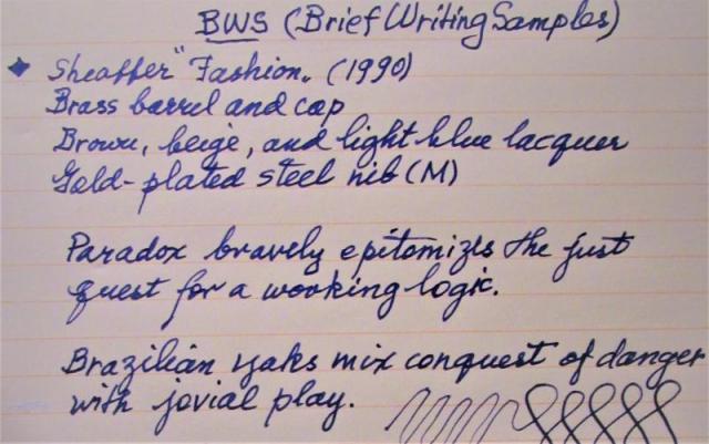
To celebrate the act of writing, here are photo reviews of two 'slim' pens (under 10 mm around at the grip). Notice that, with slip-on caps, 'threads' at the grip are not an issue, so the pens are equally smooth to hold. Also, though the pens may vary in size and shape, they are all about the same in girth, so the feeling of control as one grips the pen is about the same. Performance in this case it seems to me is in the nib itself. Both pens are aging beauties but are still manufactured (the Hastil) or available (the Fashion). The pangrams used are courtesy of Wits 'n Wisecracks: 251 Pangrams for Everyday Use by Millard Port, via Amazon Books. Enjoy this holiday excursion into thinness.
-
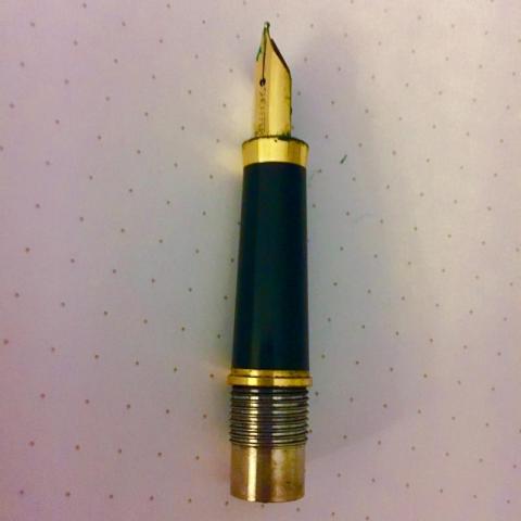
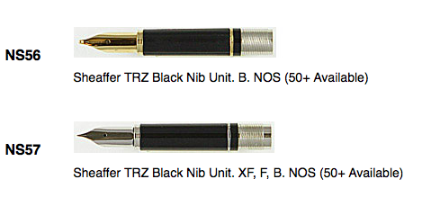
Hallo, Have had a Sheaffer Fashion fountain pen since my early teens. At some stage the pen developed flow issues. Being young and foolish my attempts to fix things made everything worse. Meantime the seals that keep ink where it should be seem to have dozed. Whilst I'd prefer to get it fixed, I suspect it would be cheaper to buy a replacement nib. Rummaging around on the internet would suggest that the nibs in the Fashion are the same as the TRZ nibs. Indeed they look identical. Would anyone be able to confirm either way? Unhappy looking nib: Happy, unused nib (not my image): TRZ nibs (not my image):
-
While I'm hesitant to reduce pens/inks to mere fashion accessories, picking the colors to use each day is pretty much the same as deciding which tie or which wristwatch to wear. That's why I like giving each ink its own pen; having that ink in this pen makes it easier to find the ones I want. Of course, the same can be said of the pens themselves. There was a thread awhile back by someone seeking advice on what would be a nice but not too expensive FP that would be suitably impressive for whipping out at business meetings attended by the boss and other FP-wielding co-workers. The one bit of advice I remember in particular was "don't get a nicer pen than your boss has!" So, FPs as status symbols for successful businessmen, like Rolexes and BMWs. I get that. Yet the pen can be merely a fashion statement as opposed to a status symbol, like my Waterman JIF Color or my red Pelikano or all those demonstrators with the ink sloshing around in them. Just using a FP instead of a ballpoint is making a statement. Not quite sure where I'm going with this but would be interesting in hearing your thoughts.
-
I recently bought several modern Sheaffer fountain pens and am sorting through them. The first one in the picture still has the original Sheaffer sticker and identifies it as a Sheaffer 263. The 263 identifies the color as matte berry. The second one is a little thinner and clipless It is an eighth of an inch shorter than the larger diameter one. Is one a Sheaffer Fashion I and the other a Sheaffer Fashion II ? What color did Sheaffer call the second one? I believe there were six different colors. In looking at the picture the bottom one appears to be very close to the color of the top one, but in actuality the difference is more pronounced. I did see an old add picturing the different colors and it appears that there were two that were very similar. The second one has a convertor in it. I started to pull it off gently but it didn't want to come off and I did not want to risk breaking the pen, so I quit. These convertors should just pull off, shouldn't they? Thanks, Michael Little Phoenix, Arizona


