Search the Community
Showing results for tags 'faber-castell'.
-
Bock make Loom nibs. Are Bock's own nibs as bad as nibs they make for Faber?
EntonCorquhoy posted a topic in Of Nibs & Tines
Greetings. The medium nib on my Faber Loom is the worst nib I've ever used. And I've used some of Alibaba's nastiest shrapnel. But the Loom makes a noise like a metal pencil with a tinny high frequency hiss over it. Worse still, the feel of it on the page is like the sound of it in the ear and it goes straight through me. Clawed-blackboard-style. Certain types of felt tips used to have a similar effect on me. But this is the only fountain pen nib to ever do it. So I want to replace it, and friends recommended Bock. Except today I've read that the nib which makes my Loom misery for me is also made by Bock. Bock's-own users out there, can you tell me if the pencilly sensation sounds about right for your steel Bock nib? Thanks very much. Enton- 14 replies
-
- faber-castell
- loom
-
(and 2 more)
Tagged with:
-
desaturated.thumb.gif.5cb70ef1e977aa313d11eea3616aba7d.gif)
Faber-Castell Neo Slim Aluminium fountain pen in Olive Green, for under A$62
A Smug Dill posted a topic in Market Watch
The relatively new Aluminium line of fountain pens in the Faber-Castell Neo Slim product family has been on my “watchlist” — or, more specifically, sitting below my shopping cart in the list of ‘saved for later’ items — in Amazon.com.au for most of a month now. This morning, the prices on the Olive Green ones dropped as one of the Black Friday offers. Sold and shipped by Amazon Germany, with a choice of EF, F, and M nibs, for between AUD $60.01 and $61.35. I leapt. -
-
-
-
-
Somehow I did it again and managed to buy too many Royal Blue inks. It's far from my favourite blue hue but nevertheless useful in broad nibs. In any case, it gave me the opportunity to compare them. The first picture is of what I wrote on a scrap of Lalo 100g paper. It's not a great picture but you can probably see that there's not much difference between Montblanc, Pelikan 4001 and Faber-Castell Königsblau. Pilot Blue, which was added for comparison, is similar but yet slightly more blue (apologies for the tautology but I can't put it otherwise). Also note that the unlabelled cotton swab at the bottom is Pilot Blue. Then I folded the paper, so that only the right part remained visible and left it exposed to the spring sun for a month. The second photograph shows the deterioration of all inks but especially of Montblanc Royal Blue and, surprisingly, Pilot Blue. Pelikan and its presumed sibling Faber-Castell fared slightly better. Finally, I put a wet finger across the paper and then blotted it with a tissue. All inks but Pilot Blue were affected. Bottom line: everything as expected, although I thought that Pilot Blue was more UV resistant.
- 21 replies
-
- montblanc
- pelikan 4001
-
(and 2 more)
Tagged with:
-
Hi, I was looking for this information both on FPN and other sources, added some experiments and this is what I maneged to put together: 1) Faber-castell eMotion, ambition, loom, basic, and (!!!) GRIP use same size nibs. 2) I am ready to bet they are exactly the same nibs. 3) The nib is #5. I made sure just puting both JOWO and BOCK #5 nib into GRIP, LOOM and ambition. 4) For some of those pens (eMotion and Ambition for sure) there are nib units avalible. Basicly it is nib, feed and whole section, so must be matched to pen model and sometimes version (ie all black eMotions) 5) those nib units pricing is absurd. In UK its 33 GBP for Ambition and 38 GBP for eMotion. If you section and feed is OK, there is no sense buying them. 6) !!! The cheapest way to buy nibs for all those pens: buy #5 steel nib (a don't know about US but in EU and UK there are some vendors with Jowo and Bock nibs available. (btw: Schmids are actually Jowo or Bock with Schmid feed and housing.). Cost of such nib is around 8 to 10 euro. 7) second cheapest way - but more fun and you get another pen "free" - you buy Faber-Castell GRIP pen Take the nib out, put on eMotion. Grip pens start from 15 euro (a grabbed one in the local stationery shop for 60 PLN which is even cheper). 8) Nibs are friction fit. in GRIP the feed is very basic, very long and quite fragile. There are no grooves in the housing to position the nib, so lenght of feed prevents leakage. But position nib on feed is easy - you will feel it, nibs just "jumps" in place. 9) eMotion and Ambition feeds are better, but I'm not sure they are interchangeable. But I think they are. I will check it and let you know. Feeds are much better, and positioning the nib with feed is also easy. THER ARE grooves inthe housing for the nib - just make sure the nib fits. Puting it back require almost no force. Well thats it I will try to check Ondoro and Essentio - but I don't expect any differences. (BTW: nibs, and whoie nib units on Graf von Faber-Castell Classic, Guilloche, and Anello are also interchangeable. Only difference is colour.
-
Hello, Few days ago I was tidying my attic and I found, among my late uncles things, a box with following fountain pens. They have been sitting there for at least 20 years. I will appreciate any help with identifying, or confirming what I found on web, and also any advice on cleaning them. If you have any links to advice how to clean them, and/or restore them, please link it. Also if there is service they can be sent to (in EU). Since they all seem to be piston filling pens I intend to fill them with water, hoping it will unclog/wash residue ink and see where they leak. 1. I think this one is Montblanc 146, F (?) tip. On the piston cap is engraved 146 and F and L(?). This L looks weird, and I could not get good photo of it. Engraved on cap ring is Montblanc Masterpiece. On cap is engraved Stahlunion, which, I think, is German company which he used to work with. There also is small hole on cap. As far as I can tell, piston is not working, as I could not see any movement through ink window. Is there any way to repair it? 2. Parker 51 (?), Dove Gray, Vac filling (?), no idea of nib size. How to check for nib size? Damage on grip section, looks like it was mended with super glue. 3. I think this one is Faber Castell Osmia. Under piston cap is engraving 884, EF. Piston is working. 4. No idea for this pen. On cap is engraved Germany Rolled Gold. 5. This one is a bit strange. Looks like Montblanc. And I think it is Montblanc 254, OBB engraved on piston cap (Broad nib?). Cap is friction fit. But the nib is Pelikan, F. I guess at some point nib was changed. Or is there possibility of some cooperation between Montblanc and Pelikan? 6. This one is a bonus one. It was not in box with others. At first I thought it is fake Montblanc, but at closer inspection I found that there is engraving at the cap – Montblanc No. 12 and according to photos I saw on web it might be legit. What do you think? Cap is friction fit. Nib looks verry clogged. I don't know nib size.
- 21 replies
-
- montblanc
- faber-castell
-
(and 3 more)
Tagged with:
-
The Ondoro is another of my Faber-Castell Design (FCD) pens. These FCD steel nibs are common across the entire design product range - Basic, Loom, Ambition, Ondoro & e-motion and have been impeccable in my experience. My first pen from the design series was an Ambition. I feel that the Ondoro is structurally a much better pen, though it might lack a bit of aesthetic flair prevalent to the Ambition. Below is a link to this review on my blog: Faber-Castell Ondoro Review The Ondoro line comes with a fountain pen (with 4 different nib widths), a roller ball, a propelling pencil (0.7mm) and a ballpoint pen across three coloured resins - Orange, Black & White (now discontinued) and a wooden one (smoked oak) priced substantially higher. PRESENTATION The Ondoro along with the included converter was hand-delivered at my workplace by A.W Faber Castell India personnel, encased inside this moss-green cardboard box. This colour always reminds me of the Australian Baggy Green Caps. The box has a slider where the pen is placed beneath a fabric band on a felted bed, along with a warranty card and a cartridge. Like the pen, the box does portray certain elements of minimalism. http://1.bp.blogspot.com/-Fc0XQgBbg8g/VeHlxofp3nI/AAAAAAAAFVQ/cm40PCnSoYs/s1600/box.jpg DESIGN - HEXAGON & CHROME (6/6) The pen seems to have an affair with geometry, structurally constituted of two overlapping hexagonal prisms - one orange and other chrome, with domed ends. Bold and minimalistic both in terms of convergence and functionality. The barrel is glossy while the cap is shiny chrome plated metal. Unfortunately the mirror finishes have a magnetic attraction for fingerprints. Faber-Castell calls the barrel material precious resin and it does feel qualitatively substantial. http://1.bp.blogspot.com/-jwgZbMNod34/VeHl7XF8PlI/AAAAAAAAFVY/ozpam9geDiw/s1600/DSC_5717.jpg The metallic cap snaps on and off the barrel with audible clicks. While putting the cap on, the hexagonal facets of the cap need to be aligned with the ones on the barrel. There is some metal at the end of the grip which actually is part of an insert for the nib unit. And there rests the shiny FCD nib. The barrel is designed to converge with the section subtly initiating a concave taper at the end of its hexagonal facets, leading to a comfortably concave grip section. http://2.bp.blogspot.com/-UwY4iHyWtyo/VeHmMQG5zdI/AAAAAAAAFVo/_bxi6lwZDgE/s1600/DSC_5725.jpg The finials at either end have smooth and convex domes, the one at the end of a barrel carries a engraved circle or an ‘O’. http://2.bp.blogspot.com/-2bRPeFtLQrY/VeHmHqEzhMI/AAAAAAAAFVg/gflyaBVtiwU/s1600/DSC_5726.jpg A mirror finish on the hexagonal chromed cap will attract your attention while you keep resisting your instant urges to polish off finger-prints, even after the slightest touch. The dome like finial is etched with Faber-Castell logo of two jousting knights and embossed there is a traditional statement preserving antiquity - Since 1761. The spring loaded clip is shaped like an arc with a concave end. It’s engraved with GERMANY on one side of its loading point. A plastic insert inside the cap gives the snap-on friction. http://3.bp.blogspot.com/-PZkfeOy0kTQ/VeHlwGjb_LI/AAAAAAAAFVI/RXHG6CgwqS8/s1600/cap.jpg FILLING SYSTEM (6/6) The rather small resinous concavity at the end of the barrel unscrews from the barrel with seven turns and it disengages the section containing the nib and CC filling system. There is a mention of e3 on the metallic thread insert, it’s apparently a reference to their old manufacturing plants. http://2.bp.blogspot.com/-r54us3mfHlU/VeHmXs1aUxI/AAAAAAAAFVw/ccQWq8h8GSY/s1600/DSC_5755.jpg The insert for the section threads with the metallic insert in the resin barrel. http://1.bp.blogspot.com/-qscoJSXp5Ls/VeHmkJikquI/AAAAAAAAFV4/l343kFQhwS8/s1600/DSC_5757.jpg The converter says SCHMIDT on the piston along with the brand imprint of FABER-CASTELL Germany on the metallic sleeve. It has a reasonably high capacity of around 1 mL, and the ink does last for quite a while! I usually am biased towards piston fillers, but I like the capacity offered by Faber-Castell or Schmidt converters. In case of GvFC Converters, there is no mention of Schmidt on the converters themselves. This converter will snugly fit many other pens. http://2.bp.blogspot.com/-NSOno4o5b_g/VeHmlIAnTaI/AAAAAAAAFWI/lWTl-pFgC5k/s1600/DSC_5763.jpg NIB - ALL THAT MATTERS (6/6) The nib is made of stainless steel alloy with an iridium tip. The initially available nib sizes featured F, M and B nibs, though an EF was made available later. I went with an F sized nib. Right out of the box, this was a very smooth nib. The nib has a perforated imprint of dots which cover a third of its surface area. There is a subtle absence of any breather hole. The nib-size is embossed above the traditional Faber-Castell Design logo of two jousting knights near the tail. http://3.bp.blogspot.com/-GuGepiLE0h8/VeHmk2nj1EI/AAAAAAAAFWE/zimurJDHyqs/s1600/DSC_5776.jpg The feed is standard grey plastic, with a big filler hole for ink suction, which incidentally is used across the GvFC Intuition & Classic Series. http://2.bp.blogspot.com/-fDBSCfLAAE0/VeHmvEJDeYI/AAAAAAAAFWQ/PTA5tgQflgM/s1600/DSC_5778.jpg Faber-Castell Design (steel) nibs are sourced from JoWo whereas the GvFC nibs (18k except Tamitio) are made by Bock. PHYSICS OF IT (5/6) – RELATIVELY SPEAKING Sans the cap, the pen measures around 12.4 cm, which is quite comfortable for me given the wide girth. The cap can be posted easily. While the posted pen exceeds a 15 cm scale, a steel cap of 17g does make it top-heavy. Uncapped Length ~ 12.4 cm Capped Length ~ 12.8 cm Posted Length ~ 16 cm Nib Leverage ~ 1.9 cm Overall Weight ~ 32 g (Cap Weight ~ 17 g) Some capped, uncapped & posted references with a few pens like GvFC Intuition, Pelikan m205 and TWSBI 580 run below for your reference. Terracotta is much redder than the orange in an Ondoro http://2.bp.blogspot.com/-jVgRyXwdBG4/VeHm9LFmMQI/AAAAAAAAFWY/Dtwhl79Buqw/s1600/DSC_5787.jpg Uncapped the Ondoro almost matches a TWSBI 580 http://1.bp.blogspot.com/-HH2u5rSS3kI/VeHm_94vbnI/AAAAAAAAFWg/IKajNkSc5vE/s1600/DSC_5804.jpg Not really posted! http://2.bp.blogspot.com/-ZWsHc5_wH_I/VeHnGAQDFMI/AAAAAAAAFWo/3qO8OdWoej0/s1600/DSC_5815.jpg ECONOMIC VALUE (5/6) The Ondoro resin versions retail at around USD 125. I purchased it with a good discount, directly from A.W Faber Castell India, as there were some warranty issues with my other Faber Castell pen. I believe it’s a good value for money pen given such a beautiful nib, which can defeat any other. OVERALL (5.6/6) This nib is moderately wet, runs fine and smooth. There is absence of any line variation among horizontals & verticals. The nib has got some spring and a touch of softness. I find the grip very comfortable to hold the pen, you might say a little bit of barrel weight could have blessed this one. I will definitely recommend this pen to you, if you are looking at the Faber Castell Design Series. Being a moderately wet writer out of the box, the Fine nib puts a decent fine line (finer than TWSBI F) which takes around 15 seconds to dry a wet MB Toffee brown ink on MD Paper. http://1.bp.blogspot.com/-LtLB1WGbtKs/VeHnQe4ukTI/AAAAAAAAFWw/rHcuB7G_a0w/s1600/DSC_5837.jpg REFERENCES Faber Castell Ambition GvFC Intuition Faber Castell History Bock Clientele Thank you for going through the review. You can find some more pen and paraphernalia reviews here.
- 32 replies
-
- faber-castell
- ondoro
-
(and 5 more)
Tagged with:
-
desaturated.thumb.gif.5cb70ef1e977aa313d11eea3616aba7d.gif)
Faber-Castell Ambition and Opus 88 Picnic with each other's nib unit
A Smug Dill posted a gallery image in Premium Account Albums
From the album: ~Nothing to see here, move along
Even though the nib unit from the Ambition does not have a protruding nipple the way the Opus 88 #10 (or other generic JoWo #5) nib unit does, it can still be used in the Opus 88 Picnic or Koloro.© A Smug Dill
- 0 B
- x
-
- nib swap
- faber-castell
-
(and 4 more)
Tagged with:
-
My next pen will most likely be a Faber-Castell with a fine nib. However, I can't decide whether to go with a Loom or an Ambition. I like the design of the Ambition better, but it's €55 is 26€ more than the Loom. I have just renovated my kitchen, so my pockets are not exactly overflowing with money. Are the nibs and feeds identical on these two pens? If that's the case, my choice will be slightly easier. Thanks in advance! /Andy
- 27 replies
-
- faber-castell
- loom
-
(and 1 more)
Tagged with:
-
-
- faber-castell
- essentio
- (and 5 more)
-
From the album: Odds and ends
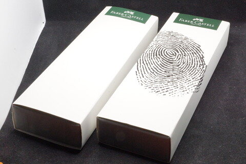
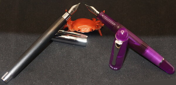
Two different Faber-Castell Loom pens arrived this week in these gift boxes. I don't think I've seen a gift box sleeve like the one on the right before that. Guess which one contained the matt gunmetal pen, and which one the glossy silver barrelled pen?© A Smug Dill
- 0 B
- x
-
Thicker than a Faber Guilloche, thinner than a Monteverde Ritma?
joshi posted a topic in Fountain & Dip Pens - First Stop
In the market for a pen that’s cylindrical, not cigar shaped. have both the Faber Castell Guilloche and the Monteverde Ritma and wouldn’t you know it, would rather have something between those widths. All suggestions gratefully received. A wet writing nib is a bonus. thanks in advance. -

The Technical Pen Experiment
Teacher Man posted a topic in It Writes, But It Is Not A Fountain Pen ....
This started because I like fineliners, I had a dim memory of experimenting with technical pens way back, and I like the many of the colours in Rohrer & Klingner's Antiktusche line. So, a few weeks ago, I got really interested in the possibility of using acrylic inks, which is what they are, in technical pens. (I like self contained pens instead of dip pens. Personal taste.) By the way, technical pens or dip pens or whatever, go and have a look at those Antiktusche colours. I higly recommend not only Rohrer & Klingner's website, but the swabs at http://www.kalligraphie.ch/store/index.php/cat/c113_Rohrer-s-Antiktusche.html. If you live in Europe, you might then want to buy your ink there as well, to support them for putting up these helpful swabs. Anyway... First, I searched this forum for useful information. Unfortunately, you mostly get people who do not really read the question and then give you advice they have heard somewhere. In other words: You ask, can acrylic inks be used in technical pens, and people will give you categorical advice like, only fountain pen ink should bne used in fountain pens! Ah. Quite. The technical pen is not a fountain pen. Also: As I have since learned, even fountain pens can take acrylic inks, provided you are prepared for extra work and care. If you use old and / or expensive pens, it makes sense to take no rists. If you are open to trying some weirder things, mess around! Second, I mailed both Rotring and Rohrer & Klingner. Rotring, unsurprisingly, will tell you that only inks made by Rotring are safe for their pens. If you used anything else, you void the warranty. Rohrer & Klingner will tell you that, in principle, their Inks are fine for the Isograph, the Rapidograph, even the Rotring Art Pen. The important bit is the "in principle". Those pens are designed with highly pigmented ink in mind, so that is not going to be your problem. The acrylic bit is going to make things risky. If acrylic ink dries, it stops being water solluble. So, if you let a pen dry out, you could end up with a solid mass which cannot be cleaned from your pen. Third, I have begun buying technical pens from various manufacturers, and not all of them have arived, yet. I have also begun experimenting with a few of those Antiktusche inks. What I have not yet done is let a pen dry out completely and see what can be done with the cleaner fluids from either Rotring or Rohrer & Klingner. Once all the pens I ordered have arrived, I will write something about how they compare. And sooner or later, of course one will dry up. So I will then post about the experience of cleaning it. Bottom line so far: You can get some techical pens for under € 10. There is no reason not to play around with acrylic ink in a technical pen, even if you fear it will kill the pen eventually. You can do a lot worse with € 10, I am sure. Also: Acrylic ink, unlike fountain pen ink, turns out to be amazing for writing postcards, which these days are often very bad at handling fountain pen ink. I kave some cards which turn into an absolute nightmare at the first drop of even my best behaved inks. Acrylic ink works like a charm! * Thanks to Rohrer & Klingner, as well as RoyalBlueNotebooks and fiberdrunk for help / advice.- 26 replies
-
- rapidograph
- isograph
-
(and 8 more)
Tagged with:
-
The main event is the site-wide discount(s): 10% off the total for orders of value £40 or more¹, and 15% off the total for orders of value £75 or more². The respective discount codes expire on 26 May. Then there are selected items specially discounted, including Faber-Castell Essentio Carbon fountain pens (all nib sizes) for £13.33 ex VAT each — before applying a site-wide discount code! They're probably worth buying at that price for the excellent steel nib alone, never mind whether you may be apprehensive about (numerous) anecdotal reports that their gripping sections cracking. Buy three or more of them, or two pens and a handful of Faber-Castell (‘international standard’) converters, and qualify³ to get, free of charge⁴, a Faber-Castell pencil case filled with a Pitt Artists Drawing Pen, a 2B pencil, an Apollo mechanical pencil, an eraser-tipped Grip pencil, a fineliner and a kneadable eraser as well. 75ml bottles of Graf von Faber-Castell ink are also £13.33 ex VAT each. I think the pens are regularly priced at £25 ex VAT, and the inks £20.83 ex VAT. — ¹ The actual eligibility criterion is order total value of £33.33 or more excluding VAT and shipping. Apply discount code BIRTHDAY10. ² The actual eligibility criterion is order total value of £62.50 or more excluding VAT and shipping. Apply discount code BIRTHDAY15. ³ With eligible Faber-Castell (not GvFC) products in the shopping cart totalling £33.33 or more excluding VAT. ⁴ If the item is in stock at the time for you to add, and you in deed (remember to) add it to your shopping cart before checking out.
- 15 replies
-
- site-wide discount
- graf von faber-castell
- (and 3 more)
-
desaturated.thumb.gif.5cb70ef1e977aa313d11eea3616aba7d.gif)
Faber-Castell Loom vs Essentio - focus on gripping section
A Smug Dill posted a gallery image in FPN Image Albums
From the album: European pens
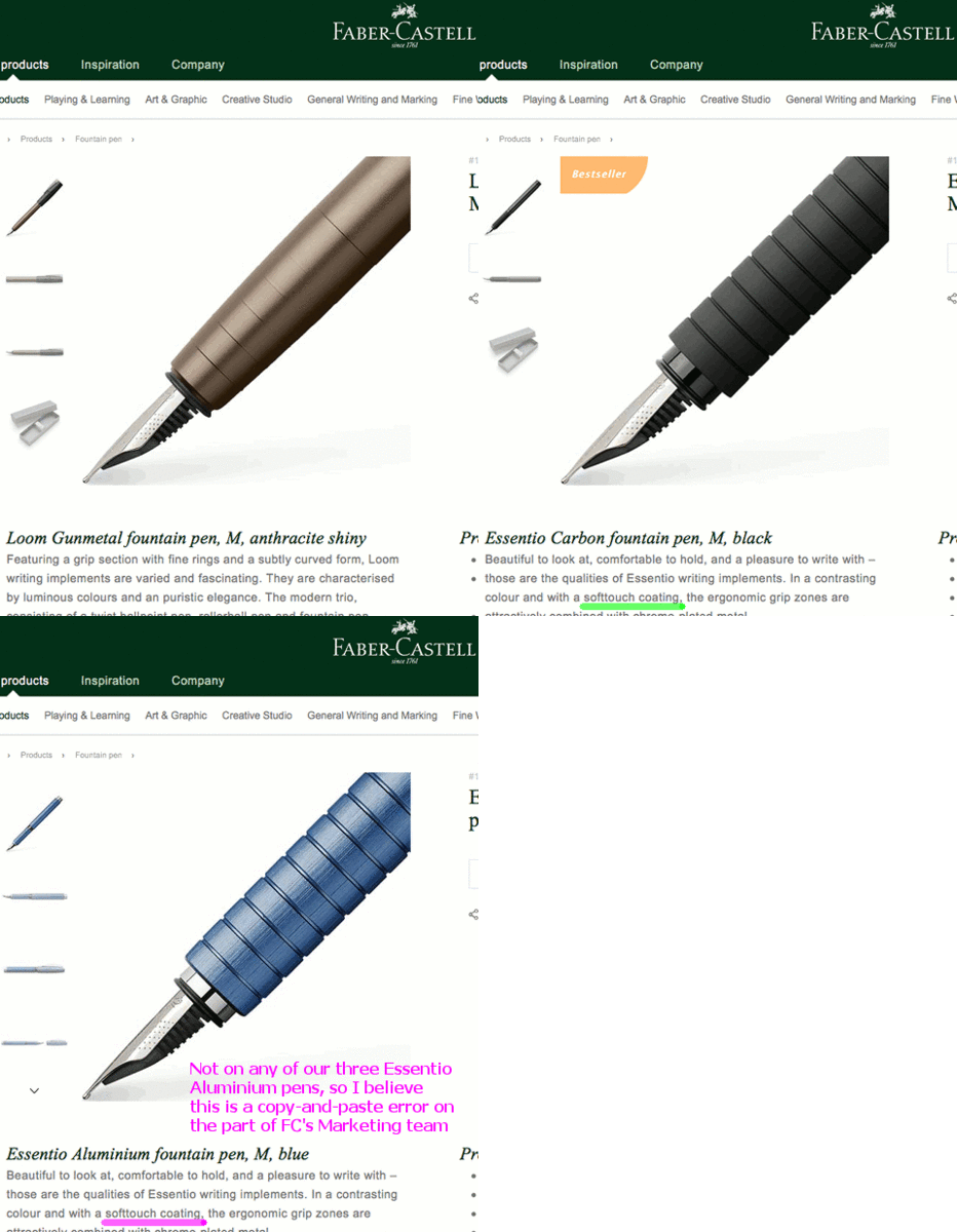
Out of the three models shown, I only have the Essentio Aluminium, so I can't comment on the accuracy of the descriptions for the other two; but the gripping section on the Essentio Aluminium is just bare, striated metal with no ‘softtouch’ or rubberised coating. For more details, see: Faber-Castell Loom Gunmetal fountain pen Faber-Castell Essentio Carbon fountain pen Faber-Castell Essentio Aluminium fountain pen© Faber-Castell
- 0 B
- x
-
- faber-castell
- loom
-
(and 7 more)
Tagged with:
-

Interview With Count Charles Alexander Von Faber-Castell
Appelboompen posted a topic in Other Brands - Europe
Hi fellow Graf von Faber-Castell enthusiasts, We made an interview with the Count von Faber-Castell and perhaps you find it interesting: https://www.youtube.com/watch?v=eSMiGR6cFqQ P.s. don't forget to subscribe to the channel for more cool videos regarding writing instruments!-
- faber-castell
- graf von faber-castell
-
(and 1 more)
Tagged with:
-
How Smooth Is The Two Tone Jowo Steel Nib?
zicitron posted a topic in Fountain & Dip Pens - First Stop
Hi all, I am eager to order a custom made fountain pen and from my research, there seem to be a lot of options around. For me, both the smoothness of the nib and the design of the pen are equally important. What is the use of having a gorgeous pen which gives a lot of feedback (in my case!) or have hard starts due to a "poor" nib? I have seen that a lot of companies doing custom made pens offer the 2-tone Jowo nib (which is German made, I guess?) to fit into their pens. My question is: Are the 2-tone Jowo nibs as smooth as, say, the nib on a Faber Castell Ondorro? If not, which nib (the smoother the better) would you recommend to match a custom made fountain pen? Also, any good companies you know which are into custom made fountain pens?- 12 replies
-
- jowo
- custom-made
-
(and 2 more)
Tagged with:
-
There are brands I trust and Faber-Castell is one of them. So far I’ve never been disappointed by Faber-Castell fountain pen (the same can’t be said, sadly, about their inks – newest additions to the line are less than mediocre). Not only their products offer good quality but also interesting design. Of course some of their designs don’t suit my taste – Basic is too heavy and unshapely, Loom looks funny. Both of them, however, are great writers. I was interested in trying Ondoro for quite some time. It offers unique and rather striking design that attracted me to it – how many hexagonal fountain pens do you know? The temptation was strong but before I could spend money on the pen I’ve received it from a friend. I didn’t object. I’ve grabbed it before she could change her mind and started testing it. Since that time I’ve managed to try two Ondoros. I’ve sold Orange one and, after some time, bought Black one and, month after, received another black one. At the moment I have two black Ondoros. I believe this design is subtle but also sophisticated. Smooth, unclattered barrel finishes with a comfortably tapered grip near the nib. Polished chrome cap is engraved with the company logo on the end and is equipped with functional spring-loaded clip. The hexagonal shape is quite ergonomic in the hand. Also it’ll never roll off the table, trust me on this. Actually you don’t need to trust me – just look at the pen Fit & Finish Construction and quality are quite impressive. In their marketing materials Faber-Castell claims, as most manufacturers do, the pen is made from “precious resin”. The material has nice feel to it but let’s be realistic and call it plastic for what it really is. It feels substantial and solid and because of matte finish (in Black Ondoro) it’s pleasant to the touch. The plastic is, in muy opinion, much better than the one used in Pelikan pens. The metallic snap-on cap is small and hexagonal. It opens and closes on the barrel with audible click. It’s made of chrome plated metal and plastic (inside) – it’s quite heavy and it tends to collect dust easily. I don’t mind it but some people won’t be happy cleaning it every few days. The cap can be posted on the back of the pen – you just need to align facets on the barrel with the ones on the cap. I never post my pens but if you usually do you may be unhappy with Ondoro – metal cap will make it back heavy. It feels unbalanced to me. The pen isn’t huge but, due to significant diameter and well engineered grip, it is very comfortable to hold. Small grip section is short but has concave shape that forces fingers to hold it close to the nib. For me it’s perfect – I always keep my fingers almost on the nib. Some people though will need to get used to it. Nib Ondoro’s stainless steel nib doesn’t have a breather hole, it’s adorned with dotted pattern as well as the Faber-Castell logo and the nib size stamped on it. It’s available in EF, F, M and B sizes. I had a chance to try fine and medium Ondoro nibs. They both performed well out of the box. They’re not buttery smooth – in a way they’re similar to japanese nibs. They give some feedback, sometimes less, sometimes more – depending on the paper and ink you use. Filling system The Ondoro fills using the standard international cartridge/converter system. The system is practical, easy to clean, but rather boring. It has no panache. Dimensions Length, capped: 12.8 c Length, uncapped: 12.4 cm Length, posted: 15.9 cm Weight, posted: 32 g Summary Faber-Castell Ondoro is undoubtedly interesting fountain pen. It’s design is eye-catching but apart from visual appeal it’s quite practical and ergonomic. Ondoro writes nicely and I appreciate the fact there’s little in the way of branding or marks on the pen to spoil its clean lines. As for the price – it’s not cheap pen. For it’s MSRP you can easily get better pens on eBay. On the other hand it’s well built and with unique design. I’ve sold my first Ondoro because I didn’t fully enjoy it’s orange hue (I love oranges, but darker ones). After some time I’ve decided to get another one in another finish and I’m quite happy with it. I think it’s great pen but it should be 30 % cheaper.
-
This ink is a really neat brown. It flows consistently well, has no problems with cleanup, and is decent on lubrication. It's a really good all-rounder ink if you don't mind it not being permanent. Or, for that matter, water resistant at all. On a ten-point system, 10 being the best: Flow: 8 Lubrication: 6 Dry Time on Tomoe River Paper : 20-25 sec Shading: 7 (Depends largely on the pen) Bleed: None. Ghosting: Just a bit, nothing too heavy. Color: 7 - I like it a lot, especially in my Monteverde Invincia with a Pendleton BLS Nib. Its a very nice brown with good shading in this pen. Overall: 7 - This is a brown ink I could see myself returning to! Written Review: Photo: Scan: After capturing, I noticed there were bits of these really neat silvery black sheen where the ink pooled up enough. It probably won't be seen unless your pen is REALLY flowing on very ink-resistant paper, but it is there! I'll leave two pictures. One of the sheen circled and one not circled. The pictures do not do it much justice as in real life it sheens much more especially under light. I had real trouble picking up any sheen on my camera. Thanks for checking out my review! -Nick
-
Let’s start with the end of the review, why don’t we? Get it over with and move on to more interesting things. Faber-Castell e-Motion is great pen, worth every penny you pay for it. The end But you need some context, so let’s start again. First, a personal thought. There is a thing I find irresistible in most Faber-Castell and Graf von Faber-Castell designs. Some of them are strange, some elegant but they’re all, mostly, unique. Also they all, mostly, work for me. While I don’t really like the way Faber-Castell Basic looks like, I think it’s great entry-level pen. Faber-Castell e-Motion on the other hand not only looks well, it also performs well. In this price range it’s one of more interesting choices. Not everyone will enjoy it, but the ones who’ll actually try it, will remeber this pen for unusual design and great pen-to-paper performance. I’ll agree that this pen looks odd. After analyzing pictures some people may wonder if it’s possible to use this pen comfortably for more than few minutes, if at all. I was asking the same question to myself before buying e-Motion. After using the pen for a while I can assure you it’s not only possible, it’s also enjoyable. The Faber-Castell fountain pens come in a rather minimalist and elegant white cardboard box with the Faber-Castell logo printed on it in silver. A small brown leather strap that is attached to the sides of the box serves for pulling out the slider. After opening the box, the pen is revealed. Chunky, almost cigar-shaped, this pen sits comfortably in the hand. High-gloss metal in combination with warm brown pearwood looks and feels modern and elegant. Sure, this pen is rather heavy. It has to – there’s a lot of metal parts in it. This makes it feel solid and the weight is perfectly balanced. Of course if your preferred pens are the likes of Pelikan M200 you’ll find this one too heavy. The clip is spring loaded and feels strong without being overly tight. The cap is heavy and has interesting curves that for some will look gracefull, while for others simply odd. I enjoy them. Nib Writing sample (L'Artisan Pastellier's Botany Bay on Rhodia Dot-Pad) I’ve made a mistake with this one. I’ve decided that I have too many mediums and broads and it would be good to have some fine nibs in the collection. I should have known this wasn’t meant to work for me. Sure this nib writes perfectly well. It doesn’t skip, the inkflow is consistent, there’s no scratchiness to it. Also the nib looks nice – the nib does not have a breather hole, and features “golf ball” dimpling across the nib’s face. Still – it’s just too fine for my taste. I’ll need to find a way to exchange it for medium or broad. Filling system e-Motion is C/C pen. Nothing extraordinary. Nothing exciting here. The system works well and is easy to clean. It’s also quite boring (but functional). Dimensions Closed – 137 mm Uncapped – 117 mm Weight: 51 g Summary I really enjoy this pen. It combines wood and metal, materials I trully enjoy. It feels great in my hand. In order to be more objective I think that for some people this design won’t work due to the pen unusual shape and hefty weight. For me, though, this design works very well.
-
Remove Cap Liner On Faber-Castell Ambition, Maybe Disassemble Clip Spring For Cleaning.
jbeales posted a topic in Repair Q&A
I took my Faber-Castell Ambition on an airplane, and despite the Faber-Castell website stating "You do not need to worry about traveling by air with Faber-Castell fountain pens." it leaked a bunch of ink. Part 1: Cap liner The ink has gotten itself in between the metal cap and the plastic cap liner, and, I believe, into the spring mechanism at the end of the cap. If it's possible to do non-destructively, I'd like to remove the cap liner and clean the interior of the cap. Google's not turning up any tricks, and I haven't figured out how to pull it out myself. Does anyone know if there's a way to get the cap liner out, clean it, and put it back? Part 2: Clip spring mechanism. Ink is leaking around the clip, (which is sprung), and through the end of the cap. Is it possible to remove the spring mechanism without destroying it so I can get it cleaned up? I can't see any way to make it happen, especially with the cap liner still in the cap, but it was put together, so there must be a way to take it apart! Thanks! - John-
- faber-castell
- ambition
-
(and 2 more)
Tagged with:
-
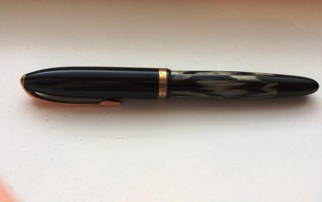
I recently bought A.W.Faber-Castell fountain pen, seller didin't know anything about pen. (especially price...) I have many Faber-Castells and Osmias, so I was excepting to find model number and nib grade in back of the pen, like all of them have. But this one, has nothing. There isn't any sign of marking there. Only markings in the pen are in cap band "A.W.Faber-Castell Germany" and in nib "Castell 14KARAT 585" Also, filling system is broken or it has some weird piston mechanism, or both. Any info about this filling system is welcome too. Piston filling knob retracts when unscrewed and then it operates the piston. It is closed by pressing and turning it, but then it don't operate the piston. Even if it looks broken, there is clearly some broken plastic underside of knob, it operates piston without any problem. Any help with dating this pen? I was guessing that I may be after dropping osmia in branding, but that A.W thing confuses me. So maybe its before Osmia? And here is the pics!
- 3 replies
-
- faber-castell
- identify
-
(and 1 more)
Tagged with:






.jpg.5b9e55e359dd51d2bf5a0ed454a1de55.jpg)
