Search the Community
Showing results for tags 'english'.
-
Handwriting Competition in my local English Schools, 2023
Mercian posted a topic in Handwriting & Handwriting Improvement
Hi all, the following photos were taken in a local supermarket. They are photos of a few of the entries that were submitted to a 2023 ‘Handwriting Competition’ for kids at the schools that are local to me, in the ‘Midlands’ of England. The competition was organised by the local ‘Rotary Club’. I note that the model that these children are being taught is not the one that was taught to me in the 1970s & 1980s. Those of you that have a keen eye for a waspy will notice that this model seems to cause children to have difficulty drawing the glyph for ‘f’ in such a way that it does not look like the glyph for ‘g’. And that some of these entries include spelling mistakes. The images are of writing samples from children who attend various local schools. One of these schools is the Middle School that I actually attended, although I did notice that the local Primary School that I attended had no entries in the display in this local supermarket. I am posting these images here because it engladdenned my heart to see that handwriting is still being taught in my local schools (in the English ‘Midlands’) in 2023 😉 Slàinte, M.- 20 replies
-
- schools handwriting
- handwriting
- (and 5 more)
-
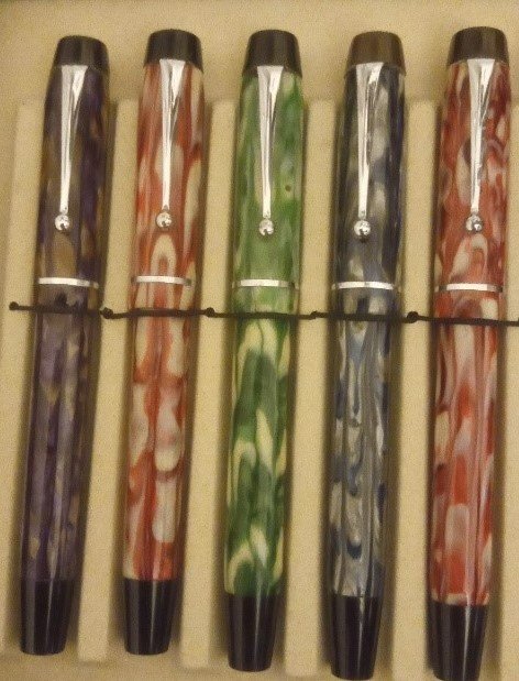
Hi All Sorry haven't been on here in a while... I have been busy trying to research some of my mentmores!!! I don't think they are dimplomas; Celestes, Modernes or even Majors. one of the barrels just mentions - Mentmore Made in england here is a picture of mine as well as the colours. best wishes Rick Mentmore colours.docx
-
Hello, I would like to ask the members if someone among the Onoto experts can help me to identify this model. It is a great writer and I would like to know more about its history. (It is written on the barrel: Patent Self filling) Thank you, F.
-
Can Anyone Tell Me About The Wyvern 690?
Brontosaurus Pluto posted a topic in Great Britain & Ireland - Europe
Hello, My father just got me a Wyvern 690! Im stoked cause I love Wyverns but I cant find any info on this Model. Can anyone tell me about it?- 3 replies
-
- wyvern 690
- wyvern
-
(and 3 more)
Tagged with:
-
Looking through my English Duofolds I came across three pens from Newhaven production during the second world war. All three had one thing in common, the gold plated cap bands were seriously brassed, much more so than on US and later Newhaven Duofolds. (The ball of the clips were also brassed but this is much more common.) I wondered if wartime limitations meant that the gold plating used was thinner quality than normal on Duofolds?
-
Hello again to all my FP friends, [This review has been sitting on my desk for months and I finally got around to posting it. Stay tuned for a comparison of Diamine Cornflower and Penbbs #116 Cornflower.] Diamine needs no introduction on this board. Suffice it to say that they have been making inks for over a century and produce many, many beautiful hues, a lot of which are prone to feathering and bleed through on everyday office paper. This ink up for review is from Diamine’s Flower Series. It is named after the cornflower (centaurea cyanus) which can be various shades of blue or lavender. I’ve never seen the flower in person, but by just comparing with various photographs online, the ink looks like a pretty good match to the flower. Diamine Cornflower is a deep and very saturated blue with a dash of purple. This ink dries quickly on absorbent paper, but has an average dry time on nicer papers. Sheening is nice and shading possible with wet nibs on good paper. It can be quite a stunning color with the write combination. Unfortunately, this ink’s downfall as a daily work ink is its tendency to feather and bleed through. Although feathering with finer nibs wasn’t too bad on copy paper, even the Japanese fine nib produced noticeable bleed. Water resistance is passible; a dark purplish line remains legible. This is a lovely vibrant color that reminds me of a dark counterpart to Noodler’s Baystate Blue. The color is also standard enough that it could be used in most professional environments. They only thing that keeps me from buying a bottle is that the feathering and bleed through make it impossible to use on any paper I would run into outside the house. However, if you like saturated, slightly purplish dark blues and mostly use good paper, then this is not an ink you’ll want to miss. *A special thanks to lapis for sending a sample of this ink to me! Pens used (in order): 1. Pilot 78G Fine 2. Lamy Safari Broad 3. Pilot Plumix Italic 4. Noodler’s Nib Creaper Flex 5. Hero 5028 1.9mm Stub Swab Paper Towel Drop 80gsm Rhodia Tomoe River *Many thanks to Lord Epic for kindly sending me some of this paper! Check out that subtle sheen! 70gms Deli Copy Paper Moleskine Water Resistance Comparison (More blues to be added later) Thanks for reading! SDG
- 21 replies
-
- diamine
- cornflower
-
(and 8 more)
Tagged with:
-
How Do I Get The Filler Out Of An Aerometric P51 And Replace The Sack?
Ursus posted a topic in Repair Q&A
I have just got a beautiful English aerometric Parker 51 from 1965, but when I flushed out the dry old ink the press-four-times filler slowly started letting out water at the opening where one pushes. I assume that the pli sack has gone loose and either has to be replaced or re-glued with shellac - which leaves me with some questions: 1) How do I get the filler out? (It certainly is not easy to get it out and I don't want to use to much force.) Is it correct that it is not screwed in? Does it help putting it in warm water? 2) Any advice on what size of pli sack I should get will be appreciated, as will any advice on what brand of shellac to use and any details with regard to the procedure in general. I have looked all over FPN but I have found very little on the subject, so if you are experienced in these matters please give me as much advice as possible. Best regards Ursus -
http://i.imgur.com/QFgaUVj.jpg http://i.imgur.com/BT2QAIT.jpg http://i.imgur.com/rVNaj7t.jpg (The first plate above says "Bartholomeus it is meete and most convenient" etc etc) Richard Gething was born in Herefordshire, perhaps in 1585, and at some point in his life travelled to and worked in London. Massey describes him as being in the company of the "heads and fathers" of English calligraphy and that he deserves our "highest commendation". You might have heard of or read Sir Ambrose Heal's "The English Writing - Masters and Their Copybooks 1570 - 1800": this copy of Calligraphotechnia once belonged to him and has his bookplates and some notes by him written in it. This book also once belonged to one Nathaniell Adams, who wrote his name in it in 1654(? not sure about the last digit). Note the elaborate knot which is part of his signature. There is a specific name for such a knot, but I forgot what it was. Short biography of Richard Gething here: http://preview.tinyurl.com/qgn9p89 A .zip containing all the scans is here: https://mega.co.nz/#!SJ0mXDRL!F4dU8mcqB0SR25_cULhQCA6_M2h4GH2lqf__QAu0RPs And I've uploaded the scans on flickr here: http://tinyurl.com/ou9oh93
- 3 replies
-
- copy book
- italian hand
- (and 8 more)