Search the Community
Showing results for tags 'edelstein'.
-
Pelikan Edelstein Golden Lapis Ink of the Year 2024 In 2011 Pelikan introduced the Edelstein series of high-end inks, available in a variety of colours. The theme of the Edelstein concept is the gemstone – each ink corresponds to the beautiful colour of a gem. The Edelstein line of inks is presented in 50 ml high-value bottles, that are truly beautiful, and worthy of a place on your desk. In this review the spotlight shines on the shimmering presence of Golden Lapis, the Edelstein Ink of the Year 2024. This is a limited edition glitter ink, that will most probably be gone in the near future. At heart, Golden Lapis is a bright light-blue ink with added golden shimmer particles. I’m not a fan of shine & shimmer, so will mostly ignore this aspect of the ink. Just one word of warning: the gold particles tend to accumulate at the surface, and will easily come off the paper when the ink has dried. It’s almost unavoidable. The ink’s colour is quite enjoyable. My first thought was: “Oh, this is Topaz with shimmer”. But that’s not really the case. Topaz is a lighter turquoise blue, while this Golden Lapis definitely is a touch darker. Still a light & bright blue though. Most Edelstein inks work well across the nib size range, and can handle all types of paper. This one is a bit more finicky. It mostly has problems with absorbent paper: the ink gets sucked right in and through the paper, with bleed-through as a result. Yikes! On hard-surface coated paper, the ink looks great, but it needs its time to dry… for a long time. In return, you get strong and truly nice shading, and a bit of a purple-reddish sheen. Overall, a good-looking ink with some technical issues. The chromatography shows a light-blue dye with some purple component in the mix that darkens up the ink a bit. Water resistance is fairly good: although a good deal of the dyes are washed away, enough is left to easily reconstruct your writing. Not bad. Golden Lapis writes well in all nib sizes. A nicely lubricated and well-saturated ink that always leaves a strong and contrast-rich line on the paper. I like it best with the broader nibs, where the shading really comes into play. I’m not usually a big fan of heavy shading, but for this ink I make an exception. Golden Lapis looks at its best when the shading is strongest – the contrast between light and darker parts is really well balanced, and looks just darn good. But you only get this lovely and aesthetically pleasing shading on the hard-surface paper. On absorbent paper, shading is just barely there and the ink loses much of its appeal. To show you the impact of saturation on the ink’s look & feel on paper, I made some scribbles where I really saturated portions of a piece of 52 gsm Tomoe River paper with ink. This gives you a good idea of what the ink is capable of in terms of colour range. Golden Lapis has a medium colour span, gradually darkening as saturation increases, but always keeping true to its light-blue nature. The light-to-dark ratio in writing is just right, with really great aesthetics. You get prominent shading, not too extreme, which looks absolutely gorgeous – but only on the hard-surface paper. Technically, the ink has the typical Edelstein feel: well lubricated, good saturation. It’s a shame it doesn’t work well with absorbent paper, and that includes all types of copy paper. The ink then gets sucked into and through the paper, making a mess of the opposite side. For some reason, it also didn’t work well with the paper in my Paperblanks journal, which usually is not that fussy about the inks I use. Looks like the Paperblanks paper is just a touch too absorbent to work well with this ink. Below you’ll find photos of the writing samples on loads of different paper types. This should give you a good feel for the ink. On each scrap of paper I show you: An ink swab, made with a cotton Q-tip 1-2-3 pass swab, to show increasing saturation An ink scribble made with an M-nib Safari fountain pen The name of the paper used, written with a B-nib Safari A small text sample, written with the M-nib Safari Title of the quote, with a Pelikan M120 with M-nib Drying times of the ink on the paper, with the M-nib Lamy Safari I’ve also added a scan of some writing samples to give you another view on the ink. Scanned images and photos often capture different aspects of the ink’s colour & contrast. That’s why I present them both. The ink swabs look closest in colour in the scanned image. The character of writing shows best in the photos. Below you also find some blow-ups on coated paper to really show you that beautiful shading. Writing with different nib sizes The picture below shows the effect of nib sizes on the writing. The top samples were written with a Lamy Safari, which is typically a dry pen. I also added a few visiting pens. What is really visible here is the wide range of blue hues the ink produces in the different pens & nib sizes. That’s quite some variety for a single ink. Cool! Related inks To show off related inks, I use my nine-grid format, with the currently reviewed ink at the center. This format shows the name of related inks, a saturation sample, a 1-2-3 swab and a water resistance test – all in a very compact format. Golden Lapis’ base colour is fairly similar to several other inks. Iroshizuku kon-peki comes close, but is a tad lighter. In the Pelikan Edelstein line-up, Topaz would be my alternative of choice. It’s technically a better ink, and looks amazing on any type of paper. Inkxperiment – Pythagoras I’ve put myself a challenge to try to produce interesting drawings using only the ink I’m reviewing. I find this to be a fun extension of the hobby, and have found these single-ink drawings ideal for experimenting with different techniques. And creating these monochrome paintings is simply fun, and always good for a couple of hours well spent. Inspiration for this inkxperiment comes from the world of mathematics. Recently I came across an article on the internal structure of protons, which captured my attention. So I grabbed a book on particle physics, and on page 10 or so I got lost in the math... a bit embarrassing 😉. So I’m refreshing my math now, starting from the basics. And right there at the very beginning is that Greek philosopher genius of about 2500 years ago who had that great insight into the geometry of triangles. I tried to capture his wisdom into this little inkxperiment. I started with an A4 sheet of 300 gsm watercolour paper, and painted in the temple background, using Golden Lapis with multiple water/ink ratios. I then used pure ink and lots of glitter to frame the sky. Next I added the visualization of the Pythagorean theorem, and our philosopher sitting at the temple wall. The end-result gives you an idea of what can be achieved with Golden Lapis as a drawing ink. Inkxpired – computational art I love experimenting with pen/ink/paper and have added another layer as part of the hobby. I’m exploring computational art, inspired by the ink drawings I do during ink reviews. Another fun offshoot of the hobby… and all that starting with a few drops of dye-coloured water on paper. I started by using a duo-tone colour filter and added a graph paper backdrop. I then used a “tiny world” filter with focus on our philosopher. Next I used a grid-filter which also added colour to the image. The end result shows the mathematical lens through which Pythagoras viewed the world. Conclusion With this Ink of the Year, Pelikan continues to present us with a shimmer ink (please stop doing that 😉). This time with a nice bright-blue base colour that looks gorgeous on hard-surface, good-quality paper. Unfortunately, the ink suffers badly when using it on absorbent paper, with loss of shading and quite some see-through and bleed-through. A nice enough ink to try, but not one that falls in the must-have category (my opinion). Technical test results on Rhodia N° 16 notepad paper, written with Lamy Safari, M-nib Backside of writing samples on different paper types
-
Pelikan Edelstein Garnet In 2011 Pelikan introduced the Edelstein series of high-end inks, available in a variety of colours. The theme of the Edelstein concept is the gemstone – each ink corresponds to the beautiful colour of a gem. The Edelstein line of inks is presented in 50 ml high-value bottles, that are truly beautiful, and worthy of a place on your desk. In this review I take a closer look at Garnet, the Edelstein Ink of the Year 2014, which is now part of the regular Edelstein line-up. Garnet is a fairly bright and well-saturated orange-leaning red. In daylight and in scans the ink’s red tones dominate, but under warm artificial light Garnet definitely shows its orange-leaning nature. This is a decent red ink, that works well in all nib-sizes and on all types of paper. But that’s about it… personally I think there are lots of similar reds about, and there is little to lift Garnet above the pack. Below I give you enough background information to let you make up your own mind. The chromatography shows orange-red dyes and a bit of grey in the mix. The grey tones down the ink a bit, making Garnet appear less vibrant. For red inks, this can be a good thing: a full page of vibrant red might be a bit too much for some. From the bottom part of the chroma, you can already deduce that Garnet is not a water resistant ink. This Edelstein ink can handle all nib sizes with ease, always showing a well-saturated line. I actually prefer this ink with the finer nibs (EF/F), where its presence on the paper is less overwhelming. My personal opinion is that red inks are ok for occasional notes when reviewing/correcting a document, but are too loud for regular writing/journaling. A full page of Garnet hurts the eyes. To show you the impact of saturation on the ink’s look & feel on paper, I made some scribbles where I really saturated portions of a scrap of Tomoe River paper with ink. This gives you a good idea of what the ink is capable of in terms of colour range. Garnet has a low dynamic range, with little difference between the light and darker parts. Not a lot of shading with this ink! The little shading you get is most apparent when using Garnet in dry pens with broader nibs (like the 1.5 / 1.9 calligraphy nibs for a Lamy Safari). I’ve tested the ink on a wide variety of paper – from crappy Moleskine to high-end Tomoe River. On every small band of paper I show you: An ink swab, made with a cotton Q-tip 1-2-3 pass swab, to show increasing saturation An ink scribble made with an M-nib Lamy Safari fountain pen The name of the paper used, written with a B-nib Lamy Safari A small text sample, written with an M-nib Lamy Safari Origin of the quote, written with an F-nib Pelikan M101N Bright Red Drying times of the ink on the paper (with the M-nib Lamy) The ink copes well with a wide variety of paper – it even works well with Moleskine paper: just a tiny bit of feathering, and only a bit of bleed-through. This is an ink that can tolerate even crappy copier paper at the office. I like Garnet just a touch more on the yellow papers in my test set. The yellow background accentuates the orange undertones of the ink, and reduces the contrast between ink and paper, making a page of red writing less loud and in your face. Scanned images alone are not enough to give you a good view of the ink - they tend to exaggerate contrast, and sometimes have difficulty capturing the colour of an ink. I’ve therefore added a few photos to give you another view on the ink. Writing with different nib sizes The picture below shows the effect of nib sizes on the writing. As you can see, Garnet works well in all nib sizes, even the finest ones. I actually prefer using it with the EF/F nibs – the fine line you get tames the ink a bit, and makes a full page of Garnet look a little more palatable. Related inks To show off related inks, I use my nine-grid format, with the currently reviewed ink at the center. This format shows the name of related inks, a saturation sample, a 1-2-3 swab and a water resistance test – all in a very compact form. This allows you to easily compare the ink with its eight direct neighbours, which I hope will be useful to you. Garnet sits somewhere between MB Corn Poppy Red (which is a bit more vibrant) and kyo-iro Flaming Red of Fushimi (which looks a bit softer and more delicate). Inkxperiment – stilt village I’ve put myself a challenge to try to produce interesting drawings using only the ink I’m reviewing. For me this is an incredibly fun extension of the hobby, that continuously challenges my drawing skills. Red inks often have a low dynamic range, and are a real challenge for single-ink drawings, and Garnet is no exception. I therefore decided on a simple pen drawing. I started with an A4 piece of HP photo paper, on which I painted the background using a water-soaked kitchen towel on top of which I painted with water-diluted Garnet. This always produces a nicely textured background on which to paint the subject. In retrospect, I should have diluted the ink quite a bit more… the background turned out to be a bit too prominent. I then drew in the village buildings using a 2-point perspective, and added the stilts and netting with my Lamy Safari fountain pen. Final touches to the buildings were done with a felt-tip pen and fountain pen. The resulting drawing shows what can be achieved with Garnet in an artistic context. Due to its limited colour span, Garnet is best used for line drawings. The stilt village turned out quite well. A pity about the background that should have been softer… well, lesson learned for a next time 😉 Conclusion This Edelstein ink of the year 2014 (which is now part of the regular line-up) has no real technical shortcomings: well-saturated, works with all nib-sizes and paper types. It does lack water resistance though, if you care about such things. All in all a decent red, but personally I’ve seen better ones that I liked more. Technical test results on Rhodia N° 16 notepad paper, written with Lamy Safari, M-nib Back-side of writing samples on different paper types
-
Ink Shoot-Out : Pelikan Edelstein Topaz Vs Pilot Iroshizuku Kon-Peki
namrehsnoom posted a topic in Ink Comparisons
Ink Shoot-Out : Pelikan Edelstein Topaz vs Pilot Iroshizuku kon-peki Iroshizuku kon-peki has long been my only cerulean blue ink, and I've been very fond of it. Recently, I obtained a bottle of Pelikan Edelstein Topaz and - lo-and-behold - this turned out to also be a nice cerulean blue. A great opportunity to put these inks into close comparison, and find out which of them I like the most. Here comes... the Ink Shoot-Out. A brutal fight where champion inks do battle for four rounds, to determine who is the winner. In the left corner - the challenger: Pelikan Edelstein Topaz. In the right corner - my current favorite: Pilot Iroshizuku kon-peki. Which champion will remain standing at the end of the fight ? Let's find out... Round 1 - First Impressions Both inks make a wonderful first impression. I really like their color... a fine cerulean sky-blue. These inks give me a relaxed, vacation-like feeling. They remind me of the sunny day sky-blue in late spring, with me relaxing on a tropical beach soothed by the sound of crashing ocean waves. There are some differences though: Topaz is more of a morning-sky color, while kon-peki is more of an afternoon sky-blue. Topaz is definitely a shade lighter than kon-peki, which is most obvious in written text, not so much in the ink-swabs. For me, topaz is a fresher color, which appeals to me more.Both inks shade nicely, but the shading on topaz is less prominent, and - in my opinion - more aesthetically pleasingkon-peki is a wetter and more saturated inkBoth Edelstein en Iroshizuku are the top-of-the line inks of their respective brands. And both live up to their reputation: these are seriously fine-looking inks. But for me personally, I like the morning sky-blue of Topaz better. There is no obvious win by knock-out in this round, but I will yield this round to Topaz on points. Round 2 - Writing Sample The writing sample was done on a Rhodia N°16 Notepad with 80 gsm paper. Both inks behaved superbly, with no feathering and no show-through or bleed-through. You will find that the Edelstein ink is on the dry side - this is especially noticeable with the EF nib. The iroshizuku ink had no problem with the finer nib. With broader nibs, both inks wrote just fine with a nice ink-flow. It is well-known in this community that Edelstein inks are a bit dry. I won't hold this against topaz - just use an F nib or broader, and you won't have a problem. In my opinion, both inks are evenly matched, so this round ends in a draw. Round 3 - Ink Properties Both inks have similar drying times in the 15-20 second range on the Rhodia paper. Topaz needed a tad longer to dry completely. Both inks also did fine on the smudge test, where I draw a wet Q-tip cotton swab across the text line. There is some smearing, but the text remains perfectly legible. For the droplet test, I drippled water onto the grid, and let it sit there for 15 minutes, after which I removed the water droplets with a paper towel. As you can see, these are not water-resistant inks. But if you look closely, you'll notice that kon-peki leaves a bit more ink on the paper (and with some luck, you'll be able to reconstruct the written word). The chromatographies show that both are true blue inks, that are very water-soluble (in the chromatography the dyes migrate with the water to the top of the picture, the bottom part illustrates what remains on the paper after a good soak). You also notice that kon-peki appears to stick better to the paper. The difference between these heavy-weight champions is minimal. Again - no knock-out, but this round definitely goes to the Japanese champion - on points. Round 4 - The Fun Factor Welcome to the final round. Here I give you a purely personal impression of both inks, where I judge which of them I like most when doing some fun stuff like doodling and drawing. Here I must admit that I like Edelstein Topaz a lot better than Iroshizuku kon-peki. The more subtle shading on Topaz made for more interesting effects when drawing. And I definitely like the color of Topaz a lot better - a late morning sky-blue, while kon-peki is a deeper afternoon sky-blue. This is of course a purely personal judgment, but I'm quite convinced that - in the future - I will will reach faster for the bottle of Topaz, and that my kon-peki will be used less often. For me, this round definitely goes to the German champion. No knock-out, but a definite advantage on points. The Verdict Both inks find a proud place in my collection, and both are very well-behaving inks with a lovely sky-blue color. But counting the points, I find that Pelikan Edelstein Topaz is the clear winner over Pilot Iroshizuku kon-peki. As far as I'm concerned, Topaz has convincingly won this shoot-out on points, and is my new reigning champion ! -
Ink Review : Pelikan Edelstein Olivine --- Ink of the Year 2018 --- In 2011 Pelikan introduced the Edelstein series of high-end inks, available in a variety of colours. The theme of the Edelstein concept is the gemstone - each ink corresponds to the beautiful colour of a gem. The Edelstein line of inks is presented in 50 ml high-value bottles, that are truly beautiful, and worthy of a place on your desk. In this review I take a closer look at Olivine, the Edelstein Ink of the Year 2018. This is a limited edition ink, that could be gone in the near future, although it's not unheard of for Pelikan to change its mind. Be sure to check out lapis's review for an excellent and highly detailed discussion and comparison with other greens. To clear the field: Olivine is not the kind of green that people anticipated based on the pre-release pictures and the images of the mineral circulating on the web (see the thread in lapis's review for a thorough discussion of this aspect). This review will totally ignore this topic, and simply evaluate the ink on its own merit. Olivine is a dark green ink, with very visible blue undertones. I wouldn't go so far as calling it a teal ... the green clearly dominates. But the blue undertones do give it a certain complexity that is quite apparent when writing or drawing. The chromatography of this ink shows a complex mix of dyes, clearly indicating the bright blue undertones hidden within the ink. The result is a very fine writing ink, that can handle all nib ranges without a problem. The ink has excellent contrast with the paper, even when using EF nibs. Olivine also shows of some impressive but still elegant shading, which even shows up in finer nib sizes. Well executed! Overall, I really like what I see on the paper. To show you the impact of saturation on the ink's look & feel on paper, I made some scribbles where I really saturated portions of the paper with ink. This gives you a good idea of what Olivine is capable of in terms of colour range. The ink shows quite some variation between light and darker parts. This probably explains why it's such a good shader. Technically, the ink behaved perfectly, with exceptionally good flow and saturation, and a good contrast with the paper even in the finer nibs. Overall a pleasurable ink to write with. Drying times are quite reasonable in the 10 second range with M-nibs. Olivine copes well with a wide variety of paper - and can even tolerate the crappy ones. Only on Moleskine, the ink looks sickly and pale, and has noticeable feathering and bleed-through. On other papers the ink behaved impeccably, looking good on both white and more yellowish paper. Unfortunately, Olivine shows a total lack of water resistance. Even the slightest touch of water obliterates your writing - see the water test at the end of this review. As such, I don't consider this an ink you can use in the workplace. I’ve tested the ink on a wide variety of paper – from crappy Moleskine to high-end Tomoe River. On each scrap of paper I show you: An ink swab, made with a cotton Q-tip1-2-3 pass swab, to show increasing saturationAn ink scribble made with a Lamy Safari M-nib fountain penThe name of the paper used, written with a Lamy Safari B-nibA small text sample, written with an M-nibDrying times of the ink on the paper (with the M-nib) Inkxperiment – Swamp Lake CastleI've put myself a challenge to try to produce interesting drawings using only the ink I'm reviewing. I find this to be a fun extension of the hobby, and have found these single-ink drawings ideal for experimenting with different techniques. When using Olivine for drawing, the complexity and colour range of the ink can be used to great effect. For this drawing I used 300 gsm rough watercolour paper. For the sky, I diluted the ink with lots of water, which brings forth the blue undertones. For the swamp lake, I used mildly water-diluted ink giving a darker green colour. The yellow/blue highlights were obtained by applying some bleach to the partly-dried ink. Olivine reacts really well with bleach, leaving a beautiful light-blue colour. For the foreground, the castle and the tree accents, I used pure Olivine, painted in with a small brush. The end result gives you a good idea of the colour span the ink is capable of in a more artistic setting. And it must be said, I'm very pleased with the drawing capabilities shown by this ink. ConclusionOlivine might not have been what you expected, but viewed objectively, this certainly is a very good ink. One that writes very smoothly and with beautiful shading. Personally, I also like the colour - the blue undertones add extra depth and complexity to what is in essence a dark-green colour. A pity this ink has zero water resistance. Finally, I was really impressed by the expressiveness of Olivine in a more artistic setting, the colour range that can be obtained is unbelievable! Overall, I'm glad I got myself a bottle of this ink. Technical test results on Rhodia N°16 notepad paper with Lamy Safari, M-nib Backside of writing samples on different paper types Backside of writing samples on different paper types
-
I like inks that I can usually bring at work, ordinary enough for documents, but with that particular tone enjoyable for the user and for the reader. I was looking for a deep dark blue when I've been reccomended (by my evil stationer) to buy Pelikan Edelstein Sapphire Blue, misled by a ink swab card which looked a lot darker than the actual ink. Pelikan Edelstein Sapphire is a quite ordinary blue ink, quite similar to the Pelikan 4001 Royal Blue, but with more shading and a hue more on the purple side of the colour spectrum. It's quite difficult to describe Pelikan Edelstein, you could just say "It's an ordinary blue" without having someone contraddicting you, but I think there's something more to be told. On white paper the Edelstein Sapphire looks intense, more like a purplish blue (you can see how much purple there is in the cromatography), with a good ammount of shading. Even if this ink clearly isn't my ideal blue, it stands out compared to the cheaper cousin of the 4001 line. It behaves well on every paper, no bleedthrough or feathering on Schizza & Strappa paper and on tracing paper, a little motr on common copy paper. Has nice shading properties with all tipes of nibs and good drying times. Almost none waterproofness. On swab test It seems unable to get darker than a certain ammount: the 2nd swab and the 3rd swab are about the same on every paper I used. In the end, is this ink worth the price? Even if I like it, even if lt leaves a noble looking colour on paper and makes your writing feel somehow "important", spending from 15€ to 20€ for an ink that can be easily mistaken with the 4€ Pelikan 4001 Royal Blue (especially to those who do not share our passion) leaves me a bit lost. I don't think this ink has the right features to be in a premium ink line like the Pelikan Edelstein. Don't mistake me, it's not a bad ink, it's not a bad colour, but in my opinion there are better and more exclusive blues in the same price range. COPY PAPER SCHIZZA & STRAPPA PAPER TRACING PAPER CROMATOGRAPHY INKDROP ON TOWEL
-
I have mixed feelings about Edelstein a s a line. The inks aren't bad. But they're not as good as the price tag would suggest. On the other hand Pelikan does a great job communicating with pen enthusiasts and engaging them in activities (Pelikan Hub, creating the color of the ink of the year). My feelings change nothing - each year I'm eager to try their new ink. I've played for a while with Aquamarine and I'd like to share my view. I didn't expect to enjoy the color and while I'm not crazy about it, I must say it's quite interesting, especially in braoader nibs. The ink is fairly waterproof and offers nice and smooth flow - at least in pens I've fillied with it. I haven't observed any bleedthrough or feathering. I'm not sure if I'll keep the bottle or if I'll resell it, but this ink is really good. PS: Be sure to check excellent Namreshnoom review. Bottle Ink Splash Drops of ink on kitchen towel Water resistance Software ID Tomoe River, Kaweco Sport Classic, B Leuchtturm 1917, Kaweco Sport Classic, B Poljet, Graf von Faber-Castell Tamitio, B Oxford, Graf von Faber-Castell Tamitio, B Mini-comparison
-
Colour: More of a dark pink than a red Flow: Moderate Feathering: Not observed on Rhodia Dotpad 80g/m² paper, looking closely at the thinnest hatching lines, and words/glyphs ‘reverse-written’ with the nib upside-down (i.e. the bottom of the feed facing up) Show-through: Low to nil Bleed-through: Not observed Drying time: 9–10 seconds Smudging after fully dry: Didn't happen when I rubbed my thumb over the hatching/stippling panel and the largest Chinese hanzi characters Water resistance: So apparently poor that I don't think I need to soak some part of the sheet for an hour or so Shading: Very subtle, when the range of colours that can come from this ink is so narrow Sheen: None observed — and I checked with a loupe and a bright LED light Shimmer: None My thoughts: My initial impression is that this is an uninspiring colour; and, looking at some old writing samples, I thought it is similar to Pilot Iroshizuku Tsutsuji. However, I've since done a side-by-side comparison of those two, and the apparent differences actually made this ink seem slightly more appealing now. If I wanted to use a red ink that dries quickly and exhibit a reasonably consistent colour, such as when I'm marking up draft documents that I'm not keeping for future reference, this could actually be quite suitable.
-
Pelikan Edelstein Moonstone - Ink of the Year 2020 In 2011 Pelikan introduced the Edelstein series of high-end inks, available in a variety of colours. The theme of the Edelstein concept is the gemstone - each ink corresponds to the beautiful colour of a gem. The Edelstein line of inks is presented in 50 ml high-value bottles, that are truly beautiful, and worthy of a place on your desk. In this review the spotlight is on Moonstone, the Edelstein Ink of the Year 2020. This is a limited edition ink, that could be gone in the near future, although it's not unheard of for Pelikan to change its mind. Moonstone is a light cool grey with some complexity to it. There is a definite yellow tinge in the undertones, that can come to the surface as a sheen at places where the ink is really saturated. Before diving into this review, be sure to have a look at Lgsoltek's entry that really shows of the ink when using wet pens and broader nibs. In the text below the ink is shown mostly with fine/medium nibs. Moonstone is a very nice grey, but be aware that it is on the light side. When used with dry pens like the Lamy Safari, ink flow is not so good. You get a low-saturated line (almost pencil-like), and writing is not really pleasant with sub-par lubrication. As such, I didn't use my standard Safari test pens for this review, but switched to wetter pens that do more justice to this ink. With wet pens, the flow problem is solved, and you get a nicely saturated line and a really beautiful cool grey colour. The chromatography shows the inherent complexity of this grey, with the yellow undertones and even a hint of blue/purple. The lower part clearly shows that this ink is quite water-proof - the dyes attach very well to the paper. With wet pens, this Edelstein ink is a pleasure to write with. The ink certainly prefers broader nibs - with fine nibs it becomes a bit to unsaturated. My guess is that you should really stay away from the extra-fine nibs - saturation will not be good, and the result will be more like a H pencil. Shading is extremely strong - even a bit too excessive for my personal taste. It's present with all nib sizes, but really pronounced starting at M and above. I'm not a fan of hard shading, so this lowers the attraction of Moonstone for me - but that's of course a personal opinion. To show you the impact of saturation on the ink's look & feel on paper, I made some scribbles where I really saturated portions of a scrap of Tomoe River paper with ink. This gives you a good idea of what the ink is capable of in terms of colour range. Moonstone has a very broad saturation span, going from a wispy barely visible hazy grey to a much more saturated dark grey. This broad saturation span explains the harsh shading you get with this ink. Technically, the ink has issues with flow in dry pens like the Lamy Safari. You really need wet pens and broader nibs to bring out the best from this ink. With the right pen/nib combination, you get a well-behaved ink with good saturation, and good contrast with the paper. Also heavy shading, which in my opinion is a tad too harsh. Moonstone copes well with a wide variety of paper - it even works well with Moleskine paper: no visible feathering, and only a bit of bleed-through. This is an ink that can tolerate even crappy copier paper at the office. This grey ink looks equally good on both white and more yellow paper. No complaints! Another big plus for the office environment: this ink is what I would call waterproof. No smudging, and the text remains very readable even after prolonged contact with water. For more detail, see the water test at the end of this review. I've tested the ink on a wide variety of paper - from crappy Moleskine to high-end Tomoe River. On every small band of paper I show you:An ink swab, made with a cotton Q-tip1-2-3 pass swab, to show increasing saturationAn ink scribble made with a Pelikan M400 with F cursive-italic nibThe name of the paper used, written with a B-nib Platinum 3776 CenturyA small text sample, written with the Pelikan M400 with Fci nibOrigin of the quote, written with a Yard-o-Led with F nibDrying times of the ink on the paper (with the F-nib Yard-o-Led) Writing with different nib sizesThe picture below shows the effect of nib sizes on the writing. Because Moonstone is no good match for my usual Safari test pens, I added a collection of wetter pens with different nib sizes. The top portion is written with the Lamy Safari. As you can see, the ink becomes very light, with an almost pencil-like quality. With the finer Lamy nibs, flow was not good, and the writing felt scratchy and badly lubricated. With the broader Lamy nibs, flow improved, but saturation remains low. The bottom portion shows a variety of wetter pens. With these pens, Moonstone wrote perfectly and the colour of the ink looks much more saturated – a vast improvement! My recommendation: use Moonstone with wet pens and broader nibs. Related inksTo show off related inks, I use my nine-grid format, with the currently reviewed ink at the center. This format shows the name of related inks, a saturation sample, a 1-2-3 swab and a water resistance test - all in a very compact form. This allows you to easily compare the ink with its eight direct neighbours, which I hope will be useful to you. Moonstone looks really similar to a number of other cool greys. Given some of its technical shortcomings, that is a good thing. It's not too hard to find a reasonably close substitute that can handle a broader variety of pens. Inkxperiment – the heart of the mountainI've put myself a challenge to try to produce interesting drawings using only the ink I'm reviewing. For me this is an incredibly fun extension of the hobby, that continuously challenges my drawing skills. From the saturation swab with its broad range, I already expected this to be a great drawing ink. This time, inspiration for the inkxperiment comes from Tolkien's "The Hobbit". I recently watched Peter Jackson's adaptation again: his movie trilogy is a really good interpretation of the book (and I even liked the little artistic extension with the romance between elf and dwarf ;-). The "Heart of the Mountain" refers to the Arkenstone, hidden in the dwarven halls beneath the Lonely Mountain, and jealously guarded by Smaug. I started with a piece of HP photo paper, on which I painted the background using a kitchen sponge and water-diluted ink. I then added the hexagonal rock structures in the foreground with my fountain pen, and shaded them with a felt-tip pen lightly dipped in Moonstone. I then added Smaug, and painted in the background with a Q-tip dipped in a number of water/ink mixtures. Finally I added some finishing touches to the background with an M-nibbed Lamy Safari. As usual, my drawing of real-life subjects is on the level of a 5-year old... no matter, I now call this my naïve explorative style that interprets real-world complexity using basic forms ;-) The resulting drawing shows what can be achieved with Moonstone in an artistic context. As you can see, this Edelstein ink is a real pleasure to draw with. It can handle a very broad tonal range, making it a really nice sketching ink. ConclusionThis Edelstein ink of the year 2020 has a lot going for it: a nice light-grey with some complexity in its undertones and (a bit too heavy) shading. It can also handle a broad variety of paper and is waterproof, making it an excellent choice for the office. The only downside: not an ink for dry pens. You should definitely reserve it for wet pens and broader nibs. With the right pen/nib combination, Moonstone is an ink that I really enjoyed playing with. Technical test results on Rhodia N° 16 notepad paper, written with Lamy Safari, M-nib Back-side of writing samples on different paper types
-
Dueing this wonderful period with no pubs/bars/restaurants and the like open, I thought I'd just scan some of my currently-inked Blue-Black inks. I do have others around but these were the first pens that came to hand. I wasn't totally surprised at the results but in one case, quite a bit. As usual, they were done on some pretty-awful paper I got from the University where I used to work which was made into small square pads. It's probably 90GSM. Soaked for 30 minutes then rinsed and dried. The biggest surprise came from the Pelikan 4001 that was in the long cartridge - it still retains most of its colour, unlike my favourite bottled version. However, that pen was filled some time ago so could be a little 'long in the tooth' - a bit like me! The Platinum stayed true to form, being visually really a 'dark blue' and the Pilot is a little paler. Edelstein & Sailor are about right - somewhat blurred but reasonable legible and would probably behave better if only subjected to a liquid spill. The 4001 Violet was only included as I've recently inked a new addition with it and haven't really done this test on it before.
- 16 replies
-
- blue-black
- 4001
- (and 5 more)
-
Pelikan Edelstein Mandarin In 2011 Pelikan introduced the Edelstein series of high-end inks, available in a variety of colours. The theme of the Edelstein concept is the gemstone - each ink corresponds to the beautiful colour of a gem. The Edelstein line of inks is presented in 50 ml high-value bottles, that are truly beautiful, and worthy of a place on your desk. In this review I take a closer look at Mandarin, one of the standard inks in the Edelstein line-up. Mandarin is a very nice orange. It's a vibrant colour, but by no means exuberantly so... and it happens to be a superb shading ink! This ink is on the dry side, even for an Edelstein - a characteristic that I have noticed more often than not with inks of the yellow/orange complexion. As such, I preferred using this ink with a wet Pelikan. It's an ideal match for my M600 Vibrant Orange! Mandarin leans heavily towards the yellow at the unsaturated end of its spectrum. In my opinion, much of the ink's shading appeal is due to the combination of yellow & orange that shows on the page. The chromatography clearly shows the yellow & orange components of this ink. From the bottom part of the chroma you can also see that there is zero water resistance... all the colour migrates away with the water. This orange Mandarin works really well as a writing ink that can handle all nib ranges without a problem. Even with fine nibs the saturation is ok, but keep in minds that it feels very dry with these nibs. With my Safari test pens, the writing experience was not nice when using the EF/F nib, but improved when moving to M and above territory. In all honesty, you should do yourself a favour and pair Mandarin with a wet pen. Much more joy! Shading is simply great, especially with broader nibs. I really like what I see, a pity about the dryness of this ink. To show you the impact of saturation on the ink's look & feel on paper, I made some scribbles where I really saturated portions of the Tomoe River paper with ink. This gives you a good idea of what the ink is capable of in terms of colour range. Mandarin moves from a faint yellow-orange to a dark almost red orange. A beautiful colour span, and one that shows great promise for drawing. Technically, the ink has its shortcomings: very dry, feels a bit unlubricated and has absolutely no water resistance. Drying times are quite short in the 5 to 10 second range with the Lamy Safari M-nib. Mandarin looks good with both white and more yellowish paper, but I personally prefer the way it looks on pure white paper. With the lesser-quality papers in my test set (Moleskine and printing paper), the ink showed some minor feathering and quite some show-through/bleed-through. The ink thus works best with wet pens and good quality paper. I love the way it looks in my Paperblanks journal. I’ve tested the ink on a wide variety of paper - from crappy Moleskine to high-end Tomoe River. On every small band of paper I show you: An ink swab, made with a cotton Q-tip1-2-3 pass swab, to show increasing saturationAn ink scribble made with a Lamy Safari M-nib fountain penThe name of the paper used, written with a Lamy Safari B-nibA small text sample, written with the Safari M-nibOrigin of the Terry Pratchett quote with my Pelikan M600 F-nibDrying times of the ink on the paper (with the M-nib Safari) Writing with different nib sizesThe picture below shows the effect of nib sizes on the writing. All samples were written with a Lamy Safari, which is typically a dry pen. I also added a visiting pen - my wet Pelikan M600 Vibrant Orange with an F-nib. My M600 was made for this ink - they make a great couple. Related inksTo show off related inks, I use my standard nine-grid format, with the currently reviewed ink at the center. It shows the name of related inks, a saturation sample, a 1-2-3 swab and a water resistance test - all in a very compact format. The grid makes it easy to compare the ink with its eight direct neighbours, which I hope will be useful to you. Inkxperiment – city sunsetWith every review, I try to produce an interesting drawing using only the ink I'm working on. I simply love this part of the review, where I can experiment with the ink in a more artistic setting. Some inkxperiments are only so-so and others work great, but all of them were fun to do. From the saturation sample with its broad tonal range stretching from yellow- to red-orange, it was already clear that Mandarin would be a great drawing ink. I started with a 18x13 cm page of HP photo paper, and applied a wet paper towel with ink to create the textured background. Next I used a Q-tip and brush to paint in the city buildings, accentuating them with pure Mandarin applied with a glass dip pen. I finally added the setting sun, and some people on the streets. I quite like the end result... the yellow and red in this orange ink make for a very interesting mix of colour tones. ConclusionPelikan Edelstein Mandarin is an ink with technical shortcomings, most obviously its dryness. But with wet pens and/or broader nibs these shortcoming quickly disappear, and you get a nice writing ink with really beautiful shading. I liked using the ink for personal journaling, and simply loved it for drawing. Technical test results on Rhodia N° 16 notepad paper, written with Lamy Safari, M-nib Back-side of writing samples on different paper types From Idea to DrawingThis inkxperiment practically drew itself. It started with a very minimal concept drawing as the main idea. Next I decided to try a new technique for creating the painting's background. I took a sheet of HP photo paper, and covered it with a paper kitchen towel. I then wetted the towel, and painted some ink on top of it with a brush. The ink migrated through the towel to the underlying photo paper, creating some very interesting-looking textures. This is a technique that I will surely use in future inkxperiments! I then used Mandarin with a few water/ink ratios, and drew in the city block with a Q-tip and brush, adding the accents with a glass pen dipped in the ink bottle. The sun and the people in the street were painted in with a brush, using ever more saturated ink. I was really impressed with this Edelstein ink... the colour range that Mandarin is capable of is really impressive. It moves effortlessly from a yellow to an almost red dark orange. Fantastic!
-
here is another ink mix I've been playing with. I have tried a similar mix before and results of mixing are very stable, i.e. no unwanted side effects like precipitations, or changes to the typical characteristics of the starting inks. The starting ink is Edelstein Aquamarine. I got this ink with purchase of the Aquamarine M200, but as much as I like the pen, this ink is a bit too green for my taste. I had already tried this in a mix with Edelstein Sapphire, which is a lovely ink on its own. The fact it leans evidently on purple is a good starting point to tame the excessive green in Aquamarine. I had already made some earlier tests which suggested the ideal starting ratio would be around 6 parts Sapphire to 4 parts Aquamarine. Being a test, I did not want to exceed with quantities so using two clean syringes I put together 3 ml of Sapphire with 2 ml of Aquamarine. I regret that my syringes are slightly too big (they are 2.5 ml metered syringes) and accuracy is not at its best. I already like the resulting mix, a middle blue, with no purple tinges, however it is slightly pale, so I have made a further test adding 1 part (0,5 ml) of Edelstein Tanzanite. The result is a slightly darker blue with similar tone. After some testing it seemed to me that there was still a slightly cold tone in the mix, and decides to add one more part of Aquamarine. So the final mix is Sapphire 6 parts Aquamarine 5 parts Tanzanite 1 part (depending on preference even a 1:1 ratio - 6 parts Sapphire + 6 parts Aquamarine - could look nice, to steer towards a more sea type of blue). Here is a picture taken on a very glossy paper which shows the tones rather well, on copy paper the tones are slightly more dull. Admittedly the photo loses some of the differences in tone which are more evident on paper (I will try with a scan later) The behaviour of the mix is very similar to that of Sapphire. I do not find it dry (Aquamarine is slightly dry) and the mix including Tanzanite feels slightly more wet
-
Ink Review : Pelikan Edelstein Smoky Quartz --- Ink of the Year 2017 --- In 2011 Pelikan introduced the Edelstein series of high-end inks, available in a variety of colours. The theme of the Edelstein concept is the gemstone – each ink corresponds to the beautiful colour of a gem. The Edelstein line of inks is presented in 50 ml high-value bottles, that are truly beautiful, and worthy of a place on your desk. In this review I take a closer look at Smoky Quartz, the Edelstein Ink of the Year 2017. This is a limited edition ink, that could be gone in the near future, although it’s not unheard of for Pelikan to change its mind. In any case, with 2017 slipping past, I thought it appropriate to further examine this ink. Smoky Quartz is a warm brown ink, that spans a broad palette, ranging from very light (the smoky part) to almost black-brown. It is a rather complex mix, with some orange and grey-green undertones, as evident from the chromatography. The result is a very fine writing ink, that can handle all nib ranges without a problem. In finer nibs, the ink is more of a light brown, but the broader/wetter your pen, the more the darker brown appearance of the ink comes into the picture. Combine this with some nice shading, and you get an ink that’s worthy of your attention. To show you the impact of saturation on the ink’s look & feel on paper, I made some scribbles where I really saturated portions of the paper with ink. This gives you a good idea of what the ink is capable of in terms of colour range. When fully saturated, Smoky Quartz becomes a very dark – almost black – brown. Technically, the ink behaved perfectly, with good flow and saturation, and a good contrast with the paper even in the finer nibs. With broader nibs there is some really nice shading that enhances your writing. Overall a pleasurable ink to write with. Drying times are quite reasonable in the 10 second range with M-nibs. Smoky Quartz copes well with a wide variety of paper – and can even tolerate the crappy ones. Only on Moleskine, the ink looks quite ugly, and has noticeable feathering and bleed-through. On other papers the ink behaved impeccably, looking good on both white and more yellowish paper. Surprisingly, Smoky Quartz is a very water-resistant ink (see water test at end of review). With the droplet test - where I drip water on the paper, and keep it there for 15 minutes – readability remained excellent, with only some minor smudging of the text. With running tap water, a perfectly readable green-gray image of your writing remains, even after a 30-second exposure. Respect! This certainly is an ink you can use in the workplace. Inkxperiment -Eerie Woods When using Smoky Quartz for drawing, you can get some interesting results – owing to the orange & green-grey undertones in the ink. In the drawing I used 90 gsm sketch paper, that I completely soaked in water. I then spread a line of Smoky Quartz with a brush, and added some accents with a glass pen dipped in bleach, defining the trees. Final touches around the trees were made by dipping the still wet paper with a Q-tip cotton swab with a tiny bit of Smoky Quartz on the tip. Conclusion For me, Edelstein Smoky Quartz is one of the best Inks of the Year that Pelikan ever released. It’s a warm brown ink with a broad tonal range, that not only looks nice, but is also very water resistant. This makes it a fine ink for use in the workplace. If you like brown inks, and haven’t gotten a bottle of this ink yet – now is the time. Highly recommended! my overall score: A+ Technical test results on Rhodia N°16 notepad paper with Lamy Safari, M-nib Backside of writing samples on different paper types
-
Ink Review - Pelikan Edelstein Aquamarine (Ink Of The Year 2016)
namrehsnoom posted a topic in Ink Reviews
Ink Review : Pelikan Edelstein Aquamarine (Ink of the Year 2016) Pen: Lamy All-Star Ocean Blue, M-nib Paper: Rhodia N° 16 notepad 80 gsm Review In 2011 Pelikan introduced the Edelstein series of boutique inks, available in a variety of colors: aventurine (green)jade (light green with bluish undertones)mandarin (orange)onyx (black)ruby (dark red)sapphire (purple-blue)topaz (light blue)The initial offering did not include a blue-black, but in 2012 Pelikan was quick to remedy this, and added tanzanite to the line-up to complete the offering. The overall theme of the Edelstein ink series is the gemstone - each color corresponds to the beautiful color of a gem. The inks themselves are presented in 50 ml high-value bottles, which are truly stunning, and an ornament on every desk. After releasing the original line-up, Pelikan started the tradition of releasing a yearly "Ink of the Year". These inks are produced for a year only, and quickly become bottled treasures. Once inventories are depleted, these inks are gone forever. 2012 : turmaline2013 : amber2014 : garnet2015 : amethystThe ink of the year 2016 is "aquamarine". Pelikan itself describes the color as "neither blue nor green; it's something in between". This is also the second time that Pelikan turned to its Facebook fans to help choose the color. And I must say - they've chosen wisely. I really like the color of this ink, and - as Pelikan stated - it sits nicely between blue and green. In my opinion, it's very similar to other blue-greens I like: iroshizuku ku-jaku : this one remains my favorite, and is a touch more on the blue sidediamine schubert (music collection) : this one leans more towards the green side Pelikan Edelstein inks are known to be on the dry side, but this is a wetter ink, with drying times in the 20 second range. It behaves beautifully on a wide range of paper: Rhodia N°16 notepad 80 gsm - drying time ~20 seconds, no noticeable feathering, no show-through and no bleed-throughPaperblanks journal paper - drying time ~20 seconds, no noticeable feathering, a ghost of show-through, no bleed-throughGeneric notepad paper 70 gsm - drying time ~20 seconds, no noticeable feathering, a ghost of show-through, no bleed-throughMoleskine journal - drying time ~10 seconds, no noticeable feathering, show-through and some bleed-throughThis definitely is a very well-behaved ink. Water resistance is on the poor side, but still acceptable. The color disappears quickly, but a greyish ghost image of your writing remains, which is still perfectly readable even after 30 seconds under running tap water. Conclusion Pelikan Edelstein Aquamarine is a very well-behaving ink, even on lower quality paper. Blue-greens are not for everyone, but if you happen to like them, this one is definitely a winner. A stunning color worthy of a gemstone ! My overall score: A- 23 replies
-
- edelstein
- aquamarine
-
(and 1 more)
Tagged with:
-
Was just at Pelikan's site where they're trumpeting this year's Ink of the Year, Olivine. I believe the new color has been known for a while but this makes it official.
- 9 replies
-
- edelstein
- olive green
-
(and 1 more)
Tagged with:
-
I'd been meaning to do this comparison for some time, but either didn't have the time, some pens wouldn't cooperate, or the inks wouldn't come out as I thought they should. Missing are Vert Empire and Perle Noire, orphaned by an uncooperating Kaweco Sport and a Penmanship's converter I gave away. I have learned a lot on these forums so I hope this also helps others, particularly when comparing specific inks, like blue greens, blue purples, reds and oranges. The paper is HP 32 lbs, which all pens glide on, except for the Waterman le Man 100 with Mandarin which doesn't like this paper and sometimes stops flowing - there is always one! Oh and a Platinum Cool only starts reliably upside down, on any paper, I thought I'd cured it but nope. The differences between Souten, Kon Peki and Équinoxe 6 are subtle, and depend greatly on the nib and paper, and even on the pen and the time of day, as evaporation will change their colour drastically; but to my eye they clearly go from more blue to more green; they are all spectacular, Souten does have a funky smell, luckily I have a cold so I can't smell it as much right now, none of my other inks smell of anything. Some inks just make their pens glide, particularly Verde Muschiato and Verdigris. Some inks took a long time to show their true tone, like Myosotis (can look too dark, turns into a blue black), Lie de Thé (can look like milk chocolate), Orange Indien looks spectacular in this nib, a lot more boring with finer.
- 8 replies
-
- iroshizuku
- sailor
-
(and 5 more)
Tagged with:
-
Link to the June Blog at Federalist Pens- http://www.federalistpensonline.com/June-Update_b_27.html - Pen Shows - Pen Reviews (Bexley, Aurora) - Giveaway Summary! - Pen Clubs
-
- federalist pens
- edelstein
- (and 7 more)
-
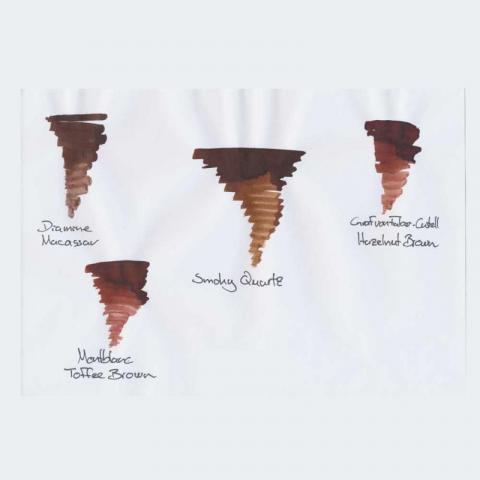
The new Pelikan Edelstein Ink of the Year 2017 Smoky Quartz has arrived today. We have made a quick comparison with other known brown inks. The color is not as warm/red as the Hazelnut Brown by Graf von Faber-Castell or the Toffee Brown by Montblanc: The closest match we have found is the Diamine Macassar. The Smoky Quartz is a very nice brown ink which is a really nice addition to the Edelstein ink offer. Best regards
- 47 replies
-
The other day I was reading the compact review of Pelikan Edelstein Smoky Quartz by member Jan2016... https://www.fountainpennetwork.com/forum/topic/320111-pelikan-edelstein-smoky-quartz-compact-review/ ...and I noticed that one person said that they do not like any of the inks sold by Pelikan. That intrigued me, because (IIRC) every time I have seen Pelikan Edelstein Topaz mentioned on here, the person mentioning it was doing so because they like - or even strongly like- that ink. As far as I can remember, I cannot remember ever seeing such unity of positive opinion about an ink. So, just to satisfy my curiosity, are there any of you reading this who dislike Edelstein Topaz? Or even only feel 'meh' about it? My thanks to you in advance for your replies. Cheers, M.
-
What Pelikan Edelstein Ink Colors Do You Buy Most Frequently
Denizzz posted a topic in Inky Thoughts
Hey Guys, i wonder what are most popular colors of Pelikan Edelstein these days. Got the chance to try out the Pelikan Edelstein Aquamarine, love the colour, thought i would ask which colors of Edelstein do you buy more frequently. Thanks! -
(P)Ink Shoot-Out : Callifolio Andrinople Vs Edelstein Turmaline
namrehsnoom posted a topic in Ink Comparisons
(P)ink Shoot-Out : Callifolio Andrinople vs Edelstein Turmaline Given that today is Valentines Day, I thought it would be fun to pitch a fight between two inks that are definitely up to the occasion. And what a surprise ! These turn out to be pink inks ! I’m not a pink ink person myself, but these inks crossed my path and somehow stuck in my collection. The inks entering the arena today are L’Artisan Pastellier Callifolio Andrinople and the Pelikan Edelstein Ink of the Year 2012 Turmaline. Both are really vibrant super-pink inks that I would normally dislike, but these two have a certain “je ne sais quoi” that turned my eye. The date being what it is, I thought it would be a perfect time to do a detailed comparison, and find out which of these inks I like the most. Enter... the Ink Shoot-Out. A brutal fight spanning five rounds, where heavyweight inks do battle to determine who is the winner. In the left corner – la petite Française Callifolio Andrinople. In the right corner, das Deutsche Fraulein Edelstein Turmaline. Which champion will remain standing at the end of the fight ? Let's find out... Round 1 - First Impressions Both inks are an eye-searing super-pink. The inks pop from the page – pink and proud – waiting for some joyful writing or drawing. Both are lovely, but there are some differences: The Edelstein ink is more saturated, leaving a well-defined line when writing.Edelstein Turmaline is also very well lubricated, making your pen glide over the page. In contrast, Callifolio Andrinople writes much drier with noticeable feedback from the paper.Callifolio is a more reddish purple, which in my opinion looks more appealing. I like the fact that the colour is more subdued (if it’s possible to say this of a pink ink).Evaluating this round, I find that the French girl has the looks, the German girl the moves. In my opinion, this evens out. For this round, it’s the judge’s opinion that both champions are on par with each other, resulting in a draw. Round 2 - Writing Sample The writing sample was done on Rhodia N°16 Notepad with 80 gsm paper. Both inks behaved flawlessly, with no feathering and no show-through or bleed-through. Pelikan Turmaline wrote like a dream, with very good ink flow and lubrication, and leaving a well saturated line. In contrast, Callifolio Andrinople is much less lubricated, and feels much drier. It also has visibly lower saturation. The Callifolio ink needs broader nibs for a satisfying writing experience. Turmaline on the other hand writes perfectly fine even when using an EF nib. Colourwise both inks look very similar in writing, the reddish undertones of Andrinople becoming more apparent in the broader nibs. Both inks also exhibit some nice and classy shading. The shading is not very prominent – ranging from rose to pink – but it’s definitely present, and enhances the character of your writing. For this round, the focus is on writing, and here the German ink clearly has the upper hand. A solid win for Pelikan Edelstein Turmaline. Round 3 - Pen on Paper This round allows the batlling inks to show how they behave on a range of fine writing papers. From top to bottom, we have : FantasticPaper, Life Noble, Tomoe River and Original Crown Mill cotton paper. All scribbling and writing was done with a Lamy Safari M-nib. Both champions did well, with no show-through nor bleed-through. But this round is not about technicalities, it is about aesthetics and beauty. Are the fighters able to make the paper shine ? Well – the choice is difficult and highly personal (almost a blonde vs brunette thing). In my opinion, Callifiolio Andrinople is the more beautiful of the champions – I find its more reddish appearance much more appealing. The only exception is with Tomoe River paper, where I prefer the looks of Edelstein Turmaline (on this paper it’s a really striking and vibrant pink). For this round, Andrinople gets the upper hand and is granted the victory. Round 4 - Ink Properties Both inks have drying times in the 20-25 second range on the Rhodia paper, with Andrinople the quickest-drying of the two. Both inks also do fine on the smudge test, where a moist Q-tip cotton swab is drawn across the text lines. There is some smearing, but the text remains perfectly legible. The smearing is more prominent though for the Edelstein ink. For the droplet test, I dripped water onto the grid and let it sit there for 15 minutes, after which I removed the water droplets with a paper kitchen towel. Neither of the champions exhibits good water resistance – all that lovely pink writing just disappears, leaving only smudges ! The Pelikan ink leaves some traces of the original though, which might be reconstructed with a lot of patience. The chromatography shows that Turmaline leaves a greyish residue – as was apparent in the droplet test. You can also clearly see that Turmaline is a more intense pink, and one with a surprisingly complex chemical composition (notice the very water-soluble yellow and light-grey components at the top). With Andrinople, the chroma shows the more prominent existence of the red undertones. In this round, both inks show more or less the same behavior. Andrinople dries a bit quicker and is a bit more smudge-resistant. On the other hand, Turmaline is more soak-resistant (in comparison with Andrinople that is – both inks score very low for water resistance). There is no clear winner in this round. Round 5 - The Fun Factor Welcome to the final round. Here I give you a purely personal impression of both inks, where I judge which of them I like most when doing some fun stuff like doodling and drawing. Both inks do well, and the lack of water resistance allows for nice effects when using a water brush. I really enjoyed using them. Pelikan Edelstein Turmaline was easier to draw with using a fountain pen – no doubt owing to its better lubrication. When using a brush or dip pen, you won’t notice the drier feel of Callifolio Andrinople though. On the other hand, I really like the somewhat more reddish appearance of Andrinople. On the light side of these inks’ colour spectrum, they produce an almost identical light-rose colour. It’s only on more saturated parts that Turmaline shows it’s more pinkish nature. I really wanted a clear winner for this round, but in all objectivity I have to admit that both inks were on par with each other. Both inks dealt some good punches, but neither of them dominated the fight. I had a great time using them both ! So for this round, I have no other choice than to declare a draw. The Verdict Both inks are joyful, lively and vibrant pinks that are guaranteed to bring colour to your page. For writing – Pelikan Edelstein Turmaline is technically the superior ink. In the looks department, I definitely prefer Callifolio Andrinople myself. In this fight, both champions put on their best show, but in the end no clear winner emerges. So – as a first in this shoot-out series – I leave it up to you to pick your winner. If you prefer blondes, go for Pelikan Edelstein Turmaline. If you prefer brunettes, the French ink Callifolio Andrinople is an equally good choice. And in case you’re interested: my own vote goes to Callifolio Andrinople ;-) Postscriptum: in case you want to buy a bottle – be aware that Pelikan Edelstein Turmaline was a limited edition ink that is no longer produced. You can still pick up a bottle of Andrinople though, and use the occasion to explore some other Callifolio inks. I’ve done so myself, and never regretted it.- 4 replies
-
- callifolio
- andrinople
-
(and 3 more)
Tagged with:
-
Ink Shoot-Out : Pelikan Edelstein Aquamarine Vs Pilot Iroshizuku Ku-Jaku
namrehsnoom posted a topic in Ink Comparisons
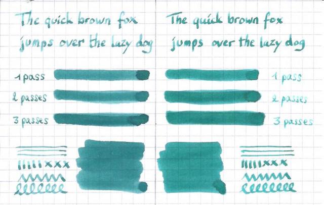
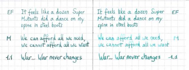
Ink Shoot-Out : Pelikan Edelstein Aquamarine vs Pilot Iroshizuku ku-jaku When playing around with the new Pelikan Edelstein Ink of the Year 2016 Aquamarine, I couldn't help but notice its similarities with that other blue-green Pilot iroshizuku ku-jaku. The idea arose that it would be fun to put these inks into close comparison, and find out which of them I like the most. Enter... the Ink Shoot-Out. A brutal fight where two inks do battle for four rounds, after which the winner is announced. In the left corner - the challenger: Pelikan Edelstein Aquamarine. In the right corner - the reigning champion: Pilot iroshizuku ku-jaku. Which champion will remain standing at the end of the fight ? Let's find out... Round 1 - First Impressions Both inks make a very fine first impression. I really like their colour - both of them are a nice blue-green of green-blue, which gives them something of an exotic look. The inks seem evenly matched, but nevertheless there are some differences: iroshizuku ku-jaku is a bit more saturated, which gives it a richer feelthe shading on iroshizuku ku-jaku is more evenly spread across the lines, which makes for a more aesthetic lookku-jaku is a tad more blue than the edelstein aquamarine. For me personally, this makes it look nicerThe is no obvious win by knock-out in this round, but the iroshizuku ku-jaku wins this round on points. Round 2 - Writing Sample I did the writing sample on a Rhodia N°16 Notepad with 80 gsm paper. Both inks behave perfectly, with no feathering and no show-through nor bleed-through. With the EF-nib, the Edelstein Aquamarine was on the dry side, while the iroshizuku ku-jaku had no problem with the finer nib. I will not hold this against the Edelstein ink - once you know that it writes a littly drier, you can simply adjust to a broader nib size. With a fine nib e.g. the Edelstein Aquamarine behaved just fine. In this round, the champions are evenly matched. Let's call it a draw. Round 3 - Ink Properties Both inks have similar drying times in the range of 15 to 20 seconds on the Rhodia paper. Both inks also behave admirably on the smudge test, where a moist Q-tip cotton swab is drawn across the written word. For the droplet test, I drippled water onto the grid, and let it sit there for 15 minutes, after which I removed the droplets with a paper towel. On this test, I find that the Edelstein ink has better water resistance. The original lines are better preserved, and much less smeared than with the iroshizuku ink. The difference between the champions is minimal, but this round goes to the German champion - on points. Round 4 - the Fun Factor Welcome to the final round. This is a purely personal impression of the inks, where I judge which of them I like most for doodling, drawing, and just doing some fun stuff. Here I must say that I like the iroshizuku ku-jaku much better than the newer Edelstein Aquamarine ink. I find that the iroshizuku ink flows a bit wetter, making it easier to draw with. And I also like that ku-jaku is a bit more on the blue-ish side. My guess is that - in the future - I will reach faster for my bottle of iroshizuku ku-jaku, and will use the Pelikan Edelstein Aquamarine less often. The Verdict Both inks are wonderful additions to my collection, and both are certainly very well-behaving inks with a lovely blue-green colour. But in the end, I find that Pilot Iroshizuku ku-jaku has the edge over the newer Pelikan Edelstein Aquamarine. As far as I'm concerned, iroshizuku ku-jaku has won this shoot-out on points, and remains the reigning champion !- 30 replies
-
- edelstein
- aquamarine
-
(and 2 more)
Tagged with:
-
You may have gathered from the title that I am not that fussed on Edelstein's Mandarin. When I first saw it I thought, 'Oh, a truly popping orange', but that thought was rapidly replaced with a retina burning headache. I tend to like reds and oranges, but I like them to have a little subtlety about them and not quite 'true' in their colour spectrum (if that makes sense). Iro's Yu-yake, the Fuyu-gaki, Noodler's Apache Sunset, couple of the Diamine oranges, Herbin's Orange Indien; you get the idea, I like reds and oranges. Mandarin seemed like a great choice, but in a very short time I grew to truly loathe it. I even contemplated throwing it down the sink just so I could use the bottle for something else. Then I had a brain wave. Why don't I add a few drops of Edelstein's Onyx Black? So, three small drops later and with dip pen in hand I tested it. It's a little similar to Apache Sunset. Now bear in mind I tested this with a dip pen on highly absorbent paper. At first it was extremely similar to the Noodler's, but as it dried the shading disappeared (not unexpected with this ink). Dried and unshaded you are left with a rich orange saffron with a noticeable red aspect. It still 'pops', but it isn't headache inducing and it has left me with an ink that I can now happily use. I will try and get a pick uploaded later. Just thought I would let you all know in case, like me, you had contemplated ditching the ink, or wondered how on earth you might ever use it.
-
Ink Review : Pelikan Edelstein Topaz Pen: Pelikan M120 Green-Black Special Edition, F-nib Paper: Rhodia N°16 notepad 80 gsm Review In 2011 Pelikan introduced the Edelstein series of boutique inks, available in a variety of colors. The theme of the Edelstein concept is the gemstone - each color corresponds to the beautiful color of a gem. The inks themselves are presented in 50ml high-value bottles, which are truly beautiful, and worthy of a place on your desk. Here I review the color Topaz - a really nice cerulean blue, which reflects the color of a morning-sky. This truly is a stunning color, similar to iroshizuku kon-peki, albeit a tad lighter in color. I'm in love with this ink - it's a happy color, which gives me a vacation-like feeling. It's a true light-blue ink, which clearly shows in the chromatography. It seems to be a single-component dye. Topaz exhibits some really nice shading - but the shading remains subtle, resulting in a pleasing and highly aesthetic look. Love it ! The ink is - in my opinion - a bit too dry for an EF nib, but looks and writes great in F, M and B. The ink is a bit too exotic for the workplace, but great for journaling and especially so for drawing and doodling - just look at my starry friend in the handwritten review below ... that's a happy topaz fellow ;-) Topaz is a well-behaving ink on a variety of paper - even on cheaper paper like Moleskine or regular notepad paper. The ink is smudge-resistant, but I wouldn't call it water-resistant. With a good soak, almost all of that lovely color disappears, but a perfectly readable residue remains (even after 30 seconds of running tap water). Not really visible in the scan, but you can trust me on this - you will be able to reconstruct your precious writing. Rhodia N°16 notepad 80 gsm - drying time ~20 seconds, no feathering, no show-through nor bleed-throughPaperblanks journal paper - drying time ~10 seconds, no feathering, no show-through and no bleed-through. The color looks really beautiful on this ivory paperGeneric notepad paper 70 gsm - drying time 5-10 seconds, no feathering, some show-through and bleed-throughMoleskine journal - drying time ~5 seconds ! No visible feathering, very prominent show-through and bleed-throughThis ink dries superfast on cheaper paper - that's probably why there is no feathering visible... the ink is just drying too fast for it to spread. Very good behavior on the cheap paper - just use one side only due to the significant show- and bleed-through. And even though it dries superfast, this doesn't seem to affect the writing experience, which remains smooth. The ink is really well lubricated. Conclusion Pelikan Edelstein Topaz is a definite winner. A stunning color, nice shading, and good behavior on a wide range of paper. Suggestion - try this ink on a more yellowish paper... pure loveliness ! If you don't own a bottle, I just have one word of advice: buy one now, you won't regret it. my overall score: A+
-
Hello friends, At Iguana Sell, we have some more good news from Pelikan to share with you! This time Pelikan dazzles us with its new 2016 colour: THE Ink of the Year 2016- Aquamarine Among the models that integrate this Edelstein Ink Collection, the Aquamarine is the favourite to represent this new year. This beautiful colour, between blue and green, is full of power and elegance. The responsables of electing this gorgeous color were the fans of the brand in Facebook! In addition to the beautiful tone, this Edelstein Inks are characterized by the special ingredients they use that ensures an smoothy writing. If you need any additional information, please contact with us to info@iguanasell.com or at +34 91 441 50 41. It will be our pleasure to assist you! Have a lovely day! Kind regards, Gabi Iguana Sell
- 10 replies
-
- 2016 colour
- pelikan
-
(and 2 more)
Tagged with:
-
A while back, Pelikan introduced its Edelstein line of "boutique" inks in fancy bottles. I had looked at reviews and found many that were quite dismissive of this line. Perhaps people were expecting a Noodler's or Private Reserve from Pelikan. I don't know if the inks themselves have been re-formulated since their initial launch or not. But because the Edelsteins didn't get no respect, and were quite pricey, I bought other inks that seemed to have a better reputation. Recently I picked up Pelikan Edelstein Tanzanite, as I wanted a fairly "safe" ink for a (for me) pricey Pelikan pen, and I'm a fan of blue-blacks anyway. Well, I think this ink rocks. It has great flow, excellent saturated color, fabulous handling. As I say, I don't know if the ink has changed, but the one review I found people seem to have varying opinions. I like the ink. I don't know how the other inks in the line are, but this one is worthy of consideration. Of course, if you like dark blue ink. As usual, the papers are MvL=Mohawk via Linen, Hij=Hammermill 28lb inkjet, TR=Tomoe River. The colors are fairly close to accurate. The ink is not very water resistant, but the heavy dye load means there's something left on the paper. I don't not have an ink blot for this one, I forgot.