Search the Community
Showing results for tags 'eclat de saphir'.
-
J Herbin Éclat de Saphir (Cartridge) Thanks to @Lithium466 for the cartridge. It’s difficult to review an ink which leaves your indifferent, when writing with. However, I truly enjoyed drawing and doing washes with it. It’s an happy blue It’s like most Herbin inks, it doesn’t like copy paper. I didn’t bother to ink up a flex nib for this one, and @LizEf has done an excellent review of this ink for a Japanese Ef nib. Let's start with the lovely chroma: Writing Samples: Photo: Comparison: Water test: and finally an artwork, Loving Blue The background is Éclat de Saphir, the darker blue is J Herbin Bleu Myosotis, and the outlines are done with Noodler's Polar Brown. and this one was done in homage of @LizEF new kitten, Smoke: the other inks are: Sailor Kiwa guro (Cats J Herbin Bleu Myosotis (Water) J Herbin Éclat de Saphir (Bathtub) J Herbin Bouton d'or Noodler's Polar Brown · Pens used: Kaweco (EF/F/M/B, BB) · What I liked: Chroma, Doing washes. · What I did not like: Writing with it. · What some might not like: The colour · Shading: I didn’t see much. · Ghosting: Yes, on cheap paper. · Bleed through: Yes, on cheap paper. · Flow Rate: Wet · Lubrication: A bit on the dry side · Nib Dry-out: Did not notice. · Start-up: Ok · Saturation: Pastel royal blue · Shading Potential: Nope. · Sheen: No. · Spread / Feathering / Woolly Line: Did not notice. · Nib Creep / “Crud”: Did not notice. · Staining (pen): No. · Clogging: Did not notice. · Cleaning: Easy · Water resistance: Ok · Availability: cartridges, 10 ml, 30 ml bottles. Please don't hesitate to share your experience, writing samples or any other comments. The more the merrier
- 14 replies
-
- j herbin
- eclat de saphir
-
(and 1 more)
Tagged with:
-
J. Herbin - Éclat de Saphir La Société Herbin, Maître Cirier à Paris, was established in 1670. This makes J. Herbin probably the oldest name among European ink makers. Today, Herbin produces a range of beautiful fountain pen and calligraphy inks, writing instruments, gift sets and accessories. Herbin inks are made in France, and the finishing touches on the bottles are still done by hand in Paris. J. Herbin is probably best known for their inks in the "La Perle des Encres" series. In this review, I take a closer look at Éclat de Saphir - a good-looking blue-with-a-bit-of-purple ink, that to my eye belongs to the Royal Blue / Sapphire Blue family of colours. The ink writes very purple when wet, but quickly dries to a standard royal-blue colour, with the purple still there just below the surface. The ink is quite saturated, and works well with all nib sizes and with all types of paper (white as well as more yellow ones). Shading looks best in M-nibs and broader, but remains subtle without too much contrast between the light and darker parts. Quite nice. The ink has excellent lubrication, even in drier pens like my Lamy Safari. With wetter pens like my Pelikan M120 with M-nib, the ink leaves a very saturated blue line, and in the process loses most of the shading. My guess is that with wetter pens, you need broader nibs to bring out the shading again.. To illustrate the colour span of Éclat de Saphir, I did a swab on Tomoe River paper where I really saturated portions of the paper with ink. This perfectly illustrates the ink's colour range, which moves from a fairly light to a really dark royal blue. The purple undertones surface most easily in the lighter parts of the swab. On the smudge test - rubbing text with a moist Q-tip cotton swab - the ink behaved perfectly, with only minimal smearing. Water resistance is not so good: the ink disappears quickly from the page, but leaves behind a ghost image of the original text, which can still be read when using some effort. Your writings will not be lost, but it's definitely not a water-resistant ink. Éclat de Saphir dries fast on all my test paper, typically in the 5 to 10 second range. That was a surprise, because it writes with a really wet line - I would have expected longer drying times from this ink. I've tested the ink on a wide variety of paper - from crappy Moleskine to high-end Tomoe River. On each scrap of paper I show you:An ink swab, made with a cotton Q-tip1-2-3 pass swab, to show increasing saturationAn ink scribble made with a Lamy Safari M-nib fountain penThe name of the paper used, written with a Lamy Safari B-nibA small text sample, written with an M-nibDrying times of the ink on the paper (with the M-nib)Éclat de Saphir looks great on both white and more yellowish paper. I didn't detect any noticeable feathering, only with the notoriously bad Moleskine paper some barely visible feathering is present. With the lower quality papers in my test set (Moleskine, Generic paper), there is however significant show-through and a tiny bit of bleed-through. You can check this for yourself at the end of the review, where I show the backside of the writing samples. Writing with different nib sizesThe picture below shows the effect of nib sizes on the writing. All samples were written with a Lamy Safari, which is typically a dry pen. I also added a visiting pen - a wet Pelikan M120 with an M-nib. Here the ink leaves a very saturated dark-blue line, taking away most of the shading that shows up with drier pens. The ink contrasts very well with the paper, even in my EF nibs. With run-of-the mill office paper, you typically need smaller nib sizes to compensate for the lower quality of the paper. Combine this with fast drying times, and you have an ink that is quite at home for office-related note-taking. And even though Éclat de Saphir looks like a standard Royal Blue, there remains that purple undertone that makes it just that bit more interesting. Related inksTo compare Éclat de Saphir with related inks, I use a nine-grid format with the currently reviewed ink at the center. This format shows the name of related inks, a saturation sample, a 1-2-3 swab and a water resistance test - all in a very compact format. I hope that you'll find this way of presenting related inks useful. It's a bit more work, but in my opinion worth the effort for the extra information you gain. Inkxperiment - Visit to the Lands of FaerieAs a personal challenge, I try to create interesting drawings using only the ink I'm reviewing. I find this to be a fun extension of the hobby, and these single-ink drawings often present a real challenge. It also gives you an idea of what the ink is capable of in a more artistic setting. For this abstract landscape, I experimented with using HP premium photo paper as a medium. I started off by wetting portions of the paper with water, and drawing in the horizon line with the trees and parts of the foreground. The water on the photo paper lets the ink bleed out nicely. I then applied some bleach - purely as an experiment to bring in some highlights. Next I completely submerged the paper in water, and added some drops of ink. This reacted nicely with the photo paper, resulting in the light blue-purple haze that covers most of the drawing. Once dry, I painted in the fence and little girl in the foreground. I quite like the end result, which shows off the eery magic of Faerie land. You also get a good idea of what Éclat de Saphir is capable of in a more artistic setting. ConclusionJ. Herbin Éclat de Saphir has a royal blue style colour with a definite purple undertone. The ink works great with all paper types, is well saturated, and shows good contrast with the paper even in the finest nibs. This is an excellent choice of ink for use at the office - not too extravagant, but still playful with that purple undertone just below the surface. Personally, I'm not particularly fond of this type of blue - but there's no denying that this is a very good ink. If you like the colour, you will not be disappointed if you give Éclat de Saphir a try. Technical test results on Rhodia N° 16 notepad paper, written with Lamy Safari, M-nib Backside of writing samples on different paper types
- 6 replies
-
- j. herbin
- eclat de saphir
-
(and 2 more)
Tagged with:
-
I have decided to review some of my many inks. These aren't necessarily in any particular order. This one is J Herbin Eclat de saphir (Sapphire blue): Eclat de saphir (Sapphire blue): Sapphire is a gemstone. The terminology probably comes from 2 origins: the Greek with “sappheiros” (a stone of blue color) or from the Hebrew “sappir” (the most beautiful thing). This color is a reminder of J. Herbin and his work at the most prestigious royal courts of Europe. From the beginning, J. Herbin distinguished itself from its competitors by offering a wide range of colors for the fountain pen inks. In 2007, 4 new colors were introduced which brought a total of 30 references of various colors. The names chosen for each color are very poetic to preserve the originality of the brand and as a French tradition. This isn't a waterproof or an archival inkBearing in mind the paper I use is very smooth, this ink took 13-16 secs to dry.It flows well and lubricates the nib quite well.It is currently available in sampling packs of 4 x 10ml mini glass bottles and 30ml D bottles. Each bottle of 30 ml has an integrated pen rest. They are known as “D bottle pen inks. The “D” refers to the old French unit of measure “la Demi Courtine”.It's available from many B&M shops and online retailers worldwide. J. Herbin is the oldest name in pen inks in the world. M. Herbin created “The Jewel of Inks” in his shop on the Rue des Fosses Saint-Germain in Paris in 1700. Herbin uses all natural dyes in their fountain pen inks. This natural composition is reflected in the very neutral pH of the inks.
- 10 replies
-
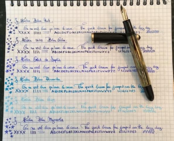
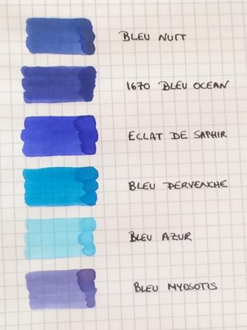
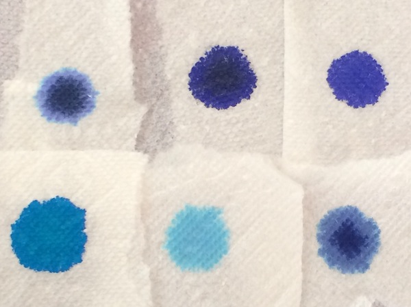
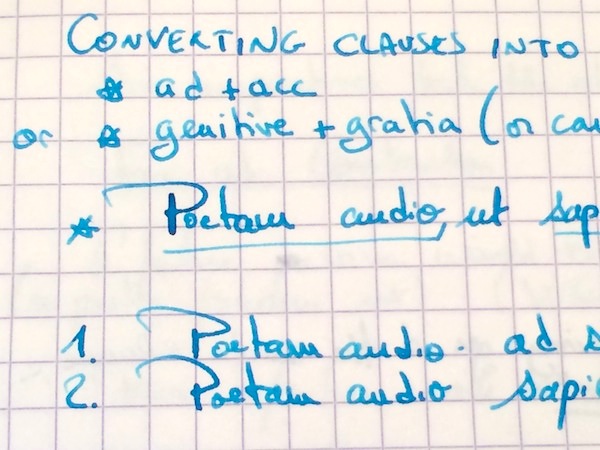
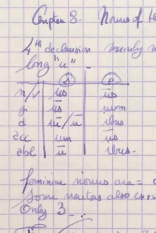
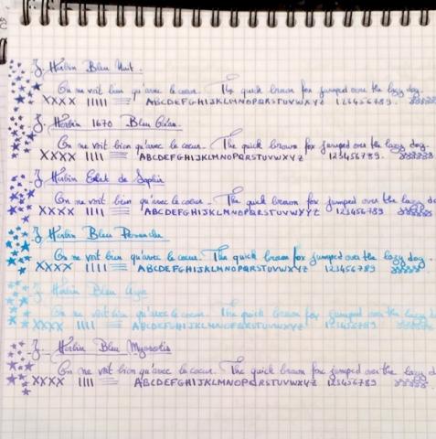
I love inks that are wet and easy to clean, so I’ve accumulated more than half of the Herbin line. And, blue is the color I use most often in my daily writers, so I thought it would be fun to do a comparison of the Herbin blues: Bleu Nuit, 1670 Bleu Ocean, Bleu Pervenche, Bleu Azur, Bleu Myosotis and Eclat de Saphir. I use all of them regularly with the exception of Bleu Azur (which I ordered a sample of to add to this comparison). The comparison was done using a Pelikan 400NN F nib on Rhodia. Ink Swabs: Ink on Paper Towel: Top Row: Bleu Nuit, 1670 Bleu Ocean, Eclat de Saphir Bottom Row: Bleu Pervenche, Bleu Azur, Bleu Myosotis As with most Herbin inks, all 6 blues are all extremely easy to clean, have never stained any of my pens, are wet and very well behaved (immediate start-up in a pen left uncapped for over a minute, no performance issues even after sitting in an unused pen for a couple of days and no skipping noticed in any pen that I’ve put them in.) Yet, as with any brand, these blues are not all created equal and differ considerably in the lubrication/smoothness they provide. So, my ranking of the inks (in addition to personal color preference) is greatly determined by this factor, since I enjoy using smooth inks: 1. Eclat de Saphir 2. 1670 Bleu Ocean 3. Bleu Pervenche 4. Bleu Myosotis 5. Bleu Nuit 6. Bleu Azur (I've included additional writing samples from my notebook to show color variation in different pens. Please excuse the Latin class notes and the nonsensical doodles ) 1. Eclat de Saphir This has become one of my benchmark inks as it has performed exceptionally well in every pen that I have put it in, and I usually have the most fun playing with a nib when a pen is inked with it. It offers some shading which appears to be determined more by the flexiness and wetness of the nib than the actual composition of the ink. In some of my pens Eclat de Saphir is a soft blue with violet undertones while in others, the wetter writers, the color is a truer, more intense jewel like blue. Although less smooth/lubricated than the 1670 Bleu Ocean, writing with the ink feels good, and all of my pens seem to reach their full performance potential (on Rhodia) when inked with this blue elixir. I imagine that a nib filled with Eclat de Saphir must feel as limber and free as the body/mind post a good yoga class! This is one of my top 3 inks and if the entire Herbin line performed the same way I would have trouble using any other brand. Lubrication: Good 2. 1670 Bleu Ocean This ink’s biggest appeal is its smoothness/lubrication, which surpasses all other Herbin blues, and is unlike any other Herbin ink I’ve tried in that regard. In some wetter nibs some might even consider Bleu Ocean to be too smooth. In fact, in the wet 1950s 146, the best comparison I can give to writing with this ink is the rush one gets from skating on slightly wet, freshly cleaned ice. The color is a dark blue with purple undertones and minimal shading. The ink can appear dull/muted in a drier nib or beautifully saturated in a wet writer. Yet, despite that saturation, it cleans out effortlessly even from high maintenance pens. Lubrication: Very good 3. Bleu Pervenche I have a huge weakness for turquoise ink and recently tried about 15 of them in hopes of finding the perfect one. Although Bleu Pervenche was not my first ranked turquoise based on color (Rohrer and Klingner Blu Mare wins hands down for me in that category!), Bleu Pervenche is the one I turn to most often because it provides the most fluid writing experience out of the samples I tried (which also included Omas, Visconti, Montblanc, Diamine, Monteverde, Pelikan, Waterman...). I would have liked for it to feel even a tad smoother (like Eclat de Saphir), and if it did I would have ranked it above Bleu Ocean, but overall this is a beautiful ink. Lubrication: Ok to good 4. Bleu Myosotis This color comes to life not when the ink first meets the page or even immediately after it has dried. Days later, it evolves into a very soft blue that sits between a cool, silvery grey and a subtle violet; the color is on the lighter side but remains perfectly legible and for some reason reminds me of the ink that a winter fairy would use (all it needs is silver shimmer...) Shading is higher than the previous three blues and, combined with the faded color, gives the ink a nice vintage quality. Lubrication: Ok to good. 5. Bleu Nuit I want to like this ink more than I do. Bleu Nuit is more of a blue grey than a blue black and shades beautifully (more than any of the other Herbin blues). Yet, whenever I use this ink, I usually like the color and the shading for about half a page and then get bored with it. Another area where the ink falls flat for me is its lubrication. This is one of the wettest inks of the bunch, but not in a good way; it does not provide the smooth, silky wetness I enjoy writing with but rather a kind of thin, watery flow. Lubrication: Ok (mainly due to extreme wetness of ink) 6. Bleu Azur I cannot really comment much on this ink, because I only used it for the writing sample in this comparison, but in that brief moment, I did not enjoy using. It felt thin and watery with even less lubrication than Bleu Nuit. On Rhodia, the color is so light that I could never use it in a daily writer. However, I will say that, when painted on the paper with a q-tip, the color is beautiful, so Bleu Azur could make for a wonderful light blue ink for anyone who uses fountain pen inks to draw, paint... Lubrication: Poor
-
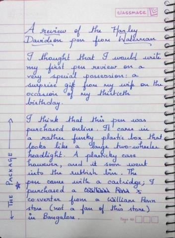
A Review Of The Harley Davidson Pen From Waterman
aswinsainarain posted a topic in Fountain Pen Reviews
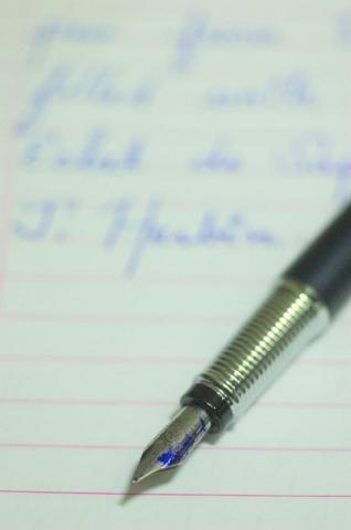
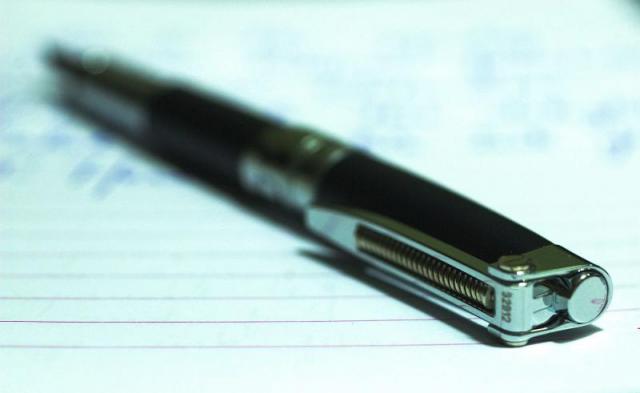
This is my first review here and I thought I would do a hand-written one. Unfortunately, my scanner has broken down and the images below are snaps taken with my mobile phone camera. A couple of the close-up pen shots were taken with my Nikon D-SLR and a Macro lens. I struggle to give marks, and have restricted myself to giving stars (3 stars being the best). I have also uploaded this material to a new blog I have started, on the insistence of a colleague (http://fpensnme.blogspot.in/).- 8 replies
-
- waterman
- harley davidson
-
(and 1 more)
Tagged with:
-
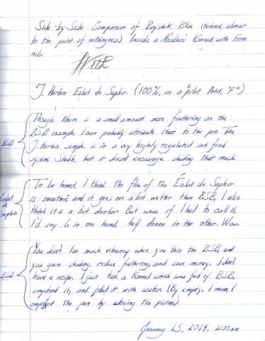
When I first got into fountain pens, I bought ink because I liked the color, or (often) because I liked the philosophy behind the company that made it, (Mr. Tardiff is an individualist after my own heart.) however, I never would have guessed before I found this forum that there could ever, EVER be a fountain pen ink that could be called, for lack of a better term, "controversial". I suppose anything that arouses strong emotions might be worth getting into a tizzy for, and we pick colors because we like them, so I guess I shouldn't be too surprised, considering how strongly practically everyone feels about Baystate Blue. It's got to be the most vibrant, delightful color I own. Well, I'm tired of people ragging on Baystate Blue, so I did this dilution to show that it can be tamed, if you're having trouble with it. As I said, I love the color, but it feathers anywhere from ever-so-slightly to badly on my Clairefontaine (90gsm), Fabriano (85gsm), and Staples Bagasse (the stuff is practically see-through, but handles fountain pen ink well), as well as my hand-picked Norcom notebook material. However, I want to show you that by diluting it, you can make it perform splendidly. I got a sample of Éclat de Saphir a long while ago, and I've been using it in a Pilot Petit1, and from the moment I first saw it, I've been thinking "this looks just like a thinned out Baystate Blue", it doesn't have the vibrancy, but it does have excellent performance on cheap papers (most of what I use at work, sadly) so at last, I did a side by side comparison, and I'm quite happy. The paper I did this on came from a 50¢ Norcom notebook I pulled from Walmart. Good lord. Short of a napkin, it doesn't get much thinner/cheaper than this. Notes: This is not scientific, since I didn't perform these samples in the exact same pen, but the performance is highly comparable, I think. The tiny cutoff is some noodling I did with a few different blues. The "Baystate Blue thinned" is the thinned result. The paper is 90gsm Clairefontaine.
- 13 replies
-
- baystate blue
- eclat de saphir
-
(and 2 more)
Tagged with:

