Search the Community
Showing results for tags 'ebonite feed'.
-
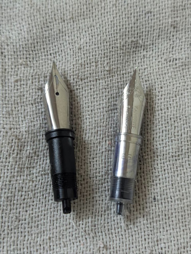
It recently came to my notice that kanwrite has started to provide #6 nib units for cartridge converter pens with an ebonite feed... Available in JoWo and Bock threading, here's a comparison with a standard JoWo nibs unit. The feed seems to be the same as the standard kanwrite ebonite feed for eyedropper pens, the difference being the tail for accepting a cartridge or converter. I think it'll be a great choice for flex nib users or for people who want a wet flowing pen... My only gripe is that the fins/horizontal channels could be a bit more deeper. Have a great day. Regards, Aravind
- 3 replies
-
- ebonite feed
- kanwrite nib
-
(and 1 more)
Tagged with:
-
From the album: Size and shape comparisons
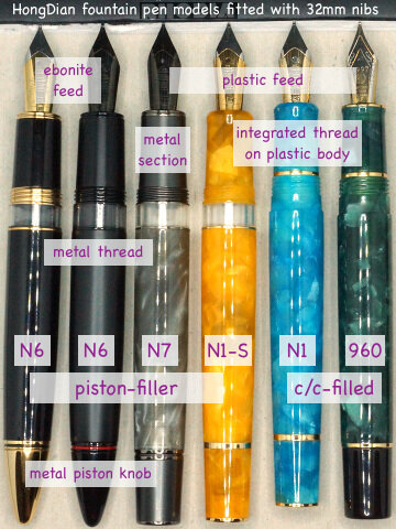
Even though these models have nominally size #6 nibs, don't expect easy nib interchangeability with other (also nominally) size #6 nibs:
- 0 B
- x
-
- hongdian 960
- hongdian n1
- (and 6 more)
-
desaturated.thumb.gif.5cb70ef1e977aa313d11eea3616aba7d.gif)
Santini Calypso Mother-of-Pearl piston-filler
A Smug Dill posted a gallery image in FPN Image Albums
From the album: European pens
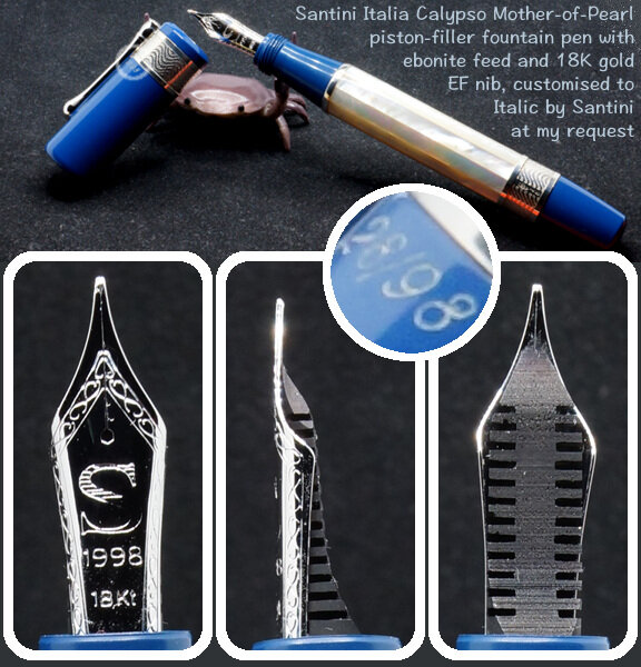
Calypso Mother-of-Pearl piston-filler by Santini Italia, numbered 28/98. Most Santini pen models and colourways are expressly ‘limited edition’, presumably on account of not intending to produce or source more of a particular pattern of acrylic or ebonite for their pen bodies. There are other Santini pen models, for example the Atene, with the same core design; but the Calypso is the only one using mother-of-pearl for the panels on the faceted barrel, bracketed by muted blue ebonite parts of the body.© A Smug Dill
- 0 B
- x
- 1 comment
-
- santini italia
- hybrid body construction
- (and 8 more)
-
desaturated.thumb.gif.5cb70ef1e977aa313d11eea3616aba7d.gif)
Santini Calypso writing sample in Pilot Iroshizuku Asa-gao
A Smug Dill posted a gallery image in FPN Image Albums
From the album: European pens
Produced by this pen: https://www.fountainpennetwork.com/forum/gallery/image/11064-santini-calypso-mother-of-pearl-piston-filler/ Follow-up to: https://www.fountainpennetwork.com/forum/topic/365641-leonardo-mosaico-hawaii-or-santini-michelangelo-the-eagles-wings/#comment-4522716© A Smug Dill
- 0 B
- x
-
- santini italia
- ebonite feed
-
(and 1 more)
Tagged with:
-
Click President... Is the newest model in Click's lineup any good ?
Aravind_A_2310 posted a topic in India & Subcontinent (Asia)
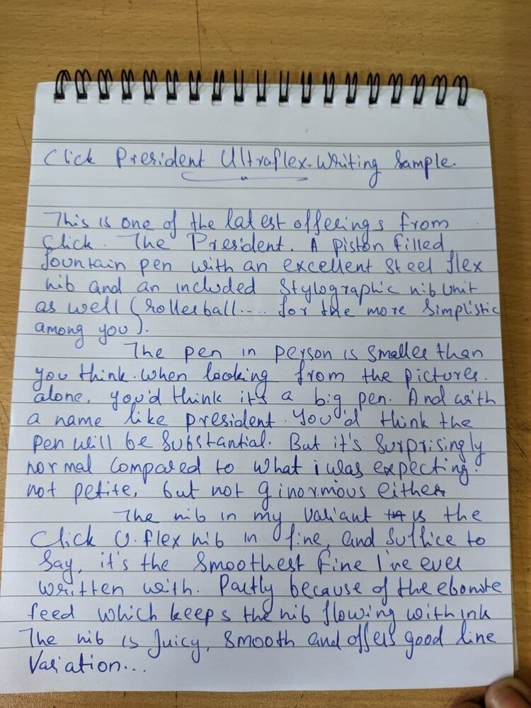
I came to know about this pen on the Inked Happiness website as the new model of Click called the president. When I saw it, I immediately thought, "Well, I liked the FPR Jaipur V2, But I'm not going to pay that much for a pen. At least not just yet. But this looks very similar, I suppose let's give this a shot...". I contacted one of my most frequently contacted Pentailers, Mr. Suresh ji and sure enough, he had gotten stock of this pen. I immediately fell in love with the Dark blue pen with the chrome trims, and decided to pull the trigger on that one, and after a Google pay transaction of Rs.800/-(plus an additional Rs.65/- for shipping) Here we are. For those who don't want to spend the next 5-10 minutes reading this whole thread and want a quick TL;DR, well, here it is. "For the money, this is a very compelling package, the Ultraflex nib is smooth and wet and the included rollerball unit is also a nice touch. A good value for money pen indeed" Now, those who want t get a somewhat detailed walkthrough, let's crack on. Appearance and Build The pen arrived in a good looking cardboard box. it has a cardboard sleeve and a small cutout showing the Click logo foil stamped in gold. Removing the sleeve, you'll find the pen nicely nestled in a die cut foam insert and the included rollerball unit. Overall a good unboxing experience for a relatively premium looking pen. Taking the pen out of the box, and my immediate thought was, "Wow... It's smaller than I expected it to be..." I mean, with a name like president and looking at the pictures Suresh Ji sent me, I thought it'd be a big pen. But I was surprised in seeing that it's size was, well... normal. To put it in perspective, here it is with some other pens that I have: 1. Click President 2. Airmail/Wality 71 JB(RCC/Duos) 3. Kanwrite Desire 4. Parker Vector 5. Airmail/Wality 69 T Coming to the pen itself, well, it's a classic design, reminds me of the aristocrat but with a different design. The pen is available in 5 colors all in a somewhat demonstrator looks in either gold or chrome trims. Nibs are also available in Fine, Medium, Broad and UltraFlex. I chose the Dark Blue with the chrome trims coupled with the UltraFlex nib. And It's and overall handsome looking fella. The chrome trims around the cap, clip and the part just beneath the blind cap at the back are tastefully done and the overall size and feel is just right for me. Coming to what's inside the cap, the nib, it's a screw on Nib unit carrying a No.35 (No.6) size steel flex nib sitting on an ebonite feed. which is a nice touch. the nib seems to be thinner than the standard No.6 nibs I have from Kanwrite and Consolidated. I guess that along with the scalloped shoulders aid in the flex of the nib. The real surprise for me was the included rollerball unit though. It's the first time, I'm seeing a fountain pen coming with a rollerball unit. I mean, the closest I've got to a rollerball fountain pen, is eyedroppering my pilot V7 cartridge pen (Which does work and writes like a dream BTW). Coming to the tail end, here you'll find a blind cap enclosing the piston mechanism. Personally, I'm not very fond of this design as I tend to lose the blind cap, but that might be me refusing to act up on my clumsiness. the piston action is smooth and the whole thing disassembles with ease. The overall build is good but for the price, could've been better. issues like the minor molding flashes on the blind cap threads and requiring a plier to remove the nib unit all of which detracts from the overall quality of the product. In the hand, the pen feels quite good. the grip section could've been an bit longer, but ergonomically, the pen feels good, the girth is just right for my size of hand (slender, long hands). it's a very comfortable writer. Both posted and unposted. But you do need to push the cap with a little force to post securely but the balance still feels a ok. Overall, a very comfortable writer indeed. Writing and Final Verdict The nib I got, was the fine Ultraflex. And surprise to say, it is the smoothest out of the box fine nib I have ever used. the pen just glides and the ebonite feed makes sure that you get a juicy ink supply no matter how much you flex it. The nib while writing normally gets a decent fine line and when you want it, coax the line into a nice double broad line. Though to be fair, I'm not the kind of person capable of exploiting the full potential of this flexible masterpiece. However here's a set of writing samples that shows the flex of the nib to the best of my capability, along with a normal writing sample. The rollerball attachment is also a very good addition, the ball is smooth and provides a light, fatigue free writing experience. So much so, that I'm considering to use the rollerball attachment permanently. Don't get me wrong, I love writing on a iridium nib as much as anyone else in this forum, but for daily use this makes more sense to me. Overall for the final verdict, for the price, this is a good value pen. I'd say, while this might not compete with the build quality of the Kanwrite heritage, I'd still cross shop this with the heritage, for around Rs.700 less, you're getting a similar filling mechanism, Almost the same ink capacity and a variety of nib options. I won't be surprised if click released this to compete directly with the pen from Kanpur. For around Rs.900, it's a damn good pen for an everyday carry. If you've tolerated my loooong (and rather boring) lecture, then congrats!!! Here's a 🥇 . You certainly deserve this. Anyway, dry jokes aside, do sound your opinions below, and I'll see you soon .- 14 replies
-
- click
- piston fill
-
(and 3 more)
Tagged with:
-
desaturated.thumb.gif.5cb70ef1e977aa313d11eea3616aba7d.gif)
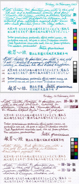
Writing samples from four gold-nibbed Pilot pens
A Smug Dill posted a gallery image in FPN Image Albums
From the album: Nib comparisons
OK, this isn't exactly a fair or methodical comparison of these Pilot pens and nibs, but I just got myself a Pilot 14K gold #10 FA nib again — this time on a used Custom 743, on which a replacement ebonite feed from Flexible Nib Factory is already fitted — and I really wanted to see if this highly sought after nib, which I hated the first time around, actually has anything special to offer now that I have the benefit of two more years' “study” of fountain pens and practice in handling them to appreciate what I may have overlooked back then.© A Smug Dill
- 0 B
- x
- 1 comment
-
- custom 742 fa nib
- custom heritage 91 sfm nib
- (and 7 more)
-
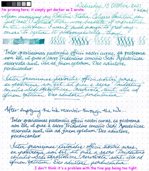
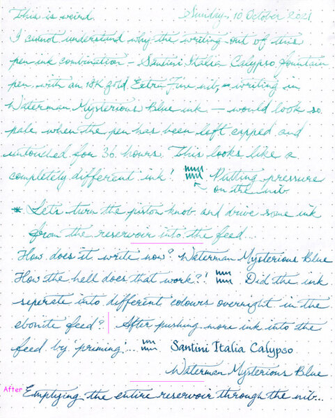
desaturated.thumb.gif.5cb70ef1e977aa313d11eea3616aba7d.gif) I'm at a complete loss trying to figure out why this is happening. The nib unit for my Santini Italia Calypso Mother-of-Pearl pen, which houses a rhodium-plated 18K gold nib and an ebonite feed supporting it, has just been returned to me from Italy after repair. I bought a bottle of Waterman Mysterious Blue ink from a local department store a couple of weeks ago, while the nib was still away. After flushing and drying the nib unit, I decided to fill the Calypso pen with this ‘safe’ ink first, to test how the repaired nib writes. The first few pages of writing samples were sufficiently ‘wet’ on the page, that the ink marks exhibited sheen on Rhodia DotPad 80g/m² paper. I reported back to Santini that the nib is all good, thanks very much; and I set the pen aside — properly capped, of course. I picked up the pen not even two days later, and to my utter surprise, it wrote (“Sunday, 10 October 2021” below) extremely faintly. I thought the ink may have dried out somewhat in the nib and feed the pen was hard-starting, but there was no skipping or breakage in the lines of ink, so that wasn't what it was doing. Pushing the nib a bit harder, I got slightly more colour out of it, but it still looked nothing like Waterman Mysterious Blue ink. Eventually, I primed the feed by turning the piston knob, and the colour became a bit closer to blue (or teal-black). I've marked out in the image below —with straight magenta lines — where or each time I primed the feed. Only after the nib and feed were literally dripping ink (and cleaning it up with a paper towel) did the colour of the writing return to what I thought Waterman Mysterious Blue ink looks like. I emptied the contents of the ink reservoir into a sample vial, then flushed, cleaned and dried the nib unit. After reinstalling the nib, I gave the pen a fresh fill from the same bottle of ink as before, and started a second test sheet to check if the issue persists over the following couple of days. In the meantime, I compared the ink extracted from the pen and the ink still in the bottle by chromatography, just in case something has contaminated or denatured the ink from the first fill after it passed through the nib and feed into the reservoir. Nope, it doesn't appear to be the case. What it does look like, however, is that the blue and violet dyes have somehow been filtered out, such that then nib was only laying down the turquoise dye in the ink when I wrote with it after it was capped for a day or so, as opposed to the ink evaporating and getting more concentrated with dye (thus appearing darker). Can anyone explain what's actually happening?
I'm at a complete loss trying to figure out why this is happening. The nib unit for my Santini Italia Calypso Mother-of-Pearl pen, which houses a rhodium-plated 18K gold nib and an ebonite feed supporting it, has just been returned to me from Italy after repair. I bought a bottle of Waterman Mysterious Blue ink from a local department store a couple of weeks ago, while the nib was still away. After flushing and drying the nib unit, I decided to fill the Calypso pen with this ‘safe’ ink first, to test how the repaired nib writes. The first few pages of writing samples were sufficiently ‘wet’ on the page, that the ink marks exhibited sheen on Rhodia DotPad 80g/m² paper. I reported back to Santini that the nib is all good, thanks very much; and I set the pen aside — properly capped, of course. I picked up the pen not even two days later, and to my utter surprise, it wrote (“Sunday, 10 October 2021” below) extremely faintly. I thought the ink may have dried out somewhat in the nib and feed the pen was hard-starting, but there was no skipping or breakage in the lines of ink, so that wasn't what it was doing. Pushing the nib a bit harder, I got slightly more colour out of it, but it still looked nothing like Waterman Mysterious Blue ink. Eventually, I primed the feed by turning the piston knob, and the colour became a bit closer to blue (or teal-black). I've marked out in the image below —with straight magenta lines — where or each time I primed the feed. Only after the nib and feed were literally dripping ink (and cleaning it up with a paper towel) did the colour of the writing return to what I thought Waterman Mysterious Blue ink looks like. I emptied the contents of the ink reservoir into a sample vial, then flushed, cleaned and dried the nib unit. After reinstalling the nib, I gave the pen a fresh fill from the same bottle of ink as before, and started a second test sheet to check if the issue persists over the following couple of days. In the meantime, I compared the ink extracted from the pen and the ink still in the bottle by chromatography, just in case something has contaminated or denatured the ink from the first fill after it passed through the nib and feed into the reservoir. Nope, it doesn't appear to be the case. What it does look like, however, is that the blue and violet dyes have somehow been filtered out, such that then nib was only laying down the turquoise dye in the ink when I wrote with it after it was capped for a day or so, as opposed to the ink evaporating and getting more concentrated with dye (thus appearing darker). Can anyone explain what's actually happening?- 22 replies
-
- waterman mysterious blue
- ebonite feed
- (and 4 more)
-
desaturated.thumb.gif.5cb70ef1e977aa313d11eea3616aba7d.gif)
Waterman Mysterious Blue weirdness out of my Santini Calypso pen, page 3
A Smug Dill posted a gallery image in FPN Image Albums
-
From the album: Problems
I noticed that my Santini Italia Calypso (piston-filled) fountain pen, which is fitted with an 18K gold nib supported by an ebonite feed, somehow wrote in a very different and, counter-intuitively, much lighter instead of darker colour, after then pen was capped and unused for about a day and a half. The nib unit has just come back from Italy for repairs, and the pen was freshly filled with Waterman Mysterious Blue ink, which I only bought a couple of weeks ago from a local department store. The pen does not have a history of allowing ink to dry out quickly while capped. I decided to empty the contents of the reservoir (into a sample vial), flush and dry the nib unit, and fill the pen anew from the same bottle, to see if the issue persists. (Spoiler: It does.) Chromatographic comparison between the ink in the pen's reservoir after the weird lightening has been seen, and the ink still in the bottle from which the pen was filled in the first place, can be found here: The retest results can be found here: https://www.fountainpennetwork.com/forum/gallery/image/6553-waterman-mysterious-blue-weirdness-page-2/© A Smug Dill
- 0 B
- x
-
-
Those of us who make a habit of checking out products on the Fountain Pen Revolution (FPR) website (fountainpenrevolution.com) will know that things have been fairly quiet there for a while – pens for sale as per usual, but no new updates of their product line. All of that changed in late July when they announced on their Facebook page that they were launching a new, US-based website (fprevolutionusa.com), and a brand new pen – the ‘Himalaya’. I don’t know how I missed this announcement, but when a newsletter arrived in my inbox, advising that the website was now up and running – and offering a 15% discount on all purchases – I was off the mark and running. At the time of writing this review, the Himalaya is only available from the US site, not the India-based site (which still offers cheaper postage to international customers), but I didn’t want to wait, so I ordered – and the pen arrived on 5 September 2016, a little over a week ago. Disclaimer: though I have received free review pens from FPR in the past, this pen was purchased with my own money – in either case, the views expressed in this review are entirely my own. ______________________________________________________________________ 1. Appearance & Design The Himalaya is available in four colours (and two materials): Saffron Acrylic, Taj Mahal White Acrylic, Green Ebonite or Brown Ebonite. I liked the look of the Saffron Acrylic, and ordered a Medium nib with monochrome (stainless steel) finish. Colour aside, the Himalaya is a fairly ‘standard’ looking fountain pen - not too dissimilar in shape and size from the FPR Jaipur, although the cap ‘finial’ is more curved, and the pen body is missing the ‘step-down’ effect produced on the Jaipur by the piston knob. The clip and centre band on the cap look much the same on these two pen models, too. There’s nothing ‘original’ about the Himalaya’s appearance – but (to my eyes) it’s an attractive pen. http://i.imgur.com/LDbrKrM.jpg Can I put in a word here also for the material this pen is made from? I don’t own a lot of acrylic pens (just this one, and two FPR Trivenis), but I find the combination of translucence and pearlescence quite mesmerising. The ‘Saffron’ acrylic used for this pen, especially, is beautiful – I can’t believe it only cost me $29 (plus postage, minus 15% discount…)! … 2. Construction & Quality Despite the delicate appearance of the acrylic material, the pen feels quite sturdy in the hand – as far as I can tell (thus far), it’s neither brittle nor likely to crack any time soon. Everything seems well-finished; the tolerances on the threads are excellent; the finish on the acrylic and chrome accents are all well-finished – no rough edges or discolouration. The clip seems sturdy, and is tight enough to hold the pen firmly in a pocket, but springy enough to be flexible. All in all, a very well made pen. http://i.imgur.com/L6ggXtr.jpg … 3. Weight & Dimensions I think I’d classify the Himalaya as a ‘Medium’ sized pen – longer than my pocket pens (the TWSBI Diamond Mini, Kaweco Sports etc), but a little shorter than a “full-length” pen like the TWSBI Diamond 580 or Eco, the Lamy 2000 or Diplomat Excellence A. It’s very comfortable in the hand, though, and long enough to write with either posted or unposted. http://i.imgur.com/sOWnwq9.jpg Lengthwise, the pen is 134mm long capped, 121mm uncapped, and extends to 152mm when posted. It weighs in at 16g (10.3g uncapped), which makes it one of my lightest pens. The cap diameter (not including clip) is 14.5mm at its widest point, the barrel diameter sits around 12mm, while the grip section (18mm long) tapers down from 11mm diameter near the cap threads, to 9mm at its narrowest… before flaring out at the end to 11mm at the lip. This again compares very favourably with the Jaipur (though the latter’s grip section is less tapered), and sits very well within my ‘comfort zone’. … 4. Nib & Performance Like almost every other pen made by FPR, the Himalaya takes a #5.5 nib, available either in stainless steel or ‘two-tone’ finish, paired with a 5.1mm ebonite feed. This makes the Himalaya extremely versatile – nibs can be easily swapped between FPR pens, and/or you can buy extras. http://i.imgur.com/s9b1KeO.jpg I ordered this pen with a stainless steel M nib, and inked it up with Diamine Pumpkin. The writing experience was fantastic – beautifully smooth, laying down a fairly wet line on the page, with no skipping or other problems. I’ve almost always been happy with the nibs on my FPR pens (the EF and flex nibs occasionally need a little smoothing), and this nib was an absolute dream. If I was allocating points out of 10, I’d give this a 10. http://i.imgur.com/1rNzDmS.jpg … 5. Filling System & Maintenance The Himalaya’s filling system is the main ‘point of difference’ that sets it apart from other FPR pens. Most previous designs either used a screw-type piston filler mechanism (Dilli, Guru, Indus, Jaipur) or were cartridge/converter pens that could be eyedroppered (Triveni and Trivine Junior). On opening the body of the Himalaya I found a push-type piston filling mechanism, similar to (but smaller than) the system Nathan Tardif uses in his Noodler’s Ahab. As with the Ahab, this can be removed to convert the pen to an eyedropper – but as far as I’m aware, it’s not possible to use standard international (or other) cartridges with the pen. http://i.imgur.com/3T8Ghld.jpg The push-piston mechanism is simple but highly functional, and worked well to get a full fill. I haven’t measured this, but would guess it can hold somewhere around 1ml. I expect the mechanism will prove to be more durable than for the Indus and Jaipur – though I understand the design of these has improved since I had a problem with the piston seal in an early model Jaipur. … 6. Cost & Value At US$29 (plus postage), the Himalaya is one of FPR’s more expensive pens – it sits between the Jaipur and Indus (~$18-19) and the Triveni ($39-45) – but for the price, it’s excellent value. I have trouble thinking of any other brand that would sell an acrylic pen of this quality for under $50. … 7. Conclusion In my books, the FPR people have hardly put a foot wrong with their product line. This is not their largest pen (that honour goes to the full-sized Triveni), but it’s a beauty to look at, and *extremely* pleasant to write with. I feel like I could be tempted to order another in the Taj Mahal White Acrylic – but am going to try and resist this temptation. Congratulations again to Kevin and the FPR team for another fantastic product!
- 136 replies
-
- fountain pen revolution
- india
-
(and 2 more)
Tagged with:
-
Review Of Flexible Nib Factory Feed On A Pilot Custom 823
stylophilly posted a topic in Of Nibs & Tines
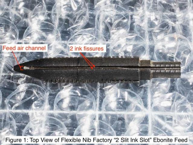
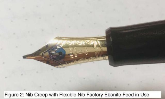
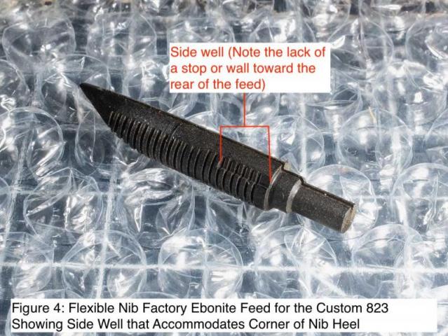
I just want to share my initial experience with the replacement ebonite feed for the Pilot Custom 823 and 743 I purchased from Flexible Nib Factory. The one I got is a black ebonite feed with the “2 Slit Ink Slot.” Attached photo is a top view of the said feed, showing the two “ink slots” or ink fissures in the feed air channel (see Figure 1). I have this ebonite feed installed on a Pilot Custom 823 fitted with a broad nib. Having used this pen on long writing sessions in the last few days, I am happy to report that the feed works splendidly. As I had hoped, the pen writes much wetter now than with the original Pilot feed. And though I have never had any problems with ink starvation with the 823, I have seen the ink flow noticeably ebb from time to time with the original Pilot feed in use. With the ebonite feed, I have found the ink flow to be consistent. Thus, it seems that the ebonite feed makes not just for a wetter writer but also a consistent one at that. For what it is worth, I have noticed the comb feeds to the ebonite to be constantly full of ink. By the same token, ever since installing the ebonite, the pen has also become prone to nib creep, that spontaneous pooling of ink on the nib surface. Often the nib creep happens around the breather hole, sometimes on the shoulders (see Figure 2). In any event, this ink pooling does not affect the functioning of the pen, just the looks of the nib maybe. While the ebonite feed works well, the installation is not as foolproof as it could be because of the way the nib goes onto the feed. It all has to do with the way Flexible Nib Factory makes these ebonite feeds. As with the Pilot feed, the ebonite feed has side wells toward the rear where the two corners of the heel of the nib nest into (see Figures 3 and 4). However, unlike the Pilot feed, the ebonite feed lacks a rear stop to the side wells, meaning it is possible to have the corners of the heel of the nib in the well, but have the nib sitting too far back in relation to the feed (see Figures 5 and 6). There is a simple workaround to this design feature, which is to set the corners of the heel of the nib against the front of the well where there is a stop or wall that prevents the nib from moving any further forward (see Figure 7). With a firm hold to keep the nib in place, the user then just needs to insert the nib-feed assembly into the section, in order to put the pen back together. Note though that given there is no back stop to the well where the nib heel fits into the feed, the user has to make sure to have a firm hold on the nib and feed once the whole assembly is set in place. After all, the greatest chance that the nib could shift further back on the feed is when one is pushing the nib-feed assembly back onto the pen section. Other than this one quibble, the feed fits well overall. Maybe a little too well with the one I got, as it took quite a bit of force to install the nib and feed into the section. Well the force was nothing outrageous, at least nothing that indicated to me that something was going wrong with the installation. Rather it was definitely more that what I had to expend if it were with the Pilot feed. At any rate, one indication that the nib on the 823 is in far enough into the section is if the date code imprinted on the bottom left of the nib appears just above the section (see Figure 8). In all, the ebonite feed is definitely worth considering if you are looking to turn your 823 or 743 into a consistent wet writer. Flexible Nib Factory also offers the “3 Slit Ink Slot” should you want an even wetter writer. But from the way my “2 Slit Ink Slot” performs, I am guessing the “3 Slit Ink Slot” would be too much of a good thing, at least for a “normal” nib (i.e., a non-Falcon nib). At any rate, both “2 Slit” and “3 Slit” models are available in red and black ebonite. Ordering from Flexible Nib Factory was a smooth process all the way. My feed was promptly sent by USPS first-class mail the day after I ordered online. I received timely updates on the status of my order via email. And after only a couple of days, I received a padded envelope with a the feed encased in a small plastic tube. Thanks for reading, and I hope this review proves useful.- 13 replies
-
- pilot
- pilot custom 823
- (and 3 more)
-

Fountain Pen Revolution New Release : The ‘Jaipur V2’
Jamerelbe posted a topic in Fountain Pen Reviews
In February of this year (2020), the folks at Fountain Pen Revolution released the latest pen in their range – the ‘Jaipur V2’. The original Jaipur came out some 5 years ago now, with a fairly basic piston filler mechanism and a #5.5 nib – and with the funky smell that’s characteristic of pens made from vegetal resin! The Jaipur is an update in almost every imaginable way – larger nib, upgraded piston fill mechanism, and manufactured from more ‘up-market’ materials (that smell a lot more 'neutral'...). I reached out to Kevin the moment I saw a preview of this pen on his Instagram feed, and asked him to let me know when it was available for sale. In early February, the day they launched on the PFR website, I placed an order for a Jaipur V2 in blue acrylic, with my favourite Ultra-flex nib – and a couple of weeks later it arrived, with an orange acrylic pen thrown in. [Full disclosure, this latter pen was provided free because I’ve reviewed a few FPR pens before – it was a ‘tester’ pen, that couldn’t be resold because it had already been used.] I have a much wider range of pens in my collection than I did when the original Jaipur came out – including some much higher-value pens. I don’t tend to use my vegetal resin Jaipurs, Gurus etc unless I’m testing out an ink that I fear might stain my better pens, and I very rarely take them ‘on the road’ with me. The Jaipur V2 is a very different story – these are attractive looking pens, with a much higher ‘fit and finish’, and have been pretty well constantly inked since I bought them. ______________________________________________________________________ Appearance & Design The Jaipur V2 conforms to a fairly standard pen shape – more or less cylindrical along its length, though the cap diameter is about 1mm larger than the body, and there’s another step down in diameter where the barrel meets the blind cap that covers the piston mechanism. [This incidentally is one of the places where the new design is an improvement on the old: the original Jaipur ends with a piston knob that could be actuated accidentally by a curious friend, forcing ink out of the nib; the piston knob on the new version is covered by a blind cap that matches the colour of the pen body.] Removing the cap reveals two of my favourite features of the pen: the #6 nib, and a sizeable clear ‘window’ that allows the ink volume to be monitored. I appreciate the fact that Kevin designed this pen to accept his proprietary #6 nib units, so that swapping nibs out is much easier than for the original (and for the Himalaya V2, which has given me major hassles in this department!]. I really like the materials Kevin chose for the manufacture of these pens – the cracked-ice style acrylics are brightly coloured (blue and orange are the only options right now), with moderate translucency. I’ve been very tempted to buy the mottled brown ebonite version so I have the whole set – but just can’t quite bring myself to buy a 3rd version of the same pen! [i already own several Himalayas, and 4-5 original Jaipurs…] … Construction & Quality The fit and finish on the Jaipur V2 is really good. These are probably the highest quality pen in the FPR range – which I’d guess you would expect, given the higher cost of the pen. The acrylic is highly polished, the parts fit together well, and I’ve had no trouble with ink drying out over time, which suggests the seal on the cap is airtight. I only have one complaint, if you could even call it that: I find the piston mechanism fairly stiff, especially the first turn on emptying or filling the ink reservoir. … Weight & Dimensions Placed side by side with the original Jaipur, you can see the ‘genetic’ relationship between the two in terms of design – but the V2 is a little larger on almost every dimension. Capped the pen is 140mm long (compared to 135mm for the original); uncapped it’s 133cm long, while posted it’s over 170mm. The latter looks a bit unwieldy – it’s not really designed for posting – but the cap sits on fairly securely. The barrel of the pen is 13mm in diameter (the cap is 14mm), while the grip section sits at a very comfortable 10.5-11mm. The whole pen weighs in at a very 16g – uncapped that drops to 10g, which makes the pen very lightweight, and ideal for long writing sessions. … Nib & Performance I willingly paid an extra $US14 to ‘upgrade’ to an EF ultra-flex nib – it’s far and away my favourite in the FPR line, though their other nibs perform well too. This pen is designed to take the #6 screw-in nib units that were originally designed to fit FPR’s Triveni and Darjeeling pens – and the standard nibs (EF-B and 1.0mm stub) are paired with a plastic feed. The ultra-flex nib, though, comes with an ebonite feed (with a very wide and deep ink channel to maximise flow). Since writing my review on the Himalaya V2 (FPR’s second-most recent pen release), I’ve found a few reviews complaining that with the ultra-flex nib they were prone to railroading and ink starvation – I found the same problem with one of mine, that required some effort to fix (some judicious deepening of the ink channel). I’ve had no such issues with the Jaipur V2 – it’s an exceptionally wet writer (with the ultra-flex nib installed), that allows me to flex with freedom. For everyday writing, I’d recommend purchasing one of the ‘regular’ nib units – these ‘tame’ the pen nicely, producing a more moderate ink flow. [Of course, you can always order the pen with the ultraflex nib installed, and purchase a spare ‘regular’ nib unit in the size of your choice, to swap in as you wish!] … Filling System & Maintenance As I mentioned earlier, the filling system is (apart from the nib assembly) the biggest ‘upgrade’ for the V2 of the Jaipur. Whereas the older version relied on the same kind of clutchless piston with nylon seal that’s found in the Guru, the Indus, and the Dilli, the piston in this pen is much more robust, and relies on more durable washers (which I think would also be easier to replace?) for maintaining a good seal. Also, whereas for these earlier model pens the entire rear of the pen functioned as a piston knob, for the Jaipur V2 the piston knob is concealed under a screw-on blind cap – making it much less likely the piston will be turned accidentally between fills. The maximum capacity of the ink reservoir is around 1.2mm. The pen can be completely disassembled for cleaning, and easily reassembled – my only complaint with the pen (if you could call it that!) is that the washers on the piston fit very snugly against the inside walls of the pen. This makes the piston mechanism very reliable… but also a bit stiff. Maybe it’ll loosen up a little with time? … Cost & Value At US$55 (plus postage) for ‘regular’ nib sizes (B, stub and flex nibs cost $4 extra, and the ultraflex nib will set you back an additional $14), the Jaipur V2 is FPR’s most expensive pen – but it’s well worth it for the upgraded design and materials. … Conclusion Until my V2 Jaipurs arrived in the mail, I’d have said the Himalayas (V1 or V2) were my favourite line of pens from FPR. The Jaipur has changed that up, though: these pens are very attractive, they feel great in the hand, and they write like a dream. I’d happily recommend this as a mid-range pen, that competes very well with other fountain pens in this price range. And Kevin’s / FPR’s customer service has, in my experience, always been exceptional.- 4 replies
-
- fountain pen revolution
- indian pens
-
(and 3 more)
Tagged with:
-
The no. 6 flex nib from Fountain Pen Revolution fits in a Penbbs 456, this one in the absinthe material. The ebonite feed was shaved slightly to fit the plastic section housing. I modified this nib with wing scallops along the lines of the flex nib experiments in the thread below. FPR now sells these ultra flex nibs with wing scallops included. The ink is Diamine umber, and the paper is from MUJI. https://www.fountainpennetwork.com/forum/topic/324910-experiments-with-flex/
-

The Updated ‘Himalaya’, With #6 Nib, From Fountain Pen Revolution
Jamerelbe posted a topic in Fountain Pen Reviews
It’s nearly 3 years since I reviewed a pen that had (at that time) just arrived on the market – the Fountain Pen Revolution ‘Himalaya’ – and in that time I’ve added a few more to my collection (the number now stands at 5!). It’s one of my favourite low(er) cost fountain pens, it’s elegant looking, it writes well… The one thing I felt could be improved – and I guess I’m not the only one who relayed this to Kevin, the proprietor of FPR – was the size of the nib. As smooth as FPR’s #5.5 nibs are to write with, I just like the look of the larger #6 nibs better. So you can imagine my delight to discover that, in addition to the existing #5.5 nib version of the pen, Kevin was releasing an additional version with #6 nib. I ordered one the moment they went up on the website, and have been using it now for a couple of weeks. Because this is not a brand new design, I’ll try to keep the review a bit shorter – you can find my review of the original version of the Himalaya at https://www.fountainpennetwork.com/forum/topic/313017-the-himalaya-from-fountain-pen-revolution/ (and just to be clear, this version is not going away – it will continue to be produced “as long as there’s continuing demand”. [Disclaimer: though I have received free review pens from FPR in the past, this pen was purchased with my own money – in either case, the views expressed in this review are entirely my own.] ______________________________________________________________________ Appearance & Design Both versions of the Himalaya are now available in two materials (acrylic and ebonite), with multiple colour options. The acrylic versions come in 10 different colours – mine is called ‘Purple Amethyst’; while ebonite versions of the pen are currently restricted to a green/black swirl and a brown/black. Whereas the #5.5 nib version of the pen was only offered with a chrome trim (and this continues to be the case), the #6 sports a gold clip and cap band, and by default comes with a dual-tone (gold and chrome) nib. The swirled acrylic of the Purple Amethyst pen – like the other acrylics I’ve purchased in the old version – is very attractive, with a lovely ‘chatoyance’ that leave you feeling like you’re staring into the depths of the material. I like the slight tapering of the pen towards the top of the cap and the bottom of the barrel, that gives it a more ‘curved’ look – as opposed to the ramrod “straightness” of the FPR Triveni. … Construction & Quality The pen feels sturdy in the hand, is expertly turned, and has no rough patches or visible flaws. My older Himalayas are by now (up to) 3 years old, and none have shown any sign of cracking or discolouring. The clip is sturdy, and is tight enough to hold the pen firmly in a pocket, but springy enough to be flexible. The threads are smooth, making the cap (and barrel) easy to open to pull the pen apart. I have to admit there are a couple of minor ‘blemishes’ as regards the fit and finish of the pen – though for the price, these are understandable, and do little to affect my appreciation of the pen: (1) There was a slight scratch on the metal cap-band when the pen arrived; and (2) The machine marks left in the acrylic by the process of turning the pen have not been fully buffed out. It’s not really noticeable except when the pen is illuminated for photos – but in the strong sunlight (or under my Ott-lamp!) I could see lots of superficial scratching on the surface of the acrylic. [Then again, since I don’t really baby my pens, that wouldn’t have taken long for me to accomplish myself!] I feel compelled to say that I would have preferred this pen with a chrome trim – I like the look better than gold – and I’m told that a chrome version of the larger pen may eventually become available, if there’s high enough demand. I was pleasantly surprised, though, to find that in the hand the gold trim didn’t bother me – and the dual-tone (chrome-edged gold) nib looks really good. … Weight & Dimensions As with its predecessor, I’d classify the new Himalaya as a ‘Medium’ sized pen – though both the grip section and the cap have been extended to accommodate the larger nib. It’s very comfortable in the hand, and long enough to write with either posted or unposted. Lengthwise, the pen is 138mm long capped, 127mm uncapped, and extends to ~165mm when posted (as compared with measurements of 134mm, 121mm, and 152mm for the original pen). It weighs in at 16.7g (10.7g uncapped) – though I expect this would be a little heavier for the ebonite versions. The cap diameter (not including clip) is 14.5mm at its widest point, the barrel diameter sits around 12mm, while the grip section (19mm long) tapers down from 11mm diameter near the cap threads, to 9.5mm at its narrowest… before flaring out at the end to 11mm at the lip. This makes for a very comfortable writing experience – at least in my hands! … Nib & Performance This obviously is the big difference between the original Himalaya and the new version (other than the gold trim). The #6 two tone nib sits against a 6.3mm ebonite feed – both of which can be replaced. Other #6 nibs (JoWo, Bock, Jinhao etc) can easily be swapped in and out – and the ebonite feed can easily be heat set to ensure a close fit. I ordered an Ultra-Flex steel nib, and inked it up with Diamine Robert, a high sheening ink only available at Cult Pens. The slightest pressure causes the tines to split, just marginally, allowing the pen to lay down a rich line of ink – and additional pressure easily produces broader lines. FPR nibs are consistently good (with the possible exception of their 1.0mm stubs, which tend to write like an Extra Broad rather than a stub!), and their Ultra-Flex nibs (I now have 3) are amazing. … Filling System & Maintenance The new Himalaya relies on the same filling system as the old: a push-type piston filling mechanism, similar to (but smaller than) the system Nathan Tardif uses in his Noodler’s Ahab. Its capacity is (I think) around 1 mL – which will run out relatively quickly with a flex nib! – but it can be removed to convert the pen to an eyedropper, allowing for a much larger ink capacity. As I’m aware, it’s not possible to use standard international (or other) cartridges with the pen – but you *can* buy replacement filling mechanisms, if you accidentally drop the original down the sink (don’t ask me how I know this: it should be obvious…). … Cost & Value At US$32 (plus postage, plus extra if you want a B, stub, or flex nib), the #6 Himalaya is very reasonably priced – especially for an acrylic or ebonite pen. The older Himalaya still has a base price of $29, which is equally impressive. The FPR Triveni has jumped significantly in price recently – and in my view is not quite as aesthetically attractive (I own several of these too). The #6 Himalaya, for me, has now become the best pen in FPR’s range. … Conclusion I’ve been a long-time customer of FPR, and am a fan of their customer service – so it would be easy for me to be biased when it comes to their products. For mine, though, this is an excellent pen. It’s not as well “finished” as some of my more expensive pens – but for the price, I think that’s excusable. The Himalaya is attractive, fun to write with, highly serviceable… and in every other way a worthwhile buy. Thanks, Kevin, for listening to customer feedback, and making the #6 option on this pen a reality! …- 15 replies
-
- fountain pen revolution
- fountain pen
-
(and 3 more)
Tagged with:
-
Hellow, I'm trying to determine whether or not current Danitrio Densho models come with ebonite feeds. There are ancient (by site standards: over a decade) reviews for those long extinct raw ebonite models that mention ebonite feeds, but I've not managed to find anything definite about recent stuff. After all, it's been a while and things might have changed over at Danitrio. I know the larger #8 nibs on the Mikado et. al. are ebonite still, but that model doesn't concern me currently. Anyone here have a recent - say, in the last year or two? - Densho with an ebonite or a plastic feed? Thank you berry much.
- 21 replies
-
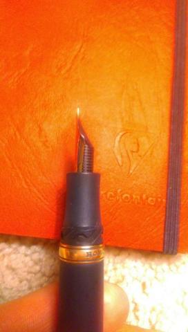
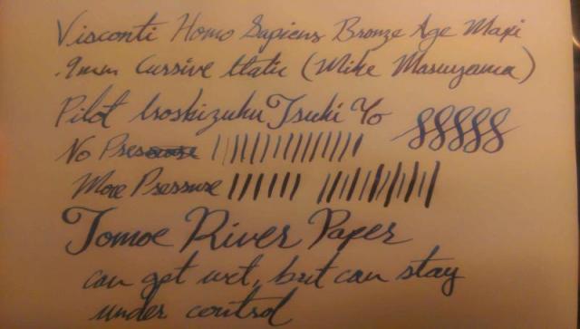
I have always thought the Visconti Homo Sapiens was one of the most beautiful pens ever, not to mention the lava material being so unique. I’ve always wanted one and finally got it. However, I knew I could have a problem with inconsistent ink flow and wetness, because so many others had. I ordered the pen and it was shipped to Mike Masuyama to grind a .9mm Cursive Italic from the broad. Mike does wonderful work, but when I got the pen it was so wet I couldn’t use it on anything but super ink proof papers. Plus, the ink had no character, it was just super dark lines the crinkled the pages. You could actually see the surface tension of the ink bowing up off of the page. Every now and then it would just start dripping ink. I sent it back to him and he tried his best to dry it out. He said the issue was the spacing between the feed and the nib, which sounded right. For a few months I barely used the pen. This was awful because the pen is so nice, doesn’t have to be babied, and fits my hand so well. Last night I took the nib and feed out and was amazed by how poorly the nib and feed fit together. You couldn’t even hold the feed centered on the nib. It was like they weren’t made for each other. So, I took the feed out of my Noodler’s Konrad and cut a slit in it, to match the slit in the barrel of my Visconti. Then I inserted the nib and ebonite feed into the pen. The feed pushed the tines of the nib apart a little bit. So, I boiled some water and dipped the nib and feed in for 30 seconds. I pulled the pen out and used a towel to squeeze the nib and feed and held it there until it cooled off. The tines were no longer pushed apart. I had successfully heat set an ebonite feed into my Visconti Homo Sapiens Bronze Age Maxi! I have been using the pen for the last 24 hours regularly and it is awesome. The flow is perfect. I get shading, decent dry time, and super consistent flow. Another side benefit is I am able to control how soft the nib feels. I like soft nibs, but with my rather sharp italic, I always felt that the nib was a little too soft for anything but the best paper. I set the feed pretty close to the tip of the nib and it has added a little more support and stiffened it up a bit. For anyone disappointed with the extreme wetness and inconsistency of their Visconti Homo Sapiens, you may want to consider installing an ebonite feed which, in my opinion, should have always been there. Ebonite does not repel ink and cause it to bead up like plastic does, lending to consistent flow. If anyone has any questions or anything let me know. I am not a nibmeister or a professional, however I can grind my own nibs, but for special pens I still defer to the masters. In other words, I think that this is something most people can do. The hardest part is cutting out the slit so the ebonite feed fits, but a dremel really helps with that. If you mess it up, you haven’t hurt your pen. Also, I have not altered the original plastic feed, nib, or barrel of the pen, so I can return it to stock form if I need to. Thanks for reading!
- 26 replies
-
- visconti homo sapiens
- ebonite feed
-
(and 1 more)
Tagged with:
-
You can really cut an Ahab feed in two ways: 1. Chip away some of the fin wall to make the channel wider, or: 2. Cut the fins that do not open into the center channel so that they do reach the center channel. I have a supply of feeds to experiment on coming soon. I'm curious if folks have more success with approach #1, #2, or combining both ways. Thanks for sharing your thoughts on this already well-hashed topic. I've read loads of posts including SamCapote's detailed Opening Up Fin Vents, but SamCapote seems to focus only on #1, which is more difficult to do than #2, so I dared to open the subject yet again, focusing on those specific points. I am aware of the need to clean the feeds, etc., before use. Again, thanks for sharing your experience with me. These feeds are not expensive, but I would like to ruin as few as possible (and yes, I have ruined a few). Ben

